Leaderboard


Popular Content
Showing content with the highest reputation on 05/22/2024 in all areas
-
15 points
-
L2 Card2.
 15 points
 -
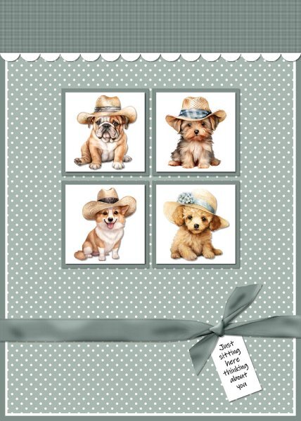
Card 2 - I changed the template by adding background squares behind the white squares, moved the top up and added a white scalloped border. Created the ribbon with the Knot 3 script. Added texture to the top panel, a polka dot overlay to the background layer, puppies from Creative Fabrica on the white squares and a tag with sentiment under the ribbon. I made this for the Cards For Hospitalized Kids Charity.
15 points
-
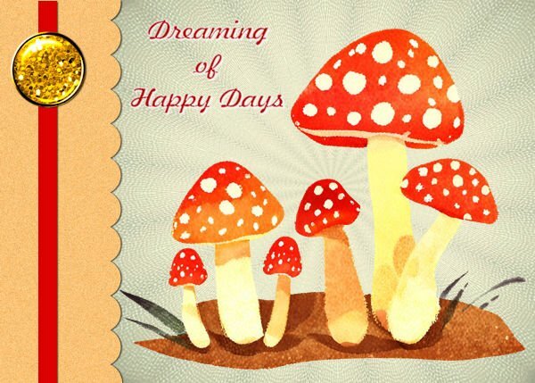
Day 1 I used a background and mushrooms from Creative Fabrica. Font Freehand526 BT The button was as suggested by Carole. I did adjust the colour. I could not get the canvas to get to correct size so just left it as it was.
15 points
-
Here is my Greeting Card Lesson 1: I used a cover from one of the Birthday cards I received over the past years. The font is one of my favorites "Chase CallasSH. I don't remember where I found it a long time ago. Following Carole's tutorial I learned a few new tips. I took this workshop in 2022 and it is so helpful to get a refresher workshop.
14 points
-
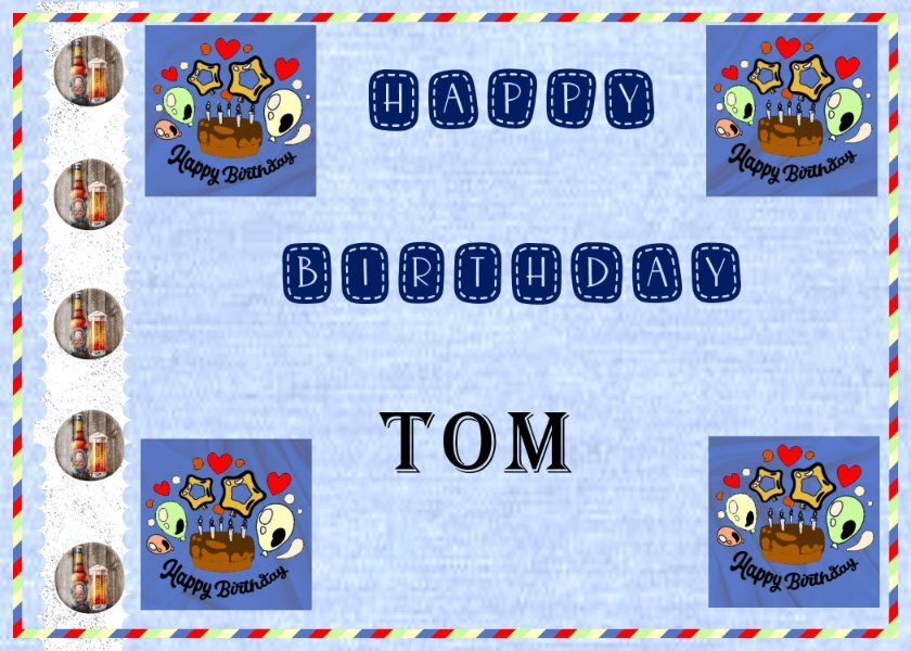
My day two. I turned it's side and went from there. I went with the blue jeans colors because that is what my husband wears most of the time. He also likes his beer and chocolate cake so that is what I gave him. The Happy birthday font is Stitch Patch which was today's 5/21 free font on C F. The cake was a black and white png file it it took forever to color everything , but at least I lots of practice with that technique.
13 points
-
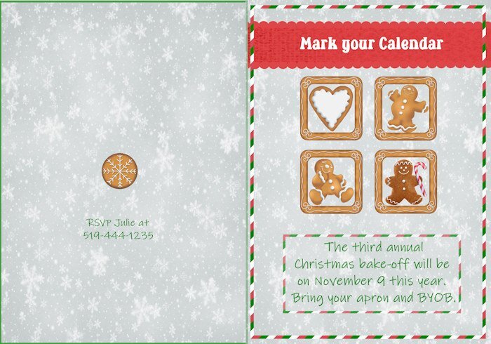
Lesson 2 - Also an invitation to a (fictional) Christmas get-together to do some baking. A group of us used to do this for a few years, then it gradually faded away, as things tend to do. Had some trouble with the back of the card, but it passes for done as it is. I really enjoyed the video with the cupcakes. The layout was cute and so cleverly done.
13 points
-
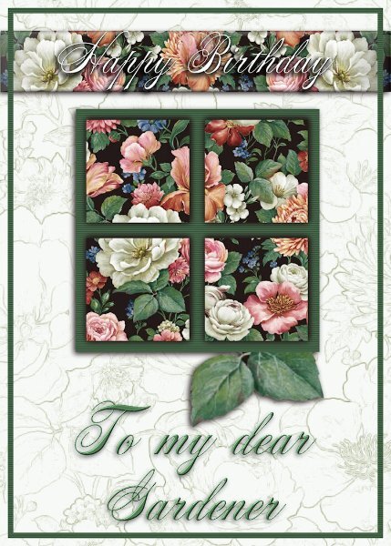
I will continue with the invitation cards tomorrow. Today's card is one I have just made to send via email. My son's mother-in-law is a keen gardiner, and yesterday she slipped and took a tumble, hurting her back. She will be fine, she's like me as tough as nails. I used today's template. I struggle to find elements, as I have very few kits, and odd elements to choose from. Anyway, I sent the ecard with the wavy lines, which I lightened even more. I'm not a big fan of patterened background papers, they have to be subtle. I also addd a texture and a little noise. I also chose to frame the text instead of the whole page.
12 points
-
My Card 2. Not sure I liked the outcome of this one but I did learn a new technique so that's a good thing. I needed to re outline the image before colouring as the original outline was a bit bitty after I had made it a transparent image using the plugin Cybia Alphaworks. I used a font called Peaches en Regalia. TFL
12 points
-
Just getting started with the week! I used a photo background, then used Posterize to change the lower background; adding a Selective Focus to the resulting image. This allowed me to focus solely on the ornament, while still keeping the main concept of the tree. for the Scallop, I added in inner blend which created a shadow to create a "depth" that I like to see when I make my 3-D cards. I used random noise in monochrome to create the texture for the scalloped section. For the ribbon, I used a gradient at 45% that used colors from the original photo; added the star (from Digital Scrapbook). Then copied the scallop/ribbon/brad and placed it on the opposite side of the card. Merry Christmas in white at the bottom finished it off.
11 points
-
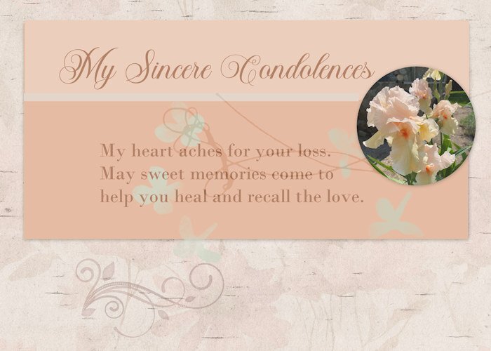
Lesson 2 Greeting card (extra template) I send cards for the usual events, but I also seem to need quite a few sympathy cards these days. Age-related, no doubt. I always struggle with store-bought cards for this occasion, so making my own sometimes is a better choice. I took the photo yesterday in a garden near me. Such lovely tall bearded irises in a soft pastel.
11 points
-
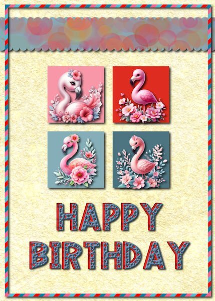
Day 2 This birthday card is for my daughter who loves flamingos so much that she had one tattooed on her shoulder. Those cute flamingos are from a CF bundle that I recently downloaded. The top ribbon has a blue background with a bokeh pattern that I made with Procreate. The scallops were made with cass quick scallop script. The font is Love Stars downloaded from CF. I duplicated the text, changed the color and moved the red copy to look like a layered font. The background is a parchment paper made in FF and lightened.
11 points
-
Lesson 1 Background Paper and brad came from The Curio Panty: Time to Unwind kit. The font was Edwardian Script Font.
11 points
-
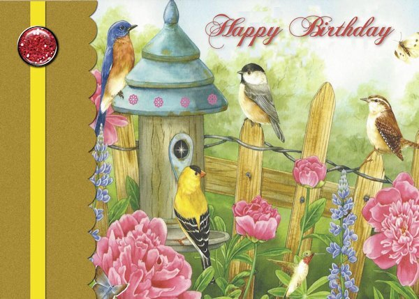
Day 2, continuing with the Invitation theme. I complied with the video, with the exception of grouping the 4 photo slots into one large one to accommodate the photo of the male Baltimore Oriole.
11 points
-
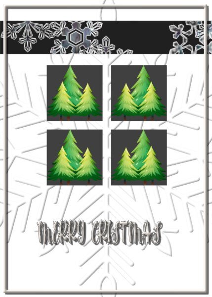
Day 1 -- All the items are from my Retro Christmas kit. The top background is one of my white grunge creations overlaid with a cass gradient. Since all the card that I make are 8.5 by 11, I changed the template to 5.5 by 11. When I print my cards, I print them borderless. The plaid was made with cass stripe2 script. The font is Sequents from Creative Fabrica. However, I had to make them in Photoshop since they don't work in Paintshop. I made them on a page and used cass AlphaSheetseparator script for the individual letters.
11 points
-
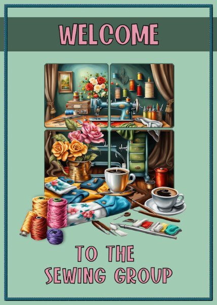
I sew in a group in Florida for the Greater Federation of Women's Clubs/RWWC - and we are ALWAYS thankful for new members to participate. We sew for many charities and organizations that just need help ... the Cancer Center, Pregnancy Center, whatever locals ask for help. We have only about ten members right now but hoping for more! We do lots of other things, too, to make money for teen scholarships and support many groups that do good things! When I am not playing in PSP, you'll find me at a sewing machine. LOL
11 points
-
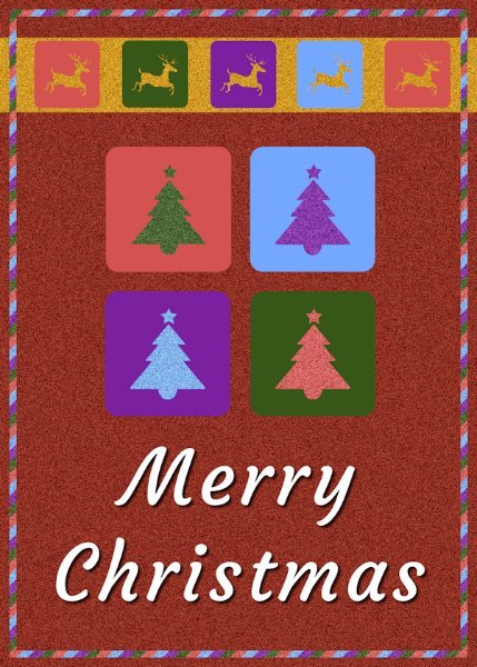
Christmas again… The trees and reindeer are from a kit by Elif Sahin (a little sparkle elements template). The font is Courgette. The background is a solid colour fill with noise added.
10 points
-
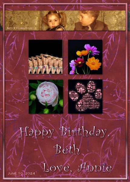
My Lesson Two - A birthday card for my step-daughter, Beth Seeber-Wilson. She'll be 57 this year, the youngest of my 3 girls. She's the grandmother of Sonya, whose birthday is also coming in June. I'm having a bit of fun with Beth, as you can see... 😉
10 points
-
Not much for embellishments here ... going to send to family and see how many want to go!
9 points
-
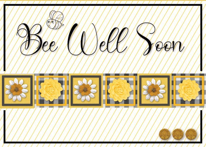
Here's card number 3. I added a little bee stamp and cute yellow buttons to finish it off. I wasn't sure about the colours at first but....it turned out nicely I think.
9 points
-
L2. Card2 corrected a bit thanks to AnnSeeber. btw, it's super fun so I've changed my work a little bit.
9 points
-
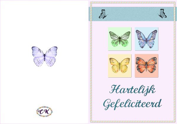
Workshop day 2 This time I used the original template and it is again a birthday card, probably all my cards will be for birthdays and this one goes by mail. It is intended for my cousin who likes butterflies very, very much; she has butterflies on her plates, cups and saucer, posters, photos, bracelets, brooches etc. Every year I try to make her a card with butterflies or send one that a bought when I come across one. I indeed need a double card so that's what I made and show here. The text is in Dutch but I kept a psp version for use with a different language. The butterflies are a bunch of watercolor cliparts that I have for a long time in my stash, I knew that one day they would come in handy. The font is Calligraphy and I it often because it is easy to read.
9 points
-
The stars are from a kit by Sheila Reed on Digital Scrapbook. The font is Ernestone Script from Creative Fabicra. It's a nice calligraphy font with lots of glyphs and swashes.
8 points
-
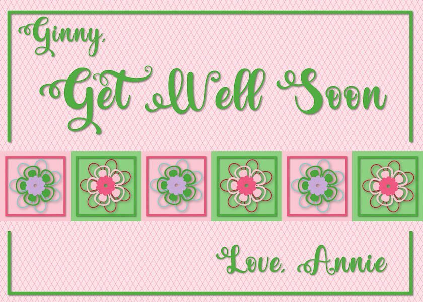
My get-well card is a bit colorful. It'll wake my friend, Ginny, up -- she's lounging around dealing with a cracked pelvis. 🧐 The flowers are from a Merisa Lerin Birthday Kit and the font is Valentina.
8 points
-
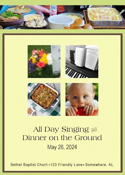
Memorial Day (United States) was formerly called Decoration Day. Families would gather dressed in their Sunday best to decorate the graves of their loved ones. On the Sunday before Decoration Day, churches would host an "All Day Singing" and a huge picnic. Gospel singers would perform in the sanctuary and congregational singing in between. It was a tradition in the South and is still celebrated in rural areas, particularly in Appalachia. The inside of the card would have instructions about where to leave your casserole on your way to the worship service. A few volunteers would get everything ready. It would also include some of the groups that would be joining the festivities.
8 points
-
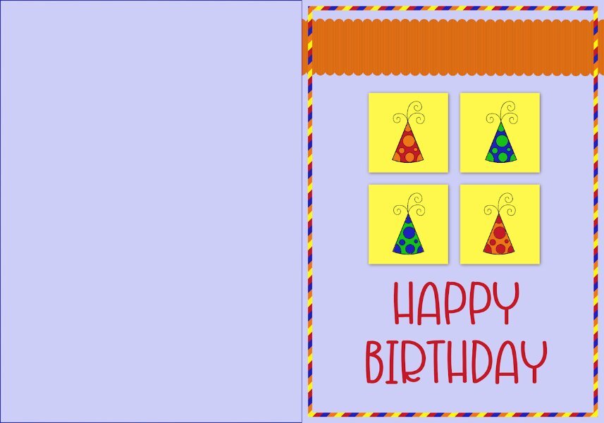
I chose primary colours and added some shadow to the squares so they would stand out.
8 points
-
@kasany I had the same issue with a white card where the edges didn't stand out here in the forum. I pulled it back and added a slightly larger bottom layer and added a faint shadow. That helped! I'll show it here again...
7 points
-
My Card 2 follows on the flower theme. I used my photo of daisies to sample the colours from and decided to use it as a reduced opacity background over a plain background. Font: Babylone. The stripey frame was fun to see take effect. I took note of how to create a back but didn't do it as I tend to print off a design on paper and attach to a pre-folded plain greetings card.
7 points
-
The floral brad you used is so gorgeous that I went right to DS and downloaded the entire bundle! If you don't mind may I make a small suggestion? The shadow you used for the brad makes it look like it's floating above the card. You might want to make it smaller.6 points
-
That's a great idea for printing, Fiona. Glad you mentioned it. I have a friend who does that with her husband's gorgeous photos.6 points
-
What kind charitable work your group does. Kudos.6 points
-
Fiona, this is so beautiful and the your color choices are perfect.6 points
-
L1. Card1. I used my material and font. I'll use the card this year. I'll send it to my family hence merry Christmas is written in my native language.
6 points
-
Hi, Question, which gallery should the scraps from this workshop go into? I didn't find any of the ones shown above in the greeting card workshop gallery6 points
-
I hope I'm doing this right...this is my go at the first lesson.
6 points
-
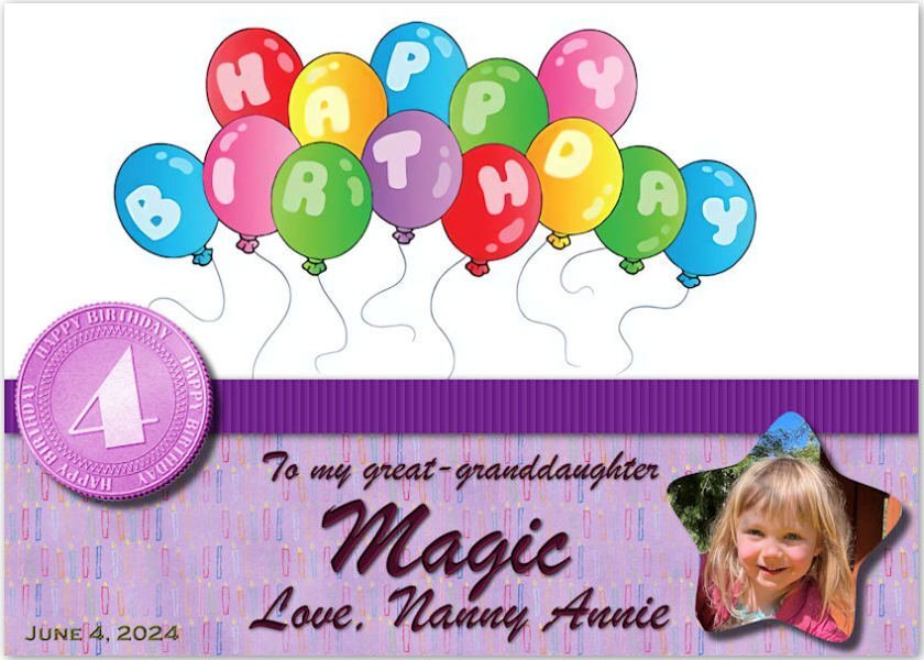
Here is my first greeting card, a birthday card for my great granddaughter, Magic. Her 4th birthday is June 4. It appears I have 4 more birthdays coming up in June so this workshop will come in handy! The birthday coin is from Cassel.
6 points
-
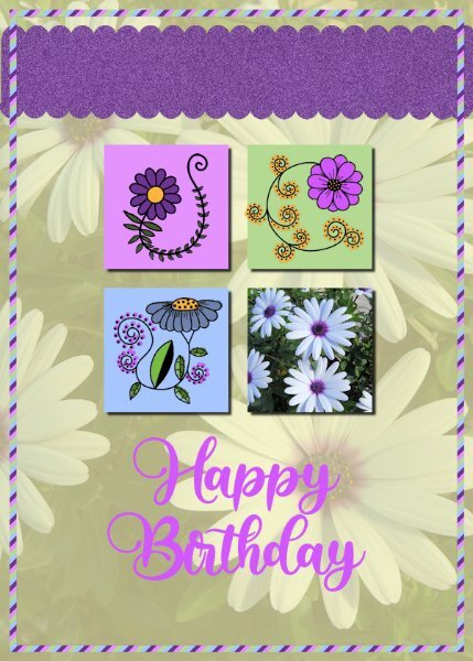
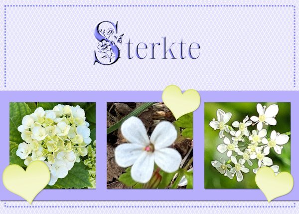
Card 3-Extra I have used the normal template so often for X-mas, Easter, New Baby, Birthday and Thank you that I now choose the extra one. However I used some of the ideas like the lines on the background and some sort of frame. My photos with white flowers and I gave them a little bit of shadow, just as the strip behind them. The heart is from Chantalia Design but recolored; the fonts are Crocus Monogram and Clarissa stories and both have a inner bevel to let them stand out a bit better. The Dutch word sterkte means you wish somebody courage with a particular situation, for instance this card is meant for a friend who has to undergo an unpleasant medical treatment. It has a backside and in this case I will write something inside by hand not printed.
5 points
-
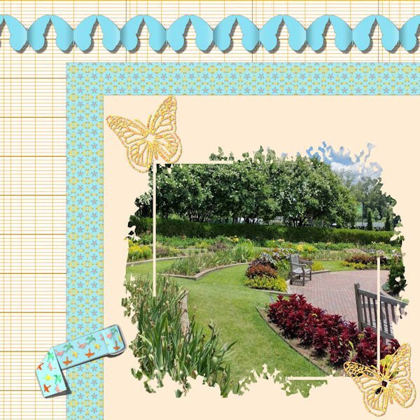
Back to the Labs for me. This is Lab 12 Mod 4. Requirements: ledger paper 2 (my background - I made several different colors and kept the pattern); rolled tape (not my favorite) and I tried folding it - without the tutorial but had followed several tutorials that folded ribbons etc; added sparkled butterflies (using Cass sparkle script). I use the pictures I took in the Botanic Gardens in 2022 a lot!. The blue patterned paper: I used the bird pattern (on the tape) and kaleidescoped and patterned it several times and liked this version the best. The other requirement was to make a folded paper streamer/banner. I chose to use butterflies and not the boy and girl. It was really interesting making the shadow on the fold/crease in the center of each butterfly. The mask I used was given to us in the Mask Workshop.
5 points
-
So bright and cheerful!5 points
-
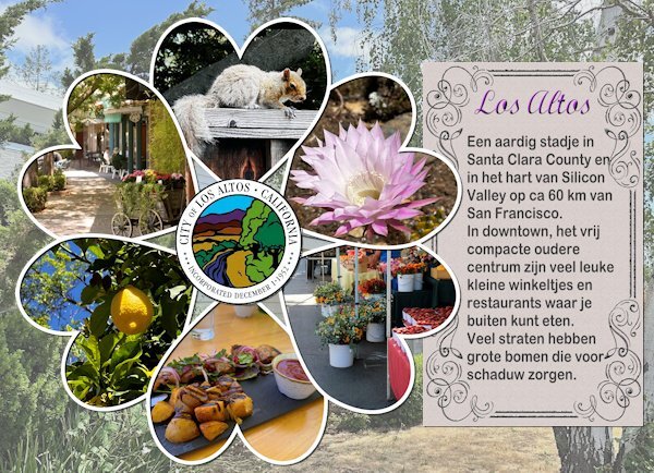
I was struggling to make an intropage for the photos I took from the daily life and things I did at home. After some thought I concluded that there was one item that covers it all: the place where they live! So I used the cass-photocircle template script again, this time with hearts and photos I took in Los Altos plus the seal of the city (thanks to google). The family photos will come on the next photo pages in the album. I wrote a short story about the place, of course in Dutch, but roughly translated it says: "Los Altos is a nice city in Santa Clara County in Silicon Valley and ca 40 mile from San Francisco. Downtown, the compact older part of the city has a lot of nice shops and restaurants to eat outside. Many of the streets have big trees that provide shadow". The background is a photo with reduced opacity of the frontyard of their house.
5 points
-
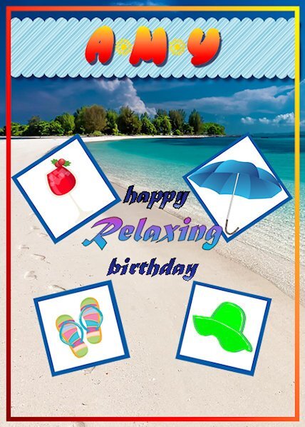
For my 2nd card, I created one for my sister (her birthday is in July and she lives in flip-flops)! This class worked very well for me to create a unique card that celebrates her ultimate desire to live near the ocean on an island somewhere. I chose a photo from Pixabay by Kanenori user_id:4749850. The tips in this lesson are going to come in very handy! I learned a lot and will be practicing these for awhile until I can do them without instruction!! VERY good class. Thank you.
4 points
-
Lesson 3 - I enjoyed this one. Little tricks and tips that Carole so patiently points out and repeats so even I can get it! I added a bit of extra shadowing to the tan-coloured frames so they didn't look as pale beside the darker ones. I still have not printed ANY cards I've made; usually send by email, but I do plan to since I have a lovely colour printer which I rarely use. Nice to know (now) how to do the layout to incorporate a folded card.
4 points
-
Another beautiful colourful festive page, but not overly bold.4 points
-
A beautiful colourful festive page. Is the font a layered or a coloured font. If it is a layered font, it is easy enough to colour them. Using all the fonts in the folder, including its shadow font. There is a tutorial, but I can't remember at the moment where it is located in the campus. Try the blog. I use layered fonts.4 points
-
Thank you, Wendy. I'm afraid I've made Magic rather in-famous in these rooms. 😉 It's hard to pass up her photos.4 points
-
Getting in some refresher lesson's again been a long time since I really used it We have a new great grand baby coming in Aug.
4 points
-
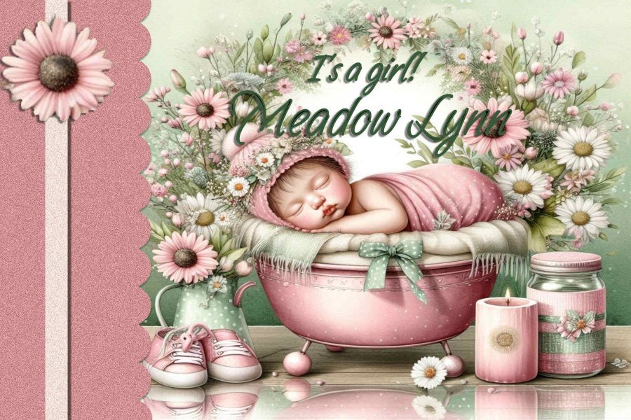
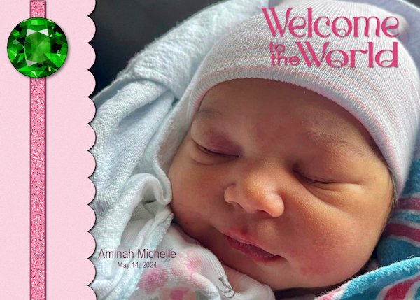
Aminah is the third addition to our family this year, preceded by her cousins Felix and Ansley. The font is Romland from Creative Fabrica. The ribbon was created using Cassel's Glitters-C script and is adorned with an emerald, the birthstone for May, from cleanPNG.com.
4 points
-
Ah, good it was in the blog. I have been using layered fonts since before Carole did the blog post. I make sure that everything is centred, that way all the fonts in the folder are aligned with each other. I will download that font, and see if the layers line up for me, using my way of using them.3 points
-
Awesome Ann. Better add one more day in June....for me! ☺️ I'm already behind, not sure I'll be able to post anything this week at all. It's very busy with my bestie moving to Scotland on Saturday and work being unusually busy. At least I can download the supplies and get it done through the Diamond membership.3 points
-
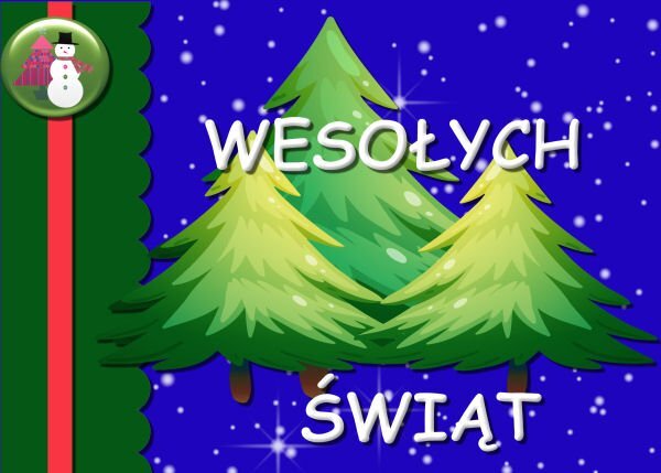
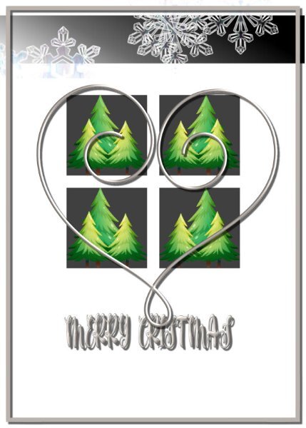
I went with Christmas. The image is from Freepik. The font is Courgette. The snowflake is from Jessica Dunn’s Snow Baby Mini Kit.
3 points


.jpg.6ac278c135af67af0a513f7def6ec603.jpg)