Leaderboard


Popular Content
Showing content with the highest reputation on 05/20/2024 in all areas
-
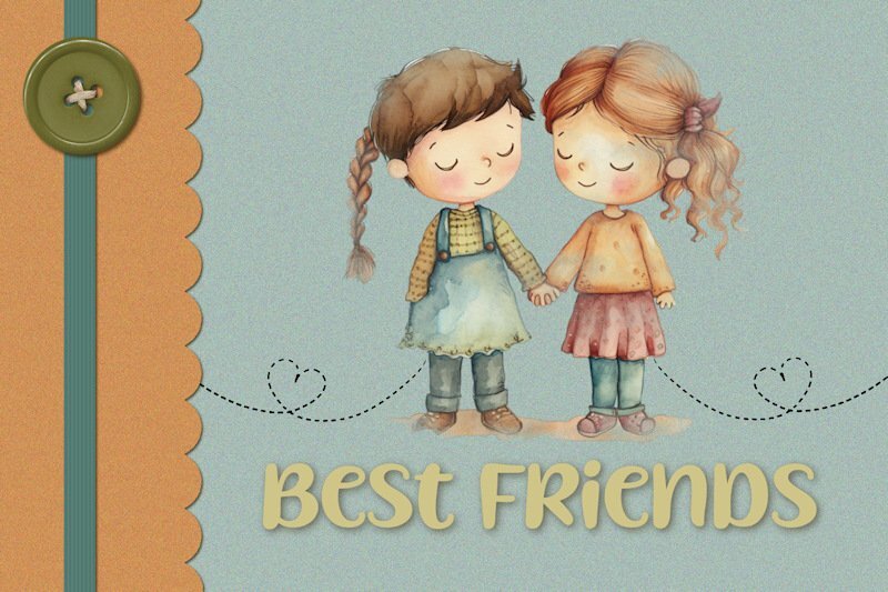
Here's my first card. I created a mask exposing the clipart and added the "stitched" heartlines.
 12 points
 -
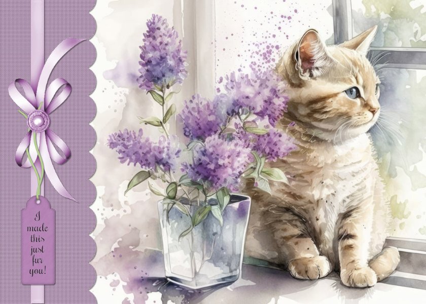
Here's the card I made for the workshop. I used a image from Creative Fabrica. Added texture to the scalloped panel and a drop shadow. Added a ribbon and tag from Craftsuprint.com (I make cards for the Cards For Hospitalized Kids Charity. The kids range in age from 2 to 18 so I think this will work for the older girls. Hopefully it will brighten their day.)
10 points
-
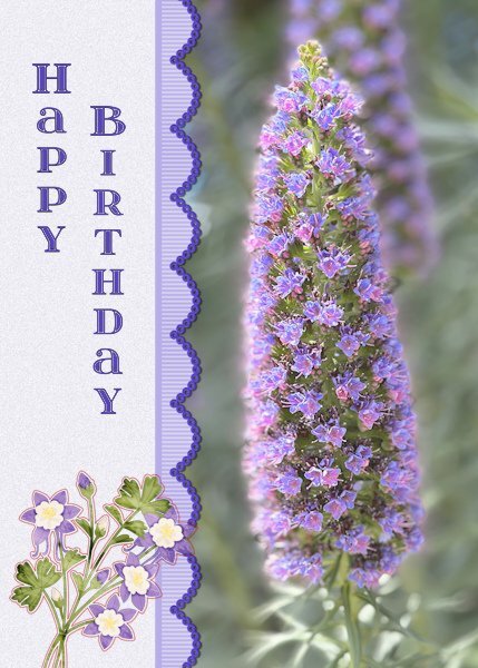
Card # 1 I used the extra template for 2024 and I changed the landscape format to portrait format to accommodate the photo I wanted to use. I'm very happy with the new extra templates for diamond members, because I have used the ones from the first workshop over and over again. That's not a problem as such but new templates give new ideas! As soon as I had taken this photo, I thought of a friend who loves purple very much and her birthday is coming up next month. I used a ribbon that I have made earlier and recolored it with hue, saturation, lightness. the flowers at the bottom are a sticker and the font is itsadzoke S01 and I think it came from a lab. The name of the flower is Echium candidans - Snakeweed
9 points
-
Lesson 1
9 points
-
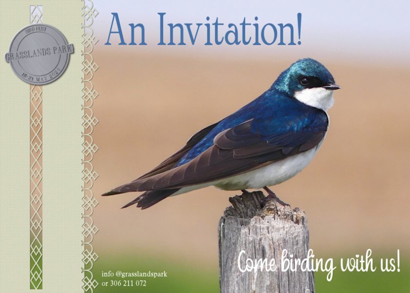
This time I'm taking a slightly different approach, instead of the usual greeing cards I have decided to go with Invitations. Primarily birds and mammal invitations. The recipients of the invitation, will get a nice surprise when they open the card. You will have to wait until the last day to find out what it is. These cards can be randomly placed into nature magazines, picked up at conservation offices, or just posted to memebrs of a particular nature organisation. One of three pairs of Tree Swallows, that are nesting in boxes fixed to the horses fence posts. This one is a handsome mature male, guarding his family. I created the token, and used one of Carole's paper punches and edge punches
8 points
-
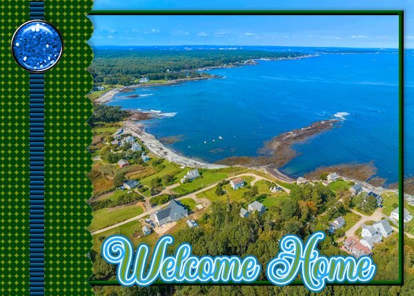
First one just using just what was given and a drone shot of my neighborhood. I've just returned for the summer - early - and wow, it's still chilly here! The second one I played a little more and made my graphics and tube in ai ... then wanted to try Carole's duplicate text shading trick. Yes - nice. Always something to learn.
7 points
-
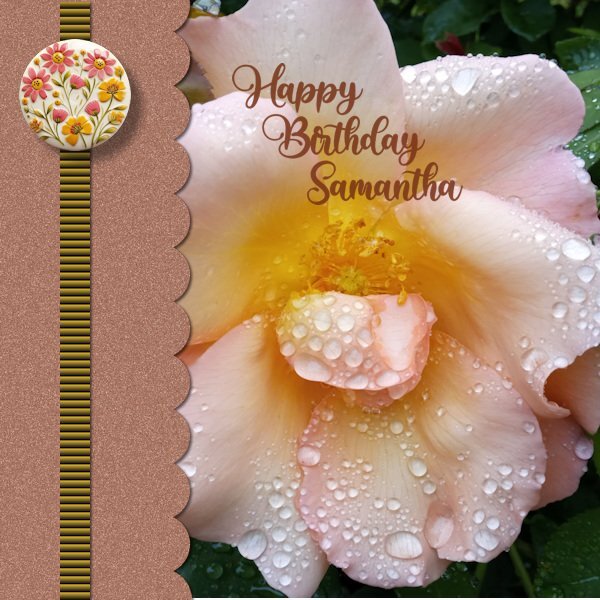
I just love flowers and flower photography plus I have a niece's birthday coming up so the ideal subject. I changed the canvas to 1500 x1500. Used a Random Noise Effect to the scallop paper. The texture effect, 'Blind' on the strip is bold at 100%. The round element is 'happiness is homemade' by Marissa Lerin form Digital scrapbooking.com. The font I have used is also from Creative Fabrica called 'Babylone'
4 points
-
I do a lot of layer duplicating in case what I'm trying doesn't work. Then I can always go back.4 points
-
Oh Sue! You are my patron saint of PSP. Duplicating and using the Eraser brush (on the shadow too) sounds much less complicated. Thank you so much!4 points
-
As I would say to my Welsh family and firends 'you have done a tidy job'. Check out the Masterclass Dynamic frames, the last technique demonstrated in the class. Like all techniques, and I'll use masks as an example, once you have done it several times, it will become second nature, and you will become proficient in using the technique. It doesn't matter which you use to cut and promote, sometime I will use the photo, and other times it will be the frame. I could have cut and promoted the letters in my layout, but I chose to cut the squiggly line. Use which ever is easier for you. I don't use the freehand or the point to point, I always use the rectangle tool, or at least whenever possible. As it gives a nice clean cut, the other tools I have noticed will leave a very slight gap. Which promoted layer goes where, in time will, make sence, and done automatically. Always make sure that you have done your shadowing, placement of your elements and any beveling prior to any cutting. I won't confuse you, but there is another way of doing it. Duplicate the layer you are going to cut, place the layer at the bottom. Making sure the shadow is on it's own layer. This time use the eraser tool, remembering to also erase the shadow. Using this technique, eliminates all of the moving of promoted layers, which can but in excess of 10-20 layers, depending on the layout.3 points
-
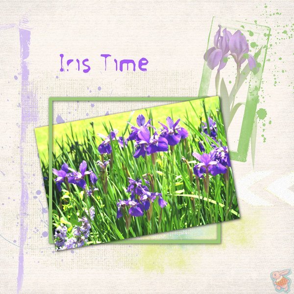
I should be too embarrassed to say how long it takes me to do a layout I can live with. Then, I should also be ashamed to admit how many times I had to try the interlacing elements technique that Sue T. pointed me back to. I have watched that video several times over the months and still have issues with which layer is top and which is bottom and then where does the darn Promoted Selection go! I'm going to keep using that technique until I get it right and quick! Photo of irises from Unsplash. Adjusted blur & hue. The translucent frame around the single iris is from Natali Designs at Pickleberry Pop. Other stuff is just splatters and paint. Font is FrouFrou. I found out that when you do this interlacing with a frame, you can't add a bevel. But is that just me too?
3 points
-
Nice glitter border on the scalloped edge!2 points
-
My first one done and I used an image from the many freebies I have saved from Creative Fabrica. I used a font called Precious but the creator is unknown.
2 points
-
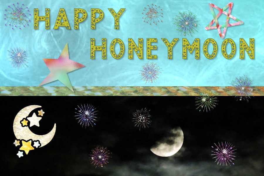
I used the extra one from Day 1. The moon photo is mine the font is Love-Stars-29963770 which is one of the $1 downloads this week on Creative Fabrica. I also used the Cass fireworks picture tube.
2 points
-
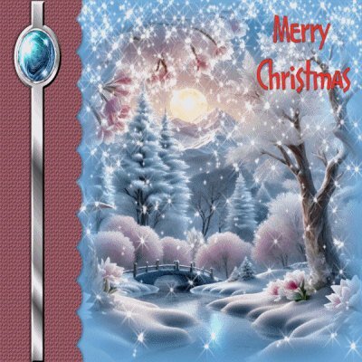
I went with Christmas. The image is from Freepik. The font is Courgette. The snowflake is from Jessica Dunn’s Snow Baby Mini Kit.
2 points
-
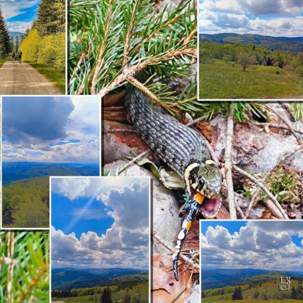
Recent Jacek's trip. He took many shots. I show the most interesting ones, Snake and Lizard is the best IMHO.
2 points
-
Nothing to be embarrassed about when your results are gorgeous!2 points
-
Nice to see you all😃2 points
-
Love this Julie. Your interlacing looks great. No one would even know; the struggle is REAL!2 points
-
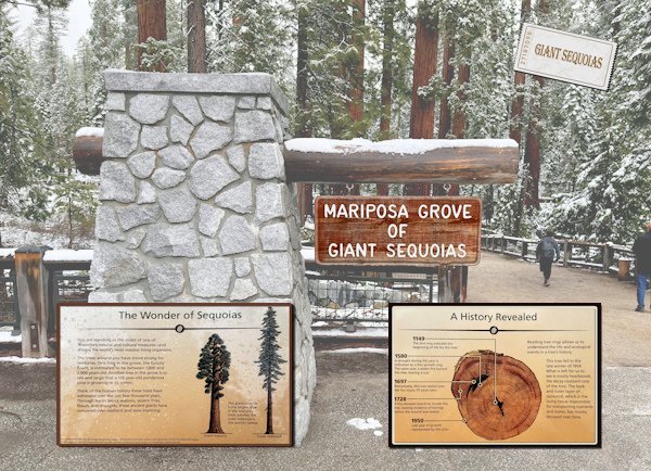
I'm on a roll! This is the last one of the intros and it is again a simple layout using a photo with a reduced opacity, except for the Mariposa Grove sign that I kept at 100%. There were information boards and I extracted them from the photos and put them here as info before the next photo pages in the album. I couldn't resist to make an admission ticket with my own script 😉. I will make another intro but that one is with the family photos and I will not show those here because my family doesn't want me to do so. Which I of course will respect.
2 points
-
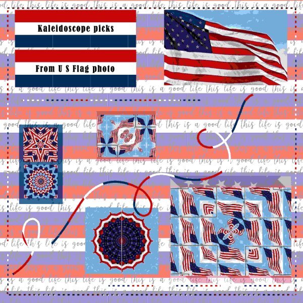
I have been playing with the PSP kaleidoscope and used this USA Flag for some. I also made a simple square red white and blue paper. I used the magic wand on the dashes and flood filled it with that paper. I did have to do it twice to get the vertical line right. I also did that for the squiggle. The background paper was one I had saved fro somewhere and I added the R-W-B background to it.
2 points
-
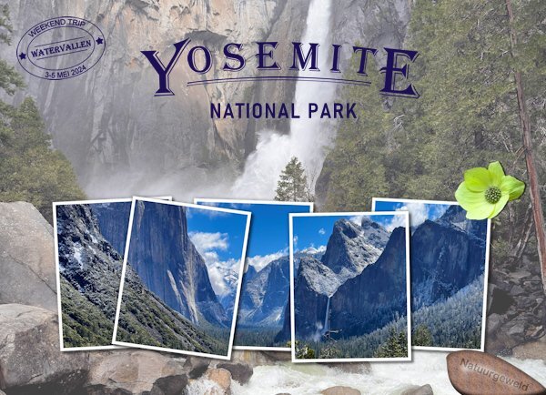
This is my second intro and it is a much simpler layout because it is all about Yosemite national park. It has a photo with reduced opacity as a background and I used cass-Multi frames collage freebie (as many of you have done) with another photo. Made a datestamp with cass-Datestamp 9 and an engraved rock (also a cass script). The flower is extracted from a photo; it is a California Dogwood and they were in flower throughout the valley in the park. I think I will use it on some of the photos in the album as well. The font of the title is Algerian and the rest is Bahnschrift. The idea for the title comes from a poster about the park which I bought when we were in San Luis Obispo. By chance we happened to come by an art gallery where they had posters of all the national parks. The old posters were, many years ago, made by an artist who gave before his death a young artist, named Thomas, the rights to design new poster. The only condition was that he had to do them in the same style and they are now printed and available in a limited and numbered edition. I don't have the font that he used on the poster but something similar that kept the idea. My son-in-law bought another one of a different park. The gallery packed mine rolled up in a tube and it came home with me where it has been laying under some books to get it straight again. We will frame it next week.
2 points
-
I used photos from our family celebration (baby party) in early May. The template is from Cassel, the photos of me and my siblings (with permission), the scrap elements are all from the DS forum, the Wisteria paper is from Creative Fabrica.2 points
-
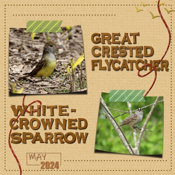
I was rather surprised to meet the crested flycatcher for the first time! A "lifer" for me. The sparrows hop around under my feeders all the time. I grouped all the rectangles and squares, doubling up on some, to create the two photo areas. I used the cass-curved photo script. The dashed lines I colored white and used the inner bevel and a shadow. I pulled some pieces from Melissa Lerin's Boozy Wine kit, using the papers as background and to add a dash of color to the coiled cord, which I doubled and wove through the titles (thanks for the tip, Sue!) I also got the tape strips from the kit and colorized them. The titles are from the script cass-stacked-wooden-alpha using Copperplate Gothic as the base. This script is a lot of fun but also a lot of work! I intend to go ahead and create a full set of alphabets from it in all the color choices. They will be easier to manipulate in the future. I used the #3 Date Stamp script with the Ink Free font. The flight of birds top right are marked digidebdesigns_birds1 in my stash. I've been playing with this for two days with a combo of fun and a little frustration!
2 points
-
I have to agree with Susan, your page is fabulous, with lots of subtle informative elements. Making the viewer eager to turn to the next page in the album2 points
-
Fabulous layout Corrie. I love how the cass-label1 labels are matching colors to the photo. Well done! and now I want that script too!2 points
-
As usual, you have come up with a great creative way to use this page.2 points
-
I maintained the sizes of all the pieces. As for the dashed shapes, I started of by trying to create proper stitching, with holes and all, but they proved to be to small. I opted for creating an embossed effect instead. As for the squiggly line, which I'm not fussed on, I decided to create alpha, weaving the letters through the line. I used two of the pieces for journaling, and the other two, to create a sort of split photo. All the original pieces are clearly recognizable. The framed ivy, is one I created some time ago in gold, all I had to do was to colourize the ivy, and frame. As per usual I used tutorials from the creative scrap on the two journaling tags, to make them less boring. Due to the piece on the top left being a little taller than the other two, I opted to tilt the pieces, so it wasn't obvious. Keeping everything exactly the same size and recognizable is a bit of a challenge, but none the less fun.
2 points
-
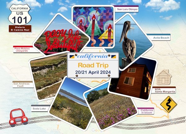
I'm working on the intropages for a photo album of my recent trip. I have 3 "chapters" for my album and each one has a scrapbook page introducing the topic of that part. Here is the 1st one about the road trip we took. The dimensions of the layout are specific for the kind of printed album I choose. For this page I used the cass-Photo circle template script that I bought recently and I choose squares and how many I needed. This is a great script I will write a review in the store! Then I used the cass-label1 script with different colors to write the places where we went and the photos were taken. I have a US highway sign as a template that I can adapt. I had already made a californian numberplate with the screws , so I just had to write the date on it. The tire tracks are done with cass-Tire Track 1 -brush; I used a color with a texture and later a grungy brush on them as well. The background is made of a google map with some overlays and blendmodes. The blue sky is an overlay I have in my stash and the car and road sign are by DiHiller (blogtrain june 2023) and the little wooden cabin is by Marissa Lerin. I'm happy to get slowly back into scrapping!
2 points
-
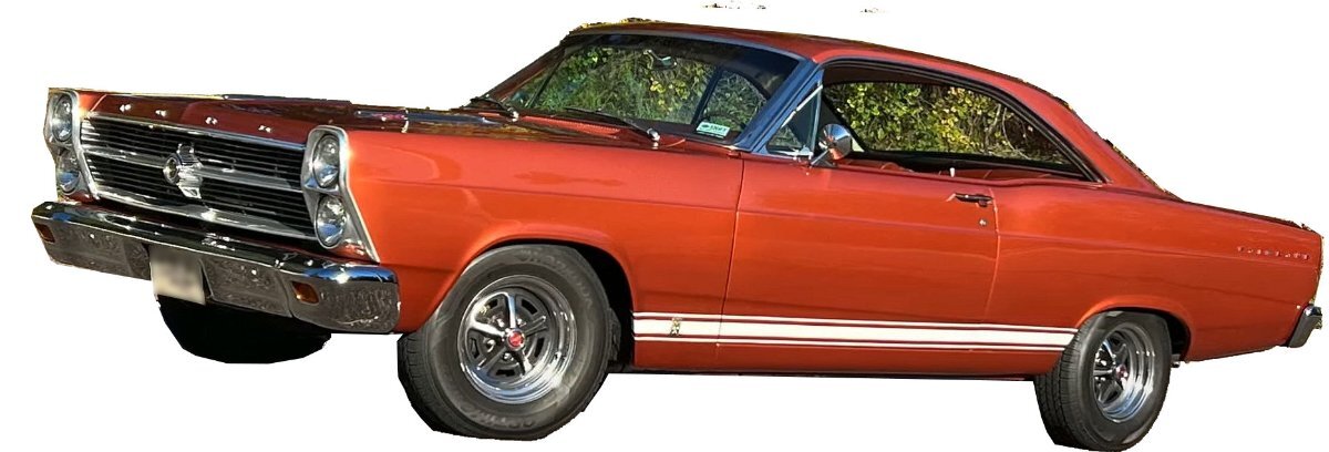
My Dad bought me my 1st car for my senior year in highschool. He bought it new because he didn't want me to have break down troubles, (also I think because I was his one and only little girl) It was a 1966 Ford Fairlane the color was Emberglow. Mom did not drive and part of the deal was that I had to take her and Grandma anywhere they wanted to go. I had that car well into my married life and remember crying my eyes out when I had to drive it to the junk yard because something major finally went wrong that was too expensive to have fixed. My dad had passed away a few years before that and it broke my heart to get rid of that car. For many years my cars were all bought used and kept until they were no longer safe to drive. When I got my first new one, I had it for over 15 years and sold it to someone I knew for there son. I do get really attached to my cars. The pic is not my car but one I pulled up on Google, but that is what it looked like brand new. I did a poor job of extracting that photo--oh well.
2 points
-
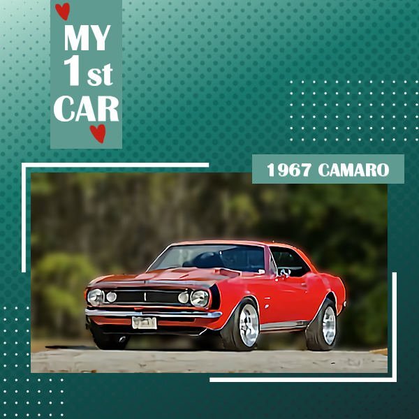
Cars have always resonated with me. As a teen, I was right there with the guys salivating over the hot cars tooling down Main St. Eventually, I worked enough to get my very own car and lucked out with a used 1967 Chevy Camaro in cream puff condition. I still miss that car!
2 points
-
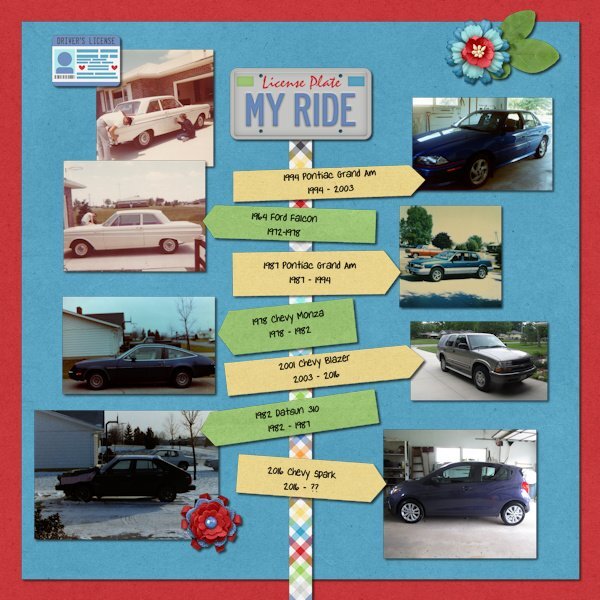
I normally keep my vehicles for at least 6 or 7 years. The first vehicle that I drove was actually owned by my mom since I was only 16 when I started driving it. It lasted me through college when I bought my first car after graduation. It was a used car that was 8 years old when Mom got it but it served me well. I did have one vehicle 13 years, which was the only vehicle that I bought that wasn't new. I sold it to my neighbor for his son. It got the son through college and his first few years of working. When the son got a new car, my neighbor decided to let his wife's granddaughter that had just turned 16 drive it. Sadly, she only got to drive it a few months since she was in an accident and the vehicle had to be totaled. That Blazer had a good run of over 20 years! I really loved that vehicle. It had so much room in the back for all my stuff when I went to scrapbooking retreats! In fact, I did a layout of all my vehicles in 2021. A couple months later I ordered a new car that finally got here in March 2022! I hope to keep this one for many years. Here is the layout. I used a retired template from Scrapping With Liz and the kit "License To Drive" by Kristin Aagard available at The Lily Pad.
2 points
-
Isn't that what the honeymoon is all about? I really didn't think about the fireworks meaning that in the movies though. LOL1 point
-
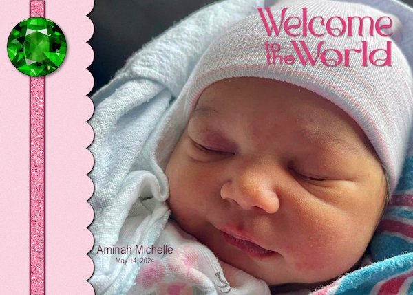
Aminah is the third addition to our family this year, preceded by her cousins Felix and Ansley. The font is Romland from Creative Fabrica. The ribbon was created using Cassel's Glitters-C script and is adorned with an emerald, the birthstone for May, from cleanPNG.com.
1 point
-
Lesson 1 - Kept mine simple. Wanted to use cool tones b/c it's so stinkin' hot here the last couple of days! The image is from somewhere online, years ago. Originally in pink. Text on path with clipart of bell, ET Designs (I think).
1 point
-
I was wishi washi on signing up for this one because I have not been doing a lot of PSP lately, but finally decided I had nothing to loose so I just signed up today. I always learn something new or am reminded about something I forgot how to do.1 point
-
Yes, this is my go-to technique. Promoted layers are cool but can get confusing for me.1 point
-
Thanks a lot, Sue. 🙂 No, I didn't. All the papers I used are from the Great Outdoor Kit by KAagard. This is one of the first kits I purchased when I started to learn about scrapbooking from Carole. Since then, I have used it quite a few times.1 point
-
I'll be there and looking forward to it.1 point
-
I have a 21 year old Saturn with its second engine in it. It has over 260,000 miles. My hubby was so excited one Christmas morning to show me he got me new headlights (the plastic covering had become so yellowed, you could barely see), he didn't let me get dressed first. lol.
1 point
-
Sue thank you and I have to quote you in stating that this compliment coming from you means a lot to me! If and when I have time I will give this DIY a go, because it is a challenge I love.1 point
-
I'm trying to find the tutorial or class that shows how to weave in and out like that. I just can't get it right when I do it. And you're so masterful at it!1 point
-
Thank you Corrie, coming from you that is quite the compliment. As over a relatively short period of time in the Campus, compared to more seasoned Campus members, your work has evolved into something quite spectacular, as have so many others. Yes, I started off with the best intentions of doing stitching. Had I been allowed to make the stitching much larger, it would have been feasible. The embossed effect is a good substitute.1 point
-
Sue a lovely page and you were quick in making it! As usual you have set the bar pretty high. I like how you used the curly line and I'm glad with your remark about the the dashed lines. Stitching was what came into my mind as well, so I will happily discard that idea!1 point
-
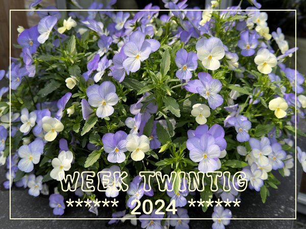
A small pot of pansies that we bought just before I traveled to California has erupted in a big bunch of flowers! I have to deadhead them almost every day to keep it flowering! It is a joy to look at and I needed that because this week was all about rearranging a rack in our storeroom. Just before my trip we had to buy a new tumbler and everything was waiting until I was back to start altering things and deciding what we could do without and bring it to the recycle unit where we live.
1 point
-
You are certainly on a roll, I hope you can keep it up. Lots to look at, without being distracted from the photos. Lots of well executed details. Did you create the arrow paper, using the arrow tutorial in lab 13-11?1 point
-
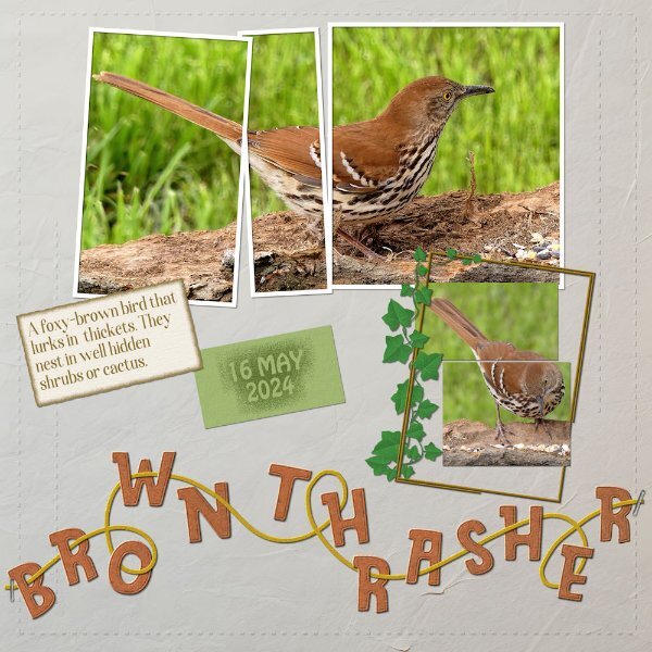
Since Tuesday I have had an influx of birds. A large flock of Goldfinches and Siskins turned up on Tuesday. A Pair of Brown Thrashers turned up a fortnight ago, and another pair arrived on Wednesday. Two female Rose breasted Grosbeaks arrived yesterday, along with the first of the Wrens. I have photos of them all, as I have erected several new feeding stations out in the trees using loose and fallen tree bark. You will no doubt see many of the photos in upcoming layouts. The remaining white-crowned Sparrows with their eloquent song, are here to stay, as the majority them had moved on over a week ago. I chose this image to showcase, as between his posture and expression, he simply melted my heart. The trees are now teaming with birds and bird song. Photo taken yesterday afternoon.
1 point
-
Looking forward to having you around, Cindy!1 point
-
Well I am in too, hopefully I will have time enough to follow along. I want to make a photo album about my visit to California too but if I don’t take on other things at the same time it will be doable. It will be nice to get into scrapping again which I missed during my “holiday“ .1 point
-
I've just registered for this workshop, too. 🙂1 point