Leaderboard


Popular Content
Showing content with the highest reputation on 02/07/2024 in all areas
-
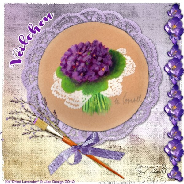
Hi Carole and campus members, I will be taking up more of my PSP training with you again. I'm totally frustrated with the hazing curriculum in two! German forums. I want to learn something AND have fun with it and not have an unpleasant feeling when I log in whether I have misspelled a copyright or placed it on the graphic. It was hardly about graphical errors, only about the legally correct placement of the copyright of the material. Really exaggerated. So I only make individual scraps when I get the chance (i.e. I don't make albums) and I'm only part of the challenges in the digital scrapbook forum and with you. In the last German PSP forum I have left, I only make frames around my own photos (credits!) I actually only want to learn PSP for scraps, frames and image manipulation, I'm no longer interested in animations and sign tags. Here my last frame and a scrap for a color challenge in DS from a small, gifted painting from a regional painter. Next I'll take a look at the button video, I also have photos to go with it. WITH FUN!
 10 points
 -
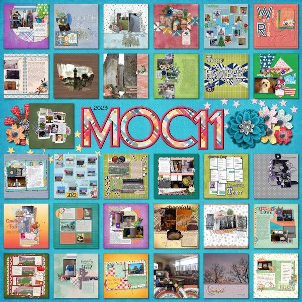
Fiddle-Dee-Dee has done this collage template for several of the MOC challenges in past years. They are always free. I've used one of them to make a collage for my Document Your December layouts (31 layouts for the month of December) and for last year's October Daily layouts. She includes the letters and numbers on the template but I don't like the font that she uses because of the number 2. So I actually used the alpha that came with the kit I used and placed it where those spots were on the template. Here is the collage for the 2023 MOC. On this one I used the lettering she had on the template.
8 points
-
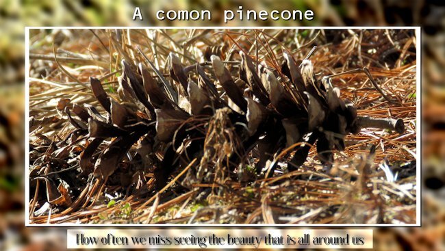
It was a beautiful day yesterday and I was out taking pictures. This was created from one of them.
4 points
-
Possibly this: but I thought there was a different (more modern) name for it. (the bold part below wasnt me, it was from google, it's like it's yelling at us). What are the characteristics of cloisonnism? (from Fr., cloison: 'partition'). Style of painting associated with some of the painters who worked at Pont-Aven at Brittany in the 1880s and 1890s, characterized by dark outlines enclosing areas of bright, flat colour, in the manner of stained glass or cloisonné enamel. Or possibly this one? Toon style, also known as cartoon style, is one of the oldest and most recognizable comic book art styles. It is characterized by exaggerated, simplified, and often caricatured characters with bold outlines and vibrant colors. Or Pop Art often features hard, defined edges and thick outlines, which can be achieved using stencils or masking techniques. These edges give the paintings a graphic quality, emphasizing the flatness of the image.4 points
-
Doska, your frames are outstanding. I look forward to seeing more of your postings here in the forum. How sad that in your other forums they are so focused on little details and seems they've totally forgotten about the art that is being created.4 points
-
3 points
-
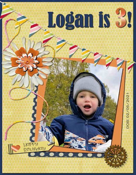
Here's a little something I did for my great-grand Logan who is 3 years old today. He also just acquired a little baby brother, Jonah. They are the children of my granddaughter Ilana and her husband Maverick. She is the daughter of my daughter Laurey. They all live nearby in the Tri-States area (NY-NJ-PA)
3 points
-
I really like the look of them. This could be fun. I just bought the script Mosaic Maker and I think it would make similar type layouts. I'm inspired to play with it.2 points
-
That is a monumental achievement Rene. It looks wonderful. And that template is really nice. Did you do the alpha as well, or was it part of the template? It's very nicely done with the clusters. This is like a contact sheet of a group of layouts, a person could do that for all their layouts or themed layouts. I was thinking of posting a 13 layout wrap up every 13 weeks for the P52 challenge. I had envisioned doing 12 layouts around/beside/under/over (in other words, where ever) the 13th layout which would be, maybe, the favorite of the first 13 with a little title on it. this idea has never made it past a passing thought stage, but this layout is motivating me to consider it.2 points
-
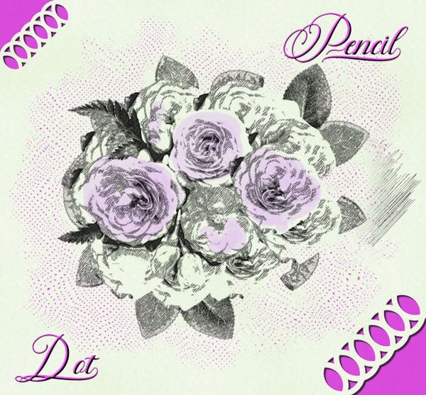
I have been playing with the Pencil Sketch 2 script which I won last Sunday and this is one of the images I created. I used this month's Lab to make the dots and an edge punch just for fun. The font is Fadilla. When using the pencil sketch I find that it gives the best result with images that have very defined edges with colors that are not too light. Here I decided to give some of the flowers a little bit of color.
1 point
-
Well if you find the answer, let me know!😉1 point
-
This is the perfect place to ask questions, whether they relate to the last master class or any other, so you are correct at the start. For the buttonholes, the steps are: create a vector circle and align it on the guide duplicate it, and mirror it select both circle OBJECTS (holding the Shift key) go to Selection > From vector object. This should make a selection from those circles you drew. If you still have the Ellipse tool active, it is possible that you won't SEE the marquee but it is there. Change tool if you want to be sure hide the vector layers (otherwise, they will hide the holes) activate the colored layer for the button delete. That should delete only the holes area Let me know if it works.1 point
-
♫ ♪ The More You Know ♪ ♫ 🌈1 point
-
Wow! Significant tradition to highlight during Black History Month. Thanks!1 point
-
LOL, you're probably kidding, but yes, it's different from the Limbo which I was good at when I was young. Jumping the Broom is an old wedding tradition. Enslaved people would jump the broom to symbolize marriage since they weren't allowed to marry legally,1 point
-
as opposed to Doing the Limbo? 😉1 point
-
J = Jumping the Broom1 point
-
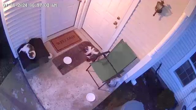
Comparatively speaking, we've had very little snow this year. I count myself lucky that my condo complex has good maintenance and clear everything right away. In fact, I had to drag out my snow shovel to clear the buildup of salt and grits they had tossed on my porch, in an overabundance of caution. The ferals come there to eat and the salt is bad for them as they lick their feet in their frequent grooming sessions. This overhead shot from my security camera shows them lounging after a feeding and also shows the salt on the concrete porch.
1 point
-
Beautiful photos1 point
-
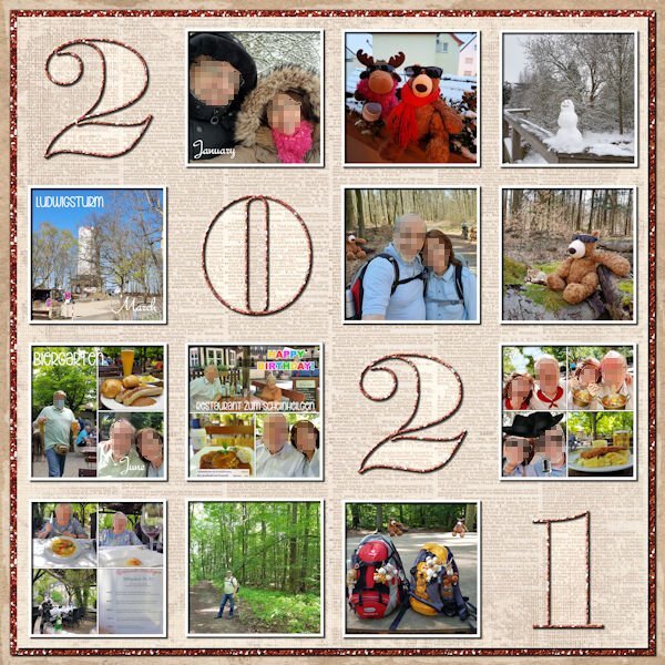
The template of this 2021 Year in Review layout was a cass-freebie from 2022 Jan... I decided to do a double page, but I will still choose the last three spots on the right side... It takes longer to decide on which photos I want to use than anything else... The square was not big, and I still managed to fit 4 photos inside! ... I am late, but I don't give up. lol
1 point
-
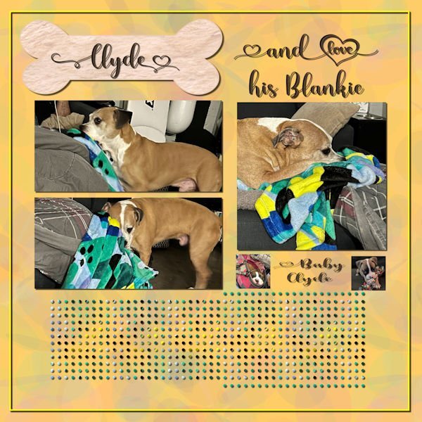
Last week, I was in Fredericksburg, VA visiting my daughter. Her dog, Clyde, is quite a character and a lot of fun. I made a pattern from his blanket and used it to fill the middle dots. I just used a color from the blanket for the other dots. The font is Madelyn Heart from Creative Fabrica. The bone is a preset shape with a texture from Creative Fabrica. The photos are mine and my daughter's. I used the open as a layer and clip to it scripts for the pictures. I loved how he would drag his blanket from the floor to the couch so that he could lay on it.
1 point
-
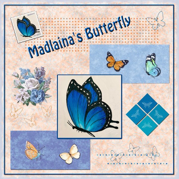
I stayed rather close to the DIY-kit and used all the elements as they were, but reshuffled them. In the big square is a photo of a drawing my eldest granddaughter did. She loves drawing and is taking courses to make a portfolio to get into a highschool that will have extra courses in arts. All the papers are from this month's Blog Train and by Jan Clark and Nellie Bell. I made 2 extra squares and they have brush prints on them; the other butterflies are from my collection and the butterfly outlines are preset shapes. The flowers are by Jessica Dunn, my own postage stamp, recolored dots and the font is Hobo. I think I have it all, nice to be back to scrapping, however I'm not saying goodbye to scripting either.
1 point
-
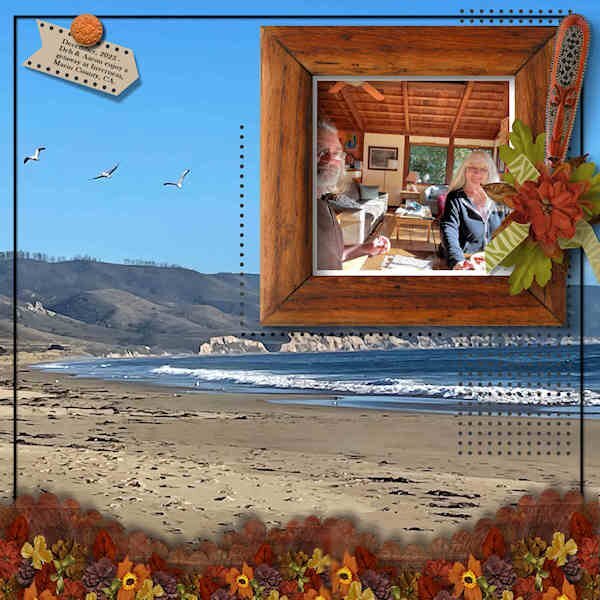
My entry for the DIY Challenge. Using a photo of Deb and Aaron in their Airbnb on vacation in Inverness, Marin County, CA, and her photo of the beach as background. The clusters at the bottom are the same size as the larger rectangles in the template + an addition. The tag top left is a combo of the two small square elements in the template. I added more dotted areas; I like the effect. The frame and all other decor came from the ID-Circle of Life mega kit. The font used on the tag is Baskerville Old Face.
1 point
-
Thank you, I must confess. I love the snow. It's magical. It simplifies an image, whilst enhancing fences, trees, branches, buildings and the like.1 point
-
Amazing find! Looking forward to what you might do to your own shots. I really like B&W with selective color.1 point
-
I can't take credit for the colour of the door Michele. Saying that you have given me an idea for possibly colourizing doors and or other parts of a building that I have, and in the future shoot. It's extremely rare for me to edit any of my photos in that way.1 point
-
I have just logged in, and read some comments. I can't take credit for the colour of the door. The door is actually that colour. Rather cool I thought!1 point
-
U = Underwear 😘😉
1 point
-
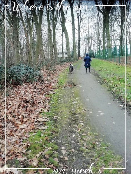
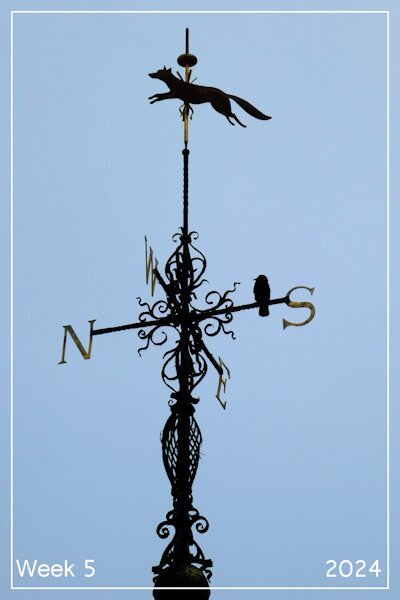
Week 5 on a day trip into Carlisle I took this photo of a weather vane on top of a bank roof. I always stop to look at it and on this day the fox had the company of a jackdaw which was nice.
1 point
-
I love the selective coloring of the door!1 point
-
Of course, I had forgotten all about that song, and the lyrics. Me too, one of my favourite singers and song back in the day. I'm pleased that I triggered some fond memories for you.1 point
-
Wow! I love this photo! I know topsy tervy well, but not upside down and inside out. I'm going to use it! Well, I'm feeling a little foolish, I just checked it out. One of my favorite singers when I was a teenager was Diana Ross (I saw her in concert in Vancouver, BC). I am known for not knowing words to songs and wouldn't you know it, here's one of the verses: Upside down Boy, you turn me Inside out And round and round Upside down Boy, you turn me Inside out And round and round My face is a little red right now; it was one of my fav. songs, that I haven't thought about in years. Sooooo, I stand corrected, I do know that term after all.1 point
-
Thank you ever so much ladies for your kinds words welcoming me back into the fold. It is very much appreciated. It was an incredidible time being home, especially being around the little girls. Ages 3 and 5. By the time I left they were already rolling the letter r, as we do in Welsh, and other letters. Also picking up many of my mannerisms. As for the memories, well they have left an indelible mark in my mind. Here we go again Susan. Haven't you ever heard the saying upside down and inside out. hahaha! I use it in reference to being topsy tervy. Being in disorder, until I get back into my ususal routines. Perhaps it's another British saying.
1 point
-
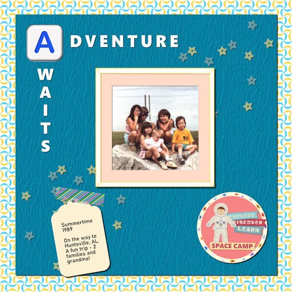
Lab 12 Mod 1. Requirements: Scallops 2: saved it as a pspimage for the pattern and then made the background paper from it. Colored Tape: it’s holding down the tape I created sometime ago; Hand drawn frame: Well I did make it but did not distress it; I made it as if it was a regular photo frame and even shadowed it on the inside as if it was thick and made a mat for the photo. I made the little circle paper in the bottom right corner and placed the spaceman sticker and the 3 journal stickers on the side and made the Space Camp sticker at the bottom. I used “Polar Cordinates” Distortion Effects on my star ribbon to outline the paper. The spaceman and the 3 journal stickers are from Pixel Scrapper – Sheila Reid. The Alphabet is one of a set I made in a Lab. The font used in the title is Segoe UI Black. The star scatter is also from Sheila Reid.
1 point
-
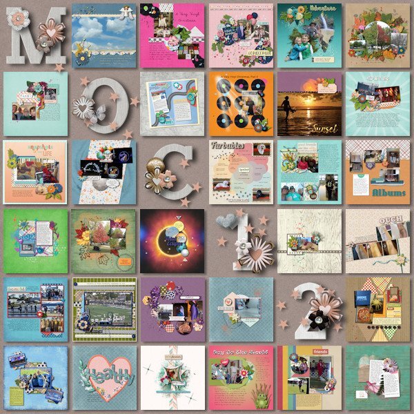
Rene that must have been a lot of work, every day for a whole month but nice to be able to have them all done and very satisfying too. They look great on this "presentation board".1 point
-
I spent the month of January participating in the Month of Challenges at The Lily Pad. 31 challenges in 31 days. Even with 4 days away from the computer I was able to get them all done. One of the designers graciously provides a free template to showcase all of the layouts. I finished that today using a kit by Bella Gypsy. Also, all layouts must have only product currently on sale at the store or retired products by the current designers. Some challenges were a real challenge! Some challenges were easy because of things I've learned here at Scrapbook Campus (hello Mask Workshop). And some were full of ideas to use in future layouts.
1 point
-
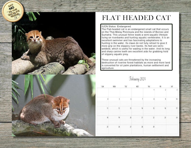
Here's my Wild Cat Calendar for February, 2024, featuring the Flat-Headed Cat. Similar to the Fisher Cat in habits as he swims and eats fish and other aquatic animals. I will post this full size on Facebook so you can print it out @ 11" x 8.5" if you wish.
1 point
-
I would now also like to take part in the Campus challenges. My dentist appointment was canceled this morning due to... Illness of the dentist. Now I can try it. So I take knit. My next word is dance (whether ice dance, ballet or pair dance on the parquet) Credits: on Scrap, Font: Pasile Scraplift from AMarie Charp ( Digitalscrapbook.com)
1 point