Leaderboard
Popular Content
Showing content with the highest reputation on 01/31/2024 in all areas
-
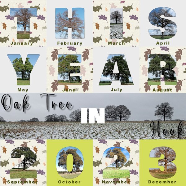
I am just getting done in time for the end of January for my first attempt at my Hook trees project. I saw people using the 2023 review template so thought I would give it a go for the trees although I will still work on some other designs in due course. This one shows my photos with their respective dates and the central photo shows the tree in situ in the field. Adjustments to the template included: - resetting the dates as the white text on the raster text layer supplied did not show up on my chosen background. - changing the grey squares to an oak leaf design paper from Digital Scrapbook.com. In order to select a different part of the pattern for each mat for the sake of interest, my process was to save the oak leaf paper as a layer. Then for each grey Mat in turn made a selection and then on the oak leaf paper layer promoted the selection to a layer and positioned it above the Mat layer. - adding a fine outline to the main letter characters as some of the photos did not contrast well with the background. As each character was a raster layer my process was to duplicate the character layer and move it above its group. Then use the Magic Wand on the new outline layer. Selection/Modify/Contract by 3 pixels and then delete and de-select.6 points
-
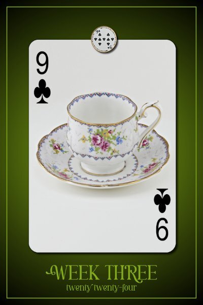
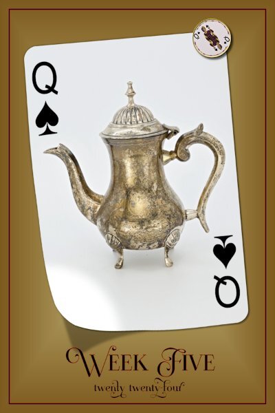
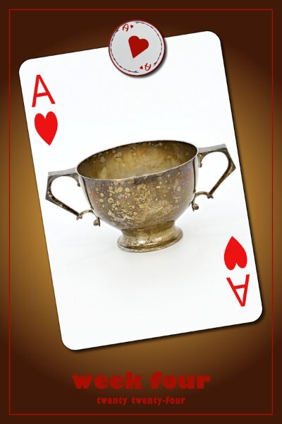
P52 Week Five Font is Beast Bird (this has lots of glyphs) (Creative Fabrica) I used the Lifted Photo Script to lift the bottom, thank goodness it comes with a shadow! I still added an extra shadow along the side and hope it looks okay. And I blurred and lowered the opacity of the lifted shadow a bit. I added a black stroke to the Vectors (fonts) and wanted to add the same look to the frame. so, I duplicated the vector and from the duplicate moved the frame down to the original vector. Then I made it black with 5 pixel stroke and the bottom red one is 7 pixels so you can see a bit of the red. It was the only way I could figure out how to give it the same look as the fonts. It might show better on FB as I can make it bigger. This little t-pot is quite tiny, only about 7-8 inches high. It's a little cutie. The face cards will be something tea related but not cups. I reserved the cups for numbers 2 thru 10.5 points
-
I have a book somewhere Just My Type described as "not just a font book, but a book of stories. About how Helvetica and Comic Sans took over the world" It's surprisingly interesting. I must find it to see about Gill Sans. When I left work I bought each of the designers in the studio the book and selected a typeface that matched their character.4 points
-
4 points
-
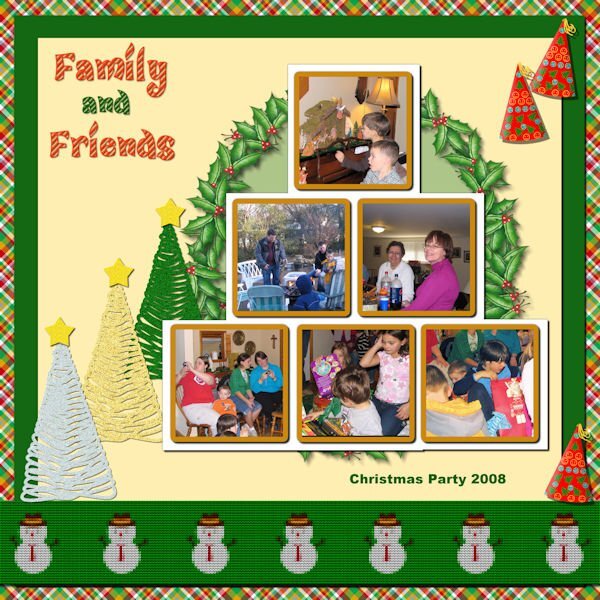
Last module for Lab 11. Lab 11 Mod 12. Requirements: Knit pattern and strip (the snowman knit strip at the bottom); glitter tree (I made a silver one, a gold one and a green one – also made a glitter star which I put on the top of each tree but they are separate); party hat – I put a gold tassel on the hat also. The plaid paper background I had made probably 2 years ago and the holly wreath on the light green circle paper I had made probably 1 year ago. I always have fun! The font for the title is CandyLandSwirls 1 from CF. I think it is fussier than I usually do, but it is what it is.3 points
-
3 points
-
I am in too but was thinking I would be the only one who has completed the course before to be repeating the exercise. I am so relieved. Like Monique says 'repeating is a good thing' For me it's a subject that is a little difficult to feel at home with as I find it difficult thinking in reverse as it were. When I have been successful the result is so satisfying and I also think that the MasterClass is one of my favourites. Thank you for putting it on again Carole.2 points
-
That ice cube tip is the second time I have heard it today so I must try it. I only use rain water as we have chemicals in our water that they (and the cats) don't like. A beautiful flower.2 points
-
Quite a funky idea Susan and I like the way the font changes to suit the china design2 points
-
P52 Week Four What?! No Tea-Cup? Today is an Ace so that means a sugar bowl. This one is quite patina'd and has an art deco look. I think it is actually from that time period so I used Gill Sans Ultra Bold & U.B. condensed on the week/year portion. For the magnet I had to improvise. This weird little round deck of cards does not have Aces or 2s so I took a 3 and edited to be an Ace. I see that I made it a bit lopsided...just keepin' it real 🤣. I wasted about an hour looking for a font for the A the would look like the cards font, I gave up and settled with this one called "Baked Donuts" (Creative Fabrica). I don't actually use sugar in tea, maybe a wee bit of honey, but only sometimes and only with earl grey tea. I had a little freak out moment when I found out windows 10 doesn't come with Gill Sans(and family), I had to get it from my laptop and load it in. It's one of my favorite fonts.2 points
-
It did me too and he hasn't seen this photo of mine because he died 40 years ago. However he knew that I liked photography and I have showed him lots of my photos. He would have loved all the new digital ways of editing.2 points
-
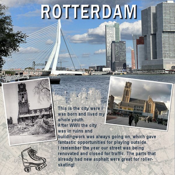
How cool to be able to photograph the same church as your father did. Imagine you standing in roughly the same spot your dad did. That gives me goosebumps.2 points
-
I would now also like to take part in the Campus challenges. My dentist appointment was canceled this morning due to... Illness of the dentist. Now I can try it. So I take knit. My next word is dance (whether ice dance, ballet or pair dance on the parquet) Credits: on Scrap, Font: Pasile Scraplift from AMarie Charp ( Digitalscrapbook.com)1 point
-
I like the 3D effect on the title. Just a straight inner bevel and drop shadow? Well executed though!1 point
-
I think I just signed up a second time! 😁 The showroom link did take me to 2023 but I have this page bookmarked so I guess it is the new 2024 showroom? I still think of this as the Love Story Challenge!1 point
-
I just go the welcome email. although the link to say Hi in the forum took me the 2023, but I got it so I'm happy.1 point
-
I just signed in. I did get a better idea about working with masks from the template workshop 2024 so I am looking forward to trying this one again. I have never been much of as mask user (partly because I always had trouble with them for some reason) but if I finally get it to stay in my head this time, I will probably use them more.1 point
-
1 point
-
Yes, I hope the quality is considered improved! And no, I had no idea a site could even last that long. Now, I wish for another 10+ years. Why not?1 point
-
1 point
-
My pickleball trip was sooo much fun! Everyone was so kind and helpful with Judy. She told me she wasn't going the night before we were to leave. I had to call her best friend to talk her in to going. She said she would go but she wasn't playing pickleball. I said, "OK", but the first time we went to the courts, she jumped right in to play and played everyday. Everyone loved her instantly. She was cheerfully greeted everywhere and received numerous hugs. Her partner for the clinic was great and they won the silver medal at the end of the clinic. We went with a group of 10 and played games every afternoon and evening...so much fun! There was another group from Massachusetts and the loved joining us for games. We made wonderful friends! This layout is of one of our group who had a "Truth or Dare" . She chose "Dare" and was asked to smile as big and wide as she could and hold it for 2 minutes. We now know 2 minutes is too long and tortuous. Her cheeks were sore the next day.1 point
-
1 point
-
1 point
-
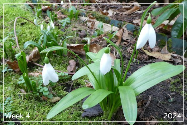
This is my Week Five: I bought this Phalaenopsis (Moth Orchid) from the supermarket in June, 2023, when it was in full bloom but had gone on sale for half price. The care instructions said to put three ice cubes on the pot, below the leaves, each week. I happened to have Miracle Grow orchid fertilizer from previous attempts so this time I made up a solution and froze it in ice cube trays. (I had resisted using ice in the past, thinking the orchids are tropical and would not appreciate ice.) Well, it flourished and now it is putting out its third set of blooming stems, still going strong after 7 months! It's the best result I've ever had trying to keep one of these plants alive. I've resisted attempting to repot it, fearful I would ruin the spell. Font is Showcard Gothic1 point
-
1 point
-
1 point
-
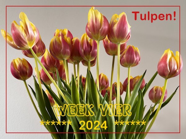
Week four and the start of the Tulip season! 🌷 Tulips are now widely available in the shops and I bought a bunch. It will take 3 or 4 months before they will be in bloom outdoors; the ones we can buy now are grown in glasshouses. The start of the season is always on Tulipday, which is the 3rd Saturday of January and is celebrated in Amsterdam on a square in the city center. There is a huge display of tulips and when the official opening is over, people can come and pick a bunch of tulips for free. I have never been there because it is not where I live. I'll buy them in a shop, but it always gives you the feeling that Spring isn't that far away!1 point
-
1 point
-
1 point
-
As this challenge will generate a new prompt every month or so and we had the Template Workshop to do, I only now had the time to make something for this new challenge. I liked what Bonnie did and made a page for the city where I was born and lived my whole youth. A little detail that is not mentioned in the layout is the black and white photo which is taken by my dad some time after the bombing of the city center of Rotterdam in WWII. The photo to the right is of the same church and I took that one on more or less the same spot a couple of year ago. My dad passed the love for photography on to me!1 point
-
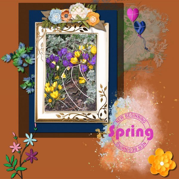
I take it 🙂 I started without a template, wow, to fill it when you don't have an idea how to fill it.............was difficult. I started with the photo and then mats, looked in my stash for spring elements and found a freebie form Carole too. The result is maybe not as nice as earlier projects, but it's ok. Used blend mode, texture effects/blinds. The new word is children 🙂1 point
-
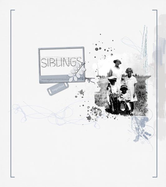
Not much of the font in this layout. I wanted to do a simple layout similar to one I saw online somewhere, and I didn't know which photo to use. Ended up with this old one (from 1930s) of my mother (tall one) and her sister and two brothers. Not a good image of them, but it's what I've got and I didn't want to improve it. They're all gone now, but they stay close to my memory and heart. Three of them lived into their 90s (not my mother).1 point
-
1 point
-
1 point









Resized.thumb.jpg.d25811db03a63358cedab1e79f527635.jpg)


