Leaderboard
Popular Content
Showing content with the highest reputation on 10/22/2023 in all areas
-
7 points
-
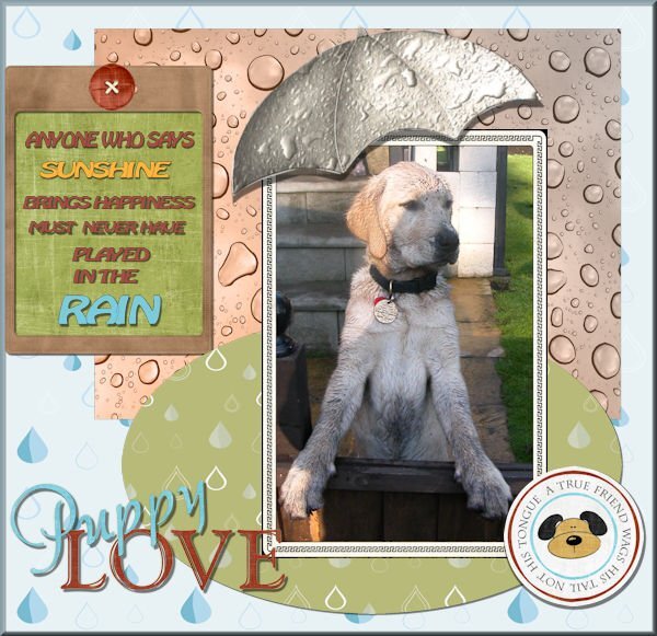
Scrap boot Camp. Day 5. Project 2 Hi everyone .I think I have posted this in a couple of places as I got a bit confused, and just when I thought I was navigating the site quite well!! .I think I am in the correct place now. My apologies. The raindrop papers were from my subscription to Creative Fabrica and the graphics were a purchase from the web site Nitwits. The very dirty pup Jodi was having a great adventure in the rain at our holiday caravan. I have struggled to get to grips with layers but since doing the sandwich project it has fallen into place so easily. Thank you so much Carole. I am so enjoying this workshop.6 points
-
Melanie, I love the Indigo Bunting. We rarely see them here in Virginia. Doska, my neighbors have a bald eagle nest on their property. Once, I got to go there and watch. I had always wanted to see an eagle in flight...and I did! Here a younger buck wanted to challange an older, larger, more experience buck. The big guy wanted nothing to do with this little one but finally had to stand his ground. It was no contest. The little one was pushed all around. They never fought for real but it was obvious which one would be victorious. Red Stars: Amanda Brown, Digital Scrapbooking, 129333 Stars in text: Brandi White, Digital Scrapbooking, Chromies Stars Font: Cookies and Milk Antlers: CleanPng Day 3, layout 15 points
-
Day 5 is now completed. On the second page the top photo on in a beautiful little area near Lillehammer. The bottom photo is Copenhagen. Everything is so beautiful in this area. The little photo on the top right is of a yummy shop that sold the most wonderful chocolate - my favorite sweet.5 points
-
5 points
-
here is now my project 3 I used a Kit named Life captured by Karen Schultz - Snickerdoodles, Made the glitter with a script by cassel, font is Beckett -Kanzlei used also reversed shadows4 points
-
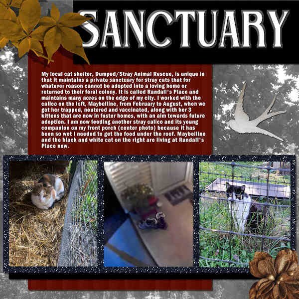
BOOTCAMP 7-SANCTUARY -The title font is Belisha treated to a Chisel effect. The text font is Franklin Gothic Semi. The background is a photo of a local field treated with the Luminance layer effect. The bird is from "cpjess-tomorrow" kit and the top and bottom elements are from "ID-Face in the Photograph" kit. A bit of explanation about the center photo: It was taken by my security camera which is mounted on a pole at the corner of the porch. You can see the pole's shadow on the left of the photo. Those stray cats are very skittish and hard to photograph.4 points
-
Sue, if you would kindly refrain from political opinion statements in these rooms. Julie nicely just asked for peace, which many can agree on. It hurts my heart to see my country being bashed. It may not be perfect but, by gum, we're trying....😥4 points
-
I have a little time to scrap so I made another one for this bootcamp I used again a Kit by Lynn Anselc - Autumn Harvest font - Denim and A day in September4 points
-
I grew up in Brooklyn, went to school in a small college town upstate, and then lived in Rochester, NY for a while. I moved back downstate to Long Island to be near my family. While the convenience in the city or the suburbs is great, I've often longed to live a quiet life on a farm. At the very least I could see the sky without all the bright lights hiding it.3 points
-
here are storks in our little zoo in Aachen fonts are Daisy and DomBoldBT, I made a cutout from one photo and used the second in my LO kit is Let Life Bloom by Fayette Design3 points
-
Day 5, layout 2 A fun filled day with friends. We drove to Front Royal, VA which is to the west and offered a little more Fall color that we have at home. We shopped a flea market, had lunch and ice cream, shopped a thrift store and visited a local park. The park offered some color and photo opportunities. Title font is Script MT Bold. Journaling font is You All Everybody. Squirrel Stamp by DigiDewi, Kit: Autumn Day on Digital Scrapbooking. Leaf in the title block is by Brooke Gazarek in the kit Crisp Fall Air, 19815. The very small leaves in the center were extracted from a scatter by Jessica Dunn, Kit, Orchard Traditions, Leafy Scatters.2 points
-
Thank you so much Ann. You or someone else must have mentioned this before, I did do this but then forgot about it ! Thank you for the reminder!! I now have a "post it note" to remind me. So much to learn and remember but so enjoying this workshop and all the help is amazing. At the moment I have 16 tabs for the site open it is no wonder I get lost !!2 points
-
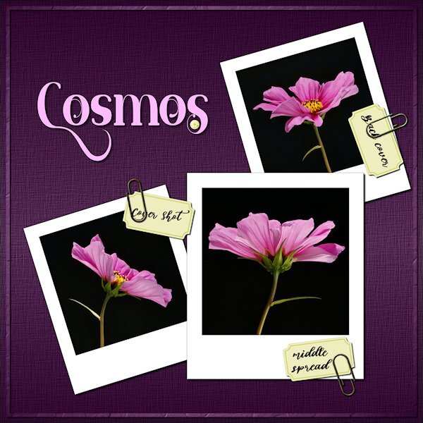
Here is my 1-2-3 Challenge. I did the tutorial for the paperclips and used the search in the campus to learn how to use them. The tag is one I made in the vector workshop. I remember to use shift when I was sizing the tag to keep the original shape. The polaroid frames (I oops'd and did three) were also from the tutorials in the campus. And even the 1 lonely sequin is from the tutorial. It is really bad, so there is only 1 and it's small. I did have an issue with Inner Bevel. I had wanted to use it on the title but it turned my title almost white and I'm not sure why. this is the setting I used. Does anyone know what I did wrong, you can see with the preview of what it did to the pink. I used the inner bevel on the frame around the edge of the layout and it was normal. I need to give that sequin another try. Mother Nature was busy making a grey sky and lots of wind, so I did these photos in my studio under artifical (constant) light. Fonts used: Molabrista and Abigail (Creative Fabrica)2 points
-
I haven't got a clue what it is like to live in a city, or any built up area. All I know is that I couldn't live in any urban area. I regard myself as being very lucky, that I was born into farming, married a farmer, and finally ended up here on a prairie farm. Both my children were born into farming, and still live in rural areas. My granddaughters were born into farming too. It's a wonderful lifestyle. It doesn't suit everyone though, thankfully we are all different.2 points
-
Quite possibly. I can say in all honesty, that there aren't any comparisons what so ever between the UK and Canada, more specifically, the prairie provinces.2 points
-
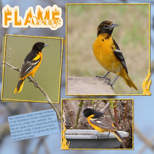
I took the word ORANGE from Corrie. Here is my page. Using the word Orange in the title. I created a ghost text, turning it into a sort of sticker for the title. Added flames to 2 of the frames, extended the branch out and over the frame. Used a photo for the background, which consisted of branches and blue sky, blurred. As I mentioned blue skies in the text. Susan prompted me to mention our blue skies, that go on for ever. I believe I am correct in posting my page, in the original acceptance message of the word Orange. By selecting edit. Which is what I have done.2 points
-
2 points
-
Angelo, you can ask your questions here in this Bootcamp forum, if you need help with the lessons in The Bootcamp. Carole or another member will see them and will be able to help you. Elsewhere in the campus you will see other forums with other topics. I had neve been on a forum either, before I started with PSP. It will take a little time and you will understand how to post in various forums based on the topics of such forums. For now, you are in the bootcamp, so any questions about that can be posted here. Hope this helps2 points
-
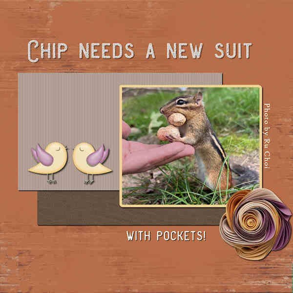
DAY 5-PROJECT 2-ADVENTURE PARK- I asked Ru Choi if I could use his chipmunk photo from the Hudson Valley in Pictures Gallery on Facebook. I dimmed the hand a bit and sharpened the chipmunk. My title font is Aviation Cocktail with inner bevel and shadow while the info on the right uses the font High Tower Text. The background paper and the birds I found in my stash without labels. The flower is by Marisa Lerin in a kit called Delight.2 points
-
2 points
-
Even after all these year, the vastness still never ceases to overwhelm me. From someone who's homeland is small Island. You can put 3 UK's in Saskatchewan alone. A population of over 70 million. Saskatchewan has a population of just 1 million.2 points
-
Hi all, here we were at a bird of prey observatory in my home in the southern Black Forest. This is a bald eagle, well known to Americans ? But they are also found on the German North Sea. h2 points
-
2 points
-
Not really, as the majority of the song birds fly south. When it does go silent when they are here, it means that a predator is at large. The nights are always noisy, between the Great Horned Owls, coyotes howling, and foxes barking, they make their presence known. Their sounds travel well in the night air. Susan you are only an hour and half flight away from me. Or a 6hr drive. You and anyone else will be made most welcome at anytime.1 point
-
You must have crows in the city! They are the best. Corvids are so much fun to watch. If you want an appreciation for your neighbourhood city crows just sign up for June Hunters Urban Nature Enthusiast blog. June lives in Vancouver, BC (Canada), right in the city and she will show you an appreciation for city nature that you didnt know what unfolding in front of you. I do know what you mean about the night sky. I live in this city for 3 years about 40+ years ago. And we could see the northern lights and tons of stars. Now I see only the very brightest few stars and would need to go pretty far out of the city to get a starry night sky. Sue is very lucky to have crisp beautiful skies as they are meant to be. I loved living on the farms (horses) that I did live on, even if it was close to the city. Where I live it's noisy, I hear the traffic 24/7. Winter is the worst as the city does it's snow clearning all night long. This is a small city and i hear snowplows scraping the roads and back up beeps. Not conducive to a good nights sleep. I'll join you and Sue in a quiet life of the farm.....or we just go visit Sue for a week or 2 or forever. 😋 How good are you at pitching a tent? I suck at it.1 point
-
Dont you find it erie (sp?) when you dont hear the birds singing. When it's dead silent. It's neat but kind of apocalyptic feeling. During Covid when we had lock downs, my job continued and I'd drive to work and there would be no other cars at all some days and some of those days the birds too, were silent and it felt like some kind of post-apocalyptic world. I work at a noisy place so I do love when the world is silent....except nature, I like to hear leaves rustling, raindrops landing on a tin roof, birds etc. Yesterday some geese flew over...I heard them honking and went outside to see. As they past over my house they stopped honking and I could hear their wings, magical.. I miss that so much. My house in Chilliwack, BC was right on the flight path to the park the geese came to every day (a 10 min walk from the house).1 point
-
Thank you. The font for the title was La Bamba LET. I don't remember where I got it, but it's available on DaFont and other sites. The "scrawl" on the side of the photo is Book Signature and came from Creative Fabrica.1 point
-
This is especially true for me if I use a script. I was surprised to see how the settings were totally different from the last time I used the tool manually.1 point
-
As you go through Carole's tutorials, you'll find that she often changes settings within tools, to achieve the desired effect. Which is probably what has happened. In those cases, it is then a good idea to reset to default. Once you have learnt how to use those settings through here tutorials, they can they be adopted in other projects that you are working on, as you will have a much better understanding of how those tools work.1 point
-
You have perfected the art of studio lighting, your shots and layout is ineffable!1 point
-
I will try these suggestions. I looked at settings and wondered if I did something without knowing it (or had in the past). I didnt even realize I didnt have the right default numbers. Good idea of restoring to default after using it. I've only done that with the brush variance palette. Never thought to do that with the other settings, but sounds good standard practice to do that for other settings too.1 point
-
I'm going to suggest to you that once you have finished with the inner bevel, restore it to default, like you do for the brush variance palette. Certainly for now anyway, until you are more familiar with it. Try lowering the elevation to 30, which is the default setting. I see the angle is slightly off, unless that is what you want. Again, the default is 315.1 point
-
1 point
-
Wonderful layout, Gerry. Can you tell me what fonts you used? They are different and quite interesting.1 point
-
Hi Carole and Members, Thank you Carole for bringing this up. When I started scrapbooking in 2005 it was posted in my favorite forum because... required by the strict German copyright rules. At that time there were a lot of thefts from Scraps, which were then passed off as their own in other forums. And if you have your own watermark and main credits on it, then a lot more cover-up work has to be done, which then becomes noticeable on patterned backgrounds. that was frightening. I do it out of habit and precisely because I also want to show my work in German-speaking countries, for example on Pinterest. And as you have already noticed, it is often helpful years later to look for the source of the kit. It is also advantageous if someone likes the kit and wants to look for it, then they don't have to ask. My favorite font for these credits on the scrap is Eurostile because it remains easy to read at size 14 and takes up little space on the edges of the scrap.1 point
-
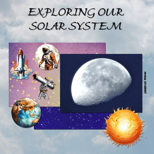
@Carolyn Rye Glad to see your revised layouts. You will learn the importance of shadowing to give the 3D effect you would have with traditional paper elements. @Angelo Cacciari That layout with the shadows look definitely more 3D. With practice, you will adjust those shadows so that the elements don't look like they are floating. If there is something that is not clear, just ask the question in the forum. If not, you can click on the "Need help?" tab at the bottom, and it will send me an email. @Doska St. It is interesting to see someone who puts the credits directly on their layout. I used to do that, but have stopped. Not sure why. However, it has helped me identify some supplies, many many years later! @Emerald Jay Great updated layout. What do you think of the result? @Anne Lamp It is great that your layout includes name and date. We know now, but we are likely to forget later, or someone else won't know. If you want more elements for your solar system, there is a freebie on the blog on this post. @Ann Seeber I love that quote about the chipmunk!! @Anja Pelzer As mentioned by others, your cast shadows are very well done! @Gerry Landreth That is a great photo to showcase. I love his look!! @Barbara Caulton Yes, you are in the right place. Posting in the "What are you working on?" thread, is not really incorrect. It is just easier to post in this Bootcamp thread so we can keep track. I am glad that the sandwich exercise clarified the concept of layers. It is SUCH an important concept. I was shocked when I heard that more than half of the PSP users, don't know/understand layers. MORE THAN HALF of current users!!! Tomorrow, your third project will be delivered. It will show you how to use some new tools and techniques. Looking forward to seeing your interpretation.1 point
-
It certainly is a sight to be hold and cherish. As the years have gone by fewer and fewer ranchers trail their cows out and then back home. They now get trucked. Horses are also being replaced by quads to gather and trail cows. The sky is equally as awesome, you have to experience it to really appreciate it. I spend a lot of time on my back, looking up, day and night. At home the Border Collie is the favoured dog for working, more specifically sheep. As the Border Collie will gather to fetch them to you, which they do instinctively. I used to train our borders for sheep dog trails. Only for local shows, not on a professional scale. We brought our Border Colie bitch out with us. The dog of choice out here for working cattle is the Australian Kelpie. They will trail cows, also they are more aggressive, which is what you need sometimes. Not around cows with their calves though, as you are asking for trouble in that scenario. As the cows will turn to defend their calves. In my opinion not a good combination.1 point
-
You can offer ANY word you want. It does not need to be related to any of the previous words. Just don't make it too hard ?1 point
-
Follow the steps that Corrie and I have taken. Corrie is yet to create a page using the word PUMKIN. And post it in her original comment, by using the edit tab. I decided to take the word ORANGE, which was Corries word of choice. I have created a page containing the word Orange. Should you decide to take the word that I have submitted which is RIVER, you are committing yourself to creating a page with the word RIVER in the title. Also you have to think of another word to enable someone else to take on the challenge. It can any word what so ever.1 point
-
Anja - That shadow on the left stork looks so realistic. Never thought of doing it like that. Thanks for the inspiration!1 point
-
I found myself imagining you riding up the hill to take that picture. This would be a site to see, all cattle in line like that. One thing great about all prairies is the sky is as vast as the landscape. And when there is clouds in the blue sky it's awesome to lay on your back and watch the clouds. My parents had roots in farming but rounding up the "crops" didnt require horses, just mechanical horsepower (combine). I much prefer the sounds of nature and the cows/horses as they move through the grass. I dont like noise. Sue, did you ever work with herding dogs? (here or back home?).1 point
-
1 point
-
1 point
-
Thank you Julie. Not in my wildest dreams did I ever think of leaving my homeland, and the life I had. Although my heart is still in Wales, I have adapted well here. If it wasn't for the local ranches that introduced me to their way of life, which revolves around horses, and cattle. I wouldn't still be here. Within my first 6 months here, I had the pick of any horse that I had schooled. The rest is history. Here are 2 photos, which I took trailing cows home for the winter. There is always a lead cow, that has made the trip several time prior. They move well, especially when they are strung out, with the wind in the faces, to keep them cool. Making the riders job easy, just along for the ride. I rode to the top of a hill, to take the first shot, looking down on the cows, and the vast expanse of the landscape. Once they had a drink, I rode on in front to open the gate. (one of my all time favourite landscape shots) As seen through Meg's ears, and I added Nell. Extracted her head, overlay.1 point
-
1 point
-
1 point
-
So cute. I love Gil Sans Ultra Bold, especially the 'i'. It's a great go-to thick font isnt it?1 point
-
1 point
-
Hi I am a musician and I am hoping to use what I learn on the course to produce artwork to promote my upcoming Halloween release.1 point




Resized.thumb.jpg.d25811db03a63358cedab1e79f527635.jpg)
