Leaderboard
Popular Content
Showing content with the highest reputation on 10/01/2023 in all areas
-
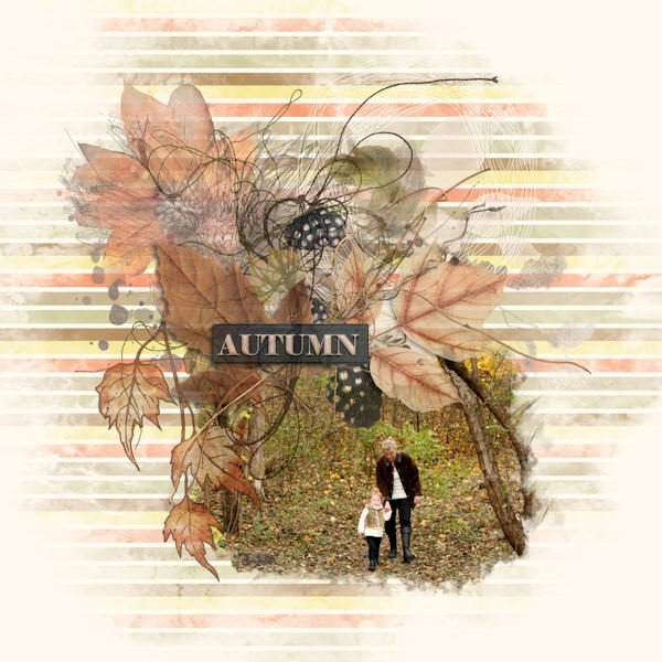
The last day of September, so the last layout for What are you working on this month. I saw a layout I liked, played with interpretation of it, and got this. Used a photo of my niece and her daughter in the leaves from many years ago. The background stripes are mine and the masks I used. But not much else.6 points
-
here is mine for the challenge, hot days in Germany and after work, I want only relax5 points
-
4 points
-
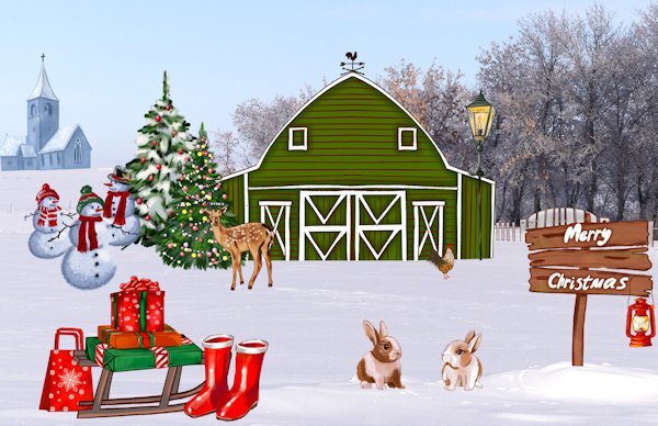
Carefully choosing one of my photos for the background, I then added some clipart to create a card. The prints in the snow are either from the white tailed hares or other resident four legged creatures. Placing the dog where some print are visible. No one would be any the wiser who made those prints.4 points
-
4 points
-
4 points
-
4 points
-
4 points
-
@Phil Kettmann I have used Corel software (Paintshop and Video Studio) for close to 20 years and I'm still learning new things about how it works. Maybe one day I might open the instructions. Me, too, Phil. Cassel's the greatest teacher. She explains things so well. Even if I can't boil water, she teaches me how to.4 points
-
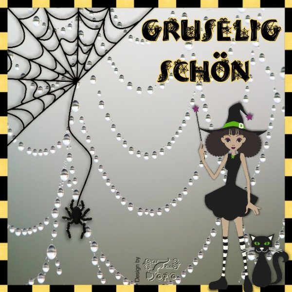
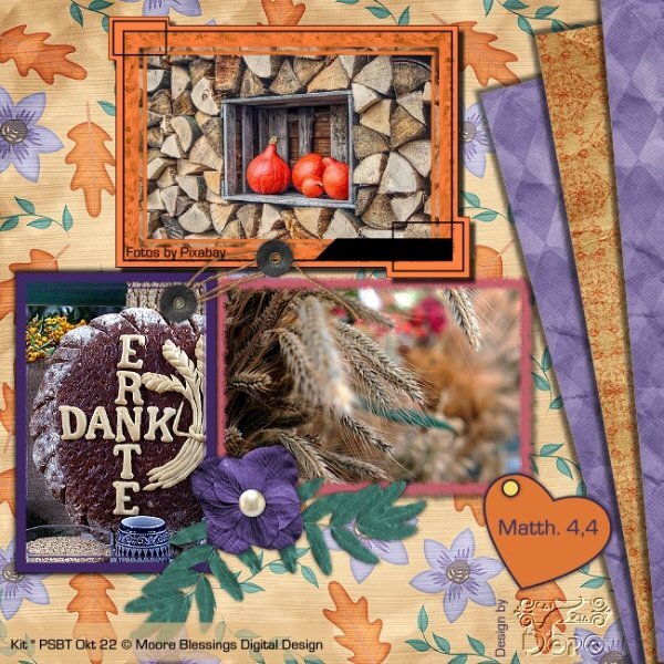
Hi everyone, Since it took so long until I was able to log in here again, I would like to show you, as is welcome in a scrapbook forum, a few scraps I generated from Photo-Impact X3 (Corel) until the PSP Course starts. This scrap that I made for DS last year fits your Halloween theme, translate: Pretty creepy. But also something for the Thanksgiving holiday. Doska3 points
-
Christmas cards? And you're finished with them? What a wonder worker! I'm not even sure what I'm having to eat later....?3 points
-
3 points
-
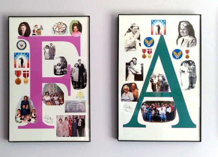
My project started many years ago but I finished it in Sept of 2023. It is a series of pictures to hang in the family room. It is a series of six pictures all 11x17 inches the biggest size my printer will print.It is printed on glossy photo paper. All of the picture gathering and editing was done using Paintshop Pro Ultimate 2023. It is composed of many family photo's gather for many years. The F in Family are pictures of my mother and father-in-law. The A is my mother and father. The M is my wife and our family. We had 3 children so it worked out just fine. The I is our son, the L is our oldest daughter and her family, and last but not least the Y is our youngest child and her family. I posted a larger picture of just the F and A. I have used Corel software (Paintshop and Video Studio) for close to 20 years and I'm still learning new things about how it works. Maybe one day I might open the instructions.3 points
-
Happy October! I love Halloween, and wild cats. Here's my October Wild Cat Calendar featuring Sushi, the Fishing Cat. There's a full-size version on our Facebook page that you can print @ 11" x 8.5". I do one for my refrigerator door. LAYOUT DETAILS: Info from: SMITHSONIAN'S NATIONAL ZOO Fishing cat | Smithsonian's National Zoo 2023 Calendar Template from Cassel Fish and Halloween Witch illustration - Pngtree Title font under photo and journaling- Agency Fishing Cat photo of the recent rescue, Sushi, from The Wild Cat Sanctuary in Sandstone, MN I find it hard to read the journaling on the reduced-size version here so I'm posting it separately: "The Fishing Cat is one of the largest of the small cats. This robust, deep‐chested cat has a body length up to 45 inches and stands over 16 inches at shoulder height. The adult male weighs up to 31 pounds. As their name suggests, they swim, dive and fish for food. Their body is ideally designed for under water movement and their toes are partially webbed. These cats "fish" at the edge of bodies of water. They appear to scoop their prey from the depths of the water and have also been observed playing with fish in shallow water. Fishing cats are native to southern Asia. Their conservation status is listed as VULNERABLE, mainly because of habitat loss due to encroaching civilization."2 points
-
Mid October is when I usually start thinking about the festive season when it comes to making Xmas cards etc. As the days get shorter, and the nights get longer is when I find I have more time to be creative. This year is an exception, as I have been steadily plodding along making all my cards and calendars since I knew that I was going home for the whole of December and January. I'll be printing more of the cards than usual, as I will be able to give them to the recipients in person., which I am really looking forward to.2 points
-
First of all, come and say HI once you register for this Bootcamp. We want to know who else will be there, on our side to cheer everyone up. Everyone started as a beginner, so don't ever compare yourself to others. You will learn one tool at a time, one concept at a time and you will create one project at a time. Everyone will have different photos and possibly different supplies so every project will be different. Once the Bootcamp is started, on October 16th, 2023, you can post your projects in here. Remember to resize your images to about 600 pixels AND save them in jpg format, before uploading them to the gallery (check this tutorial to upload to the gallery) so it won't slow down the site when we have lots of your masterpieces. Try to follow the tutorials at least enough so that we can recognize what lesson you completed. Now, let's get ready! If you missed the registration link or if you found this thread before I announced it (some people are very observant), HERE it is. Share it around if you want. Although this Bootcamp is mostly meant to help beginners, we won't exclude anyone for "excess experience". Some participants are back for a second (or third) round. You are always welcome. Remember that it will be the exact same tutorials so don't be surprised. I am sure you will now do something slightly different than the previous time. Since anyone can follow the whole Bootcamp using the trial version of PaintShop Pro, this is a perfect opportunity for anyone to give it a try and see how they like the program, so share with your friends who MIGHT consider using PaintShop Pro. The 7 tutorials will be spaced out over almost 2 weeks. This should make it easier for participants to follow without feeling stressed (it should never be stressful!).1 point
-
Thanks for your reply Carole on a Sunday. Ok , then I'll wait patiently until it starts.?1 point
-
1 point
-
1 point
-
Thank you very much for your friendly and encouraging welcome. I'm also happy to see scrapbook friends I know here from DS. Sorry for taking the time to respond, I had some personal challenges and then my LOGIN didn't work here. Now I got an answer from Carole so I could generate a new password. Yes, I have registered for the PSP course and have already loaded PSP as a test version. I look forward to learning new things. Kind regards Doska1 point
-
1 point
-
I'm happy to hear you're going "over the pond" to home for a good long time. Can't wait to see all the photos that come from it.1 point
-
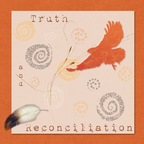
That is a beautiful tribute to the atrocities inflicted on the First Nations of any country. Do you have any hobbies, or enjoy baking, needle work etc that you can take photos of, and then showcase them in layouts. It may help you if you have passion for something. That passion will then show through in your work, and in turn you will be happy and like what you have done. Don't try to hard, and over think what you are doing. Like this page you have created. You obviously feel strongly about it, and it comes through in your page. I hope I haven't spoken out of turn.1 point
-
1 point
-
What a very nice presentation, Phil. You are giving me ideas! Oh, and welcome to the Campus. Hope to see more of your work.1 point
-
1 point
-
Yup, you are an artist, there is no mistake in that. In fact I think we should all consider ourselves artists when we create. Why not. Remember the days art galleries wouldn't allow photographs because it wasnt "art". Now some photographers create "Fine Art Photography", and show successfully in art galleries. The layouts in this forum often leave me thinking WOW! This is incredible.1 point
-
It's always a good idea to get distracted from the main task in hand. When you go back to it, you go back with a fresh perspective.1 point
-
You have done this designer proud! When creating a double page, I place the pages side by side frequently, to make sure they look right. I think it's a lot to do with how your eye perceives the layout.1 point
-
1 point
-
1 point
-
1 point
-
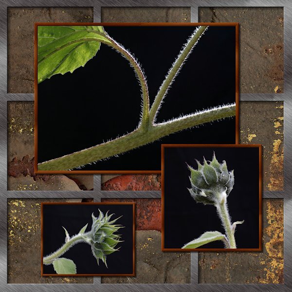
Here's my take on the Sketch Challenge. No words, just pictures. It was fun to do. I did the silver frame with vectors, not sure why, just seemed easier to do it that way. the outer frame is one object and the 2 verticals are one object and the 2 horizontals as one object. It just occured to me to make it a preset shape. Wonder if it would be useful. The background is a patter I got of rusty metal. It only has a number name (02) but I think it came froim of the ...eezy website (Brusheezy, Vecteezy etc). Lighting by mother nature...background by a non-descript black background I dragged outside....and had to weight down because it was like sail on a windy day and kept blowing over onto the poor subjects.1 point
-
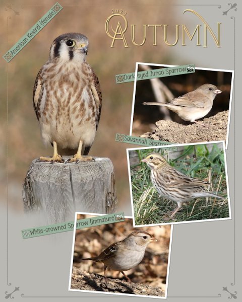
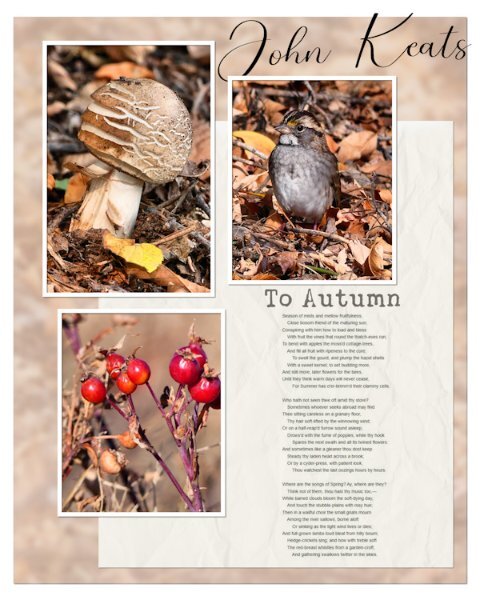
Another Autumn page in a series that I'm doing, on the birds that stop off for a brief visit, before continuing their long migratory journey. The border is a combination of a corner element which I added a thin border all around to, overlay. Phrase strips which I created, adding one of Carole's new punches. I really do love these, they are ever so easy to use. I do recommend using guides or grid when using them. Text on a text path, masks to slot the photos in . Photo frames are done using the vector rectangle tool.1 point
-
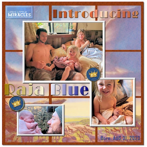
Finally finished my Sketch Challenge. Introducing my new great grandson, Raja Blue Lennox, little brother to Magic. He was born at home on Aug 31, and it took the parents a week to come up with a name. ? I think he weighed in at nearly 9 lbs. Daddy Will introduced him with a musical rendition of the opening to The Lion King, so I went with the theme and used a Lion King poster in the background, mirrored and screened in each of the 9 squares. The mat behind them has a wood grain pattern. The crown brads are from Janet Kemp. The title font is Broadway, treated to a Copper gradient and a Chrome Reflection gradient. The little word art top left is from Marisa Lerin. I tried out PSP's One Step Photo Fix and was impressed with the results. I think it is improved in PSP 2023.1 point
-
Well! I started out with the intentions of using the sketch. It didn't take long for me to do my own thing, once I added the photos. The background paper is the photo of the Immature White-throated Sparrow, blurred, overlay, and lowered opacity I added the rosehip photo to add a vibrant colour to make the page pop, on an otherwise earth toned page. I screenshot the poem to save me having to type it out. Blend mode multiply.1 point
-
1 point
-
Day 7 Working more with blend modes with the same background paper. I might see if I can use that paper throughout. In the coming week(s). Work is still needed on this one (and most of the rest) but I wanted to get it up tonight. Tomorrow, back to my scripting homework and work on these layouts in between. Thank you for a wonderful workshop. I learned a lot about manipulating masks and really liked Day 7 mask technique.1 point
-
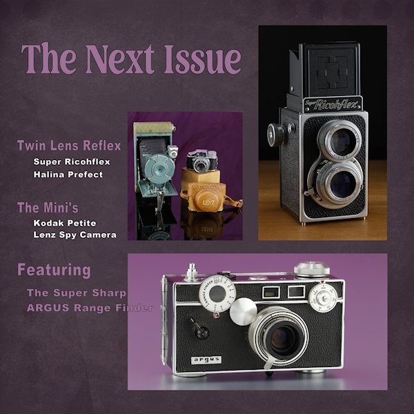
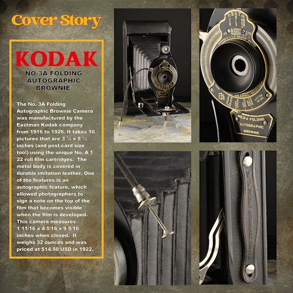
Day 6 Thank you to Sue and Rene for giving me some ideas using the blending modes. I used a white layer above the paper layer (Brook Gazarek, DigitalScrapbook.com) and used a blend mode (I forget right now, sorry) and then reduced the opacity a bit so I could control how much of the layer below showed through. The red kodak word is a bit overpowering (as Red tends to do) but is the color kodak uses - perhaps I should have desaturated it a bit. The yellow frame is the other Kodak color. On to Day 7. I think it will be one page though. I didnt photograph enough cameras and the night is coming to a close. For practice, I did do the lesson where we made it one mask. here I used all 4 as it was better suited for this layout. I'll try and get these posted on FB in the next week as I finish them all. I see blurry Kodak and Cover Story, but they are arent blurry in the full sized image.1 point
-
1 point
-
1 point
-
1 point
-
I made 3 masks together for the bigger photo and used the 4th for a single photo background is a color from little photo with a stone texture fonts Kastel Voire and Arnold Story1 point
-
Day 6: The Hoover Dam bridge is an awesome sight. The top photo is my own. The bottom photo is from my grandson taken while they were camping under the bridge. The font is Arial.1 point
-
1 point
-
Day 6 It was difficult to find a photo for this page because I changed the size of the templates. Besides adjusting the masks, I also rearranged everything.1 point
-
1 point




.jpg.3749fe5a79720b882929739acff408bf.jpg)
