Leaderboard
Popular Content
Showing content with the highest reputation on 09/28/2023 in all areas
-
9 points
-
9 points
-
9 points
-
9 points
-
Day 6 and I decided to feature his Halloween illustrations. Hayden Williams has created so many looks for his Haunt Couture Collection, more than can be displayed here. I keep forgetting these are supposed to be magazine layouts and I have to stop myself from adding shadows, borders, and textures.8 points
-
8 points
-
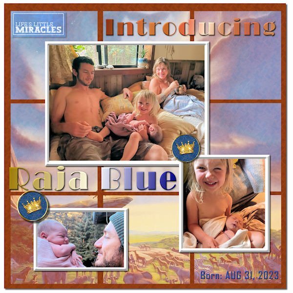
Finally finished my Sketch Challenge. Introducing my new great grandson, Raja Blue Lennox, little brother to Magic. He was born at home on Aug 31, and it took the parents a week to come up with a name. ? I think he weighed in at nearly 9 lbs. Daddy Will introduced him with a musical rendition of the opening to The Lion King, so I went with the theme and used a Lion King poster in the background, mirrored and screened in each of the 9 squares. The mat behind them has a wood grain pattern. The crown brads are from Janet Kemp. The title font is Broadway, treated to a Copper gradient and a Chrome Reflection gradient. The little word art top left is from Marisa Lerin. I tried out PSP's One Step Photo Fix and was impressed with the results. I think it is improved in PSP 2023.6 points
-
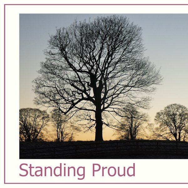
for day 7 I show you some funny trees around my home I made the template with the instructions from Carole6 points
-
Thought I'd also post my Sketch Challenge here to introduce my new great grandson, Raja Blue Lennox, little brother to Magic. He was born at home on Aug 31, and it took the parents a week to come up with a name. ? I think he weighed in at nearly 9 lbs. Daddy Will introduced him with a musical rendition of the opening to The Lion King, so I went with the theme and used a Lion King poster in the background, mirrored and screened in each of the 9 squares. The mat behind them has a wood grain pattern. The crown brads are from Janet Kemp. The title font is Broadway, treated to a Copper gradient and a Chrome Reflection gradient. The little word art top left is from Marisa Lerin. I tried out PSP's One Step Photo Fix and was impressed with the results. I think it is improved in PSP 2023.5 points
-
3 points
-
3 points
-
Hello Carol and all members, I'm Doska (nickname from first, last name and city). Jenifer already told me something about you, but because I'm still working with Photo Impact X3, I thought I couldn't take part here. But now I'm considering maybe getting a PSP because I'm afraid that with the next WIN 11 or 12 my beloved PI will no longer work. And I love digital scrapbooking, it's still my only hobby. I'm 72, have already celebrated my golden wedding anniversary (sept22), worked in emergency medicine for decades as an intensive care and... Anesthesia nurse, volunteering with my husband in the emergency services and now volunteer fire brigade (friends of my age) doing digital scrapbooking with PI-X3 since 2005. Before my PC days (since 1996) I drew. I love animals and have had cats and a dog as pets. I also have a personal relationship with Jesus Christ, since HE speak with me 2012.. I would like to ask whether I can still show my PI works until I take a course? I'm also on Merisa Lerin's DigitalScrapbook forum. Thank you for the invitations Carol and Jenifer, I hope we have fun and I learn new things. Kind regards Doska2 points
-
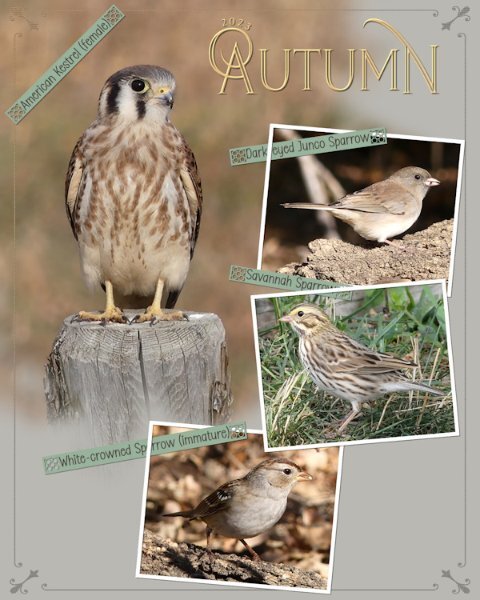
Another Autumn page in a series that I'm doing, on the birds that stop off for a brief visit, before continuing their long migratory journey. The border is a combination of a corner element which I added a thin border all around to, overlay. Phrase strips which I created, adding one of Carole's new punches. I really do love these, they are ever so easy to use. I do recommend using guides or grid when using them. Text on a text path, masks to slot the photos in . Photo frames are done using the vector rectangle tool.2 points
-
I'll come and welcome you too. I'm a beginner at Photoshopping and not the best in the group. Although I do that at a snail's pace. I've been more creative with PSP for over twelve years. But I'm learning a lot here on this platform. You will experience that yourself here.2 points
-
No at all! The colours are prefect. I can not fault it, although, and not being critical , if it was mine I would make the tree largest stars a little smaller. They overpower the models a tad. I love the three B's word art.2 points
-
2 points
-
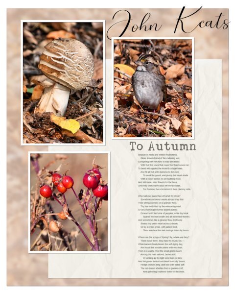
Well! I started out with the intentions of using the sketch. It didn't take long for me to do my own thing, once I added the photos. The background paper is the photo of the Immature White-throated Sparrow, blurred, overlay, and lowered opacity I added the rosehip photo to add a vibrant colour to make the page pop, on an otherwise earth toned page. I screenshot the poem to save me having to type it out. Blend mode multiply.2 points
-
I have created some memories for a relative using the masking procedure that I learnt from the magazine workshop. I was happy to learn more about the masks as I have always struggled with them. Helen is having a birthday, and I thought she would like these memories of a 6oth birthday, a win at the dart competition, and her precious old dog who passed a couple of months ago.2 points
-
I think it's just right. Love the color! And what you did with the gradient is really neat. I would not have thought of that, it sure put the focus on the girls.2 points
-
Day 5. I decided to add a pop of color to this page. Is it too much? It's really difficult to get out of the "scrapbook" head.2 points
-
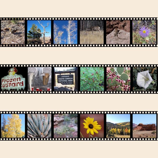
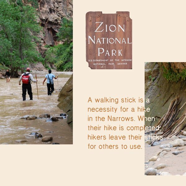
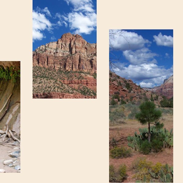
Bonnie I love your idea to feature the beauties of the National Parks of Utah, the photos are stunning and pay tribute to the region! I would love to see it for myself, maybe when I visit my family in the States again in the future.2 points
-
2 points
-
2 points
-
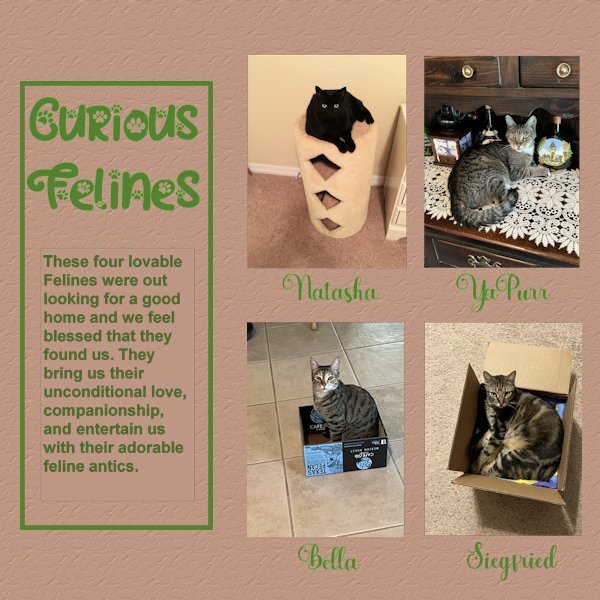
Here is my Day 6. This was a hard one for me, it is not perfect yet, but I am trying. Had a difficult time with text not showing until Carole reminded me to convert the text layer to raster. Even than PSP was acting funny and would not convert. I tried it with another sample and it worked OK. After stepping back a bit to get my energy back, it finally worked. However, I detected just a tiny border around the text, not the larger left side rectangle, just around the story text. After trying to get ride of that, I decided to leave it alone before messing up my whole project more. My photos were not quite the right size so I made them fit and deleted the grey area. My project showcases : Natasha, YaPurr, Bella and Siegfried. Because I had extra spaces below the photos I decided to add their names. Font used there : Amberto Bold. Font for Title as before Cat Paw. Added brown background with texture: Crumbled.2 points
-
2 points
-
2 points
-
2 points
-
2 points
-
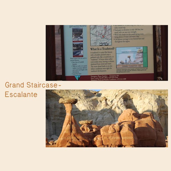
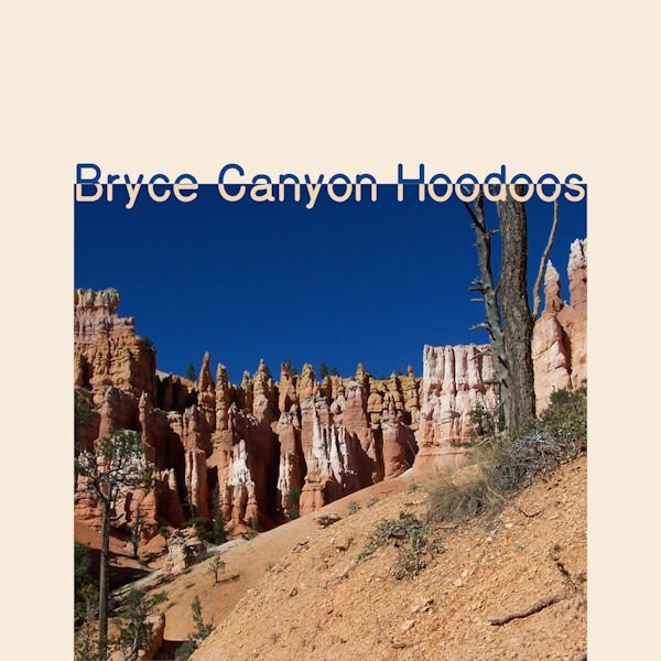
Day 2 Bryce Canyon National Park is my favorite. The small graphic on the lower right says, "The Queen Victoria formation is one example of many pinnacles, spires and walls named for famous personalities or man made features. It is even now changing in appearance and will slowly disappear as erosion continues."2 points
-
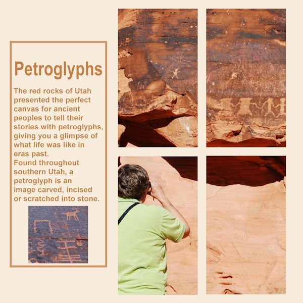
I had a difficult time getting started as I kept changing topics. This turned out very different than I planned. For many years my basketball team and I would compete in the Huntsman Senior Games. There are the Utah State Games and they are huge...over 10,000 athletes from the USA and 26 countries. Some years we went to the games, played and returned home. My favorite years were when we stayed and visited National and State Parks in Utah. I planned on highlighting basketball but put all my attention on the beauty of Utah. Day one2 points
-
2 points
-
1 point
-
Welcome Doska. Looking forward to seeing posts from you in the forum. Definately join the bootcamp in October, it's what got me using PSP after buying it for several years and not using it. Happy Anniversay by the way, that's a milestone event. I am also a member of DigitalScrapbook...although I've never posted in the forum.1 point
-
1 point
-
Hi, Doska! Great to see you here! If you decide to switch to PSP, you'll be able to use that template you asked about at Digital Scrapbooking. You are in the perfect place to learn PSP...Carole is the best! Welcome!1 point
-
Here is a link for a browser version: https://scrapbookcampus.activehosted.com/index.php?action=social&chash=af8d9c4e238c63fb074b44eb6aed80ae.3949&s=a16f9754af7f8507ca271ee628f9e02b1 point
-
1 point
-
1 point
-
1 point
-
Corrie, it is a beautiful area and very different from the east coast where I live. I never had more than a day or 2 to explore but over the years I saw a good bit. The Huntsman Games are in St. George, Utah...the southwest corner of Utah. St. George was our base. Once we saw Zion, Bryce (twice) and Grand Canyon all in one day. We were treated to a full moon rising over Bryce...amazing. All my photos of that event are very grainy.1 point
-
@Anita Wyatt When I want to make a major change in a project, I rename it before I "mess" it up. For the original version, I would name it Day 6 01 01. The next version would be Day 6 01 02. That way if I hate 01 02, I could always go back to 01 01. Sometimes I end up with more than just two versions.1 point
-
1 point
-
1 point
-
1 point
-
Sometimes, just sometimes, we have to be reminded of the tools that are available to us.1 point
-
Here's my Day 4. Hayden has a bunch of Barbie illustrations, especially now with the Barbie movie out. But I decided to go with his old-school collection. (I know it's supposed to be a two-page layout, but I was afraid if I combined it into one image, it wouldn't be very visible once I sized them down.) Hayden has a bunch of Barbie illustrations, especially now with the Barbie movie out. But I decided to go with his old-school collection.1 point
-
I think your magazine needs become a hardcover coffee table book. What beautiful photos and the architecture is like large permanent art installations. My hubby's parents were from Denmark.1 point
-
1 point
-
1 point
-
Hi @Doska St. Welcome to our community. You will find a lot of inspiration in our gallery, our blog, and our forum, even if you are not using PSP (yet). Maybe you can join our Bootcamp in October, and download the trial version of PSP for that period. Although the scrapbooking part should be easy for you since you are already familiar with digital work, it might be a simple (and fun) way to get acquainted with PSP, before buying it (the trial is good for 30 days). As for showing some PI projects, I would suggest you post them in this thread, as it is an intro for you. If you were to post in challenges for example, it would have to be clearly indicated that it is made with PI so that viewers won't assume it was made with PSP. And if you have any questions, don't hesitate to ask. We are here to help each other.1 point

Resized.thumb.jpg.d25811db03a63358cedab1e79f527635.jpg)

