Leaderboard
Popular Content
Showing content with the highest reputation on 09/25/2023 in all areas
-
Here's my Day 4. Hayden has a bunch of Barbie illustrations, especially now with the Barbie movie out. But I decided to go with his old-school collection. (I know it's supposed to be a two-page layout, but I was afraid if I combined it into one image, it wouldn't be very visible once I sized them down.) Hayden has a bunch of Barbie illustrations, especially now with the Barbie movie out. But I decided to go with his old-school collection.10 points
-
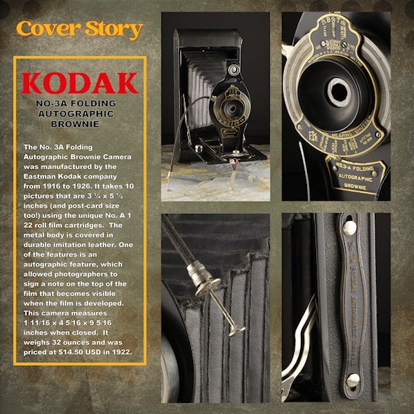
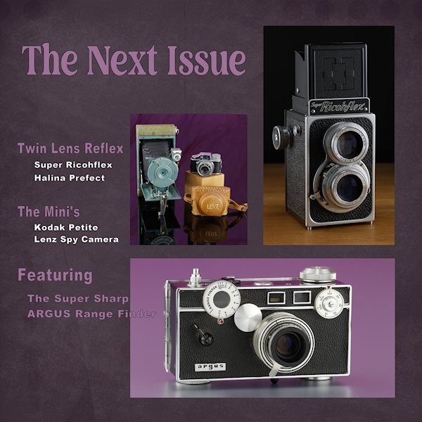
Day 6 Thank you to Sue and Rene for giving me some ideas using the blending modes. I used a white layer above the paper layer (Brook Gazarek, DigitalScrapbook.com) and used a blend mode (I forget right now, sorry) and then reduced the opacity a bit so I could control how much of the layer below showed through. The red kodak word is a bit overpowering (as Red tends to do) but is the color kodak uses - perhaps I should have desaturated it a bit. The yellow frame is the other Kodak color. On to Day 7. I think it will be one page though. I didnt photograph enough cameras and the night is coming to a close. For practice, I did do the lesson where we made it one mask. here I used all 4 as it was better suited for this layout. I'll try and get these posted on FB in the next week as I finish them all. I see blurry Kodak and Cover Story, but they are arent blurry in the full sized image.10 points
-
10 points
-
9 points
-
9 points
-
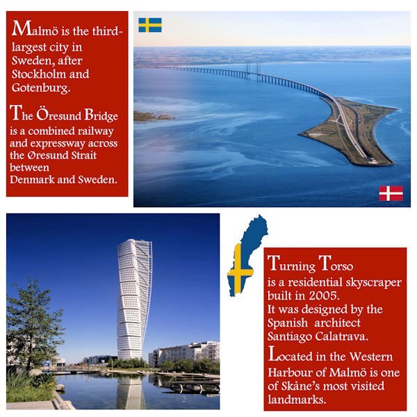
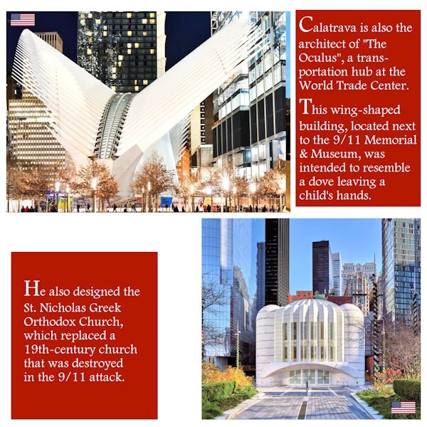
Last week, I stumbled upon a video suggested by YouTube, and it was about the reconstruction of Ground Zero... I was surprised to hear the architect, Santiago Calatrava, was responsible for the designs of two buildings... It's interesting because before looking up the Öresund Bridge, I'd never heard his name before. In the USA, he is also the architect of the Margaret Hunt Hill Bridge in Dallas, Texas, and the Milwaukee Art Museum, Wisconsin. So, I decided to include this information and create another layout page for Day 2. Now, it will be a Double Page. It's not exactly complying with the Day2 template, but being the "editor-in-chief" of this magazine, I think it's OK this time. ?9 points
-
Day 7 Working more with blend modes with the same background paper. I might see if I can use that paper throughout. In the coming week(s). Work is still needed on this one (and most of the rest) but I wanted to get it up tonight. Tomorrow, back to my scripting homework and work on these layouts in between. Thank you for a wonderful workshop. I learned a lot about manipulating masks and really liked Day 7 mask technique.9 points
-
9 points
-
9 points
-
I made 3 masks together for the bigger photo and used the 4th for a single photo background is a color from little photo with a stone texture fonts Kastel Voire and Arnold Story8 points
-
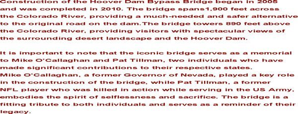
Day 6: The Hoover Dam bridge is an awesome sight. The top photo is my own. The bottom photo is from my grandson taken while they were camping under the bridge. The font is Arial.7 points
-
Day 6 It was difficult to find a photo for this page because I changed the size of the templates. Besides adjusting the masks, I also rearranged everything.6 points
-
5 points
-
5 points
-
5 points
-
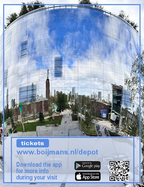
I did a backpage too and used partly the same layout of the cover, although I rotated the small frame to fit my page and I have a photo covering the whole page. The website address of the museum is the real website!!! If anyone will more information you can go there. When visiting the depot next to all the showcases is a QR code that you can scan with the app that you can download and that gives more info on what you are seeing. My QR code is not the real one of course; the google play and appstore logos I found on the net, as long as I don't sell this "Magazine" for real that isn't a problem I think. I have many more photos so I will make additional pages, if I'm going to print this for my friend's birthday later this year. Carole, thank you for this Workshop, it was a pleasure to make another magazine!5 points
-
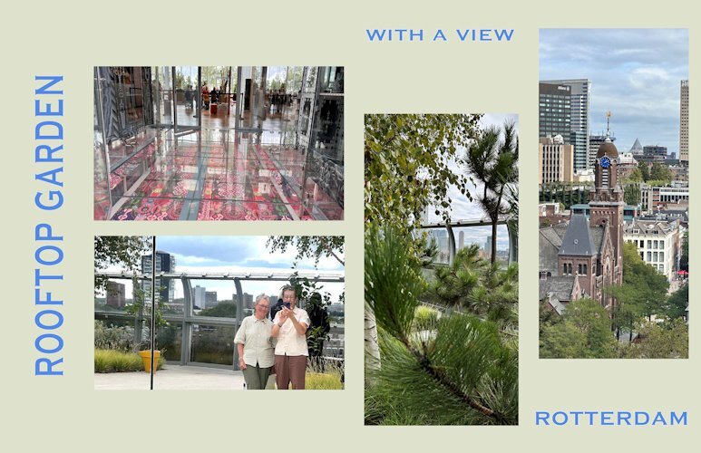
Day 7 and the last one of this workshop and of my visit to Het Depot. I used the tutorial of this day but with a twist and it features the rooftop where the garden restaurant is and you can see now the context of that glass floor too. Outside the restaurant there is a real garden with trees and a lot of greenery. It is possible to walk around full circle and a lot of the solid walls around the kitchen of the restaurant and the restrooms are of course mirrors. That gave the opportunity to take a photo a bit different from a selfie! The views of the city and beyond a fantastic, we were lucky with the weather. Same fon and colors as all the other pages for some consistency.5 points
-
5 points
-
5 points
-
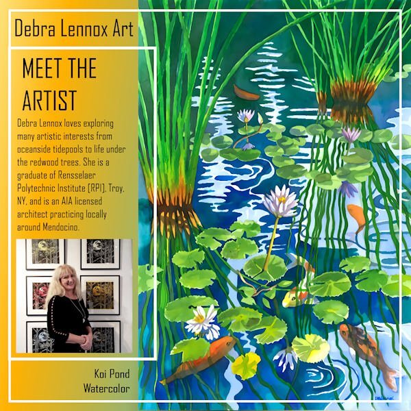
Here's my Back Page for Debra Lennox Art. I mirrored the Front Page mainly by sliding the parts of the photo group over and moving the double frames. I used the same gradient as the cover. I'm still using the same font: Agency. I have this watercolor on my bedroom wall but had to position it so you see it as you walk down the hallway as it is quite large @ 32" h. x 40" w. with matting and frame. Deb has 2 children, both married, and there are 2 grandchildren, Magic and Raja. I meant to also post the thumbnails of all 8 pages. I've added it now.5 points
-
Thank you Susan. You have done a great job with your cameras, I can relate to some of those older ones.4 points
-
WOW! Ann, this is really beautiful. What a diverse artist Debra is. And an architect, she must have beautiful penmanship as well.4 points
-
4 points
-
4 points
-
4 points
-
4 points
-
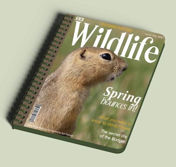
Playing around last night. I used the book cover mock up template from the blog. The spiral binding really isn't suitable for a magazine. I created my own ad for my magazine. Yes Carole, I featured everything stated on the front cover, at the time of creating the cover I added features on a whim, which I did manage to carry to fruition. A nice touch I thought to finish the workshop with. Another successful workshop, thank you.4 points
-
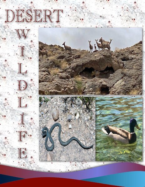
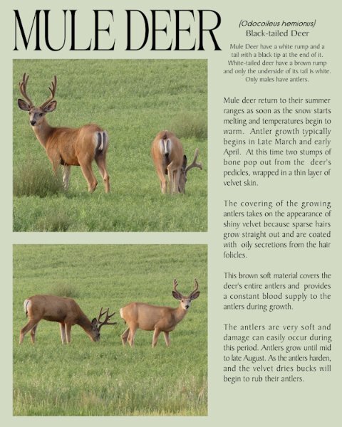
Well, it's officially Autumn, and I really don't like these darker evenings and mornings. The days are only going to get shorter and shorter. For the last page I used yesterday’s (day 6) 2 mask layers that I edited. Using the edit selection tool I moved the masks to the opposite side of the page, using the guides to keep everything aligned. Mule deer in velvet.4 points
-
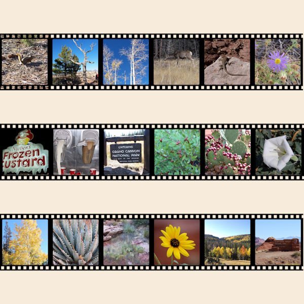
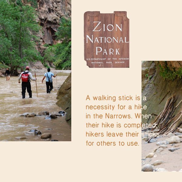
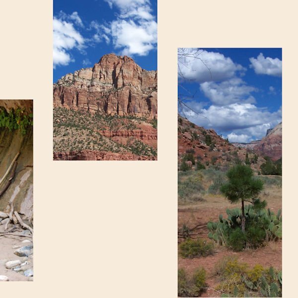
I had a difficult time getting started as I kept changing topics. This turned out very different than I planned. For many years my basketball team and I would compete in the Huntsman Senior Games. There are the Utah State Games and they are huge...over 10,000 athletes from the USA and 26 countries. Some years we went to the games, played and returned home. My favorite years were when we stayed and visited National and State Parks in Utah. I planned on highlighting basketball but put all my attention on the beauty of Utah. Day one3 points
-
3 points
-
3 points
-
I'm loving your magazine, Michele! As I mentioned before, I don't know how you find these great illustrations having so little time to work.3 points
-
Yes, she literally writes by hand in Copperplate Gothic. They had an entire course on it in college. She has lots more pieces on display on her website here if you'd care to explore.3 points
-
it has been such a pleasure to see your art. Your layouts are so consistant and the project as a whole is beautiful and cohesive.3 points
-
2 points
-
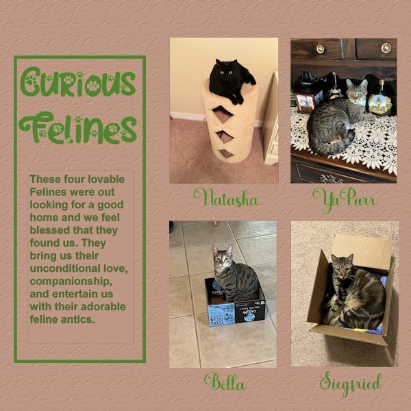
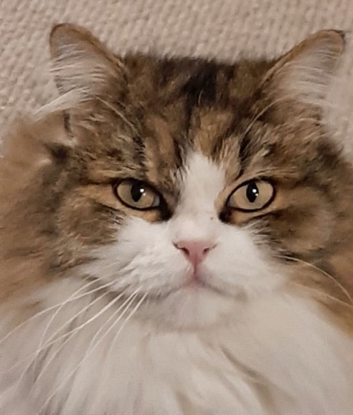
Here is my Day 6. This was a hard one for me, it is not perfect yet, but I am trying. Had a difficult time with text not showing until Carole reminded me to convert the text layer to raster. Even than PSP was acting funny and would not convert. I tried it with another sample and it worked OK. After stepping back a bit to get my energy back, it finally worked. However, I detected just a tiny border around the text, not the larger left side rectangle, just around the story text. After trying to get ride of that, I decided to leave it alone before messing up my whole project more. My photos were not quite the right size so I made them fit and deleted the grey area. My project showcases : Natasha, YaPurr, Bella and Siegfried. Because I had extra spaces below the photos I decided to add their names. Font used there : Amberto Bold. Font for Title as before Cat Paw. Added brown background with texture: Crumbled.2 points
-
2 points
-
2 points
-
2 points
-
2 points
-
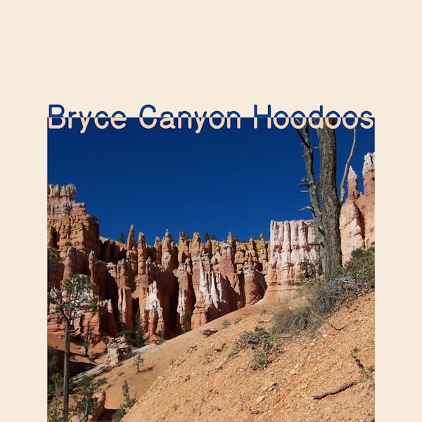
Day 2 Bryce Canyon National Park is my favorite. The small graphic on the lower right says, "The Queen Victoria formation is one example of many pinnacles, spires and walls named for famous personalities or man made features. It is even now changing in appearance and will slowly disappear as erosion continues."2 points
-
Me too! Some came from my Grandfather and some I've collected. I was shocked to see the vintage (yikes, that's my era) SLR's are gaining in value. I used be able to get 70's or 80's SLRs at thrift stores for less than $15, now some are in the hundreds.2 points
-
2 points
-
2 points
-
Awesome! That must have taken you all of 2 minutes, once you decided on an image. ? lol2 points
-
Day 3 ~ This is one of Hayden Williams' Vogue covers. Of course, I removed the "Vogue" title and did my own.2 points
-
2 points
-
I just went through reams of graph paper at home, re-arranging walls and furniture. ?1 point
-
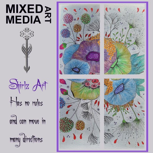
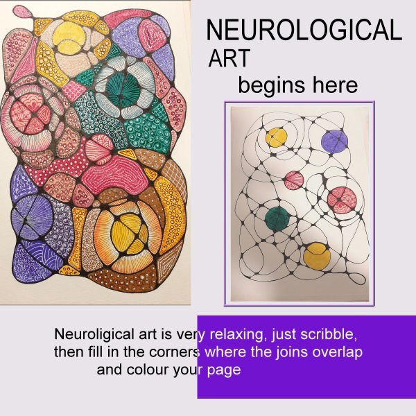
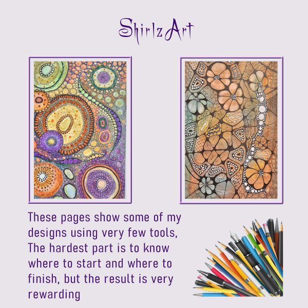
I agree with Susan, and I learned a lot about this art that I didn't know before. Great work, Shirley!1 point
-
1 point












.jpg.1bb5470a42587e56953bc09191d77697.jpg)
Resized.thumb.jpg.d25811db03a63358cedab1e79f527635.jpg)


