Leaderboard


Popular Content
Showing content with the highest reputation on 09/24/2023 in all areas
-
I'm a little late but here is my day 1. It took me a while to find some photos to use - they were all taken by me and not far from home.
 9 points
 -
Day 4 Part B
9 points
-
This is my day 4 Part A . I forgot to mention the top photo was of our community center in Cedarhurst Maryland. Our house is a block away and we had Chesapeake Bay slapping against the walls of our place.
9 points
-
Here is my Day5
9 points
-
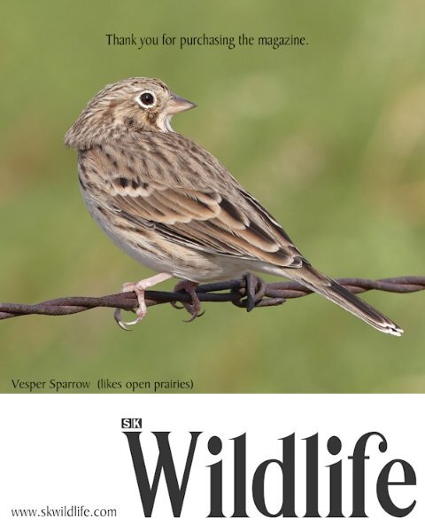
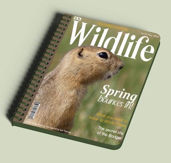
Playing around last night. I used the book cover mock up template from the blog. The spiral binding really isn't suitable for a magazine. I created my own ad for my magazine. Yes Carole, I featured everything stated on the front cover, at the time of creating the cover I added features on a whim, which I did manage to carry to fruition. A nice touch I thought to finish the workshop with. Another successful workshop, thank you.
8 points
-
Day 3 ~ This is one of Hayden Williams' Vogue covers. Of course, I removed the "Vogue" title and did my own.8 points
-
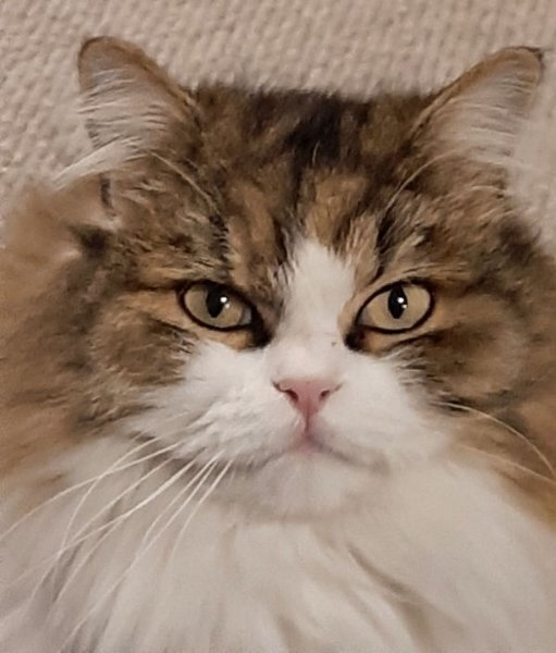
Hi Anita, A miradoll actually looks like a ragdoll/Persian very fluffy and a rounder face like the Persian, but without the snub nose. I think the original breeding mix was Birman/Persian/Ragdoll. My boy is tabby and white. She also breeds Bengals, very striking cats
8 points
-
Here is my Magazine Lesson-5, showcasing Natasha, YaPurr and Calico Tom, who is not really a Calico, but my husband liked the name and it stuck. Calico did too. All three are interested in their surprise visitor. I used a gradient in PSP 23 Ultimate for the background, Font is Cat Paw.
8 points
-
Day 6 completed
8 points
-
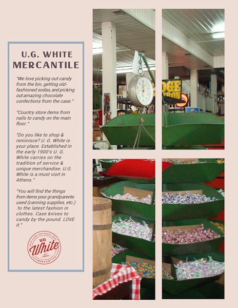
Day 6 Downtown Athens is like going back in time. One of the cornerstones of nostalgia is U.G. White Mercantile, a general store where shoppers can get housewares, hardware, and candy by the pound. Prices have increased since its founding in 1917, but the old charm remains.
8 points
-
Although I will be continuing to create pages for this magazine, as I did for the previous magazine workshops. Here is the back page that I will be using once I have completed it.
7 points
-
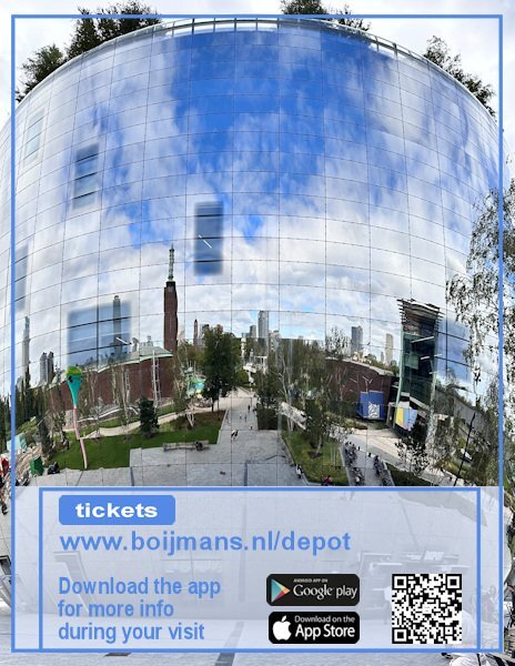
I did a backpage too and used partly the same layout of the cover, although I rotated the small frame to fit my page and I have a photo covering the whole page. The website address of the museum is the real website!!! If anyone will more information you can go there. When visiting the depot next to all the showcases is a QR code that you can scan with the app that you can download and that gives more info on what you are seeing. My QR code is not the real one of course; the google play and appstore logos I found on the net, as long as I don't sell this "Magazine" for real that isn't a problem I think. I have many more photos so I will make additional pages, if I'm going to print this for my friend's birthday later this year. Carole, thank you for this Workshop, it was a pleasure to make another magazine!
7 points
-
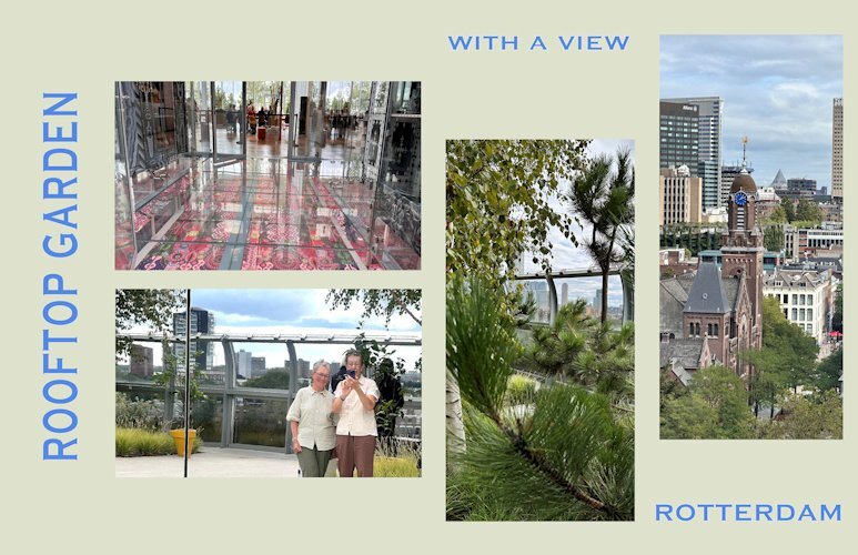
Day 7 and the last one of this workshop and of my visit to Het Depot. I used the tutorial of this day but with a twist and it features the rooftop where the garden restaurant is and you can see now the context of that glass floor too. Outside the restaurant there is a real garden with trees and a lot of greenery. It is possible to walk around full circle and a lot of the solid walls around the kitchen of the restaurant and the restrooms are of course mirrors. That gave the opportunity to take a photo a bit different from a selfie! The views of the city and beyond a fantastic, we were lucky with the weather. Same fon and colors as all the other pages for some consistency.
7 points
-
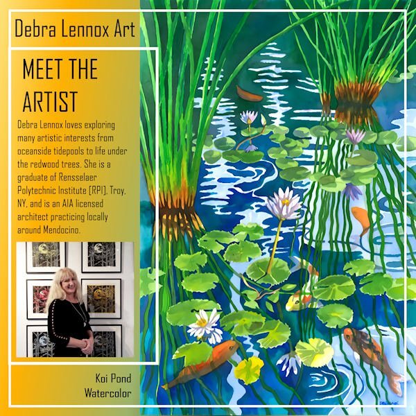
Here's my Back Page for Debra Lennox Art. I mirrored the Front Page mainly by sliding the parts of the photo group over and moving the double frames. I used the same gradient as the cover. I'm still using the same font: Agency. I have this watercolor on my bedroom wall but had to position it so you see it as you walk down the hallway as it is quite large @ 32" h. x 40" w. with matting and frame. Deb has 2 children, both married, and there are 2 grandchildren, Magic and Raja. I meant to also post the thumbnails of all 8 pages. I've added it now.
7 points
-
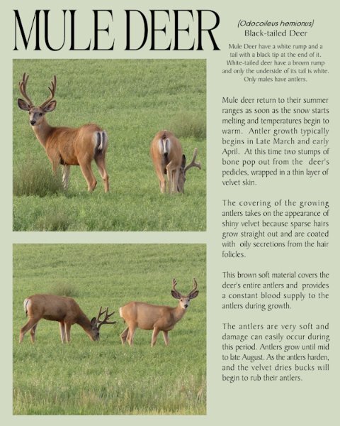
Well, it's officially Autumn, and I really don't like these darker evenings and mornings. The days are only going to get shorter and shorter. For the last page I used yesterday’s (day 6) 2 mask layers that I edited. Using the edit selection tool I moved the masks to the opposite side of the page, using the guides to keep everything aligned. Mule deer in velvet.
7 points
-
Here is my page Day 6:
6 points
-
Here are day 6 and 8 together
6 points
-
My day 8 using day 6 layout.
6 points
-
I like this one! If it is too dark for you, try using a blend mode on the patterned paper with the layer below it being a solid color. I do that quite often with a white layer below a paper. If it is a large pattern that can be distracting, doing that will tone it down. In the case of yours, it might make it not so dark but yet not really light. Having it a little lighter might make the red that you tried (and didn't use) pop.6 points
-
Thank you Carole. I did play with backgrounds on my day 5. I think I tried every gradient I have and I textured them and left them untextured. I ended up with a background paper. I also played with red color in the small type of the logo as well (Red) but in the end the black seemed better. Would have like a letter with an O or if there was S, L and R in the lower case I could have just did those letters for a little surprise pop. anyway, I used a paper for Brooke Gazerak for this one...for now.
6 points
-
Hello, here is my page Day 3, I added a photo.
6 points
-
Day 6 It was difficult to find a photo for this page because I changed the size of the templates. Besides adjusting the masks, I also rearranged everything.5 points
-
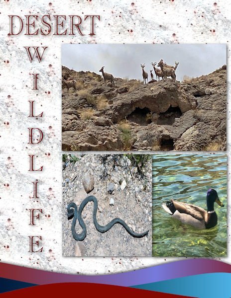
Day 5: I had to use my Las Vegas grandson to fill in some pictures of Hoover Dam, Lake Mead and desert wildlife. Font is carlsonopenfaceBT. The waves are from the cass wave script.
5 points
-
Here is my Day 4,
5 points
-
Here is my Day 7
4 points
-
day 54 points
-
I love your cat pages, I am a cat over, I have 3 cats, 2 ragdolls, and a Miradoll who is from a registered NZ breeder..4 points
-
I agree with Rene, I prefer this one too. I often use the blend mode, with a lighter solid coloured layer below. It often tones down the original top layer. You have total control on how much you want to tone it down by. Even try other solid colours besides white. Different colours will yield different results.4 points
-
Day 5 This is the one I tried a gradient (it's a light one) with a Effects>Texture Effects>Texture it's a bit bland, okay, A LOT bland. I tried dark ones too, but the photos were too glaring. Looking at the two of them, the darker version is better so i think I will explore a darker background version. Thanks for the help, more sets of eyes are better
4 points
-
Wonderful pages, ladies!!! My second batch, days 4, 5 and 6. Pls click image for a larger view.4 points
-
My page 7 - Debra Lennox Art - Mendocino (that's in Northern California, on the Pacific coast, about 3-1/2 hours north of San Francisco). The background gradient is called Baseball, and I used a layer effect of Exclusion. The font is still Agency. I left the template as is because it worked for me. What seems most odd is doing layouts with NO shadows!
4 points
-
I made 3 masks together for the bigger photo and used the 4th for a single photo background is a color from little photo with a stone texture fonts Kastel Voire and Arnold Story3 points
-
Nice touch with the ON SALE NOW page!3 points
-
@SusanEwart, the blend modes were the main reason I now lean on PSP2023 as they are so handy to just scroll through and see the effect in real time on the image. It's a new feature of '23.3 points
-
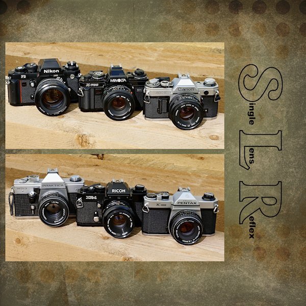
I like this lighter version better than the darker one. On this one the cameras get more attention, at least that's what I think. Oh and I recognize the Pentax camera on the right which was my dad's and when he died it came to us. We (hubby and I) used it until it was beyond repair. It had a long life and all the lenses we sold at some point because we went digital.3 points
-
I rotated the canvas to fit my photo. I again used the same background, font and font color from the previous layouts.
3 points
-
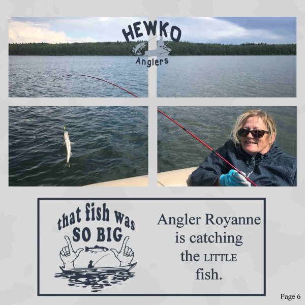
Day 6, fishing is not always about catching the big one, little ones are caught too. The word art is from www.hiclipart.com they have some fun free transparent clipart.
3 points
-
Here is my Day 2.
3 points
-
Day 6 of my trip to Het Depot and this page features the glass floor on which you can walk, although not everyone dared to! I saw people very hesitating set a step on that glass flooring! It was difficult to get a photo of the floor because of all the reflection from the glass everywhere. In the end I put my phone on the floor and was able to take a photo of a part of it. I have other photos where you can see the floor and the entrance to the restaurant but those didn't show the colors of the floor very well. Those show more the context of it all, but didn't look good in this page, even if I changed the templates to other dimensions. I'm planning to use these Magazine pages to print an album for the friend I was taking this little trip with. She will be 75 later this year and as she doesn't take much photos I think it will provide a nice gift. Of course I have much more photos of the museum visit and will make more magazine pages for that album. Luckily her birthday is to the end of November, so I have hopefully time enough to do so.
3 points
-
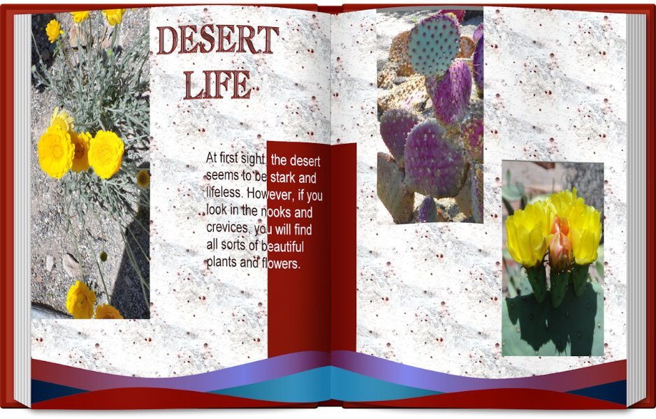
Day 4: Photos of some of the flowers and cacti found in the desert.
3 points
-
Here is Day 5 - page 6 of Debra Lennox Art - Category: Many Moons - Linocut "Dancing Moon." She does have many moons, but this is my favorite. I have it on my living room wall. Being consistent with the font: Agency. I didn't split the photo mat because I've been waiting for a template with a large area for the image. I'll try a split on page 7 or 8, depending on the templates. The background color and part of the title is flood filled with the off-white of the moon in the image.
3 points
-
Finally Day 1. I decided to use my favorite fashion illustrator as my subject. My only problem is which ones to pick!3 points
-
Day 6: The Hoover Dam bridge is an awesome sight. The top photo is my own. The bottom photo is from my grandson taken while they were camping under the bridge. The font is Arial.2 points
-
Day 7 template, click image to dl pls.2 points
-
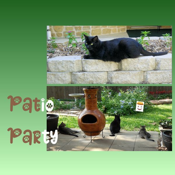
Thank you Shirley! Ragdolls are beautiful. What does a Miradoll look like? I currently have 4 rescued inside cats and one long haired Patio Cat who is a feral. I have been trying to get her to trust me enough to become an inside cat. She is Siegfried's mother, and brought him to our patio when he was a tiny kitten. She would allow me to pet him and bring him in the house, but she refuses to be a house cat. I tried a couple of times and she totally freaked out. Our back patio is covered and we have a fence around the backyard. Also, 2 side walls of the house are on the right and left of the patio to keep the wind out. I have plenty of warm cat beds and blankets for her when it gets colder and I rig up a little campsite for her. Most of the time we do not get that cold here in Texas. I keep telling her what she misses by not being a house cat. Well, maybe some day, I hope. In the meantime she gets her 3 meals a day, sometimes more and seems to be happy about that. Once I place her food down she comes up to me and brushes against me to thank me, but I only get to touch her just a little bit, before she gets skittish. I have to be patient. Some of the other cats I show in the workshops are our Rainbow Bridge Angels that will always be remembered and loved.2 points
-
I play with the blend modes all the time with papers. You can get a completely different look depending on the mode your use. Also like Sue said using different colors on the layer below give different results. And, some times with the patterned papers, I will put the plain paper on top and use the blend mode on it which can let the pattern show through but not be real distracting. So many different looks can be created through the blend modes.2 points
-
So cute. For the first day of Spring, I thought this little meme appropriate...
2 points
-
here are now my pages for day 42 points
-
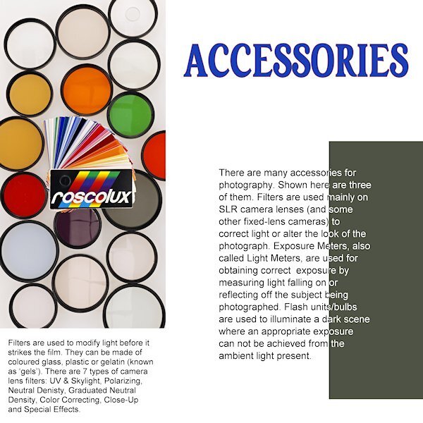
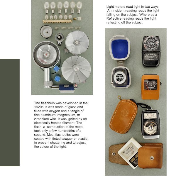
Day 4 Right off the bat I see I forgot to take the stroke off the title. I was going with the yellow-red color on the pouch of the light meter but changed my mind. I like the way we changed the color of the (rasterized) font. It's a neat effect. Still cant decide on a background as anything makes the left photo look dull and grey. Unless I go for a very dark background. My "virtual" editor of my "virtual" magazine would faint of the cost of a full color page! ?
2 points
-
Day 5. Again used the same background, font and font color from the previous days.
2 points

.jpg.1bb5470a42587e56953bc09191d77697.jpg)