Leaderboard
Popular Content
Showing content with the highest reputation on 06/25/2023 in all areas
-
9 points
-
9 points
-
9 points
-
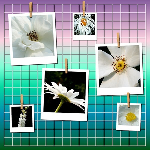
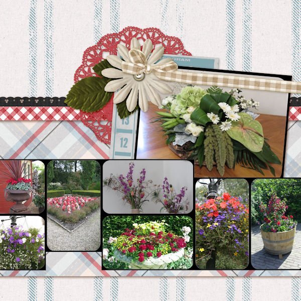
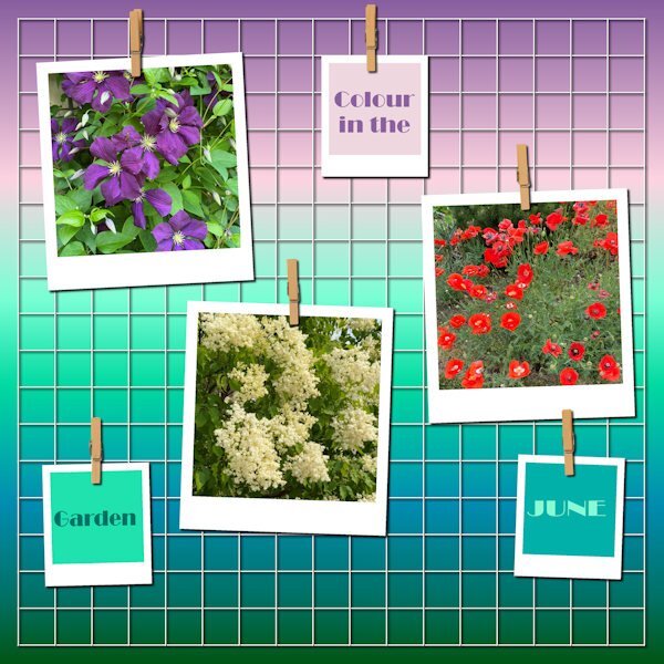
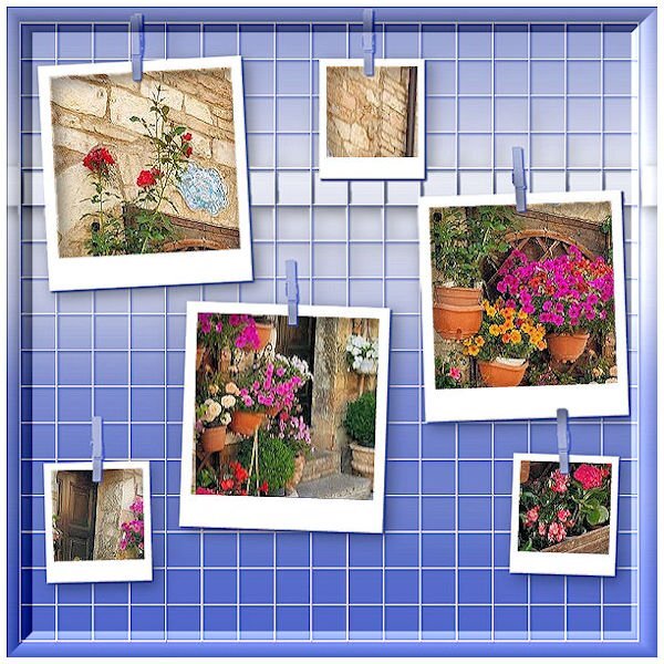
Quick Page Non-Scrap Lesson 6 No words, just photos circa 2010. It was hard to find enough white photos. I will be on a mission to start taking more white flower photos. This is a neat way to showcase photos. I think I'll be putting that script on the list. Now onto the actual Quick Page for lesson 6.9 points
-
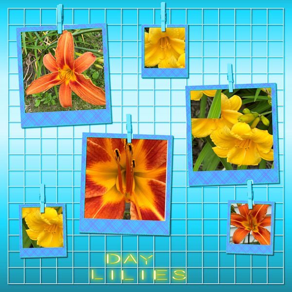
Yesterday I spent some time photographing my day lilies, one of my favorite flowers. I changed the background color and added one of my plaids to the frames. The font is Beon to which I applied the cass neon script. For the text, I used individual letters, but got too impatient with lining them up to fit the squares.8 points
-
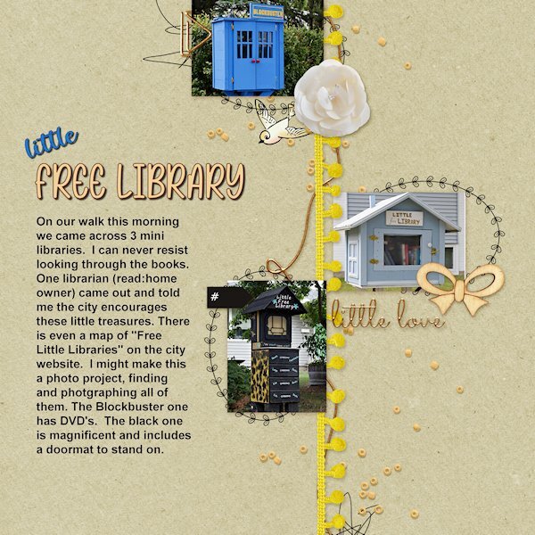
Quick Page Lesson 6 I had no idea what to do for this one as the photo space is very small and doesnt lend to detailed photos. On our walk today we came across 3 little free libraries. I have known about two of them, but I needed 1 more for the layout. And bingo! There was the blockbuster one (it has DVDs in it). I would like the do separate layouts in the future that shows them. the black one is exceptional. And we got to have a chat with the library owner of that one. Photos: mine, from today fonts: Rose Birth Flowers and Spring Garden Script (both from Creative Fabrica)7 points
-
7 points
-
7 points
-
Today's daily look gave me the opportunity to use one of AnnieC's templates from a blog train a few years ago. I might have used it previously as I totally love it; she's one of my favorite designers. I found the woman's pic years ago while googling for another project. The font is Wanted Signature.7 points
-
Nu was ik in 15 minuten klaar inclusief het zoeken naar een passende foto. Net als Corrie Kinkel heb ik 1 foto gebruikt. Maar de foto was te smal, dus dupliceerde ik het en draaide hem om, lijnde het uit. En VOILA. niemand ziet het. Ik heb een screenshot gemaakt van mijn mobiel omdat ik de foto leuk vind.7 points
-
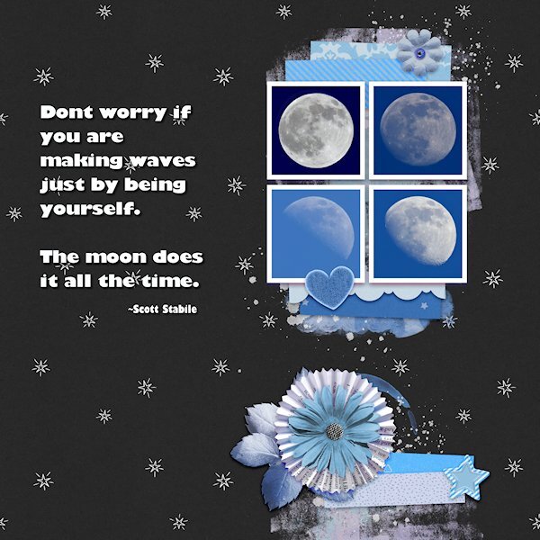
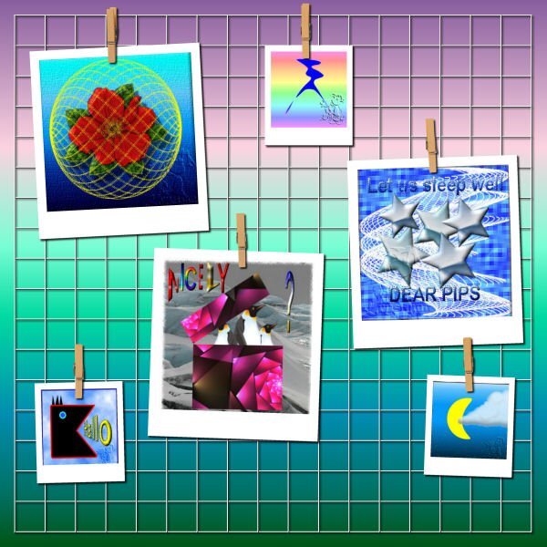
Quick Page Extra Lesson 6 I'm starting Lesson 6 with the extra. I love the layout of this quick page (I mean the QP as itself). For such a small area for the photos you eye is really drawn to that spot. I dont deny it, this is a challenge for my shooting style where it's hard to get photos that fit into a square. It's a good challenge for me. I dont have a great lens for moons, they are tiny in my images so i have plenty of space for getting that square layout. I took some creative liberties with the backgrounds going from the darkest blue of the full moon to the lightest blue in the less than full moon the lightest one is. Three of the moons were actually shot in the day...I call them Day Moons. The full moon was shot at night. I had to extract it and put it on another moons background (with permission of the "other" moon of course). i like using the selection to put the quotes in. I changed the colors using the Hue Map, it took several times going back to it. Photos: mine Fonts: Gill Sans Ultra Bold and Gill Sans Ultra Bold Condensed (windows)7 points
-
7 points
-
7 points
-
Hi, I used selection tool to extract some elements from QP and the title from another photo. vines- picture tube by cassel font - date - chirp7 points
-
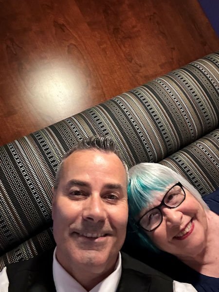
Julie, we are about 2 1/2 hours from Windsor and love to visit. We went to Nero's for our 55th dinner and Vito's the day before. Food is Canada is wonderful. They ban a lot of additives like corn syrup which I think makes the food taste better. I also love shopping at Devonshire Mall where I have been buying my make up for years at Caryl Baker. The photo is a selfie of me and Pete, taken by Pete who has been our server at Nero's for over 30 years6 points
-
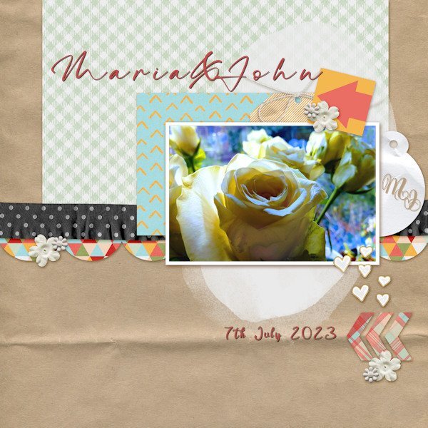
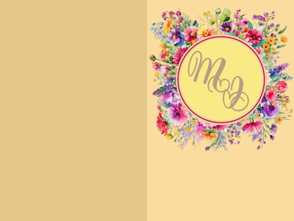
Still on Lesson 5 with some catching up to do on the next two days. I am thinking of using the extra pages templates from Day5 for a wedding card for my neighbours who are about to be married. Fonts: M&J monogram = Yash Monogram, Maria & John = The Billion, Date = Evelyne. Rose photo my own with Brightness and contrast adjustments. The original 'DATE' text I removed using the clone tool from the background. In reality I suppose the text should have been creased like the paper behind it. Can I use artistic licence here boss?6 points
-
6 points
-
6 points
-
I used the QP-7 extra layout. I thought it might take me hours to find and download multiple photos on a theme, so I cut corners by using only two. Both are from Pixabay. Having a nice manageable project to work on each day is such an enjoyable task. I will miss not having one tomorrow! The dreaded blank canvas will be in front of me once more.6 points
-
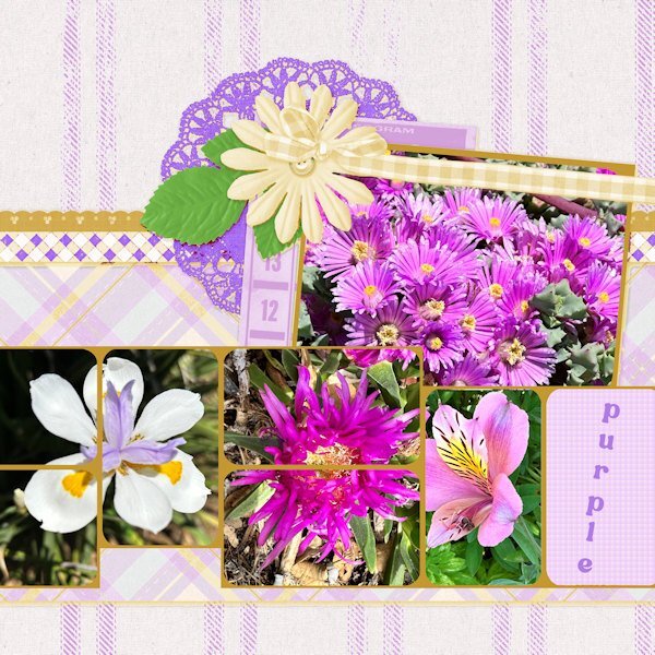
Clearly I am in a purple mood and after making my card I did the Extra 7 layout also with those lovely purple/lilac/pink flowers and then had to change the template accordingly to accommodate them. Hue, Saturation and Lightness did the job here too. I didn't put much text on it, the flowers speak for themselves. The font is Bremlin. Yesterday my album came back from the printerservice and I will make a page with the unboxing of it and show it in What are you working on in June. See you all there. Carole thank you for this QP-Workshop, although it was the 3rd time for me it always brings new ideas seeing all the work of the participants and helped me to readjust at home after my trip.6 points
-
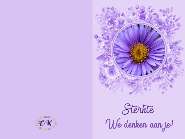
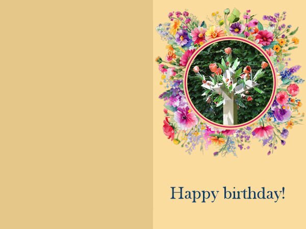
This is a card for a friend who has to have a complicated operation next week. It is not her first and she always says she hates all those very colorful or "funny" well wishing cards. So I made her a purple one by changing the colors of the card into something more monotone based on the purple of the flower. I hope this is more to her taste! It says that we are thinking of her.6 points
-
6 points
-
6 points
-
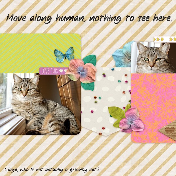
Quick Page Lesson 5 I used the page as is. Added text. Saya is an energetic playful and snuggly girl. But she always looks cranky in pictures. I had put the blinds down to see the computer screen and she kept trying to go behind them so I pulle out over the ledge and she has been using it as her sunning/sleeping spot. Maybe in the winter I'll be able to pull the blinds up again. Font: The Wild Chaos Stamped (Creative Fabrica) Photos: mine, taken a week ago.6 points
-
5 points
-
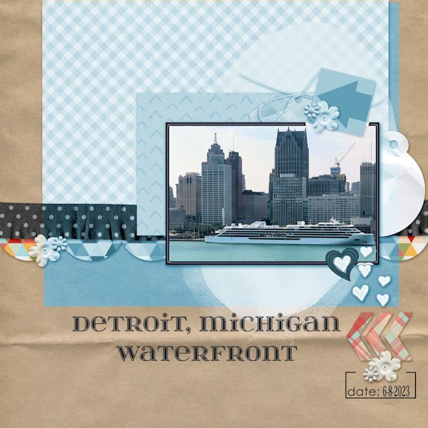
For our 55th anniversary, we traveled to Windsor, Ontario. I took this photo of Detroit from our hotel room window. I changed the hue to better match the photo and changed the white frame to also match. The frame was beveled. Since there was still a little white showing, I added a heart that I created using a cass script offset cutout. The font is itsadzokeS02, an olf font.5 points
-
5 points
-
5 points
-
5 points
-
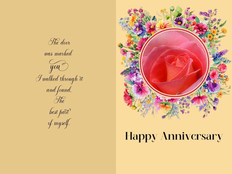
Quick Page Non- Scrap Lesson 5 I wish I'd thought of Mary's idea. Love the change of color you used, Mary. I couldnt think of what do for this and was thinking I'll just pass on it. But once I started looking at pictures, the ideas start to come together. I reduced the Clarity to make it a bit softer and dreamy. I think I should have made it even softer, but I am a chicken. it's a challenge for me to make things soft instead of crisp. It's a good lesson for me. I forgot to credit the quote on the card I just realized. It's a comma after the word "found" but it looks like a period so it seems like bad grammar. I think I will take it out. Quote: Mary Anne Radmacher Fonts: Alevandar (for the quote), Meiland Geogeous (both from Creative Fabrica) Photo: mine5 points
-
I think this is my last edited foto of this course. Friends of mine are in Italy on a summer holiday. Sent me such beautiful pictures so I asked them to use them in this course. As an answer, they sent me their whole batch. I've used just one photo and copied it 4 times and snip snip.? So just a street in ITALY.4 points
-
4 points
-
I was in the mood to do something with QP Non Scrap 4, but it took me time to make a choice for the pics. I used the Brush Script MT-Font - I found again thanks to Carole who "enlightened" me last day, LOL. Fotos are all mine. For 2023 I used the log digits made by Carole, just adjusted the color. For those of you who are interested, you can find it there at the end of this page and request them: https://scrapbookcampus.com/2019/07/theme-camping/4 points
-
So, today, we visited my daughter and I gave her the green room I had been working on. In the travel (3.5 hours), obviously, everything tumbled down as nothing was actually glued, so it took a while to put everything back together. I told her to stay out of the kitchen while I reset everything, and here is her reaction when she discovered it.4 points
-
4 points
-
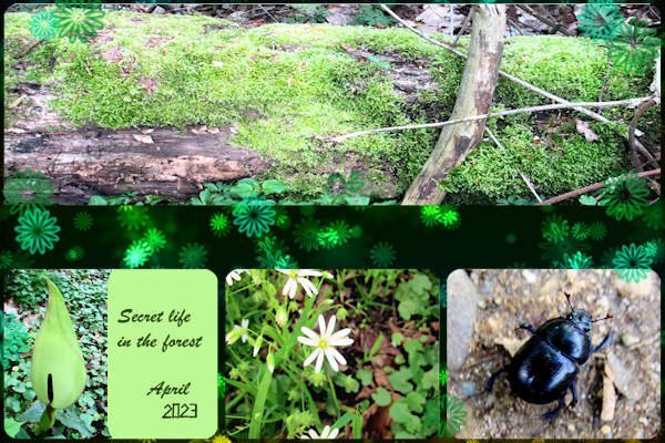
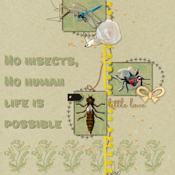
My first attempt failed this afternoon, So I deleted it. No suitable photos. The photos faded away after scaling. This afternoon after a long break I got a new idea, insects enough in my stock. But again they needed a background. I made all the same for the balance in coloring. The three open spaces got a double shade of me after being selected to give them depth. I do have time enough and can work as long as it needs till I'm satisfied, so no problem. The name of the text font is Marly Tail. The flower edge is a 'true type' too named Azalea Ornaments. No shades behind as they are background images.4 points
-
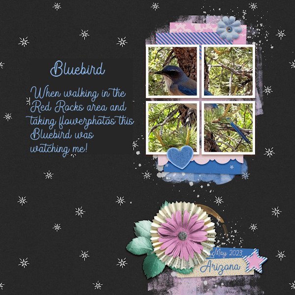
In general I do not like to use very small photos and therefore I placed only 1 photo in the frames. The color blue in the template invited me so to speak to use this photo of a bluebird, a beautiful bird that we don't have in the Netherlands. At first he/she was sitting on the ground between some grasses and I only spotted some blue and when I went to have a better look he flew up and settled in a tree to look what I was up to. I could come rather near and got a couple of photos of him or her. I don't know if there is a difference between the male and female birds. If someone knows, please tell me.4 points
-
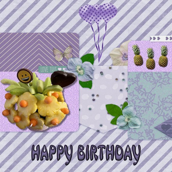
Someday, I will have to remind myself that not every empty space needs to be filled. The edible arrangement photo was taken after I received it from my lovely daughter, Beth. Pineapples are from an AI program, and the balloons are from my build a kit. I changed the hue because I love purple. The font is an olf called Mrs Beasley. The glitter paper background is from one that I made some time ago.4 points
-
4 points
-
4 points
-
wow what an interesting insect, great use of the sketch here is mine, I used the warp tool to make the two papers uneven font is Underwater World4 points
-
3 points
-
3 points
-
If you would like to remove a background outside of PSP, I would recommend https://www.remove.bg/ I use it a lot working on projects with my Cricut machine ?3 points
-
3 points
-
3 points
-
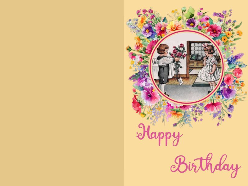
So, this time I didn't change the color of the card. I downloaded a vintage card from PS by Jessica Dunn and used smart carver on it so that both children would fit in the frame. Then (because the top and bottom of the picture were blank inside the mask, I filled a layer with the color of the wall and put it behind the picture. Lots of fun. Susan - I love your anniversary card for your hubby. My husband died 35 years ago and I still think that the best part of me died with him! But that's oK because that means that the best part of me is already in heaven!3 points
-
3 points
-
3 points
-
Such a great idea isnt it. The homeowner I talked to said one person showed up with a bag full of books to put in. She also said she has extra books in the house to replenish with. The "librarians" are really quite inventive with their library structures.2 points













Resized.thumb.jpg.d25811db03a63358cedab1e79f527635.jpg)
