Leaderboard
Popular Content
Showing content with the highest reputation on 05/30/2023 in all areas
-
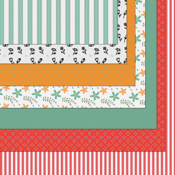
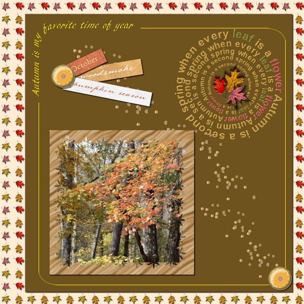
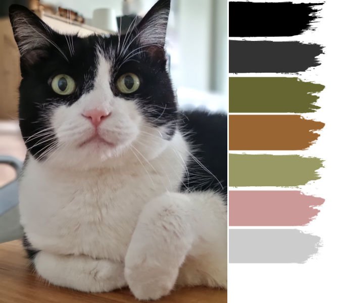
Here's what I've been working on - well, since Cassel did the color palette for the Digiscrap.com Blog Train, I added the freebie palettes, er, swatches, to my materials palette and then since it was open I went ahead and did some papers. I'm not sure how to host them, and I have never posted there before, and I only have 2 1/2 days to make any changes. The red color was one of the choices, but when I had all the papers together I wasn't sure I liked the red with the other colors. Now seeing it, maybe I do like it. So basically, I made papers and will probably never post them. LOL!7 points
-
6 points
-
5 points
-
S is for St. Nicholas. Finally getting back to my alphabet challenge from 2022. The font for St. Nicholas is Ballpark. Santa Claus is from Creative Fabrica and his coat was colorized red because my daughter said it looked like a motorcycle jacket. The holly leave and berries are mine from a previous lab as a paint brush (so I colored the berries separately), the poinsetta is a picture tube. The silver glitter paper is from Donna Sills stash that she shared with us earlier this year which I colorized as silver - the red one I colorized wouldn't work here. The font for Santa Claus is Brandish. I think the St. Nicholas statue picture was from Wikipedia. The frame around it I developed with selections, etc.4 points
-
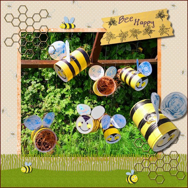
I have finally completed my project 'Bee Happy' so this is what I have been working on in May. I made the hanging bees for the purpose of decorative bug hotels for my garden. In PSP I used the Fringe Effect technique from Lab13 Module 5 for the grass layer & a reverse shadow then added a texture with the grass picture tube. I used various papers and images from the Digital Scrapbook site and studied 6 ways to add borders from the Campus Blog.4 points
-
At first I thought about wedding dresses, then I decided baby clothes would be the most sentimental. I downloaded a kit by Janet Kemp from PS and used Carole's Hanging Photos script. I'm so glad I bought it because it takes a long time to get this result manually. And it's great that it leaves everything on its own layer; I did some rearranging. The title font is Lovely Blooms from CF and on the baby blanket I used Mix Stitch from Dafont.4 points
-
3 points
-
3 points
-
I had very little time to do today's daily look pic. But I had this sweet little kitten from Creative Fabrica* that I fell in love with and never used. I added a mask from Lady22 on a background from AnnieC. The font is, coincidentally, Lazy Cuties also from CF. I added very low opacity drop shadows to everything simply to get rid of the "flat" look. *When we celebrated the campus's 10th anniversary, I won a one month subscription for CF. I've been hooked ever since and cannot foresee ever ending it.3 points
-
2 points
-
Reading the titles found me singing a few bars! This is a fun layout.2 points
-
2 points
-
1 point
-
Michele, this is so cute! I also have the Hanging Photos script, and I like it very much... Imagine having to create it manually? A lot of work!1 point
-
The random draw has taken place and the winners were sent an email. Check out your inbox as I need your replies! ?1 point
-
It is always fun to "play" with the tools first. Then, when you have a project in mind, you will know how it works.1 point
-
1 point
-
so, DH Rob (darling husband Rob) and I was out in the backyard and we were looking at what part of the Mountain Ash is dead and what is still alive (that we would keep, because I love it and because it's a bird favorite and part of the squirrel highway to the next yard). I told him about the bug hotel and he was like, no problem. I guess after 35+ yrs together, he just goes with the flow. Gotta love it.1 point
-
1 point
-
Oh Ann, so glad there are others who feel the same as me about lawns. Interestingly where I have been walking in the unmown grass I have created a natural path. Probably all the dandelion seeds blew to my neighbours though, which won't please them!1 point
-
1 point
-
I'm sure my neighbours cringe at my "lawn" it's mostly weeds. Weeds are green, it's look the same to me as when it's mowed. I wont allow pesticides on the lawn that animals go on, I have reluctantly allow ant extermination around the perimeter of the house as I do not like ants in my house, thankfully the "ant garden" where the mound is for the birds is out by far end of the garage in the back yard.1 point
-
Thank you for the explanation on Bug Hotels , it's really quite interesting. I inadvertently followed your no mow May objective too. I love dandelions and lately have been photographing them. I put a "no-mow" decree on the the backyard (to my husband) and it was gloriously yellow and the seed heads were stunning, until the wind blew them away, and I cut some to photograph (soon to be in a layout). I had also read that bees hibernate in the ground and they need the dandelions as the flowers aren't out early enough. I did not know this. My husband was saying he hasn't seen as many bees on the dandelions as there usually is. How sad is that. This year my tiny garden (I am a terrible a growing things)got a soil refresh and I was lifting up some small paver stones and there was an ant colony. I felt bad so I put the stones back and covered over with the really fine soil/dirt they seem to make . So, they still had their solid roof, then I used the cement pavers to mark the edges of the ant "garden" section and that's where the little brown birds go for their dust bath. They dont like the garden soil but they love whatever it is the ants make. Also the Magpies and Crows will use the ants to eat the mites off them (there's a word for it, but I forget right now).1 point
-
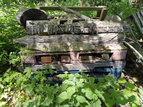
Hi, Bug hotels as they call them come in all shapes and sizes and I think started out by people leaving old bits of wood and leaves in a corner of a garden so the bugs could have shelter. I've seen huge ones made of layered pallets (not PSP palette layers!) in-between which would be all sorts of organic matter. Our councils in UK place them in parks or wild areas, some made of decorative carved wood or use bird boxes with the fronts replaced with things like bamboo, straw etc. Kids like them and it's a way of introducing them to the importance of natural areas and gardening. Susan, you will now need to make your own bug hotel to go with your bird baths. Michelle, I try not to use insecticides or such like chemicals and make compost for the garden from vegetable scraps and also get a bit of exercise digging the heap over. We have a smallish lawn that this month I have let grow wild as encouraged by the environmentalists to help wild life thrive mainly for pollination purposes, so called 'No Mow May'. It doesn't look tidy but it's not a problem. Now you've given me a couple of subjects 'vegetable garden' and 'No Mow May' for other scrapbook projects. Hopefully I won't take so much time doing those ones!1 point
-
1 point
-
1 point
-
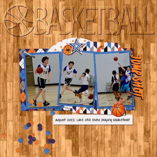
Love your layout! Amazingly, that is one set of SWL templates that I don't have (and I have a lot... over 42MB of her templates). I do have the cutout version of the globe though. Liz has had some wonderful shape templates over the years including the now retired cutout sets for all 50 states, DC and USA. She also had previously done over 10 years ago some state templates that had photo spots inside the shape of the state. She never completed the series and retired them before she moved to The Lily Pad in 2016. I have been using some of her cutouts as titles on pages and experimenting with different ways to highlight them. These were my latest (basketball done in March and the other in April).1 point
-
1 point
-
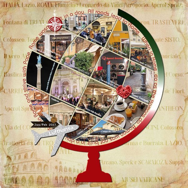
Here is the layout. I had to start from zero, as I got the message "Unable to open file" as I was almost finishing it in PSP 2023... I think it has to do with the text tool, but not sure...So I recreated it in PSP 2019 just to be sure. Credits: (1) Template: SwL_AroundtheWorldTemplate2 (2) Heart ps_janet-scott_33385_be-mine-brown-crochet-heart_cu.png (3) Carole: Basic background paper following the Lab5-09 Text paper tutorial, and a paper from the internet... Also used the Custom Coin script.1 point
-
1 point
-
1 point
-
1 point
-
1 point
-
1 point
-
1 point
-
Finally finishing up the April Double-Page Challenge #6. Here is Shadow, one of the star black leopards at The Wildcat Sanctuary in Sandstone, MN. She's quite a gal! I used the Vector Tube script on the title and the font is Ravie. The journaling font is Kleymissky. The background is my own Shiny Paper and the stars are from my Rustic Kit. The paperclip is from Marisa Lerin and I used the Open Book script with a gradient cover.1 point
-
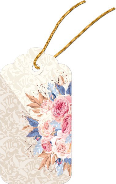
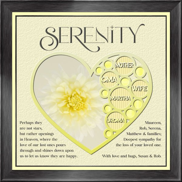
I havent made a tag yet. An unexpected passing away of my sister-in-law's mother on Sunday had me working on my condolence layout instead. Whew, that goodness I was able to go back to the Build A Kit workshop to the frame section and follow the instructions again. I used Lab 13-1 again for the shape, hearts looked weird inside hearts so i used circles. Frame is using Add borders from the master class Framing 101. My photo, and fonts are Romantic Serif (title), Sea Gardens (words in the template) and Audaciti (journaling). The title does have a bevel to help it stand out a bit, also has a very small shadow. reduced opacity on the title and journaling because black was too contrasty. I used the selection tool to fit my words in on the left side. the right side I just used a right aligment as it looked better that way. Nothing bad to report with PSP 2023. today it outshined me and any issue's I had was my dull brain at work and not paying attention.1 point
-
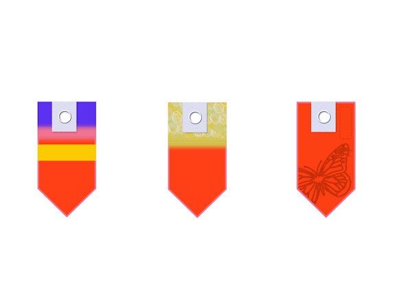
I am going over the Tags Masterclasses and just trying to create examples of tags. I haven't had time to apply to any designs. When I made the rectangular selections for the striped effects I used a ‘Feather’ value to blur the edges. My VectorPaint script did not work to start with until I realised, following the first Tags Masterclass, that after drawing the rectangle, I needed to right click on the rectangle image and ‘Convert to Path’. I didn’t see the ‘Convert to Path’ instruction in the latest Masterclass so I wonder whether it could be a difference in the versions of PSP we are running? I am on Ultimate 2021. My F11 key wasn’t working but I looked that up in View/Palettes/Brush Variance or Palettes/Brush Variance. Note to self!1 point
-
1 point
-
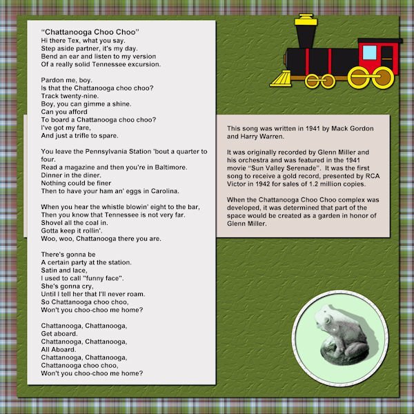
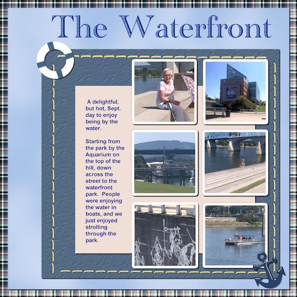
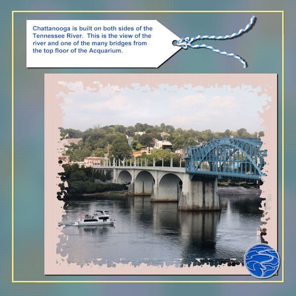
So, here is my next Chattanooga Trip layout. The font is Academy Engraved LET and I filled the open areas with a pattern taken from the water of one of the pictures. The anchor element came from NicePng and the lifesaver element came from pixel scrapper - Jessica Dunn (One of my favorite designers).1 point
-
1 point
-
1 point
-
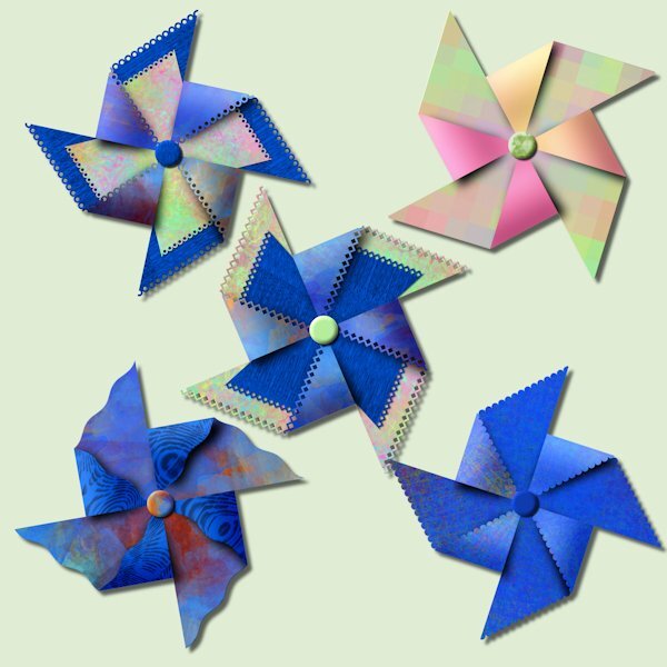
I cant find the post about our purchases from the recent sale so I'm posting here. I had a pinwheel party tonight. There is limitless combinations you can try, it was fun. I used papers from just watching A Beautiful Mess masterclass. And one has gradient on the folded forward part (pink&orange) that I had made previously. It's really quite something to watch it come together.1 point
-
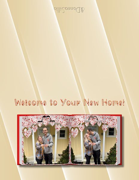
I have a separate folder for my 64 bit plugins. I copied the Abstract Curves plugin to that folder and directed my file locations to that folder, and it shows up under Effects plugins. Here is a sample of a background where I used Abstract Curves to make a background for a card that I am making for a new home party for my great niece. I thought the lines sort of echoed the slats in the house. You can easily change colors, and I wanted to match the house colors.1 point












.jpg.7b3dc44050b714059054bd837415688e.jpg)
