Leaderboard
Popular Content
Showing content with the highest reputation on 04/30/2023 in Posts
-
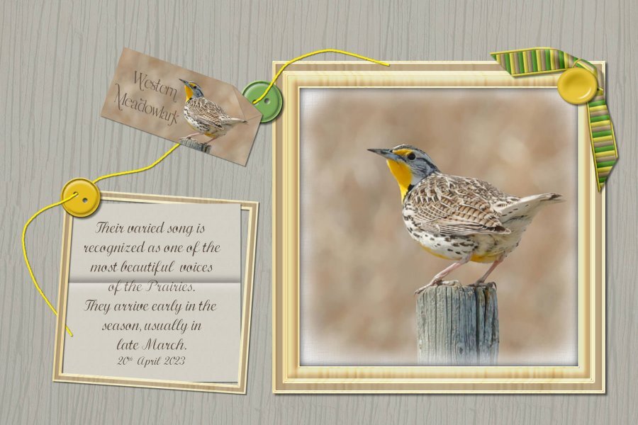
I like this challenge, it's not a lot unlike the scavenger hunt, or bingo challenge, which are my favourite challenges. I'm not accustomed to using buttons in my pages. Nor do I have any button scripts, hence I made my own. I don't have the folded corner, or folded paper scripts either. The paper was folded, but when opened out, you still have the fold. The knotted ribbon, is one of Carole's scripts. The frame is my own, made especially for the photo.7 points
-
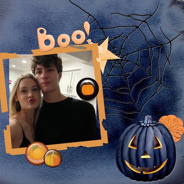
I love when new challenges are posted. They give me focus and get me trying layouts for a reason. This has the Hallowe'en theme b/c the photo of my grand-nephew was taken then last fall when he and the girlfriend went out. That accounts for the dripping blood marks on her neck! Using buttons and folded elements is difficult for me. I never know where to put the darn things. The black button on the photo was placed to hide a clock on the wall!6 points
-
I'm making an effort to participate in more challenges and for a change everything is mine. I used cass's brad factory and filigrane scripts. It's my first 1-2-3 challenge so I hope what I did qualifies. Any and all suggestions are welcome.5 points
-
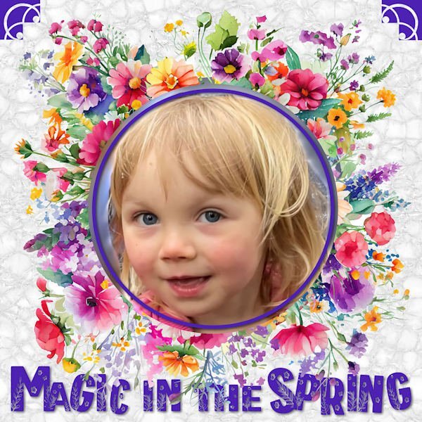
I combined Carole's flowery spring frame with the flora font, added my great-grand Magic with a little linoleum as a background and two corner brushes and came up with this. I sort of thought the font would look a little puffy on its own but mine didn't so I helped it along with one of our title lessons from March.4 points
-
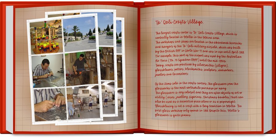
here is my day 6, I am not so good in Journaling so I made a small selection und copied the text from Wikipedia I used the open book script, airbrush paper script and the curved photo script4 points
-
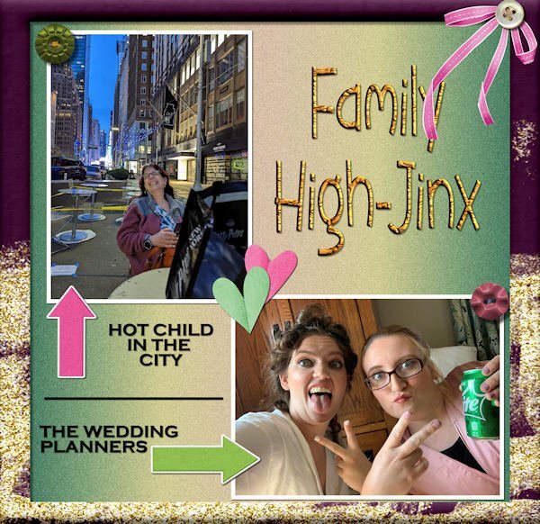
Figured it out - decided on folded hearts and a bow. 3 buttons and a frame round out the requirements. Here's my daughter, Laurey, top left; granddaughters, Ilana & Jackie, bottom right. All the decor is from my stash; frame from PSP frame. Edit: I forgot to mention the background is a PSP gradient called Nature Glow and I added some noise for texture.4 points
-
Back in the day when I was learning to make webpages I acquired Note Tab Plus as an alternative to the Windows Notepad. Note Tab numbers the lines so you can find your place in the code. It also has little scripts of its own to automate repetitive tasks which made things easier. I still use Note Tab. It's a Swiss product and I always had the free version. I don't code any more. Left it behind when I transitioned to Dreamweaver for webpages. Honestly don't miss it. Not my favorite thing.3 points
-
I'm entertaining those thoughts, but still still a litte frightful of coding. Not in the 'grizzly-bear-chasing-me' frightful, more like when I'm stretching on the floor after I workout and i turn my head...and....THERE IS THE MOTHER OF ALL SPIDERS STARING ME AND LICKING IT'S LIPS. Spider lips are the worst!3 points
-
I COULD show you some of my tricks if you want, although you have to not be scared of code!3 points
-
3 points
-
Many, many thanks Cristina. I suppose being minimalistic, with some fine details, could be my signature.3 points
-
I combined four or five different backgrounds including an old swirl I had made; erased some areas, used negative image on one, and played with the blend modes and opacity. The font is Rambutan from an old $1 deal from Font Bundles. Using the text cutter is a fun difference sometimes.3 points
-
I have always steered clear from using pre made frames, including the psp frames. I create a one of a kind frame for each photo. All to often I see frames that are not of equal proportions, or if they have been rotated, the shadowing is wrong. The majority of my frames are used only once. Personally I enjoy creating unique frames. Carole now has a frame script, for convenience and time. Also she has 2 frame materclasses.3 points
-
I would strongly discourage you from doing that as it will distort when used in various situations: if you have a square frame to start and use it on a rectangular image (or vice versa), the proportions on the edges will be inconsistent if you have a frame of a certain dimension (say 1000x1000px) and use it on something larger (say 3600x3600), it will become blurred This might need a blog post as you are not the first one thinking that.3 points
-
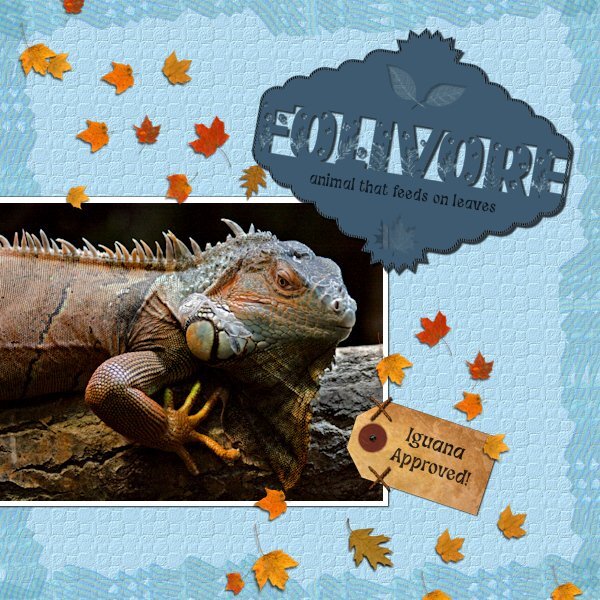
I combined the April Front Challenge with Lab 6-8 Stripe Ribbon Custom Label Cross Stitch I didnt like my Stripe Ribbon so I put all 4 together, merged and made a couple layers and used it as a border with a blend mode. The Custom Label; I saved the two parts before putting together and ended up using that version with the Flora Gardent font for the challenge in between. I hummed and hawwed with the edging, if I should omit it from the text or continue it. I tried just the top and bottom of the 'E' but it looked unfinished, going around the th outter edge looked weird, so I just closed it all up. the shadow needs work on the offset so it makes it hard to see. I believe the pictue tube leaves are Carole's. The tag is KMRD-My Fathers Study Tag 01. The Cross Stitch I used as two stitches to hold the tag on. The photo is mine I found while cataloguing shoot dates. I had passed it off as a bad photo, but thought I'd see how much I could do. Adjustment layers were used and I made selections and used the Adjust option on the top of the tool bar for selections (3 different ones in total). Does anyone know if you can make separate adjustments layers for selections, would I need to group them so the adjustment doesnt affect the whole photo? I used a texture layer on the backgound to simulate reptile skin. second font is Funky Grim (CF). This was fun to do and a surprise at what I did with the photo. Cant wait to get better at the photo editing/adjustment layer part of it. Again, I must add, my monitors are very bad so i really have no idea what anything I do looks like.3 points
-
3 points
-
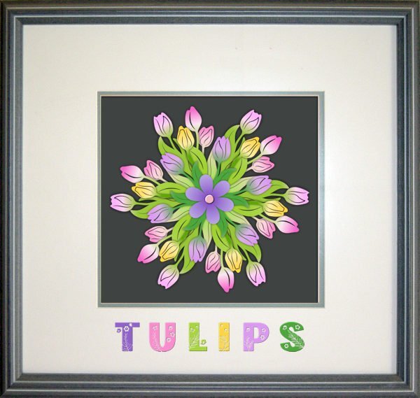
By mistake I had downloaded a 3D flower mandela with 6 layers, colored and in png format. I had now clue what to do with it but decided to "assemble" the flower to give it a try before deleting it. The normal shadows didn't give a good result so I tried shadows without an offset and a blur and opacity from 100% on the backlayer to 40% on the toplayer and the little heart has a slight bevel to let it stand out a bit better. I choose a frame from the frames inside PSP and used the Flora Garden font with different colors. At least I had fun making it!3 points
-
2 points
-
The whole class is $60. As for non-English in coding, you might be surprised that most of the commands are actually using English words as the language is Python and it is English based. Have you ever opened a script in Notepad? And of course, you might still want to rely on ready-made scripts. I have over 15 years of experience in scripting, so even though I started with that same exact course, I have learned more since. But, at any point, if you change your mind, you know where I am!2 points
-
Cristina, I'm so glad you are back at it. I know about a creative slump. It is my norm to start any creative project and go through phases of liking and hating it. Often having to set it aside for days (months and years too). it's frustrating to sit down to create and there is nothing. When I do photography (if I'n not in a current project) it takes me a while shooting to get warmed up. My creative juices arent like tap I can just turn on, more like a slow leak that takes time to become a bigger leak. Often doing something as far removed from photography and layouts gives me inspiration...as does the campus (in a big way). Want some really cool ways to make paper, I just watched the master class A Beautiful Mess. It's really good and it just has you playing around with effects/techniques. I highly recommend it. Sometimes creating with nothing in mind is a good place to get inspired2 points
-
2 points
-
2 points
-
I am not very good at scattering which is why I purchased the scatterbrush script. After experimenting, I created a star scatter to use on the glitter papers that I made in my kit. The original image was 500 by 500 px, made seamless with Effects and put on a new raster layer above the glitter paper. I added the pattern and changed the blend mode to dodge. The script was just what I was looking for to make scatters.2 points
-
2 points
-
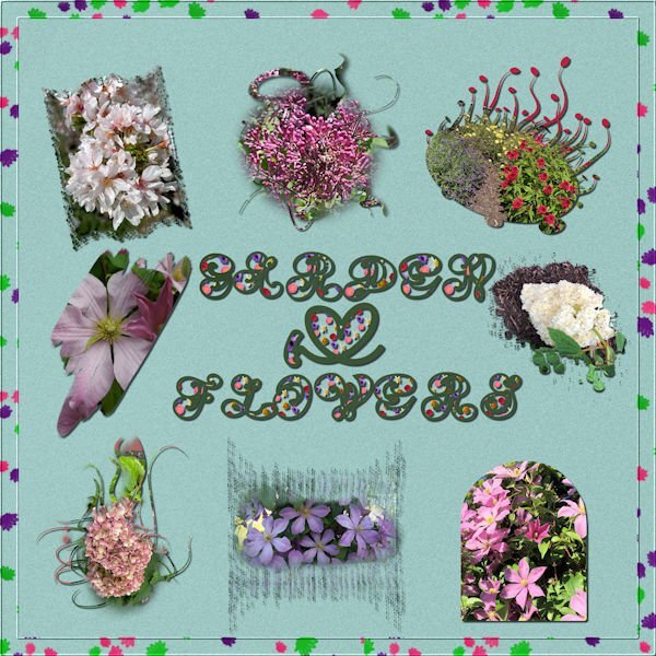
This thread made me realize that I had already purchased the raster to mask script. I used it on my flower pictures. They are all from flowers in my yard. I also used the seamless pattern script to make the letter fill and the scatter script for the border. The font is Amen which was on my computer. It is not as clear as I would have liked it. The background paper is a solid paper from my kit. Most of the masks are from brushes except one.2 points
-
That is often a motivator for members. I often use buttons either in clusters or in corners, a bit like they are holding the photo. But that is far from the only way to use them!2 points
-
I am not sure what the original size is for the pre-loaded frames, but notice that in the preview, you can see if they should be square or rectangular, vertical or horizontal. I think the PSP frames are a good way to go fast for someone who does not know better.2 points
-
this time i bought lot of wonderful things not all used, Airbrushed Paper - PSP script Contact Sheet - PSP script Open book - PSP script Stack'n Cluster - PSP Script Color Paint - PSP Script Curved photo - PSP script Paint Splash - PSP Script Pop Art - PSP Script Split Photo - PSP Script Watercolor - PSP script Netting - PSP Picture Tubes Skyline 2 - Picture Tube Spiral Binding #1 - PSP Tubes Colored Pearls - PSP Picture tubes2 points
-
Scatters can be many things including paper or metal. They can be translucent or not. If I use a scatter there are times I don't even use a shadow. But for the most part I use a very small offset (maybe 1, 2 at the most). The opacity is usually 50 or lower with a blur of no more than 10. But there are times the the scatter item is thicker so the settings would need to be adjusted just like adjusting for different types of flowers or frames.2 points
-
The question is not whether the scatters need a shadow but what shadow to add. Anything that might be made of paper or such would require a shadow, but when you are talking about translucent elements, that is trickier. Maybe you can get some details in the Shadow Challenges Master Class. However, you are probably on the right direction with reducing the opacity. Remember that the more translucent something is, the less shadow it casts since the light goes through more.2 points
-
1 point
-
Yes, I’ve opened it in Notepad, but then I panic when I see all the symbols. YIKES! HOWEVER, I have written a script myself, and it is one I bound and use every single time I open PSP. (I wrote it by performing the steps and having PSP record it).1 point
-
Yes, once you BUY anything in the Campus, you get the permanent access. I still have the written notes printed and bound. I keep referring to them, years later!1 point
-
You have access, and Carole added videos to the course, which is very helpful... After the course last year, I started to review the lessons, but then, my husband and I started to travel (to make up for covid times), and I didn't continue... If there is another class this year, I will participate again.1 point
-
I plan on another cohort for the scripting course. Last time, I started it in August, with 2 lessons per week (I was also making videos to illustrate the lessons and add information about changes in more recent versions). Maybe you would like to join then.1 point
-
Susan, you can try and see if this is for you... Sometimes, the fear makes the spiders bigger than they really are. ?1 point
-
And that's when the scripts get longer and longer! And we are so thankful for all the options! ?1 point
-
Beautiful Anja. I have two of those scripts. I dont have the airbrush paper script, it sure looks great on your layout. Another one to add to my wish list! Love that font too.1 point
-
Yes, you have that option. When I code scripts, I try to offer as many options as I can.1 point
-
1 point
-
1 point
-
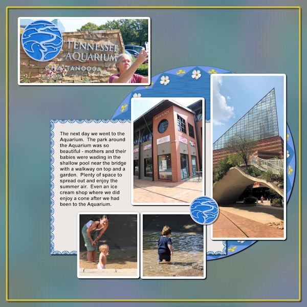
Back on Chattanooga. This is about the park surrounding the Aquarium. Anna and I enjoyed this day - it was full. The picture Anna is taking of the Aquarium sign is what I chose to be a title for this layout. I put a Cass stitch around the journaling paper; I made a brad from the Aquarium sign. The background is the same one I used for the 2 Aquarium layouts I did (which were the first layouts of this trip that I did).1 point
-
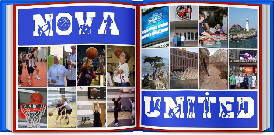
I'm not finished but here is what I have created so far. I decided to use my basketball group as my theme. It has been harder than anticipated as good photos are hard to find. NOVA United celebrates its 20th anniversary this September. This page features some play and places we have played and other projects we participated in. Does not come close to represent everything. I decided to use the open book script...just because.1 point
-
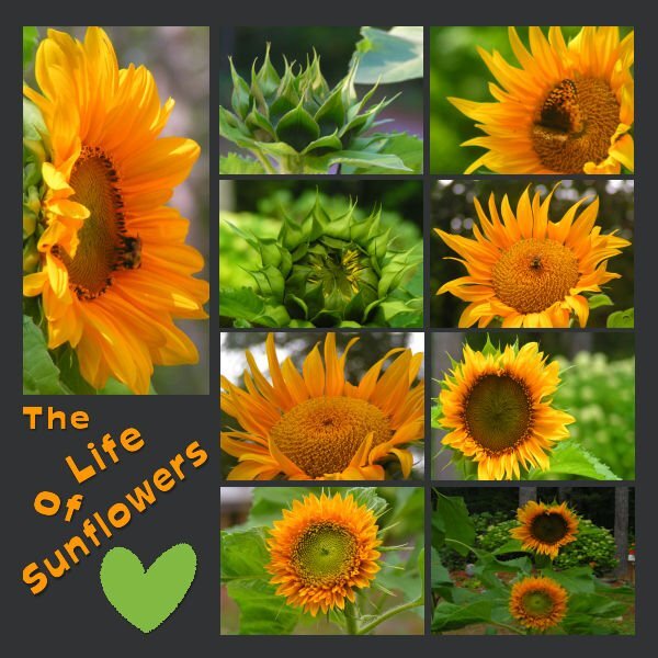
Day 1 I have managed to get some work done this week (between the computer and an external drive) in spite of my full disc. I plan on continuing to work on some more of the lessons this week! I have thoroughly enjoyed all of the fabulous creative work that has been posted during the workshop. My pages were Sunflowers from 2022, they are dwarf Sunflowers that I grew in containers on a tabletop. I live in a woodland setting with spots of sunshine, but I have always loved Sunflowers. I have read that you can't grow them under trees, but I think this proves them wrong! If you don't have much space to garden, I would highly recommend giving dwarf Sunflowers a try it is very rewarding!1 point
-
1 point
-
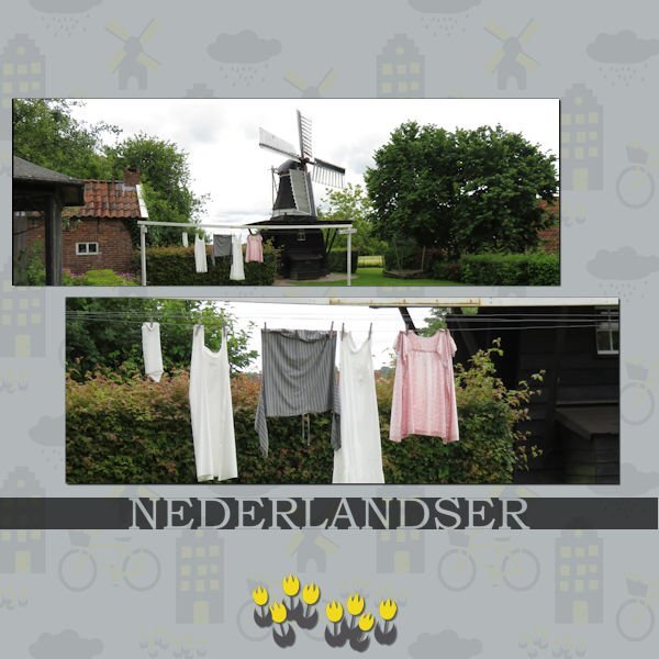
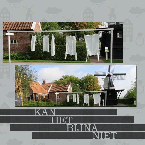
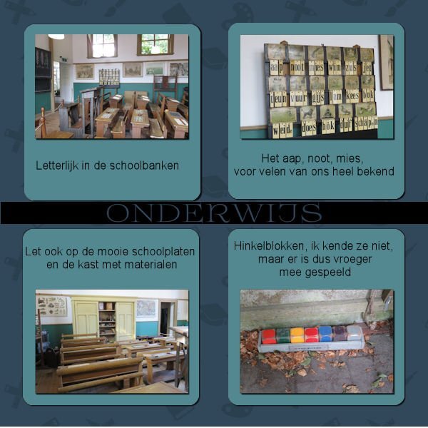
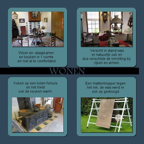
I'm almost glad Mary is also late with her projects. Had a busy week last week and when I finally sat down ,nothing was to my liking. But here's day 1? My project will be about a museum in the North of the Netherlands. I used Carole's Cut out phrase script for the text, Arial is the font and also Book antiqua, one other font I don't know. I think the template came from pixelscrapper1 point
-
1 point
-
1 point
-
1 point
-
It is not online for the most part. The notebooks are saved on your hard drive. I do not use any of the online features of any Microsoft programs aka OneDrive. I have copied notebooks from old computers to new computers on my own. If you choose to sync your notebooks between computers or other devices (iPad, tablet, phone), then yes online is needed. I don't do that. I even have 2 computers (desktop and laptop) and I do not have them sync. I don't need everything on my laptop that I have on my desktop. When I do need something on the laptop I use a thumb drive to transfer the info.1 point






Resized.thumb.jpg.d25811db03a63358cedab1e79f527635.jpg)
