Leaderboard
Popular Content
Showing content with the highest reputation on 04/25/2023 in all areas
-
9 points
-
9 points
-
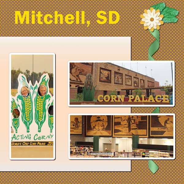
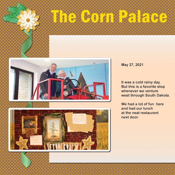
OK, Project 3. I've used photos with less opacity before, but this is the first time using one on 2 separate layouts and combining them in a double page. As you may see, this wasn't really done well, but as they say, it's good enough for government work LOL. I'm not going to redo it. The subject matter is dear to me. I discovered this monument when Laurie, Joe and I took our RV trip out west to visit family and extended family members after the Covid lockdown; it is located in South Dakota. I love history and am fascinated by the desire to link various areas of the country by highways. There is another highway out east that I discovered on a trip with a friend many years ago. The monument to the road developed from Washington DC to Springfield, IL is located in Zanesville, Ohio. It is located in a building and the monument is a beautifully done series of dioramas showing its development as time went on. And then, of course, we now have Interstate 90 which links New York to Seattle, Washington. Interstate 40 is a very busy highway also and goes from near the eastern seaboard almost to the western seaboard in California. As I love to travel by car, the history of roads really appeals to me.8 points
-
7 points
-
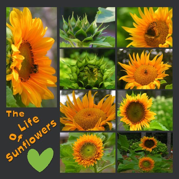
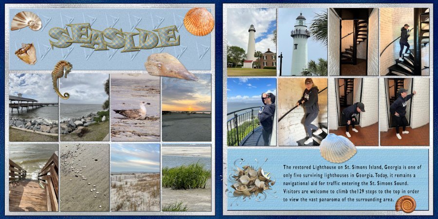
Day 1 I have managed to get some work done this week (between the computer and an external drive) in spite of my full disc. I plan on continuing to work on some more of the lessons this week! I have thoroughly enjoyed all of the fabulous creative work that has been posted during the workshop. My pages were Sunflowers from 2022, they are dwarf Sunflowers that I grew in containers on a tabletop. I live in a woodland setting with spots of sunshine, but I have always loved Sunflowers. I have read that you can't grow them under trees, but I think this proves them wrong! If you don't have much space to garden, I would highly recommend giving dwarf Sunflowers a try it is very rewarding!6 points
-
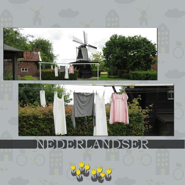
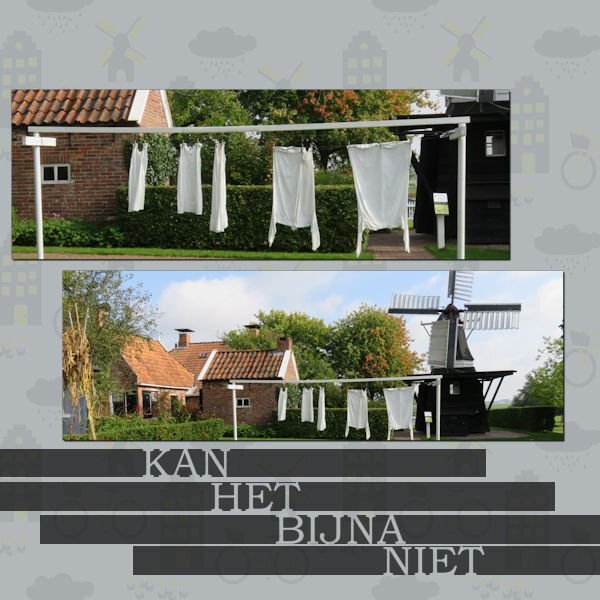
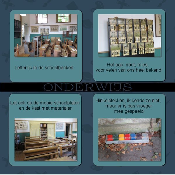
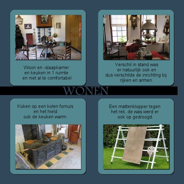
I'm almost glad Mary is also late with her projects. Had a busy week last week and when I finally sat down ,nothing was to my liking. But here's day 1? My project will be about a museum in the North of the Netherlands. I used Carole's Cut out phrase script for the text, Arial is the font and also Book antiqua, one other font I don't know. I think the template came from pixelscrapper6 points
-
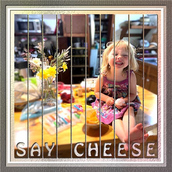
This is a sample the of the flyer "spines". the big one is a shiny very thin 1/4 fold furniture flyer, the upper right is Safeway (food always makes cool colors on the spine) and bottom right is another thin, not shiny 1/4 fold Michaels flyer. They make neat patterns. Not sure what I'll do with them but maybe one day i'll figure it out. Right now, they just look cool to me. This is a layout from a past sketch challenge.4 points
-
I didnt use the template, just made the masks myself. Raster-To-Mask would have saved me a lot of time. On the other hand, I've finally committed to memory how to make the masks. Actually, it really didnt take that much time to make them. I wonder which would be faster to see. Carole making a mask or the script making a mask...my bet is on Carole.4 points
-
Paper is from digitalscrapbooking from Janet Kemp The mask I made with Cassel's script cass-MaskMaker Font: Flora Garden and Misha Gergoval3 points
-
It is my favorite, also, and I use it all the time, though I think I've encountered a glitch when working on a template that started as a PSD. One of the photo areas would not turn to a mask and went all white.?? I ended up doing the mask by hand (had to drag out my written instructions...the script has got me spoiled!)3 points
-
I got one called Confetti Maker and one called Punched Confetti. I couldnt decide, so I got both. The Build A Kit workshop really taught me that I want to make more of my own elements/papers etc, So I bought things with that in mind. That workshop had a big impact on me. And now I see the value in the Double Page layout too. Love the workshops.3 points
-
My favorite script is not a fancy one with which you can make great layout but the humble "Raster to Mask" script. It is such a time saver but I did buy it on another occasion. From this sale it has to be the "Custom Confetti" and I only gave it a quick try, because this weekend we had visitors and I wanted to finish the Double Page Workshop first. But I like that it makes confetti from any image design or shape, so it will always match the project I'm doing.3 points
-
Monique indeed it is Dutch through and through, much more isn't possible! Nice topic for this workshop.2 points
-
Ann I had the same problem as you and needed to do that one by hand too with the same result to drag out the instructions! I agree that script gets one very spoiled, but I continue to use it frequently.?2 points
-
Thanks, Rene. It was the Yin_template 501.psd that I used for the scattered photos for Lesson 4 of the Double Page Workshop. I think two of the photo areas refused to process with the raster-to-mask script so I did them by hand. The script saved a lot of time considering there were 19 photos all told.2 points
-
I have only ever used it on PSD templates and have had no problems. I'm guessing it was something with the specific template that caused the glitch. I scrapped 4 of my week in review templates yesterday and used the Raster To Mask and Merge Group Rename on all of them. Worked so well, I did bind them to my custom toolbar!2 points
-
2 points
-
2 points
-
And here is day 6 and the last of this workshop! The left side of the double page has photos of a few of the lakes to show something more than the mountains which I love so much. On the right side are some details of the country as a whole. The background is as in the lesson but when I had the left single page background I mirrored it to the other page to avoid a noticeable seam. The embellishments I already had done some time ago and could use here again. Between the photos I used the picture tube water. Fonts are: Lucinda calligraphy and Joaquin Regular which I used throughout this Workshop.2 points
-
Here is my photo project for Assignment #1 of the Double Page Workshop. It is in Memory of my Dad "Digger" Don Carey who passed away in July of 2003. This July will be 20 years since his passing. He was a wonderful husband, father, and Grandfather. He was married to my mom for 40years before he passed away he raised 3 great-kids (myself and my 2 sisters) I am the baby of the family and the only boy.(Aren't I Cute LOL) The baby in the last photo is his only grandchild my oldest sister's daughter. Sorry I'm a little behind on the projects but it's been a busy week. Hope everyone enjoys this as much as I have enjoyed viewing the rest of the projects here.2 points
-
hahaha, you crack me up. Not sure if you remember that abstract spines of the flyers I was taking pictures of. It's those. I keep saying to myself I"m not going to bring home any more flyers. But I see some with a cool color combo or design and I end up at home wth copious bundles of flyers. I'll post a few, but right now I'm late leaving for work. Work is such a hassle when it cuts into my creative time.? PS. they are quite dead (if dead means "stale dated").2 points
-
2 points
-
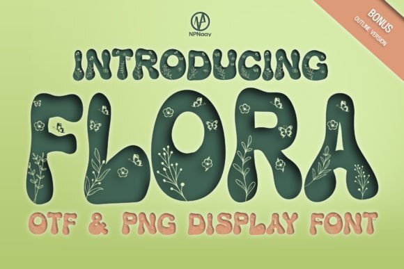
Whenever you create a project, it is likely that you will want to use some text. In this case, you might be looking for some interesting fonts to showcase titles or dates. This month, you will get the opportunity to download a free font that is a little different than usual. You can get this free font at Creative Fabrica. Do you have a nice spring photo or story to share to showcase this fun font?1 point
-
With all the shopping you did, yesterday, for the Birthday sale, what is your favorite purchase? Why is it your favorite? Can you show a sample? There is still time for others to follow your recommendations.1 point
-
The museum is also a memorial for Zane Grey (obviously Zanesville is his family home). Zane Grey wrote 3 books about his Zane ancestors which are very good even though they are novels and not biographies. I was really impressed with that museum which is located off the highway (believe it is federal highway 40).1 point
-
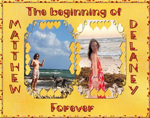
I'm still playing with the scripts that I purchased. A new one is cass-scatterbrush which I love. I made a heart pattern and used it to fill a border on an 11by14 image for my grandson's engagement that I would like to have printed on canvas. If there are any suggestions for improvement, please let me know.1 point
-
At first I was copying the text documents from each script into a WordPerfect document but that was a pain when I wanted to look up the info when I ran the script. I also have them on a spreadsheet I keep with info about Scrapbook Campus, again putting the info from the text document on it. But it was also a pain to look up stuff when running a script. So I took the time the other day to set up a tab in my OneNote Scrapping notebook for the scripts. I have a page listing all that I have purchased and another page for my "to be purchased" scripts. I then organized them by type - Tool, Element, Photo with the main page listing all scripts bought from that category. Each category then has a page for each script where I copied the text document. I have thought about putting the preview on this page as well for each script, just haven't done it. When I was playing with some of the scripts the other day, I had OneNote open to my scripts section and would have the info on the script I was using on my 2nd screen. Really helped since with some scripts you need a blank canvas and I can never remember which ones!1 point
-
Very much. I have a number of them where I did the bargello pattern. Your script is on my wish list for the next sale. My original inspiration was from a glass artist who made complex bargello patterns in fused glass. Soon I as I started where I work now and saw the spines of flyers or paper sections I knew I wanted to do that with paper. The whole project was supposed to be called F & G because that was the sections of the paper that I inserted on those nights. My co-workers thought I was nuts, now they dont even bat an eye when they see me taking bundles home. (these are left over bundles, sometimes there is really cool patterns but that flyer will run out so I dont get them)1 point
-
My favorite script is cass-alphaseparator which I actually downloaded by accident. I have found this script really helpful in making adjustments to my Titles and words because the script does all the work of separating and formatting for you on the vector letter.1 point
-
Rene I did bind it to my toolbar too, it's so convenient that way!1 point
-
Inquiring minds want to know what KIND of "flyers" are you "ejecting"? Are they alive or dead? ?1 point
-
I have just played with the Open book script so far. When I saw Gerry's book I had to have it. Now I'm going to add the Merge Group rename too to my wish list. I always think I will go back and rename it, then I dont. I bought 24 items so it will take some time to get them all installed and tried out. I did buy lots that would be good for making kits, like button machine 3, a number of bows, some tubes, confetti maker, paper pattern type scripts and the two tone font. I'm looking forward to playing with that one. After watching the Vector Master Classes and now on the Brush Variance classes I can see how that font will come in handy. I could see scheduling in time for just playing with tools to see what they do (with assistance from the master classes) without having to think of and end layout in mind. I'm taking a PSP short break while I catch up on an ongoing abstract photo project so I can eject the flyers (I'm photographing) out of my house.1 point
-
Rene, after seeing your comment, I added this script, Merge Group Rename, to my Wish List. Ann and Bonnie, like both of you, I also got the Open Book Script. ? I am sure this script was a hit this time, thanks to Gerry Landreth posting layouts with it... At least, it was the reason I purchased it!1 point
-
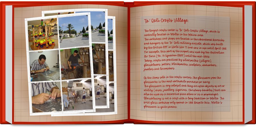
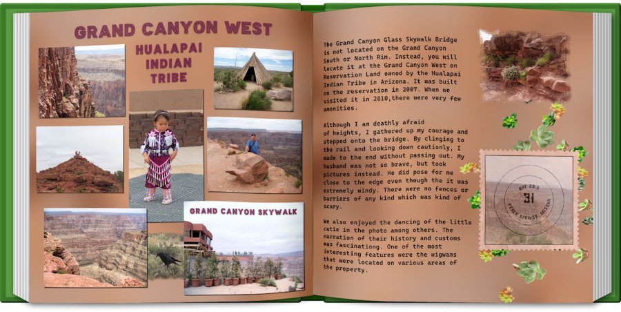
Day 6: The photos are old, but we enjoyed this trip to the reservation so much. I made the grunge background per Carole's instructions. The Title font is an Open font License called "Baltic Boden." I am loving the ofl fonts that I found on the Internet. The text font is "Cascadia Code" and was in my font list. I used cass-shadow for the pictures. The Title shadow was done manually because I didn't like the shadow used by the script. The postage stamp was made by FF, but the stamp is from a scrap tutorial. The stamp font is "atara grunge" which was purchased from Deeezy.com. I used a mask on the photo on the second page and the cass-scatteredelements script using the succulent tubes. I also used the book script.1 point
-
1 point
-
1 point
-
1 point
-
1 point
-
1 point
-
Well, haven't had a chance to play with all of them but the one script I did use I'm kicking myself for not getting it sooner... Merge Group Rename. I always drag and drop my photos into the layer palette of the template I'm using so it keeps the image name but I always lost that when merging the group so would have to rename the merged layer. Now I don't have to ?1 point
-
1 point












Resized.thumb.jpg.d25811db03a63358cedab1e79f527635.jpg)


