Leaderboard


Popular Content
Showing content with the highest reputation on 03/28/2023 in all areas
-
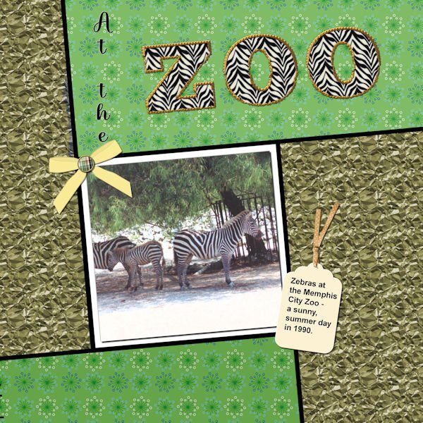
Well, I did complete workshop 6 and will go on to 7 today also. Not too happy with my last couple of layouts - however, the different ways to use text have been interesting. With this one I used a pattern in the letters instead of a color - it was interesting resizing the layout - the zebra pattern didn't want to resize; so I had to close the jpg and then call it forward again - and this time the zebra pattern also resized. The ribbon on the tag is from PS - Gina Jones; the rest of the elements are my own. I think the font I used for the Zoo was something Big Chunk.
 12 points
 -
Finally completed Day 7. The photos are of my youngest grandson, who by the way, is now a teenager. Found this one, for some reason, hard. It is still not my best attempt but after two attempts, have given it a go. I am definitely not good at scrapbooking. Needless to say, I have learned a lot thanks to Carole. I have absolutely enjoyed all 7 Days.
11 points
-
I'm done in. Workshop 7. Changed many times, but this is what I finally came up with. I'll post it and then I have to restart my computer as I overloaded it working on this. The font is Dragon Kids from Creative Fabrica. The lower cluster is from PS - Jessica Dunn.
7 points
-
Day 6. Template : Cassel Papers : Marisa Lerin (digitalscrapbook) Font : Simplefire (= monoline font)6 points
-
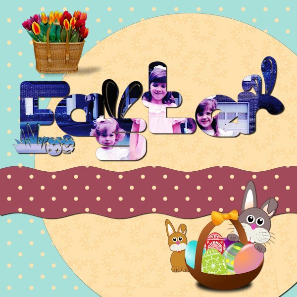
Day 7. I found several fun graphics on Pixabay but kept running into shadow problems. I couldn't use the eggs because the shadow angle was wrong for the layout. The font is Thanks Bunny. It has lots of fun glyphs.
6 points
-
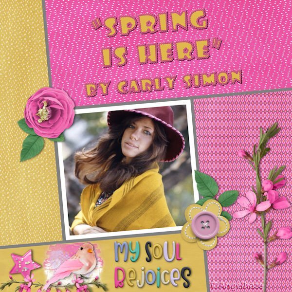
Here is my Workshop #6: Spring is here, this is the name of the song from Carly Simons, the scrap kit is Extraordinary Bundled Collection by Artgal Style and he title is made with the font: Showcard Gothic with a rose rope vector script.
5 points
-
Day 5 : it's not really a scrapbook page, but I didn't like everything I tried, so I tried something else ? Template : Carole Cassel Instead of papers, I used on the bottom layer the effects - texture effects - soft plastic on the second a blend mode The font is Poplar Std5 points
-
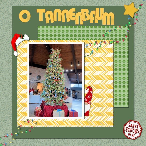
Still working on it. This is workshop 5. The text is Bauhaus 93; the Christmas hat and the star are from Cassel; I'm not sure, but I think the gnome is from Creative Fabrica. I extracted the "Santa Stop Here" sign from another picture of the tree. The scene is from the Germantown (TN) Civic Center Christmas Santa Party for the kids. Yes, Santa was there and I even have a picture of me with Santa!
4 points
-
Nadine: I know what you mean. I often feel so disappointed and dissatisfied with my layouts after I've spent hours on them! In the beginning, I think I have a good idea, and it goes downhill after that! But I think your finished project is great!3 points
-
Many years ago I was on ArtGal Style's creative team so I have a lot of her kits. Although she retired all of them when PlainDigital Wrapper closed down and only moved her newer kits to her new shop at GoDigitalScrapbooking. She is a sweet person and still creates really nice kits! Nice layout.2 points
-
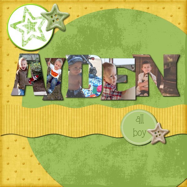
Finally finished my day 7 project. I started over on it several times! I decided rather than one picture to do individual letters with separate pictures. This is my grandson when he was small. Not sure where any of the papers are from. I got the elements from Pixel Scrappers and the round star at the top was made from a paper by Marisa Laren. This has been a fun week!
2 points
-
Day 4 I used Cassel's template. Papers : digitalscrapbook , commons_sharon-grant Font : Goudy Old Style Title Font : Hobo Std2 points
-
WOW! It's a triple play! You covered one text workshop, the song of the month and the freebie, all in one! Nice - congrats!1 point
-
All of you guys have done such inspiring work, I love all the pages but I have to admit that "Penny being Penny" is my favorite. We have always had cats and I love them to death and I can tell by the pictures that Penny is something else. I got caught up in a Scrapbooking summit and didn't get anything done. I'm also taking a machine embroidery digitizing class and that is keeping me jumping. Spreading myself to thin for a almost 75 year old (3 more days). Keep up the good work and maybe I'll get something done some day.1 point
-
Here is my Workshop 5 made with the kit: Mimosa story by Malo Scrap by Malo Scrap I made my big possible!
1 point
-
Great idea!?1 point
-
Day 4 Text On A Path...easiest time I have had doing text on a path. It usually takes several tries. This layout was completed fairly quickly. Not sure I should have used a path on top and bottom...it did give me more practice.
1 point
-
That's so nice from this forum, now I see I do have to add a shadow to all the papers, just like others did,not only around the paper around our dog. Still have the question about the shadow around the rope though ?
1 point
-
Still with my papers and orchid photos. I just made a simple curve with the text. The font is Salmon Queen script with an inner bevel. On all the layouts I have some sort of butterfly as an embellishment. Here in The Nederlands we have a world famous Spring bulbs show called "De Keukenhof" and on the grounds are glasshouses too and in one of those there is an orchid show with fantastic plants and the colors of the flowers go from subtle to vibrant. We have been there a couple of times in the past and each year the displays are different inside and outside.
1 point
-
Day 4 project. I used Carole's layout with a few minor changes. Wings are from Marisa Lerin's Birdhouse In My Soul Kit. The background is from Marisa's Garden Party Paper Kit. The photos are compliments of my oldest daughter who is learning photography.
1 point
-
Here is the tag , as I can see it isn't legible in the above page, due to being resized. Yearling male Antelope
1 point
-
Day 3. It's always a treat when any four legged animal comes to visit. Carole used the word adorable to describe my Red squirrel, so I decided to use it in this page. As I do adore these majestic animals. The Antelope are frequent visitors. Males and females are segregated. Here we have some adult males with yearling males, not to far away were the pregnant females and yearling females. I don't use the selection tool to wrap text. It's ideal for quickly typing journaling, but it has far to many limitations for my liking, and for the word art/text that I like to create. Again, I didn't use any outside recourses.
1 point
-
Not my best work, it's too busy and too much focused (hahaha pun intended) on the right side. I used stuff from my kit and learning I need way more stuff and that "stuff" needs to be in different orientations. The photo was a test for me getting ready to photograph my camera collection. The Pentax K1000 was the first SLR camera I ever used, it has a soft spot in my heart. And of course this isnt the actual camera I used, cause then I would have stolen it from my high school...and I'm a good girl and don't do that sort of thing?. Anyway, my brother, who at the time was a commerical diver living in Borneo, came home to visit the family and came to the open house at my high school. He was blown away by the schools dark room and my interest in photography, so much so, that he bought me my first camera, a Ricoh KR10, which I sold and now wish I still had. I know. BEST. BROTHER. EVER! Looking forward to Lesson 3, it looks wonderful.
1 point
-
I was so ready for Day 3. And Carole gave us a template to work with! So, how hard was it going to be? Well, let me say...I spent way too much *@^$# time on this project! The text tool has a mind of its own (which is what I thought before I started this series). When I clicked on the Text Tool and tried to change the size, the colours would change. So, then I'd click on the Materials Palette boxes to change the colour, and the text size would revert. Or I'd click on the Font colour button on the text toolbar, and nothing would happen. And this went on and on until I was ready to do damage to the laptop! Sigh. So here is my Day 3 with wrapped text. I'm so over it. (I used an old photo b/c I happened to have it for some work I was doing on a history article.) And then, I wanted to go back to change a couple of things, and I saved the .pspimage merged. Not my day. EDIT: I just couldn't walk away from the project. I had to try again. I started with the template and same image, and worked it through. I still had a few glitches with the text tool, but not nearly as many as the first attempt. Now, I AM DONE with this!
1 point
-
Well - seems it was just the previous layout because now PSP Ultimate 2022 is acting like it's supposed to. this is my layout 2.
1 point
-
here's my Day 2 all credit on my gallery (clic on image ☺️) @Cassel I use your template (je ne sais pas si tu vas le reconnaître ? ) thanks ))1 point
-
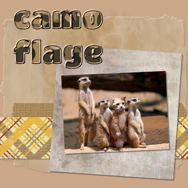
Beautiful, and ever so entertaining to watch these rodents go about their daily lives. I didn't use any outside sources, not even a script to create the round brad. The papers are also my own. I did use one of Carole's corner punches.
1 point
-
Here is my text workshop Day2: Birdie
1 point
-
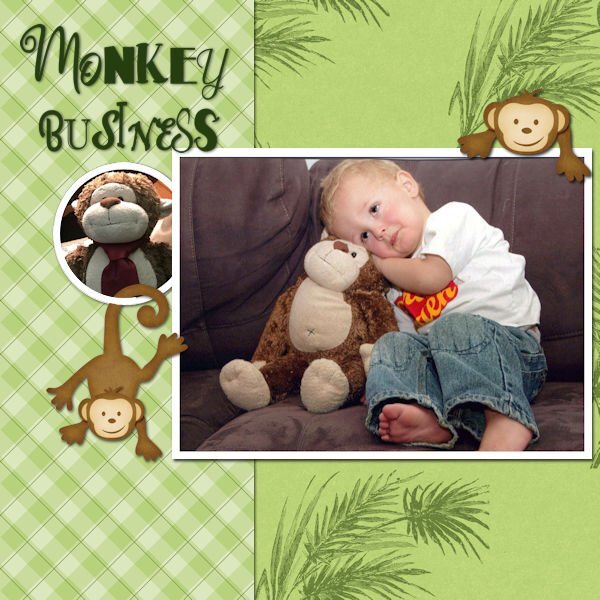
Here is my day 2 project of my grandson when he was young with his "Best Friend", Mr. Monkey! I made the plaid paper and the other is from Jessica Dunn. I choose to put a second picture rather than an element.
1 point
-
Lesson 2 Text. Having fun with this stuff.
1 point
-
This effect looks cool. I didnt realize just how cool until I put a paper behind it. I used the kit I have made. Last night I though, yuk, none of this looks good together but after a good sleep and no headache, it doesnt look that bad to me now. The photo is really old (2006) and shot with a point and shoot camera; my first foray into digital and first time not shooting with an interchangeable lens system. I didnt do well with the lag time between pressing the shutter and it taking the picture and soon moved back into a DLSR camera. This shot was taken either in Vernon, BC where I lived at the time, or more likely in the Fraser Valley (westcoast of BC)
1 point
-
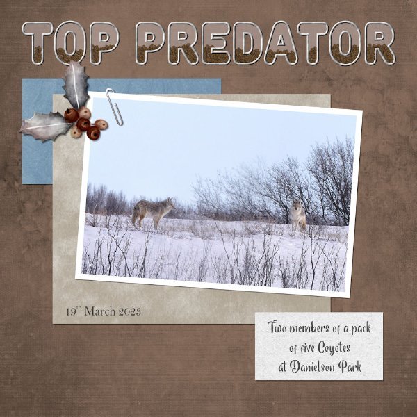
Day 1 A pack of coyotes I have been observing this winter. On this day all five were out, and had their eye on either an old or ill white tail deer, it was skin and bones with it's ears flat. I watched while they slowly manoeuvred the deer into the trees. They keep the herd of over 200 deer healthy. Hunting in the park is forbidden. Here are two of them, I blended 2 photos together. All my own work including the holly and berries picture tube element. I filled the title with pine cones, as there are lots of conifer trees in the pack.
1 point
-
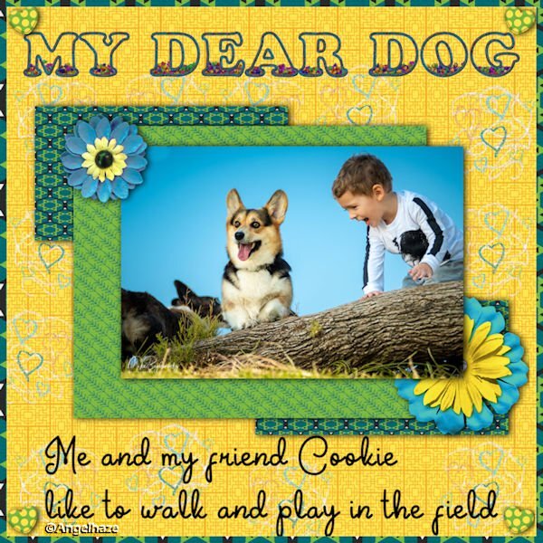
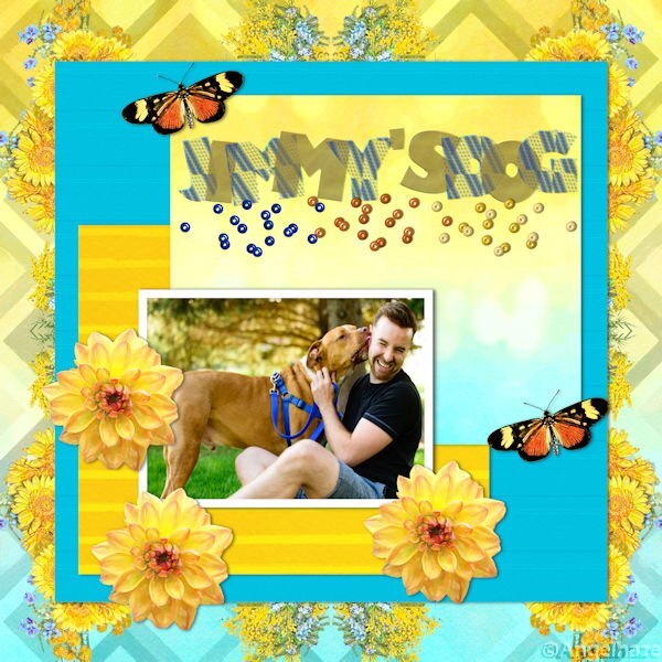
Here is my layout with this first Text Workshop: made with the kit "Tangible Hope Bundle Designed By Marisa Lerin" done with Text Wokshop Temlate 1 from Cassel. The font is Cooper Standard Font. MY DEAR DOG
1 point
-
I decided to post right away before I see the wonderful work that others will produce. The layout here is simple, but it's a photo that always makes me smile. I had to work on the outlined & filled text a couple of times before I got it to cooperate. Those layers mess me up sometimes....which one I AM on vs. which one I SHOULD be on! The font is Titan One, and it's nice and thick for this purpose. I'd never used the Effects>Texture>Sculpture and was happy to try it. Nice effect.
1 point


Resized.thumb.jpg.d25811db03a63358cedab1e79f527635.jpg)


.jpg.ba0df8074d38aac75336fb1f2ace1cf2.jpg)
.jpg.27a42ede37cc47376d062a4cb09c0cff.jpg)