Leaderboard
Popular Content
Showing content with the highest reputation on 03/20/2023 in all areas
-
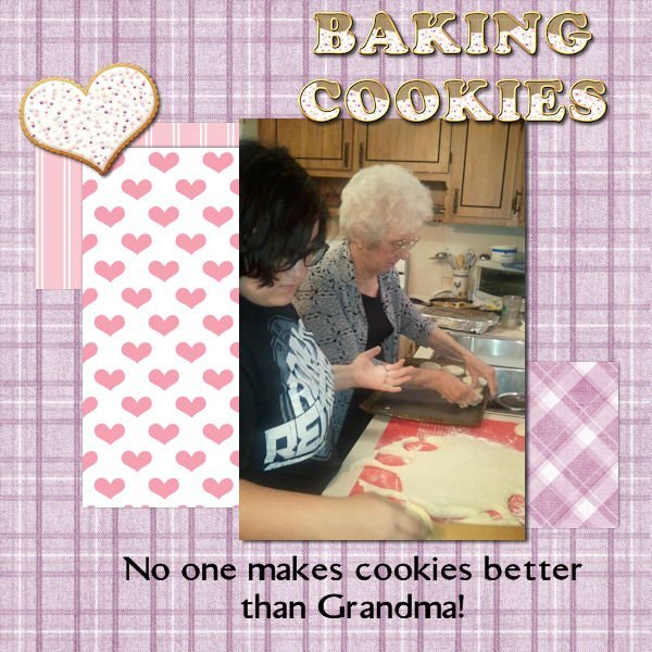
Just finished lesson 1 and it was so much fun! This is my first Workshop so I hope I am in the right place to post my project. This is my Mom teaching my oldest granddaughter how to bake cookies! The cute little cookie on the page is by Jessica Dunn. I also used the icing from the cookie to make the icing for my cookie letters. Not sure I am totally happy with the color papers I used but they match well with the cookie!10 points
-
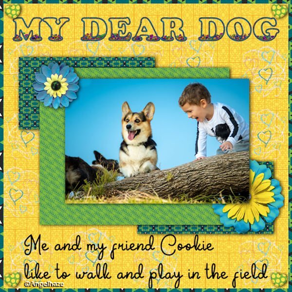
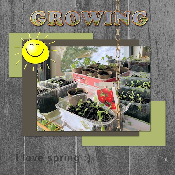
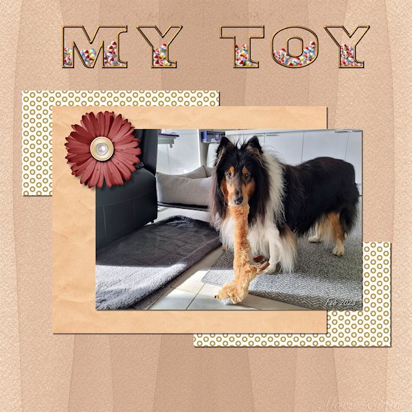
I decided to post right away before I see the wonderful work that others will produce. The layout here is simple, but it's a photo that always makes me smile. I had to work on the outlined & filled text a couple of times before I got it to cooperate. Those layers mess me up sometimes....which one I AM on vs. which one I SHOULD be on! The font is Titan One, and it's nice and thick for this purpose. I'd never used the Effects>Texture>Sculpture and was happy to try it. Nice effect.9 points
-
6 points
-
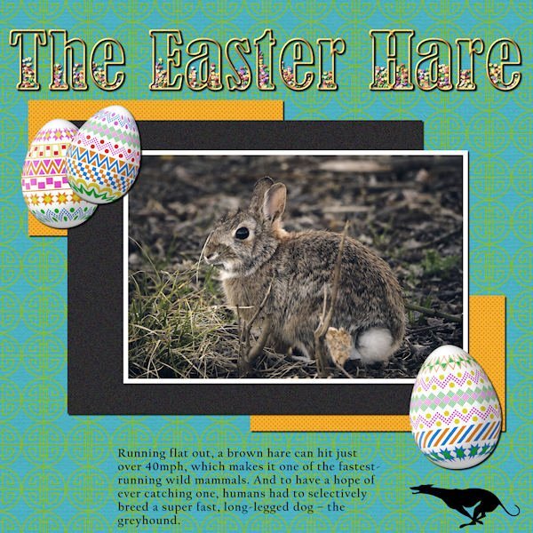
LESSON 1 - THE EASTER HARE - Photo from Pixabay by Matteo Baronti; Cass-decorated eggs; TITLE - Bernard MT Condensed filled with PSP Tube candies (for Easter, of course); Greyhound silhouette from Vector Stock. I also used Cassel's template and the MarisaL Tangible Hope kit. (Thanks for the kit, Carole, I noticed it was free because it was from your account)5 points
-
4 points
-
3 points
-
2 points
-
2 points
-
Hi, everybody! it's a long time, round about 4 months, since I have been active here in the campus. I try again and hope to be able to come along more often. I remember "wise words" in 2020, I just started and had to stop it. And as Cristina said it, a good opportunity to go through it again, hopefully this time....2 points
-
I just looked at lesson 1 and all I can think of is Baby Got Back by Sir Mixalot. (? I Love Big Butts ?) LOL2 points
-
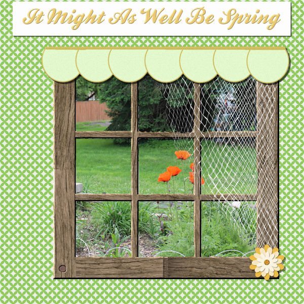
I'm game. The first song that popped into my head was from State Fair (a musical by Rogers and Hammerstein). I thought I was kind of copying a layout I had done before and just change the title. However, I have worked on this almost the whole day - the problem was the font! Every time I wanted to duplicate the title so that I could innerbevel it, the layer disappeared and left me with the title as "selected". I finally just flood filled the selection on a raster layer and went from there. I even tried closing out and restarting the computer, but that didn't work. I don't know if there was just so much in the file because I had worked hard on the netting and it couldn't handle the font. Well, anyway, here it is.2 points
-
1 point
-
I did the lesson but didn't complete a page. I'm making titles for a project I will be working on later. I think I'll just post one page with all the titles at the end. Although I did end up having to make a psptube because I didn't have one that fit the theme of the title!1 point
-
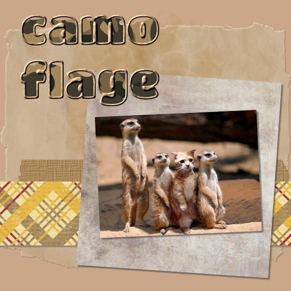
I just found the cat in with the meercats! Ha ha!! Clever photo and nice use of the text. Love your colors. I recently discovered the sculpture effect and am floored as to its potential! Thanks, Cassel!1 point
-
Might be simple but it is cute, I love yellow cats. I haven't even found the email with the lesson link yet.1 point
-
1 point
-
1 point
-
1 point
-
I can't give credit for the illustration because I couldn't find the original on Google. Layered a couple of papers by Gina Jones from PS and played with the opacity to get the hue I wanted. I used a rounded rectangular selection to change the shape of the pic and added a couple of select selection borders on separate layers. Some clipart from DSS to add some interest. The font is Sexy Beachy from DaFont.1 point
-
CF had some amazing watercolor carriages; it was hard to choose just one. I added my avatar from the game just for fun. This is a little late for the seamless topic from February, but I clipped some floral elements from the original carriage pic and used Cassel's seamless pattern script. I flood filled a new layer with it and lowered the opacity above a solid layer. The font is from DaFont and it's called Atziluth.1 point
-
Found this lovely illustration by Yigit Ozcakmak which I thought fit the theme very well. I got the paper and elements from DSS several years ago. And the font is, of course, Little Mermaid from fontmemes.1 point
-
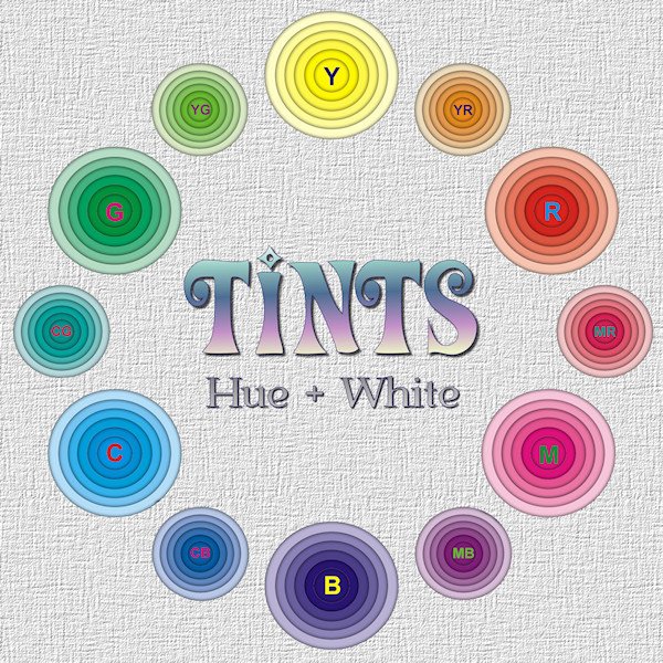
I was playing with the Shadow box Master class. And I had this color wheel in mind (although I don't actually subscribe to the "color wheel" model?). As it turns out, those little circle layers are too small to be effective at showing the depth. it was a good learning experience, and I've included a larger version so you can get the idea of the depth. It's good for big layouts. I look forward to trying the ones from the masterclass.1 point
-
1 point

Resized.thumb.jpg.d25811db03a63358cedab1e79f527635.jpg)


