Leaderboard


Popular Content
Showing content with the highest reputation on 02/24/2023 in all areas
-
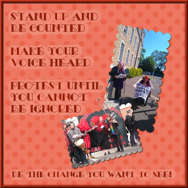
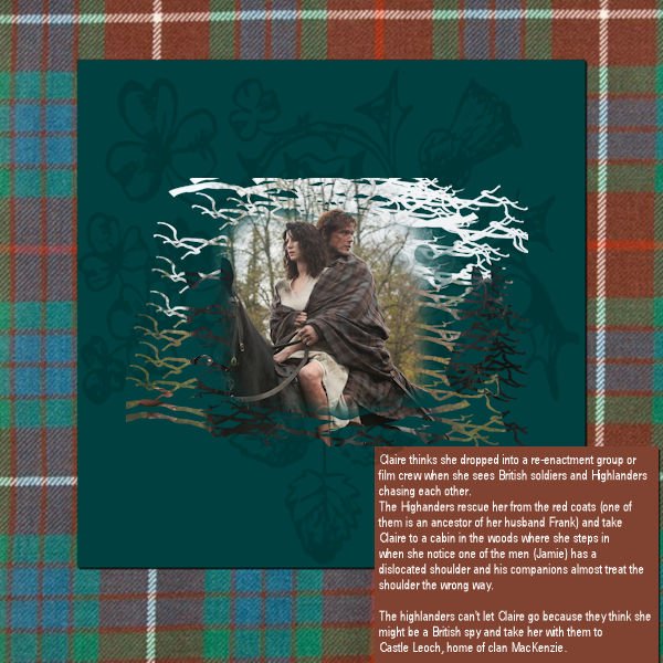
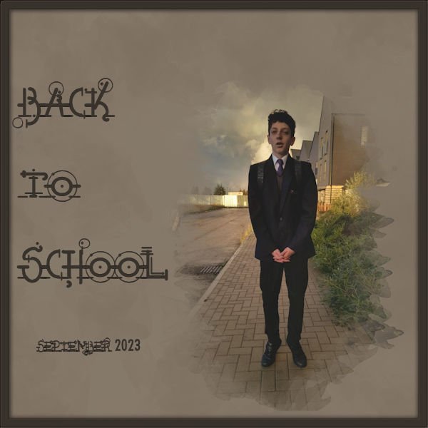
And finally my lesson 7 A little glimpse into the days when my body allowed me to be the activist that my heart is.
 9 points
 -
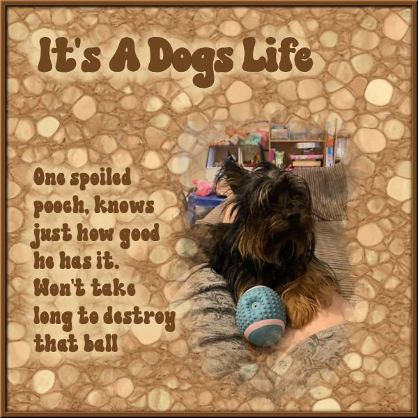
Lesson 6 My daughters dog, as you may have noticed I like to put borders around my pages
9 points
-
And now my lesson 5. I really don't remember how long it is since I made a frame, so of course I exported it as a frame for future use.
8 points
-
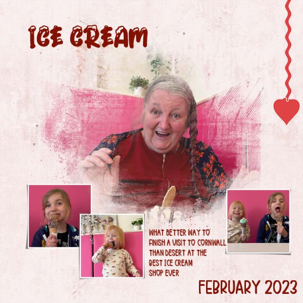
Day 7 the small photos are made with a Free script from Cassel in the store : cass-polaroid Sticker: Master class Title Work 3. I enjoyed participating in this Workshop for the third time, and to see the various beautiful pages you have made. Thank you Carole for reviewing our work.6 points
-
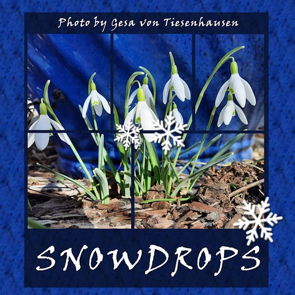
I made a seamless tile to fill the background with the pattern of the blue vase behind the flowers in Gesa's photo. The font is Viner hand. The snowflakes are picture tubes. The layout is a template that came from Lab 9-10.
6 points
-
Lesson 5 I used a branch brush, couldn't find another that I liked, at first I didn't like that one either, but then I rotated it on the right side and now it looks better. Not my best work, but it's ok for now. I really forgot how much fun masks are to make and use!?
5 points
-
Here is a seamless tile I made for my Snowdrops layout (posted in What are you doing...? ) I took a piece of the blue vase behind the flowers in the photo and used it to fill the background.
5 points
-
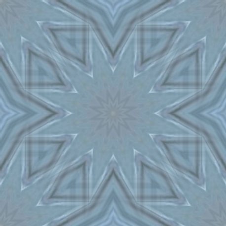
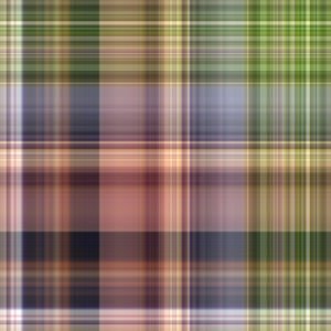
I have not had the time that I hoped to have this past week to devote to this excellent mask workshop. When I did work on it, I spent ages trying to figure out how to make the plaid. Somehow I kept missing a key element in terms of the settings when going from the sample to creating a square. However, I finally succeeded. I will upload the result which as you can see does not involve any masks--next time, perhaps. Thanks Carole.
3 points
-
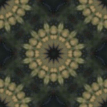
An example of a seamless tile I did some time ago for a layout. Instead of that page I show the tile and a page filled with it. I have made a lot of hem with the kaleidoskop, or of plaids but as they are intended for a particular layout I stopped saving those and simply make new ones that suits the new project. I found that I never reuse those, so I save only the more generic ones.
3 points
-
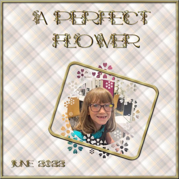
Quoting my own project, but wanted to ask if the English I used is ok? ?
2 points
-
Very different. In the settings, you set ONE angle. In the Brush Variance, it will "vary" so if you set it to about 100%, the rotation will be all over the place. You can always review the two classes on Brush Variance palette.2 points
-
@Hank SobahIt is with experimentation that you can discover what replicates reality, what you like, what you don't like, etc. Keep experimenting! @sharon thompsonThere are some classes on the inside that plays and explains the Brush Variance palette. Have a peek. Once you understand the settings, you will be more comfortable playing with them. @Donna SilliaThe placement of the photos makes me smile as it seems like he is he really spotting her! @MoniqueN.Yes, adjusting the size of the pattern is something that depends on every project. And yes, one little checkmark can throw off a tool like the Fill tool! Doing great with creating your own masks, and you can see how it can be customized to the photos! @Anja PelzerYou can see the different effects with the blurred mask and unblurred. Two ways to address future masks. @Mary SolaasDid you try using the music picture tubes from the Campus? Colors of papers are changing often, right? @Harmony BirchBetter late than never. Once you start to understand how masks work, you will see that you will likely create masks more often. Some scrappers tend to have their own preferences. If you like to add frames, go for it! @Marie-Claire Great layout and Poncho is always so photogenic! @Karen BorgmannYou are very patient and you will tame that PSP!!! You will win! @Alice DanielGlad to see you managed the plaid tutorial! The tutorials will be left available to all until the end of month, so if you have not had time to complete your projects, you might want to take a look over the weekend as the month is winding down.2 points
-
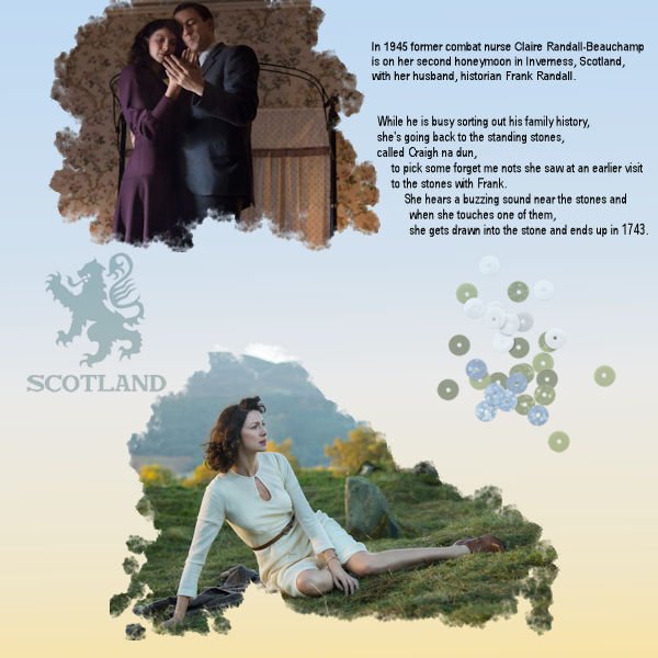
I forgot how much fun it is to make projects with a mask ? The Scotland sticker had a other colour originally, with the color changer and the opacity changed, it looks better.
2 points
-
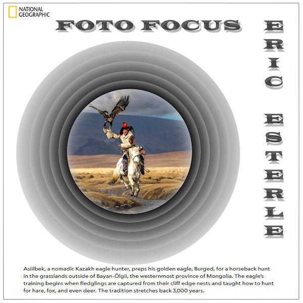
Playing with Carole's Offset Cutout template, I turned every layer to negative and came up with this. I subscribe to Nat Geo and they announced their yearly photo winners. This guy didn't make first place, but his work is the one I liked the best. I may keep this as a template myself to do more. Could be similar to Michele's Fab Divas series. The font is Wide Latin treated to a cutout effect. The journaling is from the magazine as is the logo. I turned the Raster 1 Shadow layer at the bottom into a mask for the photo.
2 points
-
I'll post a few of the many patterns I made during the mask workshop. Most were made either with the West Virginia layout, the ocean layout. Julia - love your perspective stripes - some of them remind me of a pinstripe suit material.
2 points
-
I've been having fun playing with the "perspective striping" that was answered in the Feb. Q & A. This is just one, and I haven't used it for a layout yet.
2 points
-
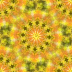
my lesson 3, been a while since I played with kaleidoscope
2 points
-
Lesson 3 >>>>here I am bringing up the rear (again)! I was struggling along and then my PSP program starting acting up. Guess it was his way of saying "Aren't you finished yet?" Hope the little gremlin doesn't show up again---fingers crossed!
2 points
-
Day 5 Paper : Marisa Lerin , Digitalscrapbook Font : Fly Watercolor flower is a freebie, I don't know where this comes from anymore.2 points
-
Day 4 Filmstrip Cassel Cluster : freebie connieprince.com Paper : Saskia Veldhoen on Digitalscrapbook, Commons Font : Sun Island2 points
-
I'm finally getting a bit more confident playing with the settings, just found out why my floodfilled backgroundpaper had holes in it where the mask was. Floodfilling all layers wasn't such a great idea ? Uncheked, floodfilled again and it was right ?2 points
-
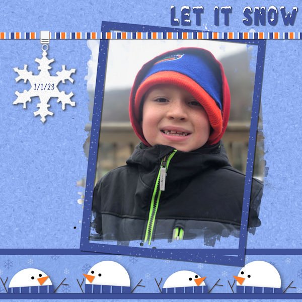
And staying with the cornwall theme here is my lesson 2
2 points
-
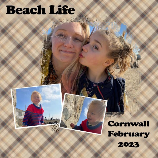
I finally got around to doing this, so here is my lesson one, sweet memories of my visit to Cornwall to spend time with my grandchildren
2 points
-
2 points
-
2 points
-
The font is Femme, free from DaFont; I thought it had a nice relaxing feel. The background is mine, but I need some help. I wanted to add a little interest to the background to blend into the watercolor clip art I got from CF. I didn't like the results from any of the watercolor brushes I have. I ended up adding a texture which, unfortunately, changed the color. So I promoted the "spots" from the texture, then flood filled them to adjust the color. There has to be an easier way to do this as it took me forever to get this result. One of these days I have to master the brush variance as that would probably have solved my problem. Any suggestions?2 points
-
Not too difficult, but not everything has to be. I started with a black png file that I recolored it with red, black, and light grey. Polka dots on the background to make it interesting. I wanted a display font that wasn't fancy so I used Nesdate October Ten, free from DaFont. I added a black rectangular selection behind it as the dots were too distracting.2 points
-
I finished the Masks Workshop Final Quiz with 10/10 as result. Yes ! ?1 point
-
Ann - love your idea for a tile. Makes for an interesting background.1 point
-
Your English is better than mine! And I'm a Canadian (English speaking)! I'm a bad Canadian who miserbly failed French (our second language).1 point
-
No, I haven't. ? Will give it a try later, I will finish the rest of the lessons first.? Is rotating in the brush variance palette a lot different then when you rotate in the presets at the top?1 point
-
I wonder how it would have looked if you had used the Rotation jitter in the Brush Variance palette to brush that mask all round the edges?? Did you try?1 point
-
Harmony, I love the font you used! Do you remember which one it is?1 point
-
What a beautiful dog! Like the lay out too?1 point
-
Day 6 Flower: Marisa Lerin, digitalscrapbook Text : digitalscrapbook1 point
-
And lesson 4. I really enjoyed making my own mask.
1 point
-
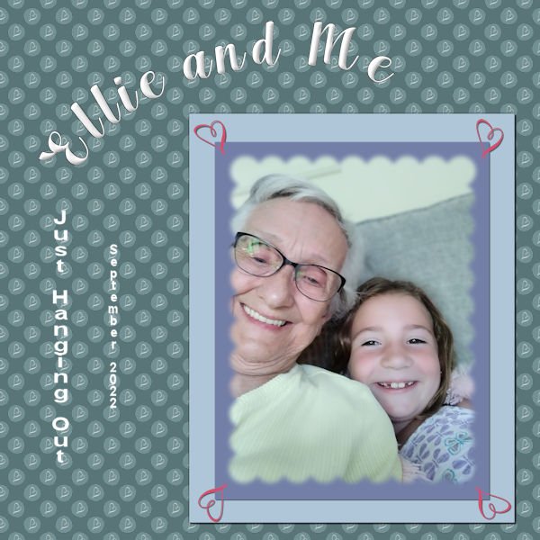
This is my project 7. finally finished the workshop. whew!!! Had fun playing. The background is the combo polka dot - learned that in one of the previous labs I was doing. I put a "squiggle" from one of the fonts that I imported as a brush. (What fun!) And I used that squiggle brush in the four corners of the papers behind the mask. Ellie is the great granddaughter of my cousin that I visit every year in Illinois. She is a barrel of fun. The font is Arlington Script (the only font factory I go to is Creative Fabrica). I chiseled and inner bevelled the title. The journaling is in Arial (2 different sizes). The original polka dot was a deep pink with a white heart squiggle, so the polka dot part of the paper is in the luminance blend mode as the background paper is a deep blue green. Fun, fun, fun!
1 point
-
Harmony - you're doing great. Grandchildren are so much fun.1 point
-
Thanks Julie. Unless I use the corner punches to create labels, or other small elements, it's my opinion and personal preference to use them very large , and not as tiny punches on the corners of large background pages. Making them insignificant. This way they really pack a punch, as they should. Pardon the pun!! Of course it depends the layout and the creator.1 point
-
Great feature the way you used the corner punches in a large size!1 point
-
And this is the Extra 6. And I've got to go to bed. Good Night!
1 point
-
And now Project 6. My linoleum started out green, but I used Hue Saturation Lightness and changed the color. Title font is Aryaduta (CF). I extracted the chess pieces (only the white ones - I used Brightness and Contrast for the black pieces (duplicate copies of the white ones). Fun with the curled ribbon made with a script from Cassel. This mask is the one I talked about in the previous post - I made it with the watercolor brushes and some interesting twiggy brushes around the edges. I inner bevelled and drop shadowed the title. The white swirlly things on the paper in back of the masked picture were made with a brush I had made earlier playing around with the fancy squiggles and things that come with some of the fonts. I had forgotten how you made linoleum. I think I will play around with that again when I finally finish this workshop. One more project to go.
1 point
-
Day 7 Masks Workshop, chose to use the twins, unfortunately I don't have a lot of pictures of only them ? As you can see, I took the Polka Dot idea and did something a little different with artistic lines, fills, and overlay and some Text lessons from previous workshops.
1 point
-
Thank you for all the feedback. I keep trying new and old things along with the workshop and finding some interesting stuff to do. I am having fun with both the AI stuff, and Filter Forge effects but so far no Filter Forge in the masks workshop. As you noted, I also use overlays and blendings - lot of fun!1 point
-
@Gerry LandrethIs that a multi-layered font? Carole: Below is a link to the font. It's a fun one with lots of possibilities. I didn't have time to play with it, but I'll revisit it soon. School Rules Font by Salt and Pepper Fonts · Creative Fabrica1 point
-
I had so much fun doing this one. The dancers are from CF's Dance-Marathon-Watercolor-Animals-Set. I'm really getting my money's worth from my subscription lately! The font is Party Dance which, I think, was in my system fonts. I tried to add a texture to the background layer to match what was on the paint splotches.1 point
-
I do love anything "sky" related; sunset/rises, clouds, lightning. All so fascinating. Often though, I am driving to or from work, or at work seeing out the windows at beautiful sunsets and can only just watch. I'm in an urban area so there is much clutter from power lines and houses. It always seems like when it's a day off, it's a cloudy day. It's looks like you have some good open space, or at least maybe you are able to isolate a tree for a silhoutte against the sunset/rise.1 point
-
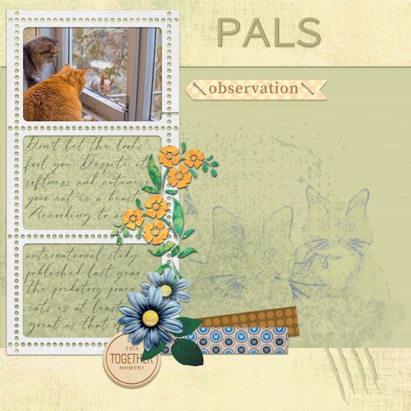
I worked with the Kit of Cintia Dhariana in Feb 2023 Blogtrain #14 digitalscrapbook.com the cats belong to my friend
1 point
-
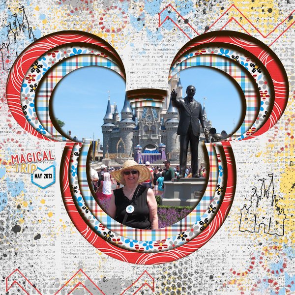
For the Valentine's Day theme, I used AnnieCDigitals Valentine template. The background is a paper from a valentine mini kit by MarisaL of Pixel Scrapper. I used the RemingtonWeather font to try and stay consistent with the wonderful word art Marisa made. And I topped it off one of Carole's lovely bows. (The couple are characters from the game.)1 point
-
Here is another one that I just did from a freebie template by Fiddle-Dee-Dee. Kit used is from Bella Gypsy "Here's To The Ears" for sale at The Lily Pad. Cheryl (Fiddle-Dee-Dee) had the shadows already on this template as separate layers. So no shadows had to be added to the 3-D shape.
1 point