Leaderboard
Popular Content
Showing content with the highest reputation on 01/24/2023 in all areas
-
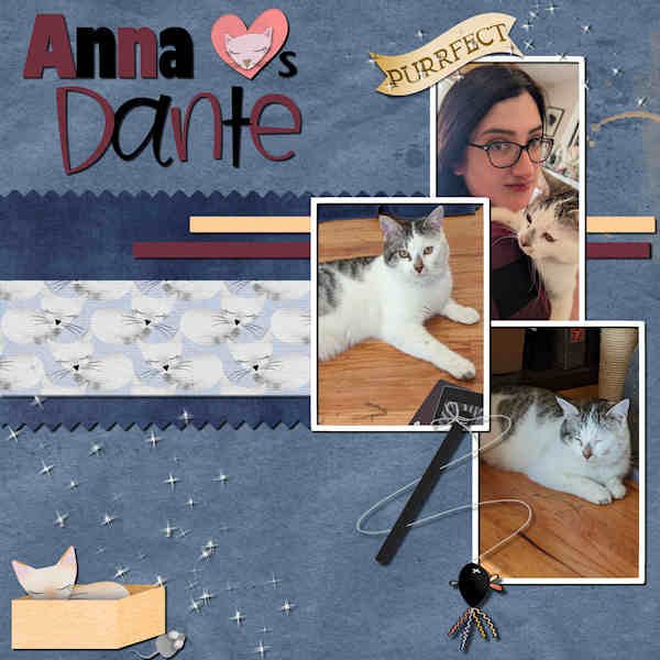
DAY 9 #4: Anna Loves Dante - My granddaughter has a new cat named Dante. I got a kit from Digitalscrapbook.com by Gina Jones called Every Day is Caturday. The plain papers, the heart and the scatters are from my stash. The patterned paper, word art and cat accessories are from the kit. The fonts used are Gill Sans Ultra and Birdy.4 points
-
My project 3. This time the papers are mine and the elements are all from different picture tubes. The pictures were taken in Memphis when my daughter and I did a Sunday tour of the sites in Memphis to use for my "M is for Memphis" alphabet book. The font used is Arlington Script. Most of the extra scripts I get are from Creative Fabrica.4 points
-
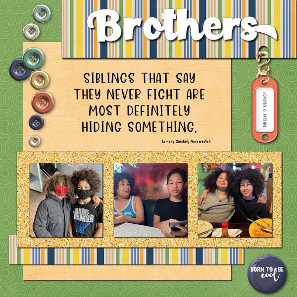
The Boys are now 12 and almost 15. I first met them seven years ago. The elements in the layout are a hodgepodge of stuff. I couldn't decide on what I wanted to do, so I scrolled. And scrolled some more. The fonts are Paladise for the title and Dear Friend for the quote. Both are from Creative Fabrica. The glitters was created using Creation Cassel's script, Glitters-C.4 points
-
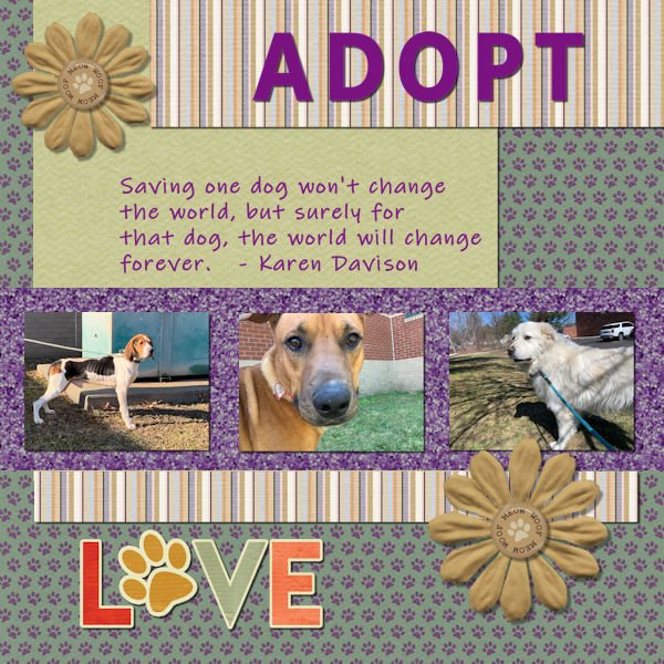
I knew exactly what I wanted to do when this project was given to us. About 10 years ago I quit my job as a lawyer and decided that I really wanted to work with and for dogs. I became a dog walker and pet sitter by day and in my free time I volunteer at my local animal shelter and smaller rescues from time to time. Oh and I'm mom to three dogs. The dog on the left was rescued by the ASPCA along with approximately 300 other hounds in a cruelty/neglect case in Vermont last winter. Our shelter took in about a dozen of the adult hounds and about 20 of the puppies. The rest were sent to various shelters around the country. His new mom & dad sent the shelter an update and a picture. He's living the life and a healthy weight now. The middle dog was transported from Texas to Massachusetts and ended up in our shelter where he quickly found a home. The third dog was on a cross country trip thanks to a Great Pyrenees rescue organization to meet his parents to be. I drove him on one leg of his trip. Sometimes it can be soul crushing but these are three success stories. As for the papers and elements, all came from MarissaL's Pets kit except for the Love element which came from Gina Jones' Fido kit and the glitter which came from the link that Cassel gave us for glitter in the email.4 points
-
3 points
-
2 points
-
I found the other Mask script that you mentioned Carole, 'Raster to Mask' and it worked perfectly. Tried it out with a different image as an experiment. The script I previously used was Mask Maker that I now realise is for use with vectors and that is presumably why it didn't work as my layer is a raster! Duh!2 points
-
Project 3 This was a lot of fun! My drop shadow is terrible on the rope around the flower. I have to try and redo it, but I think I saved it as a jpg. Trying to improve working with drop shadows.... soon as I resized the rope it looked more ugly lol ? (Sorry Carole, my internet was weak due to the snow/rain where I am, but it appeared on my end..so I reposted )2 points
-
Full disclosure...I've never done any scrapbooking! However, I do create photo books which I believe I can incorporate the scrapbooking skills that I am developing! A win-win! I am not a big glitter person, but I had fun seeing how to use it. I was pleased that I could flood fill the hearts with a 3rd glitter color after creating the "2-tone" glitter to go under my photos.2 points
-
Good Point Cassel .!! I should of moved the paper over a bit or made the text smaller !! The quote i found on the internet some years ago ...Auther unknown .......that part got hidden under the paper / pictures , If i would of made the text smaller it would of probably shown that part !1 point
-
@Steve KovacsLovely quote and lovely photos. For your elements used to decorate, did you stretch them horizontally? They look a little... odd. @Lesley MapleBeautiful cause and you showcase those photos very well. Good job in resizing the images without distorting them. @GabrielaDid you create the text yourself? It is lovely and the combination of fonts gives a great result! Good work. You might want to adjust the paper width so the text does not end up over the edge. @Ann SeeberI hope you share this page with the photographer! Who knows? You might convince him to showcase his photos in a "scrapbooking" way! @Leslie JostesYou are doing a great job and photo books might feel "plain" while you can definitely add "scrapbooking" ideas and techniques to make them spectacular. Keep it up! @TonimarieThose are such cute photos. They definitely deserve to be showcased! Great result! @Gerry Landreth Great composition. I would be a little careful with overlapping two buttons! They would be hard to stick there. Also (and this is a tiny detail), notice that the light spot on the buttons indicates that the light is on the top RIGHT. You would need to rotate them 90 degrees to the left to be consistent with your shadows. This might have been a discrepancy from the start as the designer might not have noticed that. @Mary SolaasI think I see a shadow on the text for your journaling. With small text, adding a shadow would make black text harder to read. Are you ready for the 4th project? It is coming tomorrow!1 point
-
Fabulous layout Ann. I looked up the photographer. HIs work is exceptional, no even better than exceptional. Thanks for crediting his name. I've bookmarked his website for times when I just want to see great art and be inspired.1 point
-
That link is no longer good. You need to click on the top navigation bar "Gallery" to get to the gallery.1 point
-
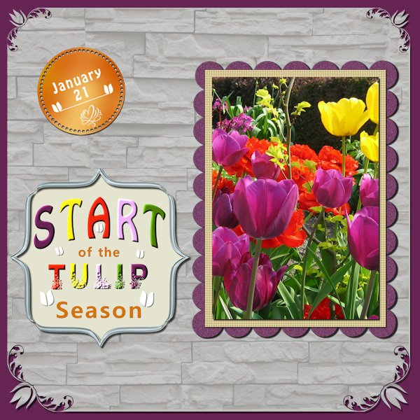
I have posted my page in the gallery, but until now I'm the first, so is it all right to post here too? Here it is easier to tell about the layout. For me it wasn't difficult to find something with the word Start because I happened to have read about the "start of the tulp season" in the newspaper of last saterday. A couple of hours later I saw what this week's challenge was about. Then it was just a matter of finding a photo in my collection. Normally I don't use bright colors, but tulips tend to have those, although there pastel ones too. In the flower cornerpunches there is one that has a tulip, so a must to use for this layout! IWAS (InternationalWordArtStudio) has free date labels in many colors.1 point
-
Pirkko, how did you achieve the metallic look of your stencil? Is it from a script? It is beautifully done.1 point
-
1 point
-
Hi Michele Contrary to my habit for creating my papers, I used the script on a 12" 3600x3600 image so that the script could put more pattern then I resized to 1000x1000 so that the texture of the patterns is visible and again resized to 3600x3600.1 point
-
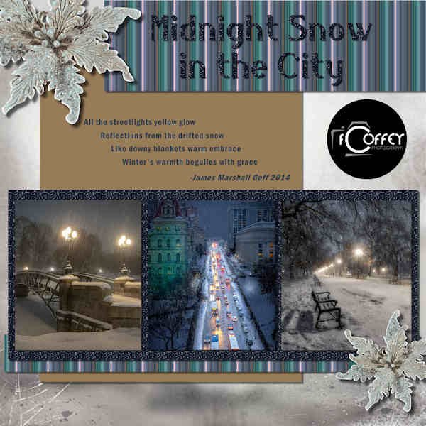
BOOTCAMP DAY 7 - #3 Photos: Fred Coffey-Photographer Setting: Albany, NY Background paper: ps-THLD-Iceland Flowers: ps-Studio4-Iceland Journaling: Poem "Midnight Snow in the City" by James Marshall Goff Journaling Font: Franklin Gothic Demi Condensed Title Font: Belisha Glitter: ps-AHA_somewhereintime_glitters10 @ 25% Stripe pattern created from center photo - jpg in Files on Facebook1 point
-
1 point
-
The quote is one that my wife has used over the years many times. This looks like a perfect spot to do just that.1 point
-
1 point
-
Buddy showed up one day, under nourished and looking for a home. He instantly became a part of the family. He enjoyed "hanging ten" and surveying his vast estate. He also spent a lot of time in my lap. He loved his new wonderful life for years. He developed cancer and you know the rest. Buddy was my buddy. RIP Buddy.1 point
-
Day 5 - Project 2 - Magic on the Beach in Costa Rica. My California family is there as we speak, and Magic's mother, Lucy, sent all the photos used on this layout. The frame for the photo is a PSP frame called Transparent; the title font is Hello Butterfly with an inner bevel #7; the text on the right is done in Kleymissky font. The flower embellishment is from my Just Beachy kit by Lin Jane. The toucan is from the eyeinspire fruitloops kit. Lucy included a little poem with the photos she posted. Pura Vida Slow flow Sunshine and resupply of vitamin d Much appreciated after weeks of NorCal rain A new heart home deep on mama Pacifica Magic home Water baby Pool obsessed Heart full of deepest appreciation and reverence for this beautiful planet we call home1 point
-
1 point
-
here is my project 1 , day 3 ein Besuch in Berlin, I blended the photo into the background1 point
-
I too had a difficult time choosing what I wanted to do, changing some aspects etc. But in the end I have something to show; I used all the elements but rearranged them. My topic is bridges; here in the Netherlands we live partly in a delta area and have a lot of rivers and waterways. Which in turn provide us with a lot of bridges and here are just a couple that I managed to take a photo from. The water background I made using a small part of the water in one of my photos, gave it a slight blur and a blend mode. The sky is also a photo that I put on top of the water to create a less sharp edge.1 point
-
I am so sad, I was looking so forward to doing this and we had 2 family members pass away last week, I can't even get to lesson 2 until next week!!!!!0 points


