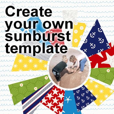
Sunbursts are commonly used in scrapbooking as a way to put the focus on specific content. It could be a story or a photo and the rays will typically converge toward that element. You can create your own sunburst template and customize it to suit your project.
layout
Using corner shapes in scrapbook layouts
Arranging multiple photos on a layout can be a bit challenging when you don't have a clear vision in mind. You can place photos, arrange them, change them and still be unsure of the end result. However, one simple way to start composing a layout with multiple photos is to place them in "a corner" arrangement.
Using a split page in scrapbook layouts
Creating a scrapbook layout can be fun, especially when you try different ways to organize your page. In this article, we’re diving into the "split page" approach. It’s a simple yet effective style where you use something like a ribbon, a line of stitches, or a color strip to split your page into two separate halves. This not only makes your layout look neat but also lets you play around with different content on each side. This method is great for adding a unique touch to your projects.
Let’s check out some cool examples and get some tips on how to do it.
Using a table in scrapbook layouts
In building a scrapbook page, there are multiple ways to arrange and layer the various components. Sometimes, you might feel stuck in front of a blank canvas. Let's look at a fresh approach in scrapbooking where we feature our photos "on the table". This method involves placing photos and elements on a horizontal base—like a ribbon, a strip of paper, or a line of text—that acts as a table. Simple yet effective, this technique helps organize your page visually, guiding the viewer’s eye and adding a layer of storytelling. Perfect for both beginners and experienced scrapbookers, let's dive into how these horizontal elements can enhance your scrapbook layouts.
Let's have a look at some examples of this approach.
Using “Contrast” in a scrapbook page
We have already looked at a few principles to design your scrapbook pages and create a pleasing project. Today, we will look at how you can use contrast. Although we might like unity, sometimes, adding contrast will just turn a project from monotonous to interesting.
Using Balance in a scrapbook page
While creating your scrapbook project, you want something that looks good. You want a balanced design to provide a sense of visual harmony. There are several different ways to use this design principle in your projects. Let's go over some of the most popular methods.
Different sizes for scrapbook projects
You have surely heard the expression "Size matters". In digital scrapbooking, it can matter. Do you know that there is more than one size you can use for your projects? Knowing which size to use for each project can be the difference between a cohesive compilation of memories or a page that just doesn’t look right. To help you make the right choice, here’s an overview of the different sizes available for digital scrapbooking and when to use each one.
Using “Repetition” in scrapbook page
When you are scrapbooking, repetition can be an effective way to create a page that is eye-catching and memorable. You can repeat various components like the paper, the color, or an embellishment. You can even repeat a particular word or phrase if it relates to the story. No matter what approach you take, using repetition in your scrapbook pages can be a great way to add interest and impact. So get out there and start experimenting!
Using “Emphasis” in a scrapbook page
Emphasis is a design technique that can be used to draw attention to a particular element on a page. You might want to put focus on a photo, a piece of text, or memorabilia. The use of the emphasis principle can make a design more dynamic and interesting. It can also help to guide the viewer’s eye through a design and to create a sense of priority. When used correctly, the emphasis principle can add visual interest and impact to a design. Let's look at a few different ways that you can go about adding emphasis to your scrapbook pages.
10 minutes to scrap – Finishing touches
We are getting close to the end of our scrapbook project. We have all the elements we wanted, and they are placed pretty much at their final location. Of course, you can still tweak your project, as long as you keep a .pspimage version of it. The beauty of digital scrapbooking.

