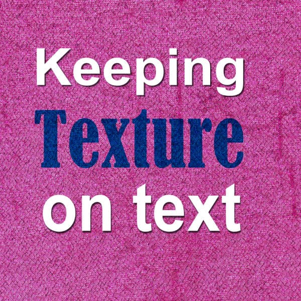
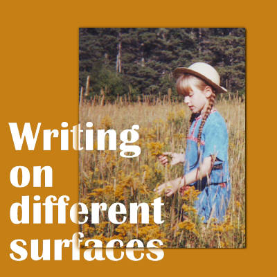
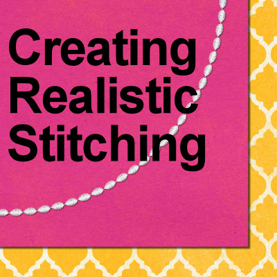
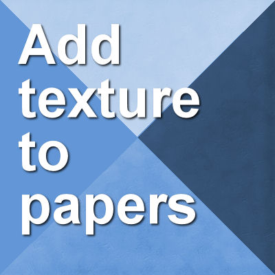
We have already looked at a few principles to design your scrapbook pages and create a pleasing project. Today, we will look at how you can use contrast. Although we might like unity, sometimes, adding contrast will just turn a project from monotonous to interesting.
texture
Grungy effects in scrapbooking
Although many scrapbook projects will have a very clean look, sometimes, you want the result a little less "perfect". That is when you will want to incorporate some grunge into various elements. Let's see what it means for your project.
Keeping texture on text
When adding text that replicates handwriting or printing, it can look like it is not really part of the project. If you write or print on something that has a texture, the inked area will still show that texture. How can you do that using PaintShop Pro?
Writing on different surfaces
When adding text, designs, or even brush strokes on a digital layout, there is no difference in whether your element overlaps more than one surface. However, in real traditional paper craft, that would not be the case. First, you would be unlikely to write from one surface onto another one, and second, if you did, the result would show something very characteristic: a disruption in the continuity of the element. Here is how you can recreate that detail in digital projects.