Leaderboard
Popular Content
Showing content with the highest reputation on 04/06/2025 in all areas
-
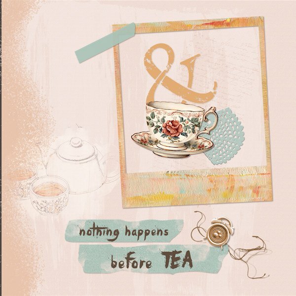
This is my interpretation of the instructions. And the words are accurate. NOTHING happens until the teapot is steeping and the first cup is poured in the morning. (I switched to morning tea many years ago after a walking tour in Devon where the coffee was terrible but the tea was bracing!) Bits and pieces from my stash. The sketch of the teapot is from Pixabay (artist: sylvia gaudenzi) with a mask and blended.6 points
-
I used one of my own oval templates. I wasn't certain whether I was to write the words myself, or use a hand written font, or either one. I decided to write my own , using the scribble text technique. Coloured tape tutorial fitted the bill for this brightly coloured layout. Scotch tape. The rectangle doily is one of Carole's. Like everything else in nature, flowers never cease to amaze me, especially when I get right up close to shoot them, then research them.4 points
-
Thanks for adding the extra larger copy of the note, I would have been nuts trying to see what all it said.2 points
-
Module 7 I found a kit from LouLou called de souenirs de vacances. The colours were nice and bright, while the photograph is very earthy tones. The Moeraki Boulders are a mysterious and weird group of 50+ boulders on the coast about 3 hours north of my home. There are many stories of their origin, some quite wild, some scientific, yet the wild ones get lots of favour. The elements in the cluster came from Sand & Beach kit from Elif Sarin of Digital Scrapbook.2 points
-
I have all three Affinity products but are only currently using Affinity Photo 2. I have not used the other two apps at this stage because I was wanting to learn more about Affinity Photo 2 first. I am also still using PSP 2023 and still continue to love it and use it. I am hoping using Affinity and PSP will complement each other. They are all great products.2 points
-
Yes, that bug affects some fonts and not others. It was reported, documented, and replicated. That is why I know it was a bug. I had just mis-read your description in the first place as I thought you were talking about a layered alpha instead of a layered font.2 points
-
2 points
-
2 points
-
2 points
-
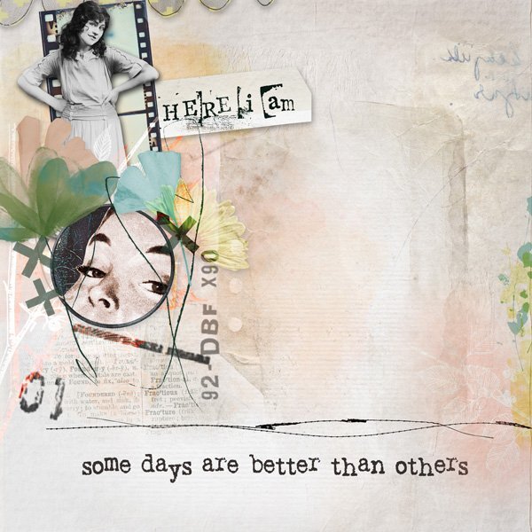
I received a free mini kit from ET Designs (called Graceful). I wanted to use it so I had to come up with an idea since I had no photos that might work. I added elements from Vicki Robinson and Rachel Jefferies which "spoke" to me. It's just about those days when things don't seem to come together very well and not much gets done. I call them my "zip" days.2 points
-
Module 5 'This was a challenge, I'm not sure whether or not I managed to get all the shadows right, but hey, it was fun . I chose a photograph of butterflies in the Butterffly House at the Otago Museum, in Dunedin. It is an amazing experience to walk amongst butterflies; they will land anywhere - on your shoulder, your head, your hand, wherever they choose I tend to be reminded of the changes they go through in their lives, from the caterpillar to the stunning creatures they become. The kit I used was Jessica Dunn's Crafty Evening mini kit and the alpha is Brooke Gazarek's Distressed Alpha Tan. The kit didn't have a dark paper, so I chose to select a rectangle and, on a new layer, poured white, and bringing that layer's opacity back below 20%. I didn't want the text to be dark, so chose white in Garamond on a white paper.2 points
-
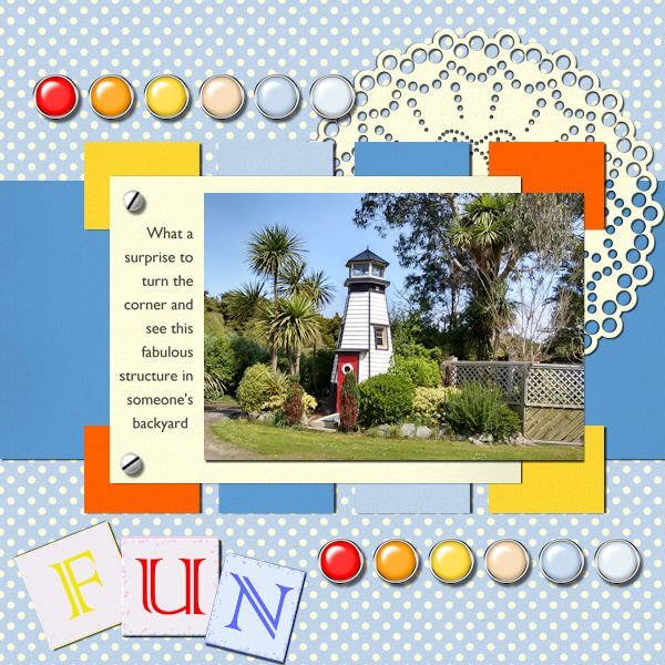
Module 4 Using the kit supplied by Carole, Fire and Ice, I wasn't sure how this would work with any of my photos, however, I found the perfect match. A bright, colourful photograph of a lighthouse, possibly a child's play hut, such a fun structure, on the road alongside the estuary outside of Invercargill. I think the colours match beautifully, like this kit is so uplifting. The screw is mine, from one of Nanson's tutorials from the days of PSP8. The journal font is Gill Sans MT Regular. I have loved Eric Gill's typographic work, since studying his font designs in 1994.2 points
-
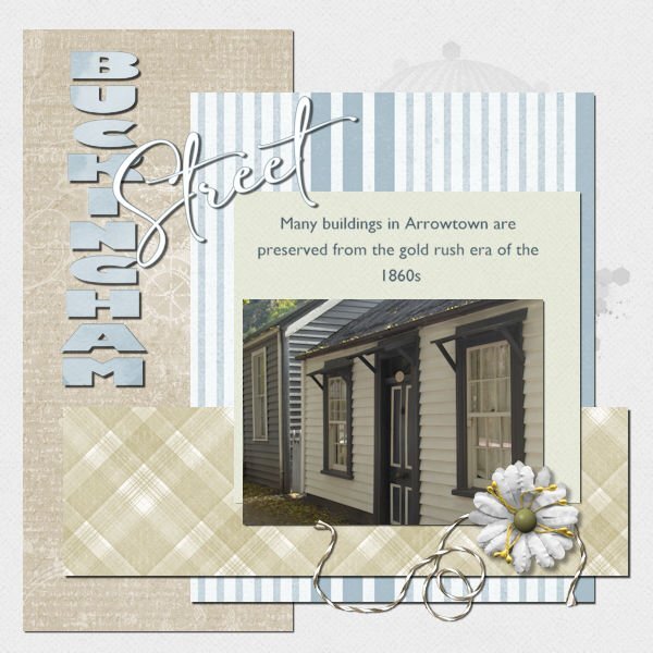
Module 3 The Arrowtown Autumn Festival is on shortly. Arrowtown is an old goldmining town, with most buildings still standing, including this row of miners cottages on Buckingham Street, the main street of the town Many cottages have been set up as boutique shops selling ice cream, wine, chocolate, and sweets, and New Age shops selling incense, crystals, etc. There are a few cafes and restaurants tucked away amongst the cottages. I used Jessica Dunn's Bohemian Sunshine kit, I had the papers and embellishments already. I colourised the papers to match the palette of the cottages. Fonts used are Gill Sans Ultra Heavy and Gill Sans MT Regular, and the script one is Amalfi Coast.2 points
-
Module 2 Using Marisa Lerin's Let's Shop mini, this kit worked even though the title doesn't...this page is not about shopping, in fact, Waipapa Point is so far removed from anything like shopping To secure the photograph of Waipapa Point Lighthouse, I used a button and a piece of string. Wildlife is prevalent nearby, I saw a sealion sunbathing amongst the tussocks leading up the sand hill to the lighthouse on top, a while ago and I also saw 2 of them fighting over a female when one male and one female rose out of the water to bathe on the beach. The lighthouse was built in this spot after one of the worst maritime tragedies in New Zealand waters back in 1881 when 131 lives were lost.2 points
-
Module 1 I thought I posted this in another forum, and it seems to have disappeared, so looking around, I found this forum for the Basic Scrap Course. I chose a couple of photographs I had taken around Waipapa Point on the south coast of the South Island. For this project, I used Heather T's kit Love Spoken Here provided for this module. I have never used alphas before, in fact, although I do have a few, they sit unused in their folder on my hard drive. The alpha in this kit was perfect for the title, and the only item I colourised was the brown button, which I toned down a bit to match the colour of the tussocks in the top photo. The trees in the lower photo are bent over, thanks to the force of the wind coming at them.2 points
-
I'll post my projects for the BSC here. Not sure how fast I'll work through them. Doing the Bootcamp as well currently. This is Project 1 from Module 1:1 point
-
Due to the compression reading some text can be a challenge. Adding some text separately, makes it easier for the viewer to read. Which helps to tell the story behind the layout.1 point
-
Thanks for that idea, Carole, I checked, and it must be the font. So, instead of using Kristen ITC, I chose Memories, and it worked fine.1 point
-
Module 6 Thank you, Carole, it was the font. I tried a different font, and it worked immediately. I used Jessica Dunn's Cherish mini-kit, I wanted something a little vintage, and this fitted my idea of what I wanted. The colours also blend in well with the photograph. Font is Memories, and Gill Sans MT Regular on the tag.1 point
-
1 point
-
Looking at it closely, I think this is an actual bug. If the grey layer has 0.0 stroke, it might be the issue. To overcome this, set it to 0.1 and in the same color as the grey so it won't show, but it might fix the bug. Worth a try.1 point
-
I like the irregularity of the black stroke being just a bit off. Very cool alpha.1 point
-
1 point
-
I never heard of Affinity until I received Carole's emails. I only use PSP products.1 point
-
1 point
-
1 point
-
I have Affinity Photo for both iPad and Mac. I have Affinity Designer for iPad only. The little bit I've used Designer makes me content with using only Photo. Thank you for teaching these classes. They've been really helpful.1 point
-
Purchased Affinity Photo and Designer yesterday and look forward to learning them1 point
-
Will be considering Affinity and would be interested in learning. Will be looking into the Photo trial first, but open to the other two.1 point
-
I got an ipad this past Christmas, I had the Universal license so I only just recently installed them on my ipad and I can't get used to it lol, but I can't wait to try my purchased brushes with my apple pencil1 point
-
I, too, was planning the switch to publisher and since I wanted to also work from an ipad, the universal is the way to go. Already used designer and i am annoyed that things are in different places win vs. Ipad.1 point
-
I am really glad to see some Affinity stuff here in the forum! I've had all three since 2023 and usually use Designer to try to design SVGs. I've only used Publisher maybe once and hadn't even used Photo before your workshop. I keep going back to PSP because that is what I'm most familiar with, but I'll never learn Affinity if I don't use it lol. I do hope you'll offer more tutorials for Affinity :)1 point
-
Susan, if not in summer, then Black Friday for sure. I would also like to encourage anybody ready to purchase -- right now-- to contact Affinity customer service by email and tell them about this group trying to learn Affinity, and how sad you are not to be able to play in the reindeer games and could they pretty please offer you all three at the super sale price, 50% off? They are the old Serif Page Plus, and a nicer bunch of folks you would ever meet. Just try it whenever you are ready to buy it.1 point
-
I'm sure I'll jump on board with Affinity eventually. Perhaps when they are all 3 on sale in the summer, if they do that again. I would think I'd like to have all three if it's financially possible.1 point
-
It is going to be discontinued and no longer supported in October 2026 aka no longer available in the MS Office 365 suite of programs (they need to lower the price if they get rid of a program IMO). They are recommending that any important files be converted to another format. Apparently CorelDraw can open the .pub files Publisher creates. As for replacement programs, I see that Canva is the most recommended. Other programs recommended include CorelDraw, InDesign and Affinity Publisher.1 point
-
At the moment I only have Affinity Photo for the free 90 days trial and I will certainly buy that one. If and when I buy the others will depend on the price of them all. I have to make that decision when I'm visiting my family in California and I don't take my laptop with me, I'll see how it works out.1 point
-
I have used MS Publisher at work a few times in the past and didn't know it was no longer supported. The Inspiration A to Z was created in InDesign by someone I paid. I no longer can use InDesign (since Adobe messed up the count of "activations") so as I was thinking of making a second similar book, I would have used MS Publisher, but I might use Affinity Publisher when the time comes!1 point
-
Publisher is the program that the gal from TLP uses to scrap, not Photo. With the 3 programs working together seamlessly, it was a no brainer for me to not buy all three.1 point
-
I'm same as Christina - the cost was just too attractive for all three - -oddly, for you at least, I didn't care about Affinity Photo. It was Affinity Publisher I wanted to buy!! (Microsoft has done the same thing to MS Publisher that Corel has done to PSP! They just dumped it and are no longer supporting it.)1 point
-
It was not what I had in mind in the beginning, but due to the circumstances, we ended up getting the Universal License with all 3 apps.1 point
-
1 point
-
That was an easy fix. I just "turned" off the mask layer and resaved everything. Thanks.1 point
-
Module 4 Project 4. Almost all supplies from Cassel's Fire and Ice with a couple of modifications. Used a green paper from Jessica Dunn. The doily was done by me following along one of the tutorials. I pretty much turned the layout 90 degrees since my photo was NOT in landscape format. PS...you have to look close to see Rambo.1 point
-
Module 3 Project 3. A couple of papers from cpjess, one modified from Flolinette-PBS and a rope from Marisa Lerin. The photo is two originals taken from aboard ship, blended together with another layer that was a gradient fill. Background, plaid paper and paint splash original. Elements from the internet. I keep forgetting to write down the font names when I have more than one and always "lose" the first one LOL. Needless to say it was as Carole calls them...a thick one and in this case a 3D font. The second is obviously Ariel. PS. I'm going to start renaming the font raster layers with the font name and size. Might keep me straight in the future that way. The OpenAsLayer does a good job with the papers and elements in that way.1 point
-
Here is Project 2 from Module 2. I have elements from Janet Kemp, Marisa Lerin, Rachel Martin, and Sharon Dewi Stolp. I created the background using photo corners from Jessica Dunn. I only downloaded two of the four and went from there. I actually have several of those now in different colors. Rest is original photography or from the internet. The fonts I used to create two "alpha" words and 5 alpha letters were Loves Labour and Moria Citadel.1 point



.jpg.c6605f738b1156bd36c4d372ebf46bdd.jpg)


