Leaderboard


Popular Content
Showing content with the highest reputation on 02/17/2025 in all areas
-
Giant Puppet Walk that took place in Montreal in May 2017.
 7 points
 -
Hi all, here is my new Cover- this time from Tierpark Alsdorf6 points
-
Theme for my magazine will be to show items that I machine embroidered or sewed in 2023. Here is Day 1 - Magazine Cover
6 points
-
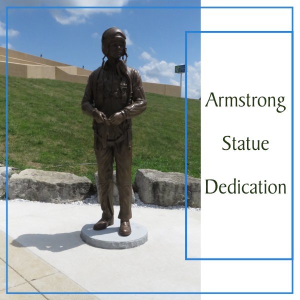
Here is my Affinity magazine cover. I'm highlighting the statue dedication at the Armstrong Air & Space Museum in July 2019 that took place during the 50th Anniversary celebration for the first moon walk. I used the same font as the other one, BakerSignet BT.
5 points
-
Hello Scappers and PSP Users, I'm liking all the examples already shown on this forum. It gave me the idea of using waterfalls as a theme. I live in mountain country so waterfalls large and small are plentiful. When I take the two hour drive to visit my son's family, there are three waterfalls all worth visiting along the way. So naturally I have lots of pictures of them. Hopefully you will enjoy seeing them through this evolving magazine article.
5 points
-
I did this one real quick with PSP. These will feature photos from the Sandwich Glass Museum in Sandwich, Massachusetts (on the cape). I will do another one with Affinity on a different subject this afternoon.
5 points
-
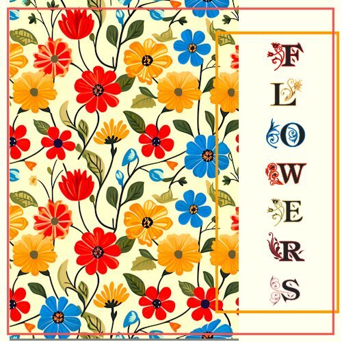
My Magazine day 1. The flower pic is a background page I downloaded (Retro-Spring-Garden-Flowers-Pattern-90720530). The font is one I downloaded from somewhere and the only name it shows is "am_intex" . Hopefully all the flower pics for the rest of the pages will me my own photos.
5 points
-
My take on this DIY. I always like this challenge. Having said that I was happy with the PSD file, of course I had to use it in Affinity. Cristina pointed me to the Affinity Resolution Videos and that had a freebie bundle with 2 fonts, styles, background papers and textured papers. Firstly I looked at the videos and installed the goodies and then used them in this layout. It took me more time then it would in PSP but it is becoming more easy now because at least I know the utmost basics. I think there is much to like in this Affinity and a lot of actions are easier than in PSP. I'm hoping to learn new things in the Magazine challenge too. Besides my photos I used 2 brads for the small circles and arranged the rest of all the elements to my liking
5 points
-
D is for Dumbbell. something I've used for over 30 years now. I got this one when I bought a group of dumbbells. Someone had painted it gold and it was already rusty. Since I have rubber hex ones (and some metal ones), and this little guy had no mate, I use it to hold open doors. I'm letting it continue to rust because it will look cool. Why someone would paint a dumbbull, "dumbfounds me. 😁
5 points
-
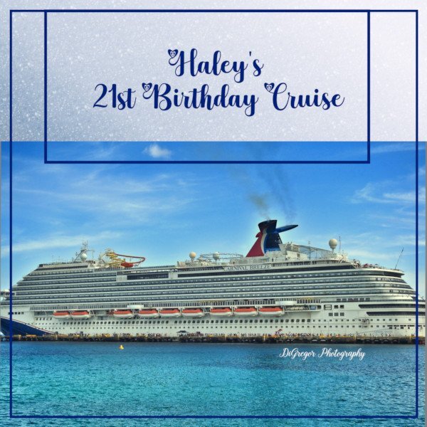
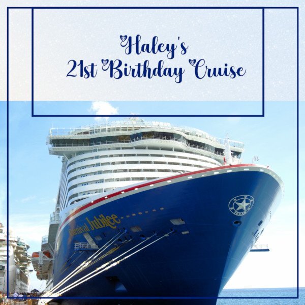
We recently went on a cruise out of Galveston to Mexico for my Granddaughter's 21st birthday. Not sure which ship photo to use. I think I like #2 the best.
4 points
-
Here is the cover for my magazine. The title font is Showcard Gothic in a brass gradient with a slight chisel effect and the background is a pattern called geometry 07 that I darkened a bit. The photos for this series are done by Lawrence McElroy.
4 points
-
I'm in, and will use Affinity, mostly. Thanks, Ann and Susan for showing your previous layouts, they are lovely.4 points
-
For my letter D I had to make 2 cards, because in this case the backside is important too. I tried to do both in one card but that didn't work. This is a small plate (15 cm diameter) made of Delfts Blue, or in Dutch Delfts Blauw which is pronounced like now. Delft is the world famous pottery city of the Netherlands for centuries. My dad worked for a big bank with an insurance department. It was in a very stately office building and these plates were on the wall in the canteen. This is written on the backside with the date summer 1949 when they were made especially for the company. Much later when that company moves to another more modern building the plates were offered to the employees. My dad wanted to have one because 1949 is the year I was born. Since then it was on the wall in my parents house until we had to clear the house because mom moved into an nursing home. I took it with me but we never had it on the wall, I sometimes use it for chocolates. It was very difficult to take photos because the glaze on it is so shiny and the light reflected badly on it, but in the end I got something that is acceptable.
3 points
-
I am making a birthday card for my grandson, Matthew, and decided to play with Carole's new script "Radial Script." The photo is Matthew and his fiancee, Lane.
3 points
-
I do appreciate your very kind words. I try to make may layouts flow, whilst retaining a balanced layout without dirstracting from the photos. It never ceased to amaze me what a varied selection of colours can be selected out using the dropper tool on photos. Here is the cut out label I created myself, after discovering the script. As for the title I used the stencil technique on the edge. I typed the word first, then on a new layer created the stroke, changed the stroke to a raster, to add the stencil effect.
3 points
-
Ann you had a good idea posting you Magazine from last year. I never got mine done, two pages and the cover to finish. So I will follow you and post it here since I had not even done the backgrounds when the class finished. I sure hope I finish within a week or two after the workshop. Oops, forgot to add that page 2 is not finished either. I am going to finish this up after the 2025 WS is completed. I also based my Calendar that year on this magazine so I'll have to finish that too as I used different pictures.
3 points
-
D is for dogs. Besides the real thing, I have had small figurines of dogs that I have bought over the years. Only 3 that I bought in the days when there were no real dogs in my life. I also have 3 that were given to me by my grandfather. I don't remember exactly why he gave them to me but it could have possibly been as simple as me admiring them and he remembered that and gave them to me. Then about 20 years ago I added these 2 figurines to my small collection. They are displayed separately because of how special they are. There is an artist that made these figurines of Havanese dogs (and other breeds). They are wood carvings and I bought 2. The black is for Pepper and the white is for Paige. Even though he is still in business, he no longer sells these small figurines for the various breeds. Although with Peyton's coloring, hers would look exactly like Paige!
3 points
-
Since you need a lot of pictures, I decided to use my Thailand pictures. Some of them will be repeats of my 2025 calendar.
2 points
-
Beautiful, Corrie. ❤️ I have always had a soft spot for blue and white porcelain. I only have one or two pieces left. I tended to acquire serving dishes. One was found packed in a large wooden barrel in my parent's basement, obviously from my grandparents. I will get to it as the alphabet continues. 😉2 points
-
Wow a new baby, will it be in Wales?2 points
-
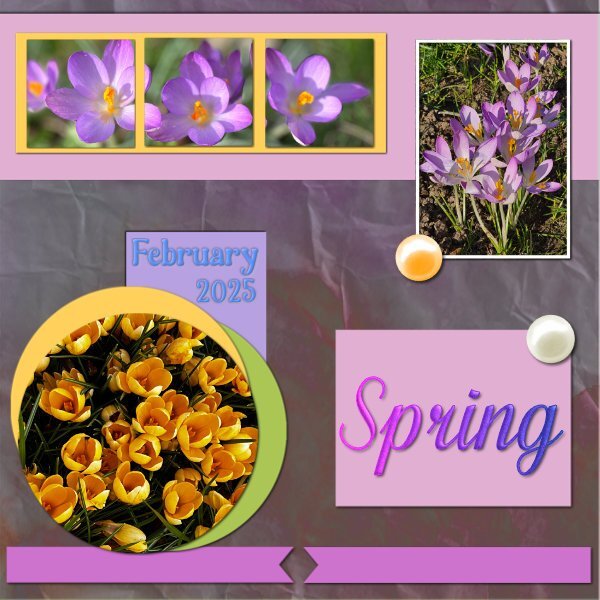
A stunningly vibrant spring layout! I was wondering if circumstances would allow you to make a trip this year to your daughter's. 8 weeks sounds like a long to wait, but before you know it you will up, up and away. I will be making another tip home in the near future, shortly after the new baby has been born in mid March.2 points
-
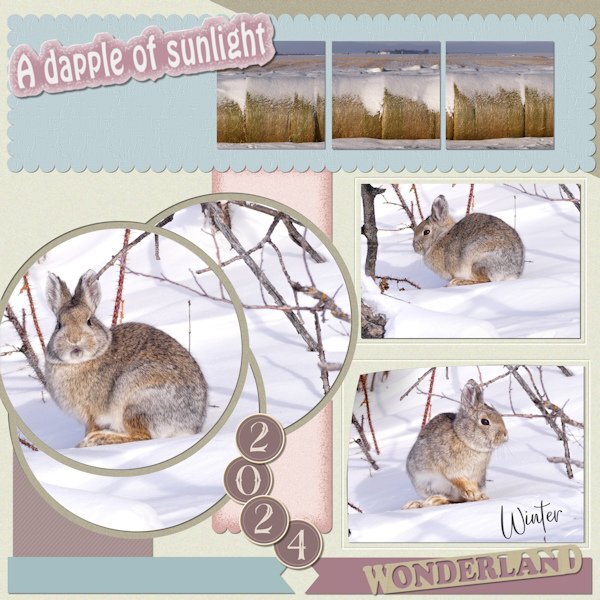
What a great use of all the elements. For us viewers there is much see and discover. and OMG that is a cute rabbit/bunny(?). The way you have explained how your choose colors for your papers makes what you think is busy, not busy at all. It all seems to flow together perfectly. Even your layout takes my eye around the layout from the big circles, down the 2024 to wonderland, up the two rectangles and across the upper squarish rectangles to the title. At least that's how I travelled through. Then I went back to take a look at your papers and wonderland cut out. I like that shaded edge on the pink paper. And I see the cut out around the two rectangles, it looks very cool.2 points
-
This one posed a slight challenge, as it is busier than what I like to go with with. Anyway, the size of each element has been retained exactly as it. I came across the cutout script, which I must have missed, so I created my own cutout 'wonderland' word.
2 points
-
I also never finished the last year's Magazine Workshop. So, I'll do the same as I did for the Affinity Bootcamp, use the same photos, and try to complete the workshop this time. 🙂2 points
-
I cant wait to see your Magazine! I love Christmas lights.2 points
-
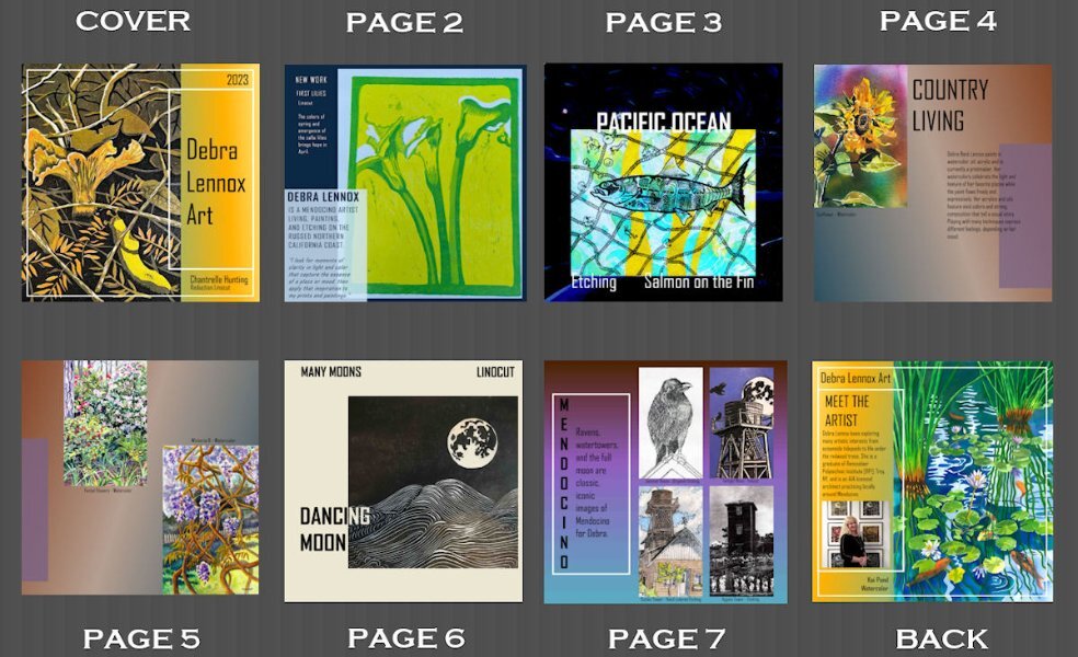
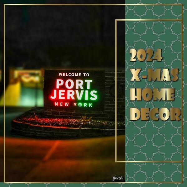
I'm in. I'm planning a guided tour of Port Jervis, NY, and it's stunning Christmas decor on every single home. I have a lot of photos. Last time I only had 6 or 8 and did an overview of my daughter, Debbie's, artwork. Not sure how I'm going to handle using 29. Here's a peek at my mag from 2023.
2 points
-
Our next workshop will soon start. Are you in? You will create various pages in a "magazine" format, with little to no decorative elements. That will generate pages with a "clean" look and save you time in choosing and arranging embellishments. The workshop will start on February 17th, so there is plenty of time for you to find your photos and invite friends to join. And this workshop will be FREE for everyone, so spread the word. (although every registrant will get some templates to work with, as a bonus, DIAMOND members will get more) Did you happen to find this thread before the registration page, by chance? Here it is. To post in this forum, you need to be logged in. To be logged in, you need an account. Registering for the challenge did NOT automatically create an account for you, so if you are new to the Campus, you will need to Register, to create your account. To make it simpler, use the same email address you used to register for the challenge (otherwise, the system will think you have a twin and you will get emails in double). The tutorials will be available for the duration of the workshop, plus one week. Of course, the DIAMOND members will keep permanent access and will receive extra templates. There will be tutorials for PaintShop Pro and Affinity Photo users. If you have access to both programs, you can choose which tutorial you will follow. They will be clearly identified.1 point
-
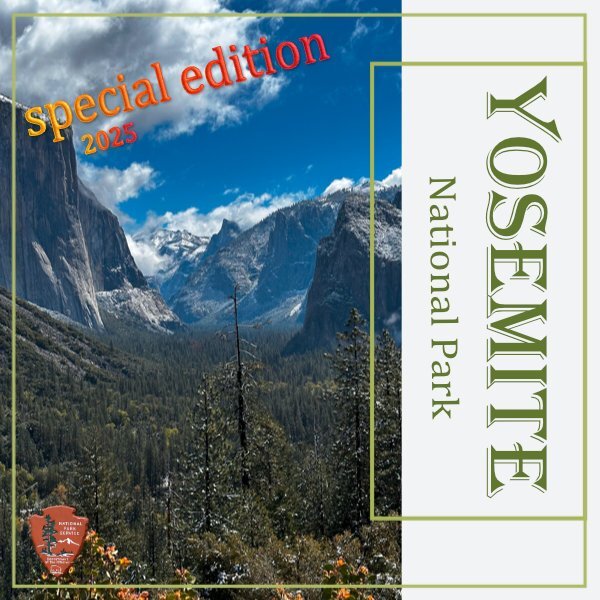
I couldn't help myself and just played a bit more with this cover. I already had in mind that I would present it as a special edition and put that on the cover.
1 point
-
The "Walk of the Giants" can be seen on "youtube" on the site "https://www.youtube.com/watch?v=tGNdzi0FyaM". I can't say if my photos are from that same day but I saw these giant puppets in action. More photos to come?. This Giant Puppets can also be see in other countries.
1 point
-
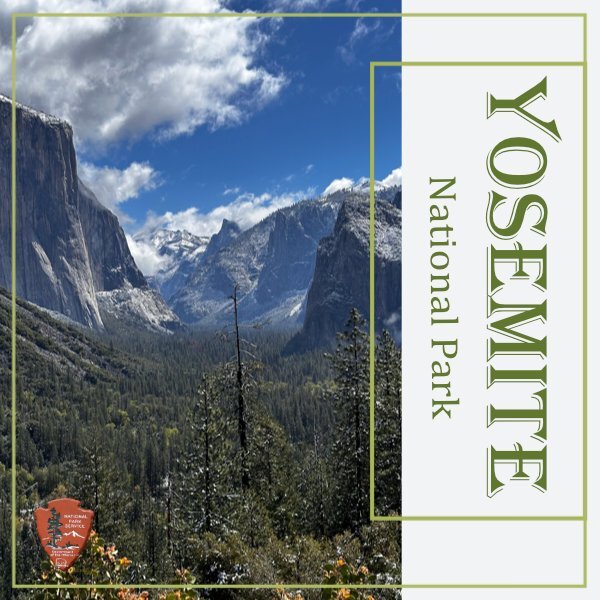
I will use Affinity for this workshop and have settled for Yosemite NP as my theme. I visited the park last year and I have a lot of photos from that visit. This is going to be a magazine and therefore I will keep the background for most of my pages off white. The font is Algerian and I have seen this font or something very similar used on posters and cards in the park. I included the NP-shield that you can find on all the national parks.
1 point
-
I'm looking forward to it!1 point
-
There you will have not only a newborn to hold but nice weather too. How long are you planning to stay?1 point
-
Remember this are the photos where I had to lay flat on the ground 😂 and there are a couple more which I have to take that are difficult qua lighting. Luckily with still life you can take your time and try on different moments of the day and with different settings. I'm so happy with my new iPhone 16pro; it has great possibilities.1 point
-
Not this time. It will be born in Truro, Cornwall.1 point
-
This is a unique D!1 point
-
I can't wait to see what you show based on this giving you an idea.1 point
-
Seeing this game me an idea for the letter "I". I had 2 other ideas but I like this one even more 🙂1 point
-
That is such a creative way to use that script!1 point
-
I very much appreciate that you are now giving the templates as a psd file, thank you!!!😍1 point
-
Thank you I'll have a look, sounds interesting......1 point
-
If I only had, I'm juggling to get everything in and I just booked my next trip to California as well which will be in 8 weeks from now. Amidst the Build a Kit, so maybe that goes down the drain this year too. When I'm back I will have a photo assignment and have to make an album for someone who is retiring. Maybe you can learn me how to fit everything in..........1 point
-
I took that course as well. Affinity Revolution is one of the first channels I found about Affinity. I agree that they are well explained. I also downloaded her freebies that came with the course.1 point
-
I agree. It's not only about recording a tutorial but also how it is presented. The workspace has larger icons and text. She zooms in and out to better show what is being displayed. Even before recording it, there are so many details to consider.1 point
-
Hi, Lucy! You made the front cover!1 point
-
I agree. I have been watching PSE tutorials and nothing comes close to the bootcamp. Nothing seems to be as progressive in start to finish learning. I have been watching the labs because I havent had time to use PSP lately and I cant believe how much I'm learning just from watching small tutorials. Some techniques are used often and I'm finding that I'm guessing (some times right) what comes next in a technique. I just watched one where the cut out was used but only one part of it (fishing floater) where I thought the cut out always had to have the two parts, so that's cool to see how a tool can be used in different ways. I am looking forward to getting back to the Labs. It's hard to fit it all in.1 point
-
I'm in too and I will use Affinity for this workshop because I want to use and learn as much as I can as long as I have the free trial version. However I will look at the diamond extras for later use. I'm not sure yet what my topic will be and which photos to use for it.1 point
-
I'm in. I plan to use some photos from the Sandwich Glass Museum I visited when in Cape Cod last fall. Lots of photos! I also plan to use Affinity but might also do it in PSP. Double the pages (yes I have that many photos from that place) and seeing how it compares doing the same simple pages.1 point
-
I'm also in, and I'll work with Affinity. I want to use the trial version as long as I have it. Like I did for the Affinity Bootcamp, I will use the same photos from the 2023 Magazin Workshop, which I never finished.1 point
-
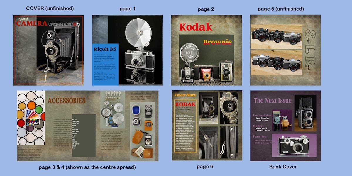
I'm in. I'm not sure what I will do. I did cameras the last time so I'm going to have to think something up pretty quick.1 point


.jpg.97c29dbc4f3a0f1f90ccb30891dc50df.jpg)