Leaderboard
Popular Content
Showing content with the highest reputation on 11/22/2024 in all areas
-
9 points
-
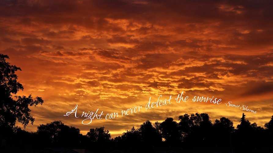
Lesson 4 I love text on a path. I should have started the path closer to the left side by the tree and made the font bigger. The font is Love Light. It doesnt have glyphs, but it sure is pretty without having to have them. Not sure if this is Creative Fabrica or a google font that came with FontBase.9 points
-
Lesson 3 Yup, there's a typo 😪. And I used 2023 for text wrapping when I meant to use 2022. So of course soon as I duplicated and converted the dup to a raster the Vector turned into one single long line. So the type will stay for all eternity. These are my mutant Sunflowers that were only supposed to grow to 6-7' according to the package. they topped at about 10+ feet. That is the roofline of my garage that you see them grow past. The font, the little bee below the flairs and the bee line-graphic is from Creative Fabrica. The two flairs are from DigitalScrapbook.com and I believe they are from Jessica Dunn. the green patterned paper is also from DigitaScapbook.com. The other green paper is a gradient with a texture and a bit of noise added.9 points
-
9 points
-
8 points
-
6 points
-
5 points
-
5 points
-
5 points
-
5 points
-
4 points
-
4 points
-
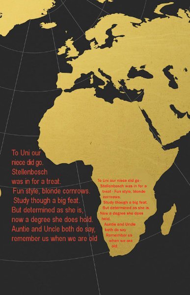
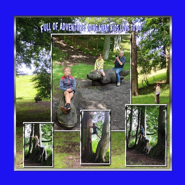
@Jeni Simpson You can play with shadows to get different effects. A large shadow like you have makes the text "float" above the surface, while a smaller but less blurred shadow will give the effect of the piece laying on the surface. It all depends on the effect you want. As for compatibility, jpgs will always work in all versions. It is the .pspimage files that need to have the correct compatibility setting. @Jannette Nieuwboer NexusFont is another option. I personally don't like that it seems to need to load fonts and for me, it takes longer to use. I cross my fingers that TFT will still work for me for a while. Looking at the shadow you put on the text and the one around the project, it gives the impression that the white text is "engraved". That is an interesting effect. @Daniel Hess That is a great use of text on path. @Ann Seeber That is quite an interesting font, and with the bevel, the holes stand out! Jackie must love to see all the attention she and her animals get from your layouts! @gwen jewitt Great use of the text on path. It goes well with the theme of children playing. @Corrie Kinkel Nice Christmas card. Will you print it? @Cristina Mochetti It makes a difference when you add shadows. Don't you think? @fiona cook I think that the text in the water works well too. If you keep it in the continent, maybe you can just make it a bit larger (in a larger selection starting a bit higher)? Just a thought. @Anne Lamp Since you added some bevel on the text, you might want to add shadows to the photos to match the 3D effect. @Jacques I think that a little shadow on the title would make it stand out a bit, since it is crumbled! And while at it, maybe something on the photos too. Delightful photos! @Donna Sillia We got some milkweed plants a couple of years ago, and even though we planted them in our garden and they seem to have propagated, we have not seen a single mornarch. 😞 @Dan Greenwood Will you print this card for Christmas? @Susan Ewart It is funny how those sunflowers look like they are peeking over the garage, as if they were spying! Looking forward to your upcoming projects!4 points
-
Those clouds would make a great base for making papers. Great shot. Clouds are so interesting to watch.4 points
-
Stunning layout with perfect colors Mary! I really like how your fonts are dancing.4 points
-
4 points
-
4 points
-
4 points
-
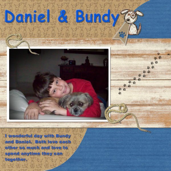
Daniel I recognized this great layout from the Tourist Spot challenge and it is very nice to see it again!4 points
-
3 points
-
3 points
-
3 points
-
@Jannette Nieuwboer Thanks. I wasn't thinking about the existing shadow or the sun in the original picture. Although...the statue was cut out of another photo just pasted into the middle of that one and as such I just wanted it to "stand" out from the rest. I'm going to leave it for now and try to remember in future projects.3 points
-
@Daniël Hess HALLO Daniël, ik wil graag een reactie geven op je crea. Degene waar het standbeeld van de man op staat. Niet uit kritiek maar om je wat inzicht te geven. Je schaduw staat aan de verkeerde kant. Kijk goed naar het standbeeld, vooral op de mouw en de broek, de linkerkant is donkerder dan de rechter helft. Dat betekent dat de zon (die je niet ziet) van rechtsachter komt. Dan moet je de schaduw links achter plaatsen. Dit is een natuur wet. Nogmaals, Dit is géén kritiek. Je plaatje is prima werk. 👌 ook zo'n natuur wet is dat hoe lager de zon staat des te hoger je de schaduw plaatsten moet. Tijdens noen geen schaduw. Een tip is: Bepaal, waar komt hij ☀ vandaan! Groeten. Ik zie je op de campus, Ik kijk uit naar je volgende werk.3 points
-
3 points
-
3 points
-
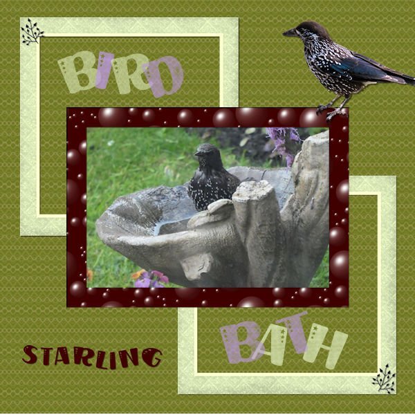
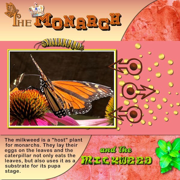
Day 3 - I love monarch butterflies and took a lot of photos when I visited the Butterfly house. The background is one of my own with a gradient on the other curve. The caterpillar, pupa and milkweed are from Canva. I made the arrow fasteners from an arrow dingbat font from CF. The first letter of "The" is Butterfly Monogram from CF, and the title is called MeLove also from CF. The word milkweed is from some png letters downloaded from CF and recolored. The gold circles are from my Build a kit 2. The crown is from AI, Adobe Express.3 points
-
3 points
-
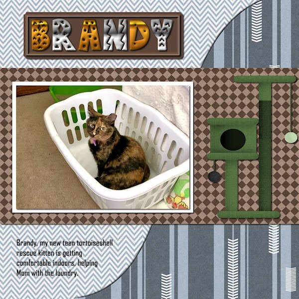
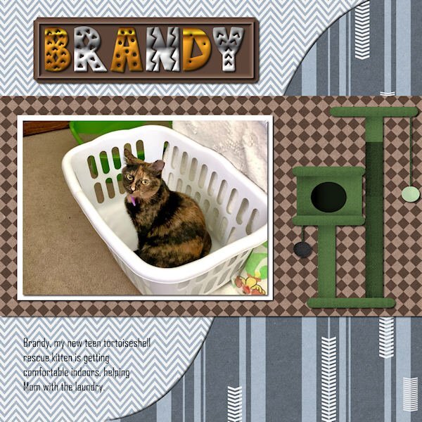
Ann I like your new kitty but the wrapped text is a little bit hard to read in the color you choose on the busy background.3 points
-
3 points
-
3 points
-
3 points
-
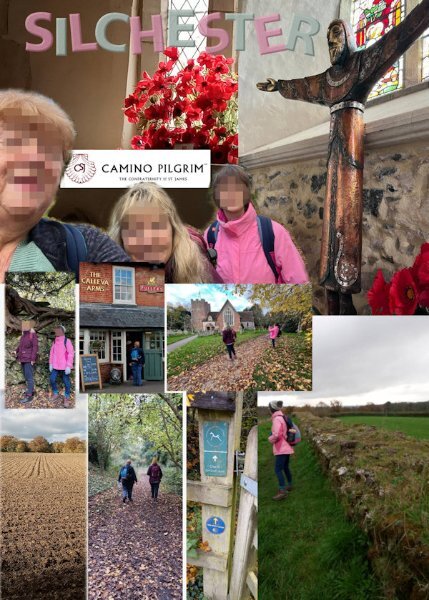
Day 5 Love this effect. I have added it to another project but just need to fuzz their faces out before sharing. Font: Humnst777 Blk BT. Pink letters with Hatch Fine texture and green with Grain Long. In Layer Styles I added the bevel. I tried to use the repeat function when applying the texture to the letters but it didn't work. Just opened up a new canvas. Worth a try I guess.2 points
-
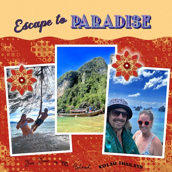
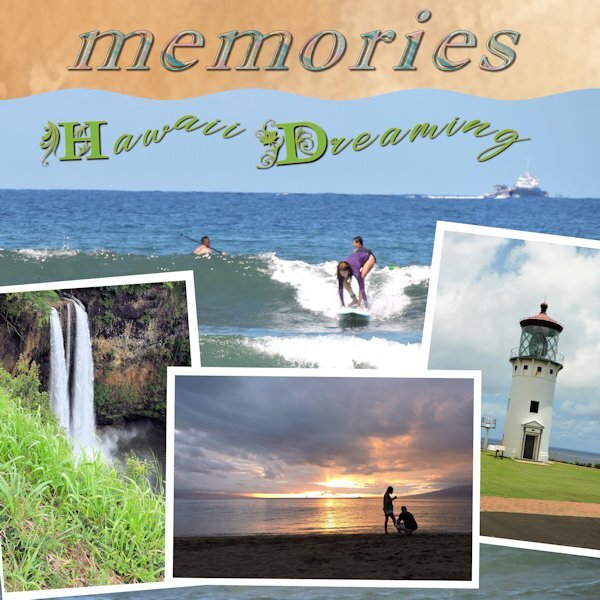
I got to thinking. The photo that is my backdrop was taken close to the town of Lahaina Maui. That was the town that was totally destroyed in the big wildfire last year. While I wish we could go back to Hawaii again (we can't) I don't think I would have the heart to see the devastation from that fire.2 points
-
I hope so. I took quite a number of photos on the same day just of the clouds and I'll be using them to make papers.2 points
-
Of course, Carole, I wasn't thinking. I automatically save .pspimage files to 7+, so I need to stay awake when creating in 2023. Great tip. I saved all my shadow presets in x8. It seems I will just have to copy them into 2023 when using that version. I've been chasing my tail today. We have been putting up gib in the lounge and haven't had much time to play. I'll be away on days 5 and 6 and will try to get them all done when I get home.2 points
-
2 points
-
2 points
-
2 points
-
2 points
-
2 points
-
For day 4 I used a card from the Mask Workshop - Extra 2b and a photo I took in Yosemite NP in may this year. When I took that photo I already thought X-mas card! 😃 It has text on a path and the 2 embellishments are from my stash. I don't think I am able to finish this workshop but that isn't a problem I have done this one before. The reason is I have a photo assignment and have to make a album out of it. The lady of our swimgroup has her 85th birthday this week and we decided to give her a surprise buffet in the cafetaria part of the pool. Everybody paid € 5 and one of the members is a cook and the pool director donated all the coffee and tea and the plates/cutlery etc. Today was the big event and I had to take all the photos, so for the next couple of days I'm busy to make an album that then will be printed and presented to her. If I was making this only for me I would take the time to finish this workshop, but now there is a little bit more pressure to hurry up. I'll have a look her what everybody is making and see you all in a while2 points
-
2 points
-
2 points
-
Thank you Cristina, Anne and Carole. It was the pixelated blanking out of the portraits I wanted so I will have a go for a design I wish to post. Thanks again.2 points
-
@Cassel Ik werk nu met nexusfont daar moet ik nog aan wennen na jarenlang gewerkt te hebben met TFT. Daarin moeten we de fonts aan vinken die we willen gebruiken in PSP. Ik heb ze in files gegroepeerd staan net als in TFT. Dus eerst zoeken in je mappen en aanvinken, het is wat omslachtiger. Met uitzondering van wat je opgeslagen hebt op je pc. Ik had de tekst tool 'bolvormig verwringen' gebruikt op het font, maar dat verdween met het verkleinen. Wat ik erg vervelend en jammer vond, het stond veel sierlijker en leesbaarder. Ik heb het ook zonder omlijning geprobeerd, maar omdat ik de kleuren uit de foto had gebruikt viel daar ook een deel van de letters in weg. Volgende keer ga ik maar een geheel andere kleur gebruiken. Ik ga nu alles verder doen in de '18. Na de tip van Corrie gelezen te hebben. Zou het een oplossing zijn om direct op 600px te gaan werken, of voor de tekst toevoegen het werkstukje verkleinen?2 points
-
Hallo Corrie, wat fijn dat je een oplossing hebt gevonden voor de bug in de '23. 👍 Ik heb nr. 3 nog niet gedaan dus pak ik de '18 maar. Om niet weer zoveel geharrewar te krijgen. Ik ben er iig mee geholpen. Ook dit vertaal/type programma is lausi om mee te werken.2 points
-
2 points
-
2 points
-
2 points


