Leaderboard
Popular Content
Showing content with the highest reputation on 10/01/2024 in all areas
-
7 points
-
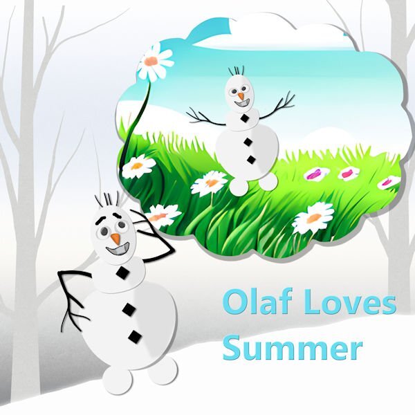
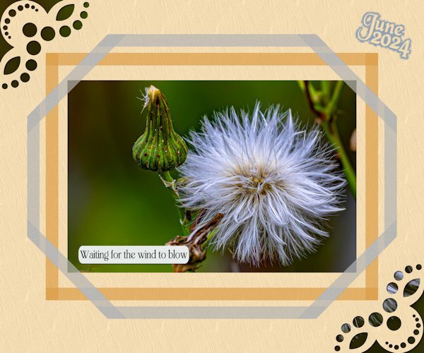
I'm a day late, but I'm here. I used one of Cassel's edge punches on a straight line, then ran the Mitered Corner script for both frames. The original tries were done manually, but I'm hard on myself and couldn't get them to line up perfectly. I couldn't resist adding a little gnome. I found the pic on Google.5 points
-
Sometimes, I want to make my own elements, papers, and so forth, and then... There are other times I have to use what I have collected over the years... Not to mention, I cannot even get closer to some of the designers' creations.4 points
-
4 points
-
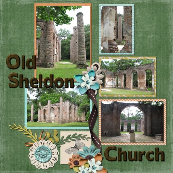
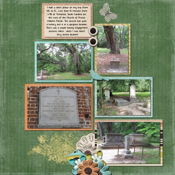
In 2013 I took a 2 week vacation where I spent a week in North Carolina with my dad then went to Orlando and spent a week with a cousin's family. It was a driving trip. On my way from NC to FL, I took a side trip to see the Old Sheldon Church in Yemassee, South Carolina. I found out about it on a website dedicated to lesser known tourist attractions. Edit to add my journaling: I took a short detour on my trip from NC to FL. Less than 15 minutes from I-95 at Yemassee, South Carolina are the ruins of the Church of Prince Williams Parish. The church has quite a history and is in a gorgeous location. There was a couple having engagement pictures taken when I was there! Very serene location!4 points
-
Fabulous Mary! What a happy layout and great Olaf you have created.3 points
-
I too love the gnome in the corner, a nice touch. Between the punches and the mitred corner, there are endless possibilities. Even, with the punches on their own.3 points
-
3 points
-
Simple and to the point, Julie. Beautifully done, love it!3 points
-
3 points
-
As I get older the less time I get to accomplish what I set out to do in a day. I thought I'd have more time on my hands, but apparentely not. It isn't as if I sit on my laurels either. Winter is the time to be more creative on PSP, once I have organized my photos, identified and documented insects, birds and other creatures I may not be familiar with. Long cold, dark Winter days and nights is the best time to while away those hours on PSP. Even preparing for the following year's calendars and cards.3 points
-
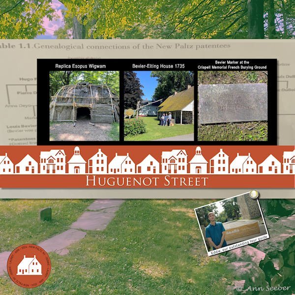
My daughters and I were exploring our French/Dutch roots in Ulster County, NY. this past summer. Historic Huguenot Street is part of the City of New Paltz. My French great-great grandmother was named Bevier who married my Dutch great-great grandfather, who was named Terwilliger. I did see an old photo showing a Terwilliger Blacksmith shop there. We had a wonderful tour guide.2 points
-
2 points
-
This is the layout I finished yesterday. It was amazingly fast, considering that nowadays, I take a long time to decide on colors, papers, and elements, so I have something I like or can live with. 😄 One interesting thing happened while working with the cat (Eyespire). I wanted to add a bevel and started playing with the "Randomize Parameters. " At one point, the cat's eyes turned red, which fitted perfectly with the theme (setting below). For the background, I selected the girls, promoted the selection to a new layer, and used the "Time Machine" filter (Effects>PhotoEffects>TimeMachine>Daguerreotype & Albumen) on the background and some of the elements/text. Credits: DiHiller: Papers and some Elements: 2019/2020 Fan Freebies --- DigitalScrapbook (ex-Pixel Scrapper) ThePumpkinPatch2023 black paper Corel 2018 Cliparts freebies Other elements: Eyespire (Halloweenies) / SheilaReid (Spookalicious) / ZaZa (Element_Scrap and Tubes19) Font: CF Halloween Girls2 points
-
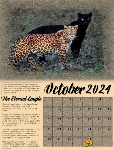
Here's my monthly Wild Cat Calendar. This one features two leopards, a pair, one spotted and the other black. The photographer, Mitha Hunugund, based in India, was published in National Geographic Nature. The title font is Babilonia and the story is Arial. The pumpkin sticker is from Sheila Reid. The calendar template is from Carole Cassel for our Calendar Workshop on the Campus in Nov. of 2023. The version posted on Facebook is full size and prints @ 8.5" x 11".2 points
-
Lovely that your background has the photo too, I just noticed that.2 points
-
Making my own frames is on my ever growing list of ideas that I want to follow and create. There are just not enough hours in a day to do everything that I want or must do. I'm not really a "house wife", if my windows are dirty well it will be going to rain again, but there are things that have to be done. 😉 Maybe I'll have more free time in the winter months. October is a busy month with birthdays that we have to attent, I'm making and printing the cards now because 2 of those are for dear friends that will be 80! For the more common numbers I can choose cards from my stock. But these are the first 2 that reach 80, so for the next one I already have a card.😀2 points
-
2 points
-
2 points
-
This is so pretty and delicate. Your backgrounds are so fabulous. You are very good at the blended background. I will have to try the outer bevel. I havent used it before.2 points
-
2 points
-
2 points
-
1 point
-
1 point
-
You are having fun with different techniques in this layout! As for the shadows on the balloons, I would use a much larger blur and lower opacity. The offset is ok but since a balloon is so "thick", the shadow should not have clear edges.1 point
-
The photo is really beautiful, Ann, and you created a very nice calendar page with it.1 point
-
Bringing October in with a bang (although the birthday was yesterday; I didn't wrap it up until this morning). Module 5 Project 5. Shadows were challenging but I "think" I got most of them done OK. Several of the papers came from the cpjess-crafty eve mini kit. Background was cass-Random Brush Print-Summer. A couple of things off internet then highly modified by myself. Alpha is original.......base font is Incised 901 Nd BT @400 dpi. The ribbon was generated with the sinebot plugin, then turned into a pattern flooded into a narrow 3600 wide selection. Stitching was the original stitch tube from Corel but I've made 3 or 4 more in different colors.1 point
-
Nice frames and a bit wider then the freebies. I love the simplicity of the layout and the colors.1 point
-
There is nothing wrong with using "stuff" that is available so widely and you used it in a great way too. It is not always easy qua time or inspiration to do everything from scratch!1 point
-
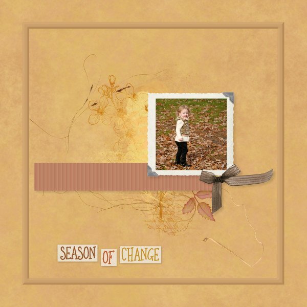
Likely the last layout for September. And another month passes by! Our fall days don't look like the photo yet. That will be later in October. Lately it's been damp, cloudy, but still very humid which keeps the temperatures in the 20s C. Old picture of my niece's daughter who is a lot more grown up now. Only things I made/did were background (blending papers), the ribbon, and outer frame with bevel. All other elements & brushwork from Janet Kemp (DS) or Erika Designs. I am simply too lazy or time-constrained to make many of my own elements. Especially when so much good stuff is available for free often.1 point
-
1 point
-
1 point
-
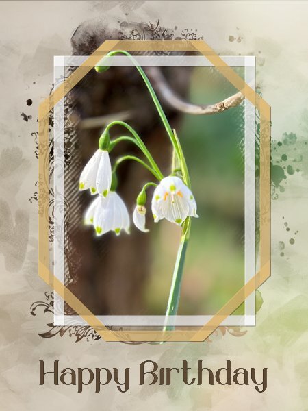
I needed a new card to send to a friend of us and I know he likes flowers too, but I didn't want the card to be too girlie. I used one of my photos taken of summer bells (Leucojum Gravetye Giant) with a mask by Jessica Dunn and of course the freebie frames. I had to change the colors of the frames for something that goes with the photo but I kept the transparency of them. The background is made of the same photo with a lot of blur and an overlay of paint streaks that I did for another project with reduced opacity. To let the frames stand out a bit they got a very light shadow with an offset of 1 and no blur. The font is Belinda. The card has to go in the mail so it is a double card with my logo on the back and I'm going to print it later today.1 point
-
I really liked Kalinda. Great character to offset the "good wife".1 point
-
I have watched Band of Brothers when it was broadcasted over here and it comes on again sometimes. I think my husband has seen it at least 4 times now.1 point
-
I happen to be watching Band of Brothers right now and he's in it. That was a long time ago. I don't normally watch war movies/mini-series, but this one is exceptional.1 point
-
Yes, it seems to be. I'm really into it but I started back on Season One. The first I realized who the actor was is when they announced the start of Season 4, so I have a lot of viewing pleasure to look forward to...1 point
-
1 point
-
I watch most PBS dramas, but this is one that comes on late and is very dark. I usually turn it off, but I'm sure I'm missing something really good. I do not recall this guy from The Good Wife.1 point
-
You're fortunate to have someone who takes lots of photos you can then use for layouts!1 point
-
1 point
-
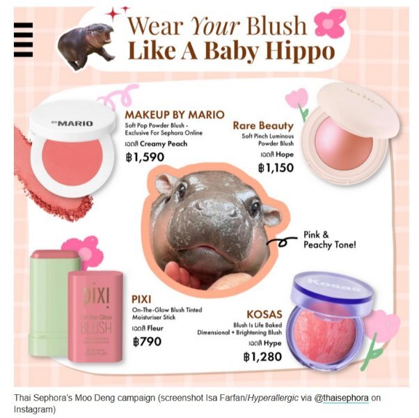
I had to check it out because I have never heard of Moo-Deng, but I found something!1 point
-
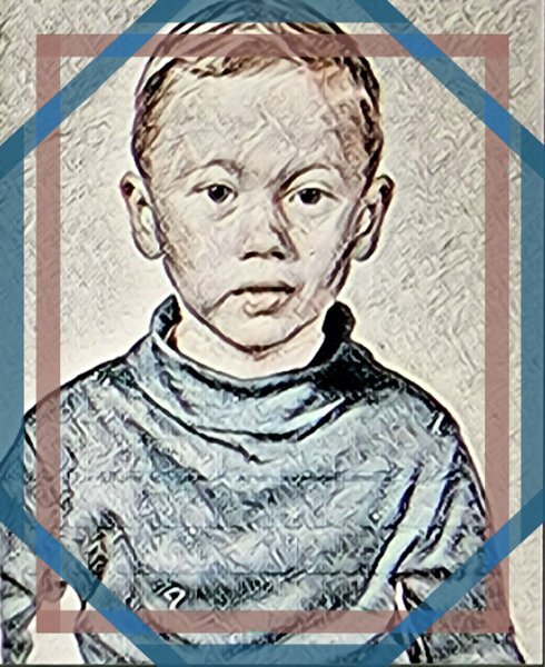
That is a really cool effect Kasany. It gives it an old world feel to it.1 point
-
1 point
-
I use your painted frames all the time to showcase what I'm watching today on tv. I got a new 36" monitor for Christmas with lots of space for displays! For example, here's what I had for Friday 9/27 - @Corrie Kinkel This is set in Amsterdam. The actor's name is Marc Warren and I first saw him on The Good Wife so I thought I'd try this show, also.1 point
-
Module 4 Project 4. Almost all supplies from Cassel's Fire and Ice with a couple of modifications. Used a green paper from Jessica Dunn. The doily was done by me following along one of the tutorials. I pretty much turned the layout 90 degrees since my photo was NOT in landscape format. PS...you have to look close to see Rambo.1 point
-
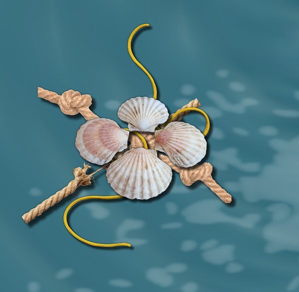
It can work but it always depends on the element. In the other comment I made, it was a very thick rope and it was under "flat ribbons". That is the part that does not work. In your cluster, the rope is much thinner, and the elements on top of it are logical to see in that order. Does that make sense?1 point
-
@Cassel I'm curious. I saw you mentioned to one of the other participants in the boot camp, something about using a rope and making sure it was on top. In Project 3, I did a cluster that is different from many, in that I had a couple of ropes, a string, and a group of shells. The shells seemed to me to "work" placing them on top over the center knot on one of the ropes which was on top of a rope that was coming apart. I really enjoyed finding that sweet spot with the layering where the string appeared to intertwine amidst the layers. Did I really achieve the effect I was hoping for placing the shells on top?1 point
-
If you keep a vector copy of the text, you can always double-click on the text object and it will show the font name in the font dropdown list. That is one advantage of keeping one "original" vector copy of any text.1 point
-
Here is Project 2 from Module 2. I have elements from Janet Kemp, Marisa Lerin, Rachel Martin, and Sharon Dewi Stolp. I created the background using photo corners from Jessica Dunn. I only downloaded two of the four and went from there. I actually have several of those now in different colors. Rest is original photography or from the internet. The fonts I used to create two "alpha" words and 5 alpha letters were Loves Labour and Moria Citadel.1 point








.jpg.28ad1d4ff4781c56fcc0f07c467f01f7.jpg)
