Leaderboard
Popular Content
Showing content with the highest reputation on 09/23/2024 in all areas
-
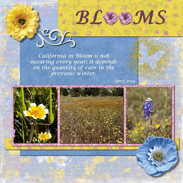
Project #3 This time I kept pretty much to the layout in the lesson, just because I like the outlook of that page. Everything except the swirl, the glitters and the glitterbutterfly comes from cpjess-MeadowBundle. I thought that was appropriate because my photos are from a meadow. The swirl is recolored and from the Fire and Ice kit (by Marissa Lerin if I'm correct). The glitterbutterfly was done by me sometime ago because I just liked to make one and that comes in handy now. The glitters around the photos are called ChineseOriental and I don't remember where I got them. The font is Lucida calligraphy.8 points
-
7 points
-
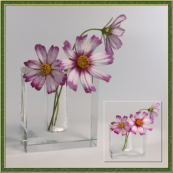
I've been busy lately with another project so this is a sparse layout from me. I needed a little PSP time so my brain could reset for the other project that I'm running into more challenges than expected. the little photo is framed with a cutout. I actually extracted the flowers and vase then made the selection around them and added the cutout. the good part was I didnt need to be perfect with the extraction as it blended in with the background. I got lucky on that. I also used the pencil sketch 2 script. I played with the opacity of the layers and used a mask to make the centre yellow part show through a little more. I turned on the photo layer that the sketch leaves intact to allow the the color to come through. maybe a little too much though.6 points
-
5 points
-
5 points
-
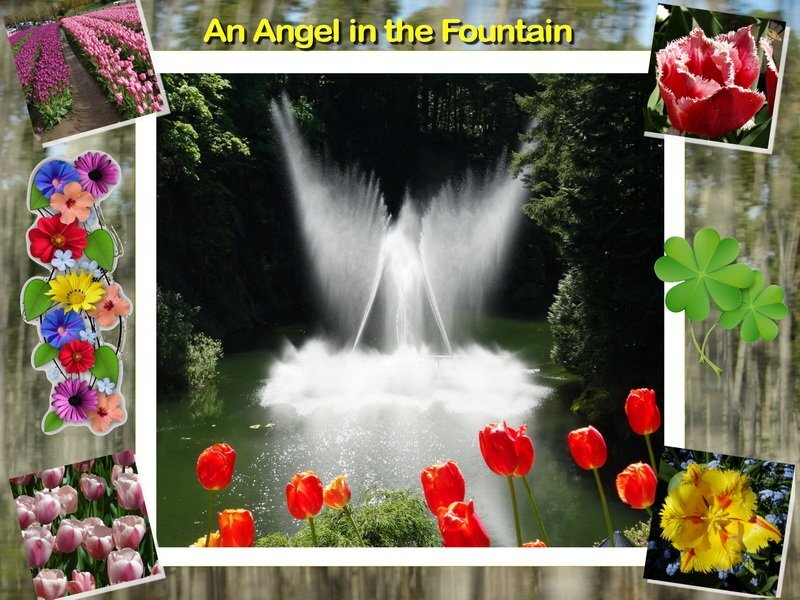
Thank you for your nice thoughts regarding the model I finished for my friend Ron. The work had a spiritual element to it. And it reminded me of the time last year when I was visiting my granddaughter in Victoria BC. We went to Butchart Gardens during tulip time and I was super lucky to get this picture of the fountain. All the nozzles in the fountain are constantly moving and I have lots of nice ordinary pictures of it. But this one must have been created with the help of my guardian angel. Sometimes we just get lucky and get a great image.5 points
-
5 points
-
5 points
-
4 points
-
That is amazing, once in a lifetime photo, and I got goosebumps reading your post.4 points
-
4 points
-
4 points
-
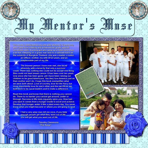
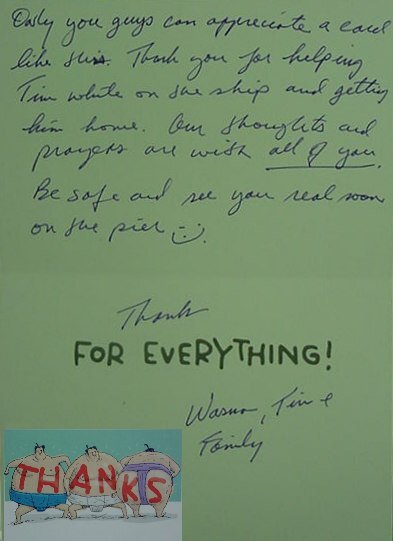
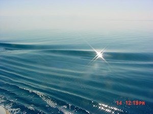
Project 3. I know it is difficult to read the postcard at 600 dpi so I'm throwing in a small size copy of that element. The angel(s) came from Janet Kemp, The background was from a Tutorial Project, the striped paper was a modification of a Flolinette-PBS paper, the font was Blackletter 686 BT. The background for the bigger text is an original photo taken while we were steaming FAST through the Red Sea to get on station for the start of the Desert Storm campaign which I heavily modified, by changing hues, and mirroring a selection (small copy attached of original).4 points
-
4 points
-
Day 5 - Project 2 Sadly this dogwood tree is no longer there. It was on the lot next to mine and they tore that house down for a parking lot (shades of Joni Mitchell). 😢4 points
-
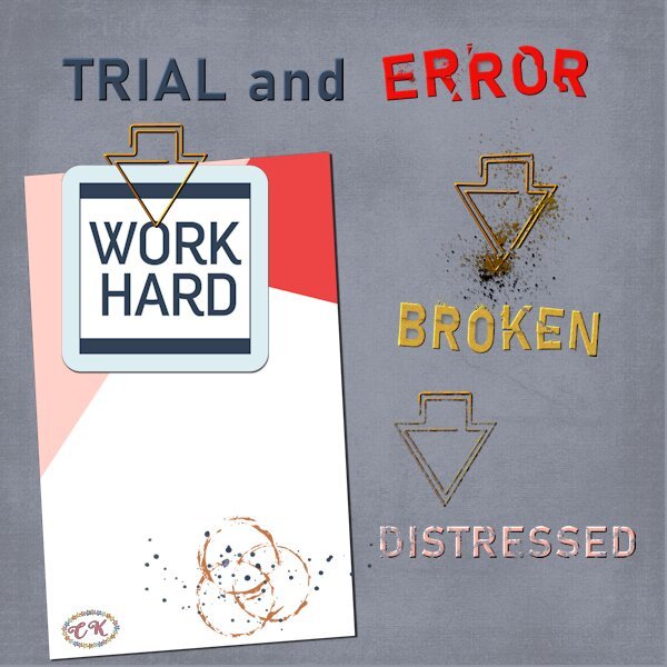
It may have taken a while but now I have used that paperclip as I promised I would do. Actually it was fortunate that I didn't do it before because I won the cass-Broken script this Sunday and it came in sooo handy! Thank you Carole and I can show you immediately what I have come up with. I had great fun making this layout and I must admit that the paperclip wasn't all too difficult to use. The clip is in essence the same as a regular paperclip, they are both made out of one piece of wire. Therefore I looked at how I would use a normal one and then I saw how to use this one. I can't believe it is that simple after all the discussion about it, but when I follow the line of the clip I think it is oké. I used the Broken script not only on the words but on a paperclip too and I hope it is all visible on this reduced page. I have given the words and the clip a slight bevel to make the effect better to see. The other paperclip and the word distressed are treated to a brush with distress effect. The 2 papers and the stain come from Marissa Lerin in the Work Bundle and the font is Bahnschrift.3 points
-
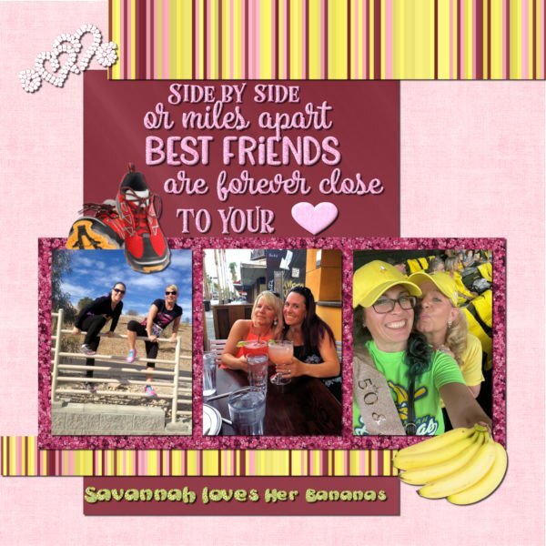
My daughter and Heidi have been BFF for over 30 years. They celebrated their 50th birthdays in Savannah, GA where Beth lived at the time. If you haven't heard of the Savannah Bananas baseball team, you should check out their hilarious videos on YouTube. They are so popular that you have to enter a raffle to get their tickets even if they are playing in Cleveland. I made the background using FF. The glitters are from ones that I made in the past using the cass glitter script. The stripes were made with cass stripes 2 script. The bananas and running shoes are from Canva. The saying is from Creative Fabrica. I converted the hearts to a vector using selection to path script and then my diamond tubes using VectorTube. The saying was selected and filled with my pink glitter pattern. The heart was a vector shape converted to a raster and filled with the pink glitter. I chose the colors based on Heidi's love of pink and of glitter (my kind of girl!). The photos are from Beth (I didn't get a good one of them wearing their banana costumes).3 points
-
Wishing I had photos to use for a squirrel vs dog layout: My husband's hunting beagles were kept in a kennel which was a wire enclosure tucked under the trees along the property line. The RED squirrel would get up in the tree and drop acorns on the dogs! Beagles howling all day was not entertaining! 🐶😵3 points
-
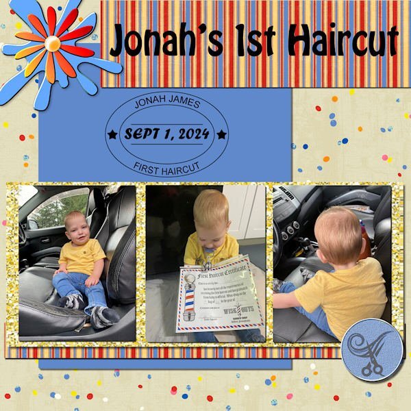
Yes, and initially, the shop put the wrong date on it, but mama Ilana declared she was going back to get a correct one because it's a "keepsake!" 😄3 points
-
I created these pages for the Alphabet Book Challenge. These are the vintage items for which I have photos.3 points
-
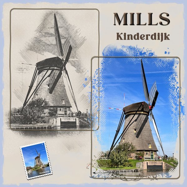
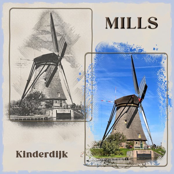
Might be simple, but very effective layout! How old is that windmill?3 points
-
I agree, in this case you didn't even need to put a postage stamp. It's almost out on a limb. The pencil sketch and title is all it requires. It's nicely balanced.3 points
-
As soon as I read this back and front challenge I thought of the sketch made with cass-PencilSketch script of a windmill. Because the sketch is on a beige paper I made a background paper of the same colors to let the sketch blend in with the background. On the actual photo of that mill I used Jessica Dunn's mask for the June 2024 photomask challenge on digitalscrapbook.com. The postage-stamp is made with my own script and was already in my stash. Because the layout needed something extra I used an inked edge from Rachel M Hailey, she has a couple of them in different colors. It is a simple layout but when I tried some embellishments it didn't work.3 points
-
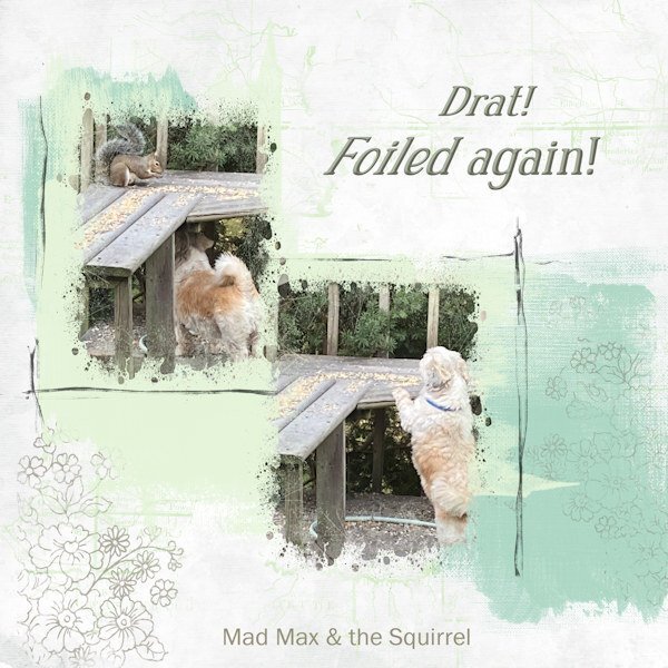
My early morning routine involves tea, the birds, and the squirrels (birdseed and peanuts for them). And one of the dogs here loves to bark at and chase the squirrels. He is one of two long-term fosters who live here. The third dog is mine. Long-term foster = forever for various reasons. Mad Max (as he is lovingly known) has not yet ever got close to catching one of his prey, but he won't give up! Masks on pix are Cass PaintSplash - Square. Other elements from my stash. The "scratchy borders" around the pix are from Katie Pertiet.3 points
-
3 points
-
I adjusted some of those things and more and posted the edited one under the first one. Thanks, especially for catching the misspelling that I can't believe I didn't catch.2 points
-
Very nice, Leslie. I do like the colors. If I may make a suggestion, and it just may be my opinion, but I'd put the larger photo in the center with the two smaller ones on either side to balance the layout. What do you think?2 points
-
2 points
-
What a lovely thing to do in memory of your lifelong friend. How touching and wonderful.2 points
-
I think squirrels are of a higher order than some other critters. They are smart, fast, and seem to enjoy "laughing" (as you say) at the dogs who are attempting to catch them! As soon as Mad Max runs onto the deck to chase the squirrel, it runs off the deck which causes the dog to jump off the deck, and then the squirrel comes back up on the deck, and feasts on peanuts. It always makes me laugh. Which is always a good thing.2 points
-
My daughter has 2 dogs and one of them is doing the same as your Mad Max. Where they live there are a lot of squirrels and they walk over the fence and are in the trees surrounding their garden. So it is a constant barking and he chases them but I think they are laughing at him. Even when I take him for a walk whenever he starts to bark look for the squirrel.2 points
-
I appreciate that! By converting it to black and white, and tweaking it to maintain clarity and detail, which is my preffered way. As I couldn't bear the thought of loosing details. Especially when I go to great lengths to get the best shot possible. I'm almost certain you take the same approach too. Actually in this case, the background black and white image, draws the eye to it, and not the framed coloured photo.2 points
-
2 points
-
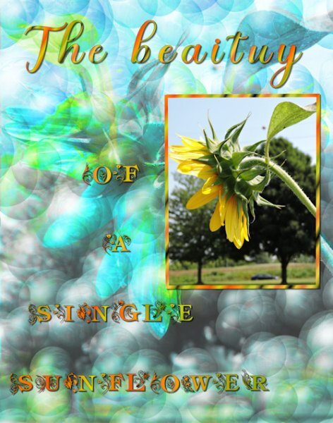
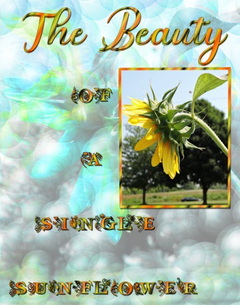
Your sunflower is positively regal, standing tall. May I be as bold as to make a couple of suggestions, as after all you are the creator. I think you may have muddled the letters on what I think should read beauty. Also check the kerning, as the letters aren't joined. I like the background effect, but it does drown out the Sunflower and the text. Try lowering the opacity, and add a little blur. These are only suggestions, as I'm not critiquing your work. As we all have our own styles and personal preferences.2 points
-
2 points
-
2 points
-
Carolyn, we all started somewhere, that is what is wonderful amongst this gang of creatives, and we learn from each other as well. Have fun, and you will find the learning gets easier.2 points
-
Well done you! Now I see how you used it, it looks better untitled.1 point
-
1 point
-
1 point
-
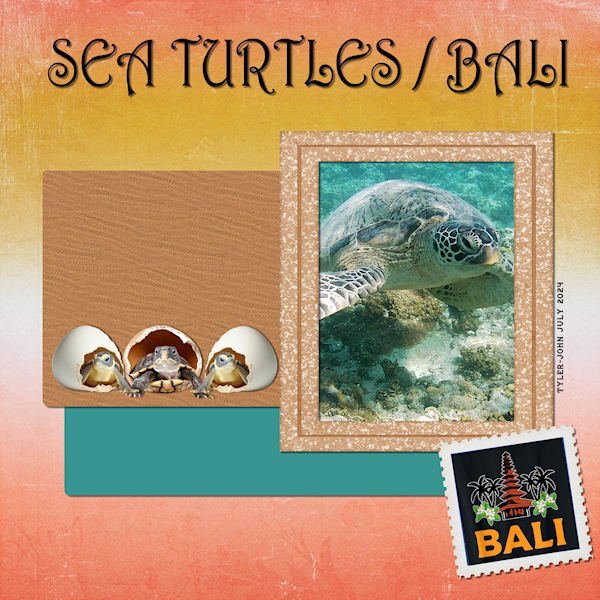
Here is my Project 4 - Adventure Park - I downloaded the kit Carole offered: By the Stream so I chose a photo taken by my grandson Tyler-John on his trip to Bali, Indonesia in July. The title font is Harrington; the frame is from Jessica Dunn's Nana's Kitchen kit, the background paper and the stamp format from By the Stream. EDIT: @Corrie Kinkel I added a sand texture to the brown paper and found some baby turtle clipart to replace the original.1 point
-
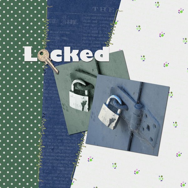
For some reason, I am having difficulty posting, every time I go to the bottom of the page to reply to topic, I get the entire page come up, so I am replying to Carole's comment this time. For Day 5 Project 2 I have chosen to use a photograph I took years ago at a dam in Central Otago. I often take photos to create textures and I loved the cobwebs on this old lock. I decided to use a copy of the same photo, with a Sheilsoft script, a soft ultra tone, then altered this copy's hue, saturation, and lightness. I used Jessica Dunn's Spring Skies mini kit, altering the colours to suit. The green polka dot paper was quite bright and I felt it took over this image so I adjusted the green to a more muted grey/green. I also adjusted the white paper's hue, saturation, and lightness, not changing the white, and changing the flowers instead. The stitching is from Marisa Lerin from Digital Scrapbook, the key from Sheila Reid, also from Digital Scrapbook although I used the artistic effect chrome to brighten the key. I have been playing with the Beginners' Scrapbooking projects and had created something for this particular layout, and decided to do something different for the bootcamp.1 point
-
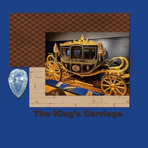
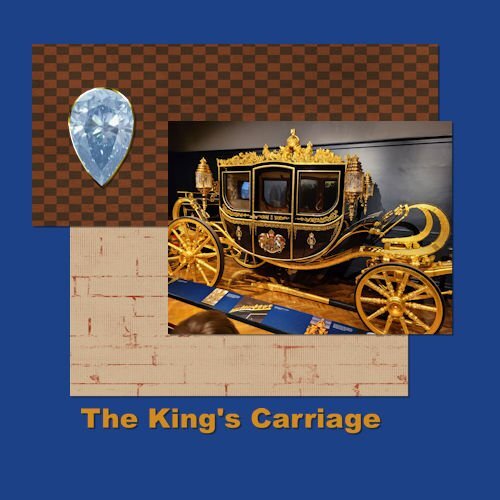
Project 2 We travelled to Paris and London this summer and this was one of the sites we visited (Royal Mews). The Royal Carriages were quite spectacular. Love to use these shortcuts, but might not remember them for long. It's lucky they are listed with the menu options. Made a few changes based on feedback from Cassel. Shifted the elements and changed to gold text. Thanks for the suggestions. PS Cassel - Regarding the Lace Spools from yesterday - No I have not made Lace, just make the spools so far. I used to Knit and Crochet, but now my time is mostly taken up by woodturning. Thanks1 point
-
1 point
-
1 point
-
I use Canva which is not free. Canva has a free portion, but it is very limited. A friend bought mine for me because I was editing his book. My grandson who is a teacher gets the full version free from his school. Educators and students can get the full version for free.1 point
-
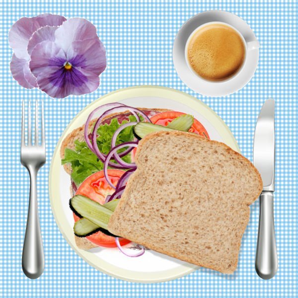
Not better, Carolyn, just different from yours. Mine, last time, was similar to yours. You added a spoon for stirring your coffee, that shows initiative.1 point
-
1 point
-
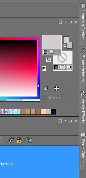
I always save my workspace after I make any changes. Keep in mind that the workspaces only work in the version of PSP they were created for. When I save mine, I always add the version # and date I saved. I learned the hard way.1 point
-
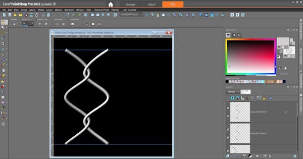
Over the years, I've changed up my workspace. This is my latest. I have a bunch of shortcuts on the top toolbar for things I use often, including scripts. I have a few on the layers palette, too. I use Auto Hide on palettes I want access to without having to take up space. I haven't decided which pics I'll use, but here's one I might.1 point







Resized.thumb.jpg.d25811db03a63358cedab1e79f527635.jpg)

