Leaderboard


Popular Content
Showing content with the highest reputation on 09/22/2024 in all areas
-
Challenge, using the same photo twice. I simply changed the photo to black and white, with some minor tweaking. The other background paper was created using the blend mode, HSL on two papers. I did mirror the original photo to give the page balance.
 8 points
 -
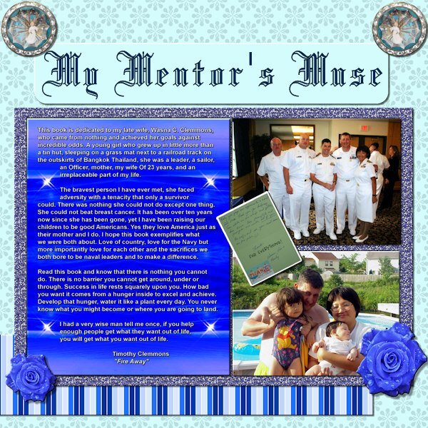
Project 3. I know it is difficult to read the postcard at 600 dpi so I'm throwing in a small size copy of that element. The angel(s) came from Janet Kemp, The background was from a Tutorial Project, the striped paper was a modification of a Flolinette-PBS paper, the font was Blackletter 686 BT. The background for the bigger text is an original photo taken while we were steaming FAST through the Red Sea to get on station for the start of the Desert Storm campaign which I heavily modified, by changing hues, and mirroring a selection (small copy attached of original).
7 points
-
This time it's JJ's turn for a haircut. He ended up getting his photoshoot in the car as he was so BAD in the barbershop! 😭😘😄
7 points
-
Day 5. Decided to add and tag and a crown.
7 points
-
Day 5. Our little Boy was around 10-11 months old when this photo was taken. Such a missed little boy.
6 points
-
Frame is from Cassel, the reading dragon came off the internet. Rest was just "Moi". Font was Fraktur BT at 550 Pixels.6 points
-
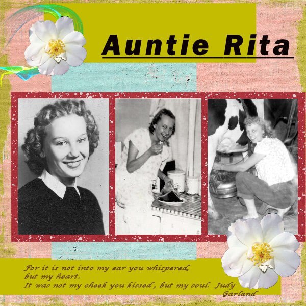
My mom and Auntie Rita's daughters say I remind them of her. Sadly, Auntie passed when I was about 10 years old so I didn't really get to know her. I will be printing this page for each of her four children.
5 points
-
Day 5 - Project 2 Sadly this dogwood tree is no longer there. It was on the lot next to mine and they tore that house down for a parking lot (shades of Joni Mitchell). 😢5 points
-
Template is from Cassel "Artsy" - The frame has been inner beveled. I used the Kaleidoscope treatment and then used Blur/Radial/Twirl on the photo in the background. This is my granddaughter-in-law Lucy Lu, mother of Magic and Raja in California. Her 35th birthday is coming up on the 30th so I'll be adding more to this for her birthday.
4 points
-
Back to finishing up the Shadow Workshop. This is Lesson 6 Tutorial. I wasn't going to do this one as it seemed to be so tedious. However, I plowed through. This is the result.
4 points
-
Nice catch. I didn't think about that. The postcard addition was a last minute after-thought and I missed it.
3 points
-
It's not a fluke just because it wasn't planned. It's creativity on the fly. 🙂3 points
-
It certainly was a puzzling paperclip. When you get around to using yours in a layout, just look at mine, even though, to me they still don't look right. 😉3 points
-
Interesting interpretation of this challenge!3 points
-
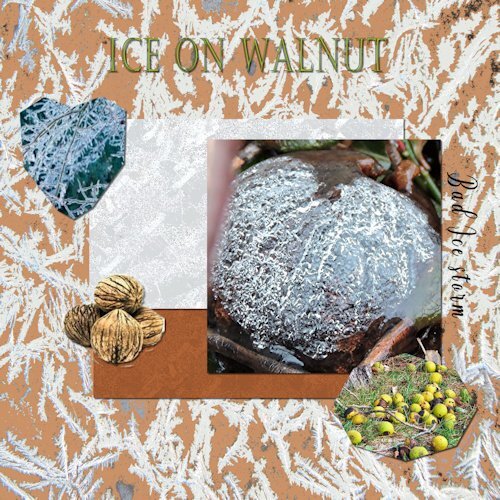
My day 5 project. The walnut photo is one I took in my yard a few years ago after a bad ice storm. The background papers were created using one of my frosty window photos and then a bunch of editing.
3 points
-
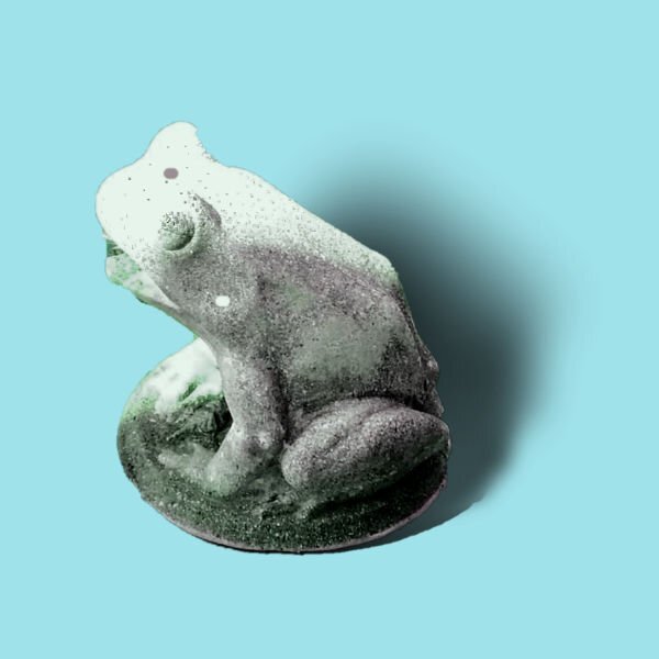
OK. I needed to see how to make shadows for something that stands out and up. I extracted a frog statue during my work on the Chattanooga trip. This is my take now on the shadow for that element. And now I'm finished with the Shadow Workshop and am ready to go on to other projects.
3 points
-
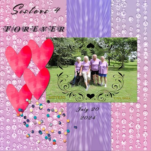
I finally got lesson 3 finished (durned everything else took up to much time lol. Sisters. I had a niece take this pic for me at my one sister's yard sale because she was moving a long way away.
3 points
-
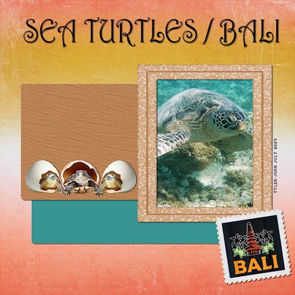
Here is my Project 4 - Adventure Park - I downloaded the kit Carole offered: By the Stream so I chose a photo taken by my grandson Tyler-John on his trip to Bali, Indonesia in July. The title font is Harrington; the frame is from Jessica Dunn's Nana's Kitchen kit, the background paper and the stamp format from By the Stream. EDIT: @Corrie Kinkel I added a sand texture to the brown paper and found some baby turtle clipart to replace the original.
3 points
-
Not much to say about this! - the papers were in my stash and recoloured to hopefully match colours in the photo, the font Arial, the foliage also from my stash.
3 points
-
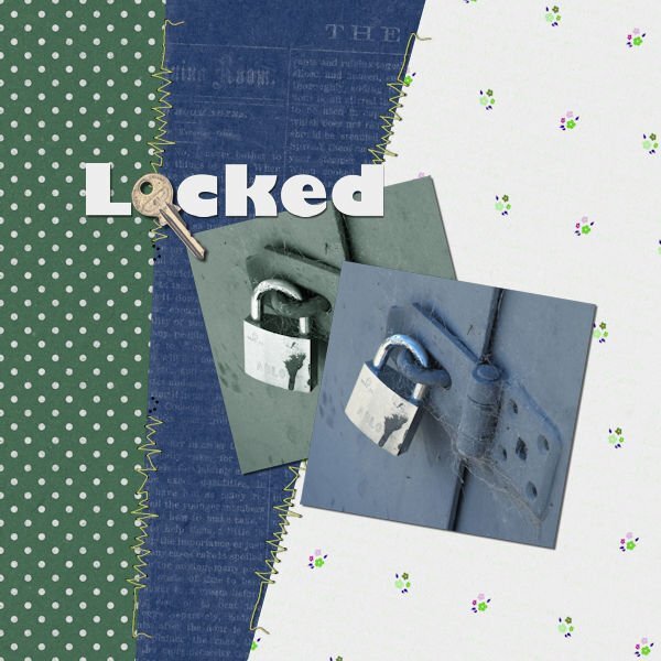
For some reason, I am having difficulty posting, every time I go to the bottom of the page to reply to topic, I get the entire page come up, so I am replying to Carole's comment this time. For Day 5 Project 2 I have chosen to use a photograph I took years ago at a dam in Central Otago. I often take photos to create textures and I loved the cobwebs on this old lock. I decided to use a copy of the same photo, with a Sheilsoft script, a soft ultra tone, then altered this copy's hue, saturation, and lightness. I used Jessica Dunn's Spring Skies mini kit, altering the colours to suit. The green polka dot paper was quite bright and I felt it took over this image so I adjusted the green to a more muted grey/green. I also adjusted the white paper's hue, saturation, and lightness, not changing the white, and changing the flowers instead. The stitching is from Marisa Lerin from Digital Scrapbook, the key from Sheila Reid, also from Digital Scrapbook although I used the artistic effect chrome to brighten the key. I have been playing with the Beginners' Scrapbooking projects and had created something for this particular layout, and decided to do something different for the bootcamp.
3 points
-
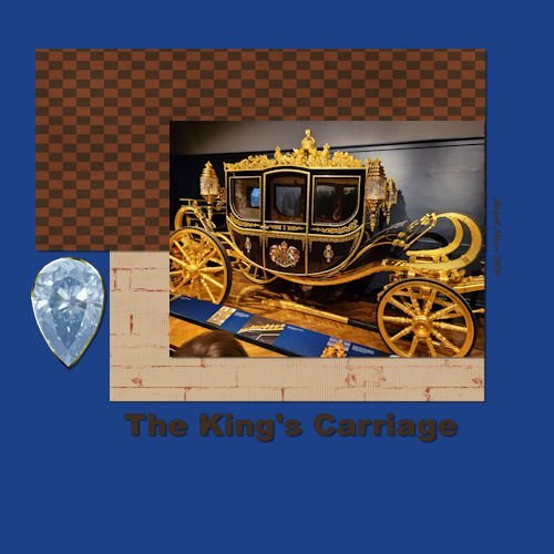
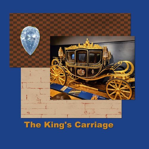
Project 2 We travelled to Paris and London this summer and this was one of the sites we visited (Royal Mews). The Royal Carriages were quite spectacular. Love to use these shortcuts, but might not remember them for long. It's lucky they are listed with the menu options. Made a few changes based on feedback from Cassel. Shifted the elements and changed to gold text. Thanks for the suggestions. PS Cassel - Regarding the Lace Spools from yesterday - No I have not made Lace, just make the spools so far. I used to Knit and Crochet, but now my time is mostly taken up by woodturning. Thanks
3 points
-
My little sandwich with a rose to dress it up with!!3 points
-
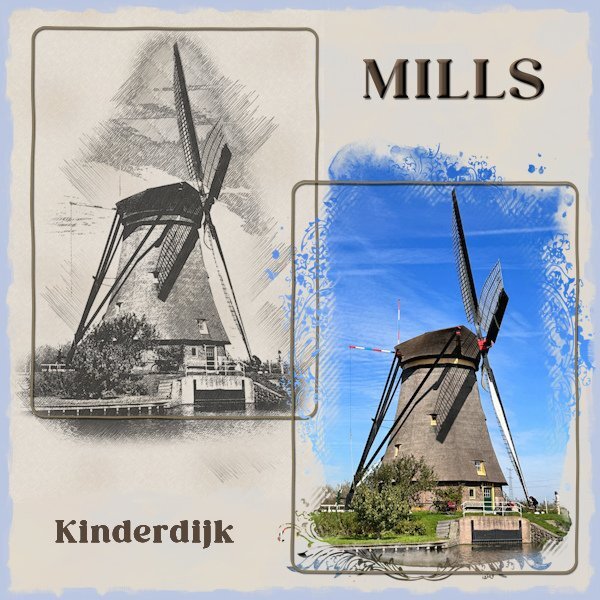
Without the stamp but I had to place Kinderdijk on the bottom left to keep it balanced
2 points
-
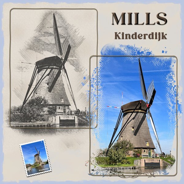
As soon as I read this back and front challenge I thought of the sketch made with cass-PencilSketch script of a windmill. Because the sketch is on a beige paper I made a background paper of the same colors to let the sketch blend in with the background. On the actual photo of that mill I used Jessica Dunn's mask for the June 2024 photomask challenge on digitalscrapbook.com. The postage-stamp is made with my own script and was already in my stash. Because the layout needed something extra I used an inked edge from Rachel M Hailey, she has a couple of them in different colors. It is a simple layout but when I tried some embellishments it didn't work.
2 points
-
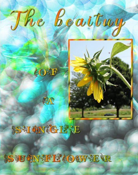
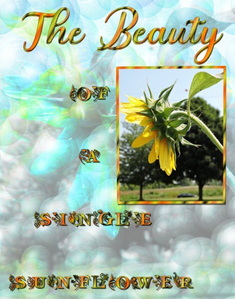
The sunflower pick is mine. The background was done with balls and bubbles . the top text is Misha GergovalMas the other text is am_intex,
2 points
-
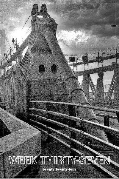
AND Week 37 for Sept 22 - our Mid-Hudson Bridge in the recent fog. It is VERY foggy here most mornings lately.
2 points
-
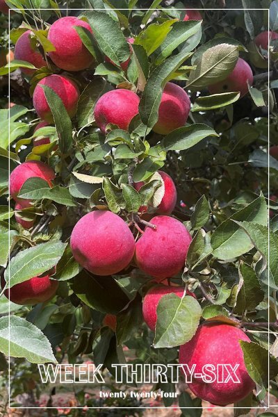
Running a bit behind here. This is Week 36 which for me was Sunday Sept 15. The apple season is in full swing here and Applefest will happen here on Oct 6. It's a one day affair in the Village of Warwick and I steer clear while 30,000 tourists clog the streets. 😵
2 points
-
Thank you, Michele, truth be told, I wanted to use a key but wasn't sure where to place it, then, it hit me, replace the o in Locked! Not planned, just a fluke, really.2 points
-
I'm glad there is a solution for this "puzzle"paperclip because I unexpectedly didn't had time today until now to give it a go.2 points
-
My grandson David sent me this photo of him and his girlfriend while they were in Thailand playing rugby. David educated me on the difference between Asian and African elephants. I had to download a photo of the Asian elephant from Canva. The cartoon elephant is also from Canva. The font is Asian Pacific from CF, and the texture is "elephant skin" from FF. The background and first paper are from CF and called "oriental reds." The second paper I made from a sample of Rachel's shirt. According to David, the elephants in the picture are rescued old elephants who are no longer able to work. The Thailand stamp was a free png downloaded a couple years ago. The picture frame pattern is from stripes created with cass script stripe 2.
2 points
-
Good you persevered and as you learn to follow the logical steps it will get easier on other projects too!2 points
-
Mine too! I walked away twice, going back thinking that I would approach it and work on it in a way that would make it look realistic. 😆2 points
-
You've got my head spinning with those paper clips. I think both examples work, but the one on the left just looks better aesthetically.2 points
-
This paperclip has really made me think. Am I correct in saying that it can be used in one way only. I even got out a paperclip and a piece of paper. Lol2 points
-
I hope so, perhaps between us we can come up with a solution. Just to let you know, I tried removing over and under. My brain is telling me that what I am seeing doesn't like right.
2 points
-
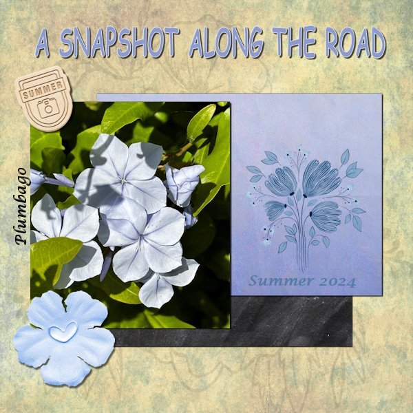
Project 2 I didn't use a kit for my layout but made a background with different papers from my stash and a blendmode. The other papers, the flower stamp, the flower and the little label are all from different designers and come from my stash. The font for the title is Comic sans and the other font is Lucida calligraphy. The plant's Latin name is Plumbago, in Dutch Mannentrouw, but I couldn't find an English common name, so if anyone knows?
2 points
-
Arrow paper clip from the recent masterclass. I have made several different ones. When I went to use these to attach several pieces of paper my mind went blank. I can't for the life me work out what goes behind to get the realistic effect. Surely there has to be 2 options. I don't have any problem with conventional paper clips or different shaped one. Any ideas!!!! I'm going to look very foolish if its a case of either erasing, or using the promote to selection tool on selected areas. But what selected areas I ask myself!!!!!
2 points
-
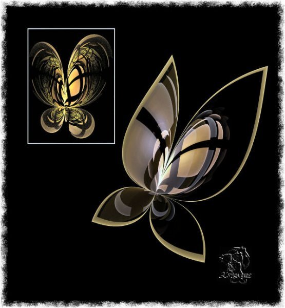
I have used recently my favorite fractal generator Apophysis=APO in short word. Sure, I use APO editor first of all but PSP later /everything, believe me/. I don't write scripts for APO, I only can modify in APO editor look/pic of used script. This time butterfly-before modification in a white frame, the second butterfly is without a frame. Excuse me English mistakes, please:)
2 points
-
We are all learning here, no matter how long we've been here. We learn not only from Carole but also from each other. It's fun, and the community is very supportive.2 points
-
Donna, it has happened many times to me. I post something here, and it doesn't take long to see that something isn't right. And if it's a Workshop and I don't catch the issue, Carole has eagle eyes, and she immediately spots it! 😄 I like it, so it helps me to improve my work.2 points
-
I said a couple of days ago, I was going to improve my nautical scatters picture tube and share it with everyone. Here is the results of that. My McAfee hiccuped when I double clicked the link below although it is OK. I suggest you copy the link and paste it into your browser address line to get the download. Place the PspTube file into the "documents/Corel PaintShop Pro/2022 (or your version)/Picture Tubes/" folder. The other file is just an image where I set the size at 30 and painted around the canvas (over a white background layer) as a sample of using the Tube. Noticed can't change the default "size" after you have exported the tube...I think the default is 100. The Images/paintbrush stamps were originally sized at 100. http://www.toroscope.com/shares/dhess-nauticalscatters.zip PS...This is assuming you are interested in a nautically themed picture tube to create some scatters. It's not exactly generic but good for anything that is boat or ship or ocean themed...or perhaps some other categories.2 points
-
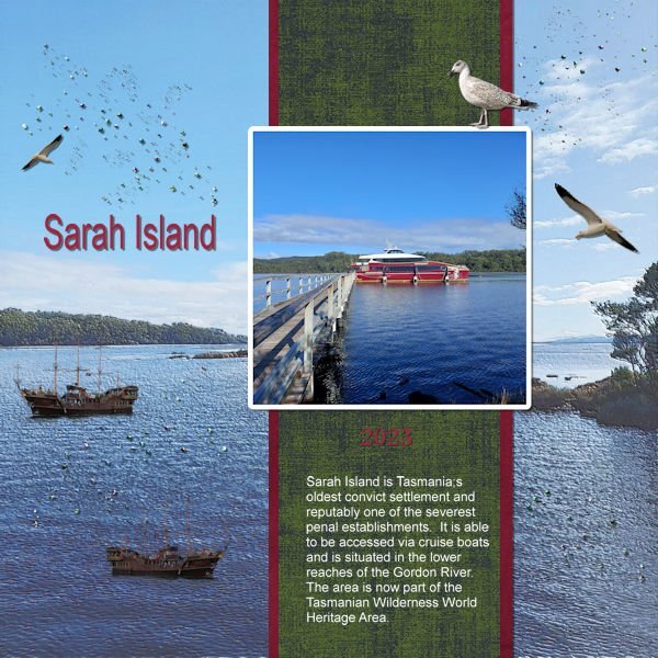
The background is a photo taken from the jetty to the island with a light blend mode (I do like the way the blend modes work in 2023!) I added in the 2 boats, seagulls and sprinkles. Another interesting day with 2023 and a full reinstall - and now thankfully everything seems fine again.
2 points
-
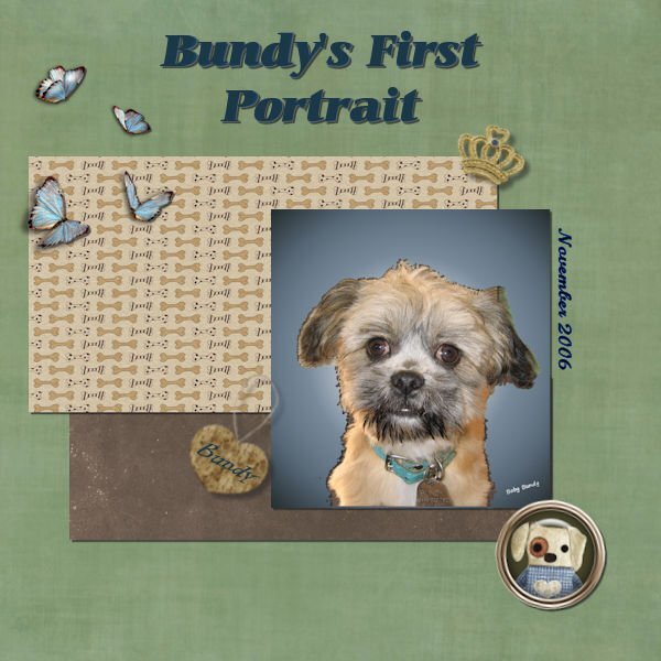
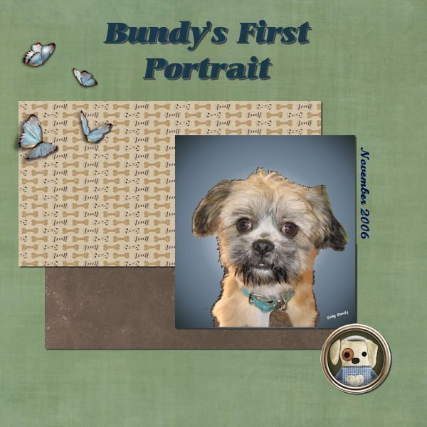
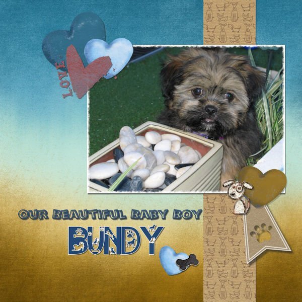
Day 3 and I did enjoy displaying this photo of our beautiful little boy, Bundy. He passed the rainbow bridge almost 2 years ago now and we still miss him every day.
2 points
-
I agree, in this case you didn't even need to put a postage stamp. It's almost out on a limb. The pencil sketch and title is all it requires. It's nicely balanced.1 point
-
@Cassel I actually used bits and pieces. I am a collector of anything that I think will come in handy for a project then I cannot remember where I got it from. I most try to be more organized with my collections. @Ann Seeber the name of the font was Doggy Smart.1 point
-
I found the history lesson interesting. I'm glad you shared it. In North America we cant even imagine what that would have been like and that there would still be people living now (young kids then) that had to experience that. The detail in the parachute harness is neat.1 point
-
Ann, simple but very nice. I only think that it would be more effective if you could have used a turtle on its own instead of the small photo, or had that photo blend in to the background. It is just a thought and no critic what so ever 😘1 point
-
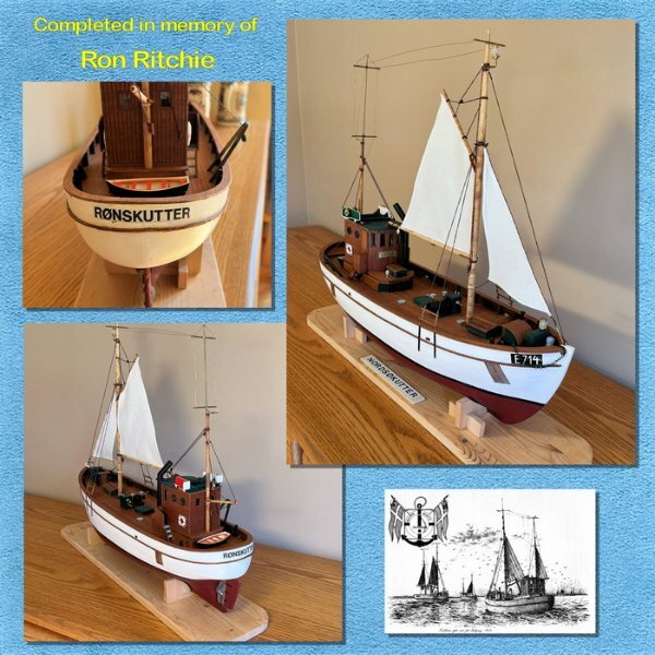
My friend Ron and I have been wooden model builders for years. These models usually take several years to complete as we always have other family responsibilities that are more important than hobbies. Anyway in the case of this model of a Danish fishing trawler, Ron bought is over 10 years ago but never really got too far into it. Unfortunately Ron recently passed away and his family asked me if I wanted to finish the model. I agreed and have worked on it for the last seven months. It in now finished. I even renamed the boat in his honour. The sad part of this story is that now I will have to work on future projects without my lifelong friend. The nice part of being part of being a member of Scrapbook Campus is that I've learned how to create meaningful images of my DYI projects to share with family and friends. Although I do not use all the nice add-ons I see in many of the works of other members, I still enjoy seeing all your work as it motivates me to continue.
1 point
-
Day 3 ~ When my favorite aunt turned 90, the family got together for a wonderful party. This is a picture of my cousin and his grandson. I used a kit by EmeraldJay from the PS September 2024 blog train. The fonts are 11S01 Black Tuesday and January Is Coming. And, yes, @Donna Sillia, I am now seeing my errors. 😄1 point
-
@Cristina I am glad my feedback is well received and useful. @Michele The "normal" shadow on the light green paper looks like it is missing. Is it the case or is it just due to the resizing (which is possible)? For the lifted shadow, try to just make it smaller. I find that the larger it is, the harder it is to make it look right. @Sheila HoggIs it possible that the mode for the Warp Brush was not on the Push? Maybe a different mode was set? Can you check that? Using the Pick tool is a good alternative in many situations. Good work. On your flowers, it LOOKS like the shadows are a little wide on the top right and bottom right ones. The others look great. @Daniel Hess Those flowers are looking good. Do those shadows start to make sense? For the bonus flowers, the offset looks appropriate for those but the opacity seems high and the blur a little low. @Rene MarkerYou are bringing up a good question about where to make the selection. The answer is simple: you make the selection wherever you want based on where you plan on starting the curl of the corner. You want the shadow to gradually go from "normal", where the paper/photo is flat to gradually get blurred where it is lifted. So if you want a large area to be lifted, your selection will be larger than if you want a slight, subtle lift. Does that make sense? For the clusters, that will be on lesson 6. Stay tuned! (but yours looks good) Warping the shadow on flowers is not always necessary. In fact, I usually don't do it, but it is an option that could add a touch of realism in some situation, with some flowers (not all). @Donna SilliaFor your flowers, be careful to NOT bring shadows upward. It looks like that on middle right flower. Do you see what I mean? the others are all in the correct angle. @Mary Solaas Your lifted shadows look good. I think the main "issue" (and that is probably because I never explained it) is how the photo is pushed. I will need to add a lesson or a tutorial for that. In the meantime, try to not touch the photo with the center of the brush, but keep it OFF the photo. See if it helps to "curl" the photo better. @fiona cook The shadows of those flowers look good. It seems like you are getting the hang of them. There is no SIMPLE way to retrieve the settings you used, however, if it was not too long ago, you can check in the History palette (F3), right-click on the Drop Shadow you did, copy to clipboard, and then paste it on another document (Notepad, Word, etc.). You might recognize the settings. Another way would be to check the Image Information. The settings might be saved there and you could see them. @Corrie KinkelI am glad that these lessons are making you "think" more about the shadows. That is the goal since it will allow you to adjust each shadow based on what is logical for any particular element. @Julie MagerkaFor your lifted corners, have a second look at the angle. Draw an imaginary line between the shadow corner and the photo corner. Does that get directed toward the light source on the top left? The other thing is that you can lower the opacity a lot on those shadows. Remember that the further the element is, the lower the opacity. On the other hand, your flowers look great. @Jeni Simpson Despite all that work, you managed to pull out fairly good shadows for those lifted corners. For the next ones, try to add even more feathering to make a more gradual transition between the "normal" shadow and the "lifted" one. The flowers are pretty good too. @Anja PelzerYour flowers are well shadowed. If you have a flower (or an element) that is transparent, you would likely need to lower the opacity since it would let the light through. But you have a good solution. @Gerry LandrethVisualizing the shadows that should be associated with each element is a great start. Of course, applying it is another thing, but at least, it will allow you to decide if it matches your vision or not, so you can always tweak it as needed. @Linda J WalkerThose flowers are quite good with their shadows. Good work. @Carolyn RyeYou did a great job on those flowers! Get ready for another challenge tomorrow! You will have to use that Warp Brush some more!!1 point