Leaderboard


Popular Content
Showing content with the highest reputation on 05/23/2024 in all areas
-
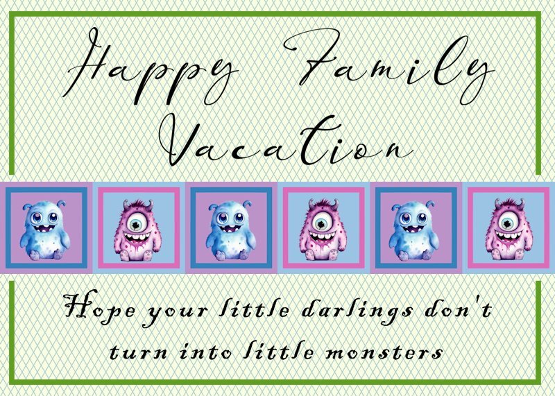
Here is my day 3 card. The little darling monsters are from a kit named Cute-Monster-Watercolor-Sublimation-69251614 . The bottom font is Blackadder ITC The top font is Banggar Slant.
 16 points
 -
13 points
-
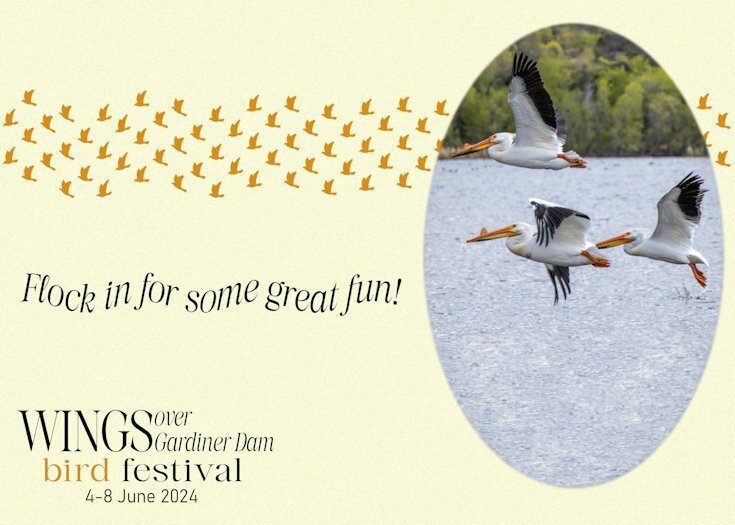
Day 4. The invitation cards are all fictitious. Although I do live a 20 minute drive from Gardiner Dam, where there is always an abundance of birds of all kind. American White Pelicans at Gardiner dam, on the South Saskatchewan river side of the dam. The other side of the dam is Lake Diefenbaker. This card shows my attemp at being witty.🙃
12 points
-
Not necessarily satisfied with this, but my arm has given out; not easy to do with a pinched nerve. 😄 I took the pic of my neighbor's flowering bush (tree?) a long time ago. I put several of Cassel's scripts to work: brad factory, ribbon factory, and bow 11.12 points
-
Card 3, I am slowly catching up after days with visitors. I still have the extra card to complete for Day 2, I have not decided how to do that one, yet. We have a wonderful garden planted by a woman on farmland about 8 kilometres from here. Muriel was pregnant with her son, now in his 40s, I think, and she and her husband were on a huge farm. She decided to begin planting, now her gardens are visited by people from all over the world. The font is Lemon Milk, the butterfly is a brush from Danetta. Flower photography is mine. Jeni
12 points
-
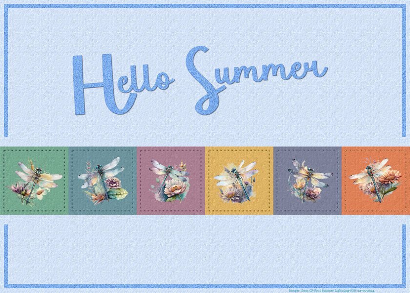
Number 3. Using images from Creative Fabrica. Have saved so many of their beautiful images so finally putting them to good use. The font is called Summer Lightening. Tried a bit of stitching after giving the squares a fabric texture. TFL
12 points
-
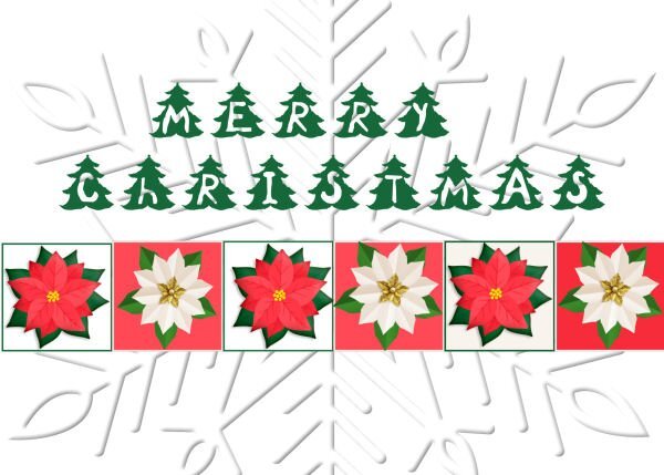
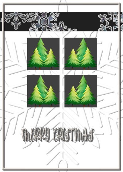
L3. Card3. Fonts Christmas Tree
11 points
-
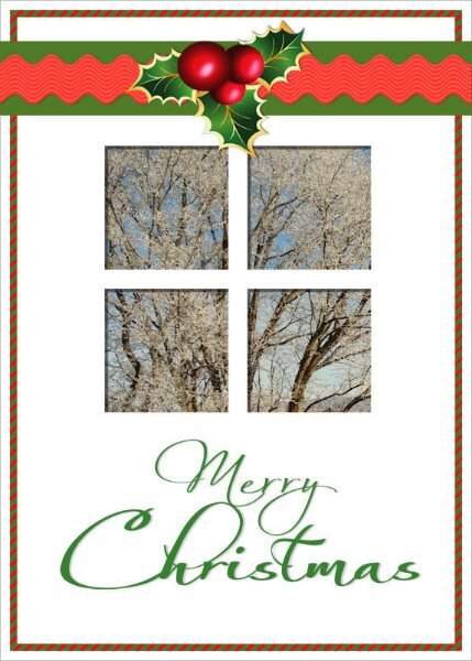
Day 2 Card This card looked like a door, so I added windows with a view towards snow-covered paddocks. I used some ric-rac I created a few years ago in a digi-scrapbooking group. The fonts used were Always Black and Always Light. The holly came from an exchange in one of my graphics groups. It had a shadow already, so I turned it upside-down. Jeni
11 points
-
Lesson 3 - I enjoyed this one. Little tricks and tips that Carole so patiently points out and repeats so even I can get it! I added a bit of extra shadowing to the tan-coloured frames so they didn't look as pale beside the darker ones. I still have not printed ANY cards I've made; usually send by email, but I do plan to since I have a lovely colour printer which I rarely use. Nice to know (now) how to do the layout to incorporate a folded card.
11 points
-
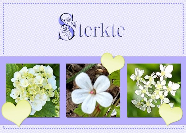
Card 3-Extra I have used the normal template so often for X-mas, Easter, New Baby, Birthday and Thank you that I now choose the extra one. However I used some of the ideas like the lines on the background and some sort of frame. My photos with white flowers and I gave them a little bit of shadow, just as the strip behind them. The heart is from Chantalia Design but recolored; the fonts are Crocus Monogram and Clarissa stories and both have a inner bevel to let them stand out a bit better. The Dutch word sterkte means you wish somebody courage with a particular situation, for instance this card is meant for a friend who has to undergo an unpleasant medical treatment. It has a backside and in this case I will write something inside by hand not printed.
11 points
-
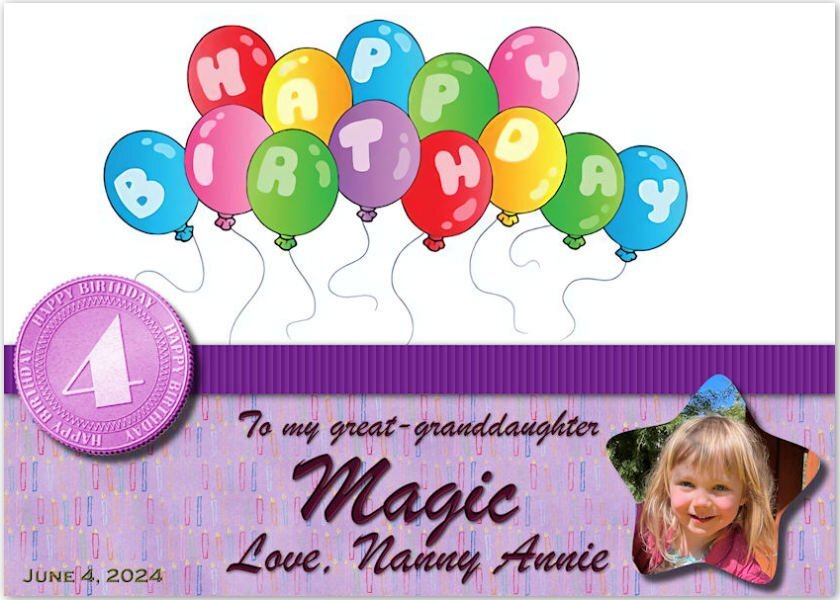
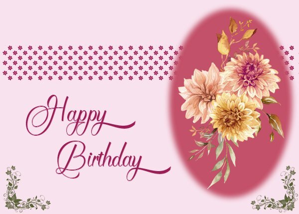
Day 4 For this card I used a flower bouquet clipart from my stash (I suspect it was once a freebie by CF), but instead of the hearts I used a flower and a leaves corner by Lyleya; the font is Mimosa script. I needed a more generic birthday card and this one is not with a specific recipient in mind. Like always I keep one version as a psp-image to change text or colors when needed. I will probably, at a later moment, use the extra template, but for now this should do because I'm working to make my album at the same time as well.
10 points
-
Card number 4. Another CF image used. I used a mask but forgot to take note of whose. I used the technique that Carol demonstrated for the band which worked so easily. However, I coloured hap hazardly and used a font called Butterfly Bold. TFL.
10 points
-
Card 3 The iris flowers are from my garden and the font is Magnolia Balmitha from a CF font bundle. The texture is from texture effects sculpture called designer effects 01 and lightened. The flower borders are glitters from my kit.
10 points
-
Card 3 : I haven't varied much with the design from Carole's tutorial but I liked the idea of the texture to the background that Sheila has used. Font: Blackbird. I am not sure when adding textures how you can change the colours from the choice in the box that opens up to any colours in your swatches. It always opens up with the wheel without a way, that I can see, of getting to your swatches in the Materials Palette.
10 points
-
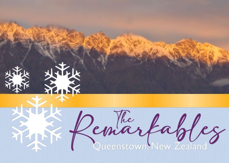
Extra card Day 1 The Remarkables is a mountain range and skifield about 2 hours from me, in Queenstown. It is called the Remarkables because the range lies directly north-south, one of only two mountain ranges in the world to do so. I was lucky to get this pic, taking it in the early evening in the middle of winter [July], as the sun went down. I took the snowflakes from something I created years ago, 2009, and I don't remember where they came from, possibly a brush. The fonts are Adelia and Gill Sans MT. Jeni
10 points
-
Card 1 - I received the image in one of my graphic groups yesterday, it appealed to me. The brad is from Jessica Dunn's Vintage Blooms mini kit from Curio Pantry. Jeni
10 points
-
The inside of this card would read, "Happy Retirement!" The text treatment recreates a card I have waiting to be sent to a friend who retires at the end of May. The picture is a stock picture I've had for years. The sandals across the bottom and the suns in the ribbon are from Cassel's Summer Punches.
9 points
-
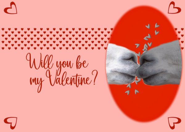
Card 4: I didn't use a punch but a heart shape that I colourised. Font: Blackbird, Loved making the hearts. No idea why I chose alpacas. Maybe because they have big lips for kissing!
9 points
-
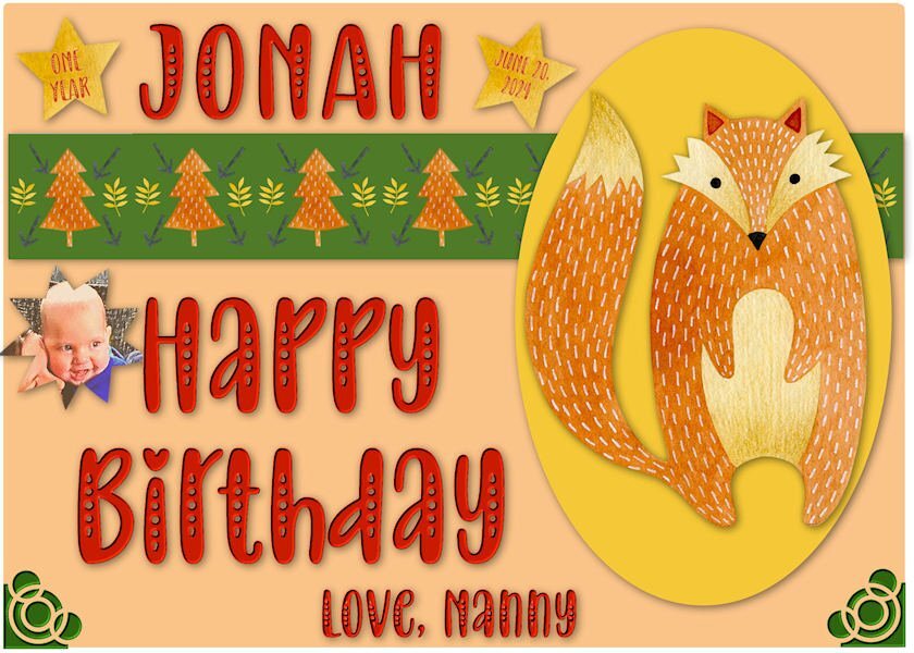
Getting ready for great-grandson, Jonah's First Birthday. He is the son of my granddaughter, Ilana, and brother to Logan. My daughter Laurey is grandma. I used a collection in my clipart from Design Bundles-Watercolor Forest Friends. The font is Baby Olivia.
9 points
-
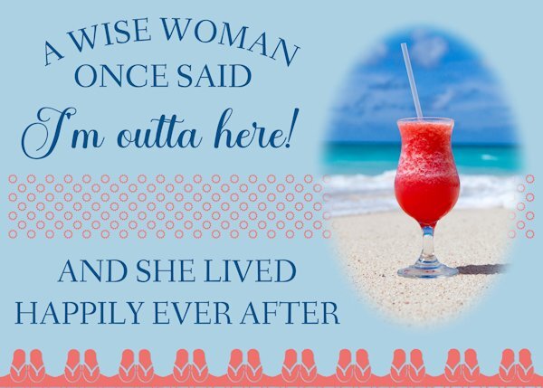
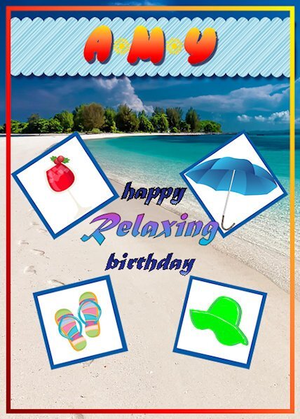
For my 2nd card, I created one for my sister (her birthday is in July and she lives in flip-flops)! This class worked very well for me to create a unique card that celebrates her ultimate desire to live near the ocean on an island somewhere. I chose a photo from Pixabay by Kanenori user_id:4749850. The tips in this lesson are going to come in very handy! I learned a lot and will be practicing these for awhile until I can do them without instruction!! VERY good class. Thank you.
9 points
-
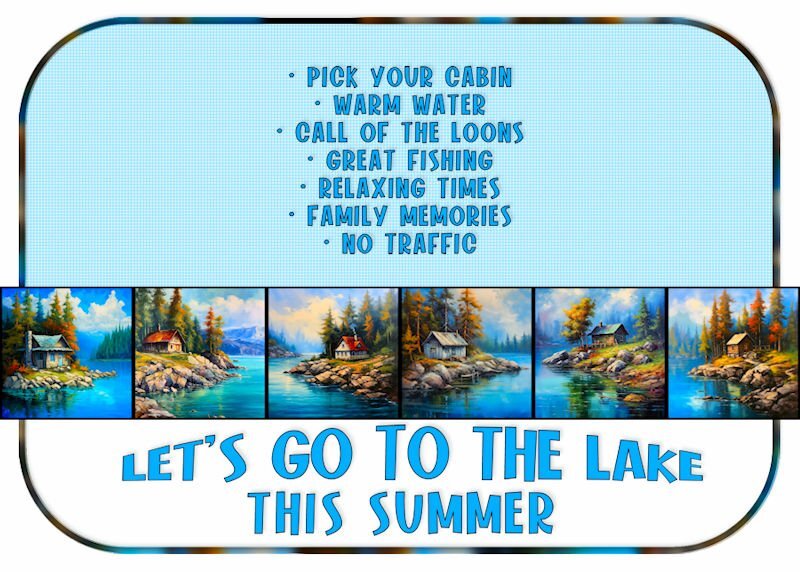
Not much for embellishments here ... going to send to family and see how many want to go!
9 points
-
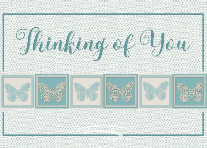
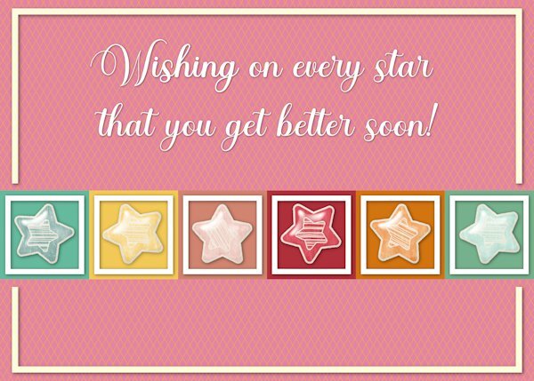
The stars are from a kit by Sheila Reed on Digital Scrapbook. The font is Ernestone Script from Creative Fabicra. It's a nice calligraphy font with lots of glyphs and swashes.
9 points
-
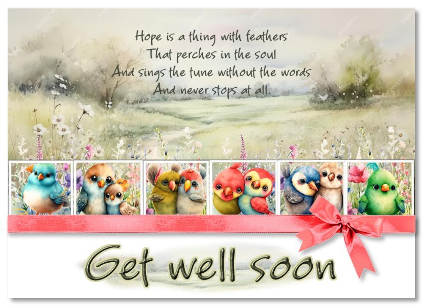
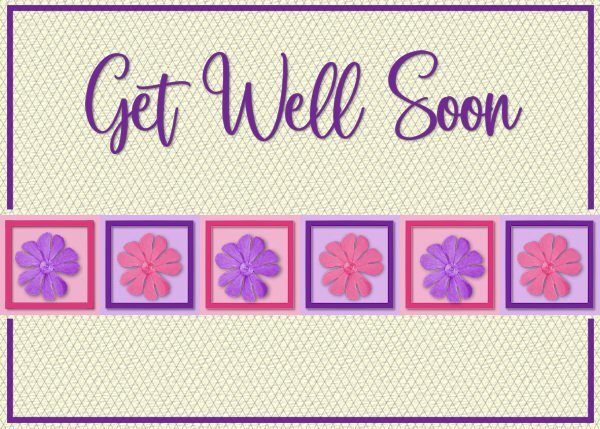
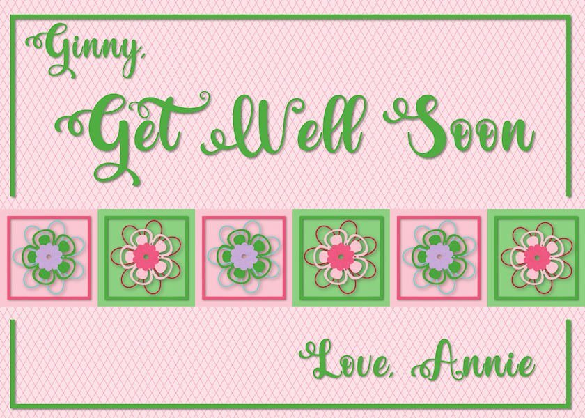
My get-well card is a bit colorful. It'll wake my friend, Ginny, up -- she's lounging around dealing with a cracked pelvis. 🧐 The flowers are from a Merisa Lerin Birthday Kit and the font is Valentina.
9 points
-
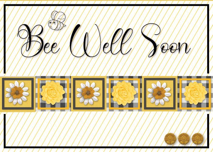
Here's card number 3. I added a little bee stamp and cute yellow buttons to finish it off. I wasn't sure about the colours at first but....it turned out nicely I think.
9 points
-
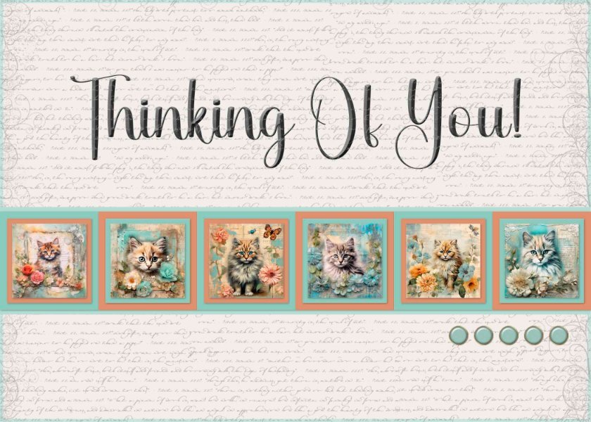
Card 3 - I used kitty images from Creative Fabrica, a script overlay from Samantha Murphy, Brad template by Josy Carson, Font is Black Letter Regular.
8 points
-
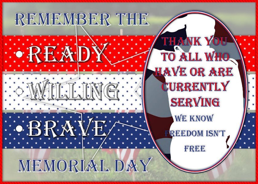
Been doing cemeteries ... so I guess I have that on the brain. Memorial Day fast approaching. I was okay with the little stars as they had color behind them. It's already super busy and colorful ... don't think it needed any corners. LOL
8 points
-
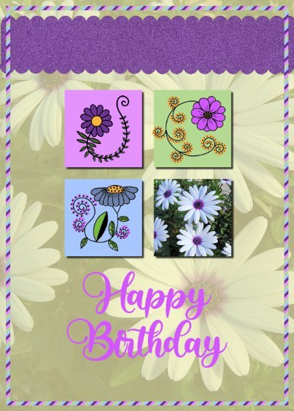
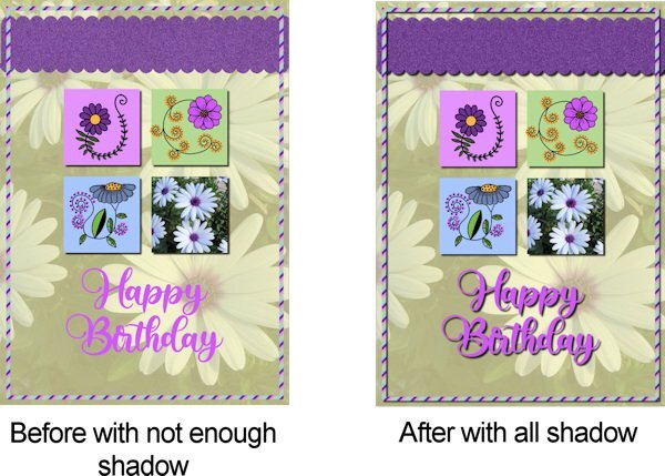
Carole suggested either add shadows totally or not at all so I have added them now so we can see the improvement with finishing all the elements with shadow. Thank you Carole for your eye.
8 points
-
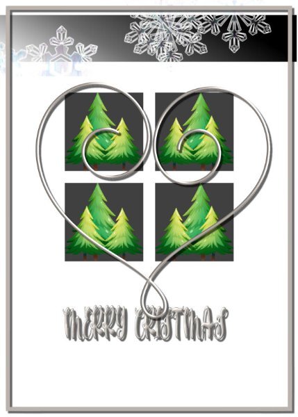
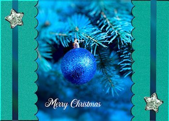
Just getting started with the week! I used a photo background, then used Posterize to change the lower background; adding a Selective Focus to the resulting image. This allowed me to focus solely on the ornament, while still keeping the main concept of the tree. for the Scallop, I added in inner blend which created a shadow to create a "depth" that I like to see when I make my 3-D cards. I used random noise in monochrome to create the texture for the scalloped section. For the ribbon, I used a gradient at 45% that used colors from the original photo; added the star (from Digital Scrapbook). Then copied the scallop/ribbon/brad and placed it on the opposite side of the card. Merry Christmas in white at the bottom finished it off.
7 points
-
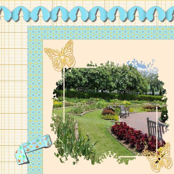
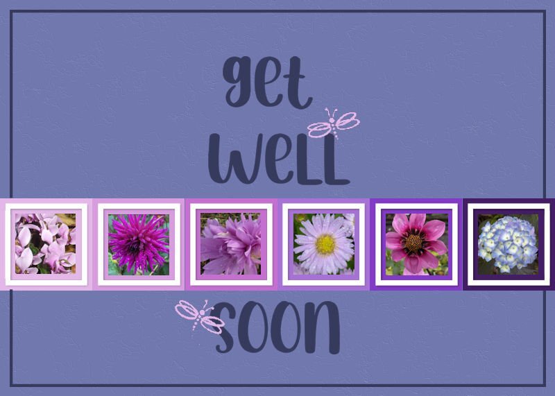
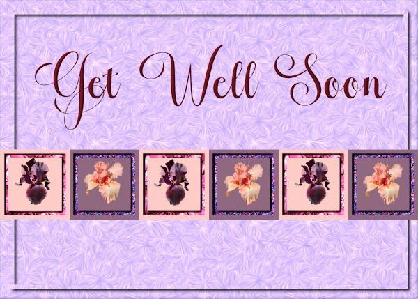
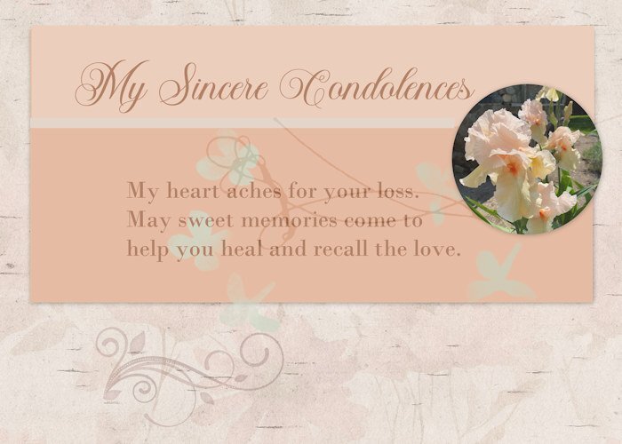
Lesson 2 Greeting card (extra template) I send cards for the usual events, but I also seem to need quite a few sympathy cards these days. Age-related, no doubt. I always struggle with store-bought cards for this occasion, so making my own sometimes is a better choice. I took the photo yesterday in a garden near me. Such lovely tall bearded irises in a soft pastel.
7 points
-
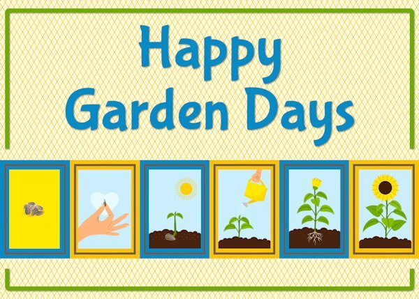
I went with a gardening theme for card 3. The font is Bubblegum sans. The sunflower sequence has been extracted from an image downloaded from Freepik. The background is as Carole showed in the video.
6 points
-
6 points
-
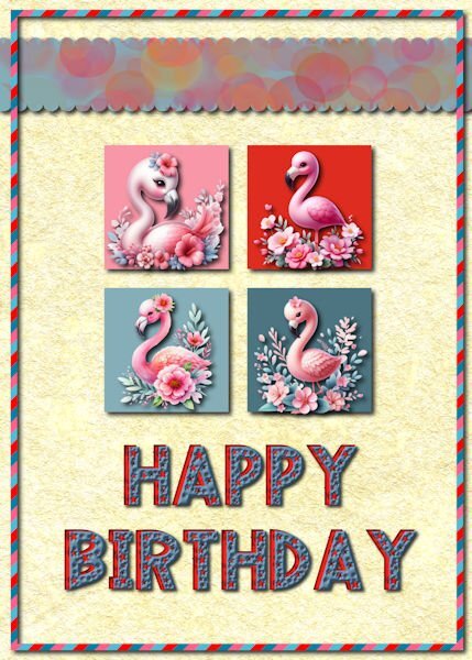
Day 2 This birthday card is for my daughter who loves flamingos so much that she had one tattooed on her shoulder. Those cute flamingos are from a CF bundle that I recently downloaded. The top ribbon has a blue background with a bokeh pattern that I made with Procreate. The scallops were made with cass quick scallop script. The font is Love Stars downloaded from CF. I duplicated the text, changed the color and moved the red copy to look like a layered font. The background is a parchment paper made in FF and lightened.
6 points
-
L2. Card2 corrected a bit thanks to AnnSeeber. btw, it's super fun so I've changed my work a little bit.
6 points
-
Lesson 1 Background Paper and brad came from The Curio Panty: Time to Unwind kit. The font was Edwardian Script Font.
6 points
-
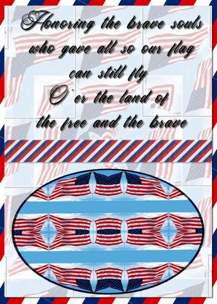
My day 4 card. The background (not the stripes) and the oval were made with a kaleidoscope image I made from an American flag. The striped stuff was made using the red white blue striped square I made a few days ago. The text is Tattoo Studio. OOPS I see I forgot to link the text and shadow when I moved the text over a little. Oh well I can always fix that. I did.
5 points
-
day 2 the font is Kayla Extrude - don't remember where I got it. I really like the custom selection ... if I saw it before, I forgot it.
5 points
-
I want to go!5 points
-
The squiggle adds a personal addition of endearment and touch of class to an overall most appealing, eye catching layout. So many wonderful layouts submitted, especially from the newbies. All in all the simplicity of the layouts depict utter perfection. That is, In my humble opinion!5 points
-
There weren't any photos to give me away this time, it must have been my style. 🙂5 points
-
Yes, it did. Very nicely with those little touches.5 points
-
5 points
-
4 points
-
Getting in some refresher lesson's again been a long time since I really used it We have a new great grand baby coming in Aug.
4 points
-
Absolutely beautiful Jeni...love your colours.4 points
-
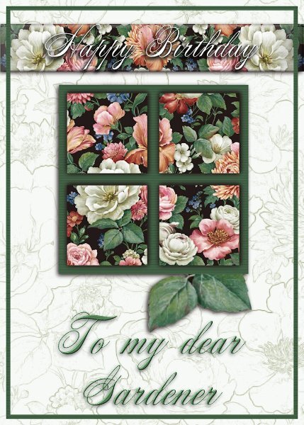
I will continue with the invitation cards tomorrow. Today's card is one I have just made to send via email. My son's mother-in-law is a keen gardiner, and yesterday she slipped and took a tumble, hurting her back. She will be fine, she's like me as tough as nails. I used today's template. I struggle to find elements, as I have very few kits, and odd elements to choose from. Anyway, I sent the ecard with the wavy lines, which I lightened even more. I'm not a big fan of patterened background papers, they have to be subtle. I also addd a texture and a little noise. I also chose to frame the text instead of the whole page.
4 points
-
@kasany I had the same issue with a white card where the edges didn't stand out here in the forum. I pulled it back and added a slightly larger bottom layer and added a faint shadow. That helped! I'll show it here again...
4 points
-
L2 Card2.
4 points
-
Back to the Labs for me. This is Lab 12 Mod 4. Requirements: ledger paper 2 (my background - I made several different colors and kept the pattern); rolled tape (not my favorite) and I tried folding it - without the tutorial but had followed several tutorials that folded ribbons etc; added sparkled butterflies (using Cass sparkle script). I use the pictures I took in the Botanic Gardens in 2022 a lot!. The blue patterned paper: I used the bird pattern (on the tape) and kaleidescoped and patterned it several times and liked this version the best. The other requirement was to make a folded paper streamer/banner. I chose to use butterflies and not the boy and girl. It was really interesting making the shadow on the fold/crease in the center of each butterfly. The mask I used was given to us in the Mask Workshop.
3 points
-
Michele that is very unlucky, I hope you recover soon.3 points
-
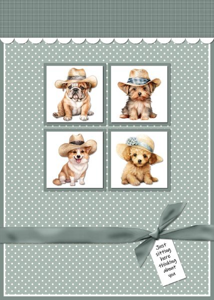
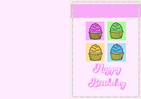
Card 2 - I changed the template by adding background squares behind the white squares, moved the top up and added a white scalloped border. Created the ribbon with the Knot 3 script. Added texture to the top panel, a polka dot overlay to the background layer, puppies from Creative Fabrica on the white squares and a tag with sentiment under the ribbon. I made this for the Cards For Hospitalized Kids Charity.
3 points


Resized.thumb.jpg.d25811db03a63358cedab1e79f527635.jpg)