Leaderboard
Popular Content
Showing content with the highest reputation on 05/21/2024 in all areas
-
13 points
-
12 points
-
12 points
-
12 points
-
11 points
-
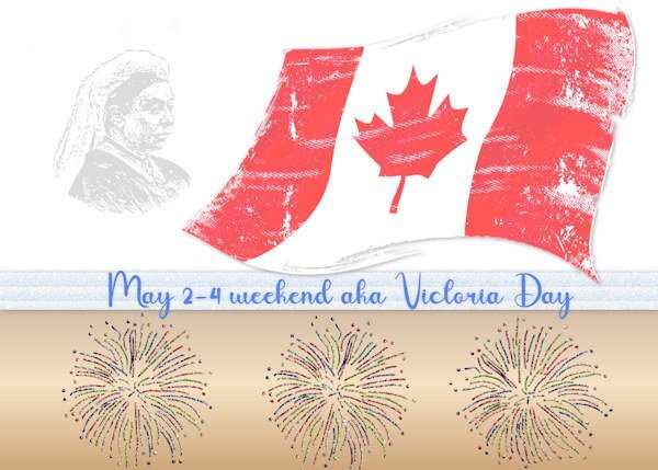
Lesson 1 (extra template) Since today is a holiday (Victoria Day, in most of Canada) I thought it fitting to do something for it. It tends to be more usually called May Two-Four and is celebrated with fireworks, barbecues, boating, cottages, beer and more beer. Even if the date is not May 24, it still gets that name. Image of Queen V, the flag, and the fireworks from online.11 points
-
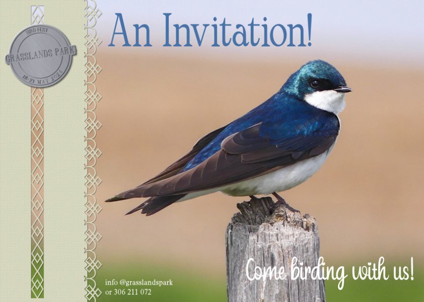
This time I'm taking a slightly different approach, instead of the usual greeing cards I have decided to go with Invitations. Primarily birds and mammal invitations. The recipients of the invitation, will get a nice surprise when they open the card. You will have to wait until the last day to find out what it is. These cards can be randomly placed into nature magazines, picked up at conservation offices, or just posted to memebrs of a particular nature organisation. One of three pairs of Tree Swallows, that are nesting in boxes fixed to the horses fence posts. This one is a handsome mature male, guarding his family. I created the token, and used one of Carole's paper punches and edge punches11 points
-
10 points
-
10 points
-
10 points
-
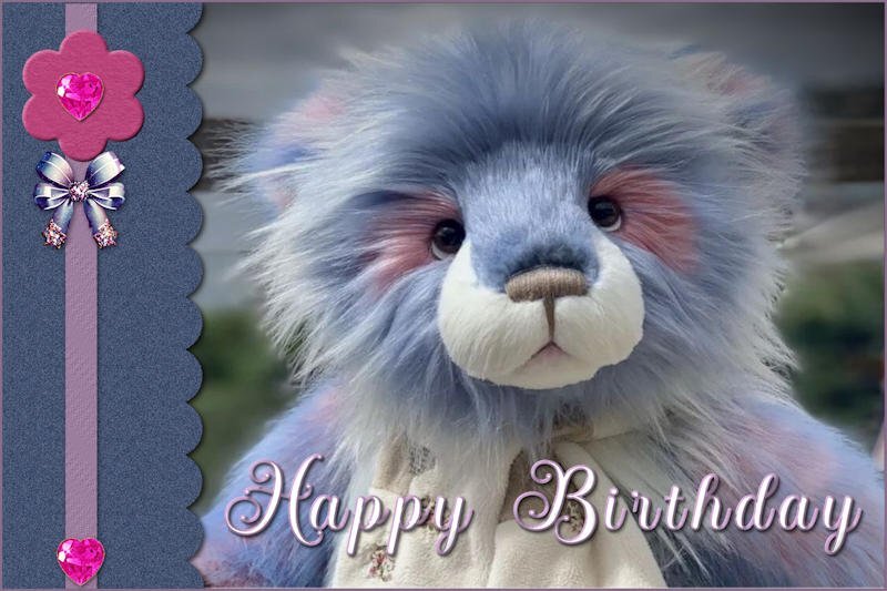
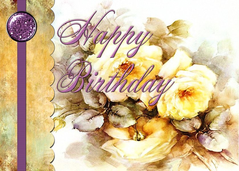
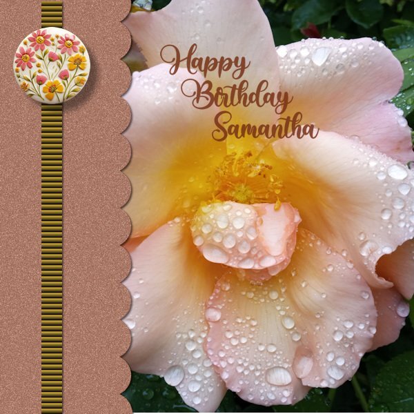
I just love flowers and flower photography plus I have a niece's birthday coming up so the ideal subject. I changed the canvas to 1500 x1500. Used a Random Noise Effect to the scallop paper. The texture effect, 'Blind' on the strip is bold at 100%. The round element is 'happiness is homemade' by Marissa Lerin form Digital scrapbooking.com. The font I have used is also from Creative Fabrica called 'Babylone'10 points
-
First one just using just what was given and a drone shot of my neighborhood. I've just returned for the summer - early - and wow, it's still chilly here! The second one I played a little more and made my graphics and tube in ai ... then wanted to try Carole's duplicate text shading trick. Yes - nice. Always something to learn.10 points
-
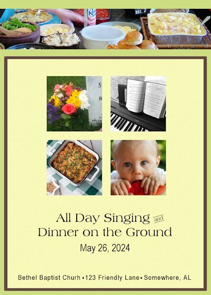
Memorial Day (United States) was formerly called Decoration Day. Families would gather dressed in their Sunday best to decorate the graves of their loved ones. On the Sunday before Decoration Day, churches would host an "All Day Singing" and a huge picnic. Gospel singers would perform in the sanctuary and congregational singing in between. It was a tradition in the South and is still celebrated in rural areas, particularly in Appalachia. The inside of the card would have instructions about where to leave your casserole on your way to the worship service. A few volunteers would get everything ready. It would also include some of the groups that would be joining the festivities.9 points
-
9 points
-
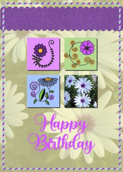
My Card 2 follows on the flower theme. I used my photo of daisies to sample the colours from and decided to use it as a reduced opacity background over a plain background. Font: Babylone. The stripey frame was fun to see take effect. I took note of how to create a back but didn't do it as I tend to print off a design on paper and attach to a pre-folded plain greetings card.9 points
-
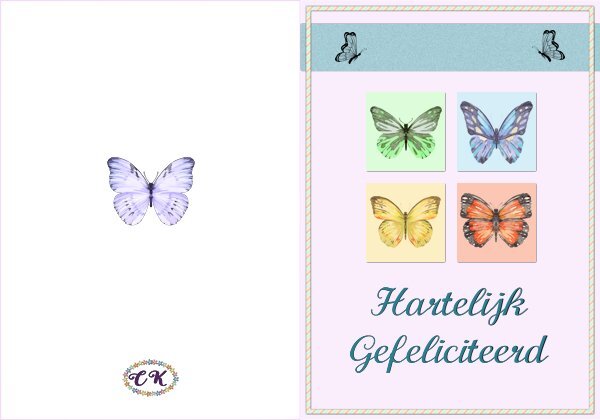
Workshop day 2 This time I used the original template and it is again a birthday card, probably all my cards will be for birthdays and this one goes by mail. It is intended for my cousin who likes butterflies very, very much; she has butterflies on her plates, cups and saucer, posters, photos, bracelets, brooches etc. Every year I try to make her a card with butterflies or send one that a bought when I come across one. I indeed need a double card so that's what I made and show here. The text is in Dutch but I kept a psp version for use with a different language. The butterflies are a bunch of watercolor cliparts that I have for a long time in my stash, I knew that one day they would come in handy. The font is Calligraphy and I it often because it is easy to read.8 points
-
8 points
-
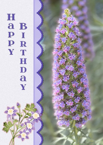
Card # 1 I used the extra template for 2024 and I changed the landscape format to portrait format to accommodate the photo I wanted to use. I'm very happy with the new extra templates for diamond members, because I have used the ones from the first workshop over and over again. That's not a problem as such but new templates give new ideas! As soon as I had taken this photo, I thought of a friend who loves purple very much and her birthday is coming up next month. I used a ribbon that I have made earlier and recolored it with hue, saturation, lightness. the flowers at the bottom are a sticker and the font is itsadzoke S01 and I think it came from a lab. The name of the flower is Echium candidans - Snakeweed8 points
-
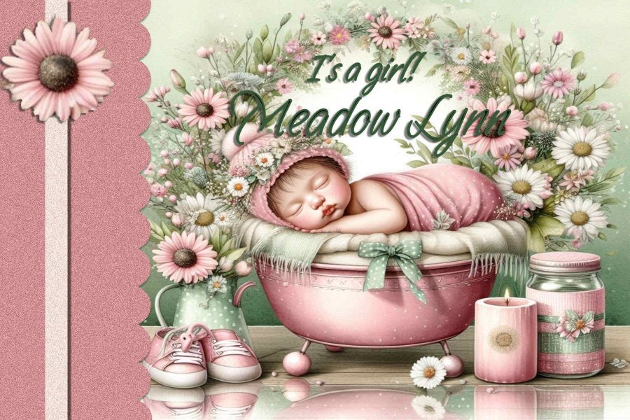
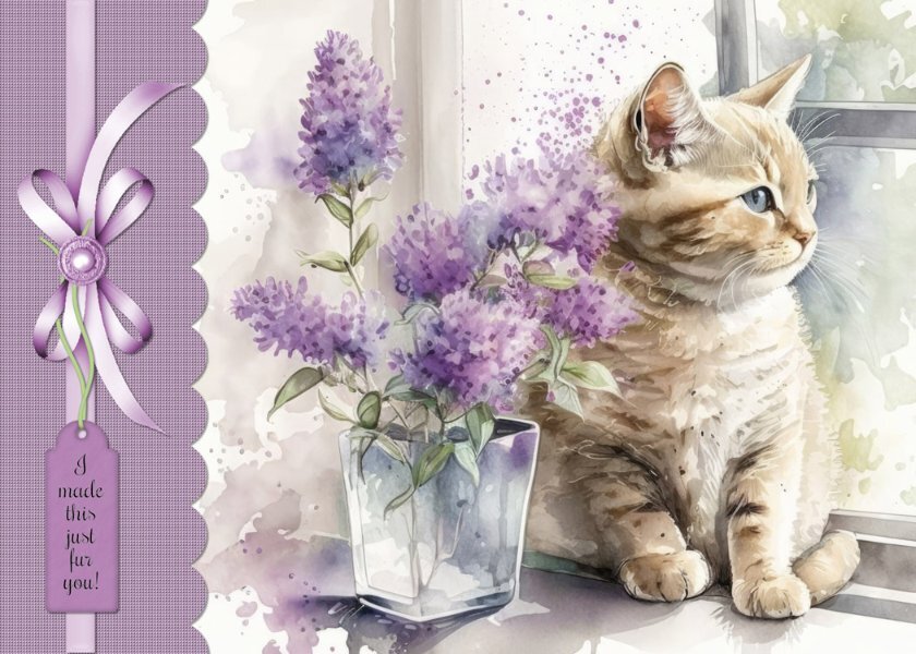
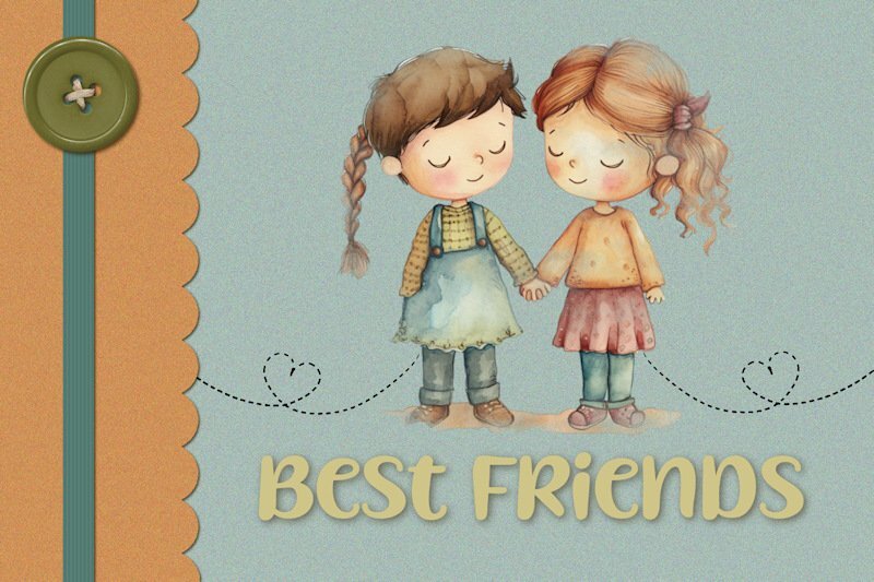
Here's the card I made for the workshop. I used a image from Creative Fabrica. Added texture to the scalloped panel and a drop shadow. Added a ribbon and tag from Craftsuprint.com (I make cards for the Cards For Hospitalized Kids Charity. The kids range in age from 2 to 18 so I think this will work for the older girls. Hopefully it will brighten their day.)8 points
-
8 points
-
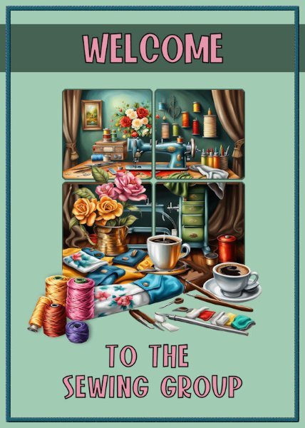
I sew in a group in Florida for the Greater Federation of Women's Clubs/RWWC - and we are ALWAYS thankful for new members to participate. We sew for many charities and organizations that just need help ... the Cancer Center, Pregnancy Center, whatever locals ask for help. We have only about ten members right now but hoping for more! We do lots of other things, too, to make money for teen scholarships and support many groups that do good things! When I am not playing in PSP, you'll find me at a sewing machine. LOL7 points
-
7 points
-
Hi, Question, which gallery should the scraps from this workshop go into? I didn't find any of the ones shown above in the greeting card workshop gallery7 points
-
7 points
-
7 points
-
6 points
-
6 points
-
6 points
-
My Card 2. Not sure I liked the outcome of this one but I did learn a new technique so that's a good thing. I needed to re outline the image before colouring as the original outline was a bit bitty after I had made it a transparent image using the plugin Cybia Alphaworks. I used a font called Peaches en Regalia. TFL5 points
-
5 points
-
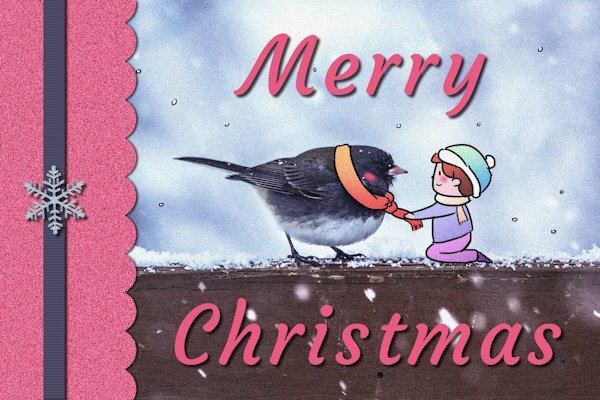
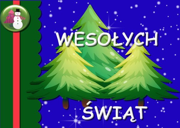
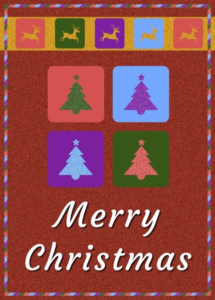
Day 1 -- All the items are from my Retro Christmas kit. The top background is one of my white grunge creations overlaid with a cass gradient. Since all the card that I make are 8.5 by 11, I changed the template to 5.5 by 11. When I print my cards, I print them borderless. The plaid was made with cass stripe2 script. The font is Sequents from Creative Fabrica. However, I had to make them in Photoshop since they don't work in Paintshop. I made them on a page and used cass AlphaSheetseparator script for the individual letters.5 points
-
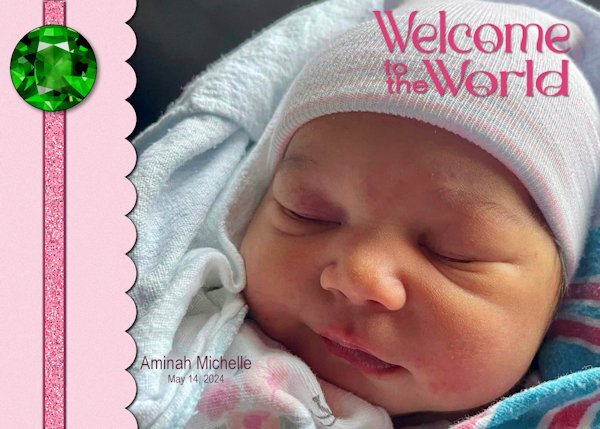
Thank you she will be our second girl. we have 6 boys they sure keep their mom's busy.5 points
-
5 points
-
Awesome Ann. Better add one more day in June....for me! ☺️ I'm already behind, not sure I'll be able to post anything this week at all. It's very busy with my bestie moving to Scotland on Saturday and work being unusually busy. At least I can download the supplies and get it done through the Diamond membership.4 points
-
Hello… Sorry, I'm late . I am interested to learn to make a greeting card.4 points
-
4 points
-
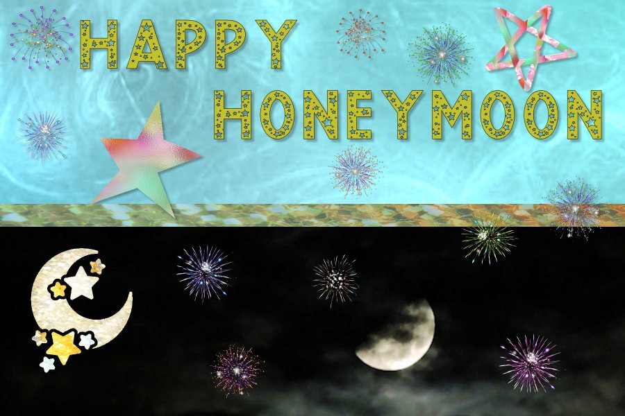
Honeymoon....firewooks? Isn't that what they use in the movies for - ahem - the honeymoon night? 🙃4 points
-
You and I are quite predictable with our choice of topics. You with your flora and fauna and myself, birds and other creatures to showcase our photos. Great first page, love the colours.4 points
-
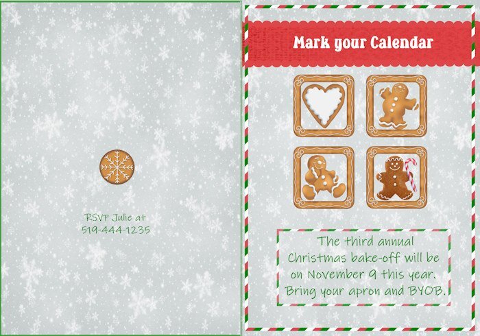
Lesson 2 - Also an invitation to a (fictional) Christmas get-together to do some baking. A group of us used to do this for a few years, then it gradually faded away, as things tend to do. Had some trouble with the back of the card, but it passes for done as it is. I really enjoyed the video with the cupcakes. The layout was cute and so cleverly done.3 points
-
Incredible work from everyone. It's really inspiring. Looks like I might not be able to join as this week is going to be an exhausting one! But I will look forward to seeing your beautiful creations.3 points
-
3 points
-
3 points
-
3 points
-
2 points
-
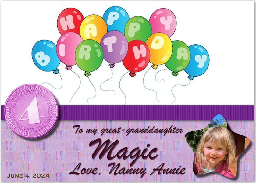
Thank you, Wendy. I'm afraid I've made Magic rather in-famous in these rooms. 😉 It's hard to pass up her photos.2 points
-
Isn't that what the honeymoon is all about? I really didn't think about the fireworks meaning that in the movies though. LOL2 points
-
2 points
-
2 points
-
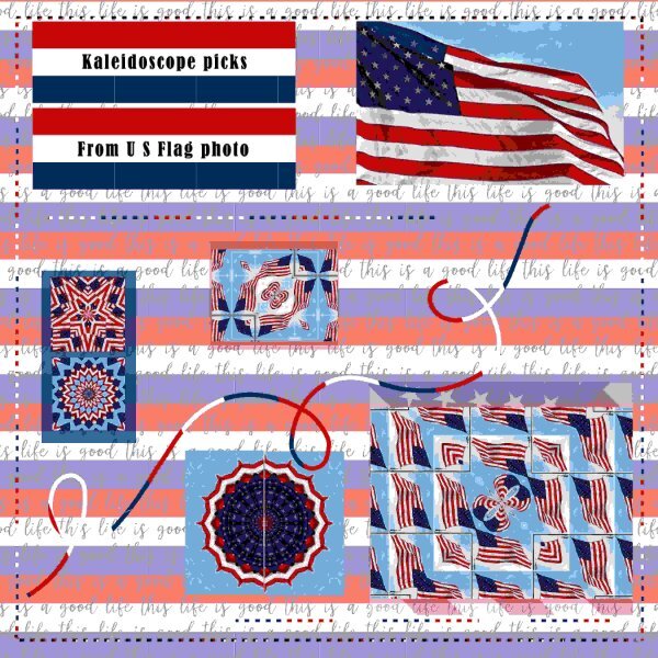
I have been playing with the PSP kaleidoscope and used this USA Flag for some. I also made a simple square red white and blue paper. I used the magic wand on the dashes and flood filled it with that paper. I did have to do it twice to get the vertical line right. I also did that for the squiggle. The background paper was one I had saved fro somewhere and I added the R-W-B background to it.2 points
-
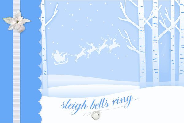
They came together on one image. I have a subscription to Freepik and the creator is laogao. I'm not skilled enough to create a montage myself. Is this a possible masterclass topic?1 point









.jpg.6ac278c135af67af0a513f7def6ec603.jpg)

