Leaderboard
Popular Content
Showing content with the highest reputation on 04/27/2024 in all areas
-
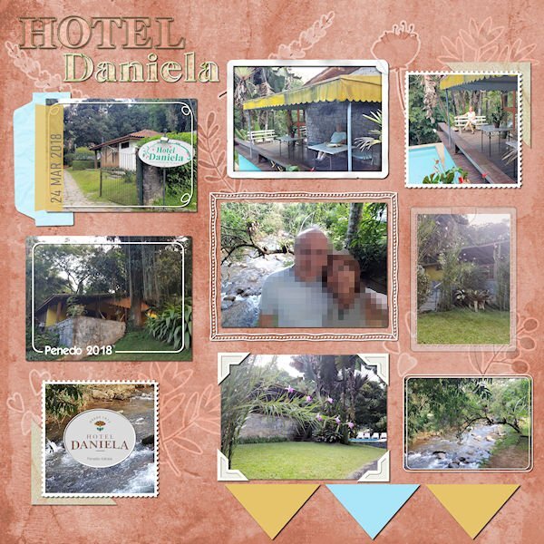
After many moons, I have something to post here... It's one layout from the folder I called Unfinished Layouts... There are still many in it! I finished it a few weeks ago, but I only remember to post it today. Credits: Template from Scrapping with Liz (SwL_LotsofBlocksTemplate3) Background paper: DiHiller_PSJul2021_Paper5 plus Greenery and berries stickers from mommyish_AAM. I played with the blend mode. Alpha (Hotel): APennington_TLP Treasured Font: Astorica Display Black Cassel: I followed different Frame Tutorials from the Creative Scrap tutorials.6 points
-
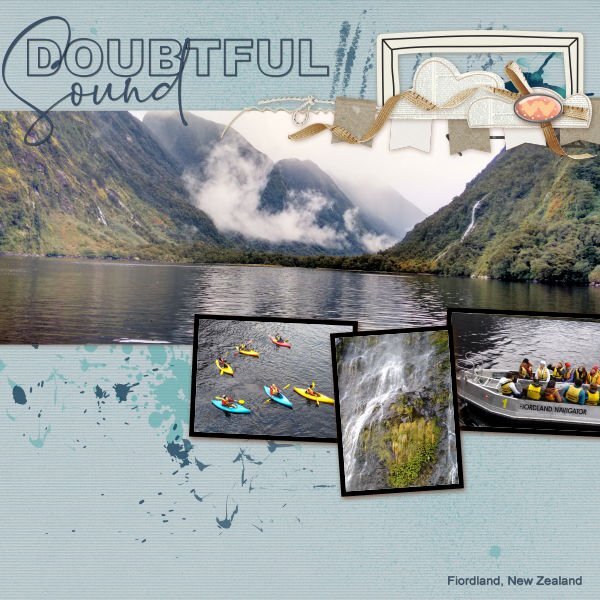
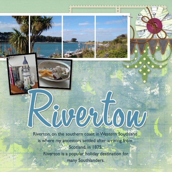
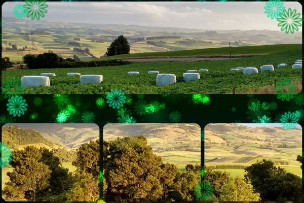
Doubtful Sound in Fiordland is accessible by boating across Lake Manapouri, then travelling by bus across the Wilmot Pass to Deep Cove. It is a popular tourist destination and somewhere I worked on the first overnight launch trip to the Tasman Sea in 1992. On the overnight journey passengers have the opportunity to either take a kayak onto the Sound, or to enjoy being taken out on board a tender. I spent my 70th birthday in Riverton, about an hour away from my home in Eastern Southland. It is a beautiful fishing village on the south coast where my great-grandparents lived, and mu grandfather was born. Travelling down from Venlaw Forest, near where I live, one gets a great view across farmland in Eastern Southland, New Zealand. Jeni6 points
-
5 points
-
4 points
-
4 points
-
4 points
-
here comes day 3 font Kinder Journey I flipped the page fonts are papierkind and Becket-Kanzlei3 points
-
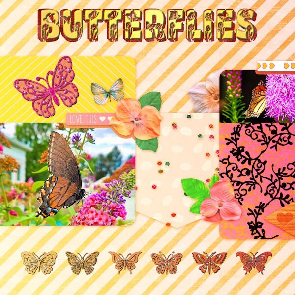
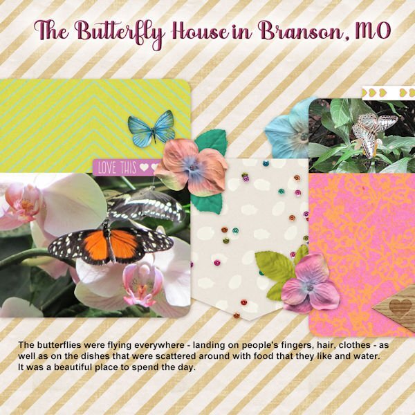
The butterfly photos are my own. The pink butterfly is from my 2023 Build a Kit. I changed the color with a gradient under the original and a blend mode and made the floral design mostly black to match the picture above it. The font is Butterfly from CF. Using the pen tool, I added a block font behind the original and filled it with red. The bottom row of butterflies is from a CF font called Butterfly Joyful.3 points
-
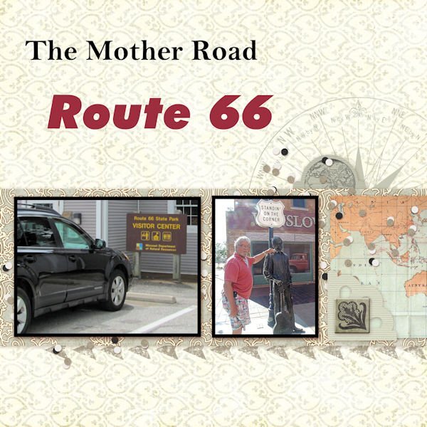
The extra QP for lesson 5. Pictures my brother and I took on our trip to the Glass Bridge on Route 66 back in 2014. The fonts are: Bell MT for The Mother Road and FutureXBlaklt BT for Route 66. Unfortunately the wording on the signs in the pictures doesn't show clearly. The large one is the sign for the Route 66 State Park just outside the St. Louis area near the Merrimac River. The smaller picture is my brother standing in Winslow, AZ by the sign "Standin' On The Corner".3 points
-
3 points
-
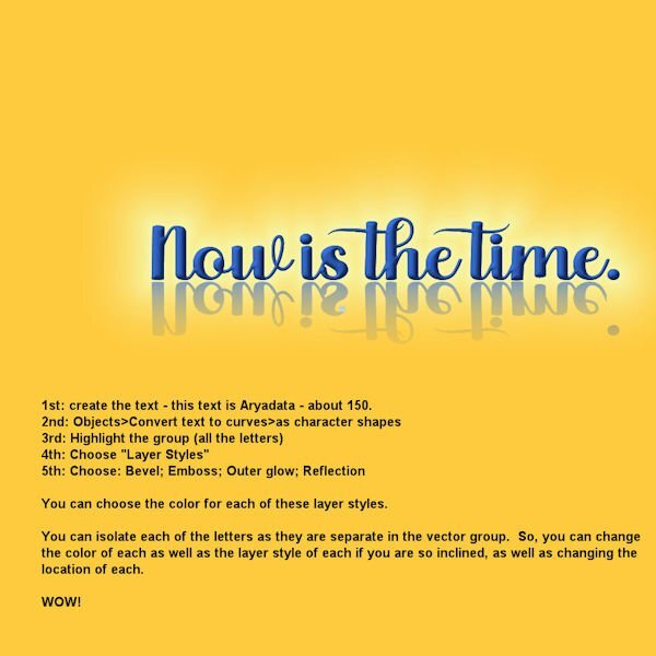
@Susan Ewart Wow, Susan. You sure are on a roll. Your creating the text and then using Objects>Convert text to curves>as character shapes - really got me going. I believe Carole taught us that in one of the workshops we've been attending - maybe the Text workshop??? Anyway, so I got to playing with it and this is what I came up with. Because using layer styles means you don't have to change the text to rasters in order to bevel, etc. them. Carole also introduced us to layer styles in one of the workshops. We have to remind each other of the different things Carole is teaching us - so much to learn (and maybe forget until one of us reminds us of them)!3 points
-
What great work has been posted here! There are so many beautiful layouts and birthday cards! It's always a joy and inspiration to browse the posts.3 points
-
3 points
-
3 points
-
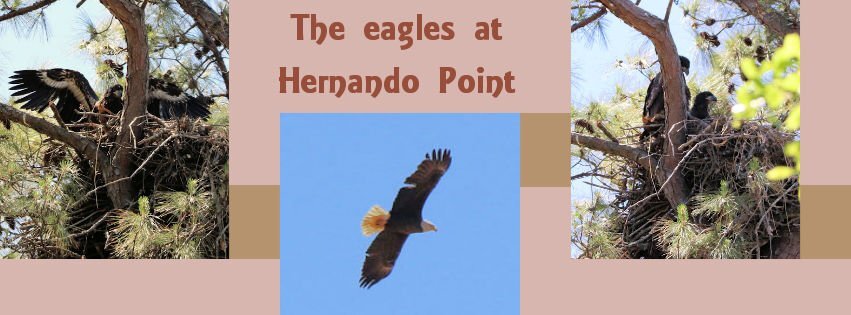
And this is from lesson 3 - The font is AR ESSENCE. These pictures I took on Monday - the eagles live in their nest in the top of a tree on the RV park. It was a wonderful day for viewing and trying to get pictures. I have a Canon EOS Rebel T7i with a small zoom lens (EFS 55-250mm) that I did not put on a tripod - but was lucky to get a number of great shots. I do not do the photographer thing (like Susan Ewert, Sue Thomas, and Ann Seebert) but use the automatic settings- this one was landscape. These have been enhanced and cropped. Of course with PSP.3 points
-
3 points
-
3 points
-
3 points
-
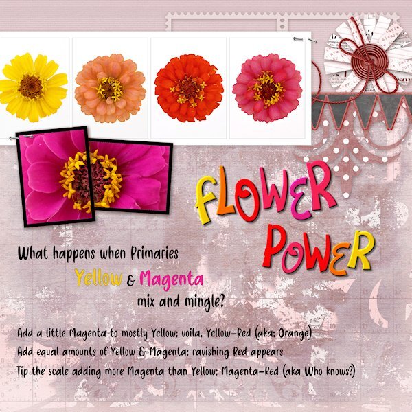
Day 4 Diamond QP Here is a color flow from the subtractive color (absorbs light as apposed to RGB which is additive and reflects light) color system CMY commonly used for printing (inks, paint etc). Starting with Yellow (very low on the value scale) and strong willed Magenta (fairly high on the value scale). Note the colors of the flowers are not PURE colors, in fact if all all three primaries are present and not any one of them at full strength, it's a tone (Hue+grey). Just keeping up with my color practice along with my PSP practice. I changed the color of the back ground with either Hue Map or HSL or likely both. the Fonts are Flower Love and Friendly Cactus. I used Objects>Convert Text to Curves>As Character Shapes for separate the letters so I could move them separately. Then rasterized and inner beveled.3 points
-
day 5 again with photos from the knight festival day 4 Fun on the Playground font is Bigger Summer Fest2 points
-
2 points
-
2 points
-
2 points
-
2 points
-
@Jeni Simpson Thank you for all the wonderful pictures and stories about New Zealand. I had read and viewed stories and pictures about Australia, but not New Zealand. A beautiful country. Oh, by the way - have you been to the places where they made Lord of the Rings? Peter Jackson left Hobitton there and it is a tourist attraction now.2 points
-
Sue, I feel the same way. 🙂 I really like creating my own stuff, although I certainly use things from the kits I've collected over the years. I have many of Carole's great scripts, which come in handy to speed up the process... Some work like magic! Like you, I love the Masterclasses. There is always something new or a deep explanation of something we saw before, but my go-to is the Preview page of the Creative Scrap tutorials... I like looking at the photos to decide which tutorial to follow.2 points
-
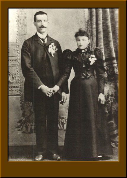
@Susan Ewart For Filter Forge, it is a plugin that you can access from PSP directly. Under Effects > Plugins > Filter Forge. Do that while your image is active in PSP and it will automatically "open in FF". Those irregular letters on the Flower Power makes the layout so much fun! @Jeni Simpson Great choice of photos for those pages! @Michele That photo really made me smile. Isn't that a great attitude we should all have? @Ann Seeber Isn't that great to see those cute creatures so close to home!? It is great that you find space to add a lot of information about your photos on the page. @Anne Lamp Is that you, dancing, in the photo? @Mary Solaas On your Museum photo, did you place the photo on top of a shadow? It looks like part of the shadow on the plant is missing. Moving the arrow is definitely a chore; it is not really meant to be moved as it is a flattened png format! You are making things hard on yourself 🙂 Interesting to see that a bride was not wearing white at her wedding. You are also adding fun information to your pages. @Donna Sillia Beautiful cat! Black cats can look mysterious! @Bonnie Ballentine Are the deer photos from the cam? Keep them coming, and if anyone has not started yet, you can still do so. Those pages are quick to make so you should easily catch up.2 points
-
2 points
-
I'm digging deep for photos. Poppy photos are from 2011 and trail camera photos are from 2021. Poppy is about 9 or 10 weeks old in these photos.2 points
-
2 points
-
2 points
-
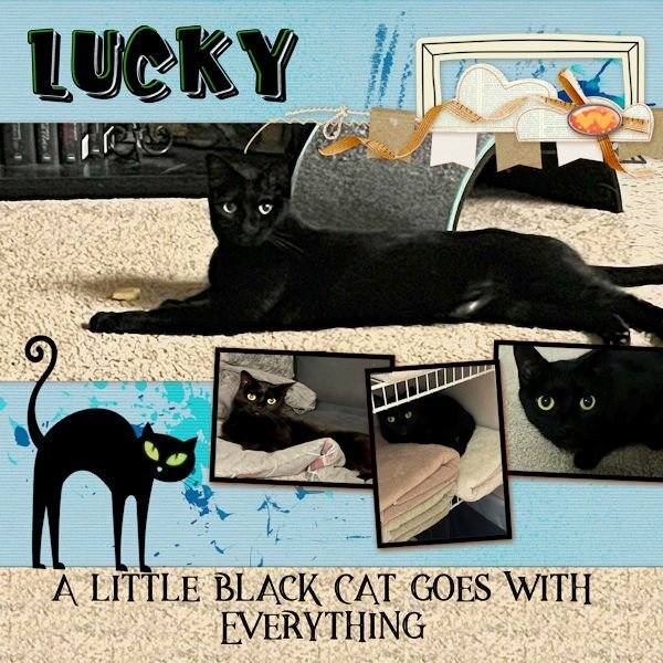
I had this quickpage saved from last year. The photos are of my daughter's cat who was a feral kitten when Beth rescued her. Baby Lucky terrified Beth's two pit bulls. She would boldly lie on one of the dog's beds, and they would not come near her. Now, of course, they are friends. The fonts are a layered font, Kid Zone, from CF. The black cat is from Scary Halloween Ornaments also from CF. The quote font is Magestic Inline Grunge from Deeezy.com.2 points
-
2 points
-
2 points
-
I'm doing this piecemeal. I did some alteration on this remembering what someone said in the 1st QP Workshop I did about putting a layer above the QP in a color (I used a gradient sky blue in this one) and changing the blend mode (I used Dodge with an opacity of 24). You have to be careful when doing this because it also changes the color of the photo if your photo is alerady there (and mine was). So - it's a learning curve. The font is MV Boli.2 points
-
2 points
-
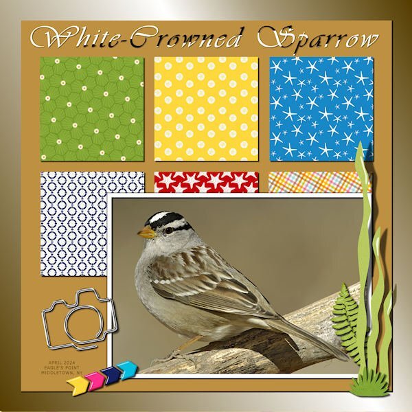
I went back and tackled the layout from Lesson 2. I decided to create a template of sorts in order to change the background color which is now a gradient created with the cass-gradient creator script using the colors of the sparrow. The title font is Vivaldi treated to the Sculpture Effect using the Geometric pattern with white. I have these little guys hopping all over the ground under my feeders. Their striped heads are quite noticeable. He even dominates this busy QP.2 points
-
I'm late, but here's my Day 1. Since many of us are seniors, I used this funny photo from Freepik. The font is Rosthila Sans. QP's are just that...quick, but it took me some time lining up all the letters. OCD is a battle sometimes. LOL2 points
-
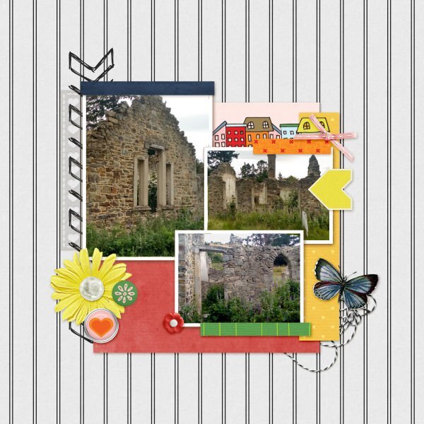
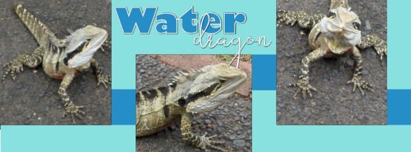
An old run-down building in St Bathans, Central Otago, New Zealand. The owner of Ohinetahi, an historic homestead on Lyttelton Harbour at Governors Bay, Christchurch, New Zealand hosted a garden party yearly on behalf of Save the Children. I loved to attend partly because of the scenery, and partly because of the gardens. An Australian Water Dragon, posing while enjoying the sun at Lone Pine Koala Sanctuary in Brisbane, Australia Jeni2 points
-
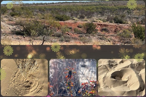
Day 3 Diamond Extra QP You know you need more practice with Filter forge (13) when you cant figure out how to get a photo into it. It was different than version 12 and I haven't used it in a long time. They have great filters so I don't know why I haven't. The Fonts are Break Love and Breath from CF. Bottom photo is my original. upper right is PSP effects>photo effects> infrared. the left photo is the one I used filer forge on, I forget the name now.2 points
-
Oh, my...my mistake...thank you for catching it, Ann. I'll repost.1 point
-
@Cassel I went back to the pspimage for the Museum piece. The picture was placed in the slot for the picture. The shadow of the fern leaf that comes over the picture shows up. Only in the reduced image is it to faint to be seen. You have such a good eye.1 point
-
1 point
-
1 point
-
1 point
-
Beautiful, Michele. It's so delicate and feels like warm spring hug (from Mother Nature).1 point
-
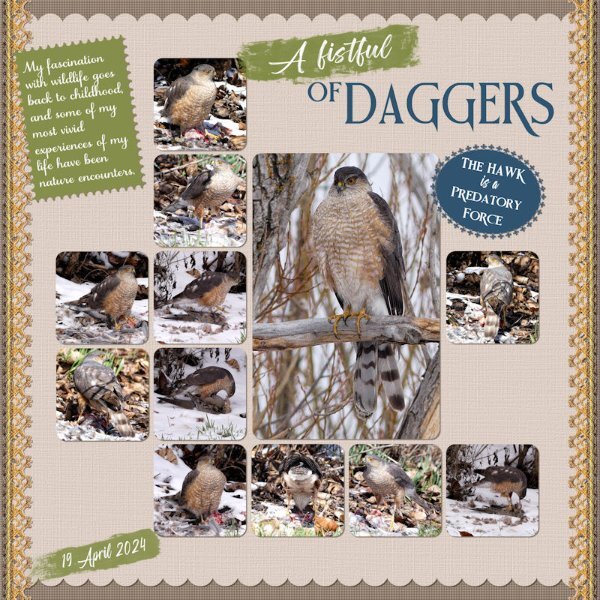
Wow, very nice, Sue. I do see Cooper's Hawks here by the condo and see the occasional pile of feathers, probably a mourning dove's remains. Everyone has to eat. I've been enjoying a series on the Public Broadcasting Station [PBS] coincidentally called "A Fistful of Daggers" which is all about raptors. Fascinating! I looked the show up on Google Images and put this on my desktop for now.1 point
-
I had decied to make my Xmas cake today. Got out all the ingredients, the butter was out softening, as it had been in the fridge, lined the cake tin. Everything was ready. I went outside to fill the bird baths, and feeders when I heard the Robins suddenly sounding off the alarm. My Sharp-shinned Hawk swooped down and flew off with a mourning dove. One of a pair I have here, now only one. After a short while I heard another hawk, and loe and behold there he was up in the tree, looking down on what I believe to be the female tucking into a hearty meal. They certainly do have a fistful of daggers, and what a predatory force the Hawk is. After over two hours, with a break from eating about half way through the meal, she flew off, leaving nothing behind, other than the feathers. Here are some of the pics I took. I got very cold and wet, but it was worth it. It’s always a privilege to be able to witness a private, moment like that which happens all the time but we rarely witness much less get photos of! Some may not like these pages, and find them distasteful and cruel. I have a comment for that. By saying nature is cruel is damaging, it isn't cruel, it's indifferent, brutal and effective, but it is equally beautiful and a marvel of natural wonder. Eventually I did get my Xmas cake baked, fed with brandy, and put away in a cool, dark place. Sharp-shinned Hawks. The template I used is from lab 10-2. It's one of my favourites, which gets used often. I can remember once, that Cristina, said she liked that template too. Carole's lace , where I used a gradient and then a blend mode. a fancy font on the tag, and brush strokes to highlight some text. Scallops and postage stamp edging on the note with text. The other page is a layout demonstrated in the scrap with grids masterclass.1 point
-
Having the pic on the top right on top of the punched part of the paper is a very interesting twist on the usual.1 point
-
Hi Sue. What a charming layout! Can you tell me if the title "ROBINS" is a font or an alpha? It's very interesting.1 point


Resized.thumb.jpg.d25811db03a63358cedab1e79f527635.jpg)
