Leaderboard


Popular Content
Showing content with the highest reputation on 04/05/2024 in all areas
-
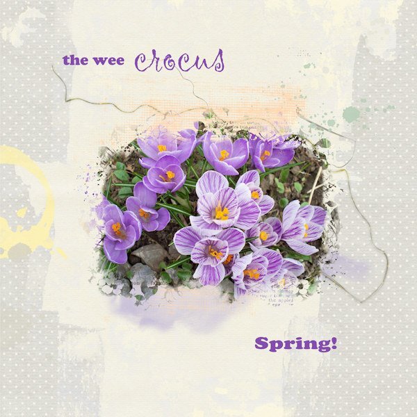
After a mild and warm March, we are having a much wetter and colder April so far. There are a few early bulbs out here but they're biding their time. I had to dig into old pix to find one from my own garden a number of years ago. The mask I used is the free one from Jessica at Curio Pantry. I blended a couple of background papers, used some splashes and splatters and some squiggles.
 9 points
 -
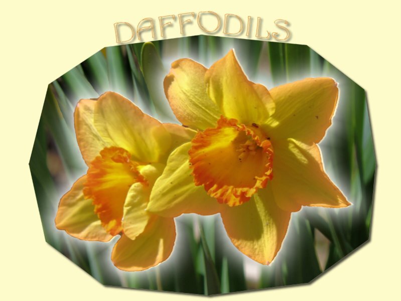
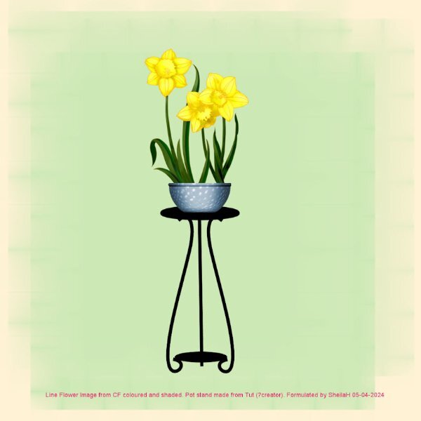
Hope you all had a fab Easter. My PC slowly died over the last couple of weeks but now have a new fast one. I am still suffering from the effects of Vertigo and have to ride it out as there are no meds for allieviating my symptoms. However, I do think it is gradually going but very slowly. Anyhow, unknown to me I did not know of this months challenge and only saw it tonight. As I have finished colouring and shading a line image of Daffodils today too it will fit the bill here. I also had made a plant stand image last year so put the two together. I find that playing with my PSP helps with concentration at the moment and I did feel lost without it. TFL.
9 points
-
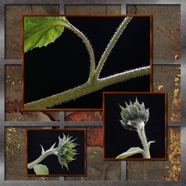
I hope this counts...more like pre-flowers than "flowers". I posted this one because my grid squares are not square (look at the far right column) and I'm hoping the Masterclass will teach me how to make everything square and even. These were the first sunflowers I've ever grown (2023). They were supposed to be 6' tall, perfect fit where I put them (against the garage wall). They ended up being mutants and grew to over 10 feet tall, having to bend around the eves troughs to reach for the sky. Some got too top heavy that they leaned over and that's when I got this shot. My lighting designer/expert was Mother Nature.
5 points
-
My total solar eclipse experience in 1999☀️😎 SOFI= Sonnenfinsternis = solar eclipse4 points
-
Font is Myriad, most graphics Jen Maddock, some myself.4 points
-
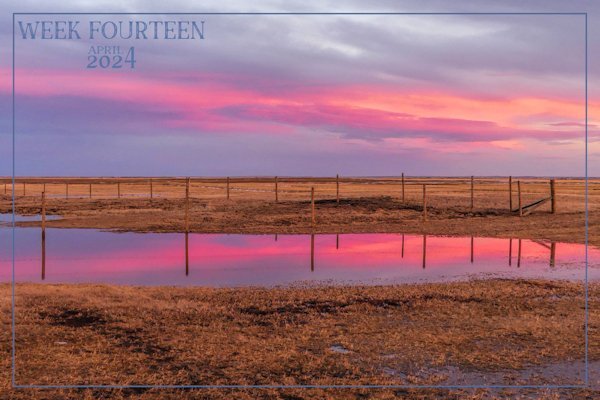
This past week we have some stunning sunsets and sunrises. The temps are rising slowly, obviously the ground is still frozen, hense the standing water. Rainbows are created by water droplets in the air. The colours are wave lengths of light. Like in a sunrise, as in the image below. Red is recalled the red shift, as the light is stretched. Stretched light causes the red colour.
3 points
-
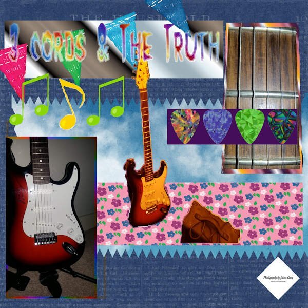
There is a double meaning behind the title "3 cords and the truth." It is a quote from (Professor of Rock a YouTuber who tells the stories behind Music from the 80's) He uses it as his closing line when his videos are over. The second meaning of the line is my truth (I'm better at playing with pictures of my guitar then I am at playing the guitar LOL anyone willing to give lessons?)
3 points
-
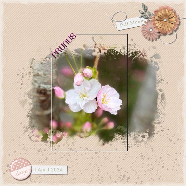
Lately on a dry spell I came along a front garden in a street I normally pass by and saw a magnificent rather big Prunus in full bloom. The only problem was that I had to take my photo from the pavement and in that position it was impossible to get a good shot of the tree without getting the front window and door of that house on the photo too. Nowadays you have to be a bit careful when you do that, because most people don't like you doing so and I didn't want the house in the photo anyway. Therefore I took some close-ups and used one of them here. I like the work of Jessica Dunn and subscribed to her newsletter recently. She hosts a mask challenge on digitalscrapbook.com for this month and has a freebie mask and as a welcome gift I got the mini kit dandelion wishes part 2. And I used both the mask and the kit for this layout to make a background from 2 papers with a blendmode. Made a cluster with some elements, changed some colors to go better with my color scheme and made a text frame because the frame in the kit was way to overpowering for this photo. The font is Belinda, a freebie from CF. Just a whole layout using freebies!!!
3 points
-
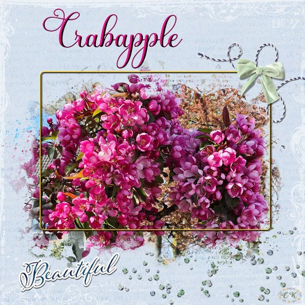
Because I like this theme challenge and I like this mask I made another layout using a photo from a crabapple (Malus) tree in my neighborhood. With a more colorful photo and another background it looks completely different. The background is made with 2 papers and a blendmode; all the elements are by Jessica Dunn and I made a very thin frame and the font is Beladine Gadelia.
2 points
-
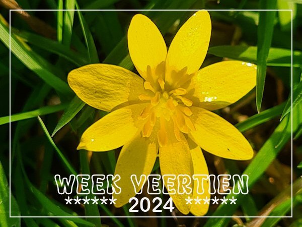
The last couple of weeks in every patch of grass along roadsides and in public gardens is colored by "speenkruid" ( pilewort - ranunculus ficaria - lesser celandine) and this week I finally got the time to take a photo when we had a sunny spell.
2 points
-
Nice use of the mask! I like this mask and it is very versatile!2 points
-
I think we are boycotting "U's" this week, that's the memo I got. hahaha, sorry, my job kicked my butt to curb last night so I was a little bleary-eyed when I posted. I will write the alphabet out today and post by the computer so thinking wont be required of me. 😔2 points
-
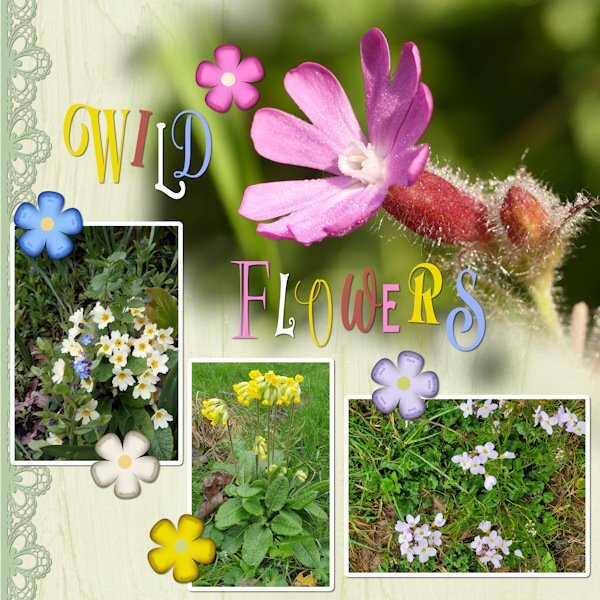
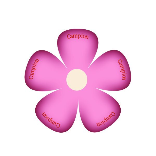
UK WIld Flowers. I have many favourites. The Campion which flourishes in hedgerows all over the country, can flower almost all year round in some areas. Wales and Cornwall, especially so. I used one of Carole's lace picture tubes, edge magic script on the flower elements, which I created myself, adding the flowers names on a curve, as the flowers are vectors. As for the tile, I went wild using many different fonts, and colours from the photos. Due to compression, some of the flowers names in the flowers may not be legible. Forget me nots, Primroses, Cowslips, Shepherds smock. The main photo is a macro shot of the Campion flower.
2 points
-
Since you suggested them Sue, I've watched the No Kit series. One I had seen before, and the other two were interesting. The basket weave one (Kit 3) is a great inspiration, but I'd have to watch a dozen times to get it right. No time for that, sadly.1 point
-
That is lovely Corrie! And that mask works in any orientation. None of our trees are ready to bloom like that yet! But I love it when they do.1 point
-
Thank you. It's in NO 3 and it's just what I was looking for (and more too).1 point
-
Excellent!1 point
-
C F has a gorgeous horse freebee today here are a few of the horses included.
1 point
-
Thank you so much Michele. The flowers I grew for the first time (ever) were my muses last summer. I'm going to try again this year. it's a steep learning curve for me (black thumb). The instructions tell you once the seeds sprout to thin them out. I'm like no way! What if I thin out the one that would actually grow, and isn't that seedling manslaughter? I'm no plant killer...oh wait, I will chop off their little heads to photograph them. 😱1 point
-
There was a report on a news station out of Dayton last night on the cost of hotel rooms. This is what they found out about the 2 hotels in my town. "In Wapakoneta for the weekend of the Eclipse, Comfort Inn is priced at $632 while Holiday Inn Express is $1,243." A town about 45 minutes from us has these prices "In Bellefontaine, the prices range from $895 to $1,167 in total." Bellefontaine is in the path of totality but the duration will not be as long as ours since it is east of us. They are fully booked!1 point
-
Pre-Happy Birthday Corrie. How does one top a birthday gift like the universe is giving you. Too bad you wont be able to receive it. It's the thought that counts...that Universe, always thinking about us, eh?1 point
-
I'm nowhere near the area of totality. Here's a special food item, just for the eclipse.1 point
-
1 point
-
Flowers it is. Fonts. Butterline, Bell, Cornish Pastry, Selectric Advocate1 point
-
And here is a second project, about a place in Germany (say shtorkoh, meaning storks in English) Storkow about a 40 minutes drive east of Berlin and 20 minutes west from the Polish border. It is part of the outer, historic military ring around Berlin. Interesting place. Graphics JBS and Marisa Lerin, fonts are Qiara on title and Poppins on body.1 point
-
Another one from the 1960. Some graphics JBS Designs, rest myself. Again 10x8 inches, fonts are Lato on body, Pacifico on title Rock Beach on location and Georgia on date.1 point
-
Great calendar page @Ann Seeber, love the open book look. Is that a script as well? I was hoping to get into scripts on Easter Monday but life had different plans... It sure is on my list. Thank you for the lovely kit @Louyse Toupin!!! I have a little project going with photos from the sixties and seventies. Some are slides, all are scanned, except the one on this page 😉 Graphics JBD Design discontinued. 10x8 inches. Font is Lato on body and Nickson Four on title.1 point
-
I will start with another version of these daffodils that I posted last month. I do play with flower pictures a lot an could really go crazy with this theme.
1 point
-
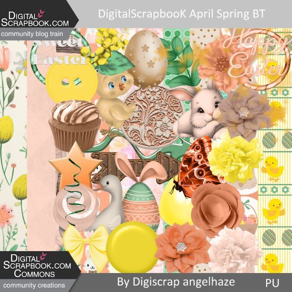
Hello, I have built a mini kit for : https://www.digitalscrapbook.com/forums/digital-scrapbooking/digitalscrapbookcom-blog-trains/apr-2024-blog-train-final-list here is my part, to download it just go on my blog: Digiscrap Angelhaze
1 point
-
Happy April. Here is my monthly Wild Cat Calendar for April 2024. I used the cass-open-book script for the top and a calendar from Gina Jones. The Snow Leopard photo was taken by my granddaughter, Jackie Thorpe, at her Claws 'N' Paws Wild Animal Park in Mt. Ariel, PA. The title font is Fredericka the Great, and the text font is Agency. The background gradient is labeled "Bondi." The "Say No" brad is mine. I will also post this on our Facebook page full size for anyone who would like to print it out at 8.5" x 11" which is what I do.
1 point
-
I have found a great site that can list all the cities in the path of totality, but also those who will experience partial eclipse. It shows what you will see in various cities: https://eclipse2024.org/eclipse_cities/index.php I found out that my hometown will see 99.56% totality, so we are just out of the full path, so we will drive to Miramichi, which will be close to the center of the path, where we can get 3.5 minutes of totality (weather permitting).1 point
-
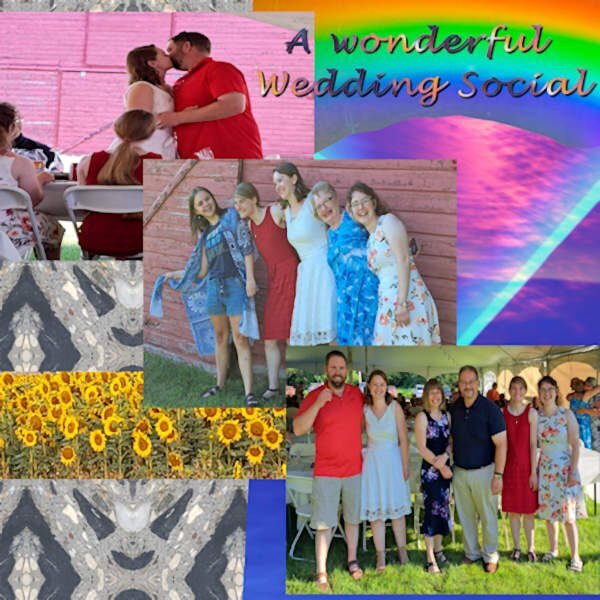
Bootcamp Project 3 “Friends” Good afternoon everyone here is my Bootcamp Project 3 "Friends" Project. Hope you enjoy it! 😉 There are a lot of elements to this image. 1) For the background I used a photo of a patch of stone edging that I took using an app called “Mirror Labs” to create the geometric patterns. 2) The rectangular image was a photo of a sunset with a color filter applied 3) The photos were all taken at my friends Bryan and Lori’s daughter’s wedding reception 4) The sunflowers are a selection from a photo I took at a local Sunflower farm 5) The rainbow is selected from a photo of a CD with the sunlight creating the rainbow effect 6) The text is Lucida Handwriting font with a gradient fill and drop shadow As you can tell I like to use my photos for the elements whenever possible. I enjoy experimenting with a variety of photographic styles and photo effects apps. 📷
1 point
-
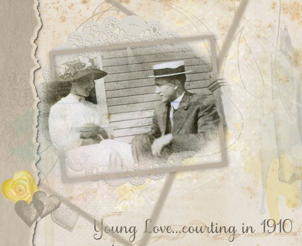
I've been hoping to see this technique presented for a while. It was covered in the March 2024 Q&A, so I had to give it a go. I haven't posted anything for some time, just so bloody busy! Too many irons in the fire, as the saying goes. And no inspiration at all! Every layout I have tried, I have deleted as not worth posting. I do work a lot with old photos, not just my family but others' too. This one is a favourite of mine, from 1910, not my family. The styles, the looks on their faces, the general joy of the moment - are just captivating (to me). So what better material to work with than something I have worked with? Not entirely pleased with the result, but I feel I can post without cringing. It's a start with that split frame effect.
1 point
-
There are a million ways…. from your own photos. Just a woods with a creek photo, say, then blown up to the smallest side being 3600 pixels (or whatever size you’re after). Backgrounds can be blurry with the resize. Crop to,size. Put your zip line or camping photos on it. a photo of a parking garage wall, a stucco wall, an elevator door…..resize, place on a colored paper and mess with the blending modes, maybe “multiply” then move the transparency slider to 40% and see what it looks like. You can use packing peanuts, a park bench back, old wooden storage barn, peeled paint fence or wall. I used my wood floors, and also a painted wall where you could see the puckers of the paint roller. As long as the “original” is over 12” square, it will work. (I use 16” as my parameter) photo of Kraft paper, waxed paper, butcher paper, florist paper, cardboard box panel, packing paper (even if it’s been crumbled). Then add color. And blend modes, use those sliders! as long as it’s for your own use, these are sometimes popular: scan or take a photo of newspaper, wrapping paper, wallpaper. When you have it, start looking at textures. effects-texture, texture. Add one that is subtle, but not too subtle. I find this the trickiest. Post your results!1 point
-
If you are a Diamond member there are a lot of tutorials on how to make papers, backgrounds, elements etc. And there is usually a deal to try the membership for a month that would allow you to look around to see if that's what kind of stuff you are looking for. It has really helped me in learning PSP. the membership is quite flexible too. You can do it monthly or yearly or just do a month here and there a few times a year. If you are not a member, check out the "blog" tab and possibly the "Resources" tab (at the top of the page) as you might find some background techniques there. I would do a search in the search bar for "backgrounds" and maybe try one for "papers" and see what comes up.1 point


Resized.thumb.jpg.d25811db03a63358cedab1e79f527635.jpg)