Leaderboard
Resized.thumb.jpg.d25811db03a63358cedab1e79f527635.jpg)


Popular Content
Showing content with the highest reputation on 03/24/2024 in all areas
-
Day 11 Project 5 Finally got this done. Computer or user error. The latter most likely the problem. File just would not open so therefore could not change file to a Jpeg.
 8 points
 -
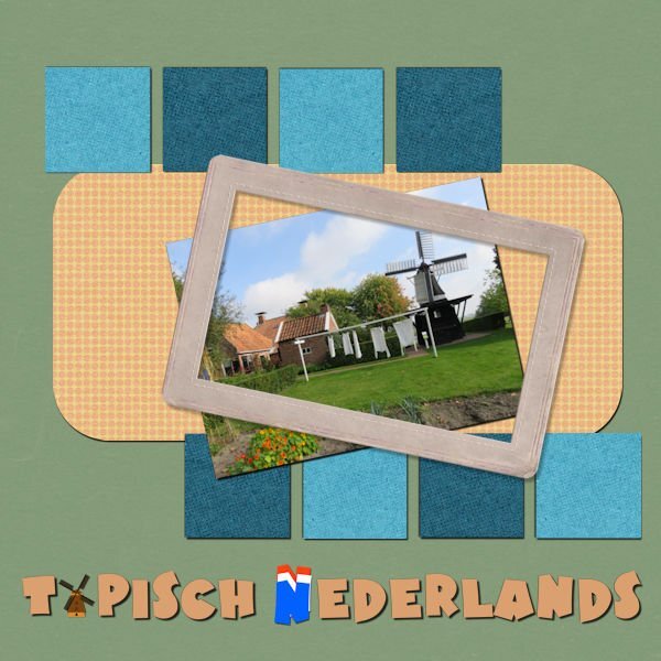
Day 11 I used elements, papers etc. from my stash and from Creative fabcrica. Writing font is Brighton, but I didn't remember the one at the bottom. The N in Netherlands I made with a copy of the original N, copied it 3 times on another file. Gave it the the Dutch colors, moved them up (overlapping) and then merged down. It was fun to do this bootcamp again 🙂 Wish I could of been more active in this thread, but was very busy this week 🙂
8 points
-
Just for the fun of it, we will be having a fun activity in the Campus: an Easter Hunt. It will be similar to the Treasure hunt that took place last September, but it will be smaller in scale and limited to the Campus blog. The hunt will take place March 30-April 1st. So you will have 3 days to find all your eggs. The clues are meant to be quite easy. If you are really stuck, you can ask questions in this thread. To keep it interesting, I would ask that nobody give the direct answers or the direct URL for any clue. I don't want anyone to get frustrated, but I also want you to browse the various articles (don't worry, there is no walking involved). Have fun!4 points
-
I've changed the shadows 😎
4 points
-
Project 5- I began to use the "Cranberry" kit, but there are no solid papers in that kit. So I used 2 of the patterned papers for the squares...but it just didn't look good to me. Last night I decided to just close it up and look again tomorrow. Today, it still didn't look good to me! I decided to pull a couple of colors out of the photo and use them for the squares. And then PSP didn't seem to want to cooperate, so I closed it down again. I feel like I have done this page many times today. So I guess that means I am done with it. There are several things I would change, if I had more time or more patience today...
4 points
-
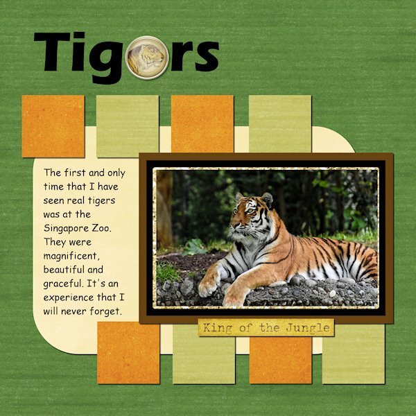
Scrap Bootcamp Day 11 - Project #5 I know that "Tigers" looks like "Tigors" 😄 but I wanted to put something in the title to remind me later that I can use elements to substitute for letters. @Cassel Many thanks for the Scrapbook Bootcamp, I have thoroughly enjoyed it.
4 points
-
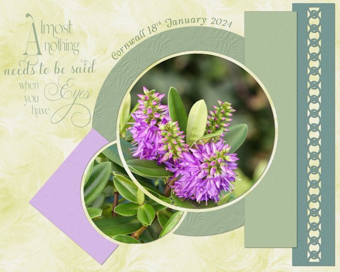
Here is my week 12, fonts Bell on my poem, Swissn on date @Susan Ewart @Cassel: PSP's vector support is what got me into checking it out a bit closer. I understand 💕the real fun starts with the scripts. I need to get into them.3 points
-
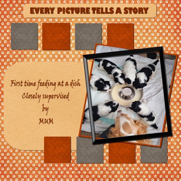
DAY 9 PROJECT 4 I have kept the same colour scheme for continuity as it is the puppies journey to their forever homes . Papers and graphics are Nit wits Pawsitivity and Gina Jones Fido.
3 points
-
This photo was taken during the covid isolation. The papers used for the title and squares are from the kits suggested on the lesson page. The blue background was taken from the photo and a texture added. The acorns are from Shiela Reid's Outdoor Adventure kit at Digital Scrapbooking. The frame is by Marisa Lerin at Digital Scrapbooking and the bow is also by Marisa...February, 2021 The Good Life. Thank you, Carole, for another fun workshop!3 points
-
Picked a random picture of my Aunt and went from there. Pretty much just followed the tutorial.3 points
-
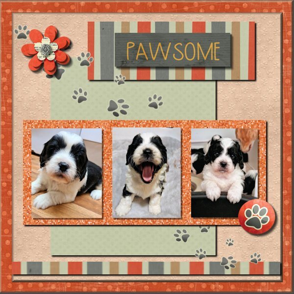
DAY 7 PROJECT 3 I could not stand the fuzzy edges and the mistakes on the shadowing so I have redone it! Thank you Carole, my opacity was like you suggested way to low and the fuzzy edges were due to the feathering being on ! As I had called it Pawsome I thought I should have some pawprints !
3 points
-
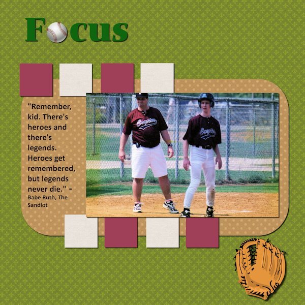
From the days long ago (note the pager on my belt,) when I helped coach my son's baseball team. Not a particularly original layout as I simply followed Cassel's instructions step-by-step with the exception of a picture frame. If I used one and tried to put it inside the photo, I cut off my head. Used a quote from one of the great baseball flicks of all time.
3 points
-
That should be fun. I hope not to find any that look like this. LOL Egg from C F.
2 points
-
Here is my last project, no 5. graphics from my Vinted kit, font is Selectric Advocate, WA brushes by Katie Pertiet. Many thanks for everything , @Cassel. Such a great workshop!2 points
-
Day 11 Project 5 Travelling along the lakeside highway from Queenstown, we chanced upon this scene. Sheep were being moved from one area of the farm to another. This happens often in country areas. Jeni
2 points
-
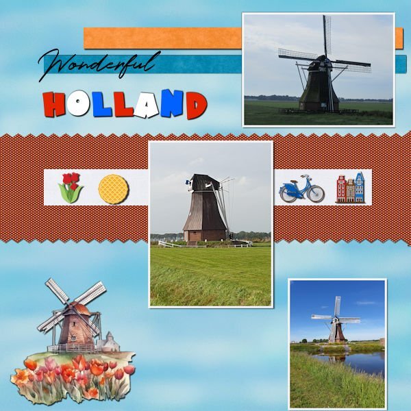
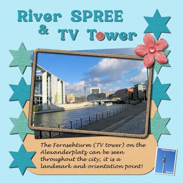
Project #5 The end of this Bootcamp and the end of the trip to Berlin. I used the minikit crafty-eve-cpjess from the 2022 blogtrain and a frame from Sharon Dewi Stolp that I have in my stash because this kit had no frame. The font is Bremlin, the font Berlin that I used for the other layouts was to thin for this one and Lucinda calligraphy. And of course again a postage stamp with my own script. Instead of the little rectangles I used stars, like a rating for the trip to Berlin, just for the fun of it. It was good to have a little refresher of the basics after having learned more over the last 4 years. I completely forgot that you can use a paper as a pattern for text, so it will match perfectly with the rest of the papers. Carole thank you for offering the Bootcamp again, I have enjoyed it as well as seeing all the projects from the others, that is always inspiring.
2 points
-
Project 4...more daffs...the top one volunteered in my yard; the other 2 volunteered in the woods. I hope to dig them and transplant them.2 points
-
Papers are all from Marisa Lerin. The steering wheel is from Canva, and the paperclip is from my kit and recolored. I pretty much followed the tutorial using the same fonts and overcame my addiction to layered fonts. This project was a good refresher for placing shadows, something with which I often struggle.
2 points
-
Project 4 - used the Spring Skies kit and used photos from work trips down time from a few years ago.2 points
-
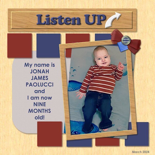
Final Bootcamp project - featuring one of my new great-grandsons. He'll explain... Fonts used are Cooper Black and Century Gothic - old standbys... All elements are mine from my own kit...
2 points
-
Oh, the sheep in the title! Lovely! 😄 🙂1 point
-
Yes, I also like the reminder 🙂1 point
-
I have done the bootcamp a couple of times, it is always a good review and reminder. There are techniques I learn and then forget about. Like the pinked paper edge! You could eaily change it to a scallop, and adapt it to your project. Also using a paper to fill the text. I should practice that again. Thanks for the review!1 point
-
I love that poem, it's beautiful. As is the layout.1 point
-
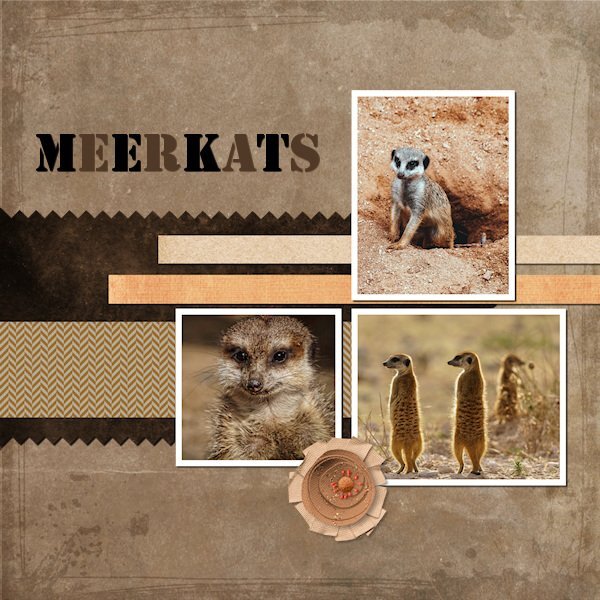
This photo could win a wildlife photo contest!!1 point
-
Objects may be closer than they appear...
1 point
-
She's BEAUTIFUL! And thank you. I can never get tired of seeing horses.1 point
-
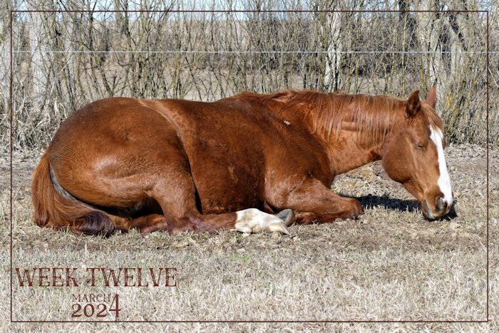
Nell is enjoying the heat of the morning sun. She is the younger of my 2 girls.
1 point
-
I am sure you are not the only one doing that now! Isn't it fun when you can at least "read" the inside of a script and get a feel for it, even if some things are not 100% clear yet?1 point
-
Never forget!1 point
-
We are not allowed to take things from public lands/ parks, etc.1 point
-
This is so nice. I love the "O" sheep and leaving the windshield wipers in the photo is a great touch!1 point
-
@Cassel I thought the same thing even though the opacity was 100% it looked like there was some ghosting. In the kit the paper was a single unit but I also thought the polka dots acted like a layer of their own. I probably should have looked through other papers for something that might have matched the theme without the added pattern.1 point
-
I honestly do appreciate your words. This community oozes encouragement, help, support and inspiration. Not forgetting constructive criticism, which I find is important, when received in the manner in which it is given.1 point
-
I didn't have anything specific in mind this evening to create. I randomly chose a photo from my trip home, created a layout/template, wordart, background paper, and used one of Carole's punches. Using vector shapes particularly for the circles not only gives nice clean lines, I'm able to do text on a path. Retaining the vectors, once I have duplicated and converted to rasters to colourize, texture etc.
1 point
-
Corrie, the woods are mine...on my property.1 point
-
Sue thank you, your words mean a lot to me! Your encouragement and critics have helped me to get further in developing my skills. Your layouts are always an inspiration!1 point
-
I like this very much, so colorful and at the same time not too much!1 point
-
Hi, I'm currently working privately on a lot of digital birthday cards and congratulations on the birth in mobile phone format. Many family members and friends have birthdays in the first half of the year😄🌷1 point
-
Scrap Bootcamp Day 9 - Project #4
1 point
-
Catching up, Project 3 used photos from a Halloween parties I knew would have several friends in roughly the same size photos. The theme was drinks / cocktails.1 point
-
Thank you it's all good now. I did the wax seal tutorial, it's a good one.1 point
-
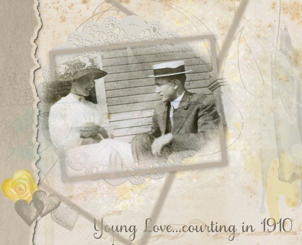
I've been hoping to see this technique presented for a while. It was covered in the March 2024 Q&A, so I had to give it a go. I haven't posted anything for some time, just so bloody busy! Too many irons in the fire, as the saying goes. And no inspiration at all! Every layout I have tried, I have deleted as not worth posting. I do work a lot with old photos, not just my family but others' too. This one is a favourite of mine, from 1910, not my family. The styles, the looks on their faces, the general joy of the moment - are just captivating (to me). So what better material to work with than something I have worked with? Not entirely pleased with the result, but I feel I can post without cringing. It's a start with that split frame effect.
1 point
-
Concentration made me think of terrible things from years gone. Today's world conflicts do not help. Items are from Bing except paper from jessica-dunn. Font is Arial Narrow.0 points