Leaderboard
Resized.thumb.jpg.d25811db03a63358cedab1e79f527635.jpg)


Popular Content
Showing content with the highest reputation on 03/17/2024 in all areas
-
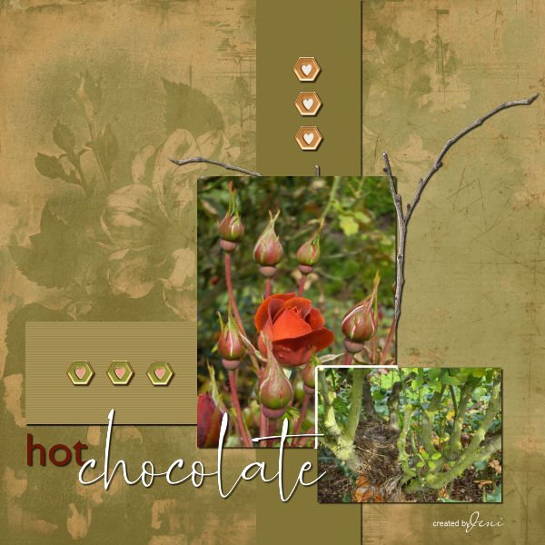
Another image is complete for Day 5, I hope. I was at a park a few years ago and was smelling this beautiful rose, Hot Chocolate. As I moved away, I glanced down, and there, where the branches joined, was a nest of about 4 tiny birds. The gardens were full of people, all stopping to smell the roses, just as I had, and no one noticed the treasures in the nest. Jeni
 10 points
 -
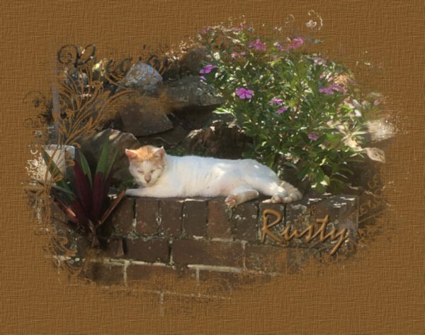
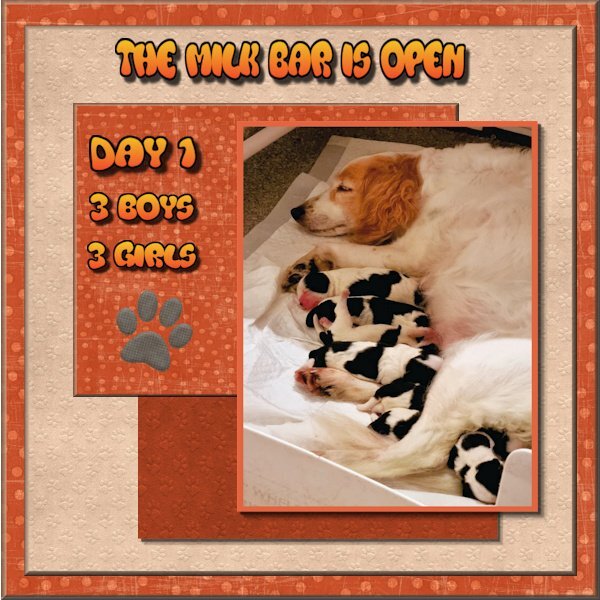
Day 5 project 2. Puppies again, this time the pups having just emerged safely into their new world, Mum settles with her fur babies for a well deserved rest. I again used one of my favorite sites Nit Wits for papers and the paw print
9 points
-
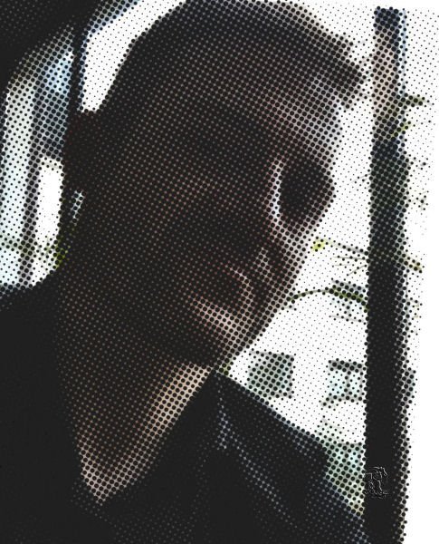
I needed a profile pic and finally found something I could use. Photos of me are rare. I decided to play some and did this. I used PSP with sprockets from marisa-lerin_134588_handy-people-gear, Harley from Harley and me from parents.8 points
-
And project 2 under the belt. I like the keyboard shortcuts as a timesaver.
8 points
-
Day 3 Learned a lot.
8 points
-
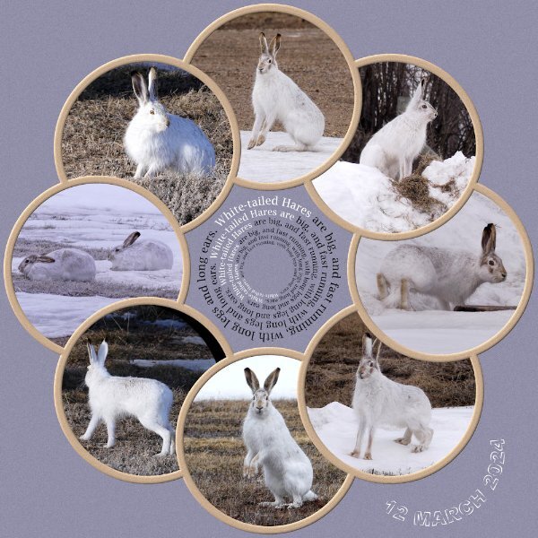
I decided to do a follow up page to the one I did for the mating hares. Once again I have used Carole's punches, simillar colours too. Now that the snow, and snow banks are slowly disappearing as the sun warms up, it's lovely to see one of my resident hares out feeding during daylight hours. Rather than use borders I used the selection tool, select selection borders, delete Instead of round I went with oval for thw photos. Although I use square layouts, I much prefer to use rectangles. We now live in a digital world, a far cry from when I was a child, when we didn't even have calculators. It doesn't matter whether you area a pro, amateur, use a pro camera or a phone. For me photography is far more than pressing a button, but in the ability to weave a narrative through pixels. Immortalizing the fleeting beauty of a moment no matter what it may be. Using the powerful impact of PSP to tell the photos story, by showcaseing them.
8 points
-
DAY 7 - My fantasy Viking River Cruise. 😉 (For the new members; I"ve done this before with a fantasy trip to Gabarone, Botswana, Africa.) I mostly used the kit Carole offered, True Heart. The gold leaf is from Nellie Bell. The title font is Belisha and the journaling font is Franklin Gothic Medium. This color scheme is a bit of a departure for me as I usually use bright, primary colors or deep tones.
7 points
-
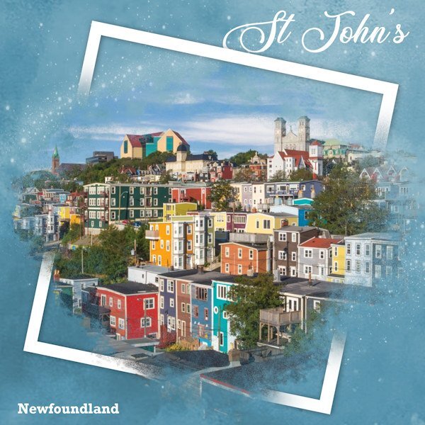
I'm in need of real colours around me these days. Saw this image online and it touched me b/c I love those primary, primitive colours in art or photos. Not much of that around here for a while. I used the spill (or split) frame technique (again). Background paper with sparkles added, and simple text. Glad to get a layout done! I have been to Newfoundland and it is absolutely breathtaking to see. We did the trip on motorcycles many years ago.
7 points
-
Scrap Bootcamp Day 5 - Project #2 @Cassel If there was an email for Day 4, I never received it.
7 points
-
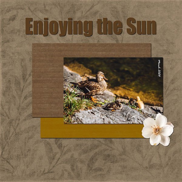
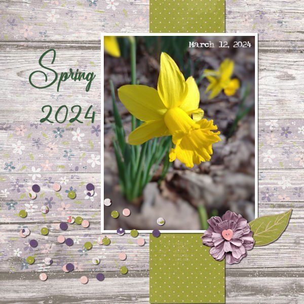
Day 5, Project 2. While I was walking in the woods looking for daffodils I met this lovely lady. She was in a group of 6 or 7. Although she is on alert, she did not appear to be too concerned.6 points
-
I increased the shadow on the flower.
6 points
-
I posted the challenge in the bootcamp, not realising they are two different entities. Here, now, posted in the correct place, I hope. Jeni
5 points
-
I apologise, I didn't realise the challenge wasn't part of BootCamp. Receiving the two in the same email confused me. This is all new to me. I have fixed the shadow that was missing on one of my images for Day 5. Jeni
5 points
-
I used a preset, I think 10-10-80-10. Deleted the shadows on the photo and added 10-10-80-10 again, and also a reverse shadow 🙂
5 points
-
Project #3 For this layout I used the kit cpjess-Vintage Blooms (Jessica Dunn) with glitters from my stash which have a color similar to one in my photos. I had to cleanup the photos, after all they are from 2008 and taken indoors. Instead of the glitter outline of a butterfly I used a paint splash from the kit. I have some elements like the butterfly but those didn't looked right on my page. The admission tickets are done with my own script and the font is Berlin.
4 points
-
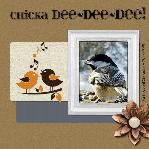
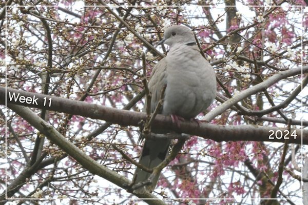
Week 11 This collared dove is a regular visitor to the garden. She is perched on a walnut tree branch but behind her you can see some pink and white blossom on other trees - spring has definitely started.
4 points
-
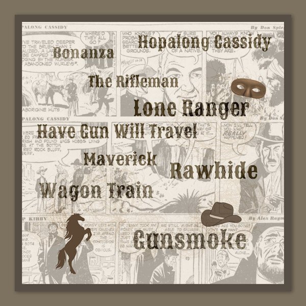
I read Corrie's story (and enjoyed it). It reminded me of my own very young childhood. I wasn't a dolly girl (much to my mother's chagrin b/c she loved making outfits for the dolls she bought me). I played with dolls (and later Barbie), but my favourite activity was playing in the open fields in our small village with lots of other kiddies, especially cowboys and Indians (which is not very politically correct anymore.) We all had holsters and fake six-guns and pretended to ride on stalliions and shoot each other! (We all survived and none of us has ever used a gun since.) Back in the 1950s, early 1960s, TV westerns were very popular on TV. I would watch them with my dad, night after night, when we weren't watching hockey or boxing or Ed Sullivan. (I was a tomboy, can you tell?) According to a bit of research, TV westerns on the three major networks (ABC, NBC, CBS) numbered over a 100 for a period of eleven or twelve years. Because most of our TV channels came from the US, we were a captive audience. This layout is my attempt to capture those days of B&W TV when I was a cowgirl, with some of the favourites everyone was watching.
3 points
-
I made this for the challenge on PSP Maniacs'
3 points
-
Beautifully executed Julie You have that technique well and truly mastered. A rainbow of colours. I could do with some colour, as the snow deminishes the drab browns are once again revealed.3 points
-
That's beautifully done Julie and the background color works so well with the color in the photos.3 points
-
My project 3. I was aiming for a midcentury modern-ish vibe. Supplies myself, Jessica Dunn, Sharon Dewi Stolp. Fonts are Georgia on date and Cuciniere on title. @Cassel: Yes, especially in a PSP WS, lol!!!! 💕😉. I have been playing with them, not enough it seems tho. I find EC gives me what I want faster. The layouts so far are the most elegant recipes ever! An absolute fool proof way to a great layout. Many thanks. Many great examples here in this thread. Fab recipe!2 points
-
Not only a gorgeous page, but very poetic words. ❤️2 points
-
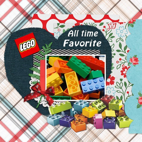
Although I have played with many toys like dolls, (a dolls house that my dad build for me) there is one all time favorite: LEGO! When I was a child Lego was a new brand with those colored plastic blocks and it was considered a toy for boys, but luckily my parents were tolerant and I got it too. At that time it was just the blocks and bottom plates. There were bigger boxes with different colors and dimensions of the blocks, but also small boxes. Those small boxes were affordable for children to buy with their pocket money and I did bought one whenever I had enough money! On all my wish lists for birthdays and Sinterklaas I had Lego on top and in the end I had a huge collection. When I had little kids, they started with the Duplo blocks and later with my old collection and like me loved to play with Lego. Of course there were many new additions like the figures, themed boxes and technics. My son has played with the technical stuff for years and after my husband and I moved to a smaller house has adopted the collection. The big Duplo blocks went to the grandchildren when they were little and I my daughter brought those with here when they moved to the States and the grands have got their own Lego; there are so many themed sets on the market now. But I love the simple blocks were you have to use your imagination to build a world of your own! I have no photos to show, but found something on the net. For the layout I used a quickpage from Marissa Lerin and adapted it a bit because I have nothing in my stash that I could use. The font is Hobo, also a favorite of mine.
2 points
-
the flowers just pop right out of the photo. Beautiful.2 points
-
On the PSP maniacs there was a some talk about using the Layer Styles and I started playing with this. First I duplicated the flowers only made a couple more layers of that and added some of the the layer styles on the a couple of them. I thought it turned out pretty so here it is.
2 points
-
Well said. Me too....avert my eyes and back away slowly (from drama, conflict or any uncomfortable situation). But...please be comfortable enough with me to say anything you want and give me any advice you feel would help in my learning, regardless of what anyone says or thinks. If you're speaking to or helping me (especially if you have knock it into my brain- I can be super dense sometimes) only you and me matter in that moment.2 points
-
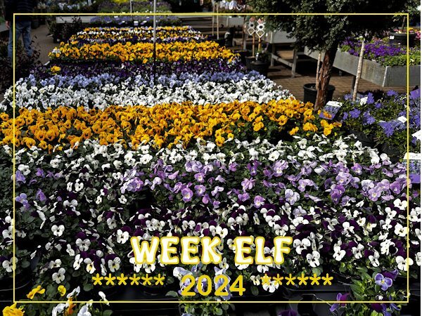
WEEK-11: This week we had a couple of very fine spring days and we were visiting a nursery in a nearby village where we go quite often. They have a nice place to sit with something to drink/eat as well and outside they have at the moment so many plants in stock that I couldn't help myself and made a couple of photos from the big display of pansies. Of course we took some home with us and they are now on the garden table where we can see them from the livingroom.
2 points
-
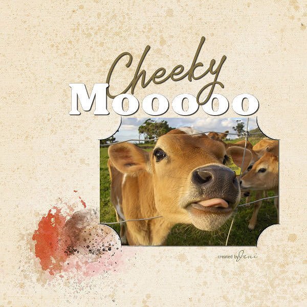
Day 2 I managed to get this shot of a nosy cow after my camera. I hope, this time, the shadows are better. Jeni
2 points
-
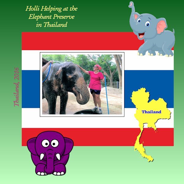
My daughter spent two weeks at an elephant preserve in Thailand.
2 points
-
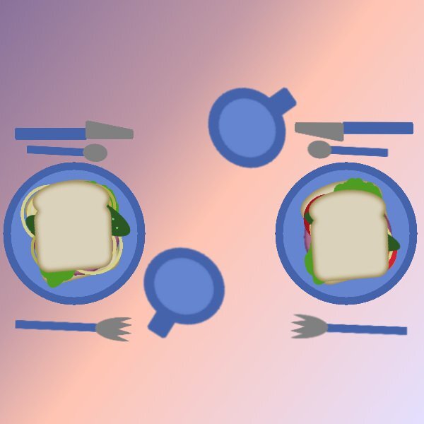
In my "Dinner For Two," I changed the color of the table to a gradient and invited my wife to join me. We have two customized sandwiches mine has extra onions and no tomato and my wife's sandwich has tomatoes but fewer pickles and onions to reflect our preferences.
2 points
-
Here is page three of my '7 stocks' micro project- Four more to go. TFL! These pages I'm sharing here are the right pages of a spread , the left ones will either have typography, photos or a mix of both and maybe a list of dishes that those stocks are to be used in. Fonts are again Pacifico on title and Lato on body. Supplies myself.2 points
-
As I've mentioned (ad nauseam, I'm sure) the game I do these pics for has been repeating themes from a long time ago so I've just been tweaking the originals. Today I took the time to create a new one. The upside-down leprechaun stuck in his pot of gold is a freebie from DitzBlitz. I used several papers for the BG at different opacities including a couple from Janet Kemp's the-lucky-one bundle (PS/DS). The posers are my avatar from the game and the font is Celtic Knots, free from Fontspace.2 points
-
Again, I appreciate your words. In fact this time you mamaged to curb the length of your comment, by quoting more of my words than your own. 😉 ❤️ Gone are the days when words used to flow freely for me. Though, these days I do have my moments. A tip, when using the technique, make sure you delete EVERY layer which is bleow the photo. In order to get the right effect.1 point
-
I got it too, but hadn't saved it in my browser because there were no links or videos.1 point
-
What a cool and clever technique. Love it. Beautiful words Sue. "Immortalizing the fleeting beauty of a moment no matter what it may be.", really resonated with me.1 point
-
I think you are right, good to know I'm not the only one blips happen too!1 point
-
I am really appreciative of your words, whether you are babbling, or short and to the point. I never know what I'm going to find. I always have my wits about me. Constanly looking, listening, treading lightly. The rewards can be immence.1 point
-
@Cassel I have checked the original page at 100% on the PSP screen and it seems like it is possible to read the font that I chose, however, I agree with you, the font was not the best choice for the patterned paper that I used. If I wanted to use the scrapbook page I would definitely change that font.1 point
-
Project 1--The fonts are Strong Signature and Underwood Champion. Kit is "A Spring to Behold" Photo is mine.
1 point
-
My best friend (since I was 12) is moving to Nairn, Scotland inJune. She is looking forward to seeing/learning about all the flora and fauna of her new area. How lucky to see these in the wild.1 point
-
My recent wosk and enormous pleasure, believe me. Selfie taken by Jacek. Super fun in/with PSP9, which can more than I/WE think.
1 point
-
Like Monique said here in the Netherlands as well as most parts of Europe we always change to daylight saving time on the last weekend of March. This year that is March 30 and 31, so the latest we can have and we change back in the last weekend of October, 26 and 27. Personally I don't feel much effect of either way, the trip to my daughter in California has way more effect because we have a time difference of 9 hours! On the outward flight I just have a very long day and on the way back I skip a night! IA couple of years ago there was much discussion in many European countries to stop the change, but it appeared impossible to agree on the topic what the new standard time should be. Nowadays I don't hear much about this, Europe has more pressing problems!1 point
-
Besides stunning photos I like the idea of having the text in e circle to match the photo circles!1 point
-
Carole's border and page punches, along with her fancy fonts, really don't need any introduction. For the date I created a wooden token. As for the hedgehog I went with a semi watercolour effect. Frame and mask my own. Whilst home with the little girls, I would take them up Badgers lane, once at the top the view is spectacular. They would take their magnifying glasses, I spy insect book, and magnifying insect jars. Needless to say I got those for them. We would turn over stones, to see what was underneath. On one occassion we saw this Hedgehog. Of course I had my camera with me.
1 point
-
My thanks for Cassel for showing me how to use masks in her recent Masks Workshop. I posted the following picture on my Facebook page and it was liked/loved by many of my friends.
1 point
-
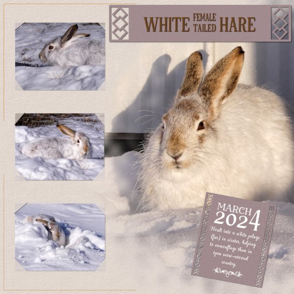
As you can see I've had a superb day outside, being entertained by 6 hares. At home we have a saying Mad March Hares. They aren't mad at all, instead it's the courting behaviour of mating hares. They spent the day, running up, down, over and around the snowbanks in the yard and out in the stubble, chasing one another. Mating suitors.
1 point
-
Here is a second page for the culinary project. Each stock has their own page... instead of putting two or more on one layout. Fonts Lato and Pacifico1 point
-
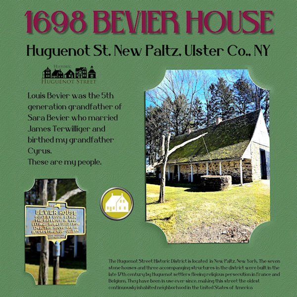
These photos showed up in The Hudson Valley in Pictures yesterday and I couldn't resist as I'm related to Louis Bevier through my father, Harold Terwilliger. His grandfather was married to Sara Bevier, a great-granddaughter of Louis. I've never been to Huguenot Street but a trip is planned! My "template" was just a .jpg so it took some maneuvering to create the "slipped-in" look. Thank goodness for promoted layers! I had to stick with the plain background because of that so I did a colorization and added a texture. The title font is Belisha. I created the brad from a piece of Huguenot art and one in my stash.
1 point
-
This is going to sound really daft. I downloaded the freebie. I had a complete mental block, not knowing how to use it. So I decided to do what I always do, and that is create my own slip it in. You will often see the slip it in technique used in many of my pages.
1 point
-
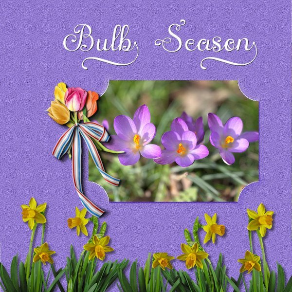
I had a little free time this evening and made something for this challenge, a very nice one too. At the moment a lot of the early bulbs are in flower and the photo I used was taken yesterday on a sunny day. I know I have often lamented about the rain we were getting, but now we have sunny days as well! The cluster with tulips I had made for another layout but it fits here too and the daffodils came from ????? Font is Austin. Enjoy my colorful spring!
1 point


.jpg.48e47647f2803f6afd893725cdae7a2a.jpg)