Leaderboard
Popular Content
Showing content with the highest reputation on 01/07/2024 in all areas
-
My hairdresser's daughter was recently married. I've made several pages...this is the first one ready to be posted. Template is Carole's Multiphoto Frame 3 freebie. The font is Mona Home. The groom restored a Ford pickup truck which is represented as the cake topper. The bride placed the Christmas tree and reindeer in the back...just for fun.8 points
-
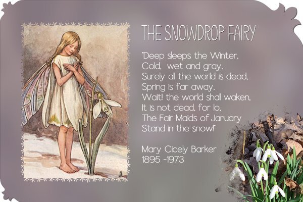
My contribution for this font challenge. I used the Mona Home font for the title of the poem and the font for the poem itself is Aura also a thin monoline font. Thanks to the extremely mild weather we have had the snowdrops are already in flower. My son showed me a photo of it from his garden, but for this layout I used one I took some years ago because it was better suited, no clutter in the background! The drawing of the fairy comes from DigitalScrapbook.com and I had it for some time in my stash together with the poem. I have taken the liberty to alter the poem a tiny bit. In the poem was written the Fair Maid of February and I changed that to January. I think that's ok I'm not going to sell or publish this layout other than here and maybe in our facebook group.7 points
-
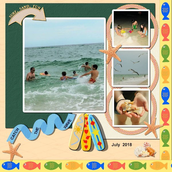
Lab 11 Mod 8. Wasn't sure how I was going to do this since it is also about the sea. But I muddled through and actually had fun creating elements. Requirements: abstract fish created and then made into a ribbon; create an arrow and add words on top of it (I didn't create the arrow but used a preset shape and worked with those nodes to get the curve - still a challenge); made a stroke and use it to fill a wave (another wave pattern) - that wave pattern I've worked with several times - 1 to put the words on it and 1 to make shadows on the folds of the strip). i also used the stroke to make circular frames in different colors and as "x"s; and used that same idea to make a ribbon and then to use Carole's scripts to make a curled ribbon and several bows. Lots of fun. The surfboards I made in a previous lab.5 points
-
5 points
-
4 points
-
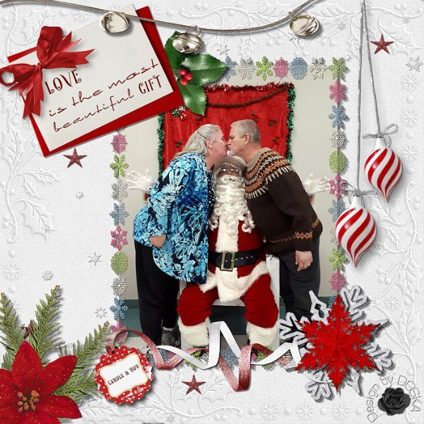
Wow Scrappers, have you been busy these 6 days in the new year with such beautiful ideas. I bring you, with Carole's permission, my January 1st creation (also in my scrap gallery) I had so much fun putting it together. The photo is just lovely, which I initially only sent to her privately, but she likes it when I put it here. Credits: Photo: © Carole An very old "white christmas" kit from Molemina Photoframe from "HOHOHO" kit from DS Anette Marie Background: MLDesign Texture 07 "Xmas" Fonts: Happy Holidays & Elegance4 points
-
3 points
-
3 points
-
Those dastardly dastards! (I'm coining a new word). That's too funny. I don't have a common name and this is the common misspelling of my name. When I say my last name I usually have to spell it, so I say, "E-W-A-R-T....Like Stewart, only, we aint no Saints"! Get it? I think Stewart really means St. Ewart! 😋3 points
-
3 points
-
2 points
-
2 points
-
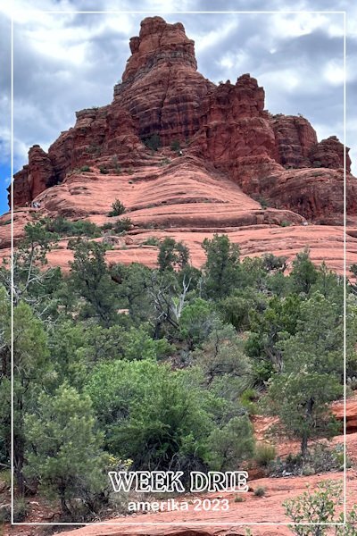
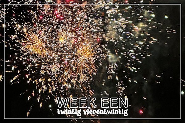
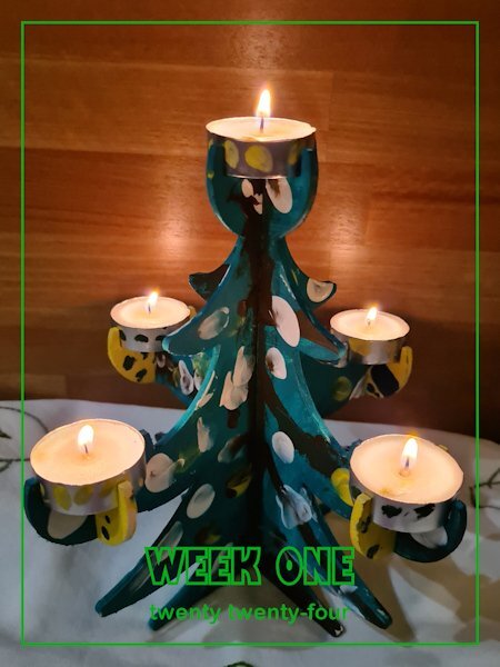
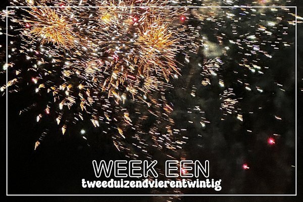
I have been playing around with the new script cass-CountingCards1-Weeks. I made 2 cards for week one but I can't see myself taking a photo every week and make a card. Carole maybe this could be a new challenge! So I thought when would I count in weeks: on a holiday when I make a lot of photos and each week could have a lot of photos. That would make a nice intropage for the different holiday weeks in a photo album. Therefore I tried that option with a photo from last year. Nice!!!2 points
-
Ok, thanks. That's what I thought, but I had a spot of trouble earlier that was many hours unraveling, so I wanted to be sure. I was also worried I would never be able to find them in all my scrips, but it was relatively painless, just using the regular search. I have had quite a day today. Happy New Year, Carole, + everybody!2 points
-
Whenever you create a project, you will likely want to use some text. In this case, you might be looking for some interesting fonts to showcase titles or dates. This month, I am suggesting a monoline font that is simple and even in thickness. You can get this free font HERE. Although this font does not have any additional glyphs, it has all the accented characters you would want to write in just about any language.1 point
-
I can't use a phone. I need something more substantial and I hold it with both hands. Any phone photos I take are always blurry because my hand shakes since the phone is so lightweight. And, when I started this in 2008, I had a cell phone that didn't even have a camera!!! I'll always use a regular camera no matter how great cell phones get at taking photos. Just call me a dinosaur... And, I only use my phone for phone calls and texting as well. The screen is too small for me to get on the internet or play apps! LOL1 point
-
You do beautiful work, Mary! Those Labs and your hard work really pay off!1 point
-
I don't use a camera any longer, I use my phone. The phones have better and better cameras, enough for what I want. But when I buy a new phone with new possibilities, I always do the same to get to know it.1 point
-
1 point
-
There have been times when I haven't been able to take a photo so I do use one from a different day (like when I was in the hospital for 3 days). My whole reason for starting to take at least one photo a day was to get comfortable with my camera and learn more about it when I started back in 2008. Heck, some days I take photos of stupid stuff just to play with the settings on the camera to figure out how to get the best result!1 point
-
I think this is a Susy Script. Available in the store but no charge. I've used it a lot.1 point
-
It is often called a CHALLENGE, but it should not be a STRUGGLE. I have seen this interpreted in many different ways, and honestly, what if you skip photos even for a few weeks? Unless you are tracking something super specific (ex: weight loss using a particular program, the growth of your flower garden), who would know that you took that picture this week or that week? I am actually planning on joining this and showing Markus in different settings around me, throughout the year. 🙂1 point
-
I love this Ann, this is just what the newpapers do right after Christmas. they pick a number of the front pages to display on the front page of the paper that week. It's really neat to see. I like the concept of "Year in Review". It give opportunity to pick your favorites and revisit the memory associated with it. Even for me who doesnt really shoot life events (I do a bit, but I dont show it often), I like to see where I was in skill and where I got to at the end of the year and to see where I could do better and what next do I want to learn.1 point
-
1 point
-
1 point
-
Corrie, when I was teaching, I had a monthly bulletin board to teach my children a "Muscle of the Month". I taught elementary physical education...students, ages 5 t0 12. Of course, I covered major muscle groups and quadriceps were one of the groups taught.1 point
-
1 point
-
When you say "preset shapes script" do you mean the one that works with dingbats? These are great!1 point
-
Doska this is great and luckily Carole gave you the okay to share it here!1 point
-
I felt ill on Dec 27 and tested positive for Covid on the 28th. It has now been 10 days and I'm finally clear. I had mostly upper sinus involvement with a little coughing. No fever just felt sleepy all the time. Looking forward to the Q & A and the new template workshop. Hope everyone else feels better, too.1 point
-
1 point
-
1 point
-
1 point
-
Very pleasant layout, Mary! All that Lab practice is doing a great job!1 point
-
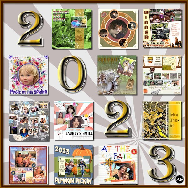
I went back to a former Year in Review layout and edited it for 2023. I picked out my favorite projects from each month of the year but, because the illustrations are confined to a square format, I didn't include our calendar project from November. The date is a font: Algerian with a gold metallic gradient and an inner bevel.1 point
-
I like NexusFont because as long as the fonts are in the uninstalled folder, I don't have to install them in the Windows font folder. I try to keep my installed fonts at a minimum. Creative Fabrica is not helping my font addiction.😄1 point
-
As most of you know, I love gnomes. These cuties are from CF (I have a subscription so I have a lot of their stuff). The font is Bestop Glistening, also from the Absolute Font Bundle. For any newbies to the Campus, I often create frames like this. I increase the canvas size, magic select around the bottom layer, add a new layer and fill the selection (in this case I used the same gold sequin pattern that I used for the text). Then I apply an inner bevel. It's a quick, easy way to dress up a layout.1 point
-
Most of the elements are from Creative Fabrica. I used their preview of their Pink Nutcracker Christmas Clipart as inspiration. The font is Bahgila from the CF Absolute Font Bundle from last year. The bundle is still available for $1. I love this bundle because all of the fonts have additional glyphs.1 point
-
I love seeing these stats. It would be cool to see these stats year to year.1 point
-
Christmas Eve service...Kit from Digital Scrapbooking, Commons, "Ready for Christmas" by Saskia Veldhoen. Paper, solid, 03. Frame 18-10a. I extracted the tree from a photo. Gifts from Creative Fabrica. Tree graphic, 18-10a.1 point
-
1 point
-
1 point

Resized.thumb.jpg.d25811db03a63358cedab1e79f527635.jpg)


