Leaderboard
Popular Content
Showing content with the highest reputation on 12/10/2023 in all areas
-
6 points
-
6 points
-
5 points
-
5 points
-
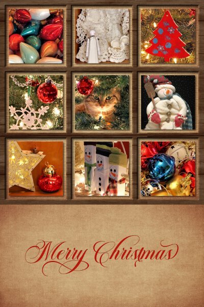
This is Christmas card #2, the one that took me quite some time. Again, I used the techniques from the Lab 13-1(and the Vector Workshop) and made a grid with Vectors. Boy, that was hard to get all the squares even. If you think grammar isn't my forte, well, math just makes my head spin. At first I forgot to account for the thickness of the edges to know where to put the inner grids, and of course having to centre the thickness of those inner grids came into the equation too. Whew! It's exhausting to think about it. I'm sure I went about it the hard way, would love to know a faster easier way to make grids and get them even. Next time I'd make the outer frame thicker than the inner grid part. Same as the last two cards, I cut off the bottom sentiment and put it on ivory cardstock with a deckle edge. Cards are all out except a few to yet to hand deliver. The other main concern was making sure I got the inner photo spots centred within the squares. I used the magic want to make a selection and then contracted, add new raster layer, flood filled with black then turned them into mask groups so I could position my photos how I wanted. If you wondering what that cheeky cat is saying (with that look on her face): "Move along human, nothing to see here."5 points
-
Christmas Card #3, not another fall back, but a card I made in one of the Challenges I think last January. I'm guess because the pictures are from that time. I added the snowflakes and "WINTER" to the front. Again, printed as 4x6, cut off the bottom and put the sentiment on the inside. The sentiment is thanks to the Vector Workshop where I learned how to use "text on a path." (notice the correct use of the period here, I'm on a grammar roll). Also, attached to warm white cardstock (Strathmore) with a deckled edge.5 points
-
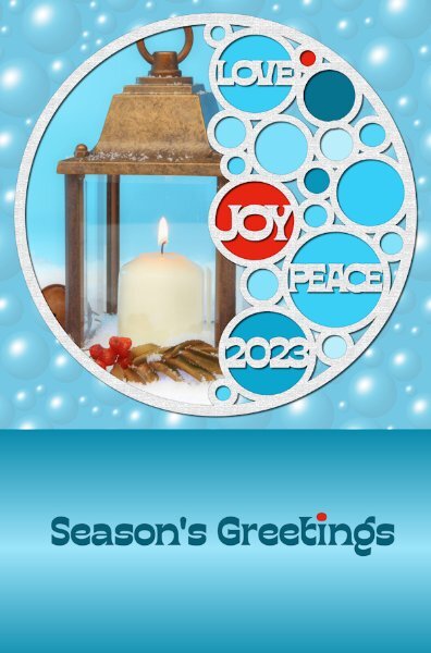
Christmas Card #1. The top square portion is the outside of the card, the bottom is what went inside the card. I printed them as 4x6 then cut off the bottom and put it inside. This went on a warm white textured cardstock with a deckled edge (Strathmore). This is also Lab 13-1 I believe, and was my fall back card if I got too busy to make cards. I ended up making two more. I found the inner sentiment color is too strong. If I did it again, I'd make it lighter, and change that one darker blue circle as it seems quite out of place.5 points
-
I found this gorgeous solstice background on Creative Fabrica in a bundle of twelve. It was hard to pick just one. The girls are from pngtree, I think. To create the "window" I combined a rectangular vector with an ellipse vector, magic wand selected on the outside, switched to a layer with a duplicate of the background, and deleted. Then I modified the selection with Select Selection Borders for the outline around the window. Added a little inner bevel on the text (Avenida LET font) and a drop shadow with 100% opacity and no blur. The singers got a smaller inner bevel just to give them a little depth. I kind of liked having the same background design in two different sizes. Any suggestions?4 points
-
3 points
-
This is a template from the 2023 December A Love For Layout Templates Blog Train. Template was created by The Cherry On Top. I added texture to the tree and snowman. The photos are from Christmas, 2020. Friends, under the cover of darkness, left the snowmen on my front porch. Each snowman was 3 boxes which contained Christmas gifts. What a nice surprise!3 points
-
I really struggled with this one. I found a couple of bird pngs on Creative Fabrica but I just didn't like anything I created. Finally I used the photo for my background. Cut out the cardinal and promoted it to a layer. Added texture to the photo/background and reduced the opacity a little. Certainly not my original idea but I like this the best of all my ideas. Font is Bahuraksa. I think it is a Window's font. This is an old photo and I noticed after I had taken the photo that there was a heart shape on the branch beneath the cardinal.3 points
-
3 points
-
Not sure where to put this. It is Christmas related. At least I put some lipstick on! Even thought I never wear makeup; today was special and just for you all. This is exactly what I look like (NOT). Yikes on the GrumpyFingers part. Makes a perfect excuse..."I'm sorry, I can't come to work today, my fingers are feeling grumpy". 😋2 points
-
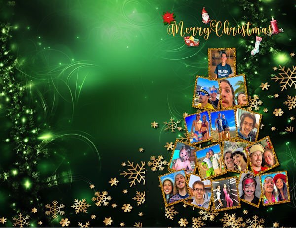
I was really lazy this year and most of my graphics and the font are from Creative Fabrica. The photo collage is from a free download, but I removed the background and moved it to my card. The card was made for my grandkids and their girlfriends who live in Las Vegas. I know it's pretty busy, but I have trouble restraining myself. The font is a glyph font called Helo Angel from Creative Fabrica. The gold snowflakes are also from a free template. This card is the front and needs to folded in half. Original is letter size to fit my card paper.2 points
-
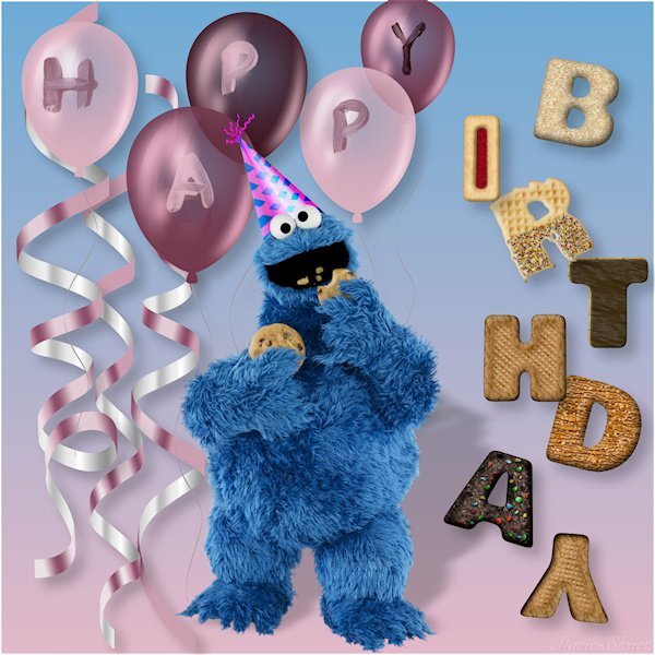
I had already used the cookies for the Christmas challenge, so I used the cookies for a birthday, not intended as a card to print but to use as a digital image to wish a birthday, for example on Facebook or somewhere else. I'm not sure the shadows are okay, but I had fun all evening with making this. Cookie Monster and his party hat are from PNGwing, the balloons are freebies, but I can't remember where I got them The Alphas are from digidelights blogspot com2 points
-
2 points
-
A suggestion and request for a masterclass on being creative using vector swashes, swirls, flourishes, dividers. For this decorative festive wordart I used several of the above vectors. To create the banner I used a flourish, duplicated it, mirrored, flipped, then added another decorative swirl in the same manner for extra curls on the banner. Using a vector I was able to easily created text following the path of the banner. I used a divider for the main stem of the mistletoe. added foliage which I took from a font monogram. The holly and berries, stars, snowflakes, ribboned bauble and date also came from font extras. Pen tool to hang the 2 decorations from the banner. I find it rewarding to be able to create my own. It is also much quicker than endless searching for something suitable online which would be in PNG format. Although I will scroll through some for inspiration. The beauty of using vectors is that you can use a 100 pixel size and resize it to 1000pixels plus whilst retaining it's clarity and sharpness. Using the pen tool you can also make adjustments to your liking. For those that didn't know or was curious to know, this is how I created the above festive wordart.2 points
-
Would you like to use this festive word art in a seasonal page. If so head over to facebook, files, to download the PNG file. Perhaps you would like to change the colours to suit your project, if so, it's easy to change. It is unique, you will not find it anywhere else. Once again created using vectors.2 points
-
Back to transparent frames. I tried out the Adjustment layers and added texture effects. Can't colorize them though. So back to my original transparent frames made with the selection tool and opacity changes. I can colorize them as well as texturize them. I even put Lucy's paws outside the 2 inner frames. I find that you can save the adjustment layers and slip in any picture, so you can save it and reuse it. In my original transparent frames, I also inner beveled them2 points
-
Now then, don't anyone dare laugh, but seeing as I had completed all my festive cards, calendars and everything else related to the festive season a while back. I decided to start thinking of Christmas 2024. I'm currently working on greetings for the inside of cards, something other than the usual plain journaling. I posted the wordart tree earlier. Since then I have done 3 similar to the one below. Although it's white vectors on a black background, they will be colourized. This is how I start any of my word/subway art. I used from vector shape to cut out the & from the bauble.2 points
-
2 points
-
The Yule Ball is from the Harry Potter stories. I pieced together a bunch of different elements including a few touches from Particle Shop onto a background pic of the empty ballroom. The font is, appropriately, Harry P.2 points
-
I think Corel looks at it as a card or even an internet greeting, idk1 point
-
I was thinking of starting my 2024 cards in January/February, well, the photographs for them and that way I can be less rushed that I usually am, since it's also the busy time at work. Your word art is something to behold. You are such a natural at the design of it from choosing the fonts, the elements and the balance of the layout.1 point
-
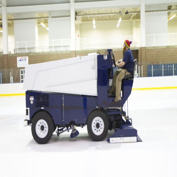
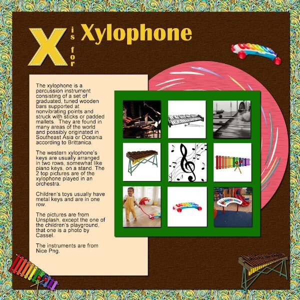
Z = Zamboni While not directly related to Christmas, is often seen during the season at ice skating rinks, smoothing the ice for skaters. Image enclosed; The fourth Zamboni ever built — they simply called it "No. 4" — sits enshrined in the U.S. Hockey Hall of Fame in Eveleth, Minnesota, along with its creator and inventor, Frank Zamboni. It stands, fully restored, as a symbol of the integral part this ice-resurfacing machine has played in professional hockey, as well as ice-skating shows and in ice rinks around the country.1 point
-
That date blows me away. What changes he must've lived through. Sorry, I'm kind of a youngster here in this group....feel free to reprimand me, I'll toe-the-line. Kidding of course. I cant really tell how old people are here, they just seem my age or younger. Funny how the written word only reveal age when certain words are used that aren't used anymore. Like the word: Rumpus Room (we'd call in a Family Room now), that dates me to the 70's (presuming I knew the word when I was 4-5 yrs old).1 point
-
Don't forget, ladies, I started with "bumbershoot," explaining it was from my dad who was born in 1892! He would be the oldster here. 😉1 point
-
Oh man! Because I know brolly and bumbershoot I'm an old girl? I'm heartbroken Susan. 😇 (But the truth hurts sometimes, right?)1 point
-
Well done Susan. Balanced and intricate and worth the time you spent on it. Love kitty's attitude! Are these your pix?1 point
-
I was taught on the inside; like "bumbershoot." But those rules vary by country and change over time so don't "quote" me! 😁1 point
-
I never have, but during the holidays as a kid, I remember street vendors in NYC doing it. I imagine some still do.1 point
-
When I was young, my stocking always had a piece of coal at the bottom of it! My father had a ready supply of it in his shop. He was a blacksmith/welder who used a forge fuelled by coal. It's such a precious memory.1 point
-
1 point
-
I am glad you found a forum in your language. I find it a little strange that you can't share what you do. They don't want publicity? Hopefully, it will answer your questions but if you have more, come back here and ask! Would you mind sharing the link to their forum? Maybe other German-speaking members would be curious about it.1 point
-
Still trying to get jolly. Decided on a layout that is NOT made of traditional red/green colours. The image is AI-generated by a designer on Etsy (AI WearGallery), and I thought it was something different to work with since I don't take a lot of pix in everyday life. Concentrating on a layout and all the details keeps my mind off other things.1 point
-
1 point
-
I've been a bit distracted and not feeling great for a while (back pain), so the Festive Season has not been on my mind. But I'd better get on it b/c the time is getting shorter! I have so many kits and elements to use, so that's what I did. No photos included, just decorative elements mostly from Di Hiller and Ericka Designs. Trying to get jolly....1 point
-
Lab13-01_Stencil Alpha: Freebie cass-ChristmasCookies-Alpha (Blog) Tubes: cass-LitLights-Red Pine branches: Snowy Winter-DBMagnolia - themagnoliapatch.blogspot.com Snowflakes come with PSP (I think) Background from photo1 point
-
1 point
-
This is beautiful. A very good use of the "Just Out Of It" masterclass.1 point
-
1 point
-
1 point
-
1 point
-
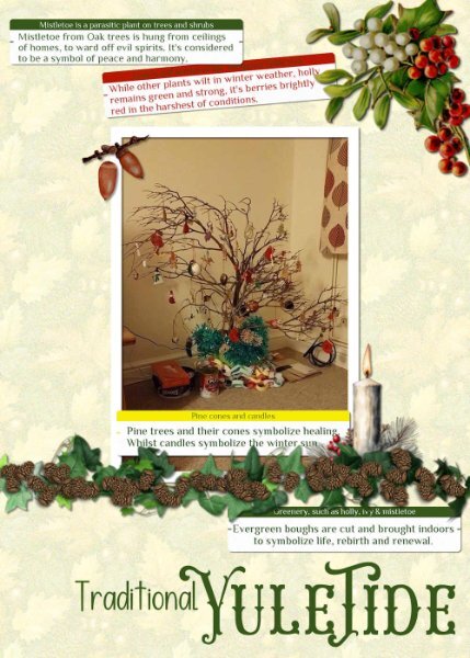
I dug out one of my very old photos from home. It wasn't that long ago that we were discussing the origins of Christmas and it's relation to the Winter Solstice during pagan times, in the campus. I mentioned that my children and I would go out gathering greenery for decorations, and branches for a tree. I have created a Yuletide page. I still make paper chains. I used Carole's label script for the journaling, the pine cones come with PSP. The other elements I have acquired over the years, which I use over and over in other pages, particularly the ivy, which you may recognise.1 point
-
Welcome to December. Here is the December calendar featuring the Amur Leopard this time. Enjoy. I even used a little Out of Bounds on this one. I have posted a full size version on Facebook that will print 11"x8.5" I feature mine on my desktop. The leopard information is from the Beardsley Zoo in Connecticut, where they have successfully bred some new members of this endangered species. Edit: forgot to name the Amur Jaguar font - Sedalia and the journaling is Arial Narrow.1 point






Resized.thumb.jpg.d25811db03a63358cedab1e79f527635.jpg)


