Leaderboard


Popular Content
Showing content with the highest reputation on 11/26/2023 in all areas
-
I decided to show a photo of the beautiful Eucalyptus flower for the cover page.
 7 points
 -
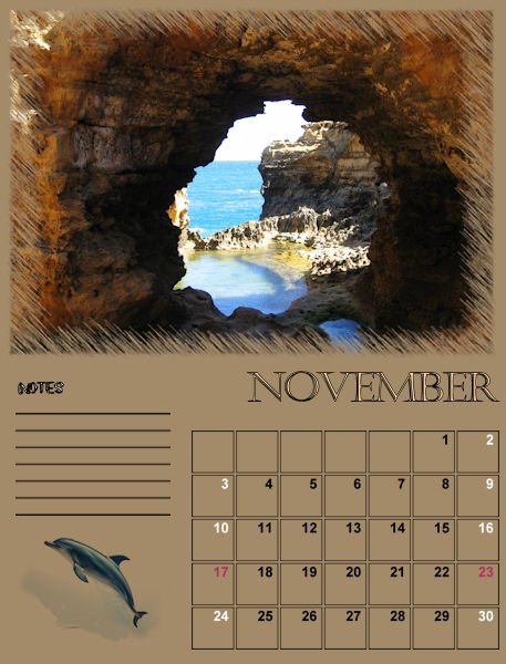
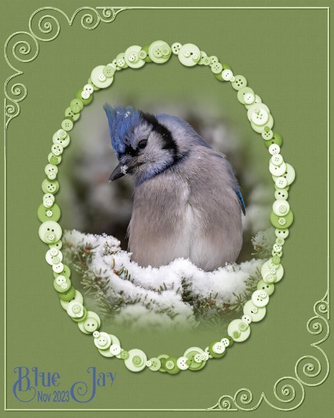
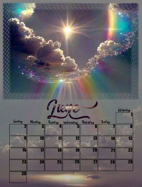
The Last 2 Months of the calendar. November shows the beautiful Grotto at Pt Campbell Victoria and December Noosa Beach in Queensland.
7 points
-
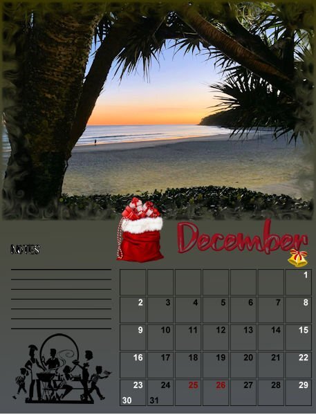
For the button frame I used the blue button picture tubes, which comes with PSP. The colours were to pastel for my liking, so I changed them.
7 points
-
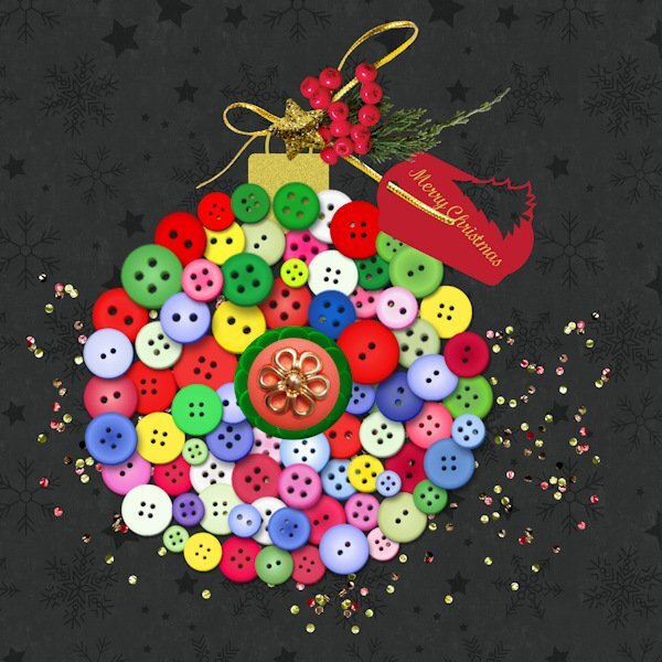
My first idea for this Button Challenge was a Button Tree, but luckily I noticed Sue has already done one and I didn't want to do something similar. As you can see I emptied by button box and made a bauble with some decorations. I mostly used the picture tubes that are inside PSP but changed some of their colors to give it a more christmas feel. Their original colors are more suited for Easter in my opinion at least. The decorations come from my stash and are by Marissa Lerin.
5 points
-
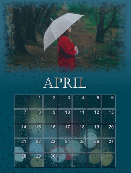
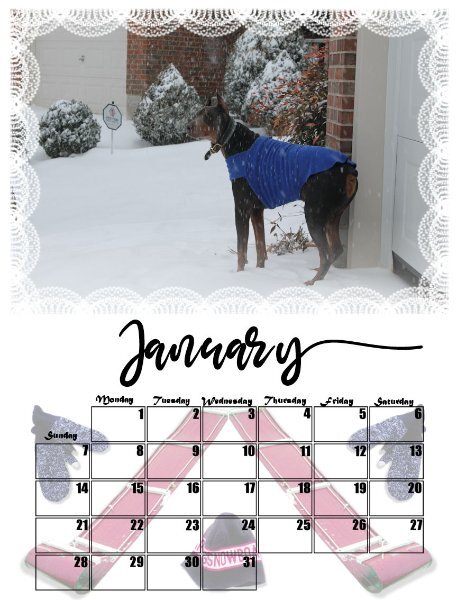
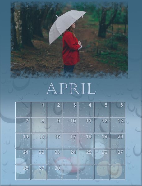
I have a hard time stopping tweaking these calendars. I have a new version of April. I'm curious which one people like better.
5 points
-
I love the suggestions and ideas people have been coming up with. Here are a few of my thoughts. I’d organise the book in a number of sections – 5 to 10 with lots of subsections. For example: Introduction – yourself, PSP, Digital scrapbooking. 1. What is Digital Scrapbooking Topics might include: Why make a scrapbook page? What makes up a scrapbook page? Using Quick Pages, Templates, Sketches What size scrapbook pages are. Digital Scrapbooking Supplies: Where do I get them? What type of things can I get? Does it cost a lot? Can I make my own 2. Layers The sandwich exercise in Bootcamp is a perfect introduction. It helped me enormously when I only knew about tweaking photos. 3. Using photos All the ins and outs including how to resize, create different effects etc.. 4. Papers and non Photo elements What these are, why use them, and how to use them 5. Titles and Journaling Types of titles for scrapbook project. What to add in journaling? Anything important about using text. 6. Making it special I’d include some of your wonderful design tips here – how to choose colour schemes, themes, how to get the best balance and so on. And, of course, a special section on how and when to use shadows. 7. Examples to work through and try Step by step guides to producing specific pages4 points
-
I use the print layout from PSP where you have the flexibility to put your page the way it fit best but there still is a white strip that you have to cut off or use for making holes to bind all the pages together, like Sue mentioned. If you want your page fitting the A-4 format like we use in Europe you have to alter the calendar pages from the workshop.3 points
-
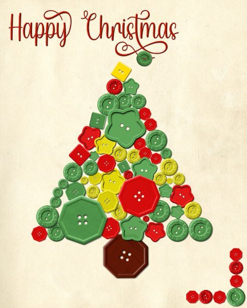
Nothing very original. I raided some of Carole's freebie buttons from the Creation Cassel blog. I did use the pen tool to extend the swash, in order to accommodate the button, threaded through.
3 points
-
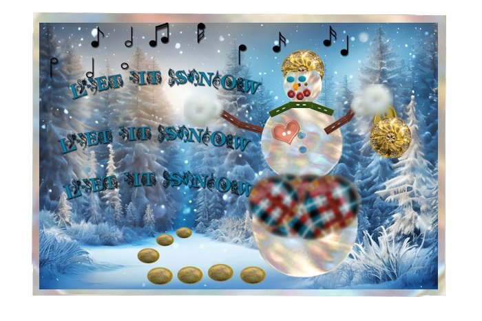
This is what I created for the Nov. random challenge. Using buttons. This was fun but time consuming. The background was downloaded from CF, "Winter-landscape-74761386". All components of the Snowlady are buttons, some distorted to make them work. Also the walkway from the woods. am_intex that I have no idea where I got it from. I did a search in my saved stuff and found over 80 buttons. Of course some were only different colors of the same one.
3 points
-
This was fun but time consuming. The background was downloaded from CF, "Winter-landscape-74761386". All components of the Snowlady are buttons, some distorted to make them work. Also the walkway from the woods. am_intex that I have no idea where I got it from. I did a search in my saved stuff and found over 80 buttons. Of course some were only different colors of the same one.
3 points
-
3 points
-
3 points
-
3 points
-
I will usually get a test print done, 1 print to see how the outsource photo printing company prints the photo/layout (I'm using London Drugs Photo - Canadians may recognize this company). Usually it's too dark so I'll add remarks, like lighten, or watch the whites or I'll even tell them the correction to make eg. take out 1 cyan and add +1 density etc. Then when I'm okay with it, is when I make the full order. I'm not talking Calendars, although when I do try a calendar I will test out 1 month probably, just to see if it's worth printing or if I need to make changes (before I commit to 12 months and a cover only to find it's too dark). Prints always come back darker, simply because it's on paper and not a backlit screen we are used to seeing it on. And then there's the blacks and inherent issues with JPG not having the latitude a TIFF file has. I have meant to save my pspimages as a jpg and tiff to compare. But not much sense in doing that until I start working from a RAW file then converting and comparing. so much still to learn in the digital post processing for me.2 points
-
I always did use Epson ink. This was when inkjets first came out. Before that all you had was dot matrix. Thank you for the kind feedback Ann! There are so many advanced users here. I've used PSP for a long time on single layer photography but I am very new to layers, masks, transparency and all the other techniques we are using here so I am like a kid in a candy shop.2 points
-
My own choice would be the first version. Nice job, Julian.2 points
-
I like the dark one. I tend toward shades though. Both are really nice, but the darker one stands out and catches my attention.2 points
-
2 points
-
Going to add some more. I've shown 2 so far.
2 points
-
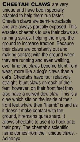
Finished up December, so I can now work out the print job. Thanks to everyone for their wonderful advice! I'm also posting a separate image with the text which is long and small on the original and unreadable in this reduced version.
2 points
-
Someone suggested that I should write a book on digital scrapbooking using PSP since there is already so much content in the Campus that I can collect and publish. Well, that is easier said than done as it needs to be well organized. I searched on Amazon and there has not been any recent book on digital scrapbooking in recent years, and even less using PSP. So, here is my thought. I want to know, from all the scrapbookers in here, what topics you feel a book should cover. Let's make a list of CHAPTERS you can envision in a book or topics you wish you had when you started (or still are looking for). I have a few ideas in mind, but I would like YOUR ideas. I will list the CHAPTERS/TOPICS in this post as you suggest them so it will be easier to see what has been already suggested. At this point, the chapters/topics won't be organized. Here is a list-in-progress. Why digital scrapbooking? Pros and cons. The Text tool - used for titles and journaling Layers - linking, and grouping Shadows Content and information - dates, names, locations Supplies to use - getting pre-made kits Fixing photos - some basics Genealogy - one way to share Photo processing - some interesting styles to replicate or use 365 or 52 - a different type of documenting everyday life Building a page - start with the focus and add the details Sharing your scrapbook - printing, posting, emailing, etc. Using PSD supplies - a lot more can be used! Variety in scrapbooking - from simple and basic to complex and crafty TOU - what it is and why Clusters Size and formats Printing or not printing Special effects (only available for digital) What to scrapbook or why1 point
-
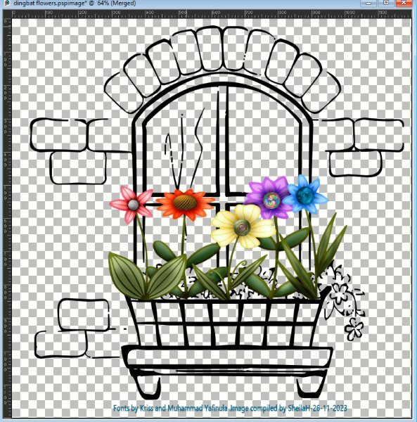
What to do with buttons? This image sort of came to mind so has kept me busy tonight. I love to turn Dingbats into shapes and can do this using SS-making preset shape script. I don't know if you can still get this free script. Anyhow, I used preset shapes made from a window font by Kriss and Wildflower font by Muhammad Yafinuha. I suppose you can just use as a font but being as I have sooooo many, it is easier to find them as a shape, especially if I am likely to make good use of them. I coloured and shaded the flowers. I used button balls I made in Filter Forge over time as the flower centers. As I wanted to keep the background transparent, I used the print screen function, cropped it, saved it as a jpg and hopefully will look transparent. TFL
1 point
-
Sure! I am just not specifying what year!1 point
-
I have been experimenting with borderless printing on my Epson and have finally determined the correct settings so that edges and borders are equal. I copied the calendar page to an 8.5 by 11 paper and filled the edges with a pattern. I have a lot of different kinds of paper and will test the heavier papers to see if you can write on them. I have also been researching how to bind the pages together with ribbon or yarn. My calendar making slowed down, first because I kept changing my mind on the calendar and the shading and the because my grandsons were visiting from Las Vegas for Thanksgiving.1 point
-
I am used to A4, then coming to North America, I was under the impression that US letter was it's equivalent. Not so. Not only they changed the paper size name, they also changed the size itself. Subtle as it may be. The American pint is different to the Imperial pint, to me a pint is a pint. Which makes the American fluid ounce 4% more than the imperial. Same goes for measuring cups. Australia is the same as the European. It can make baking a maths lesson sometime, when you are trying to convert an America recipe to imperial. when you have imperial measuring jugs and scales. That is why I mentioned in a previous comment, when using an outside source for printing anything, the first thing to do is to choose the layout size from the printers option list. No matter how little the size difference may be, it can be a real hassle editing it to fit.1 point
-
The dark one 🙂1 point
-
Mother of pearl buttons for the snowlady are simply perfect! Plus, I love mother of pearl; I seem to remember I had some for buttons on a sweater.1 point
-
Your photos through the whole calendar area really beautiful.1 point
-
Great idea making the snow lady out of buttons!1 point
-
I get the 10x10 books from Shutterfly. Easier to read the journaling! And, fit quite nicely on regular book shelves. The only thing I print right from PSP is 4x6 photos.1 point
-
Mary I too print direct from PSP and for me that works well!1 point
-
I have not seen anything like that. How cool to have creative dreams. When i was trying the scripting I was dreaming about it. I hope you find it so we can see it.1 point
-
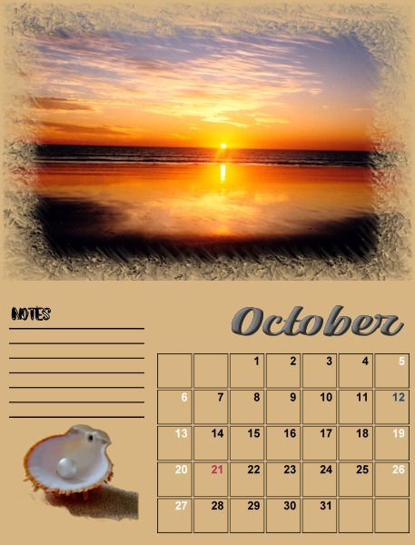
I am a bit slow to complete this calendar. My husband has been in hospital so time is a bit short. The next two months are for September and October. September is of course, the Sydney Harbour Bridge and October, Broome, Western Australia.
1 point
-
1 point
-
The custom calender script works fine now , so I could add a more Celtic feel to the date boxes en changed the beginning of the week to monday 🙂 This is the first changed and finished lay out 🙂
1 point
-
Had fun with this one. I updated the one I made years ago for the same theme. (I've been doing that a lot lately to save time.) The font is Little Brushy Regular.1 point
-
Just a small X-mas star with a decoration. As most of you know I'm taking the Scripting Course and in this week's lesson we had to use a preset shape and rotate it. Then write a (simple) script using what we had learned in that lesson. For fun I used a star preset shape and when finished with the lesson I thought well that looks like a nice X-mas star. The result from the lesson was quite small because we had to use a 200x200 image. This evening I played a bit with that script and redid it on a 400x400 image. After running the script I placed a decoration on it and I have something to use on cards or whatever related to X-mas. I love it when I can make something with the knowledge I'm getting in this course.
1 point