Leaderboard


Popular Content
Showing content with the highest reputation on 11/19/2023 in all areas
-
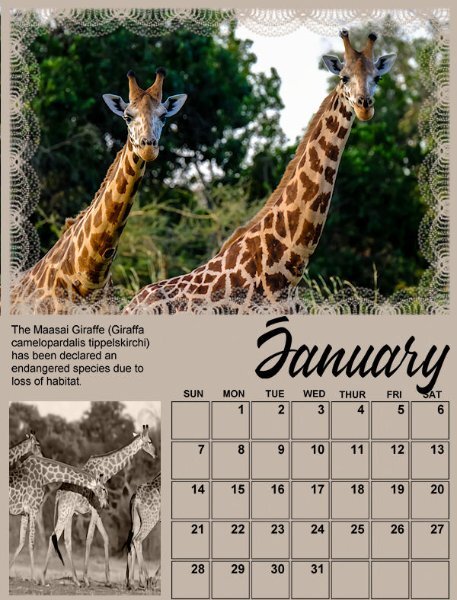
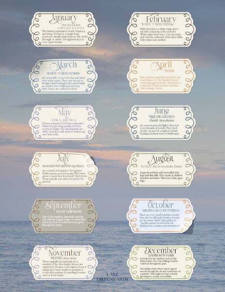
I posted the months of Jan and Feb from my mammal calendar, because I used the the same templates. Here is the front cover and a little information on each mammal showcased in the calendar. Which is printed on the back of the front cover. My personal choice of preference is to maintain a minimalistic consistent flow throughout my calendars.
 9 points
 -
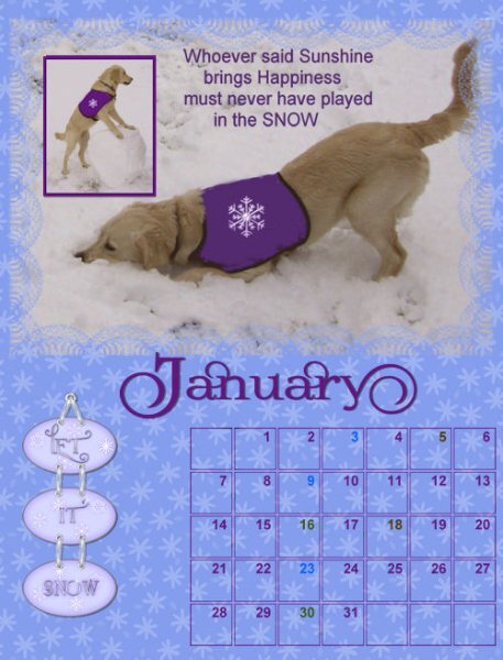
Forgotten if I "reply to topic or start new thread" Apologies if I got it wrong ! What a learning curve this all is. I started the January page and noticed how some of you had changed so many different things on day one or 2two and thought I had to try to do the same! What a disaster, computer nearly going in the bin ! I was then taking care of a friends 6 three week old puppies and the mother dog while they took a short break. Calendars were no longer foremost in my mind but puppy gazing was ! I now realized some of you have done this before. I didn't realize that each day Carole would give us further instructions. I might be 74 but I don't expect my brain to do this to me , what an idiot I was !! So today I have followed each days tutorial to the letter and tried to apply it to January at least . I had no idea that a character map existed or how to do so many of the things in the 7 day tutorial. I changed the colors on some dates to correspond with my Blue Green and Brown refuse bins being emptied .The purple jacket had something on I needed to remove and have already learnt to brush over in the purple and I added a snowflake to detract from a large purple area. Any graphics were from Pixidoodles. Have a nice day everyone
9 points
-
Calendar 2024, My boys together. I chose to try the lines for the space instead of a photograph. They are a wee bit off line, but that is my best, I never choose to be perfect, there wouldn't be any challenge in that lol. Pete is a Miradol, George is a Ragdoll, and Charli is a Ragdoll/Burmese, that is why he is a little leaner than the two fatties. The cartoon is the work of my very talented grandson. He is known for his family caricatures.
9 points
-
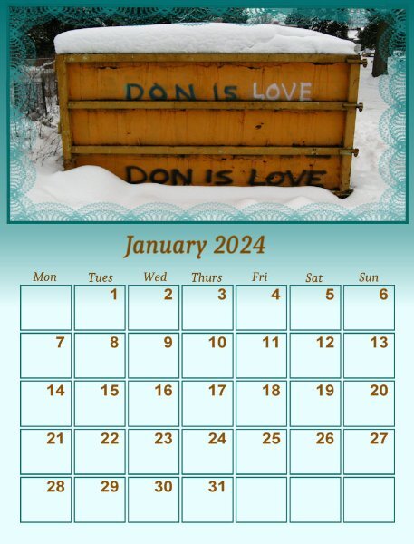
This is sort of a gag for my best friend Don. It rarely snows where I live but one year we got a good snowfall and while I was wandering in the park I saw this - a dumpster with the words "Don is Love" spray painted on it. What an odd thing to spray paint onto a dumpster!
9 points
-
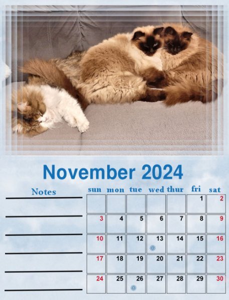
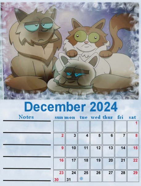
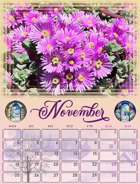
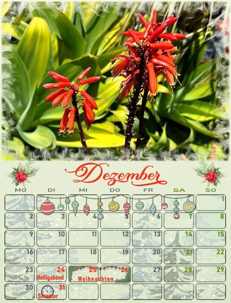
Here are my finished pages for November and December. I intended to use the same technique of "find all edges" on a duplicate of the photo, but I found that it works great on some photos and their pages but not on all! I want to be consistent so I skipped that idea and did something else instead. I search through my stock for images relating to the particular month or season and put that image under the boxes. Of course I have to use a blendmode to give the desired result and the blendmodes are different for each page depending on the colors of the image and the gradient on the page. For December I maybe overdid it with all the decorations but it is the month you can go over the top! Now again I have to alter my other pages as well, luckily I hadn't done them all yet! After that I have to alter some of the pages from German to Dutch and not all the extra holidays are the same. But that will be peanuts. Only the German calendar has to go in the international mail, the rest stays here and I bring those with me when we meet the intended recipient.
9 points
-
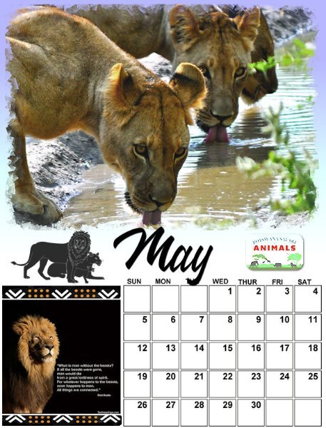
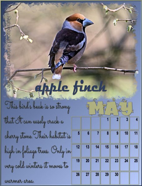
I added some elements to May; this seems to be working rather piecemeal. LOL My zookeeper granddaughter, Jackie, will be the recipient of this calendar for Christmas. She is carrying on my passion for animals.
7 points
-
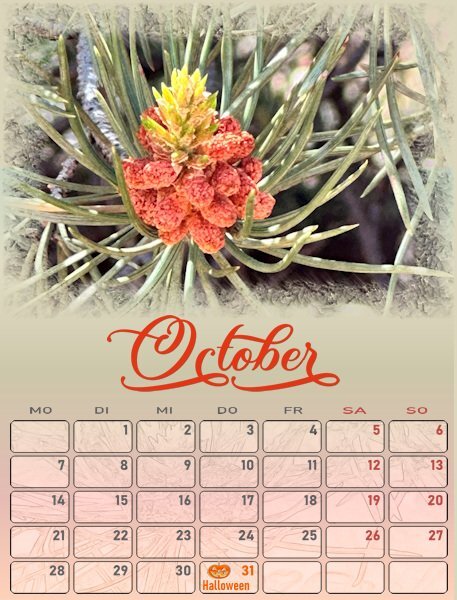
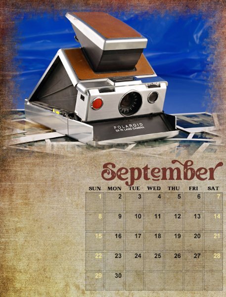
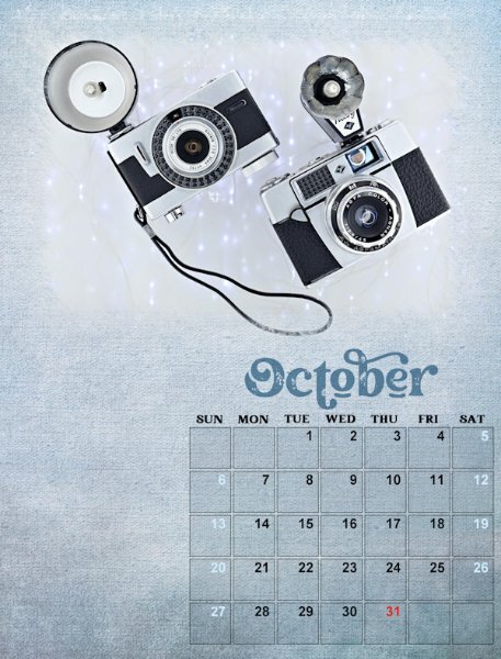
lesson 5 - September & October I darkened the boxes on these two. I like the effect and will go back and do that to the other ones too. I will be reshooting the September camera. What was I thinking with that background..YIkes, it's seriously ugly! I did try changing the date boxes grid lines and then decided to keep it all black.
7 points
-
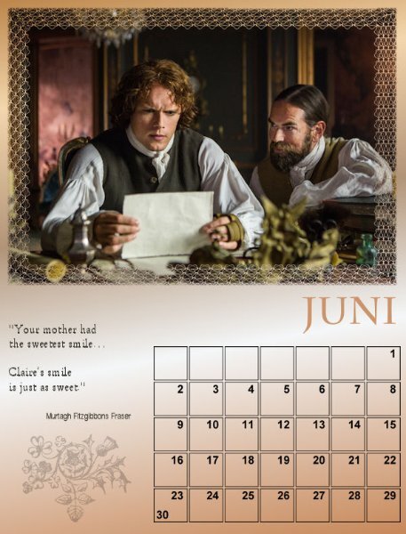
June 🙂 Font is centaur and arial ( I'm almost afraid now to mention the font name!😄🤣)
6 points
-
I don't know why, but unlike many I can only ever post one image at a time. Even when keeping within the parameters of the file and page size.
5 points
-
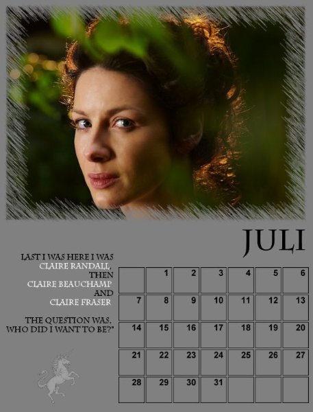
July 🙂
5 points
-
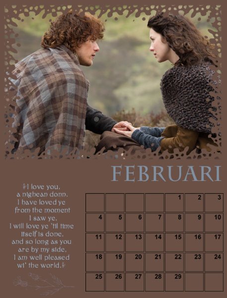
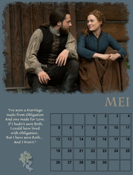
May 🙂 I use quotes from the series/books and a matching little pictures (Scotland, bridal bouquet etc)
5 points
-
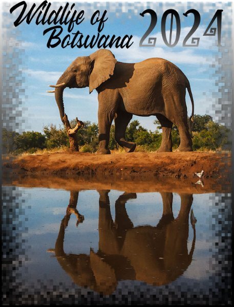
Working on the cover gave me the opportunity to showcase this elephant photo which is one of my favorites. The title font is still Wakanda and the font for the year is Witch Mystery because I thought it looked rather African. I do love African art.
4 points
-
4 points
-
@Cristina This particular workshop leads to multiple changes. I guess in a way, it is a great way to illustrate the flexibility of digital graphics as opposed to traditional paper work. @Ann Seeber That empty space is well used! @MoniqueN. I have updated the script and looking for a way to re-enable everyone's downloads. This time, you don't have to type in the font name, and in the end, everything is grouped, allowing you easy copying/pasting onto your projects. @Michele I am still using TheFontThing as I don't have to load a bunch of them into a collection. It still works fine for me with Windows 10. @Corrie Kinkel I will have a blog post on Monday, explaining in detail how to run the Custom Calendar script. In addition, it has been updated so I am just in the process of re-enabling the download.4 points
-
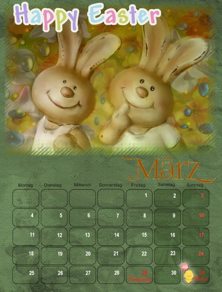
March and April calendars... I made some changes, as usually happens after I have posted... Sometimes, seeing the pages here calls my attention to a detail I didn't see before, even after working with it for a long time. CREDITS: DiHiller (DigitalScrapbook.com): HAPPY EASTER - DiHiller_April2020_HappyEaster Corel freebies: Easter chick clipart
4 points
-
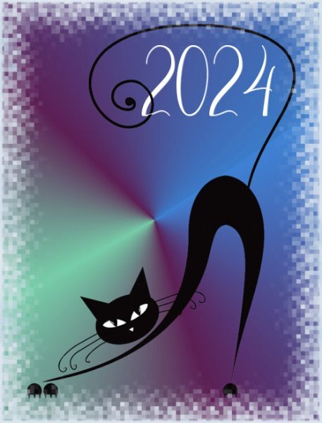
Calendar 2024.Cover Theme "Its a cats tale" Thanks Carole, I enjoyed this and picked up good tips. Maybe I will be first to post the cover, as we in NZ get to see the new day first.
3 points
-
So far, I have created January thru June. The font is Samantha Upright from Creative Fabrica. I use the Vectorstroke script to add the birthstone for each month. The flowers for Jan and Feb are from Creative Fabrica and for March my own photo and bow. I used layer styles to highlight the month. The background is my own which I call glitter streaks. I redid the months using the cass custom calendar script which was just updated. Thank you Carole. All the calendar photos are my own or from family. Jan is a picture of Lake Erie in winter, the second is from my grandson on his way to snowboarding and the third is my picture of Detroit taken from across the river.
3 points
-
I really like those Challenges and Workshops even when I don't participate actively. It's really a joy to browse all the pages and be inspired by all the different pages and styles. Well done, Everyone! Carole mentioned that around 125 have registered... I am sure we all would profit by seeing the pages of those who have not yet posted. 🙂3 points
-
3 points
-
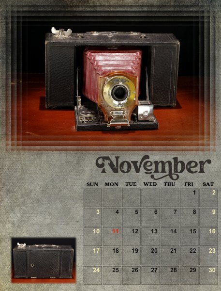
Lesson 6 November I like the feathering technique in this lesson. I added a small photo of the camera closed. It looks rather like a brick, hard to imagine that this is a camera. I will be adding text above it, to fill in the space. Oh boy, not being able to right click and move the selection is a real bummer. I'm just not that precise and I rely on that. I hope that gets sorted out soon. November's template is really nice.
3 points
-
I have to admit, it isn't difficult to create a page containing the word COLD. Here on the Prairies the winters are brutal. There isn't a happy medium between Summer and Winter. It's either plus 35c or minus 35c. The Main top photo was taken on the 18th January of this year. The wind chill was -50c, with wind blowing at 75km. I was going shopping when I took the shot of the blowing snow. The other photos were taken in Jan and Feb of 2021. Embossed metallic element. For the round tag, I used one of Carole's special fonts for the outer decoration, wove the gold under and over for a different effect. Word art sticker I created for a previous page. Used Carole's free stacked wooden alfa again.
3 points
-
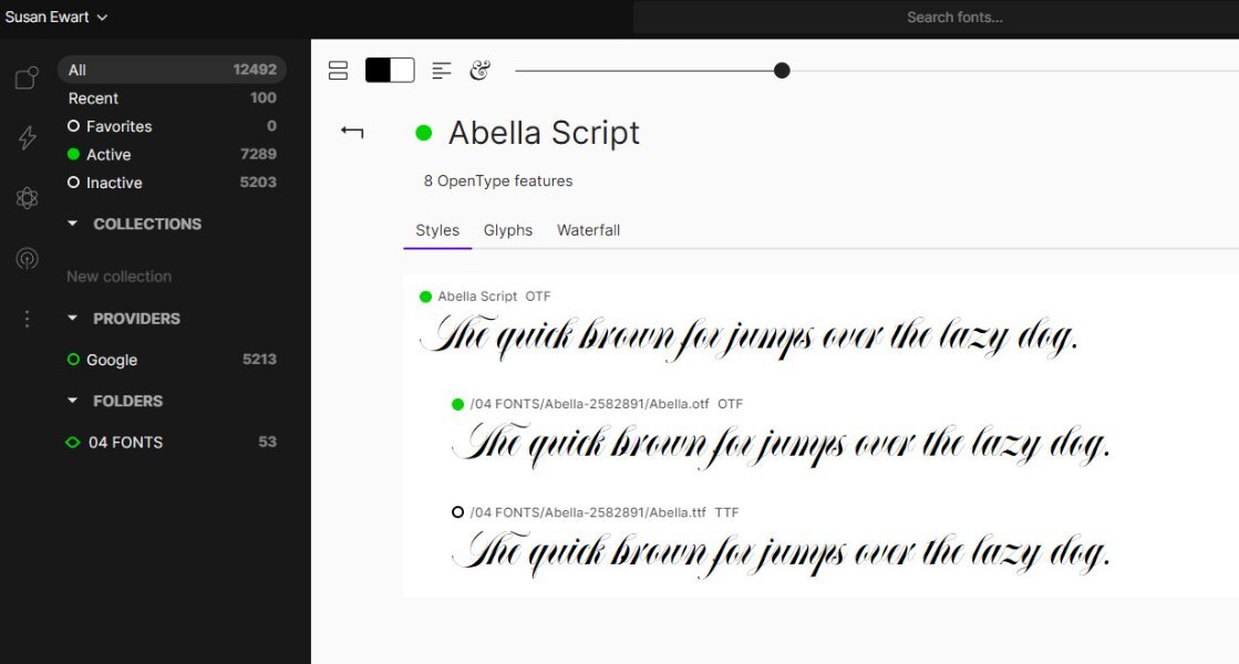
I use Font Base. I use the paid version (I think it's about $50 a year) so that I can get the glyphs like you see on the 3rd picture, you just click the one you like and it's copied to the clipboard and you got back to PSP text layer, highlight the letter and right click and paste. Google fonts came with it, I think you can go to google and download a ton more of their fonts too. I usually have them turned off. In fact you can turn them all off and just click on the ones you want active. I always turn the viewer off when I'm not using it (it's always on the bottom task bar on windows using a short cut icon). You need to remember to turn it on when you are using PSP or you get a pop up saying the font isn't available. Actually, I forget to turn it off a lot and I haven't noticed a decline in speed or lags in my computers performance. There is more features I'm sure and a different view that shows more fonts at a time but I seem to forget how to get that view again. There is some tutorials on utube about font base if you want to see it in action. I do believe they have a free version too, but you don't get the ease of using the glyphs like in the paid version.
3 points
-
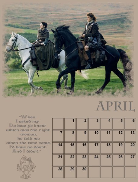
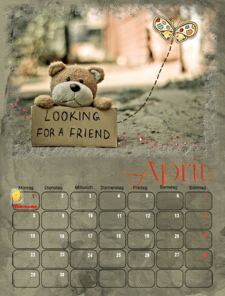
April🙂
3 points
-
Finished, but will have a look at the calendar script I have from Carole, because I would like to start the week on Monday, so the weekend dates are next to each other 🙂
3 points
-
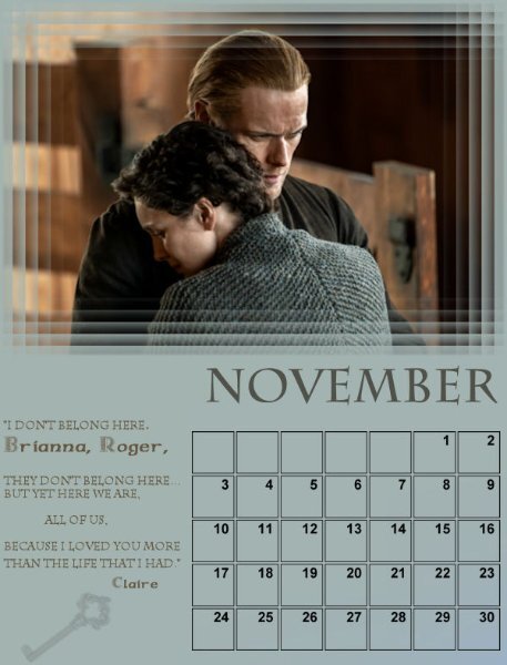
November🙂 Will shove the quote a tiny bit to the right.........
2 points
-
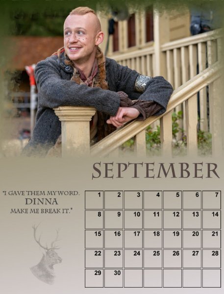
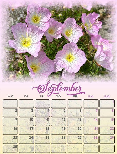
September 🙂
2 points
-
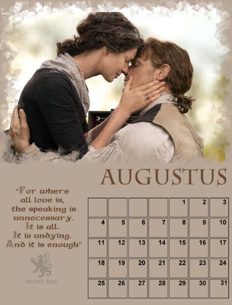
August 🙂
2 points
-
Ann beat me to the answer, because I do the same and this way you can even add more than 2. I didn't try how many you can add but occasionally I have done 4 or 5.2 points
-
I agree. Wish I had joined the group, but the Workshop will be available to diamond members.2 points
-
You can never go over the top with December! Beautiful layouts. I like that technique of images in the date boxes. It's a nice touch.2 points
-
On the subject of fonts, which font managers does everyone use? I desperately need one. I currently add the different categories to the zip filenames. It's a terrible method as it simply brings up the zip files which don't show the fonts. I'm sure (?) I would download fewer fonts if I could organize them better.2 points
-
I'm testing out how to fill the extra space. I do have some related photos, and in this case, I applied the Luminance layer filter and I like the monochrome effect.
2 points
-
Nice job, Monique. These are all beautiful!1 point
-
I love your use of color. what a good idea to use birthstones and the Vector Stroke. Wait till you get to November, it's a deco-looking frame, do you think?1 point
-
I just can't select more than one at a time to upload but I can go back and add to the original posting. I guess that's how this platform works.1 point
-
Thank you so much Cristina. That means a lot to me, Carole, you and most everyone else in the Campus are my mentors with PSP. It is amazing the changes in cameras. I do collect them. Mostly because I received my parents old cameras and then my grandfathers. It appears he did a lot of photography in his younger days. I started with photography in high school and it was a hobby for many years. Then I put it down while doing glass work (fusing and lampworking) and silversmithing. That actually led me to pick it up again to photograph what I was doing. I found I like doing it more than the current arts I was doing. I love the really old cameras, they are beautiful. And ones from the 80-90's from when I first started. Wish I had kept my first ones. I'm reshooting that awful September month. the Polaroid SX70 isn't my favorite so it's no surprise the photo didn't turn out. Well, clearly I am a Fontaholic and I will tell you the font name is hopes to convert you 😋. It is called Creative Vintage which I believe is from Creative Fabrica. It has regular version and a draft version which is the one I choose for the end bit. I lowered the opacity on the months(along with changing the backgrounds) to make it older looking. I'll be adding the changed ones once I get them all done with the text I want to add, holidays etc.1 point
-
I concur with you! It's an absolute pleasure to scrolls through all the pages.1 point
-
The wind here is a force to be reckoned with, at any time of year. There isn't anything natural to curb it. The cold itself is tolerable, with adequate clothing.
1 point
-
TFT also does. I don't use categories other than those on my computer. You can navigate to anywhere on your computer and access the fonts. There is a blog post about TFT and one for NexusFont.1 point
-
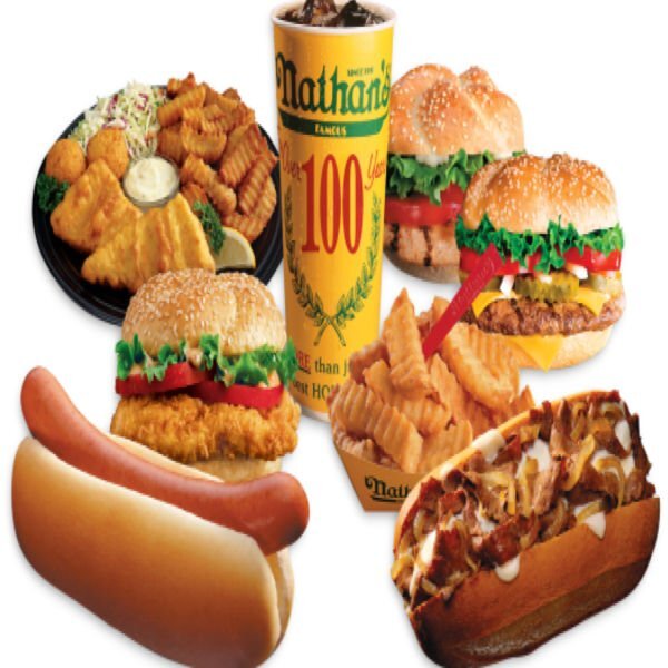
My grandparents lived in Coney Island right on the beach. We spent a lot of time there and Nathan's was part of it.1 point
-
A lovely floral calendar. very interesting1 point
-
N = Nathan's Famous Hot Dogs "In 1916, Nathan Handwerker started his nickel hot dog stand on Coney Island, with a $300 loan and his wife’s secret recipe. At the time, he had no idea how famous those hot dogs would be. He had no idea that millions around the globe would tune in to see how many of those hot dogs could be consumed in 10 minutes, or that they would be available to consumers around the world in retail and restaurants. Fast forward to 2020, 104 years later, and the start of a new decade and Nathan’s Famous is embarking on a new path. One that pays homage to its New York roots, and famous food, but changes everything you know about the brand.
1 point
-
It's the one feature of PSP2023 that I really appreciate. I can just scroll through the filters and see the effects quickly. Similar to scrolling through the fonts.1 point
-
They are so beautiful. Are they ragdolls?1 point
-
After the "font" discussion back to my calendars and these months are almost done now. I didn't like the black date numbers and have changed them to a middle/dark grey color for all the months; the outlines of the boxes are very thin and I kept those in black to keep them visible. In the lesson from today was the option to color the boxes mentioned and I gave it a try but didn't like it. All my pages have a gradient and then some part of the boxes has a slightly different color than another part, which didn't look great even with the opacity lowered or a blendmode. But I wanted something to fill those boxes and it should not be very obvious too. After some trying different options I took the same photo as in the page and in the scripts I have inside PSP I choose the find all edges. I know how to do this manually, but the script is much quicker. After that I put the resulting image in the date boxes and played with the blendmodes and opacity until I liked what I got. More work now to do this for all the other months!
1 point
-
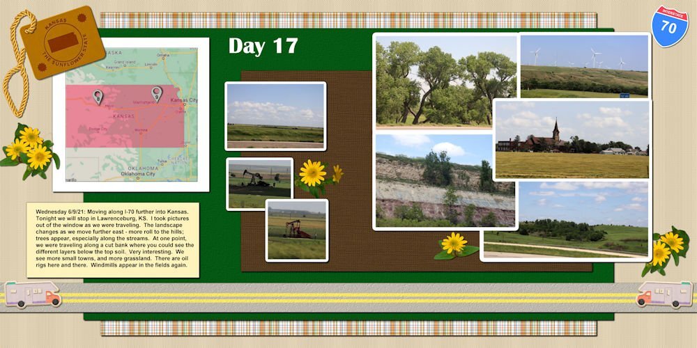
Getting close to the end of the year. Think I will be able to finish this project before the end of the year. This is the day before our visit in the town of Lawrenceburg, KS.
1 point
-
September so far, needs a little picture at the bottom left. Font (🤣) is Charlemagne
1 point
-
And Finally July!
1 point
-
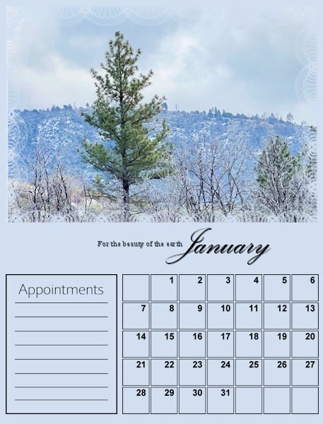
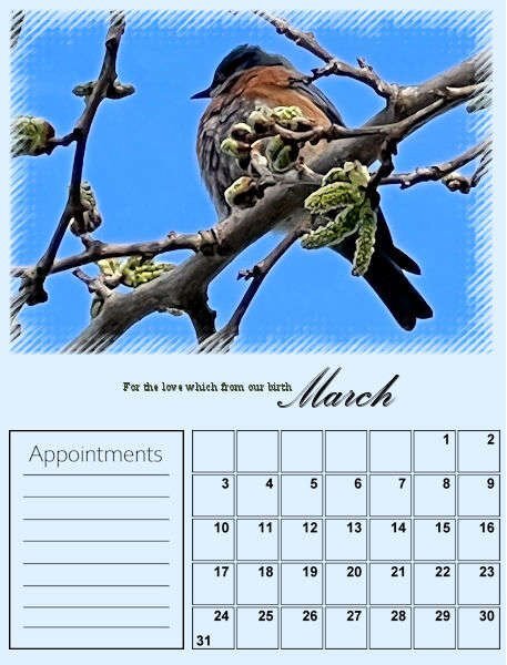
I decided to be ambitious and try to complete two calendars: one featuring our Labradoodle Lucy and one focused on Nature. When I was a little girl, my mom signed me up for the children's choir at our church. The very first and only Hymn I learned from the experience was "For the Beauty of the Earth." Still today, it is my favorite church Hymn. The lyrics resonate deep with me because I love the beauty of nature. There is beauty all around us. We live full-time in our motorhome, and I am fortunate to be retired, in good health, and can spend time traveling the United States. Someday, I hope to travel around Canada as well! I love taking pictures, and all of the photos I post are my own. Here are the first three pages of my Nature Calendar set.
1 point
-
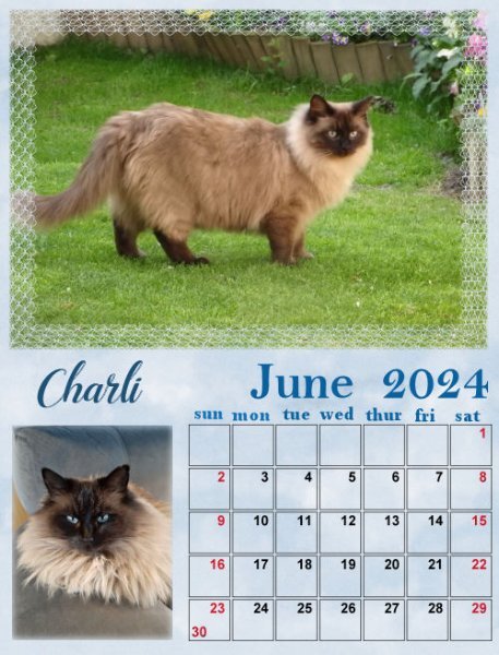
Calendar March 2024 Charli May and June
1 point


.jpg.c4227bef427e2a5dbabb416c70227bc4.jpg)