Leaderboard


Popular Content
Showing content with the highest reputation on 10/27/2023 in all areas
-
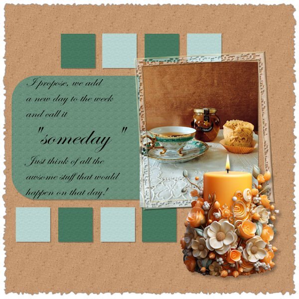
Something a little different, subway art, Autumnal equinox
 9 points
 -
Day 11 Thank you, Carole, for a fun bootcamp! You rock! A cat will always find an empty box and then...fill it...as Poppy is demonstrating in this photo...in January, 2012. Fonts are Brush Script MT and Monotype Corsiva. Brad in title: Sheila Reid, Furry Friends Kit, elements. Metal pawprint brad. Digital Scrapbooking. Paw print: Christina C, Cattitude Kit, paw print 1. Digital Scrapbooking.8 points
-
Hello, then I would like to thank you very much, Carole, for the excellent basic course in PSP, the good support and the really easy-to-understand videos, even if you are not fluent in English, but at least understand the basics, after so many years of scrapbooking 😉 We would also like to thank our dear fellow learners and advanced learners for their supportive help. I will then continue with “Basic Scrap Course 1” We'll see each other in the forum. Bye bye, ciao, dag and Tschüß at boot camp Doska6 points
-
I take it. The next word is WITCH. I did this several years ago for another group's Umbrella challenge. I hope it qualifies for RAIN. 🙂
6 points
-
Carole, thank you so much for having these classes. I hate to see it end. They really helped me a lot. And what a great bunch of people you all are too. 🙂 Here is my last Lesson 11. Thanks for looking.6 points
-
here is my improved version.
5 points
-
Thanks Carole, I really enjoyed the PSP refresher course!!
4 points
-
I found the original post and my explanation in a comment: I started with one umbrella. Duplicated it and mirrored it vertically. Duplicated twice more and free-rotated each of those. Then I merged all four to a new layer and rotated that one 45 degrees. Merged all eight of the umbrellas. Duplicated that layer and rotated it 22.5 degrees. I enlarged the bottom layer a little bit (don't remember how much). Hence, a total of 16 umbrellas, eight on each layer. Technically one umbrella LOL. ❤ ... Believe it or not, the most frustrating part for me was trying to get the puddle the way I wanted it.4 points
-
@Barbara Caulton We have a workshop every month. Not always a Bootcamp, but you can still follow and learn from the other ones. In November, it will be the Calendar Workshop. @Carolyn Rye Glad to see you are getting more comfortable with those lessons. @Doska St. You have purchased the Basic Course so you have permanent access to it. It is not linked to the Bootcamp. As for the text on path, I didn't want to scare newcomers with that. There is one article on the blog to explain it, and we also had a Vector Workshop, this summer that had a lesson on it (those workshops are now inside the membership) @Bonnie Ballentine I have considered organizing a live get-together (before that stupid COVID), but I live in an area that is not that "accessible" for people coming from all around. But, it is not completely off the table. @Anja Pelzer Beautiful layouts to remember your sister. @laurie solaas Beautiful photos and nicely resized! I might have added a shadow on the title for the "Sunset Cliff" layout, however. @Jannette Nieuwboer Are you able to read the journaling when it is in full-size? I notice that fonts that have thin and thick lines are a little harder to read, and even more when you need to resize. @Ann Seeber It is so fun to see Magic grow up, year after year. @Henry Schellenberg You had cookies for dessert? Your black and white photos really do tell a story, so it is something nice to see! @Angelo Cacciari You are doing great. If there is anything you are not sure, just post the question here. There is always someone ready to help.4 points
-
Sorry, I'm behind but I have difficulty understanding the speech in the videos I didn't understand some passages, but I'll post anyway.
4 points
-
I don't know if this was posted because I was not sure how to do this, so if it is twice, I am sorry Henry
4 points
-
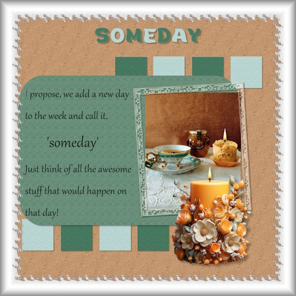
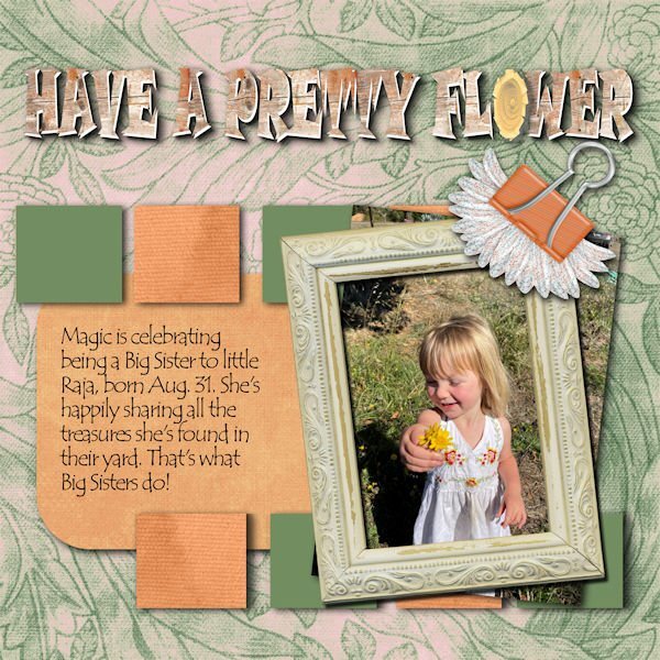
Here is my great-grand Magic who is 3 with a brand-new baby brother, Raja Blue. She is thrilled and Mama Lucy has trouble getting him back to nurse him. The papers are all from true heart digitals, one of the kits Cassel offered with the lesson. The title font is Snap with a paper showing woodgrain as the fill and the journaling font is Tempus Sans. The frame is from AHA Somewhere in Time. The clip is labeled PSBT_Songbird_Element from one of the other kits.
4 points
-
Here is my day 5, My sister died last year on 25th October and I made a Memory Page for my Album all Papers and Elements are made by Fay Burnett - retired Designer LilyBelle Design I forget to notiz my Font4 points
-
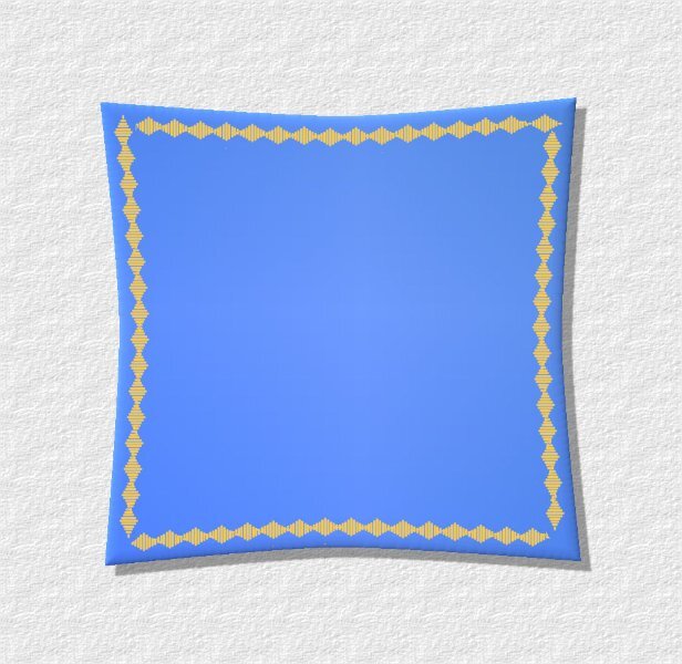
Just fooling around. Made a pillow. Used the Vector Paint script with Cass' embroidery stitch (2 separate layers) and then the eraser tool on each of those layers to achieve the look I wanted. Playing with the inner bevel, the outer bevel, and drop shadow (puffy flower setting given by Cassel in one of our classes, but adjusting it somewhat).
3 points
-
A TIP I LEARNED IN BOOTCAMP: Anja posted a layout showing a trip to a zoo and I was struck by the use of a rather, radically offset shadow that really enhanced the image of a stork. It also reminded me to always have the Shadow on Separate Layer box checked, in case I want to adjust a shadow further. Here's the illustration that I saw...
3 points
-
We have had our first snowfall, and yes, I have been out shooting snow scenes. I totally agree, it does capture the winter vibe. I have to adjust my camera settings to accommodate the stark contrast of summer colours, to the brilliant white of the snow and browns of winter.3 points
-
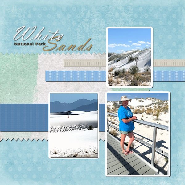
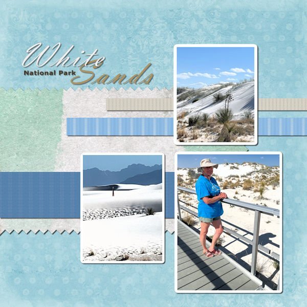
We love visiting White Sands National Park, located in New Mexico. The white dunes are incredible, and even on a warm day outside, the sand is still cool because it is made up of gypsum. Have you ever been to this National Park?
3 points
-
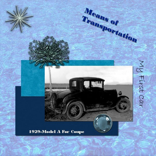
My first car I bought in a junk yard and then with my boss's help fixed up to be a reliable car for a number years. Max speed 45 miles per hour. Henry
3 points
-
I am submitting black and white photos that are part of my father's collection. They were taken in the 1920s-1930s. I did not try to fix these, except for blemishes that would have been distracting.
3 points
-
Hi, It was a lot of fun, no problems arose this time, and I figured out a few things myself (I like to sharpen straight away when I reduce it). I just wish I had known where you can bend text, for example into a semicircle. The "Peak-Blues" kit is from Tiny Turtle, the photo is mine and the fonts are Oliver and Orlando Samuel.3 points
-
3 points
-
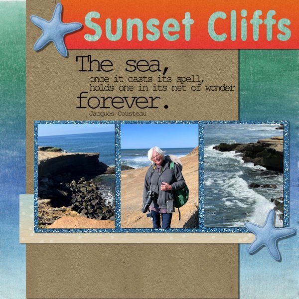
Sunset Cliffs is one of my favorite sights in San Diego, CA, because I love the waves crashing into the cliffs. I didn't realize there would be days when we would appreciate having a winter coat!! Even when it's a bit cool outside, I thoroughly enjoy the ocean.
3 points
-
Thanks for sharing your technique, Anja. Now I've learned something else new!2 points
-
I extracted the stork from another photo and saved it as a new image. then inserted into my layout, duplicated and made the duplicate black. like a silhouette. I then adjusted the silhouette using the perspective tool and scaling tool. Reduced the opacity and used Gaussian blur several times2 points
-
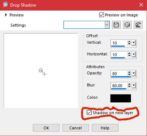
The variety of shades men can make is the reason I changed to PSP from my former Photoshop program. After boot camp, I will delve further into shadows.2 points
-
Here's how you do it, Melanie. Under Effects/3D Effects/Drop Shadow on the toolbar.
2 points
-
I take it Witch. I created this several years ago for that Osprey sight I follow so it doesn't have all the shadows etc we usually use The next word is . SCRAMBLE
2 points
-
😁to my opinion it is but I'm not the boss here😉2 points
-
this will be a wonderful book when printed2 points
-
I fixed the problem.
2 points
-
there are a few articles in the Blog about Text on Path - < https://scrapbookcampus.com/?s=text+on+path, there is also a button for pdf , you can click and safe it to your Tutorial folder2 points
-
Day 14 - Sunday. Daisy, leaves and ribbon are from PS - DB Magnolia.
2 points
-
Day 9 took longer than I thought, because I had some tradesman installing a new water heater. Anyway now completed. I have definitely learnt new ideas from you Carole. One especially is by using Ctl Y, which makes it easier to add the effects on many of my objects. Thank you for that tip.2 points
-
I take it and the next word is Roses used a few scripts by Cassel for the buttons, Sequins and confetti, and the glitter. picture tubes by Corel and Cassel2 points
-
"I take it" The next word is Hedgehog. The photo is from greenlandshop, the font is Arial size 30
2 points
-
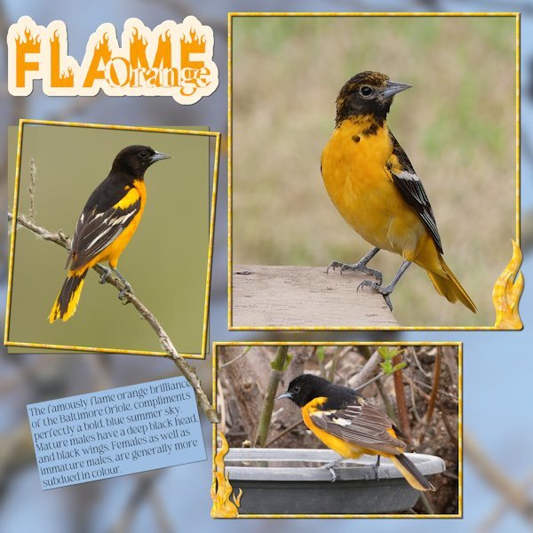
I took the word ORANGE from Corrie. Here is my page. Using the word Orange in the title. I created a ghost text, turning it into a sort of sticker for the title. Added flames to 2 of the frames, extended the branch out and over the frame. Used a photo for the background, which consisted of branches and blue sky, blurred. As I mentioned blue skies in the text. Susan prompted me to mention our blue skies, that go on for ever. I believe I am correct in posting my page, in the original acceptance message of the word Orange. By selecting edit. Which is what I have done.
2 points
-
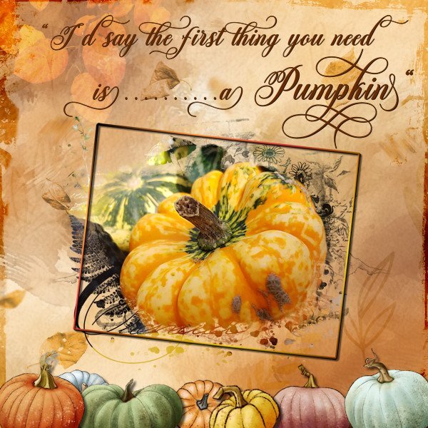
I take it and the NEXT WORD is: ORANGE Halloween isn't for me but pumpkins are. Almost every autumn I make a display on a small table in my patio with pumpkins, dry leaves, chestnut etc. Here I used a fall background from my stash with 3 different overlays and different blendmodes; one with autumn leaves a freebie from Corel, one with more leaves from InkyDeals and a frame. A mask from digitalscrapbook on my photo with a small frame and the font is Michalina. Some pumpkins at the bottom, after all the word is pumpkin!
2 points
-
Let's mix something up a bit, and instead of ME giving you a word to create a challenge, you will offer them. Here is how it will work. 1- I will suggest a STARTING WORD that someone will use in the title of their page. 2- Whoever WANTS to use it, will respond "I take it". Only the first person can take that word. Once that person "takes the word", they will add NEXT WORD:_____ 3- Whoever WANTS to use it, will respond "I take it". Again, only one person can take the word. We will end up with a thread full of suggested and taken words by various participants. After you have TAKEN a word, you can create your layout and once it is done, come back to edit the post where you "took" the word. This is a brand new challenge, and if it catches on, I might repeat it in the future. The STARTING WORD is PUMPKIN.1 point
-
I'm having a similar conversation in the String of words, where I referred to a masterclass called Pop Up, on perspective and shadowing. Which covers how Anja, created a very realistic shadow on the stork. There are other masterclasses covering perspective and shadowing, in varying degrees of advancement, to cater for everyone, from newbies to seasoned PSPers.1 point
-
To satisfy my own curiosity, I looked up which masterclass I was referring to. It's called Pop up. I thought it was a Christmas one, but it isn't, Carole uses a Christmas tree, to demonstrate perspective and shadowing.1 point
-
Of course!!!1 point
-
I would say it does. It's an awesome page, I love the rain effect, and what looks to me like a giant puddle.1 point
-
Me too, Michele!1 point
-
Coming up your way is on my bucket list. I'll let you know...1 point
-
Good Morning all, @ Carole, thank you for your help and compliment. Unfortunately, your tip with double-clicking on the work options bar in PSP's edit mode doesn't work, but when I open a new background, the double-click works, strange. I also have questions about intermediate storage (which was not required in the instructional videos) and whether I can continue with the scrapping course after the boot camp? I also have questions about intermediate storage (which was not required in the instructional videos) and whether I can continue with the scrapping course after the boot camp?1 point
-
@Cassel Thank you for those kind words. I am doing much better at following your amazing videos than I am posting my project in the correct place! Help has been amazing and hopefully I will remember for my last one . So sad it is coming to an end and the next Workshop is months away but can appreciate the time and effort they take. . But I think I can still follow your previous ones but without the forum. Hopefully this is in the correct place!1 point
-
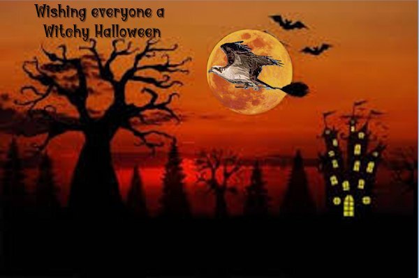
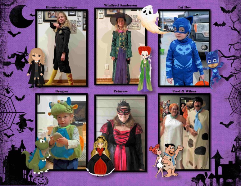
Love Halloween .... Characters are from www.hiclipart.com. It is a great site for free png files.
1 point
-
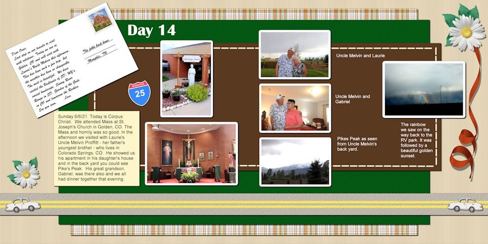
And now to the Garden of the Gods.
1 point
-
I take it and the next word is Autumn
1 point
-
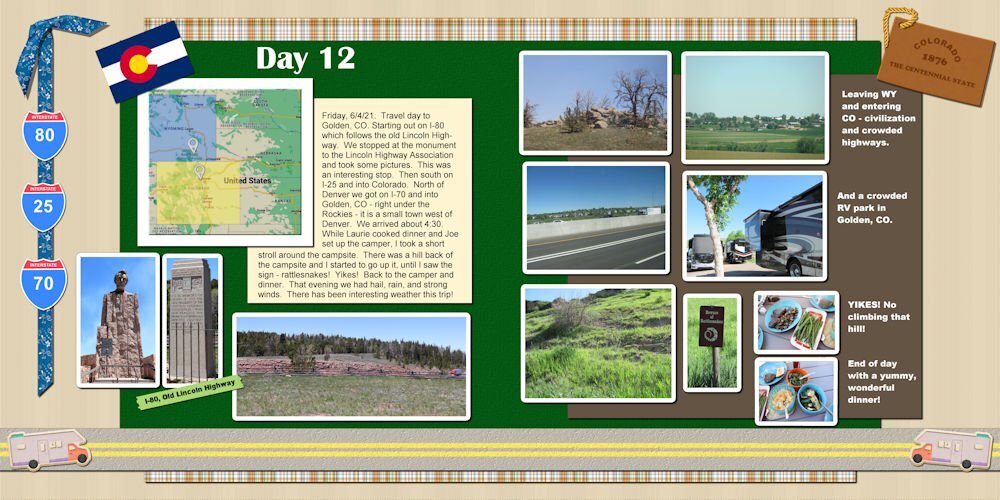
And now into Colorado - travel day.
1 point

Resized.thumb.jpg.d25811db03a63358cedab1e79f527635.jpg)