Leaderboard
Popular Content
Showing content with the highest reputation on 09/30/2023 in all areas
-
7 points
-
Day 7 shows some of the individual illustrations he made for this collection. I had a tough time balancing the two pages. The first page had the pics almost on the right edge. When I made the second page, the pics were spaced evenly horizontally but it didn't look right when I combined the two. I ended up moving the first column of groups on Page 2 to the right. Damn my OCD! I think this is one of the few workshops I've fully completed and it had some great lessons for me. Hopefully, I'll complete future workshops or even past ones so I can keep learning.7 points
-
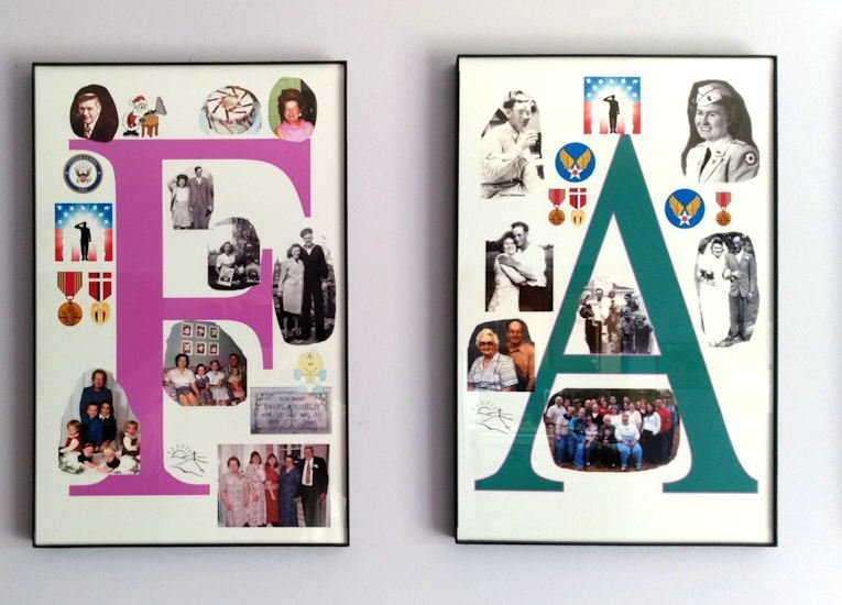
My project started many years ago but I finished it in Sept of 2023. It is a series of pictures to hang in the family room. It is a series of six pictures all 11x17 inches the biggest size my printer will print.It is printed on glossy photo paper. All of the picture gathering and editing was done using Paintshop Pro Ultimate 2023. It is composed of many family photo's gather for many years. The F in Family are pictures of my mother and father-in-law. The A is my mother and father. The M is my wife and our family. We had 3 children so it worked out just fine. The I is our son, the L is our oldest daughter and her family, and last but not least the Y is our youngest child and her family. I posted a larger picture of just the F and A. I have used Corel software (Paintshop and Video Studio) for close to 20 years and I'm still learning new things about how it works. Maybe one day I might open the instructions.6 points
-
6 points
-
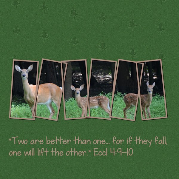
My Lesson-7: I followed Carole's tutorial and used Day 5 as the first page. On the second page I used horizontal rectangles and made them just a bit larger as my photos were larger also. I am posting both pages and will try later to combine them into a double page. This has been a great workshop. Thank you Carole and everyone here. Your artwork inspires me.6 points
-
4 points
-
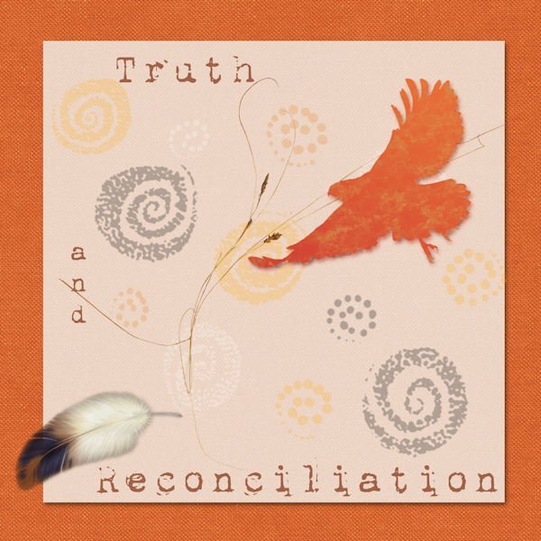
That is a beautiful tribute to the atrocities inflicted on the First Nations of any country. Do you have any hobbies, or enjoy baking, needle work etc that you can take photos of, and then showcase them in layouts. It may help you if you have passion for something. That passion will then show through in your work, and in turn you will be happy and like what you have done. Don't try to hard, and over think what you are doing. Like this page you have created. You obviously feel strongly about it, and it comes through in your page. I hope I haven't spoken out of turn.2 points
-
Mid October is when I usually start thinking about the festive season when it comes to making Xmas cards etc. As the days get shorter, and the nights get longer is when I find I have more time to be creative. This year is an exception, as I have been steadily plodding along making all my cards and calendars since I knew that I was going home for the whole of December and January. I'll be printing more of the cards than usual, as I will be able to give them to the recipients in person., which I am really looking forward to.2 points
-
2 points
-
What a very nice presentation, Phil. You are giving me ideas! Oh, and welcome to the Campus. Hope to see more of your work.2 points
-
2 points
-
Yup, you are an artist, there is no mistake in that. In fact I think we should all consider ourselves artists when we create. Why not. Remember the days art galleries wouldn't allow photographs because it wasnt "art". Now some photographers create "Fine Art Photography", and show successfully in art galleries. The layouts in this forum often leave me thinking WOW! This is incredible.2 points
-
I totally agree! They appear to speak to me, visualizing the circumstances under which they were taken, surrounding sounds, even how hot or cold I was when I was taking them, particularly when it's 30 below. All of which I feel reflect in the layouts. I'm not an artist, but I can fully understand how artists capture every emotion they experience when being creative. (All forms of art included)2 points
-
It's always a good idea to get distracted from the main task in hand. When you go back to it, you go back with a fresh perspective.2 points
-
You have done this designer proud! When creating a double page, I place the pages side by side frequently, to make sure they look right. I think it's a lot to do with how your eye perceives the layout.2 points
-
I agree with Sue it's just a starting point. Make it your own. I did pretty much the sketch as shown, only because I'm in the Scripting course and my brain has imploded about 10 times already and I didnt want to have to think. I wanted to do a layout to reset my brain and be creative.2 points
-
Jannette, the sketch is only a starting point, you don't have to follow it to the letter. The smallest detail of the sketch may trigger a layout, which will not resemble the sketch one iota. For me it was the three different sized frames, which took me down a completely different path. Don't feel compelled to replicate the sketch. For me, more often than not my photos determine the colour scheme and layout. Of all the challenges we have, I have to say the sketch, is my least favourite.2 points
-
2 points
-
2 points
-
1 point
-
Christmas cards? And you're finished with them? What a wonder worker! I'm not even sure what I'm having to eat later....?1 point
-
1 point
-
1 point
-
Redo of Day 5. I forgot that they were supposed to be two separate pics. I knew it when I started but lost track of what I was supposed to be doing ?. I also reduced the size of some of the stars as per Sue's welcome suggestion.1 point
-
1 point
-
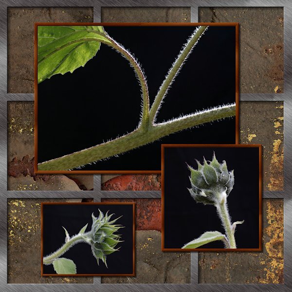
Here's my take on the Sketch Challenge. No words, just pictures. It was fun to do. I did the silver frame with vectors, not sure why, just seemed easier to do it that way. the outer frame is one object and the 2 verticals are one object and the 2 horizontals as one object. It just occured to me to make it a preset shape. Wonder if it would be useful. The background is a patter I got of rusty metal. It only has a number name (02) but I think it came froim of the ...eezy website (Brusheezy, Vecteezy etc). Lighting by mother nature...background by a non-descript black background I dragged outside....and had to weight down because it was like sail on a windy day and kept blowing over onto the poor subjects.1 point
-
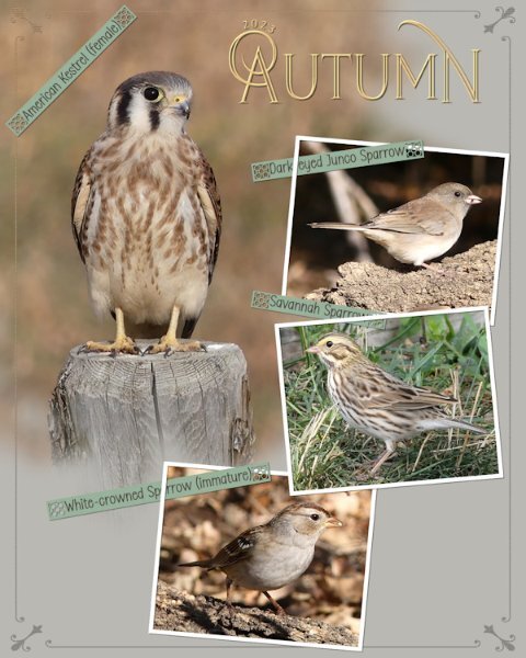
Another Autumn page in a series that I'm doing, on the birds that stop off for a brief visit, before continuing their long migratory journey. The border is a combination of a corner element which I added a thin border all around to, overlay. Phrase strips which I created, adding one of Carole's new punches. I really do love these, they are ever so easy to use. I do recommend using guides or grid when using them. Text on a text path, masks to slot the photos in . Photo frames are done using the vector rectangle tool.1 point
-
Day 6 and I decided to feature his Halloween illustrations. Hayden Williams has created so many looks for his Haunt Couture Collection, more than can be displayed here. I keep forgetting these are supposed to be magazine layouts and I have to stop myself from adding shadows, borders, and textures.1 point
-
1 point
-
1 point
-
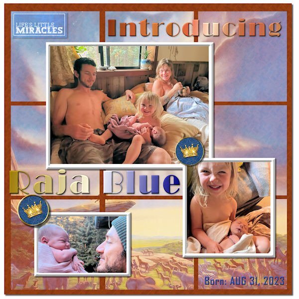
Thought I'd also post my Sketch Challenge here to introduce my new great grandson, Raja Blue Lennox, little brother to Magic. He was born at home on Aug 31, and it took the parents a week to come up with a name. ? I think he weighed in at nearly 9 lbs. Daddy Will introduced him with a musical rendition of the opening to The Lion King, so I went with the theme and used a Lion King poster in the background, mirrored and screened in each of the 9 squares. The mat behind them has a wood grain pattern. The crown brads are from Janet Kemp. The title font is Broadway, treated to a Copper gradient and a Chrome Reflection gradient. The little word art top left is from Marisa Lerin. I tried out PSP's One Step Photo Fix and was impressed with the results. I think it is improved in PSP 2023.1 point
-
Finally finished my Sketch Challenge. Introducing my new great grandson, Raja Blue Lennox, little brother to Magic. He was born at home on Aug 31, and it took the parents a week to come up with a name. ? I think he weighed in at nearly 9 lbs. Daddy Will introduced him with a musical rendition of the opening to The Lion King, so I went with the theme and used a Lion King poster in the background, mirrored and screened in each of the 9 squares. The mat behind them has a wood grain pattern. The crown brads are from Janet Kemp. The title font is Broadway, treated to a Copper gradient and a Chrome Reflection gradient. The little word art top left is from Marisa Lerin. I tried out PSP's One Step Photo Fix and was impressed with the results. I think it is improved in PSP 2023.1 point
-
1 point
-
1 point
-
I have created some memories for a relative using the masking procedure that I learnt from the magazine workshop. I was happy to learn more about the masks as I have always struggled with them. Helen is having a birthday, and I thought she would like these memories of a 6oth birthday, a win at the dart competition, and her precious old dog who passed a couple of months ago.1 point
-
1 point
-
Glad to still see you post those pages, @Mary Solaas. You can also post it in the Travel Tale thread, so "late" viewers could still see all your pages! And of course, you can add them to the Gallery too.1 point
-
1 point
-
I've been working on Lab 12 Mod 9 so I decided to use the included template for today's daily look. The "people" are characters from the game and the font is PLAYFULL CARTOON. (It's from a Mega Collection Font Bundle from Creative Fabrica. There are 86 fonts in the bundle and it's still available for $3.00.) The brick wall texture, included with PSP, came in handy.1 point
-
1 point
-
1 point
-
1 point
-
Poppy does not like snow...ever! Template # 198 by Bourico Casper, AKA, Lady 22. Fonts: Meows, Palace Script MT, Christmas Snow Bold Swash 007 by A Janner, Snowdays at Digital Scrapbook Hearts on a string by Marisa Lerin, brush #03, Winter Plaid Kit at Digital Scrapbook Snowflake by Gina Jones, Winter Elements, Snowflake 02 at Digital Scrapbook1 point
-
I've commented on this (it's beautiful), now I want to thank you for posting all the pages. I can now shoot for the photo types (landscape, portrait etc).1 point
-
There is a book called Steal Like An Artist 10 Things Nobody Told You About Being Creative Kleon, Austin On the NY Times bestsellers list! I just downloaded it from my Public Library. the first page is a quote from Picasso. “Art is Theft”1 point
-
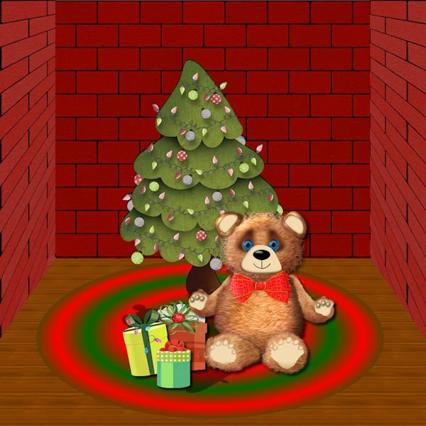
I am definitely not an artist, but I wanted to try to make a Teddy Bear. Starting with vector shapes to which I applied plush using the cass plush script, I used a lot of what I have learned about shading. The paws are tubes which I modified. I used a vector to trace the ear of a teddy that I downloaded using AI and the script to merge and cut out the inner shape. The background is from the Masterclass on Pop ups that I never completely finished. The tree is from Digital Scrapbook, and I'm not sure where I got the presents. All the other shapes--head, body, legs and arms were made from vectors.1 point
-
1 point
-
Julie, I like the layout very much! I like a lot this kind of background paper. I have to remember to use them more often. I also love reading; I always have books and the Kindle on the bedside table.1 point













Resized.thumb.jpg.d25811db03a63358cedab1e79f527635.jpg)
