Leaderboard


Popular Content
Showing content with the highest reputation on 09/22/2023 in all areas
-
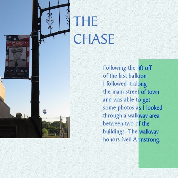
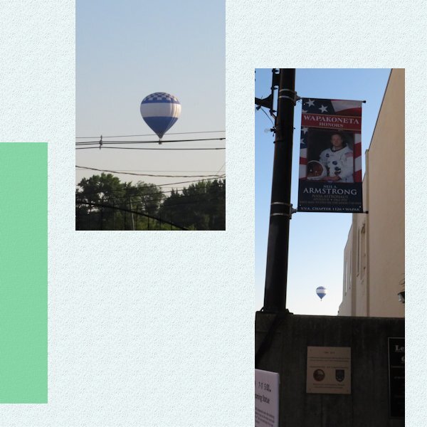
Second pager for day 4
 13 points
 -
Day 3 ........Oh boy on a roll now.
13 points
-
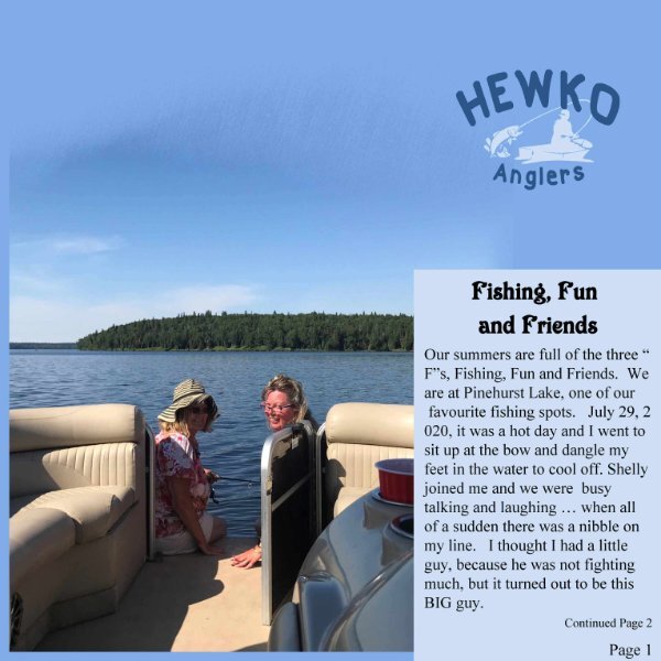
Here is day 2..... still having FUN
12 points
-
Double page. The double page was perfect for featuring the Raptors, as stated on the front cover. Some of the many Raptors that have graced me with their presence over the years, around this time of year.
12 points
-
Day 4. Actually Carole, I don't think it takes me that much longer to create my pages as it does for others to do theirs. The photos slip nicely into the masks. I didn't need to resize the templates, as I had already done that the first time we had the challenge. I'm confident in manipulating text ( vectors). The advert I took from one of my other pages, all I had to do was change the date and the title. The text I took from my notes, which I have used before. Nor do I have to worry about creating or using elements, as one does for a scrap page. Apologies for not adhering to the specs laid out.
12 points
-
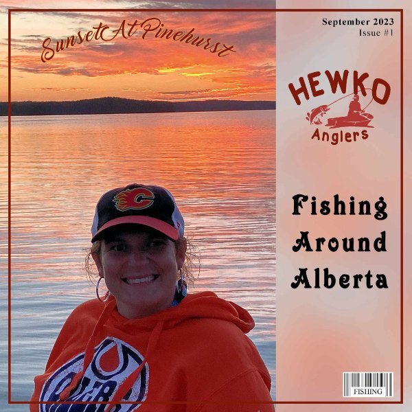
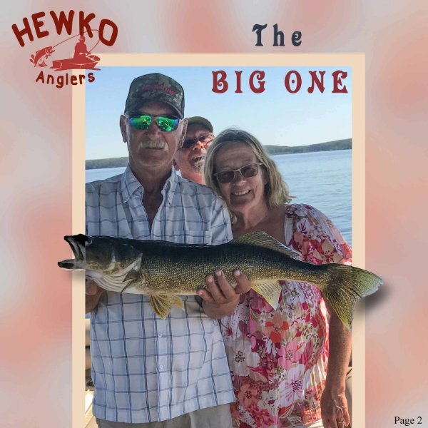
There is some really GREAT ideas here ...... I designed the logo, the fishing boat is from Free transparent background PNG cliparts free download | HiClipart. I used CASS Airbrush script on the paper and CASS barcode script. Fonts used Marguerite, Isrety, GUMS and Times New Roman. Thanks Cassel this is a great idea. Having lots of fun with it.
12 points
-
11 points
-
Well I am all caught up Day 4, YEP still having fun
11 points
-
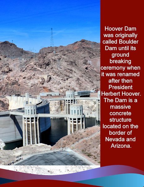
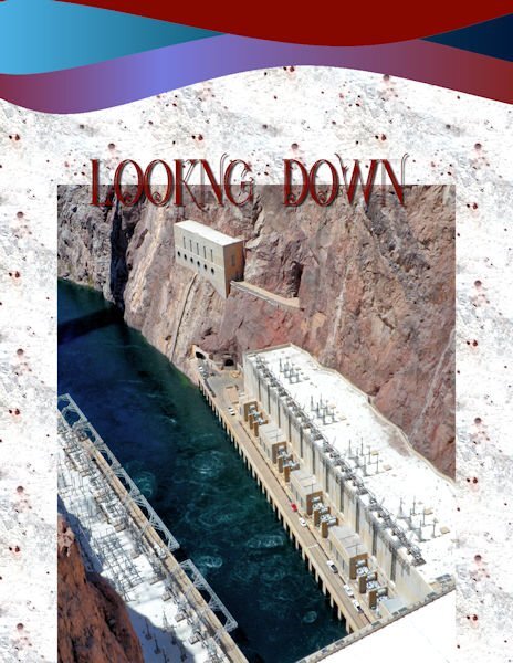
My day 2: I was side tracked the last two days designing a new business card for my son. The photo was an overview of the dam. I used the same background, stripes and colors as the first page. The font is Arial. My photos cannot do justice to the immense size of the dam and its surroundings.
11 points
-
My day 3 project.
11 points
-
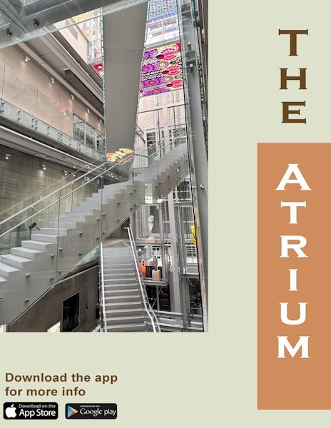
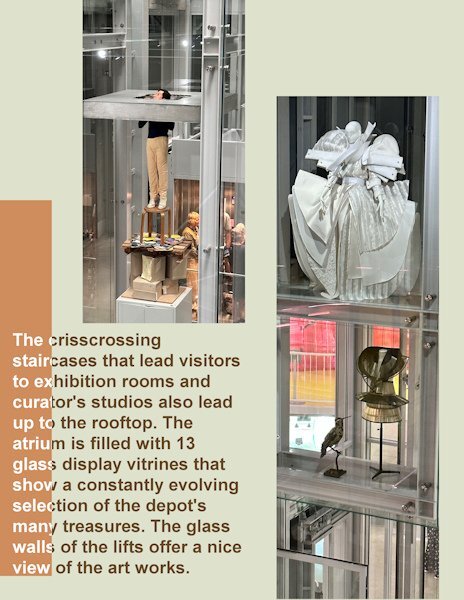
Day 4 the, double page, and it shows more of the artwork on display and the structure of the atrium. In the whole building there is glass almost everywhere and that makes it very transparent. You can see through the lifts and there are even a couple of corridors where there is a glass floor; although not everybody likes to walk on those floors. I use the same font on all the titles, but again in another color to go with this page's colors. Changed the blue mats to a more fitting color which I took from the photos. It really is a fascinating structure!
11 points
-
Here is my Lesson-4. I had a hard time to turn part of the text on the mat to white by using Brightness/Contrast. Every time I tried to select the Mat with the magic wand , it selected the mat, and the text and it did not turn that text color to white. So I just left the text all in black. The photos are mine and the Font is Fiolex Girls, which I downloaded many years ago. I kept the pages separate, I do not remember how to turn them into a double page. I think we had a Master class or workshop on that. I need a refresher course.
10 points
-
Day 4. Completed first side of the double page. I have been trying for hours to get some text on the the 2nd side, but it doesn't work for me, so one side it is on project 4.
10 points
-
Day 3: Hoover Dam, looking down at part of the power plant. Font is Starlite inline from deeezy.com
10 points
-
My day 4 projects.
10 points
-
Day 2 project
10 points
-
Finally Day 1. I decided to use my favorite fashion illustrator as my subject. My only problem is which ones to pick!9 points
-
I kept trying to get the white text on part of the mat again and this time it worked. So here it is again.
9 points
-
Day 4. I carried the background and mat colors and textures through to these pages. Along with the BakerSignet BT font in the blue color. I chose to darken the text on the mat instead of lighten it. I have trouble reading white text. I will add that I am not liking the page with the text and will more than likely change it before printing for my albums. But that will be for a later time.
9 points
-
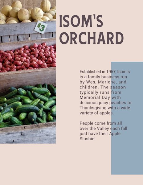
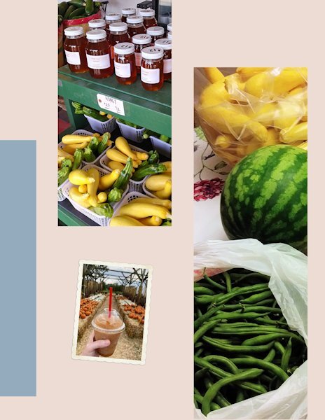
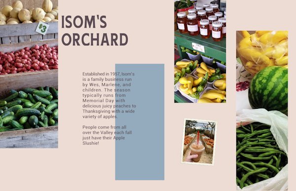
Day 4 The little farm stand is only a few minutes away. Canning and freezing were my mother's hobbies, so we were there several times a week to see what had come in from the fields. The owner even called us when she knew my mother wanted something specific.
9 points
-
Day 5. Again used the same background, font and font color from the previous days.
8 points
-
Day 5, I thought I would challenge myself and go for 4 pictures. It wasn't too hard after I got the hang of it.
8 points
-
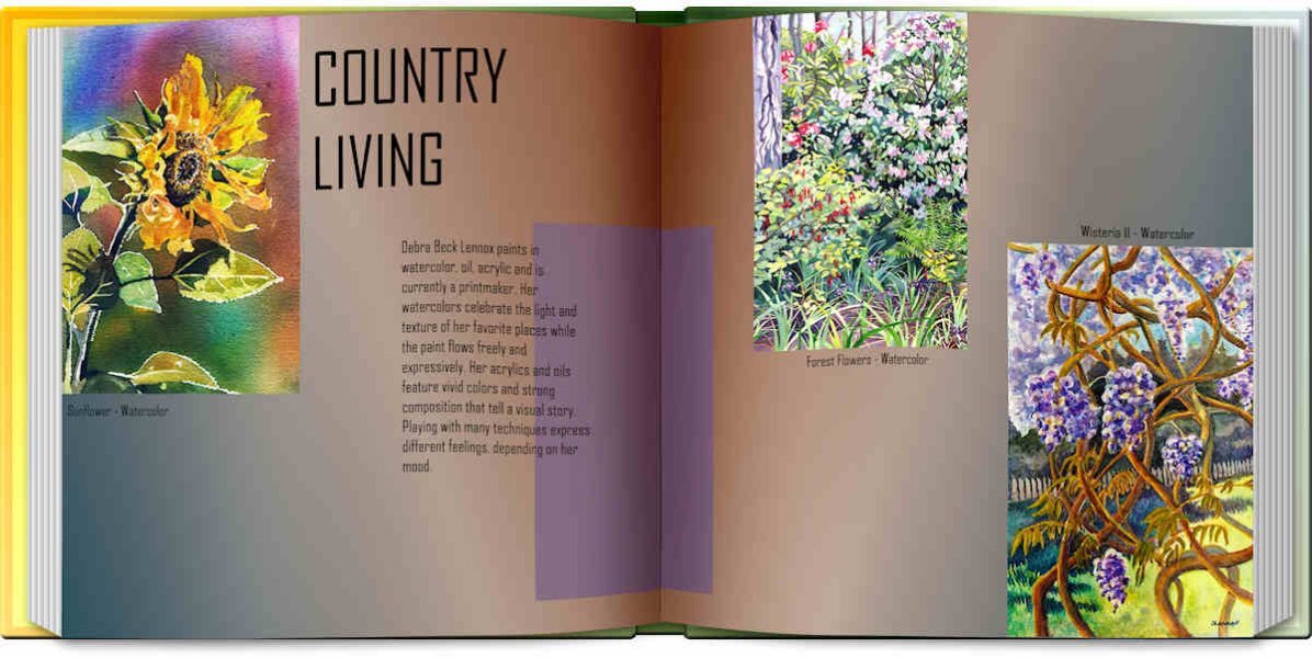
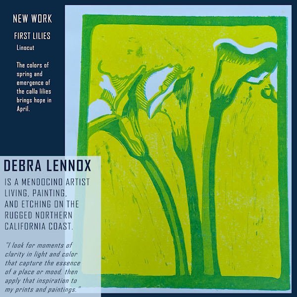
Time to post pages 4 & 5 of Debra Lennox Art. Since the two pages go together, I whipped out the Open Book script. These pieces are from her Country Living gallery. The font is still the same. I'll post the text separately as the book is not as readable. "Debra Beck Lennox paints in watercolor, oil, acrylic and is currently a printmaker. Her watercolors celebrate the light and texture of her favorite places while the paint flows freely and expressively. Her acrylics and oils feature vivid colors and strong composition that tell a visual story. Playing with many techniques express different feelings, depending on her mood. "
8 points
-
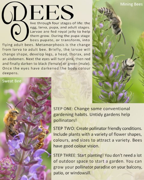
I'm on the ball this morning, as I'm off kayaking this afternoon. Day 5. Once I created the 2 masks as shown in the tutorial, I then used the edit selection tool to place the layers where I wanted them. The background paper is a photo of a pair of mining bees, which I used as an overlay, lowering the opacity greatly. I used the same font as for the Badger page. For those that may be curious or interested the wasp in the background of the sweat bee pic is a solitary wasp (Steniola species), they are ornately marked. (completely harmless). These gorgeous creatures are tiny, at around 8-10mm.
7 points
-
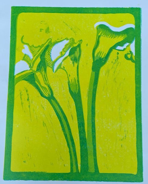
Here is Day 5 - page 6 of Debra Lennox Art - Category: Many Moons - Linocut "Dancing Moon." She does have many moons, but this is my favorite. I have it on my living room wall. Being consistent with the font: Agency. I didn't split the photo mat because I've been waiting for a template with a large area for the image. I'll try a split on page 7 or 8, depending on the templates. The background color and part of the title is flood filled with the off-white of the moon in the image.
7 points
-
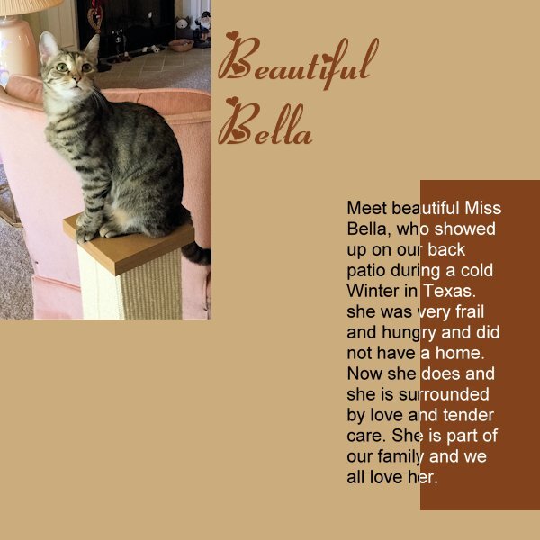
I've started working with a local shelter to trap and home local stray cats. Most recent was a female calico that had 4 kittens. We lost one kitten but all the rest are safe in homes now, including "my mama, Maybelline." Now I'm leaving out food for a young calico, but it is very elusive, and I rarely see it, though it's eating the food, mostly. It took me over 6 months to get Maybelline to be calm (though she still hissed at me if I got too close LOL) I'm just glad she got her own home and is safe now. My two pampered brats would not have allowed her in the house.6 points
-
Day 5 Design Seeds is a great resource for me. For those of us who are color challenged, it's a great help to find a different shade of beige and muted colors that go with it.
5 points
-
My thoughts on your dilemma on choosing background colours: Unless you are going with a theme, then possibly you'd want some sort of consistency. Saying that it isn't as if you are trying to match colours on the same page. Each page tells its own story about a particular photo or topic. The colours in my opinion should reflect on the photo and topic. Take my wildlife magazine, I have used different backgrounds. They are subtle colours, for a magazine I wouldn't use bold colours. When creating a magazine you need to leave your scrap book hat on the shelf, as they are two very different creative disciplines.5 points
-
Even visited by Transformers and secret base for Sector 7. Just sayin'. all kidding aside, I love these pictures. I've been to a tiny dam in British Columbia and thought it was awesome, can't imagine what The Hoover Dam would be like.5 points
-
Ann, that is so wonderful.5 points
-
When I was a kid, the character of Juan Valdez, a Columbian coffee farmer, was the face of coffee advertising on TV. There were other ads for specific brands (Maxwell House, Nescafe, Folger's, Sanka, etc.), but Juan was the man who grew the coffee. It was a campaign by the Columbian Federation of Coffee Growers to promote quality Columbian coffee in the U.S. market. The ads (with Carlos who died in 2019) continue today with a new actor. There are even coffee shops with Juan's name in over 500 locations in the world. Their concept of featuring the individual farmer(s) who grew the beans and the process of direct trade was innovative. (The background colours represent the flag of Columbia.)
5 points
-
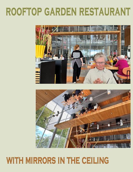
Day 5 features the rooftop garden restaurant were we had a lovely lunch and some much needed "sit down time". Like the whole building it had glass windows everywhere and mirrors in the ceiling. A bit unsettling at least that's what we thought at the time, but maybe we were just tired. Same font, other colors.
4 points
-
You would make an excellent fashion magazine designer, or any other magazine designer for that matter. Your unique style is perfect for the job.4 points
-
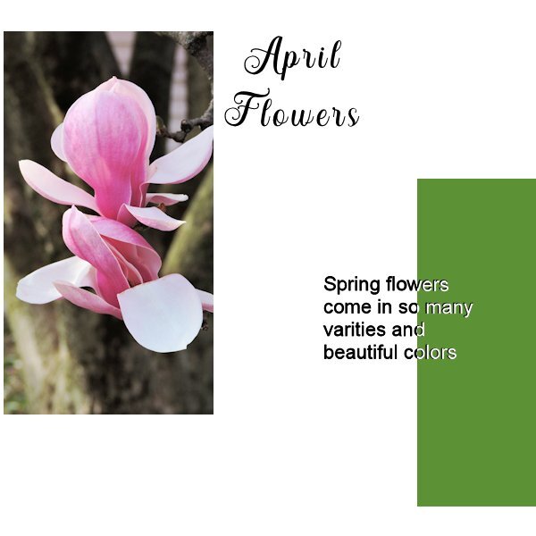
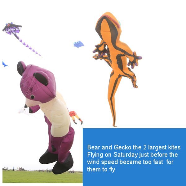
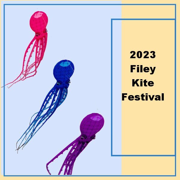
Here is my day 1 page. I had to edit the photo as it was almost a silhouette as the kites were against the bright couds and then fill the sky with colour
4 points
-
Day 3 I'm late, it's actually almost an hour into day 4....and I have to get up a 5am. Not real happy with the shot. Even thought they are all Kodak Brownies they dont play well together in a shot. Tried lots of different thing and finally just stuck them on the very old (probabably) 70's photo cutting board. Perhaps it will look better when the background is in place. I am not sure I'll still with those colors in the title, but they are the Kodak colors.
4 points
-
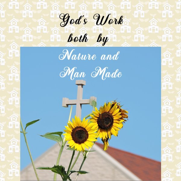
@Anita Wyatt Since the white of the text might overlap a light area of the photo, you can move the whole title toward a darker area too, so it reads easier. For the issue about the text, maybe you had not reactivated the rasterized version of the text to turn it white? @Dorothy Donn What do you mean by using "A009"? Are you adding a new mask? The template included has a mask layer "ready to use". Or maybe you had not downloaded the template? @Susan Ewart When you have the Fill tool active, do you get that Dropper tool when you press the Ctrl key? Maybe, like for Suzy, the Dropper tool setting does not have a checkmark for the "Use all layers"? @Ann Seeber I guess my brain just does not accept the fact that the image is straight!!! ? Maybe I'll need to make an open magazine script with less thickness! (yes @Susan Ewartsaw, I sasw the hint!) @Anja PelzerI think you might have kept the black text on the Day 3 photo. In fact, you might have inverted the black and the white as the white would look good on that background. @James Durrant If you had not mentioned they were kites, I really thought they were some sort of creatures!!! Looking forward to more photos! @Corrie Kinkel Your pages might be a great example of where you could integrate a QR code to link to the app or to additional information. Check the blog for a tutorial on creating a real QRCode. @Gerry Landreth Such a simple and "ordinary" topic, that can make a wonderful project. We often tend to forget about those "ordinary" things that surround ourselves. @Anne Burgess Great photo of those sunflowers! @Rene Marker That is a good idea to use darker instead of white. The technique is the same and why not? On the Day 5 page, how much time is there between the two photos? Other than the flames, they look like only seconds apart, but the visitors certainly didn't appear that fast. @Anne Lamp It looks like you might have left the black vector layer under the rasterized one. At times, it makes for an interesting effect. It looks like your rasterized layer was shifted by one pixel down. If you move it two pixels up, it might actually look like a shadow! Glad you are getting the hang of it! @Donna Sillia Learning something every day in these workshops! @Royanne Hewko Oh cool. Visiting another part of Canada!!! That small out of bound effect is great!!! @Sue Thomas No apologies needed. Looking at your pages with more text and such, it FEELS like you are working so much more than I intended, but if you are able to reuse other elements from other projects, that is PERFECT. Reusing is one of the benefits of digital work! @Shirley What happens when you try to add text to the other page? If you describe the problem, I might be able to help. @MoniqueN. You can leave the background white for now, and once all the pages are completed, it might become obvious what to choose. Since all the pages are saved in layers, it is easy (and expected) that you will go back to tweak them. @Michele That is definitely a magazine topic!!! @Marie-Claire with gray hair, you are in the best place here! I never colored mine, and it is now salt and pepper. Tonight, I will be going to a special light show. I hope to get great pics to share after (maybe I would make another magazine?). It is called Lumina. Here is their site. I only have an old smartphone. I hope it will be smart enough to take reasonable photos in that context. This also means that I will be WITHOUT my computer for a while as I am NOT bringing it!3 points
-
I am getting grey too and same, no more dying it. although I only dyed it for a few years (at home) and just got bored of doing it. Yes, the person looking back at me in the mirror isnt the one I see in my head. Where did all the lines come from? Therefore I painted all the mirrors black. hahaha, just kidding, you need mirrors to make sure there isnt a piece of lettuce stuck in your teeth when you leave the house. ?3 points
-
I have always had animals, I also wonder if I will be able to do without them. The photo you see is from 6 years ago. I have very few photos of myself because I'm always the one taking the photos. Meanwhile, post-covid, I decided not to color my hair anymore, and now I'm completely gray. That changes a person, I still have to get used to it.3 points
-
Me too. I have some that have white background in the picture, which of course only "looks" white to the eye. So if I add a background of any other color it looks dull and gray (which is probably what it really is despite what my eye thinks). So far I'm just leaving it white and in the end will decide if I'll add a colored background or put a frame around any photos with too much white at the edges before adding the non-white background.3 points
-
That Sunflower is STUNNING! I grew them for the first time. They are mutant sunflower though. Supposed to be 6-6.5 feet tall. they are almost 10' now. The open book works great in this format. It would be cool to have a "Magazine" script, thinner and both sizes...hint..hint..hint Carole. ?3 points
-
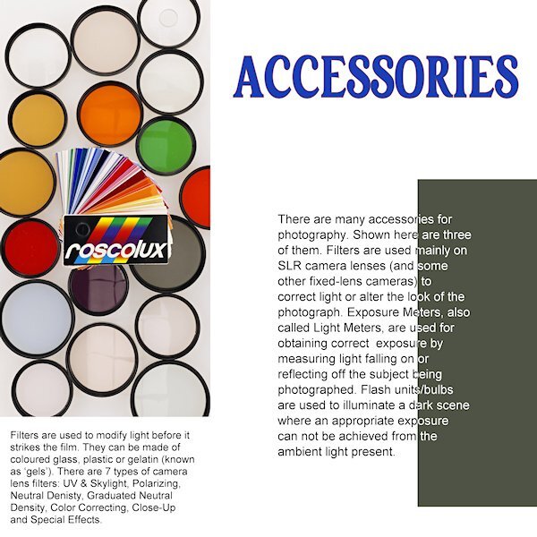
Day 4 Right off the bat I see I forgot to take the stroke off the title. I was going with the yellow-red color on the pouch of the light meter but changed my mind. I like the way we changed the color of the (rasterized) font. It's a neat effect. Still cant decide on a background as anything makes the left photo look dull and grey. Unless I go for a very dark background. My "virtual" editor of my "virtual" magazine would faint of the cost of a full color page! ?
2 points
-
Sue I do more or less the same, I had my pages made rectangles in the first Magazine I did, and I have some extras too like a barcode and QR code, ready to use. I just adapted the fonts to this magazine because it has a completely other topic. I'm so glad it takes little time, I have such crazy weeks at the moment. As always your pages are stunning and informative!2 points
-
If it's not a word, it should be. I make up words all the time, it's awesome.2 points
-
Great use of the out of bounds technique.2 points
-
Thanks Marie-Claire. Why not get yourself some fine line pens and you will be on your way. There are plenty of tutorials about. Have a go.2 points
-
Beautiful Royanne. And you've got your Oilers hoodie on. Are you in Edmo (my name for Edmonton)? I'm in St. Albert.2 points
-
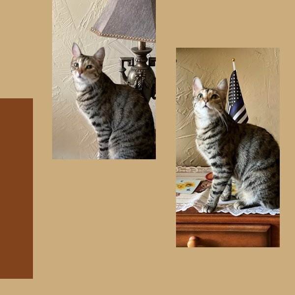
And the love between you and Poncho shows in every photo and layout. I feel the same about my cats. Since I am 82 and they are 13 & 9, who knows who will go first? If I'm ever left alone without at least one of them, I might adopt an older cat. They languish in shelters and deserve some love in their waning years, also.2 points
-
here is now my day 3, I used again a tile from the building for my background2 points
-
Here is the linocut with no other distractions. This IS straight...and how the artist wants the viewer to see it. Looking at the magazine page I decided to try a revision of the layout. See what you think of this now...
2 points
-
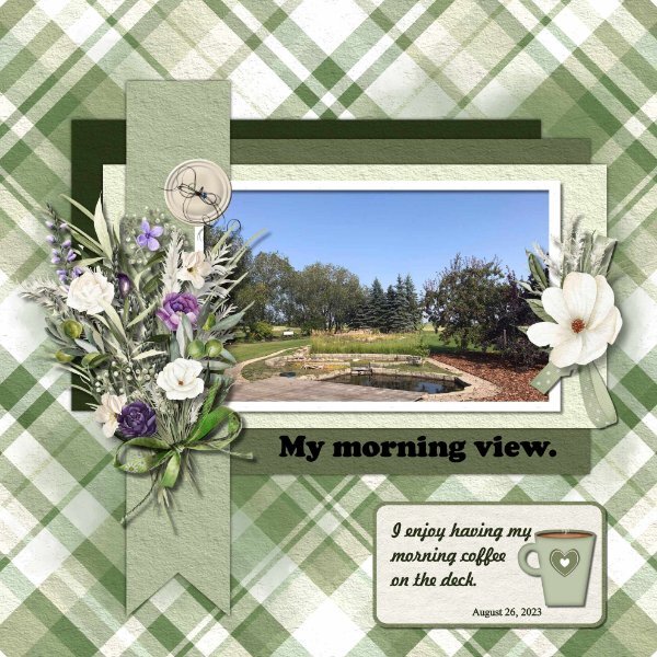
I enjoy having my morning coffee out on the deck, I have such a beautiful view of our yard. Such a peaceful way to start my day. Coffee cup from the vector course from Cassel, plaid paper cass-stripes-2 script, elements Ilonkas Designs The Story Of Seasons, button cass-Custom Kit Buttons. Font Freehand521 BT, Cooper Black and Times New Roman
2 points

.jpg.4177f82acc04b98e1628f43aa72bada6.jpg)
.jpg.69fe14d9120b139756a7431cafb7d0e9.jpg)
.jpg.cb3b23aab4514b2b9908c3f3e80ba6f2.jpg)