Leaderboard
Popular Content
Showing content with the highest reputation on 07/26/2023 in all areas
-
15 points
-
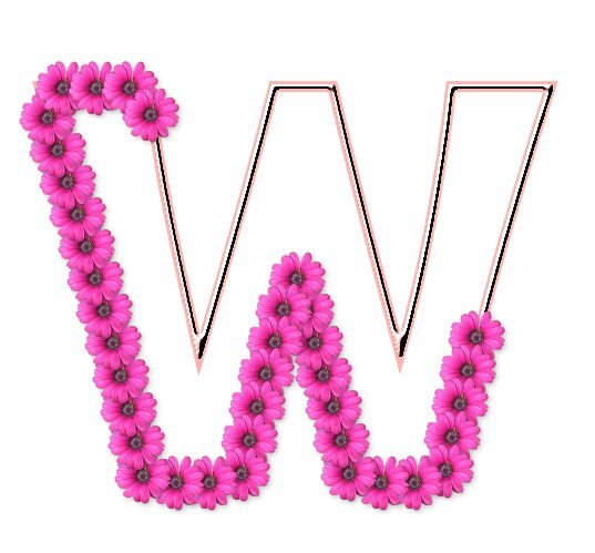
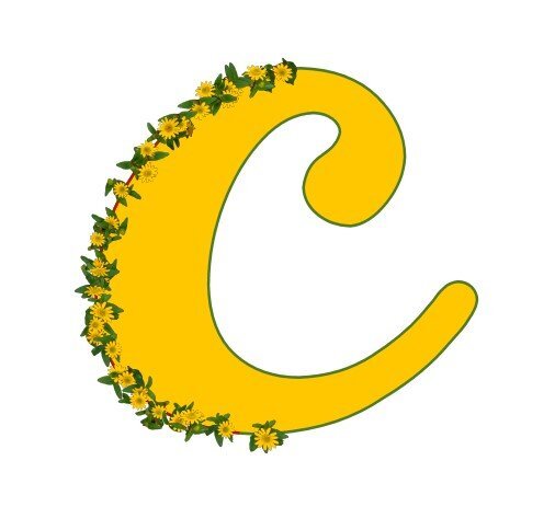
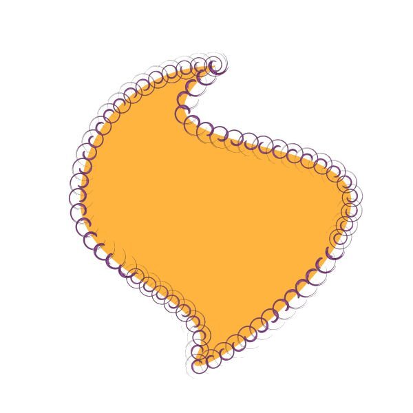
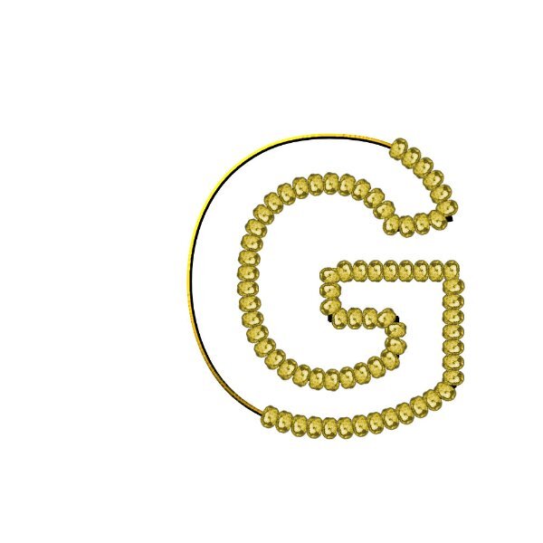
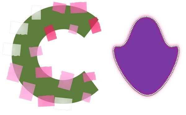
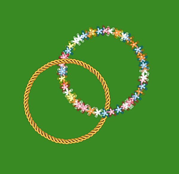
Lesson 7/day 7-- I feel like it has taken me a while to get here to lesson 7! Sometimes I can't follow directions, sometimes PSP doesn't follow directions or just doesn't want to function right, and sometimes it may be all of the above. I know I have learned many things. I need to make more notes so I can do a few of them again! I dug around and found more tubes on an old Jasc PaintShop Xtras disc. I think that is where the pink flowers were. Thank you Carole for a challenging and informative workshop, and the extra help!12 points
-
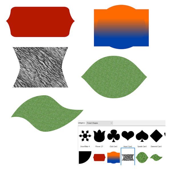
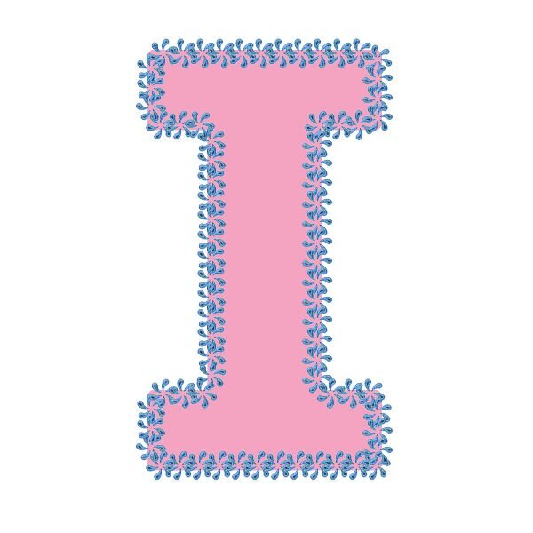
Lesson 7: Thank you so much for this workshop @Cassel Informative and a lot of fun on all the tutorials, and I've learnt a lot. This was a little challenging for me, but I got there in the end and will have another go tomorrow. I ended up giving up on a few that I was working on as I tried to run before I could walk when I was trying different shapes to use ? One question, can you use a picture tube or a custom made preset shape and convert to path? I tried but the convert to path was already greyed out, yet there wasn't a path icon showing on the layer. Apologies if I've missed something on the earlier tutorials, and maybe if time allows tomorrow, I'll have a look. Anyways, here's the one I did do successfully ?12 points
-
I'm unfortunately more than a little bit behind. I was sure at the beginning I could participate more regularly but as always the job comes first. I decided to continue anyway. I flew over the pages and just thought WOW again. So many great works, a lot of very interested participants and many new among all. Now Lesson 2 and 3.11 points
-
11 points
-
11 points
-
10 points
-
10 points
-
10 points
-
9 points
-
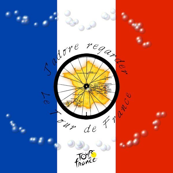
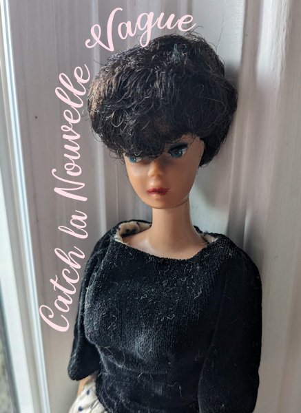
For the last 3 weeks I have been glued to The Tour de France (except for when I attended the workshop!) so now the Men's race is over I thought I would make an image for it practicing some of the vector workshop skills. I used one of Cassel's Picture Tubes trying to represent the polka dot jersey but I was fascinated by the accidental effect I created so left it at that; The background colours show through the transparent bubbles. Coolio! I think my French here is correct.9 points
-
8 points
-
7 points
-
You challenged me to use my newly-learned vector skills from the workshop in my gaming group, @Cassel. Challenge accepted! I added the cup from Lesson 4 to my original pic from 2016. I even used lesson 7 to add some decorations where I wanted them. The font is Parisienne, free from I don't remember where. Thanks again for a wonderful workshop.6 points
-
6 points
-
6 points
-
6 points
-
5 points
-
5 points
-
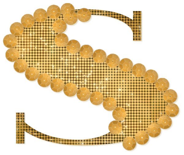
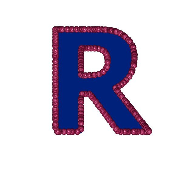
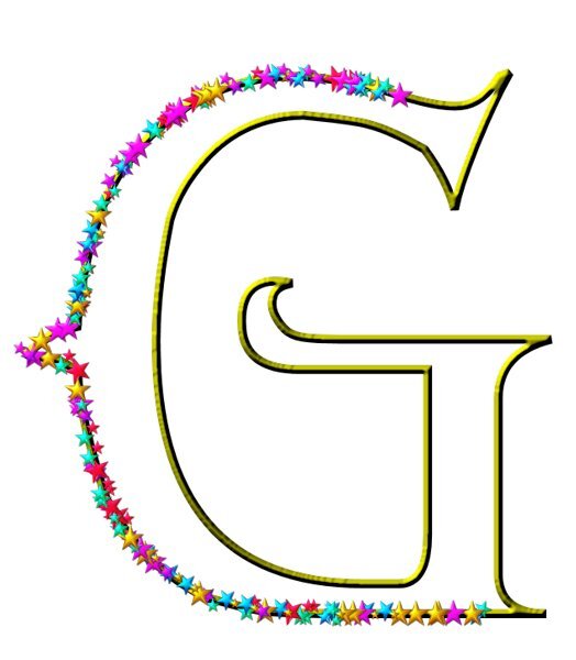
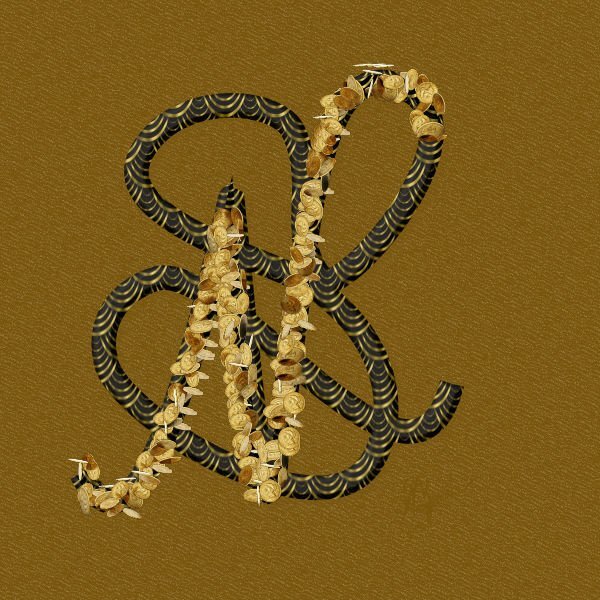
Having finally completed Lesson 7, I just wanted to say thank you again Carole for always encouraging me to step out of my comfort zone. I played around a lot with this lesson and I think I have created MY new dollar sign if ever I own a currency! I decided to free hand draw my stylized initials. I used a coin picture tube and then filled in the under vector with a pattern that was just on my pallet swatches ( maybe from the coins?) Played around with bevels, shadows, layers, blend modes, and opacity until I got something I liked. This workshop was challenging, sometimes frustrating, full of information and tips, and SO MUCH FUN in the end. I will definitely use vectors more often. My classmates are / were inspirational and have a great deal of talent . I loved looking at all of the submitted work. Thank you for having me. CHEERS until next time.4 points
-
4 points
-
4 points
-
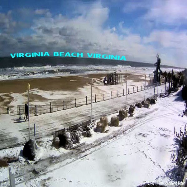
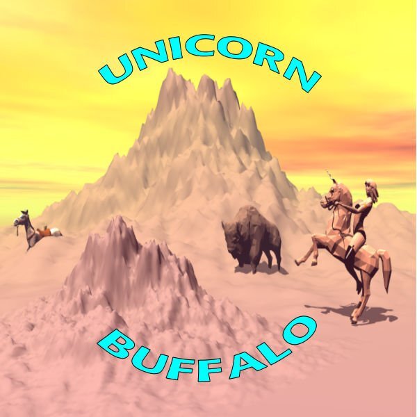
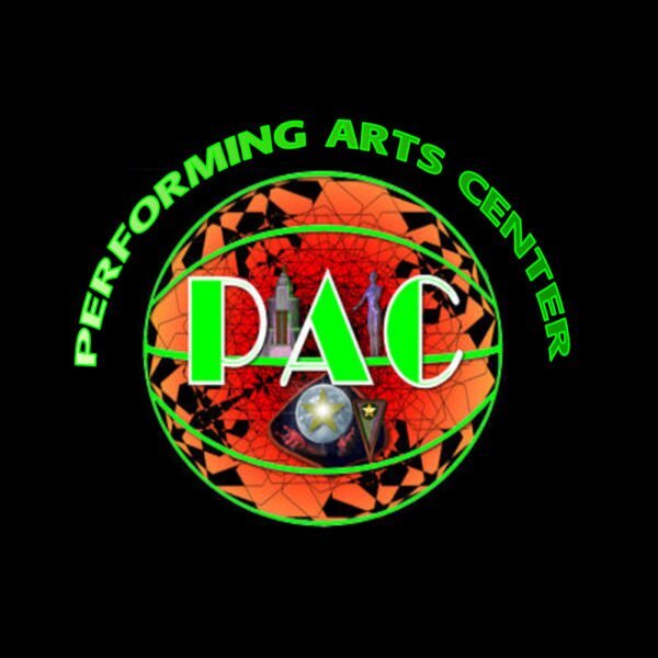
CASSEL: Thanks for asking but I now have Lessons 1 through 5 downloaded to my computer to review after I get through the last lesson. I am so glad you liked those funny cups of mine. Here is my take on Lesson 5. 1- The Beach here with snow. 2- Something I played with in Bryce 3-I used the Basketball Vector and some 3d modeling on the interior and exterior on this one.4 points
-
I went back to the cup and added a saucer today using the cup shape. (I did not save the cup and saucer as a shape). I added the artistic bubble effect on the cup to give it dimension. Again used Particle Shop Smoke for the steam, added shadows. I'm not moving forward yet, even though I'm just on 4. The fish looks good as an element - the shape will turn out as a silhouette, but I like it as an element. May have a go at the dinosaurs later today and then move on to Project 5. I'm slow - but there is so much to learn! Oh, the saucer I made using 3 ellipse shapes one for the top, one for the recess where the cup sits (just an outline here) and one for the bottom part.3 points
-
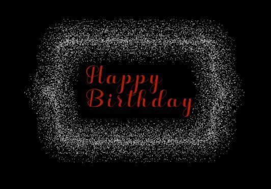
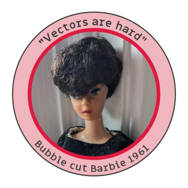
This is an updated version of a theme they first gave us back in 2016 (see 2nd pic for the original). If I want to reuse an idea from then, I have to modify the dimensions for FB. The background was made using the Balls & Bubbles effect over a black layer. Before you give me credit for that lovely text, on a rare occasion back then I used Flaming Text logo designer. I updated it for today's layout. I imagine I could have created it myself, but I didn't have enough time.3 points
-
3 points
-
3 points
-
Phew, Lesson 7! All the way through this course, I was having a heck of a time selecting a vector object. I just couldn't figure out how to do it. So I looked it up on the Corel site, tried a couple of keyboard shortcuts (notably Ctrl-Shift-B) and suddenly my PSP 2021 sort sprung to life and worked properly. Yay. Persistence pays off, I guess.3 points
-
3 points
-
Sorry Rene, looks like I took so long with that post I overlapped you. I don’t think I knew you were an accountant. I have never used a spreadsheet as a spreadsheet with numbers…I have no idea how to even add columns, but my daughter is an ace at it. Tracking stuff, now that I can do, but as soon as I add pictures, it gets messed up. We all have our daffodils on a spread sheet…that is about 900 lines for me. And maybe 20 columns. But it’s ok because it’s not numbers, LOL!2 points
-
Well, I was an accountant so spreadsheets were a mainstay of my job, some with more than 20 pages! But I use them for so much in my daily life besides financial stuff. I set one up 15 years ago to track what digi supplies I used on my layouts and include a small image of the layout when I'm done. Each year is its own page and yes some pages have over 200 line items ? And, the thing is I was self-taught on using spreadsheets, had my first experience with one in 1979.2 points
-
2 points
-
I know what you mean about the job. Sometimes I wish i was retired, but then that means I'll be that much older. I still maintain to my friends I'm going to win the lottery...WITHOUT buying a lottery ticket (I dont buy them), then i'll have all the time in the world...I hope. ? Glad to see you carved out some PSP time. I took the day off today and finally going to choose the RAW editing software I will go with (Looks like ON1is in the lead - it's the most like Lightroom...but a standalone..and on sale!).2 points
-
Preset shapes are already paths so that is why it will be greyed out. However, picture tubes are not vectors so that cannot be converted to path.2 points
-
Thanks, Ann, but I cheated and used a pic of a podium on Google, removed the background, and changed the color (it was originally purple). I can't imagine how long it would take me to create it from scratch. Maybe I'll try that challenge!2 points
-
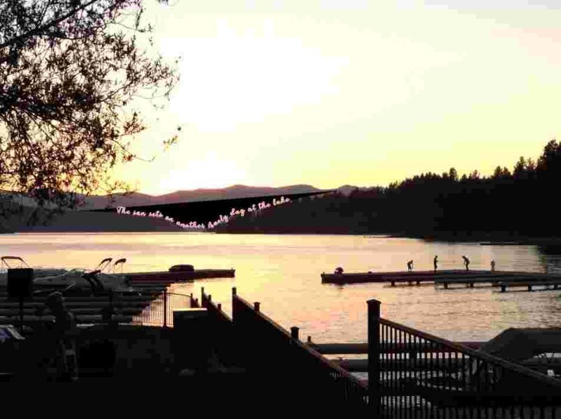
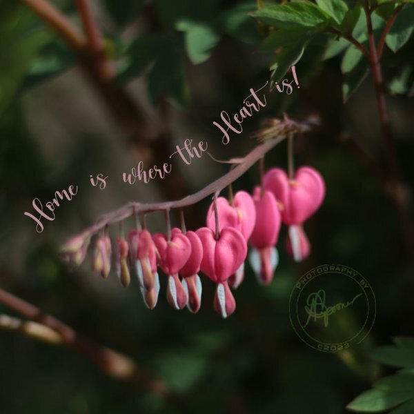
It's sometimes challenging to make a layout that fits FB's parameters. Hence, the sideways text; the font is SchwabachDeko, free from fontspace. The background is a solid layer to match the sepia effect applied to the pic. On top of it is a lovely overlay paper from Digital Scrapbook, formerly Pixel Scrapper, by Janet Kemp. The "border" around the pic was made using the Magic Wand on the outside, changing the size of the selection and adding a cutout on a separate layer. To finish it off I used the 3D buttonize effect on top of it all.2 points
-
I was working on this about a week ago (before the Vector Workshop) as an album cover for contests we hold in my group. After the workshop, I'll be able to do so much more! The font is Digital Tech, free from dafont. The "winner" is my avatar from the game.2 points
-
2 points
-
Completed Lesson 2. ? Here are some of the vector shapes I played with. I added color, pattern, gradient and stroke. Then added a background with texture Asphalt. Thank you Carole, for all your help getting around the glitches in PSP23 Ultimate. I also played with the little loop option you showed me. (First shape on top left) I love it and I feel more comfortable with all these nodes.2 points
-
2 points
-
2 points
-
2 points
-
2 points
-
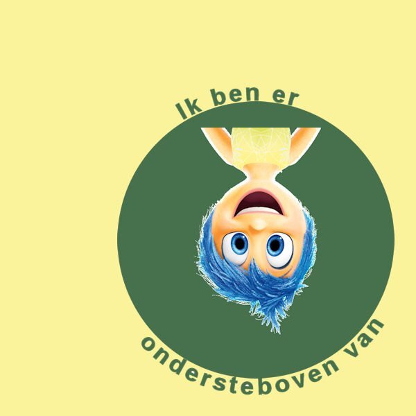
Here is my Lesson 5, Text on a path and a circular "stamp " with text top and bottom. I had already created a brush tip of my photo signature a long time ago and just added it to the center of the new "stamp". As I use mostly all my own photos for these clases I decided to make the stamp a Logo of sorts and turned it also into a brush tip. I then put it on a separate layer so I could change the blend mode to Luminence and the opacity to 59 for this lesson. I usually blend my signature to barely visible on my work so it acts more like a hidden watermark and doesn't take away from the photo. Now to tackle lesson 6!2 points
-
2 points
-
2 points
-
2 points
-
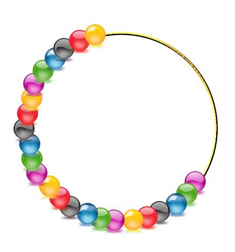
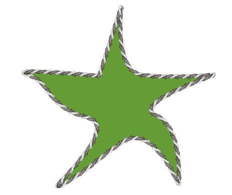
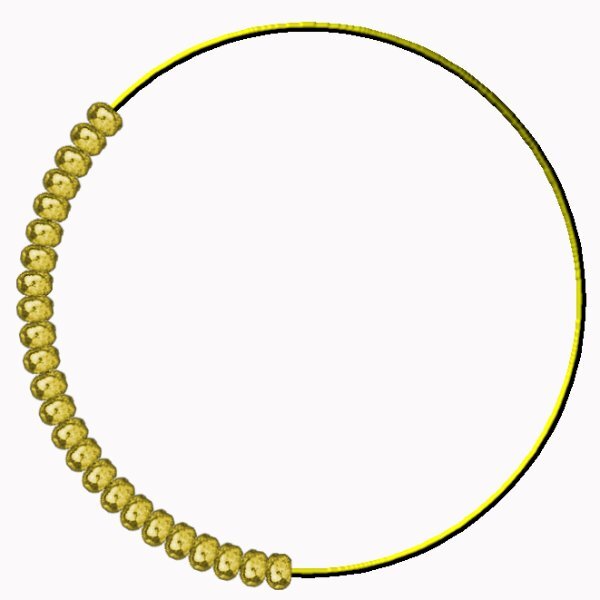
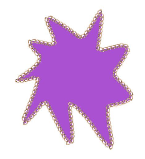
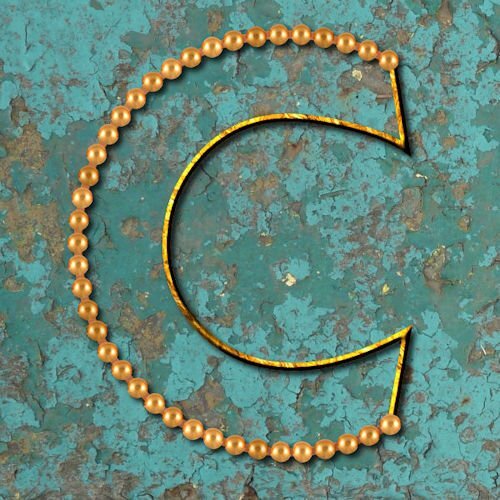
Here is Lesson 7, and it went smoothly. This time I used Cassel's ChainBead-08 picture tube. No problems with the arms or else... I wonder if the issue I had in Lesson 5 had anything to do with the image size or the number of nodes... Although I had clicked then numerous times on the center of the nodes, the icon (two curved arrows with plus sign in the middle) would not appear... That's why I had to move the nodes. Still working on the extra practice of lesson 3... I am slow!2 points
-
2 points
-
2 points


