Leaderboard
Popular Content
Showing content with the highest reputation on 07/08/2023 in all areas
-
This theme is another rerun from 2016. I had originally found the title back then; I removed the background and tweaked it. The closest I could come to matching that font was, believe it or not, neon machine from Dafont. I was lucky enough to find a watercolor silhouette of Africa from Seekpng that shared the same colors on the background for the dancers.6 points
-
5 points
-
4 points
-
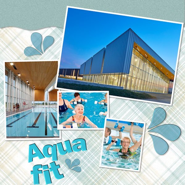
The building looks a bit like the pool I go to, same big windows. I too go once a week for classes also called Aqua Fit but for persons over 50! We have a lovely group and afterwards have a cup of coffee and a chat. Mostly the chatting already starts in the water but we manage to go along with the lessons too. Your layout is beautiful and reminds me of the one I did for the Alphabet where I used the letter Z for zwembad, which means swimming pool in Dutch.4 points
-
3 points
-
I'm in too. might be to skip a day or so, we are having our 55 marriage anniversary. the twelfth of July. But not a big party, my husband is not strong enough so our children want to arrange something. Don,t know when and where, etc.3 points
-
Lately, I have tried (and failed) to work on a layout, any layout. I'd spend time on one, look at it again later, and then move on to another. Just no mojo happening. Then, I was thinking of Bonnie's pickleball projects and got to thinking about my aquafit classes which I began in January. For a small rural area, we have an amazing sports complex cum library that has beautiful pools on offer. I planned to start then the lockdown came along.I've never been a water person, but I am loving the classes. I started with a Cassel template (from Lab 12-11) and tweaked and played with it. All the ingredients come from somewhere online. Two pix are of the aquatic area here, and the two with people in the pool are just grabs from elsewhere. I'm not sure we would be able to take pix while using the pools. Now, about those water droplets (splashes)...I was trying to make my own using Lab Mod 12-8, but they ended up looking like amoebas b/c I had so much trouble with the nodes! So these come from Janet Kemp at DS. Bring on the Vector Workshop so I can beat those nodes into submission! P.S. I don't do Lab Modules in order as others do. I skip around and try what catches my fancy.3 points
-
2 points
-
I still forget which is which, and what tool it pertains to. Not sure why I cant keep it in my head. I find I choose the wrong one first. yeesh, I have a 50% chance to guess the right one and usually dont.2 points
-
Julie have you tried it before with the precision cursor instead of that awful spear point? and have you made the notes bigger? (Just try to help)2 points
-
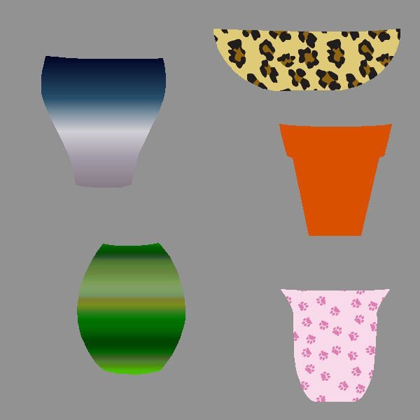
OK, Ann. You tweaked my interest in the vases. So, I downloaded them and will have to work with them. What did you mean that you set up your materials palette in order to work with vectors? Is there something special I am missing???? I'm in too for the workshop.2 points
-
2 points
-
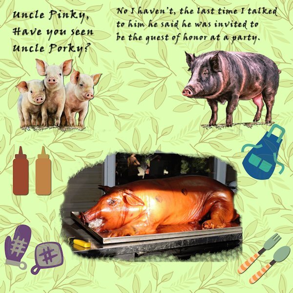
I love to eat quails.In my french country it's not an unusual speciality, but not gtilled, rather cooked in what we call a "sauteuse" or "cocotte", the whole bird sometimes filled with sausage meat, mushrooms, minced meat, foie gras, grapes and so on. Yummy!2 points
-
Being in any of the three pool areas is great b/c of those windows and skylight. It's almost like being outdoors.2 points
-
Beautifu color combination. I like how you shadowed it. The pink paper looks shimmery.2 points
-
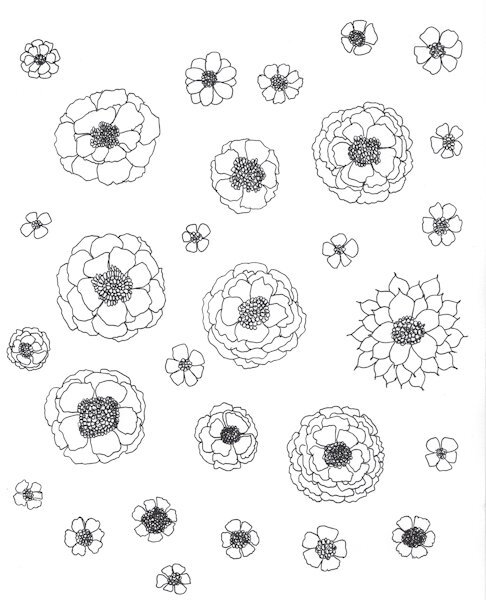
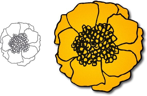
Anne, LOL! Here is what I've been working on. Florals of my own. I have pages of these, but have only scanned one, and of the flowers on that one, I have only colored and fixed up one. (Thought I'd give Susan a run for her money in the Turtle race.) Now that I have done one, I'm not sure this is the looking I'm going for so I'm going to try to fill with some paper-grain instead.2 points
-
2 points
-
1 point
-
Everything about this is beautiful. It is very dream-like, especially the background, it's perfect.1 point
-
Glad I asked. I adjusted the Leading to -1 and it was all over the place! I also wondered if perhaps the font type might affect it. So you've clarified. Thanks.1 point
-
The Leading is very finicky. Typically, you start at 0, where it should have "normal" spacing. If you want it less, use only a fraction like -0.2. That will let you see the change and you can adjust to have it closer (-0.4) or not as close (-0.1). Occasionally, some fonts are created with very large spacing. That has nothing to do with PSP, although you can use the Leading to play with it.1 point
-
I scrolled up and had another look. I do see the gradient now but it is very subtle. Somewhere, there are lessons on making your own gradients. I like your design and visualize making the back petals darker than the front and adding something to the stamens in the center.1 point
-
A scraplift is just copying the "format". The theme you give is up to you ?1 point
-
1 point
-
This is really nice Julie. Great choice of papers and elements. I love blues of any kind. That building is really cool looking, love all those windows. As to the Labs, that's the great thing about so many of them available. You get set your own course through them. Forwards, backwards, from the first, from the last or bouncing around...doing them in any direction (or no direction at all) is all that counts. They are great for getting experience with PSP and they are in nice short tutorials (less overwhelming) so you have success. I get the "no mojo" thing. That's why I got back into the Labs. After the QP workshop, I had no idea what to do, it made me feel quite restless, yet unmotivated. I guess I really am "project driven". And believe me, the ideas for layouts dont come easily. Sometimes I "see" the vision right away (this is rare). Other times it's days trying to make one work and still I abandon the layout. Having a template available is really helpful to get us making/creating layouts despite our lack of creative energy.1 point
-
Not sure though I think pin wheels could be used in a similar way to flower elements in layouts. I had another go because I wasn't happy with what I'd produced. Carole, I appreciate you producing these detailed tutorials because they really show the way things can be done in Paintshop - I always learn loads.1 point
-
1 point
-
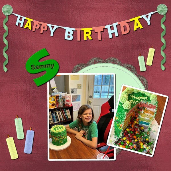
And on to Lab 11 Mod 2. Requirements: Letters dangling from a string - I chose to do Happy Birthday and I will save it to use later also - it was a challenging work; Cutout word on a letter - I chose Sammy who is the person celebrating with that humongous cake that spilled out candies - how sweet is that!!! Also required was a stitched vector shape: since I have used that tutorial in creating my alphabet for the 2022 Alphabet Challenge, I chose to use a round paper I had made previously which I had decorated with a crocheted lace (also made in a previous lab) and then stitched it (using a tutorial also). The candles were made in another previous lab; the ribbons are made from a Cass script - which I've colored and recolored and used over and over again in layouts; the stained glass brads I made from a stained glass pattern obtained from CF Spark. The background paper is Donna Sills Shimmer Paper which (if you recall) some months ago we colored and played with.1 point
-
1 point
-
here is my Image. It's a book review. Might be more of you have read the book. It was in 2019 America's bestseller. I've made all the attributes myself as background. And tubed the crawdad myself, which was enormously difficult. AI could not do the job. So it took some more time. But hurrah it's finished.1 point
-
1 point
-
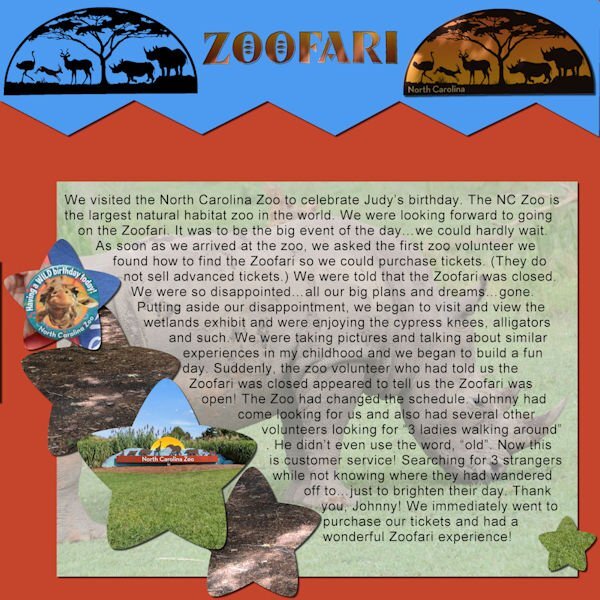
We went to the NC Zoo to celebrate our friend, Judy's, birthday. An amazing day from beginning to end. We were really looking forward to the Zoofari, an open-air truck ride to see animals in their natural habitat...up close and personal. All photos are mine. The text reads, " We visited the North Carolina Zoo to celebrate Judy’s birthday. The NC Zoo is the largest natural habitat zoo in the world. We were looking forward to going on the Zoofari. It was to be the big event of the day…we could hardly wait. As soon as we arrived at the zoo, we asked the first zoo volunteer we found how to find the Zoofari so we could purchase tickets. (They do not sell advanced tickets.) We were told that the Zoofari was closed. We were so disappointed…all our big plans and dreams…gone. Putting aside our disappointment, we began to visit and view the wetlands exhibit and were enjoying the cypress knees, alligators and such. We were taking pictures and talking about similar experiences in my childhood and we began to build a fun day. Suddenly, the zoo volunteer who had told us the Zoofari was closed appeared to tell us the Zoofari was open! The Zoo had changed the schedule. Johnny had come looking for us and also had several other volunteers looking for “3 ladies walking around”. He didn’t even use the word, “old”. Now this is customer service! Searching for 3 strangers while not knowing where they had wandered off to…just to brighten their day. Thank you, Johnny! We immediately went to purchase our tickets and had a wonderful Zoofari experience!" I used a template from Day 6, Journaling Challenge, August of 2022.1 point
-
Well, guess what? I have one more QP for the Day 8 assignment. I downloaded a few from Digital Scrapbook and this one is from Marisa Lerin called QP-Slovenia03. I decided to combine this with the Random Challenge to tell a personal story. The title font is Corlita Sans; the journaling is in Droid Serif. Behind the text I brushed some dark blue with a brush called cass-Dispersion2. The journaling is a bit small so I'll repeat it here;1 point














Resized.thumb.jpg.d25811db03a63358cedab1e79f527635.jpg)
