Leaderboard
Popular Content
Showing content with the highest reputation on 06/28/2023 in all areas
-
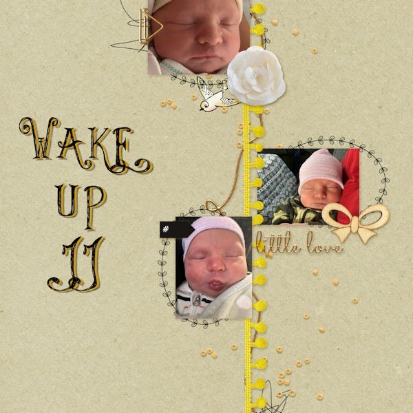
I searched in my folders and found this QP, I used a photo from my DD, and added only the date8 points
-
8 points
-
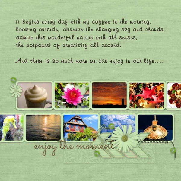
Even if it is "officially" over, I'd like to add QP 7. All photos are mine. A greater choice of totally different pics, not what I do usually but to show a bit the diversity of interests. Of course there is more than this. The font for the text is Freehand591BT. My coffee cup looks really like this ?, I use a milk foamer/frother, but not an electric one.8 points
-
8 points
-
7 points
-
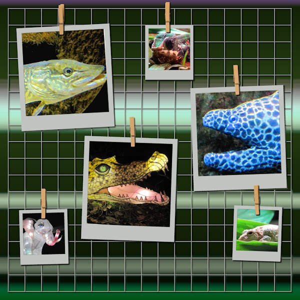
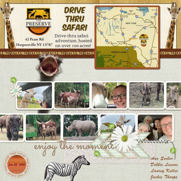
QP-7 - Our drive-thru safari. This layout was good for all the animals that were around and almost inside our car! The font is Brush Script and the ostrich head came from PNGALL. I scanned a flyer from The Preserve for the details and map on top. I will also post this in Facebook and in the comments post the little, very funny video that Jackie did from the front seat to the back and you'll see what I mean about the animals almost "in" the car. ?6 points
-
6 points
-
5 points
-
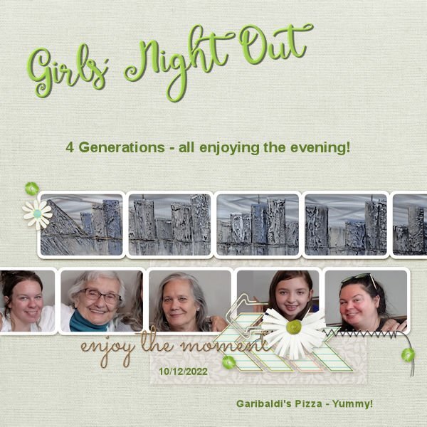
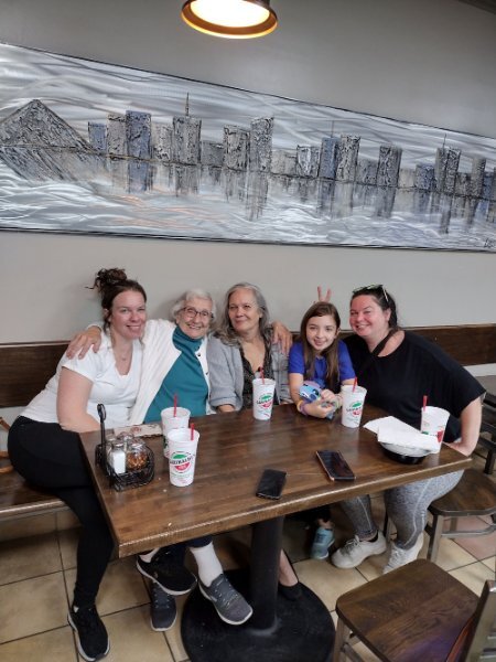
And now here is QP 7. Hard to fit those heads in the spaces. I had to take out part of the flower and clip in order to fit in Emma's head. All were taken from the same photograph. We were in Garibaldi's and the picture behind which covers all of the top layer is one that fascinates me at Garibaldi's - it was behind us in the group picture - it is a metallic take on the Memphis scene taken from across the Mississippi in Arkansas.5 points
-
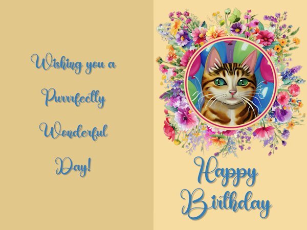
Here is my Non-Scrap project from Day 5 - The Greeting card I used the Creative Spark feature for the cat picture, I love to play with that option. The font is Birthday from Creative Fabrica. I used the method Carole showed us how to keep text aligned in the center by using the selection tool and drawing a rectangle, etc.and adding the text. Carole, you asked which elements I used on Day 8 to add to the template. The large picture with the musical cats is from Creative Fabrica and so is the little birdie on top of the musical notes. The musical notes are from my stash from years ago and I don't remember where I got them..4 points
-
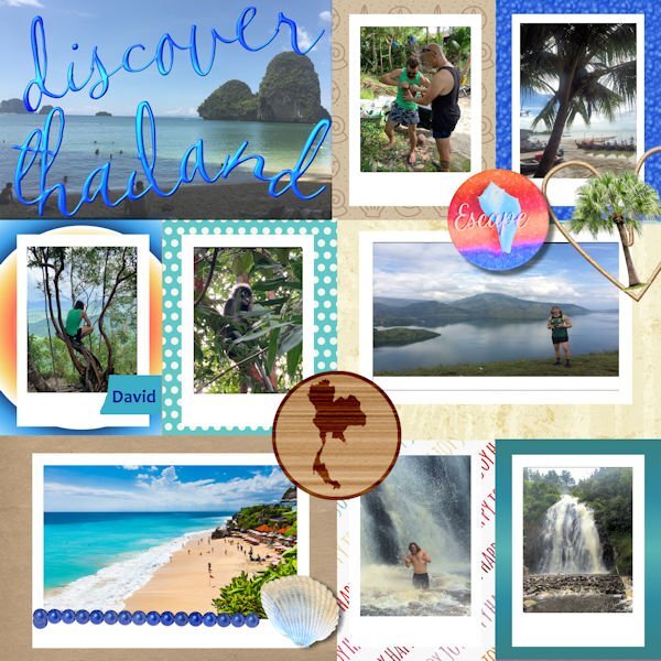
I used a qp that I downloaded a while back from Digital Scrapbook. The original file was a PSD and opened in Paintshop with layers. I could not figure out how to make the picture files into masks probably something to do with the PSD layout. The photos were sent to me by my grandson when he visited Southeast Asia prior to Covid(He made it home just in time.) The font is CallieHmk that I got when I installed the Hallmark card program. The palm tree is a tube, the map of Thailand is from Pixabay and added to the wood based on a Scrap tutorial. The shell is from shell pictures that David sent from Thailand. Escape is from a Digital Scrapbook kit.3 points
-
3 points
-
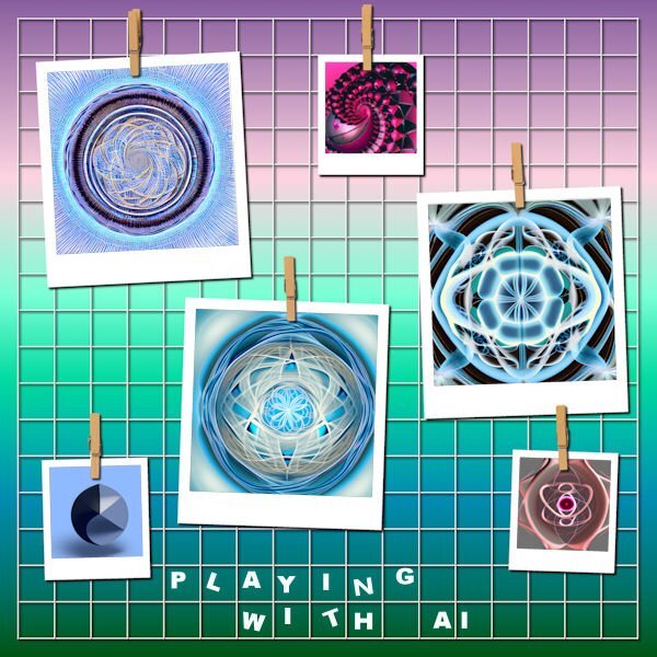
Susan, I'll try to post another AI I made with CF Spark and what I did with them in PSP. So much fun - playing with them in PSP is a lot of fun. I still have one I made when I first found cF Spark but have not played with in PSP. Not sure what I want to do with it. Any way these are the latest ones and what I did with them in PSP. - too large - will have to post my PSP patterns in the next post.3 points
-
3 points
-
3 points
-
3 points
-
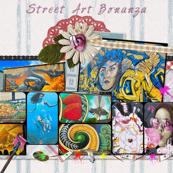
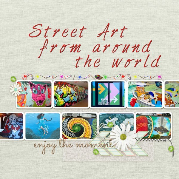
Got there eventually and decided to keep to the same colourful theme of street art. I have replicated some of their artwork and used the 'Art Group' Picture Tube for extra decoration. It has been a fun workshop and has been good for practicing PSP with basic templates as well as good for the creativity. Thank you Carole and thank everyone in the forum for their ideas and comments. Now back to training for my hike!3 points
-
Ik heb een penseel van een kwal. Ik werkte in het nieuwe frametool. Nieuw voor mij. Na meerdere verkregen een andere mogelijkheid. Ik plaatste de kwal in de vorm. Probeer vervolgens welke mogelijkheden er meer waren. Ik ging naar REFLEXTIE>EFFECTEN>CALEIDOSCOOP. Ik HEBT DE KLEUREN FFFF5 en C5dade GEBRUIKT. Gemaakt van een kwal. Het frametool heeft nog veel geheimen voor mij. Maar er is zeker veel mee mogelijk.2 points
-
Kasany - for this last group that I showcased I went to CFSpark Prompt Builder. It started me by showing different words I could use. It was interesting because I would not have thought of starting with a color background and then moving on to different layers. The outcome really astounded me too. Some of them I will use separately and some I brought in to the Reflection Effects in PSP. I'm using PSP 2022 Ultimate.2 points
-
Gerry, yes. They looked healthy and content. The welfare of wild species in captivity is one of my passions, especially wild cats and my zookeeper granddaughter is following in my footsteps.2 points
-
Yes, we do have a few 'little libraries' in our town. I haven't used any myself, but when our children were little, we had our own 'little library' in the house. It was a small angular hall closet with floor to ceiling bookshelves all around and a light overhead. Just enough room for a comfy foot stool! That's where we often found one of the kids, especially our son who loved to read. They also had books in their room, but this was our own 'little library'!2 points
-
2 points
-
I think me and their AI dont speak the same language. I have tried and all I get is hideous stuff that isnt anywhere near what I "thought" I described. It's same as when you contact a company and they use a AI help "person". You ask a simple question, how do I find my monthly invoice, and it sends me to look at how to hook up my new streaming box (that I didnt order, cause I already have one).2 points
-
Quick Page Day8 Quick Page from Digital Scrapbook (Marisa Lerin - Tunisia Quick Page 01). Photo is mine, very old...actually comes from a negative that is too old to reprint now. I scanned a smaller print (the one hanging up is 17x22 and would not fit the tiny old scanner I have) version I have and it lost all detail in the shadows. I chose this photo after I was looking for a Quick Page and saw right away, the color was perfect for that photo. This the quickest Quick Page I've done to date. Fonts: Resnick and Reneo (Creative Fabrica). Thank you Carol, for a wonderful workshop. I have enjoyed all the variety of layouts everyone produced. The active forum was fun and I looked forward to checking in to see the new pages and reading the comments.2 points
-
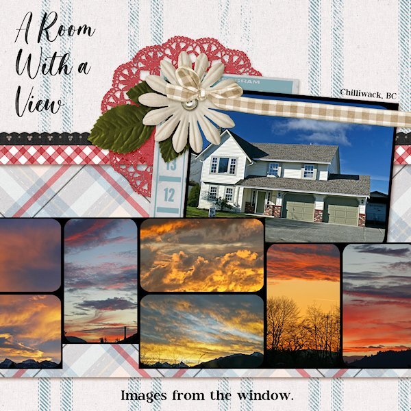
QP Extra Lesson 7 I didnt change anything on the page. Photos of crazy sunsets taken from the windows (front or back) of my house in Chilliwack (British Columbia). Being in the Fraser Valley, surrounded by mountains it was a treat to have days that there was a sunset. Normally we'd have grey sky days. Where I live now, there is less rain and sunsets almost everynight. Fonts: Magista Brush and Maxim from Creative Fabrica.2 points
-
Here is a challenge to do something that might not be repeated in other months. Just an idea that popped like that (and you can also send me suggestions for occasional random challenges too). This time, let's talk. Use at least half of the space of the page to share a story. It can be a funny one, a serious one, or even an imaginary one. Here is one example of a large area for a story. For ideas for templates to add lots of text, check this article. Post your project in the gallery.1 point
-
English is my native language and still it doesnt understand me. The post from Mary earlier talked about something called CFSpark Prompt Builder. I will have a look for that. Maybe that would help us. it seems to be all about time doesnt it. Do I have the time to put into learning to "talk" to CFSpark or should I be concentrating on learning how to do something else I need to learn. Do you find if you try to learn it all, then you spread yourself thin and nothing really soaks in well enough. That's me. I can go off in many directions and then never really get anywhere. However, we should find time for play, with other techniques because good suprises often come out of it. Argh...my kingdom for more time!1 point
-
Thank you Monique and Susan. When my friend sent me the images when they were on holiday each one wowed me. The imagination and the skill those artists have. Yes, I can't resist the colours. The little bit of black helps.1 point
-
1 point
-
Here in my street was such a library, not for books but for films and music. CD ROMs and videos. I brought them something a while ago. As well as equipment. But it's gone now. I don't know if it was stolen or if they removed it. I'll ask after it what has happened.1 point
-
1 point
-
There are a few in my town but I've never used them. I do know where one is on the opposite side of town. I have heard of a couple others but they aren't in areas of town that I go to so I haven't seen them.1 point
-
These are fabulous. Such interesting and intricate designs. I can see how you would get lost in playing with them. I love pattern. And weirdly I never used to like patterned paper, but I'm really like the seamless ones Suzy and others have been making.1 point
-
1 point
-
Thank you Corrie, for giving me some insights to think about for printing. Even if I just did my favorite layouts for a book for myself, would be a cool thing to have and like you say, to show people what I do.1 point
-
We probably did play some arrangement of it. In addition to our solo work, we did a lot of organ/piano duos and piano duets. As soon as we sat down, our differences (and there were many!), disappeared.1 point
-
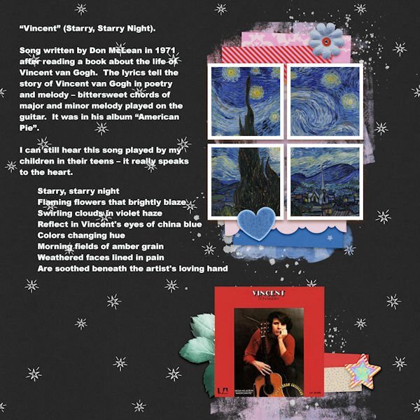
I love this song, I listen to it on YouTube, very often, again and again, most of the time before I go to bed.1 point
-
1 point
-
Gerry - I loved that movie and that song. When will they write songs like that again? Did you and your sister play this on the piano???? This layout is really COOL!!1 point
-
Deze aanbieder ken ik niet, zal er eens naar kijken. Ziet er mooi uit!?1 point
-
1 point
-
1 point
-
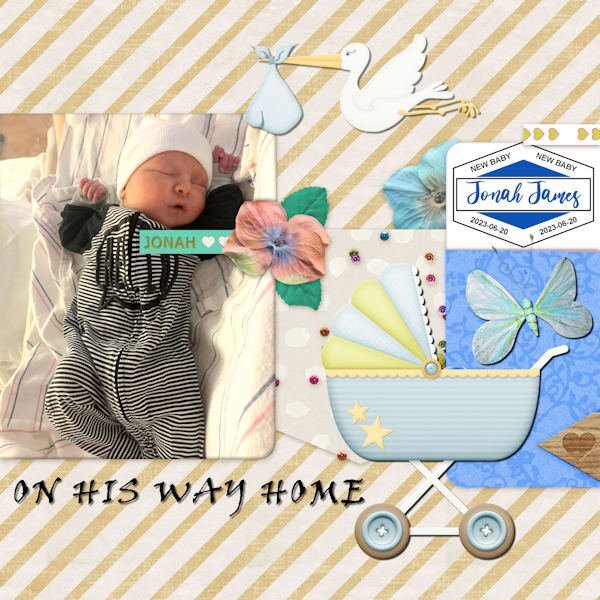
Getting started on catching up. I've been traveling around with family since Thursday so I'm WAY behind! This is QP- 5 - featuring new gg Jonah James on the day he came home from the hospital. The font is Viner Hand for the title. The label on the right was from Carole before she released her new script.1 point
-
1 point
-
1 point
-
and now the last day, showing you my mom through the early years, font is Rafting Script1 point
-
1 point
-
1 point
-
That was a great reaction from your daughter and very rewarding for all the work you put in!!!1 point
-
1 point










Resized.thumb.jpg.d25811db03a63358cedab1e79f527635.jpg)


