Leaderboard


Popular Content
Showing content with the highest reputation on 06/15/2023 in all areas
-
Sorting through my photos this evening, placing them in their relevant folders. I decided to make a start on showcasing some of them. I used Carole's special fonts for the lace edge, and to decorate the labels. Add borders tool. A simple layout.
 10 points
 -
The background paper I used is from CF's Tangerine Dreams set. I found the illustration years ago, probably on a Google search (the game is repeating the daily themes from 2016, but I'm trying to create new pics every day). I clipped the girl and added her on top of the background layer several times at very low opacity; I'm not sure if that made the BG look too busy. Cass's Mitered Corner Frame script is one of my favorites and saved me a lot of time creating this frame. You can't see it at this size, but the ribbon frame has a Multiply blend mode, letting the background show through a bit. The font is Anton.9 points
-
I just ADORE the Hilda pin-ups by Duane Bryers so I thought I would have a little fun with this theme. The font is Morning Sun.9 points
-
I absolutely fell in love with this sweet little face. The fonts are Bubble Bath and Jellyka - Love and Passion. I created the background paper using the Balls and Bubbles effect (Artistic Effects).9 points
-
I played with the shadow box I started several months back. I added some colour and adjusted the shadowing. I think it's still a work in progress. Once I'm happy with it I will add a greeting, as it's going to be a 5x7 ecard.
8 points
-
Hi, I thought I would put in what I am working on. I like to make photo books and I am in the process of doing one for our Alaskan cruise from 2018. Yes I am way behind. I usually use Shutterfly to print, so I use there standards sizes. I also do double page layouts. For this one, I started out with a plain blue background, then added some overlays, and blended them, and also added some spots with a brush, then faded them out. I scrap lifted the format from an Indigo template 34, using a mask I purchased from the Indigo template 47. I got most of the elements from Design bundles - Nautical Water colour clipart collection, and Pixel Scrapper Beach elements Blog train from August 2013. My title is the font Calistroke, & the journal is DB Sweet Everyday. I did my frames by doing selection borders, which I learned from a Carole class. (Thank you.) I have learned so much from these classes.
7 points
-
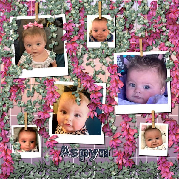
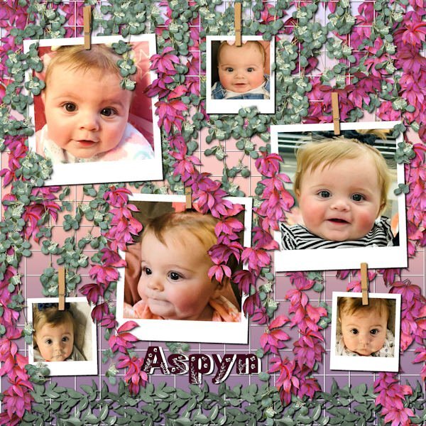
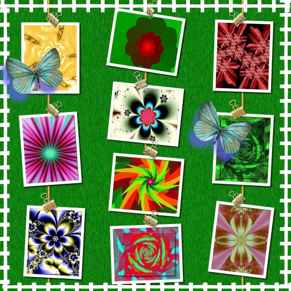
Still playing with Carole's hanging photos, this time with the grid background. I ended up with multiple layers of hanging picture tube vines. This is still Aspyn Dionne, from my last layouts. I finally used all the photos that her mother, Kristan, posted. This turned into a double page, or actually, two coordinated pages. This layout only used 6 photos each and I had 12 photos.
3 points
-
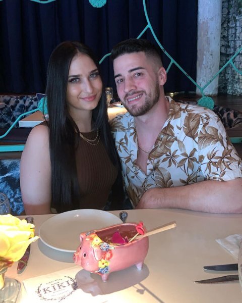
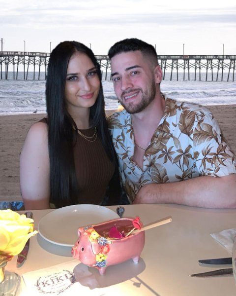
I was reviewing the Back Off Master Class when I realized with the newer versions of PSP we have Artificial Intelligence built in that promises to change backgrounds easily. I tried it with a photo of my grandson, Brad, and his girlfriend, Livia. The original background was quite dark and I replaced it with a beach scene offered by my PSP 2023 Ultimate. Here is the original and the digitally changed version.
2 points
-
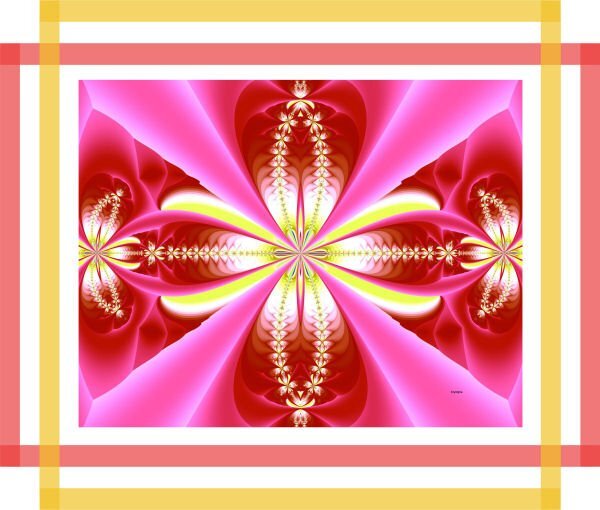
My recent work with my fractal and free Carole's frame. I like use it because this frame changes nothing in my fractal. It's only a good, fine frame which my fractal needs.
2 points
-
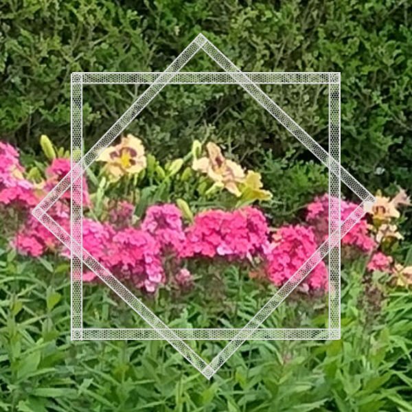
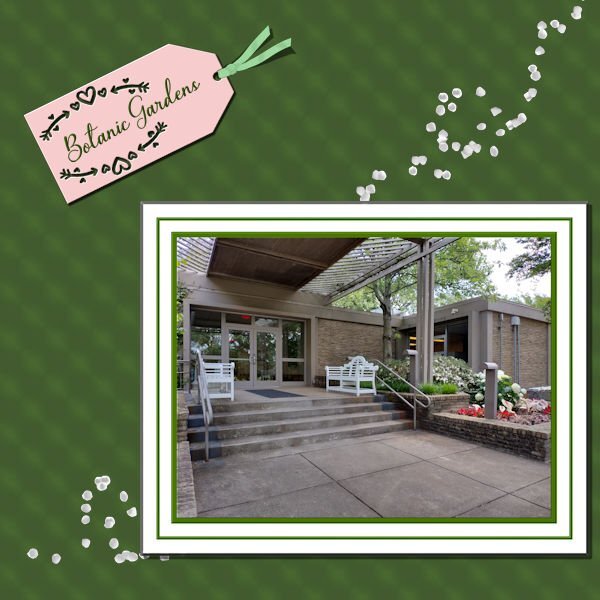
This is another Botanic Garden picture with Cass freebie transparent ribbon used as a frame
2 points
-
I think it would simply be a matter of layering straight lines in different colors and adjusting the opacity. It might be a bit tedious to do but it is not hard. Maybe a tutorial?2 points
-
Interestingly, I was doing my weekly movie theater work and came across this logo for our new Disney movie, Elemental. The font reminds me of Carole's new frames. I'd to know how to she created this effect. I'm posting a snipped so you'll see what I'm talking about...
2 points
-
So many wonderful pages being created with such varied topics, also many varied topics being discussed. I've now finished playing around with these lovely, quite different frames. I now have several templates for future use.
2 points
-
I made this for the Paintshop Maniacs page from a photo that I took at Colonial Beach, VA and my own mask. I used the shape cutter for the letters, then applied the cass-edges script. I applied a layer style bevel and emboss to the blue layer.
2 points
-
Hi, I'm back from my journey to visit my daughter & co and have been reading all the comments in the different sections of the Campus for over an hour now, you all have been busy! I had a massive jetlag and although I attended the masterclass this Sunday I definitively have to rewatch it, nothing registered with me. I have had a great time and am starting to make a photobook as I did before. I'm going to make a scrapbook page as introduction to the different topics of the book. After each intro page comes the "normal" pages with all my photos and stories. I don't do all the pages as a scrapbook page, that would take me months to do and family and friends over here are waiting to see my book with all the photos! I'll show the different intro pages as I finish them in this section of the Campus; they are still in random order because for some I need to do an internet search. This time they are rectangles because my book will be a rectangle and this way they cover a whole page, which I regret not doing last year.
2 points
-
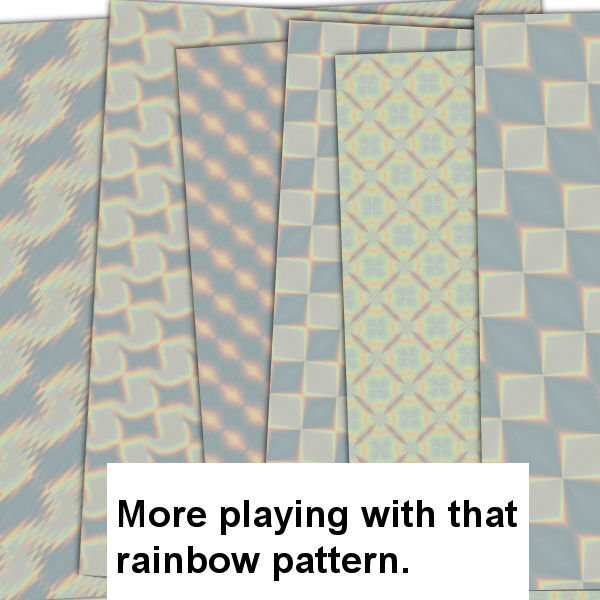
These are some more papers that I made while playing with that rainbow pattern
2 points
-
Thank you, Mary. I used to do mitered frames myself and it took me a long time. This script is well worth the money.1 point
-
You were correct. The "wrong" result works fine in your hands.1 point
-
SO if you can’t decide, maybe your V page should be “vacillation”? ???. Meanwhile, on this patterned paper, I like that you took the time to have one car with luggage facing right and one facing left with slightly different colors. It’s a little detail I appreciate.1 point
-
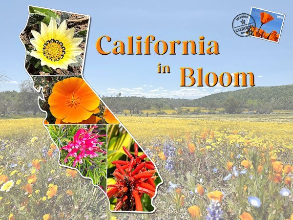
The next one. I was working on another layout but I didn't like what I came up with and made this one instead. I didn't see the full extend of that glorious bloom, only the last of it when I arrived but I have taken so many flower photos that there will be a selection in my book. The background consists of 2 photos taken by my son in law when the family went to admire that bloom. I merged them together with a mask. The template of the State is by Marissa Lerin and I filled it with my own flowers. Carole's stamps template came again to good use as well as datestamp 12 script that I bought in the last birthday sale. Font is Perfectly Vintages that I use throughout this project .
1 point
-
A friend from my betta fish group posted some photos of her 9-month old cutie and I snagged one to try with Carole's frame freebie, using Sue Thomas' work as a guide. Here's Aspyn.
1 point
-
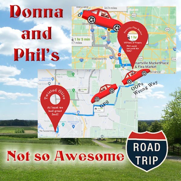
We were headed to the Hartsville Flea Market, but the parking lot was so helter-skelter that Phil decided to leave since he couldn't park his baby (red Toyota Camry SE) safely to avoid dings. We will be taking more day trips now that hubby now longer has to pick up kids. GPS has greatly improved now taking construction and traffic jams and rerouting you. It saved us hours in traffic once returning from a trip to Windsor, Ontario.1 point
-
Very nice, Sue. It looks like she’s saying, “Yes, May I help you?” at her front door. So if you shadow the photo, will you treat it like a stamp and be offsetting that semi-translucent frame everywhere it crosses the edge of the photo? That’s a lot of offsets! (Read:That’s a lot of work!)1 point
-
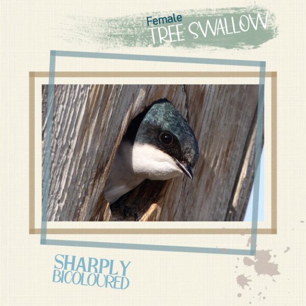
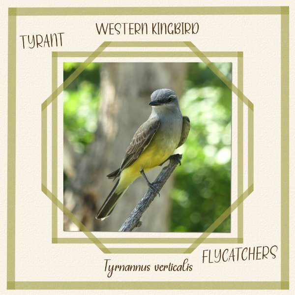
Thanks Michele. 6 of the 10 tree swallow nest boxes are occupied this year.The parents occupying this box are busy trying to keep up with the constant demand of feeding young. I suspect they gave 4 nestling. I'll find out when they fledge. I have photos of youngest popping their heads out of holes. I appreciate the shadow comment.1 point
-
I love how she's peeking out of the hole in the tree, Sue. I imagine she could be protecting a nest of eggs? I like it quite a bit without the shadows.1 point
-
To add a shadow to the photo, that is the question. I have added shadows to the others, but left this one, in my opinion naked. Personally, I would add a small shadow. I do know how to add a shadow to paint at the edge of a photo or paper. When I get a minute I'll do one for you all to see the realistic effect. It's in one of Carole's tuts or masterclasses, which one for the life of me I can't remember. All I know is it was a long time ago.
1 point
-
You could use this photos for a layout ....Ann ?1 point
-
Ann, that turned out very nice! I gather you can tell the script how many photos you have to place because the samples I’ve seen have way fewer photos. I like it with more photos, I think. Bonnie, you are on a roll! Three great LOS all at once! Donna, we have THE WORST luck with GPS - always our fault - always a mess. My husband loves it, tho. (Rolling eyes). I was surprised to see the little town where I was born on your map, Alliance, Ohio! My husband and I have taken a few day trips this summer with more to come. I come up with the ideas and he says, “sure”. And then they end up being not quite as I advertised. This last one was an overnight, more or less in that area, Shipshewana, Middlebury and Napannee. I do not think we will be going back, but the 18 mile bike ride on the Pumpkinvine Trail was really good. (Hence my bicycle kit from last month). On the way home, we got sort of lost and we were not on the grid. At all. No Apple, no Google, no VW Car care, no GPS. We just kept driving until we hit civilization, where I could ask a person how to get home. I think it added an extra hour to the trip home and it was completely ridiculous.1 point
-
I love this layout. this is me. i have a horrible sense of direction. I laughed at the "Oops Wrong Way".1 point
-
Girl's Weekend included a pickleball tournament, the beach, ice cream and more! The tournament raised over $31000 for Cystic Fibrosis.
1 point
-
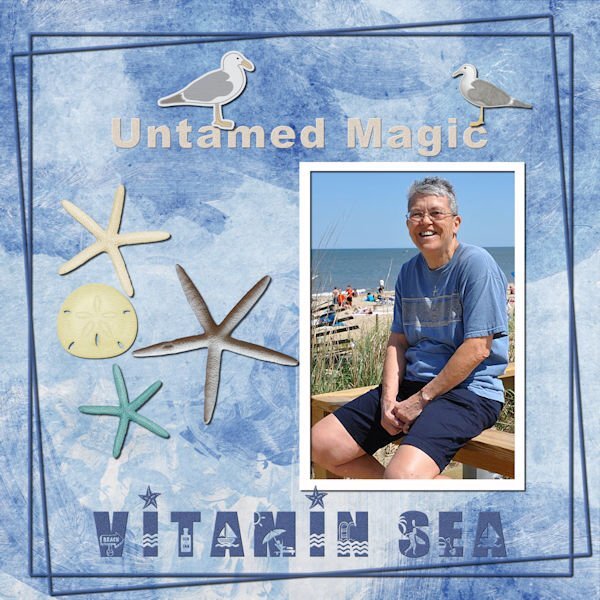
Just playing with this one. This is a favorite photo which I "misplaced". When I found it, I created a layout. Template 167 from Lady 22. Background paper by Marisa Lerin, paper 38, Coastal Papers Painted. Gulls 01 felt by Marisa, Coastal Elements. Teal starfish, White starfish and sanddollar by Sheila Reid, At The Beach Elements. Photo from May, 2010.
1 point
-
77th birthday for our friend, Judy. You may remember I asked about the font some time back. The text and the pickleball girl were on her birthday card, so I just added to my layout of her friends who gathered to celebrate.
1 point
-
Phil and I decided to make some day trips, one of which was hilarious because he told me he knew where he was going. After going about 15 minutes in the wrong direction, I finally turned on GPS. I have made a vow to always use GPS, especially when he says he knows the way. In fairness to him, he did a good job navigating Windsor Ontario with no GPS.
1 point
-
Thank you for kind words. Everyone has been busy creating wonderful pages. I've been making the most of summer, and everything it has to offer.
1 point
-
This morning in the latest email, Carole has another new script called Paint frames 1. I'm always looking for new ways to showcase photos and these frames are awesome. I've created the rectangle frame with corner boxes before, but not with the a higher opacity that overlapping or another coat of paint would give. Anyway I gave it a go. Although the script would have been quicker, these frames were easy to create. I added some noise
1 point
-
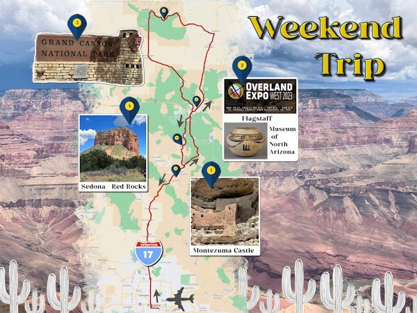
This is my next intro page and it is about the weekend trip we took to Arizona because my son in law wanted to go to the Overland Expo! He went there for one and a half days and had the time of his life. My oldest granddaughter went with her dad for the first 1/2 day while the rest of us (my daughter, youngest granddaughter and I) visited the Museum of North Arizona that has an amazing art collection of the Hopi's, Navaho's, Apaches and other tribes. En route from the airport in Phoenix to Flagstaff we also visited Montezuma Castle, a big pueblo build inside a cave. The second day, son in law again to the Expo and the rest to the Grand Canyon, which is hardly to describe, spectacular!!!! The third day on our way back to Phoenix we visited Sedona and the Red Rocks, which were also very, very beautiful. Near Phoenix the highway is through the desert, another new experience for me. It were 3 days packed with so many new adventures and of course many photos to remember it all. This page took me a lot of time to do with all the tiny details. The font is Perfectly Vintage and photos are mine except the flyer of the Expo which I found on Google.
1 point
-
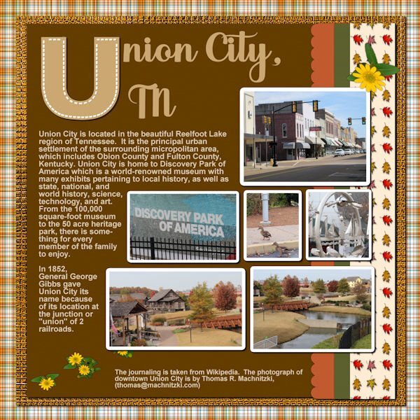
Have now finished U in my Alphabet Soup Album. On to V. Might be Valentine - not sure. All elements and papers are my own as well as the pictures taken at Union City. I have noted the photographer of the city picture and where I got the journaling on the layout.
1 point
-
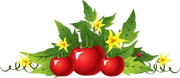
Suzy, if you'd be interested, I found this .png on Pngtree and it includes the fruit, greenery and flowers. It's really large, about 3600 wide, so I made a reduction to show you here. If you want the large version, I'll put in up in our Scrapbooking with PaintShop Pro Facebook files. I had to make a .jpg to post here but the original is a .png with transparency.
1 point
-
MyLittleFractalGarden. Fractal flowers created with Fractal Explorer. Carole's template, free garden's fence, a background of the picture created by me.
1 point
-
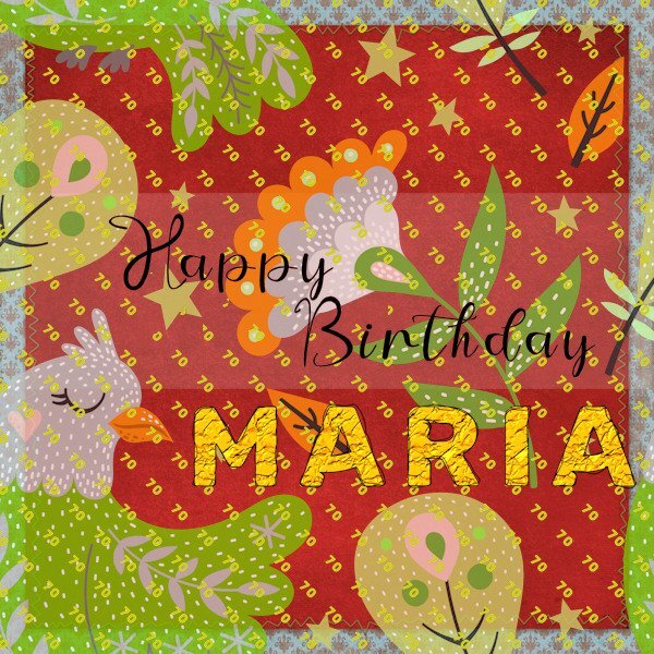
I have a couple of greetings cards to make so for the first I have utilised an effect for text from the recent master class 'Perfectly Imperfect'. For the main fill layer for the 'Maria' text I used Effects/Texture Effects/Texture 'Crumpled'. The Shininess was set to 47% which seemed to create more a gold look. I made 2 outline layers and used the Warp Brush on both. The lady in question is quite dramatic so I hope she will like the bold colours. It's her 70th so I used the pattern palette fill having created a little '70' image and kept it open on my screen in the process.
1 point
-
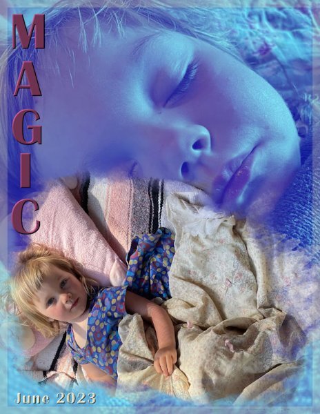
I'm rather pleased with how this turned out considering I had no template. I created the mask and ran the raster-to-mask script. The background photo has an overlay layer effect. The font is Britannic Bold. Here's MAGIC!
1 point
-
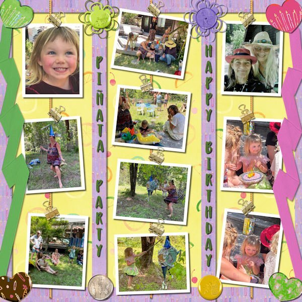
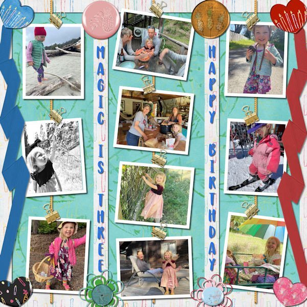
I did a two matching pages to celebrate Magic's 3rd birthday. They had a fun pinata party. They sent 10 photos so it worked with Carole's new Hanging Photos 2 template. I totally used a birthday mini-kit from Melissa Lerin. I'll try to post a preview with the two layouts.
1 point
-
Freebies are great resources that you can find in many places to build a library of elements, graphics, and tools. Since they are free, they are available to all. For this challenge, grab these graphics from Creative Fabrica (and yes, it is free). You can use these as frames for photos, journaling, quotes, and more. Grab this font HERE. How will you use this font? Remember that you can colorize these graphics using the tutorial in this blog post.1 point
-
I am the lucky one who won the wool2 tubes from Cassel and I tried something with it. The background paper is by Marisa Lerin Own pictures. Our daughter's dog regularly comes on holiday for a week while she is on the move for work.1 point
-
I love dandelions even though there are none in my grass. My flower bed had some nice big ones that I managed to photograph before the landscaper put weed killer on them. I extracted the fluffy dandelion and added it to my dandelion picture with some extra leaves that were also extracted. The seeds were created using Particle Shop; the sky background is from a desert sky sent by my grandson. The mossy boards are from a photo sent to me by my daughter. Font is Anabel 1 grunge.
1 point
-
OK, Sue. I added shadows. Since I had merged the papers and frames around the picture, I chiseled the group and then shadowed it. Also decided to do a flip on the ribbon and had separated the shadow for it. Also, decided that it needed something more - just too stark as it was, so I added Cass scattered petals.
1 point
-
I've seen those "monograms" and I'd actually call them Alphas. I used some back with our alphabet series. They appear in my files under Polka Dot Chicks Designs and have a Gingerbread Christmas kit and one other. Here's one of the letters used. It has a subtle polka dot design. BY TAMMY AND SHELBY
1 point
-
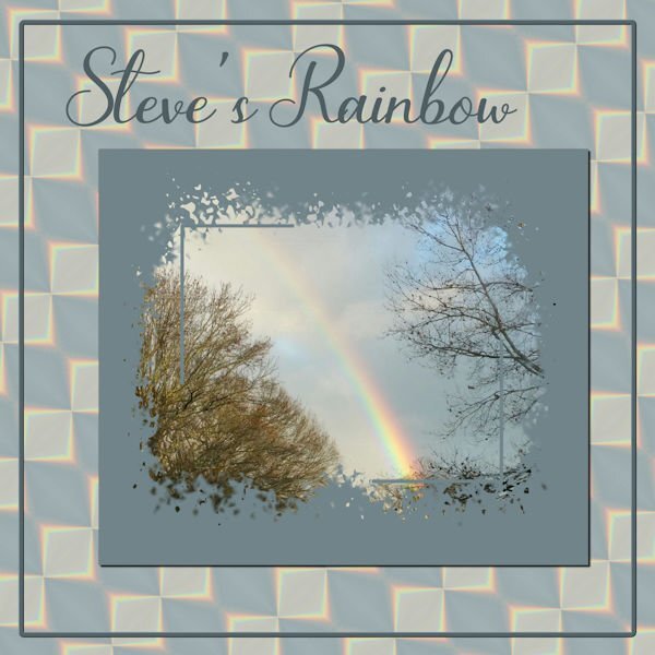
So, I'm playing with Steve's Rainbow again. I took a section of the rainbow and played with Effects>Reflection>Feedback and came up with one I liked; put it on a larger canvas size and duplicated, flipped and rotated it until I had a pattern I liked and then made a background paper of it. Used Cass' Mask from Mask Workshop Extra 3. The font is Bluebell. Canvas frame is of course from a selection and inner bevelled.
1 point
-
I was surprised to learn I won the Phrase Strips script! I had to play with it which took a bit of time as I made the adjustments to the script itself (as per instructions included) and needed some help from Carole. My deadlines for two projects are now behind me (other stuff) and I can get back to PSP time. I like the "idea" of this layout, but I'm not entirely pleased with the harsh white background. I had to leave it like that b/c I'm not much good at extracting an image and getting a transparent background (the sketch of Mrs. Roosevelt). If I changed or softened the background, then the borders of the sketch were too visible. It's a skill I have to acquire.... Otherwise, I'm happy with the phrase strips and how to use them. Thanks Carole!
1 point


Resized.thumb.jpg.d25811db03a63358cedab1e79f527635.jpg)


.jpg.c5c7ecaab5bf116de9f63e018dd7905e.jpg)