Leaderboard
Popular Content
Showing content with the highest reputation on 04/02/2023 in all areas
-
Day #7 Very fun lesson! Fall/Autumn is my favorite time of year. I will definitely Use this Title in the future for a scrapbook page. I have saved the titles in PSP format so that I can still use them, and tweak them if needed. So many possibilities! (so little time) One more day to practice and learn new techniques from this workshop....5 points
-
Day #6 Still poking along...definite time crunch lately, sorry I had to cut corners but I really wanted to participate! I am trying to keep into this, I really enjoy the group. The posts have been outstanding! I used a sunflower tube for the O, for the script I used the rope knot from my older version (Jasc 9). I thought the yellow kind of reminded me of the petals on a sunflower. Thanks to Cassel and everyone for a great workshop....3 points
-
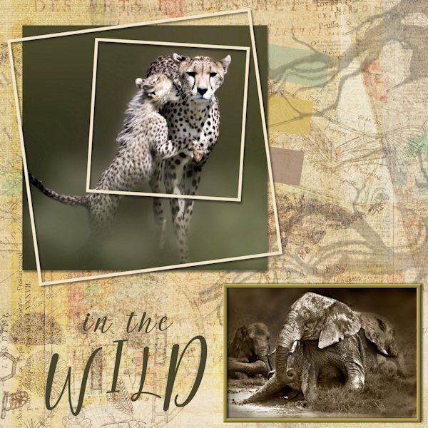
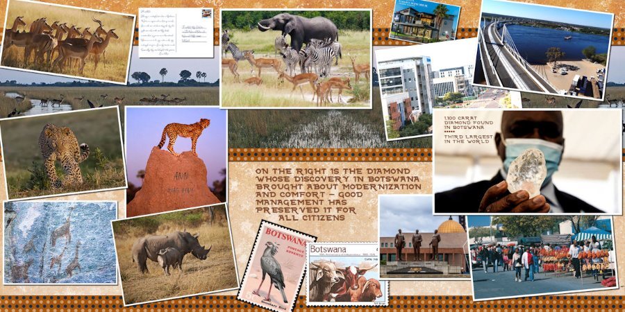
I like these challenges. It keeps me on my toes trying to create something worthwhile. I have no gift for layouts so using someone else's ideas is helpful. The background paper is from Digital Scrapbooking, Melo Vrijhof, called Animal Kingdom collage paper. I added the outlines of gnarly tree branches to the background and adjusted the opacity. The frames are vector shapes with effects added. The photos are by Bobbi Goodrich, a US photographer and artist. Her work is outstanding. I've had them for years and wanted to do something with them.3 points
-
2 points
-
2 points
-
2 points
-
2 points
-
2 points
-
Yes and no. Being double pages, they are still two separate 12x12 pages, but made to be together as a unit.1 point
-
I'm signed up. In the past I've created travel pages (real and fantasy). It was really fun to do a set of pages for a trip to Botswana, Africa, which I'll never do IRL but admire from reading about the country in the No 1 Ladies Detective Agency book series by Alexander McCall Smith. I'll show you a sample. The very first project I did when I joined the Campus was double page layouts illustrating our family vacation to Acapulco, Mexico. Not sure what I will do this time around. We'll see...1 point
-
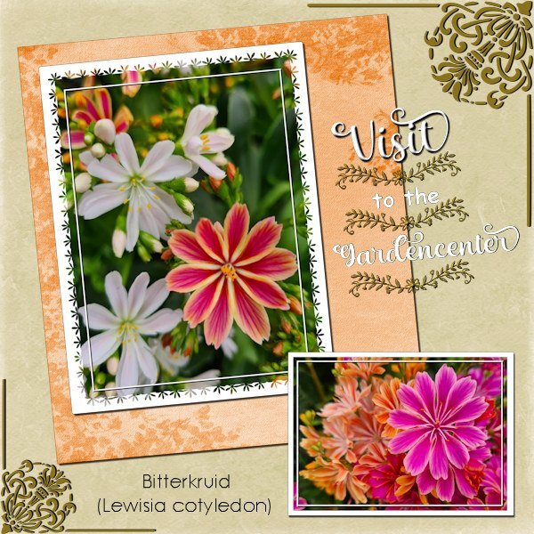
A couple of days ago we went to a gardencenter because we needed some compost and this lovely flowers caught my eye and of course I couldn't resist taking a picture of them. And I needed a change from the Build a Kit Workshop before I will wrap that up! The fonts I used are: Christmas seasonal (why it is called like that is beyond me), Floral dividers (a dingbat) and Century gothic. Background papers come from my stash. I made a simple mask for the biggest of the 2 photos inspired by some of the ones Sue Thomas has done some time ago. This is just a starting point for me in making more and different masks myself.1 point
-
1 point
-
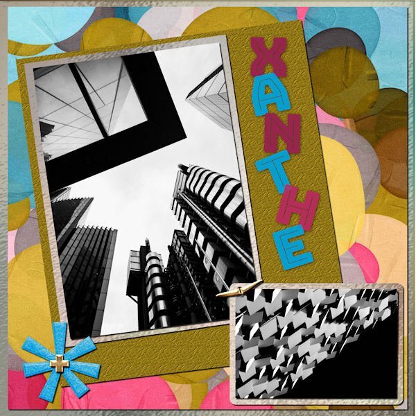
I did the March Sketch Challenge. I used a kit called ps-rachel-martin_xanthe for any papers and elements. The photos are random from Mike Hindle on Unsplash. The font is Bungee Inline and I used the technique taught by Carole in the Text Workshop-Lesson 5 but this time I used a "fatter" font and added texture. I took the title from the name of the kit.1 point
-
I used a kit called ps-rachel martin xanthe for any papers and elements. The photos are random from Mike Hindle on Unsplash. The font is Bungee Inline and I used the technique taught by Carole in the Text Workshop-Lesson 5 but this time I used a "fatter" font and added texture. I took the title from the name of the kit.1 point
-
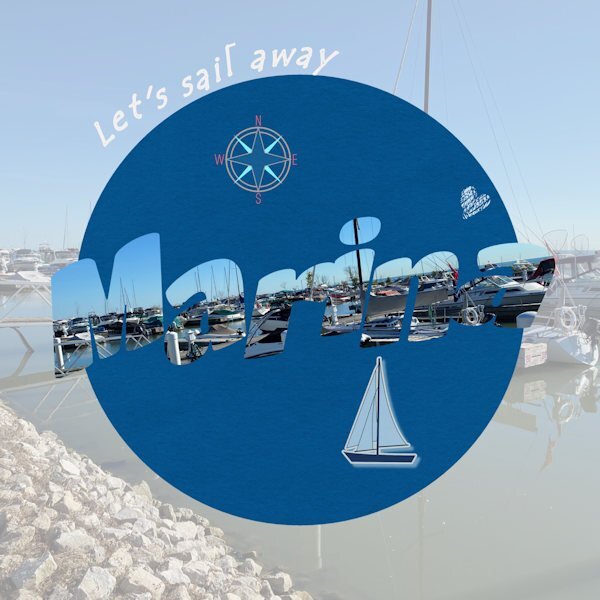
Day 7. Done. The text says "marina" in case it's not easily readable. I find it's often a bit challenging to read the letters when they are cut out as pictures. The photo is mine of the lovely marina we have in our small town on Lake St. Clair (not a Great Lake officially, but part of the system). I really enjoyed this series of lessons and prompts. I used techniques I wasn't familiar with and got a bit improved in some of those. Thanks Carole. Having your templates was a great help as well. I don't do scrapbooking, but I do enjoy just creating layouts for birthdays or other things. Mainly, PSP helps me work with old photos to make them better quality for my history and genealogy projects.1 point
-
1 point
-
1 point
-
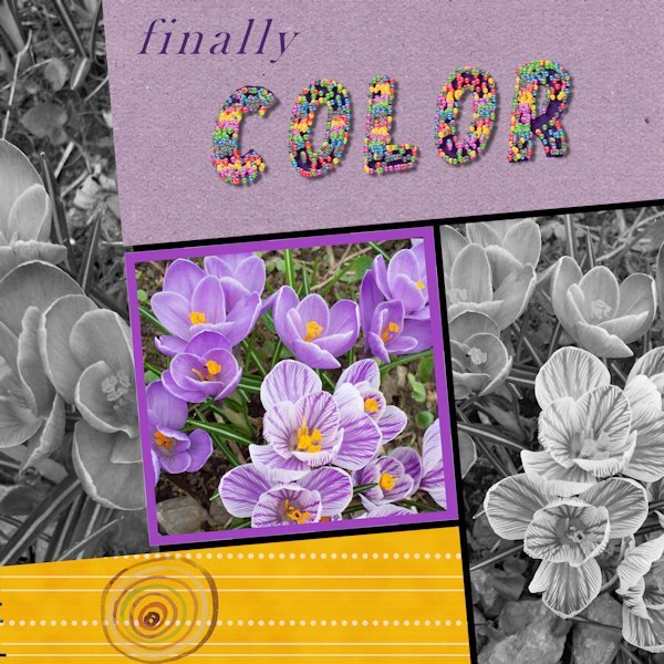
Trying to get caught up. Here is Day 6. There are many things that didn't work out well, but sometimes that has to be good enough. Photo is from my garden a few years ago. The cheerful and welcome little crocus. The title is done with a small colored ball and the vector tube script. It filled each letter entirely....oh well. I wanted colour, and I got colour! (I used American spelling on the layout.)1 point
-
1 point
-
1 point
-
This week, I found an old layout I made for ... a challenge. So I will challenge you too. I want a layout that will help us know you better. Your layout needs: Two photos of you (an older one and a newer one) 10 attributes/qualities to describe you (I know, that is always hard) Some brushwork Incorporate your favorite color so it will be all about YOU! So, what will you create? Here is the old layout that is the base for this challenge.1 point
-
1 point
-
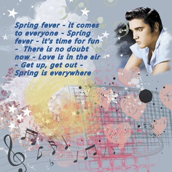
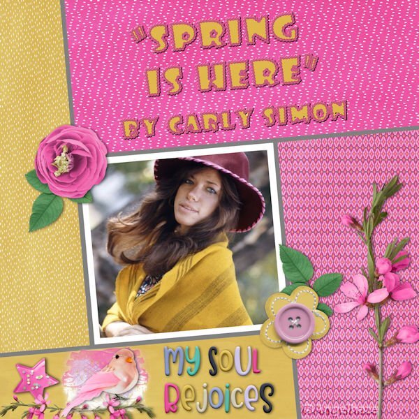
I wanted to make something for this challenge. But I couldn't think of ONE song with Spring in the title, so of course I googled for one. I chose this one by the King of whom I was not particularly a fan back then, but really love his voice now. I just wanted to "mess around" with it, and that's what turned out.1 point
-
Today it's just PSP Ultimate 2022. Couldn't get it to do File> - anything. But finally got it saved. Then SLOWWWWLY SaveAs a jpg. Close it out. Then reopen the jpg and reduce it in size (no problem there) and then saved at 600. Could it possibly be the size of the layout due to undo and redo's? I haven't had that problem before. Anyway - here is #2. There is a really good rendition of this song on YouTube by Ella Fitzgerald.1 point
-
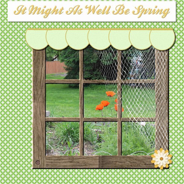
I'm game. The first song that popped into my head was from State Fair (a musical by Rogers and Hammerstein). I thought I was kind of copying a layout I had done before and just change the title. However, I have worked on this almost the whole day - the problem was the font! Every time I wanted to duplicate the title so that I could innerbevel it, the layer disappeared and left me with the title as "selected". I finally just flood filled the selection on a raster layer and went from there. I even tried closing out and restarting the computer, but that didn't work. I don't know if there was just so much in the file because I had worked hard on the netting and it couldn't handle the font. Well, anyway, here it is.1 point











Resized.thumb.jpg.d25811db03a63358cedab1e79f527635.jpg)

