Leaderboard


Popular Content
Showing content with the highest reputation on 02/21/2023 in all areas
-
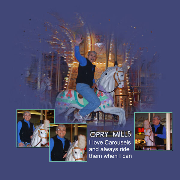
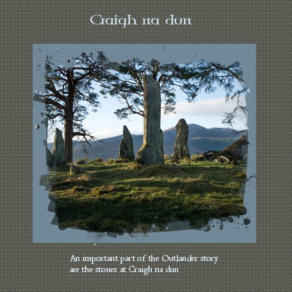
I finally got around to doing this, so here is my lesson one, sweet memories of my visit to Cornwall to spend time with my grandchildren
 9 points
 -
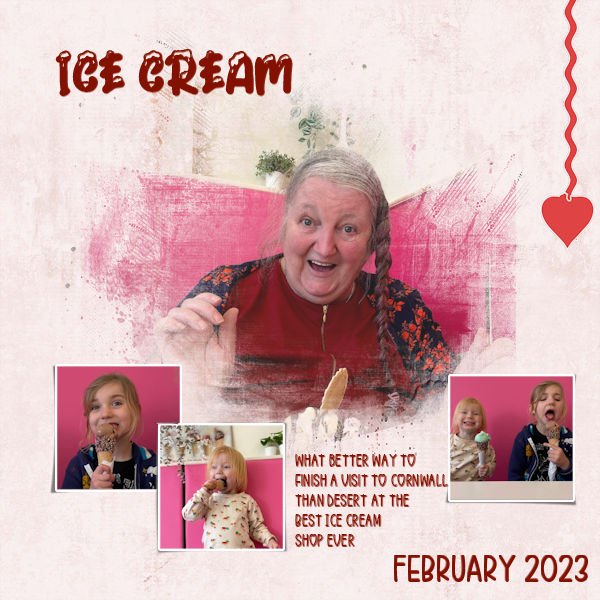
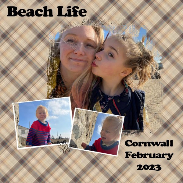
And staying with the cornwall theme here is my lesson 2
7 points
-
And this is the Extra 6. And I've got to go to bed. Good Night!
6 points
-
And now Project 6. My linoleum started out green, but I used Hue Saturation Lightness and changed the color. Title font is Aryaduta (CF). I extracted the chess pieces (only the white ones - I used Brightness and Contrast for the black pieces (duplicate copies of the white ones). Fun with the curled ribbon made with a script from Cassel. This mask is the one I talked about in the previous post - I made it with the watercolor brushes and some interesting twiggy brushes around the edges. I inner bevelled and drop shadowed the title. The white swirlly things on the paper in back of the masked picture were made with a brush I had made earlier playing around with the fancy squiggles and things that come with some of the fonts. I had forgotten how you made linoleum. I think I will play around with that again when I finally finish this workshop. One more project to go.
6 points
-
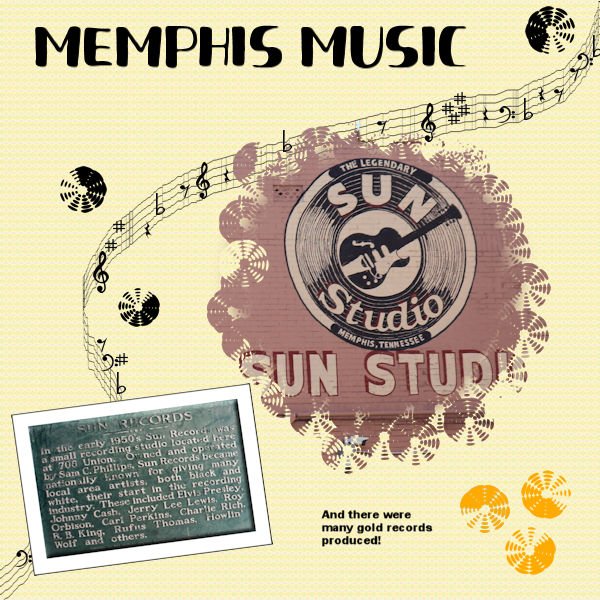
Project 5. Still behind. Using several layers for the background and the top layer was a pattern from a previous project and the blend mode. There is a brush that looks like a record (kind of) so I used that for around the original circle mask. I also used it for the records as elements. The font was Fresh Hansler Duo (CF) for the title. I used some different settings than I usually use for the Sun Records placque - inner bevel, and I used chisel on the paper behind it. This has been a challenging workshop and I do intend to finish it. I played around with creating a mask from those watercolor brushes from an earlier project and I'm also going to post a layout using the one I developed that uses some odd but interesting brushes around the edges. I think I learned more about blend modes this time as well as refreshing my understanding of how to make a mask. Anyway, it has been most interesting.
5 points
-
Day 5 Paper : Marisa Lerin , Digitalscrapbook Font : Fly Watercolor flower is a freebie, I don't know where this comes from anymore.4 points
-
Day 4 Filmstrip Cassel Cluster : freebie connieprince.com Paper : Saskia Veldhoen on Digitalscrapbook, Commons Font : Sun Island4 points
-
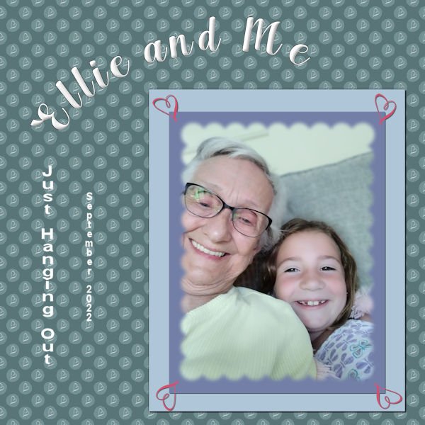
This is my project 7. finally finished the workshop. whew!!! Had fun playing. The background is the combo polka dot - learned that in one of the previous labs I was doing. I put a "squiggle" from one of the fonts that I imported as a brush. (What fun!) And I used that squiggle brush in the four corners of the papers behind the mask. Ellie is the great granddaughter of my cousin that I visit every year in Illinois. She is a barrel of fun. The font is Arlington Script (the only font factory I go to is Creative Fabrica). I chiseled and inner bevelled the title. The journaling is in Arial (2 different sizes). The original polka dot was a deep pink with a white heart squiggle, so the polka dot part of the paper is in the luminance blend mode as the background paper is a deep blue green. Fun, fun, fun!
4 points
-
4 points
-
this was a fun and interesting workshop, I learned a lot, here is my day 7 , one with blur on the mask and one without the blur I used the dandelion to make the paper and reduced the opacity4 points
-
3 points
-
Lesson 3 Centaur and (I think) Celtic garamond are the fonts I used. The kaleidoscope effect is fun to work with, but as the picture in my project is a bit "busy" it was better to make it very small and use it as a background paper with a plain mat.
3 points
-
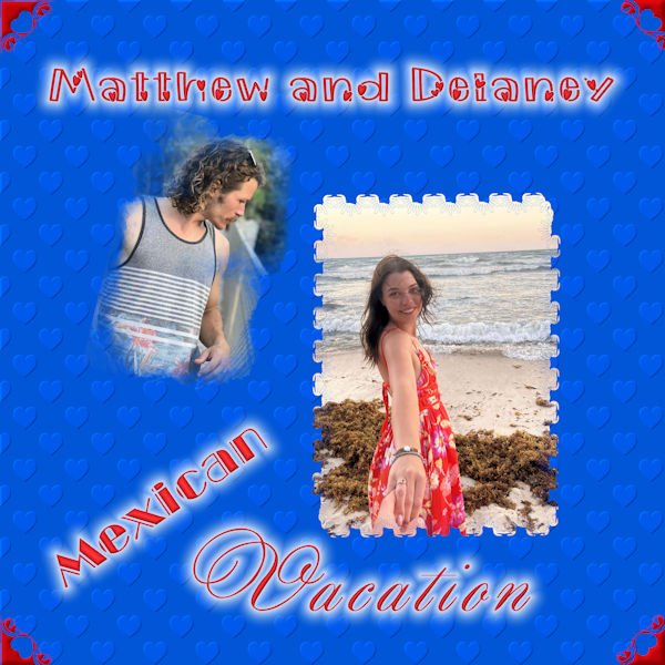
I finally completed Mask 7. I had a lot of problems with Chrome yesterday. The pictures are from my grandson who recently visited Mexico with his girlfriend. I used a flower brush for mask 1 and a watercolor brush for mask 2. For the background, I followed the embossed pattern in the tutorials. The fonts are morning love, broadway engraved and annabel.
3 points
-
I've been having fun playing with the "perspective striping" that was answered in the Feb. Q & A. This is just one, and I haven't used it for a layout yet.
2 points
-
my lesson 3, been a while since I played with kaleidoscope
2 points
-
Thanks Julie. Unless I use the corner punches to create labels, or other small elements, it's my opinion and personal preference to use them very large , and not as tiny punches on the corners of large background pages. Making them insignificant. This way they really pack a punch, as they should. Pardon the pun!! Of course it depends the layout and the creator.2 points
-
Great feature the way you used the corner punches in a large size!2 points
-
Lesson 3 >>>>here I am bringing up the rear (again)! I was struggling along and then my PSP program starting acting up. Guess it was his way of saying "Aren't you finished yet?" Hope the little gremlin doesn't show up again---fingers crossed!
1 point
-
I'm finally getting a bit more confident playing with the settings, just found out why my floodfilled backgroundpaper had holes in it where the mask was. Floodfilling all layers wasn't such a great idea ? Uncheked, floodfilled again and it was right ?1 point
-
This is si lovely!1 point
-
I leaned a lot (like how not to assume that you have finished watching all of the video when you are interrupted by a power outage). The pick tool is one that I never used before and it is fast becoming one of my favorites. The text on a path links from Cassel were especially appreciated but my head still aches over brush variances. I loved the chance to practice masks and get individual as well as group feedback. Plus I have a list of things to try that other students used in their assignments. It was a delightful way to spend time during a cold and wet and gloomy week. Many thanks to Cassel and all the participants.
1 point
-
Day 7 Masks Workshop, chose to use the twins, unfortunately I don't have a lot of pictures of only them ? As you can see, I took the Polka Dot idea and did something a little different with artistic lines, fills, and overlay and some Text lessons from previous workshops.
1 point
-
Those are the usual suspects I see everyday. This happened to be in October of 2022, I leave the baths out as long as I dare if the weather is good. They love the red bath, but were a bit miffed when I had to put a rock in it for the LBJ's (little brown jobs) as one drown in it one year and I was horrified that it happened.1 point
-
Days 6 and 7. Friday and Saturday proved to be productive full hiking days. Corner punches used on both pages, lino paper, and instead of using polka dots, I used 2 different snowflakes, with different sizes. I used 2 overlays on the 18th Feb page. Brushes to create the masks. Pages sized down to 5x7 photo paper. I haven't exactly conformed with what Carole demonstrated. I sort of went off on a whim.
1 point


Resized.thumb.jpg.d25811db03a63358cedab1e79f527635.jpg)