Leaderboard
Popular Content
Showing content with the highest reputation on 02/07/2023 in all areas
-
7 points
-
5 points
-
4 points
-
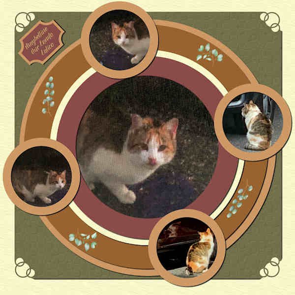
Playing around with Lab 13-02. I added corner punches and texture to the outside layers. This is a "community cat" that comes around and annoys my female, Eve, just by being near the house. I've started feeding her which upsets both my indoor cats. Oh, well, guess I'm a softie. I've named her Maybelline because she looks like she's wearing black eyeliner. ? Of the 5 photos, 3 are from behind my window screen, so the quality isn't the best.4 points
-
4 points
-
I love it too. You do great work with the brushes. I'm still playing with that.2 points
-
2 points
-
2 points
-
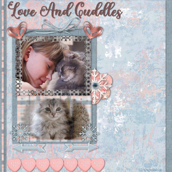
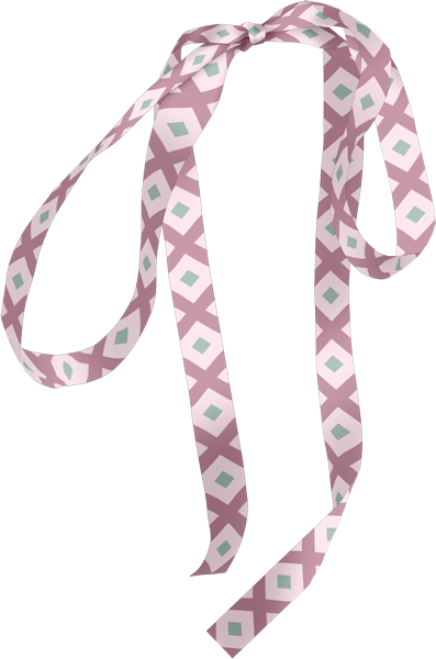
OMG! Cuteness overload! Beautiful layout and I like that ribbon. That's going to be a handy tutorial for the Kit workshop.2 points
-
If there were an animal shelter/rescue near me, I would love to volunteer. I modified a Corel template for this project. Finished it with just a couple of minutes to go!2 points
-
2 points
-
2 points
-
1 point
-
1 point
-
1 point
-
I guess rag dolls might be something I could do too with all that fabric! Now, I just have too many ideas. Which ones to do??1 point
-
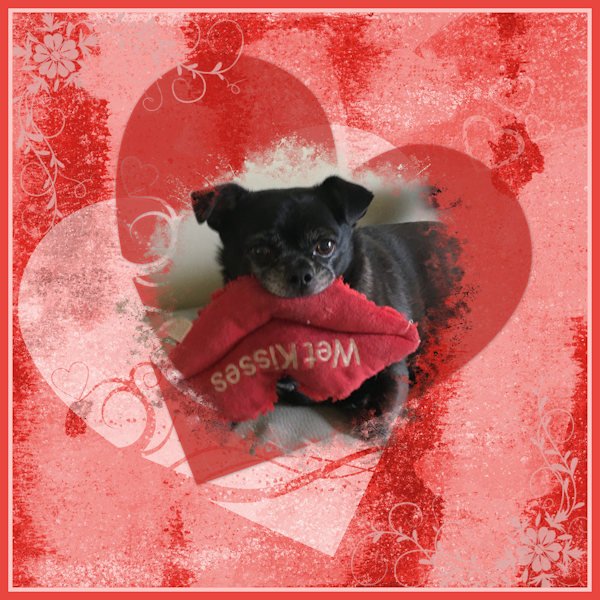
I'm hoping to get some practice with working with jpg masks. I had to try several times before I could use Carole's valentine mask.1 point
-
I was on my laptop when I did this. It doesn't have a tablet connected to it. So - I did this with the mouse. You can too. they are just straight lines so do not connect the segments and put the start just outside and press the shift key and place the end at the opposite side just outside. Simple. You can leave your pen strokes on the vector layer, but you will need to color your stripes on separate raster layers. In order to change my stripes to glitters, I made a copy of the pspimage and changed the vector layer on the copy to a raster layer. Have fun.1 point
-
No please! Keep playing. You do such lovely work and I enjoy seeing it.1 point
-
Mary Solaas, these are the perspective lines in the background that I was so interested in. Love the effect and the photo.1 point
-
1 point
-
I have to say that was fun! I do enjoy a challenge. Now that I have it in pspimage format and jpg, I can change the colors from tans to yellows, or blues, or greens, or pinks - hey Valentines!1 point
-
I am attaching 2 screenshots of my attempt at the background paper. I started with the pen tool making the lines in white. I found that if I put the beginning and end of the line just beyond the edge of the paper, I can use the magic wand to isolate every other one of the resulting stripes so that I can put the light stripes on one layer and the darker stripes on another layer. That way also I can put a texture effect on one of the colored layers to give it more oomph. I hope this explains it.1 point
-
I downloaded the template from lab 13-02 and omitted the star elements and used 2 watercolor elements from a freebie creative fabrica bundle instead. The colors are from the proposed color palette:Sedum Hues, in the experiments. With the ribbon I made with the Double Arrow Pattern tutorial I also made a bow with the script : cass-Bow151 point
-
1 point
-
1 point
-
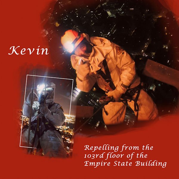
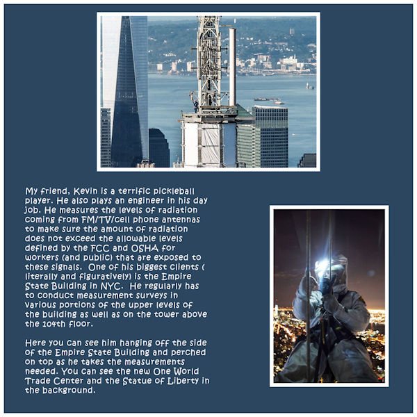
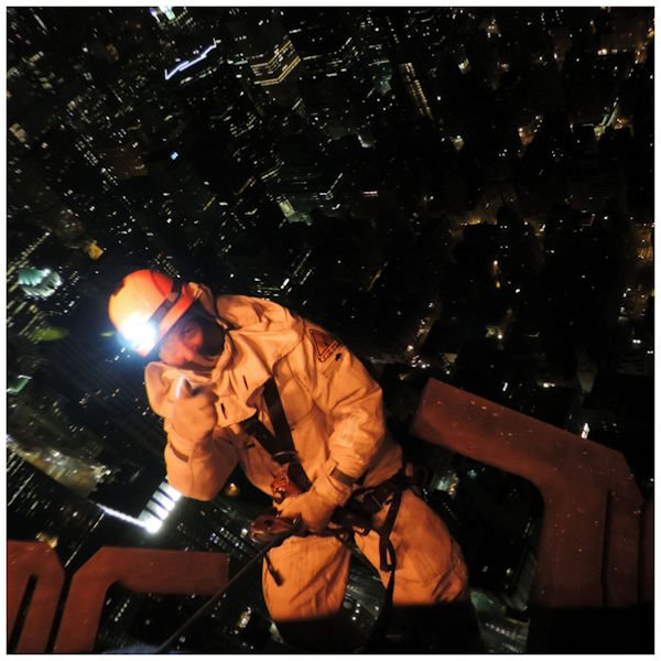
He sure does. He's got nerves of steel! The one where the city is below (camera is above) really shows just how freaky it is. The write-up is really interesting.1 point
-
1 point
-
1 point
-
1 point
-
1 point
-
This one looks nice. I see the words are closer together too, that's another thing I need to take note of. I for one like the new "chockolate", the longer the word, the more time to savior the tastiness. ?1 point
-
1 point
-
1 point
-
Okay - Ive been playing too - not yet with that stencil beautiful stuff you are posting, but somewhere someone used a background paper that I think came from CF. I had made abstract paper in one of the previous labs I've been working on and I thought - well let's see if I can put glitters on it too. So I did one with gold glitters and one with silver glitters and then did one with an expanded glitter of silver that I put in my winter folder. So here goes.1 point
-
I made my own clothes for my 2 children when they babies and toddlers. Of course back in those days boys and girls were dressed the same when babies. I used to make Viyella nighties and vests for them. Also I knitted all their matinee jackets, using the Blackberry stitch, as it is my favourite stitch. I ordered a hand made personized rag doll for the youngest granddaughter for Xmas. I'm in the process of crocheting a hat and matching scarf and mittens for her. As an Easter gift. I suspect the cost of the postage to Wales will be far in excess of the wool. But Hey, you can't put a price on making something yourself.1 point
-
I just LOVE Cassel's Punches; I used her Edge Punches to make the black border around the dancing people. Such an easy way to "dress up" your page. I would love to see a new set of Edge Punches (hint-hint). The font is Grenadier NF from 1001Fonts.1 point


Resized.thumb.jpg.d25811db03a63358cedab1e79f527635.jpg)









.png.9380dd14cd240ec499a5b49e579bfd64.png)



small.jpg.60ca55bb6e57fcfd721b058637111110.jpg)



.jpg.3d6c1cf284cc83eb9ce266defa0bff6e.jpg)
.jpg.d9307117da302e9db39e3f8365d30c38.jpg)