Leaderboard
Popular Content
Showing content with the highest reputation on 01/31/2023 in all areas
-
I often use one of my photos as a background, but mostly with an effect, a blur etc. Here is no effect on the photo other then a reduced opacity and one flower with 100% opacity and a little frame. There is a glassframe round the whole page done with a script that I found somewhere. The only other element is a tag with the name of the flower on it. The font used is Winter Vibes, a freebie from CF. The photo of the hyacinth was taken a couple of days ago, not outside but in my living where I have a container with 3 hyacinths in it. You can buy this specially prepared bulbs for indoor use everywhere in this time of the year. I wish I could incorporate the smell, because my whole room smells delicious!4 points
-
Susan, yeah, they're about the size of a Canada Goose so pretty large. They amusingly like to sit on top of our metal chimney tubes on the roof and keep warm in the winter. ?2 points
-
Wow! You have vultures in your front yard. How cool is that? Are they big?2 points
-
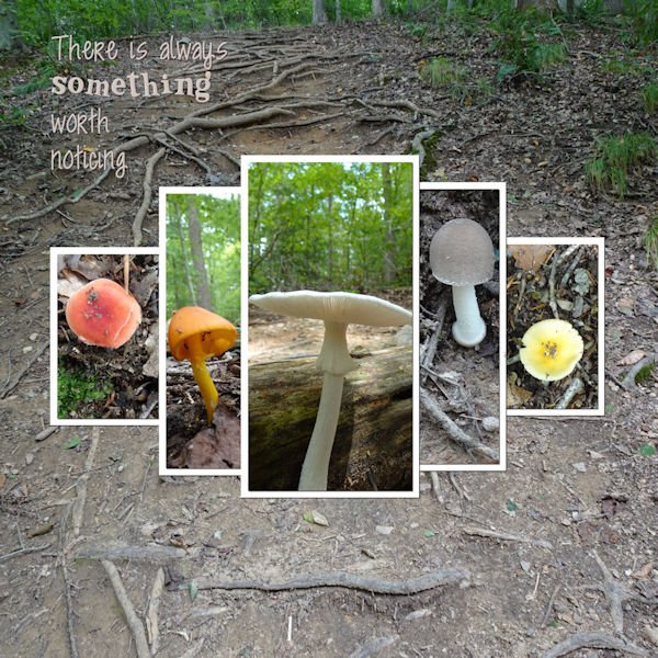
I used the template from Lab 13-01 which has a split title. I had to remove one photo group and my split title is actually hyphenated. Not exactly the same. Oh, well. The outside frame is a PSP frame labeled transparent. The blue patterned paper is from Rachel Martin and the woodgrain is Marisa Lerin, Winter Day. Mostly I just added texture to the other papers. The font is Bernard MT and the yellow arrow is from Marisa Lerin in a kit called 1000. The photos are mine, from my front yard, except for the top left portrait that I got from Ed Frampton.2 points
-
2 points
-
2 points
-
2 points
-
2 points
-
2 points
-
2 points
-
2 points
-
2 points
-
2 points
-
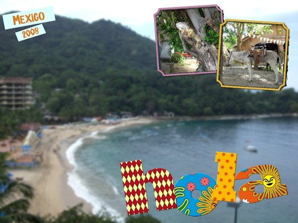
After going through my stash of photos, I realize I could do this challenge for weeks with all the uninteresting or bad pix I have! But it's a great way to use a boring photo. I made the "hola" text using individual images for each letter for the first time! That was fun. (Some edges on frames still a bit ragged....oops!)2 points
-
Another workshop will soon start. Are you in? It will start on February 13th. This workshop is FREE for everyone, so spread the word. This workshop is meant to be for those with some experience with PaintShop Pro. If you are brand new to using the program, it will be a little more challenging, although we are here to help you if you still want to participate. Did you find this thread before the registration page? Here it is. (and yes, it is the same series of tutorials, but I'll try to find more supplies for the DIAMOND members)1 point
-
Here is a challenge to do something that might not be repeated in other months. Just an idea that popped like that (and you can also send me suggestions for occasional random challenges too). This time, use a single photo but use it to cover the whole page. You can add effects to the photo or showcase it in all its original splendor. Add a title and journaling however you want, but it will have to be on top of the photo itself. Here is one example of a large photo using the whole space. For other ideas to use large photos, check out this article. Post your project in the gallery.1 point
-
Sue very nice, but now I almost don't dare to show - when finished - the one I'm currently working on because I had a quite similar idea for an easter stencil! Today I just bought PSP2023 so I'm still in the proces of customizing it, not everything goes automatic. Once that is finished to my satisfaction I'll resume my easteregg.?1 point
-
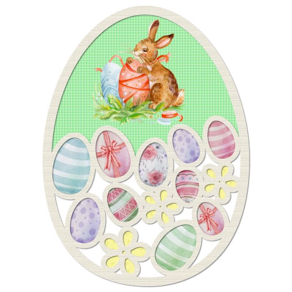
My interpretation of the stencil. I will be using it as an Easter tag. Currently I have been creating my own Easter vector shapes. Closer to Easter I will post for download for you, a vector shape Easter egg tag, which will have the hole already punched out. I won't post any of the others, as I want to encourage you to create your own. I also created the vector flower in the tag.1 point
-
It would depend on the format they come in. I have a a couple of tutorials on using masks: How to use masks? Using transparent masks But we will go in further details during the Workshop.1 point
-
1 point
-
1 point
-
1 point
-
1 point
-
1 point
-
1 point
-
1 point
-
I just signed up for this too. Maybe I will actually remember how to do some of the things Cassel teaches us this time.1 point
-
1 point
-
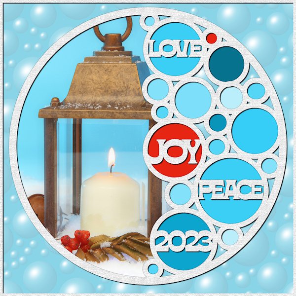
Oh what fun Lab 13-1 is! Two out of one Susans recommend it (I'm a Gemini; 2 peeps in one body). Stencils! I didnt know I needed to know this, to do some of the ideas floating around in my head. I really like this technique. And now I'm ready for next Christmas...except I'll probably forget about this by then. The font is Bornsa (Creative Fabrica I think). I used texture effects on the background and on the stencil itself and the frame around the background. I sure need practice getting my circles lined up when I'm first making them. They seem to build/land not where I'm expecting. Good thing we can move and resize. It wasnt until I finished that I noticed I didnt get one lined up well. Photo is mine from a Christmas card a few years back, BPSPATSC (Before PSP and the Scrapbook Campus). ?1 point
-
1 point
-
1 point
-
1 point
-
1 point
-
1 point
-
I'll be here too, this workshop is one of my favorites! It will be great to rehearse what I have learned before and be more creative with those masks.1 point
-
I'll be here. I really need practice with "homemade" masks. I'm too dependent on Cassel's script: Raster-to-Mask which limits me to whatever shape the raster is and doesn't have those nice fading brush strokes on the edges.1 point
-
1 point
-
1 point
-
1 point
-
1 point
-
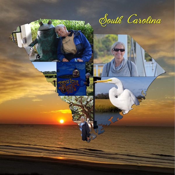
Just an example of using this technique, here's part of a double layout I did for my granddaughter's honeymoon in Feb 2022.1 point

Resized.thumb.jpg.d25811db03a63358cedab1e79f527635.jpg)




.jpg.340281b235a955ef1516a937e934c034.jpg)
