Leaderboard


Popular Content
Showing content with the highest reputation on 04/25/2025 in all areas
-
Template 4 Affinity 2.6 Gethsemene Gardens was an interesting garden created in 1957 by a Christian couple on their Clifton Hill property high above Christchurch. After many failed attempts to sell the gardens, and sadly, with the passing of the husband, Ken Loader, the property has since been subdivided and sold. The gardens were offered as a venue for functions, and Noah's Ark, opened in 2004, is still being used for this purpose. There were prayer gardens, a small church, scriptures spelled out in shrubbery, a nursery, and Noah's Ark. The kit used is Rachel Martin's PS September 2020 Blog Train, and the font is Niagara Solid.
 11 points
 -
Lesson 2 Diamond Template used (PSP) the blue paper is from my 2024 Build a Kit as is the brown template with the cracks and on that I used a paper from Digital Scrapbook. Behind is some rusty metal I had in the PSP patterns folder, with a filled color above and a blend mode, then I also used the eraser tool to take some of the layer away (same goes for the vertical wavy line, I also added a bevel. the photo (mine) was shot on mid grey background then several papers (blended) from Riley B Graphics (Creative Fabrica) and I masked the subject. The Title looked good in black but was just flat looking so I used "Selection from Vector Object<modify<expand" then on the blue paper layer I promoted the selection to a new layer from there I added a small bevel. The same was done the heart at the bottom of the quote so it would stand out a bit better. I'm seeing some really beautiful and inspiring layouts. And as usual I'm behind. it's my crazy work week with all the extra jobs that aren't in the normal week.
10 points
-
Lesson 4. It was good being able to create a page of memories so quickly. I enjoyed this one. My background photo had strange colouring at the edge so I used the Warp brush on the Mask to cover it up. I hadn't heard of the 14 stations of the Cross before I went up that mountain in Dubrovnik. Elating walk back down the mountain with a sculpture on each corner of the zig zag path. Croatia being a Catholic country each 'station' represents the crucifixion and events leading up to it and afterwards.
10 points
-
Day 4: I created the photos with AI (via Freepik). The paper is from a kit called Scrumptiously Fresh papers by Violet Insovna. The font is Sacramento. Project completed in Affinity.
9 points
-
Template 2 Diamond A sunflower from my garden, taken a few years ago. It is probably the last time I grew these stunning flowers. They were taller than I am. I love their strong stems. Kit is Jessica Dunn's Reach for the Sun mini kit, fonts are Benilla Calligraphy and Asking Ladies Bold.
9 points
-
Hi, I'm working on PSP right now, but have plans after I finished up the PSP part to dive into Affinity lessons. Have just looked at some of the work everyone is doing and it is amazing to see what others have put together. Learning so much. Thank you!
8 points
-
Day 3 - 2 more photos from Tuscany. The background is a grunge brush, and the flowers and leaves are from watercolor brushed. The CF font is botanical flowers with a style added from Adobe Express. The striped background is mine from playing with my new cass script gradientstripes.
8 points
-
Day 4 = The photos and the background are mine. The frame is a cass metallic rope tube. The font is Retro Thick from CF. I used the cass script stamped on the letters for Zion.
7 points
-
I must say that I am thoroughly enjoying the Affinity Template Workshop. Although I have incorporated some PSP. The mushrooms are what I had previously created, the tags are what I created some time ago, all I had to do was to add the text. The papers are my own, as like always are the photos, as I only ever use my own photos. The process of adding all the elements, papers, photos, shadows, etc, to complete the page, is almost effortless using Affinity. The more I use it the better I will get, providing I can remember all what I have learnt. I added the tags for better legibility. Carole has to take credit for the effort she puts into doing these workshops.
7 points
-
My Day 5: A Bike Ride (Noah: 5 years old, Ludovyk: 3 years old)
7 points
-
I am way behind you all I've just signed up for the challenge. Papers used are the same as Carole but I used the colour changer tool to try and match colours in the photo of a bumble bee on a blackcurrant bush that my son sent me today. Font used is Mocha Cherry.
7 points
-
Lesson 5 My photo subjects, still on my chosen theme of Dubrovnik, are fabrics, artifacts and a painting from some of the visited museums. I have used the placeholders in the template to create a design rather than as realistic scrap elements on a page. To change the 'stitching' colour I couldn't get the flood fill to work so used a brush instead which worked fine. I drew a border around each photo group to make them stand out and added Noise to the overall background image to soften it. Because I was mucking about this took longer to do than the template afforded but is enjoyable as ever!
6 points
-
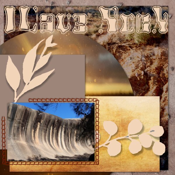
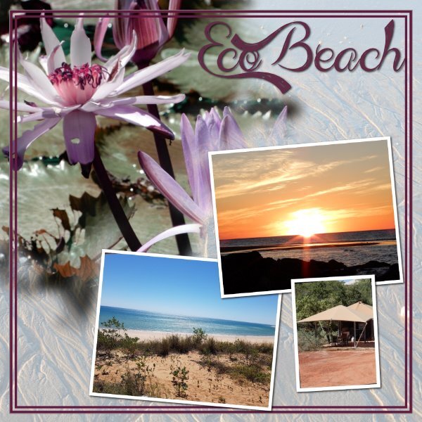
Firstly thank you to @Jeni Simpson, @Linda Rexford for your font viewer info - I have since discovered if I open my viewer before I open Affinity they work - something I never had to do with PSP - but now I know! @Cassel I use FontViewer and FXplorer and (Character Map) I like FXplorer as I have my fonts in different folders and can open 1 or multiple folders in it depending on my projects. I did use The Font Thing many years ago. Day 3 and 4 - Day 3 is a bit busy for me and needs to be redone - the photo is mine and background papers are all photos or parts of photos, the font is Alien Autopsy. Wave Rock is in Hyden West Australian and Rising 15 metres from the ground and more than 100 metres long, the rock looks like a giant surf wave of multicoloured granite about to crash onto the bush below. It’s believed this amazing formation was more than 2,700 million years in the making. Day 4 - Photos are mine and taken at Eco Beach, 130 klms south of Broome and is a self sustainable Eco resort - the background is a photo of the sand with a blend mode, the waterlilies were in a pond there and the font is Admiration Pains. Part of the Eco promotion - As pioneers of the sustainable tourism movement, we also aim to set an example of how to facilitate a holiday experience that operates with the preservation of the environment as a priority. Providing our guests with the ultimate holiday, while also taking care to protect our amazing natural surroundings, which we take great pride in!
6 points
-
Running behind as per usual here is my day 1.
5 points
-
Here is my Day 5 - a wrap-up of the series I've been using from My Modern Met. And the architecture/design firm is called BIG. I used both logos in the layout. Here's a link to the story. BIG Reveals Design for Opera & Ballet Theatre of Kosovo
5 points
-
Beautiful layout, Susan!5 points
-
Same here and will be looking into the Affinity tutorials too 🙂5 points
-
Young people like me? I'm 74 and have been using Paint Shop since v 8. I've used it almost exclusively for photos until I started taking these scrapbook tutorials. I've learned a lot which has come in handy when editing sheet music.5 points
-
Wonderful architecture. Your page looks good.5 points
-
5 points
-
My Day 4: The Family Grows
5 points
-
I finally finished Day 3's template. More Kosovo Opera House - exteriors close-up. I duplicated the photo area as I have a lot more to show you. Elephant font, no papers, just patterns and textures.
5 points
-
now here is template 4,4 points
-
I've been scrolling around looking for my Day 4 and it seems I forgot to post it! I may have overdone the silver but what the hey!
4 points
-
Lesson 4 Affinity Pictures are taken on our trip to Scotland. The Highlands were wonderful to be in and Culloden moor is the place where in 1746 the Battle of Culloden took place and where in just 45 minutes to an hour the clan culture was defeated and the language, the kilts bevame forbidden and the Scots weren't allowed to have weapons anymore. Fonts Javanese and Amazone. Paper came from my stash.
4 points
-
here is my day 3 with the Diamond template4 points
-
I saw something similar on the telly, which I thought had potential to be used in a page. Anyway, I created my own version. What would you use it for in a project? The diamond could be replaced with something else, or completely removed. Created using vectors.
4 points
-
What a beautiful selection of your work, Sue! It's a pleasure to view each one of them!4 points
-
So cool what you did with the ampersand (I love ampersands and this is a beautiful one)4 points
-
Ann, the Opera and Ballet Theatre of Kosovo is beautiful. I can understand having so many photographs of such a stunning building.4 points
-
I love PSP, and when it was mentioned that PSP would not be updated, I did Carole's Affinity Workshop and enjoyed using that programme. I still use PSP, however, when there is a chance of creating using Affinity, I go for it. I am also enjoying learning heaps in online tutorials for Affinity. It is different, and I enjoy using Affinity.4 points
-
All graphics Marisa Lerin.4 points
-
There are so many beautiful creations i can't list them all for fear of leaving someone out. Wonderful work friends! 💖 I haven't had time to create any scrapbooks but I am finding the videos very useful. I took this class last year and had forgotten some of it so it' great to have a refresher. I did manage to create a new Facebook Cover Photo banner. I took advantage of the skills I learned in Carole's curved text workshop.
4 points
-
Lesson 3 Affinity The title is "typed" so I didn't add a shadow. Font is Andalus.🙂 I know the circle polkadot layer has a shadow, but I hardly see it, on the other papers I can see it?😎🤓
4 points
-
Day 3 - Affinity Diamond Template - I tweaked it a bit to suit the photos I chose. Additionally, I duplicated one of the paper's layers, removed almost all elements, and kept only the greenery. Again, I used Lynn Grieveson's Taste of Summer kit. This time, I used Cassel's DateStamp #12, which I purchased a few days ago. Font: Brandish -------------------------------------- Carole, most probably, I could have used the "Text on Different Surfaces" feature for the date stamp. I'll take a look at that in the coming days! 🙂
4 points
-
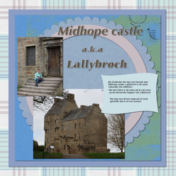
Lesson 2- This went well with Affinity. Carole, as always your lessons are excellent!🤩 The text is in Dutch and says: " As an Outlander fan, a visit to Midhope Castle — Lallybroch in the series — is of course a must. Just like Claire in the show, I too sat for a moment on the famous steps of Lallybroch. It was a dream I never believed would come true!" Pictures are my own 🙂 Fonts: Zaphhumnst and Carmina Papers are form pixelscrapper, I searched for Scotland themes.
4 points
-
Lesson 1- my first ever Affinity project 🙂 Resizing directly when you export helped 🙂 The color on the left I was hesitating if it was a bit too much, but I was so glad I found out how to change it, that I didn't want to mess with it any further 🙂 My first ever trip to Scotland will be my subject this workshop 🙂
4 points
-
Lesson 3 - Template 3-Diamond I should have titled this "Blend Modes" because every paper or photo mat, and the two pieces of foliage have blend modes and some with 3 or 4 papers in the blending group. I did group all the blended stuff and duplicated the group, hid it, then merged the end result for the shadow part. I used elements/papers from Digital Scrapbook (Marisa Lerin, Brooke Gazarek, Gina Jones, Jessica Dunn, Kerri Dempsey and Janet Scott). The foliage I used the tutorial with the filled duplicate layer above, took me awhile to get the right color fill. I still found it was too bright on the layout so I merged the blend group and blended them into the blue paper (already merged blended group). I even attempted to make a cluster from 6 separate elements. The fonts are Creative Fabrica; Madelican and Matona ('S') Photos are mine and they aren't really looking at the real sun (like fake news, there is also indoor fake sun 😲). These were my surprise sunflowers I discovered at the back of my very small garden that I only noticed because I needed to go into the little shed. I thought they were mutants, cute fluffy mutants.
3 points
-
Here's the story which may be hard to read in the 600px size. "A large staircase leads visitors into the foyer, which is filled with light from a central skylight. Wood continues into the performance spaces, with curved timber elements providing visual appeal while also enhancing acoustics. Deep velvet upholstery and acoustic curtains ensures optimal sound, and the variety of venues allows for both intimate and grand performances. All parking is located in a subterranean level." The top photo of the venue was taken in winter with a snowy landscape.
3 points
-
Ann, thank you for sharing the architecture design with us. What an amazing building. It looks like something Zaha Hadid would have designed. Your page reflects the design as well.3 points
-
Those look like grape hyacinths!3 points
-
Always a pleasure to be of assistance.3 points
-
Beautiful, Jeni, and I love that quote. I will use it somewhere soon...3 points
-
You would have seen them all before, as they are a sample of what I have posted over the years. Your comment is still very much appreciated.3 points
-
It is always a pleasure to help when I can. As I have always said, it's all in the small details which give a page that extra wow factor.3 points
-
Carole, that would be marvelous, as you know I love to create wordart for many of my pages, and always on the look out for different ways to create them. Interlacing, along with the flair button, were some of the very first turorials I watched and learnt their techniques. Which I can now do off pat. Seeing as I am at home with family, I did some prep work prior for this workshop. Photos, subject matter etc. Which meant that I could then focus on Affinity. I can really see myself usinf Affinity more and more as time goes on. The smallest full moon of 2025 is April's Full Pink Moon. This moon is a micromoon, appearing a bit smaller and fainter than other moons. Not that we would notice it any smaller. Everyone has heard of supermoons, well April's moon is a supermoons opposite. Which means that it's at its furtherest point from Earth, a mere 252,225 miles away. I took several shots of the moon over several days whilst in Wales. Thankfully the skies were clear for the most part. For the background paper I used one my prairie sunrise pics, taken on a bitterly cold frosty morning.
3 points
-
Day 3. I used a kit by CPJess spring mini. The font is comic sans.
3 points
-
Template 3 Still using Affinity Photo. 5 kilometres from home is Triflor New Zealand, an agent for Triflor Netherlands. Many farms dotted around the area grow bulbs for Triflor. I noticed one field just outside our village yesterday, with bulbs recently planted. https://www.farmersweekly.co.nz/people/how-a-southland-tulip-farm-grows-a-blooming-business/ The great advantage of living in a rural area is the community spirit. Every year, in October, the local Presbyterian Church holds a Tulip Day out at Triflor in Edendale. Triflor donates the bulbs, and the church takes the orders and payment. The customers pay around 80 cents per bulb, which goes directly to the church. Kit used is Jessica Dunn Spring Day mini Fonts are High Tower Text and Bargetta Script
3 points
-
Here is my day 3. In Roma, western Queensland, each June they have a competition called Sculptures Outback where people use recycled metal to make fabulous sculptures. This one2 cockatoos is made of old windmill blades for the crest, corrugated iron for the wings, rusted chequer plate for the back and other bits and pieces of recycled metal. It's always a fabulous display and the overall winner each year is acquired and remains in the park on the highway as you drive into Roma. There are some amazing sculptures there now after the competition has been running for several years.
3 points
-
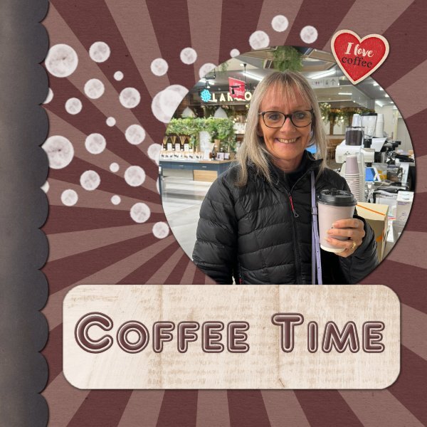
Here is my Day 1 . I used the Coffee Break kit from Sweet Shoppe Designs and the font is AR Delaney
3 points