Leaderboard


Popular Content
Showing content with the highest reputation on 03/25/2025 in all areas
-
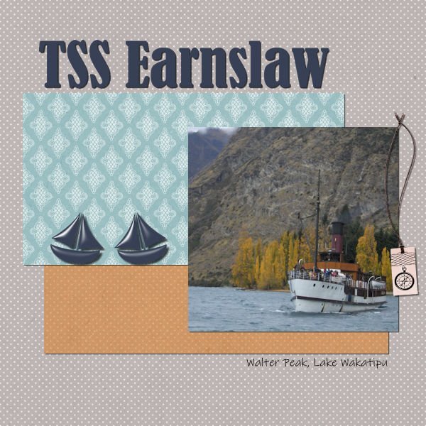
Day 7 I decided to create these pages to fit together, so they are all Walter Peak High Country Farm on the shores of Lake Wakatipu, pronounced wah-kah-tee-poo. The tourism company has bought the acreage beside the lake from Walter Peak Station, a much larger sheep station on the shores of the lake. They now maintain the farm and have removed trees other than those which are native to the area. I have continued the same fonts as previously, and am still using Jessica Dunn's Classy kit, with the oriental glitter provided by Carole. The background paper was a tad too pronounced, so I added another layer on top coloured with the same grey, and softened the blend on thetop layer, just to bring it back a touch.
 9 points
 -
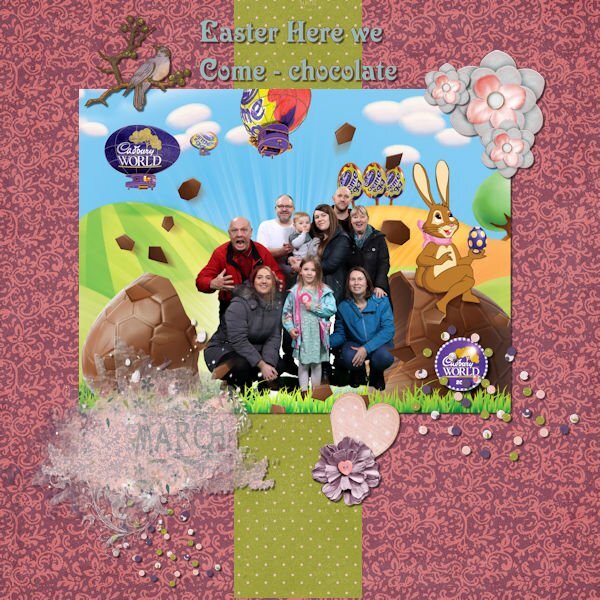
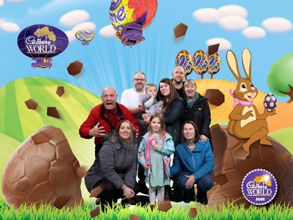
Day 3 - Project #1 - here is my Cadbury World - a trip that we took in 2022. Just playing around with the elements and shadowing.
8 points
-
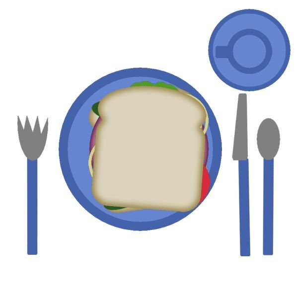
Day 2: The Sandwich - thank you for the reminder of layers and being able to drag from one image to another some elements.
8 points
-
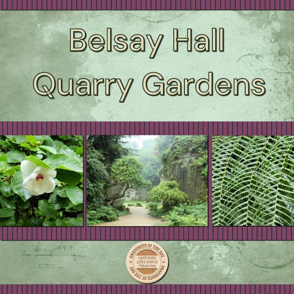
Project 3: Belsay Hall and Castle is an English Heritage Property in Northumberland (UK). Within the grounds there is a quarry garden that is quite unique with lots of different plants and trees. The photos are mine, the papers and elements are from A Touch of delight by Marisa Lerin, the font is DM Sans Medium.
6 points
-
How can anyone not love glitter. I'm in the glitter gal club with you Donna. You color choices are so perfect. Your plaid is outstanding. This will be a cherished memory.6 points
-
Once you "get" the concept of using layers you will be ahead of the game using PSP (or any other app). It is the basis of how layouts are constructed. It took me quite a while to lock that idea into my head!6 points
-
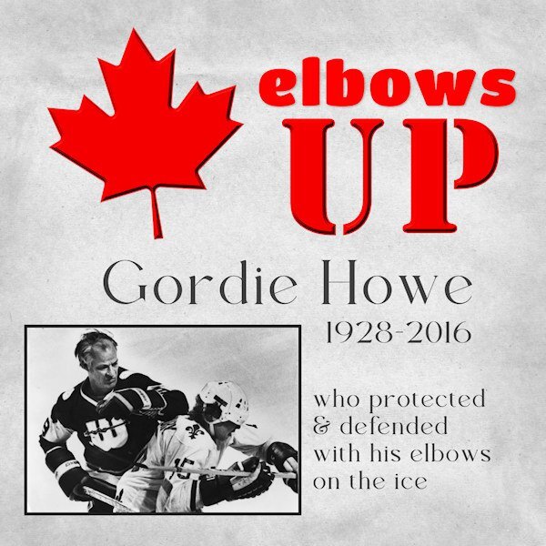
First up: apologies to non-Canadians for this layout. It really is not a political statement as much as an explanation of the rallying cry we Canadians are using these days. It originated with the hockey superstar, Gordie Howe, who was known as "Mr Hockey". With events happening now, the term "elbows up" has been co-opted by many (including actor Mike Myers) to signify our national solidarity. Also of note: the new bridge between our two countries (in planning and construction for over a decade) linking Windsor (ON) and Detroit (MI) is called the Gordie Howe Bridge and opens this summer. Gotta appreciate irony!
6 points
-
Workspace preferences: Light Grey workspace (I did have dark), untabbed pictures, I have now clicked on the classic material preference for palette, and view the ruler. I did have the ruler in inches, but changed to cm. However, mine shows the measurements in increments of 10, not up to 200 as Cassel's does. Also, I attach a photo I shall be using when we visited Cadbury's World
6 points
-
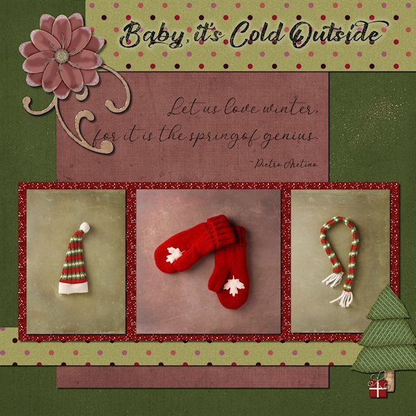
Project 3 You've seen the mittens, here's some partners for the mittens. Actually the 'partners' are about 3" (hat) and 8" (scarf), some Christmas decorations from something that I just found in a random cupboard. The mittens are full sized and were bought in the 2010 Winter Olympics when I lived just outside Vancover, BC(Canada). I put my big-girl pants on and wrote down all the supplies. Fonts: Awesome couple Script & Austyke (title) from Creative Fabrica Flower/tree/present: PS Commons Oklahoma Dawn (Digitalscrapbook.com) Swirl: Marisa Lerin (DigitalScrapbook.com) Polka Dot Paper: ABM-Christmas Joy-BG-02 (not sure who this is, but likely DigitalScrapbook) Pink Paper: PS Nov2019 BT-OKD-FiL-gpp5 (looks like Oklahoma Dawn at DigitalScrapbook) Green BG paper: Jessica Dunn-rustic wedding solid paper 10 (Digitalscrapbook) weird scatter stuff: Creative Fabrica Photos: mine The quote is not that thick in the reg layout or JPG. I saw it and thought, I need to change that, but when I checked my file, it's nice and thin, like writing. Weird EDIT: I decided to make the fonts more rustic and used the eraser on them to scratch them up and lowered the opacity. the dark black looks to abrupt on the eyes.
5 points
-
Ann, that is really a very beautiful layout.5 points
-
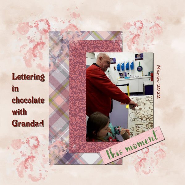
Day 5 Project 2: Writing in chocolate - Grandad and granddaughter. Script Segoe 96. Elements from Curio Pantry spring mini
5 points
-
Congratulations, Sue, on the birth of your new granddaughter, Gwen! I wish the family a lifetime of happiness! 💟5 points
-
This challenge became a kind of rollercoaster. At first I started in Affinity, but it didn't worked out well. The photo I choose was not suitable for what I had in mind, I had won the cass-Uneven Lines script and wanted to incorporate that in my layout but found it for this layout a bit too busy. In the end I duplicated the layer with the lines and rotated it 90 degrees and used it as a background under the part of the layout that I already had done. I wanted something to write the date and used an icon with a handheld phone. Afterall that is how I take my photos.😉
5 points
-
Sharla, great to see Northumbria photos, some of my ancestors were from there, and some are living there now.4 points
-
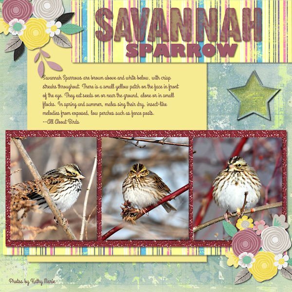
This Savannah Sparrow just flew in with the Spring Migration. The photog is Kathy Marie on The Hudson Valley in Pictures gallery. The background paper is from marisaL-distressed28-vietnam bundle. The title is the new cass-stamped alpha. The subtitle is Gil Sans Bold. The journaling font is Grand Hotel. Flower stamps from my stash.
4 points
-
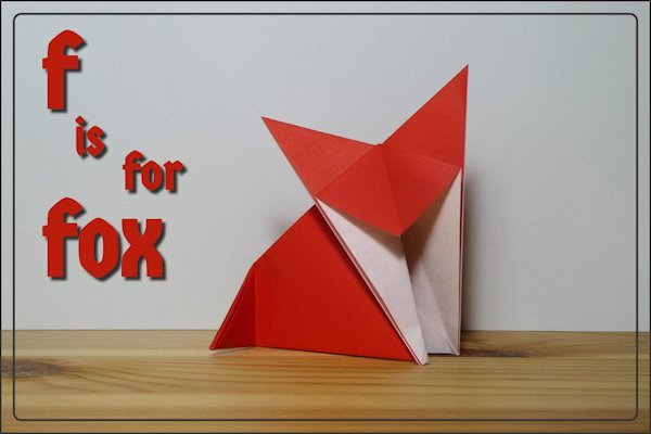
I found this origami fox under a load of paper and, as this challenge had reached F, I thought I’d take a photo. If I get some time I might do some folding for other letters.
3 points
-
Great balance on that page with your papers and elements. It works so well.3 points
-
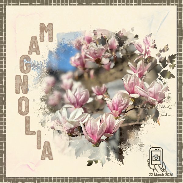
I love this time of the year when everything is so colorful after a long winter—although not as long as before! It comes with my pollen allergy, but it doesn't take the beauty of it. Magnolias are also blooming here, and I don't get tired of admiring this tree.3 points
-
You delivered! You have now set your bar even higher, as I knew you would, as you delivered a beautifully execuated page. The phone is a lovely touch. Cornwall is ablaze with Magnolias, primrises, daffs, wild garlic, and many other Spring flowers. I'm home again for a while, spending time with the latested arrival, granddaughter Gwen. You too will soon be on your way across the pond.3 points
-
So pretty. I like the uneven lines in the background. the photo is beautiful, I love magnolias. What a cool icon that is. Nice touch to add your initials and the date.3 points
-
@Jeni Simpson Interesting to see how you colorized that paper. It fits very well with the rest. @Bee Kelly Hopefully, you will get all that fixed soon. It is frustrating when computers don't cooperate, right? @Donna Sillia That is a great kit you created with wonderful colors! @Ann SeeberI am glad to see you use the stamped alpha, however, if it is stamped, should it have a shadow? @Krystyna Nicholls The way the Rulers show will depend on the size of the image and the zoom factor. That is likely why you don't have exactly the same thing I have (I also use Pixels, not cm). By the way, if you use a paint splash element, that should not have any shadow. In addition, if it overlaps different surfaces, you could try to add a little detail explained in this article.3 points
-
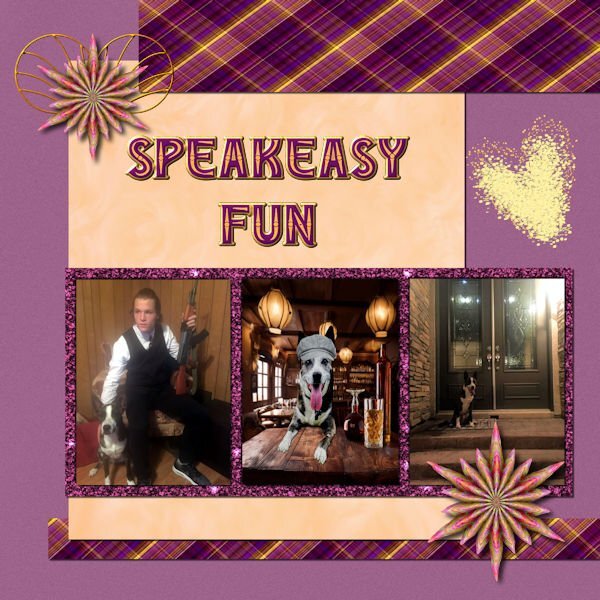
Day 6 I really do love glitter! Matthew's brother sent me the picture of Matt with the rifle, and I was reluctant to use it because of my aversion to guns. However, it fit so well with Art Deco which was my first kit. I used a photo of Chooch that has him behind a speakeasy bar with a 20's style cap on his head. The bar and cap are from Adobe Express. The flowers were made in FF. The papers are from my first build a kit. The heart is a brush. The font is Edith from CF.
3 points
-
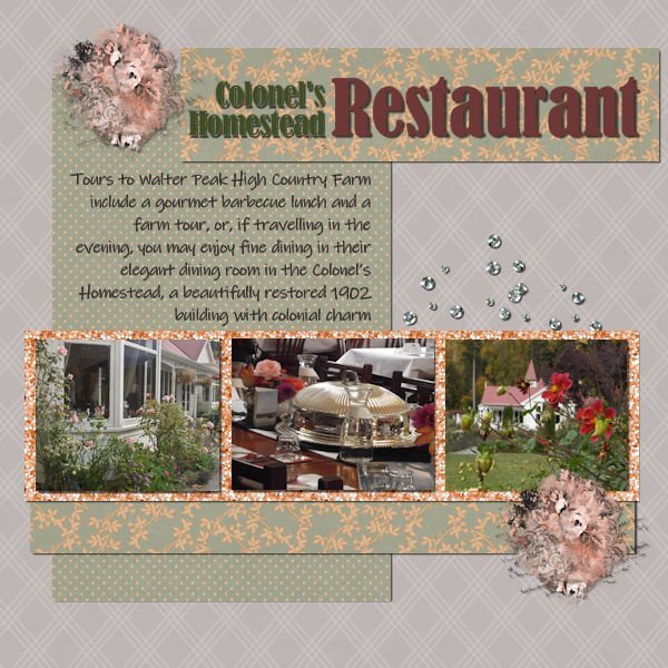
Day 5 This page, we are still on Lake Wakatipu and heading for Walter Peak High Country Farm. I took this photo when the steamer was heading back to the farm from Queenstown, across the lake. I have used Jessica Dunn's Classy kit and mini-kit. The blue paper is colourised from a soft grey.
3 points
-
This made me smile 🫠 and I wonder how do you come up with such funny ideas that are worked out to perfection.2 points
-
That are lovely gardens and you show them so well!2 points
-
I love foxes, folding and paper! I'm not as good as this though. It's fabulous. Just yesterday at work I was out on the loading dock, the shipper/reciever had some boxes open (it was a flyer insert for a paper) and I was oogling at the protective cardboard piece on the top of the box (to protect the flyer when cutting open the box). My supervisor happened along and came to see why i was ooing and aahing. They both thought I was nuts. I'm like, "cant you see the subtle colors and the texture in this guard sheet, it's beautiful." They were like, uhm, no.2 points
-
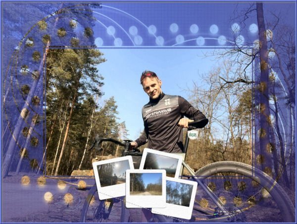
My recent "documentation" of JK's trip.
2 points
-
Some expressions come to my mind: Playing with fire OR Walking on thin ice. 😄2 points
-
I did "Time" last year, the first year was photography. This year hasnt even started for me yet...😪2 points
-
I hope you get your technical issues worked out. My PSP 2023 has been cantankerous the last few days. I've been switching to PSP2022 for a few things. And I'm saving after every few steps because it's randomly shutting down. One thing I wonder about is if PS elements is causing some of this. I haven't opened it but it's doing something in the background and it's rated as high-use by the CPU thingy that shows the load on it ( I dont know what that's called, I just call my hubby when things seem slow and he pops up this graph on the screen and tells me what's using resources).2 points
-
It is so nice when the migratory birds are coming back. Over here the "scholeksters" or oystercatchers are slowly turning up. I haven't seen one yet but I have heard one calling. They have a very distinct call and start calling their partner as soon as they arrive. Nice layout!2 points
-
I dont think I did send it to anyone. it was called "F8 and Be There" about photography. So weird I cant find my original working files. I know I was probably "organizing" and meant to copy it to somewhere and then cut it and somehow deleted it. A good lesson to be more organized. this is now 2 years later and I am better at organizing what I call my "working files" (pspimage files before they are turned into pngs or jpgs etc). I've asked my hubby if he has an old hard drive, because we swapped out one a year or so ago. I'm hoping he does and that it's old enough to have it on it.2 points
-
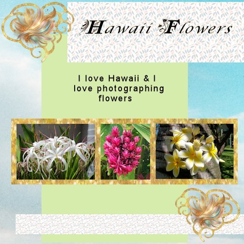
I think this is the only flower I don't like and it must have something to do with a nasty experience I once had, it is the only explanation I can think of. I have something in mind for this challenge but had very little time today and you are setting the bar pretty high with your remark, but I like a challenge.......2 points
-
I'm always on the look out for new ways to showcase my photos. I get inspired by so much on here. I enjoy the challenge of trying anything new.2 points
-
The tag wasn't legible to read in the layout. I created the tag a while back, something a little different to the norm, all I had to do was to create the ribbon and thread it through.
2 points
-
Lovely folding, even without the F it is immediately clear it is a fox!1 point
-
Super Santa:))))1 point
-
Very nice!1 point
-
Oh, what a shame about that previous kit, Suz! I'm trying to recall if you sent me a copy... do you remember the naming of it?1 point
-
Hello. Cassel allowed me to publish a "painting" that I made from a screenshot:
1 point
-
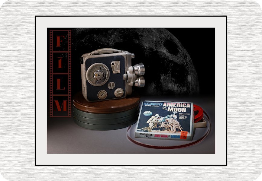
Alphabet Photo Challenge - Letter F Film... Thanks to Jeni I got an F word. I know, I love photography and you would have thought I'd be able to come of with that word but I was 'F"loundering what to use for an F word. This is for my American friends in the Campus, to remember the amazing, positive and inspiring accomplishments you made in history. There are no borders in Friendship! This didn't come together the way I wanted (the background moon looks like a dusty screen and I found myself trying to wipe the little dust particles off), but it's time to let it go. the darkest on the background and the movie camera was intended so the spotlight would be on the film itself. I think should have tried to stretch the title down. And, it was faster to pick a moon off pixabay than find the moons I had shot. I also found out somehow I deleted my Build a Kit psp files from the first kit. I had made film strips and I see that I missed deleting something and now I cant go back and fix it because I lost the PSP files. I clicked something bad one day because it's gone in the back up too.
1 point
-
Project 3 The papers are from my stash. The photos are mine. The swirl is from a dingbat. The colorful clipart was daily freebee from Creative Fabrica. The paper around the photos is from "Gold-Foil-Digital-Paper-696692" (blurred a bit)
1 point
-
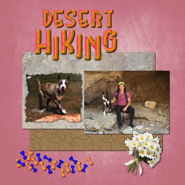
Day 5 - Photos from my grandson. The background is from our paper class; the grey paper is from one of my photos of granite and the brown is a PSE layer style, cracks. Unfortunately, the PSE style looks like a cookie, but it should symbolize the cracks in the desert floor. The font is a layered font from CF called Rainbow. Since I saved the original as a vector, I was able to change the layers to match the colors of the page. I used Carole's scattered elements script for the bones(and did not distort them this time😊). I downloaded the daisies from Adobe Express. I used shasta daisies since they grow in the desert and can designate sympathy.
1 point
-
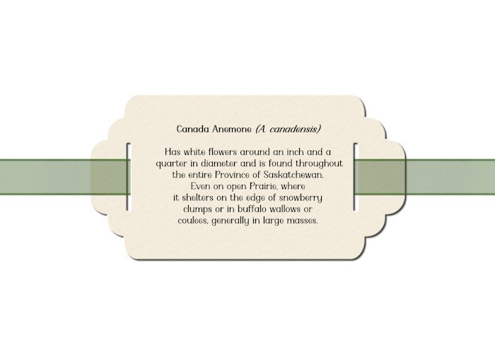
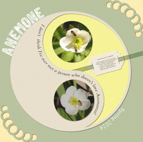
I too call it Yingyang. It makes for a nice different way to write text. I made a double page, mirroring this page. You do surprise me. I didn't think that there may be a flower you didn't like. These are native anemones, quite different to the hybrid ones. I look forward to seeing what you create, which will be beautifully executed.1 point
-
You are quick! I just see this challenge now and will have to see what I can come up with. I love the "ying/yang" circles, at least we call them that way. The photos of the Anemones are lovely, but I probably am one the very few persons that doesn't like them. So now you have met that person albeit digital and you know how much I like flowers. ☹️1 point
-
Stamped letters challenge. I am currently going through a circle phase. I saw a layout similar by AnnieC so decided to copy it. As per usual, I have saved a template. Allowing me to reuse it. All the circles are saved as vectors. Roll on Spring.
1 point
-
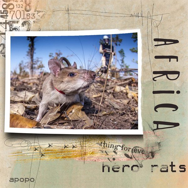
I learn the darndest things from the Nat Geo emails I receive. I can't read all the articles, but I can google the ones that are only available to subscribers. This is one story recently that caught my attention. It is about the Giant Pouched Rats of Africa who have been trained (by an organization called APOPO) since about 2016 to sniff out landmines and tuberculosis. The critters are about 25 cm (12 in) long and have a highly-developed sense of smell. Some of them are famous and have received awards for their success rates. Google Magawa or Carolina, two hero rats. I never imagined doing a layout about rats, but hey! they're a story unto themselves. Lots of bits and pieces from different designers; image from online.
1 point
-
Adam has that judgmental look down to a T!1 point
-
I keep buying those little orchids at the supermarket as well. Sometimes they thrive, sometimes I kill them - not on purpose! You're doing great with this one.1 point
-
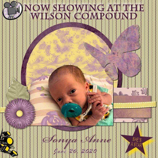
My great granddaughter Sonya was in that category. She was born addicted to heroin. Until that diagnosis, the family had no idea what her mother was going through. Very sad. 😔 I did a scraplift from a quick page for this layout.
1 point