Leaderboard
Popular Content
Showing content with the highest reputation on 11/02/2024 in all areas
-
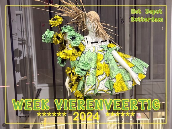
This week I went to visit "Het Depot" of Museum Boymans van Beuningen in Rotterdam. It is a building special build for storage of all the artefacts a museum has and a place where they research and restore old paintings etc. I have been there before and used the photos from that visit in the Magazine Challenge. There are display cases with some objects from the collection and this one is a dress made out of paper.5 points
-
Sue, it must be amazing to see this! I enjoy seeing the few (not even close to this scale) that get together here before migrating south.4 points
-
I must admit there's so much beauty and wonder all around. Which compensates for it's long brutal winter. Yet, winter here has to be embraced with all it has to offer.4 points
-
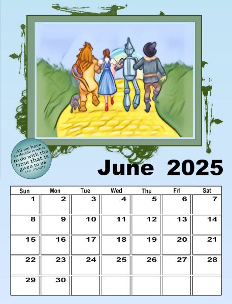
I didn't go to the lengths I did on the last one. However, this one - I developed the picture from a clip art I had from Kissclipart that I had used in my Alphabet Workshop, put it on a background that I had created to reflect grass and sky, merged it into one image and then used Instant Effects - Watercolor and used strength 50%, Color Match 30% and smooth 22%. I cropped the image to fit inside the first (light) frame.4 points
-
Wow, what a fantastic sight of so many birds! I love and admire the place where you live and the harshness of it too.3 points
-
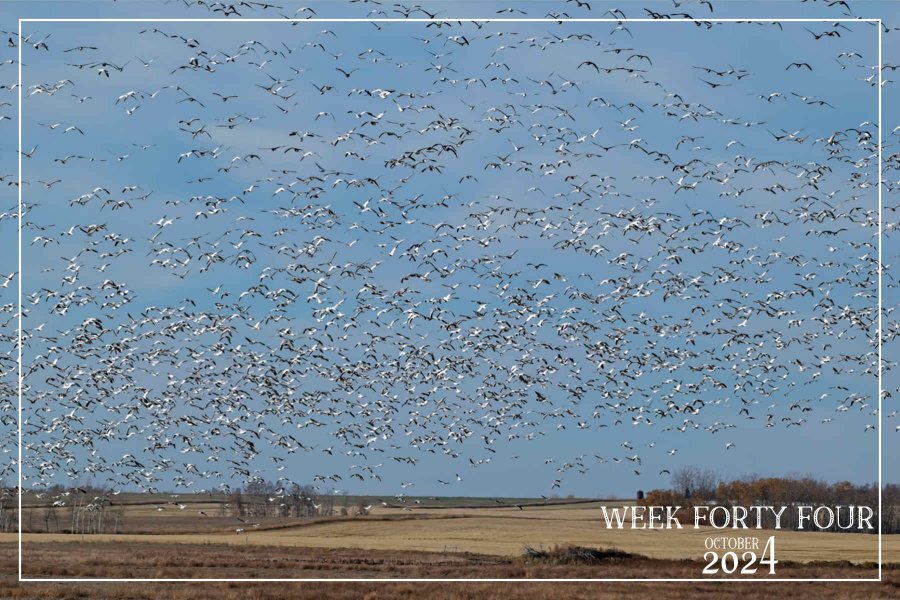
Week forty four. Whilst the smaller migratory birds have left, the Geese are now congregating in their thousands in our area. They are feasting on what the combines left behind in the stubble fields. I hear them as they fly over head throughout the night. The majority of these are the snow geese. Truly a sight and sound to behold. As seen through my eyes!3 points
-
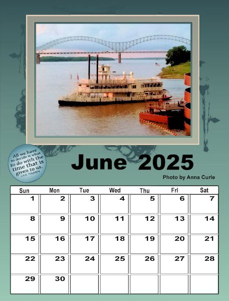
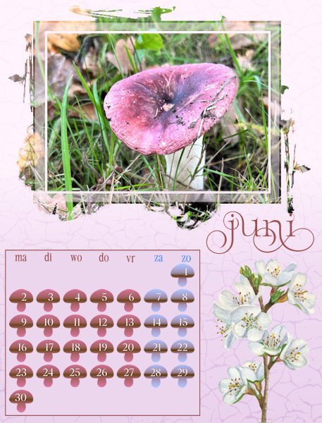
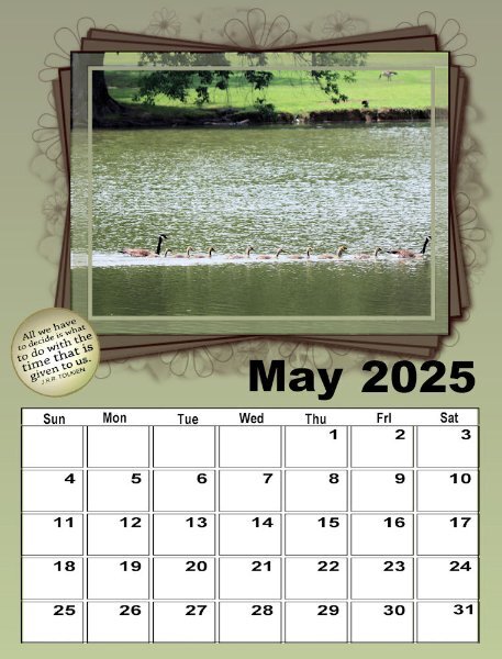
This is June for the 2nd set. It was interesting cropping the photo to fit inside the first frame, adding a layer behind it to make the next layer cream (which I saw let in the background layer as well) so I extended it just a fraction so that it made another frame (cream). Carole, those masks are very interesting. I would love to know how you made them - they are intricate!3 points
-
Thanks, Ann I have contacted a couple of print shops and am waiting until after the weekend to hear back. I added a couple inches to the top to make room for the coil and left the backgrounds white. It will be less expensive to have one sided printing.2 points
-
2 points
-
These huge gatherings are a common occurrence at this time of year. When I first came here it was ever so overwhelming to witness. I still get overwhelmed at many of the sights.2 points
-
Corrie, the whole calendar is lovely, and I am sure the recipients will greatly appreciate it. The result you achieved with the blend mode is beautiful!2 points
-
I was 14 when we lost my sister (who had recently turned 15). At the time we lived in California. In 2005, my mother passed away. Her cremains are buried in Arlington National Cemetery, where she will be joined by my father when he passes on, (hopefully not any time soon, though he turned 82 this past February).2 points
-
I actually didn't make them. I happened to have them in my stash from many years ago. I thought they were different than the ones we had in previous calendars. I didn't think it would be that challenging though as I just expected that people would just use a large image and the "extra" would simply fill in the outside. I didn't think participants would go through all the lengths you all did to "separate" the main photos from the "extras". But it could definitely become a class or something like that.2 points
-
thank you so much Monique. I'm glad to see your getting time to get to your calendar. Mine will have to wait a week or so. I love the rich colors you use.2 points
-
2 points
-
2 points
-
2 points
-
If I buy the humble bundle would you be able to suggest tutorials for how to use corel draw, or at even just how to turn a raster into a vector?1 point
-
I guess it is past the extra 7 days that the non-members have access to 😞 I am not sure why there is no page for the lesson 8. Here is the link, but I suspect it is also not available anymore for non-members: https://scrapbookcampus.com/workshops/calendar-workshop/lesson-8/1 point
-
@CaroleI wanted to start with the cover, but the link in the email doesn't work (anymore)? And also the "all done" mail hasn't got a link? 🙂1 point
-
1 point
-
Ann, another great calendar layout. I love the idea and the photo you added behind the dates!1 point
-
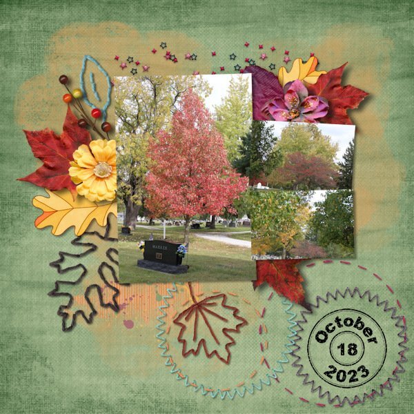
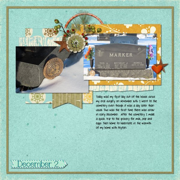
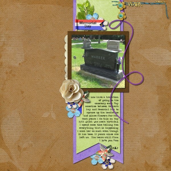
The cemetery my parents are buried in is right here in town. I've gone there for many years multiple times during the year. For quite a few years I would go 3 times in May -- Mother's Day, May 20 which was my mother's birthday and Memorial Day. Then I would go on Dec 26 which was her date of death. After Dad passed away 8 years ago, I would go once in May, June 14 (his date of death), Oct 15 (their anniversary), Dec 1 (his birthday) and Dec 26. So I pretty much saw all the seasons of the trees in the cemetery. I always take photos when I go. Since a couple of the dates fall in the months that I do a layout for each day of the month, I have scrapped a lot of layouts of the cemetery. I will share a few. My October layout in 2023 was a few days late because I wasn't feeling good after my surgery. In December 2020 we had a snowstorm on the 1st so I went on the 2nd. The last layout is one I did in 2012.1 point
-
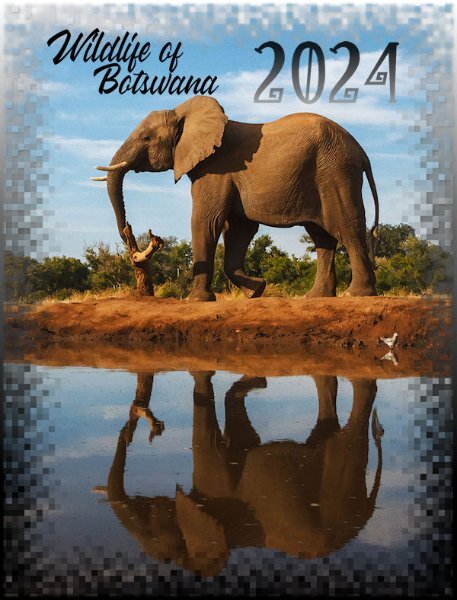
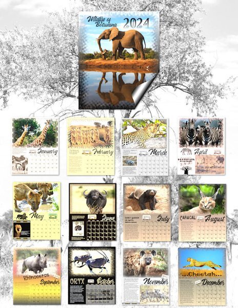
Here's my November Wild Cat Calendar featuring the Pallas Cat. They are found in Asia and are threatened as a species. Accredited zoos have breeding programs to help species in distress. Granddaughter Jackie's Nashville Zoo was recently working in Botswana with giraffes. This Pallas cat or Manul is being called the new Grumpy Cat. I posted a full size .png on our Facebook page for printing.1 point
-
1 point
-
I decided to print my pages just to see how they looked and am really glad that I did so. Then, I compared the cmyk that I had also saved; the rgb colors printed much more vibrantly, although I had to increase the vibrancy on a few, especially the reds. They look garish on the computer, but printed they are much better. No more going to the trouble of converting them to cmyk.1 point
-
1 point
-
1 point
-
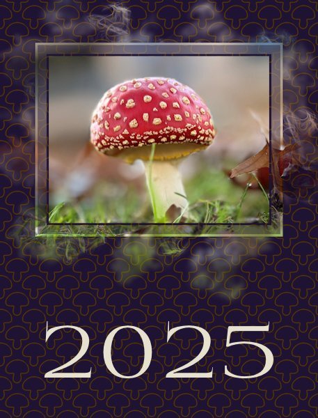
Fabulous Corrie. The cover is striking and really sets off the beautiful mushroom. I cant believe how red it is.1 point
-
Suz, I am sure I'm not as discerning as you about blacks and whites. Prices on everything have jumped here mostly caused by corporate greed so who knows what I'll pay this year!?!1 point
-
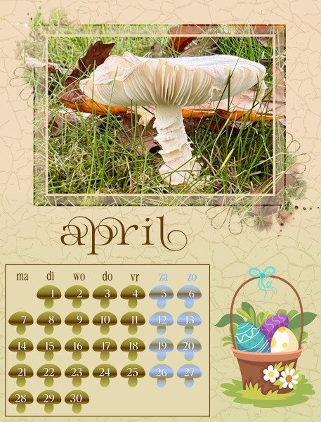
And this is the cover for my calendar. When I was trying some colors for the background I got this nice result with a blendmode. Originally I had a very light color with a darker layer with my mushroom as a pattern. For the pattern I kept the outline of the mushroom without a fill and with this dark color it looks fine, at least in my opinion. Now I only have to make an index with all the names of the mushrooms , but that is more or less a text file with some sort of frame around it. I will print that on the backside of the cover and I need the Latin names as well otherwise my recipients in another country do not know the Dutch names and I don't know the common German or English names. Besides that I have to change the names of the months to German and English. So I'm not done yet.................1 point
-
1 point
-
I'm going to give this a try when I get some down time. thank you for the good explanation Corrie.1 point
-
Wow, Ann. In Canada you can pretty much double that. My staples where I live used to be good, now the advice i got when asking if I could use my own paper for the wedding invite printing (and pay as if it's their paper - I did this before for my nieces wedding invites - they were totally cool with it, almost 100% profit for them as I they didnt have to supply the paper but got paid for it!), was to buy my own printer or borrow one from a friend. BIG eye roll. I use staples because they have really black blacks (even though my laser printer has black settings - it just doesnt compare). So I'm quite disappointed, are they not a printing company? Just asking them to do their own job. they have two kinds of white....white and another white that is the same. So nothing slightly warmer, just plain bright white. There is big advantages to living in the US!1 point
-
I still don't get where we change the calendar templates to 300 dpi. I only know when we open a new image it asks us there, which is set to 300 dpi on mine. Can you show that to me on the next Q&A. Sorry, I'm not being the sharpest knife in the drawer on this.1 point
-
I just had a lesson learned about pngs. I am doing the wedding suite and i took the files to Staples just for test prints...well, it considered pngs a photo and would not size at 100% or at actual size (same as 100%), wouldnt even give that option. I lost 1/8 of an inch off the size of the cards in the suite. Doesn't sound like much but it really is, in the design of the card. So I had to convert to PDF (I had to ask Corel how to do that, I'm still such a newbie - and they were great and gave me directions. who knew it was so easy - not me). The calendars are like photos so I'm curious to see how they turn out for you Donna. I really want to print stuff and know that there won't be cut off parts, like I get when getting prints at a photo lab.1 point
-
I've never done a calendar but I've used Shutterfly for books and I believe they have calendars as well. Then I use Persnickety Prints for my 12x12 prints and they also have calendars available in various sizes. Both Shutterfly and Persnickety Prints print from jpg files (never tried png) and I can't complain about the quality. Both are great in my opinion. One thing about Shutterfly, if you get on their email list, they send out coupon codes all the time for various things, some as high as 50% off. Like others I create everything I do in 300dpi.1 point
-
All my classwork is done in 300dpi so no conversions were needed. Staples didn't ask for CMYK. I was working in .jpg and that was fine.1 point
-
@Donna Sillia I took my calendar pages to a local Staples Stationary outlet. They printed it, punched holes and added a comb to the top so it could be hung on a wall. It cost me under $20 and the results were awesome. I just used the full-size pages as jpgs. Here's the cover and back page I made last time...1 point
-
I think it all depends on where you get your calendar printed. Some places will offer a template and you just fit your JPG or PNG file in that template. You might want to change the resolution to 300dpi, but for some printing places, that is not even necessary, so check what is required. I have had books printed and was never asked for a CMYK version, so again, check if it is required at all.1 point
-
Today I am converting all my pages to 300dpi and then copying them into Photoshop to convert them to cmyk. Since Photoshop won't save them as png, I am opening the psd file in Paintshop and saving it as a png. After I am finished, I will be contacting a printer.1 point
-
I'm interested also. The only way so far that you showed us was in the vector workshop - how to draw around the raster object, highlight the nodes and make them symetrical to soften and make the curves as needed. Works, but Corel Draw has intrigued me for some time, but the cost was too high.1 point
-
Thank you so much,, Susan. I used Adobe Express and Filter Forge a lot for the backgrounds.1 point
-
perfect colors in this layout Mary. I love what you did with the main frame part of the mask.1 point
-
I agree, each page with it's glory of color is like celebration. I love color so there was so much to discover in Donna's pages. it really has that "wow" factor. So many different calendars that had me going "WOW" that's fabulous.1 point
-
1 point
-
1 point
-
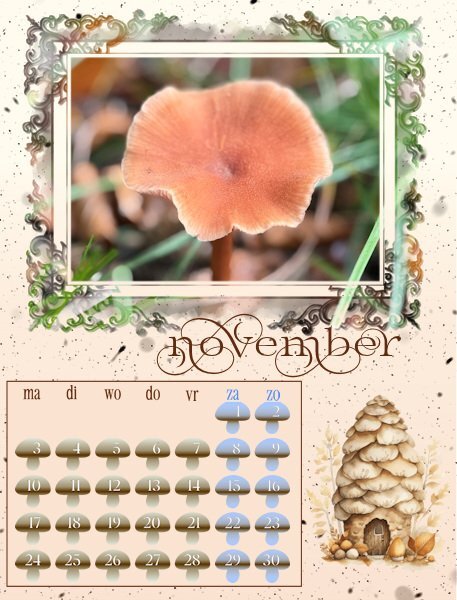
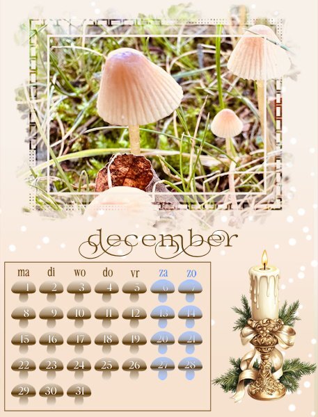
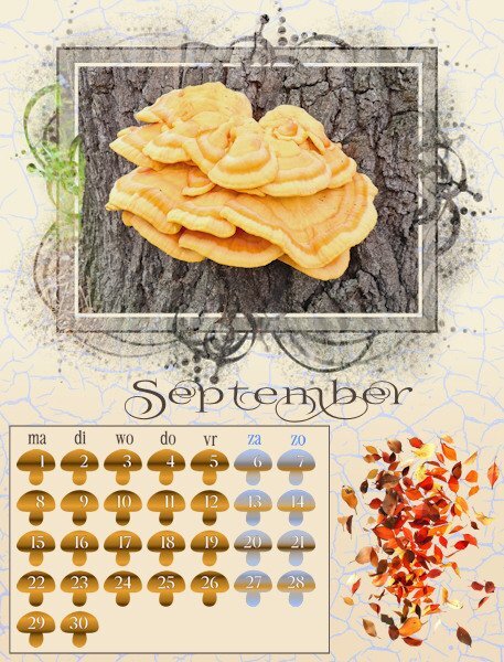
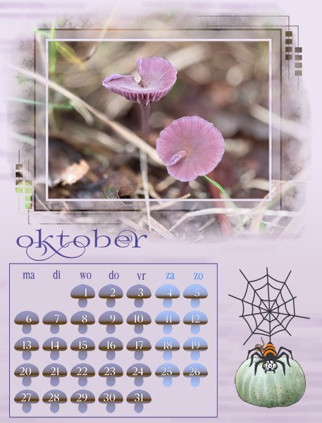
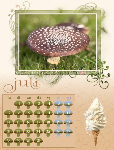
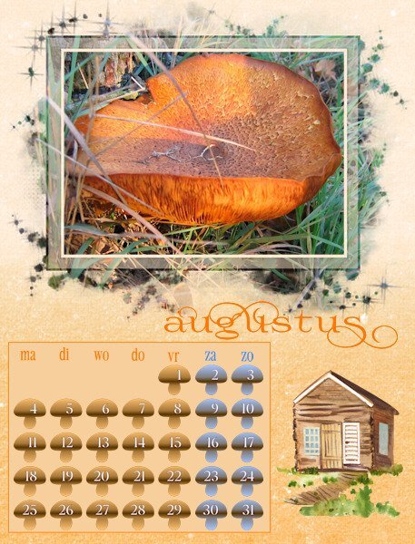
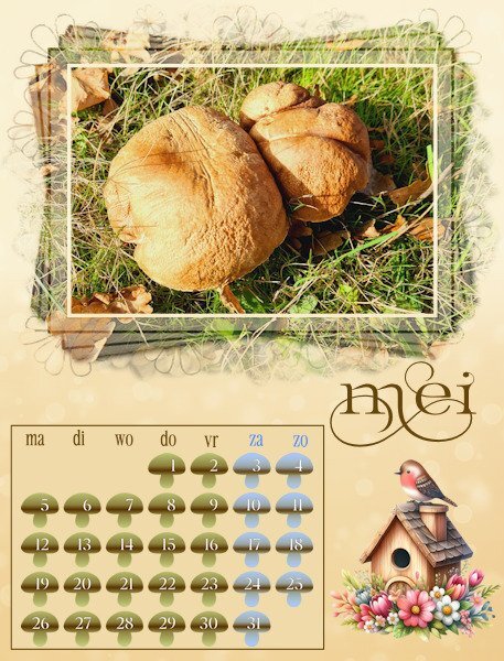
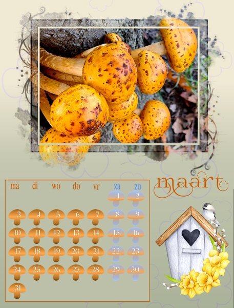
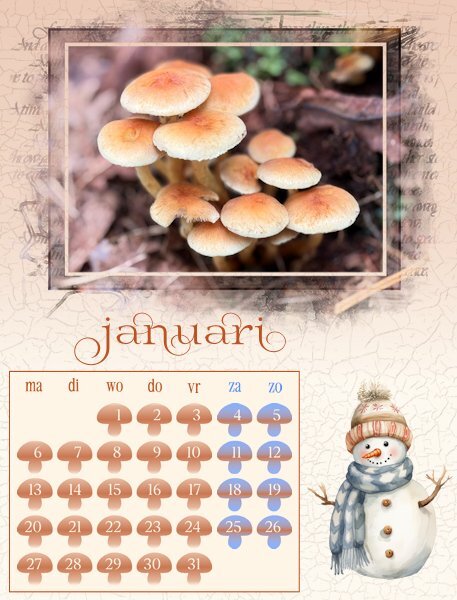
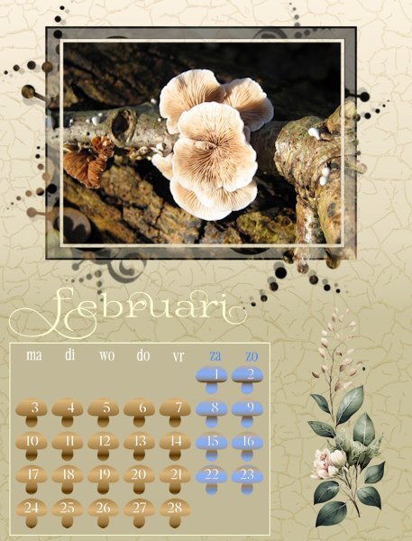
Hurrah, I'm back in business! Today I was able to go to the shop and buy a new mouse. I have all my months done and am resizing for posting. As it is almost midnight over here I will post some now and the remainder tomorrow. I didn't want the month names to overlap the masks because I know that some of the recipients of my calendar will cut the photo from the page as the month is over and use those later for making cards. This is my 5th year of making a calendar and over the years I have used different ways of doing the date boxes, like bigger with a photo underneath, smaller with all the special days with colors or small elements, completely colored etc. I also know that the recipients do not want to write on the calendar and besides that not all the special dates are in different countries on the same date and not all have a second X-mas or Easter day. Therefore I made little mushrooms with the dates, just to have something different for this year; I only colored the weekend days differently.1 point
-
1 point
-
1 point


