Leaderboard
Popular Content
Showing content with the highest reputation on 10/27/2024 in all areas
-
11 points
-
11 points
-
10 points
-
10 points
-
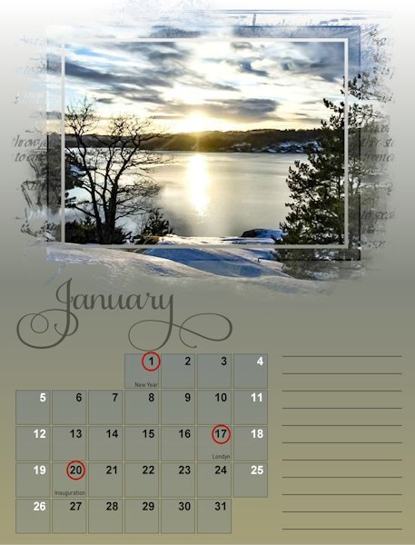
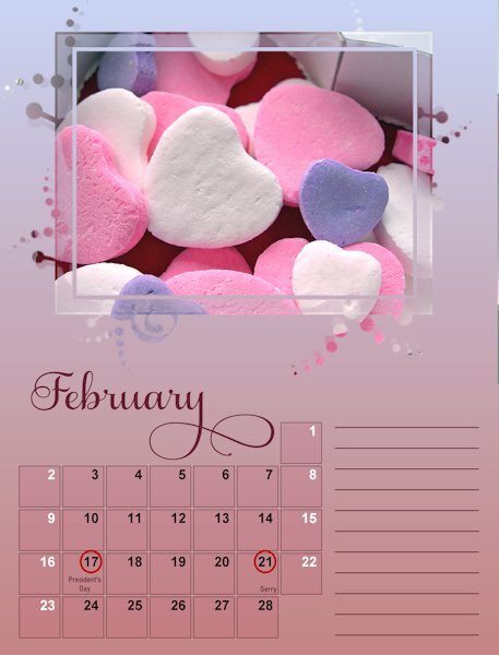
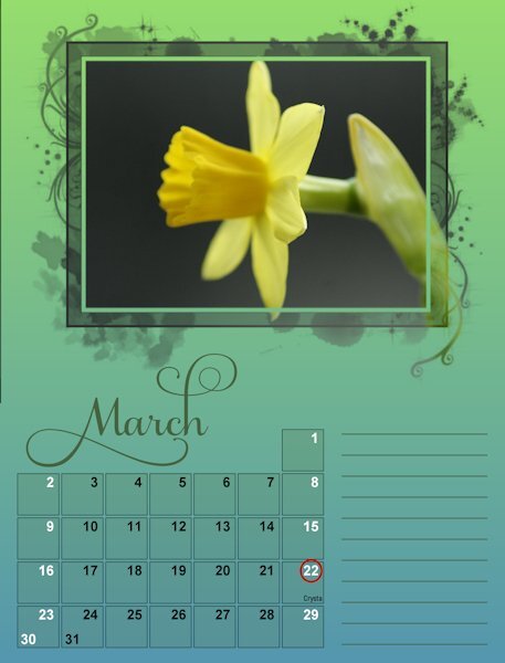
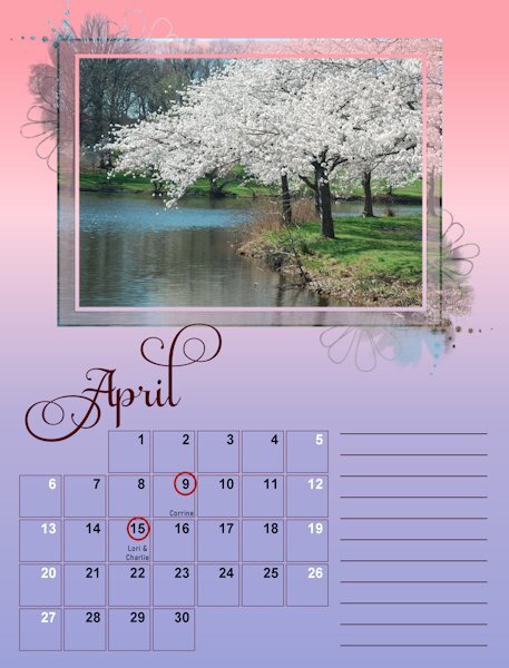
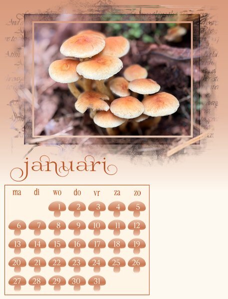
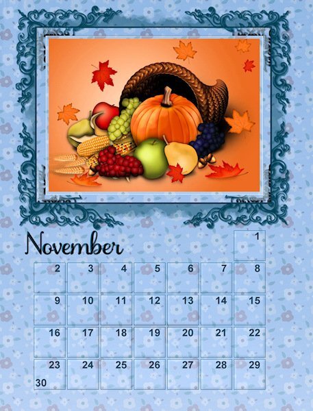
I had a bit of extra time last night because we went to wintertime and can now at least show what my calendar is going to look in a more definite way. All the month are going to be in the same style. The only thing I haven't decided on yet, is what to do with the extra space and if I'm going to give the weekend days another color or not. When I'm finished I will post the whole calendar. I'm super impressed with all the different calendars, you all are a creative lot. There is so much going on with all the posts that it is almost impossible to give a reaction on each.9 points
-
9 points
-
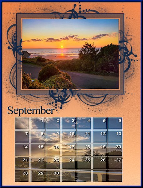
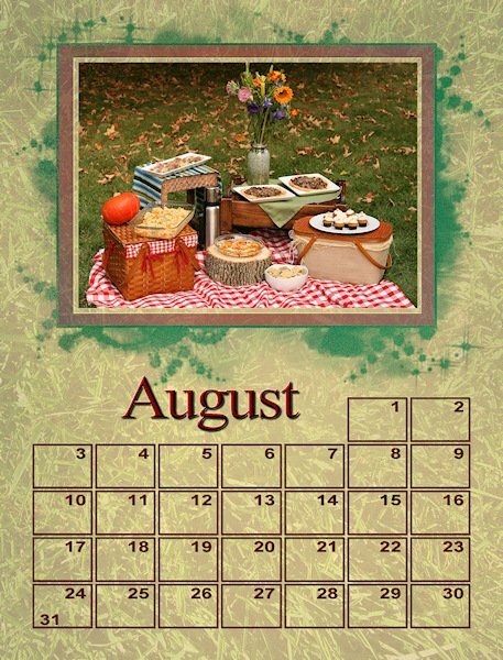
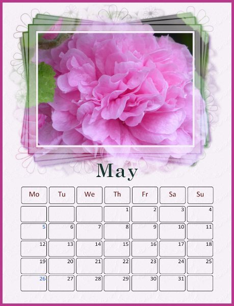
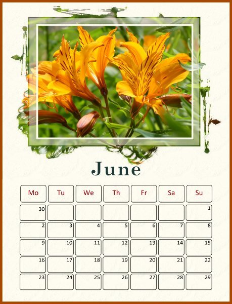
I haven't got around to filling the date boxes as yet on this year's calendars. This one is from a previous year's calendar. It's a nice way to use more photos of the same subject. Anyway, again it is down to personal choice, but I like the recipient to be able to write, or mark the dates, which in my opinion means keeping the date boxes soft. There are always many ways to achieve an effect with PSP, transparancy is one, but may I suggest you try using the blend mode. I would promote the background layer, add the image, then apply a blend mode. I as like to keep the texture, if any on the background paper only. You can also change the promoted background colour etc, to get the desired effect.8 points
-
8 points
-
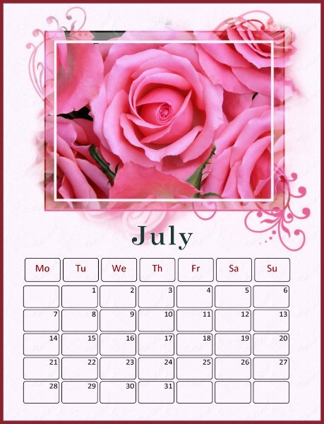
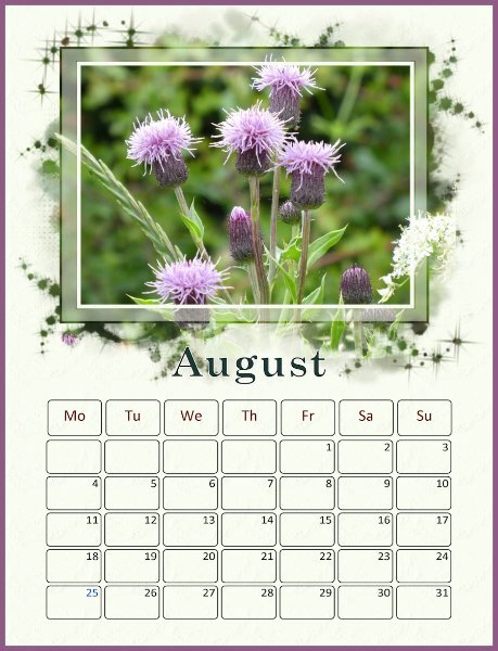
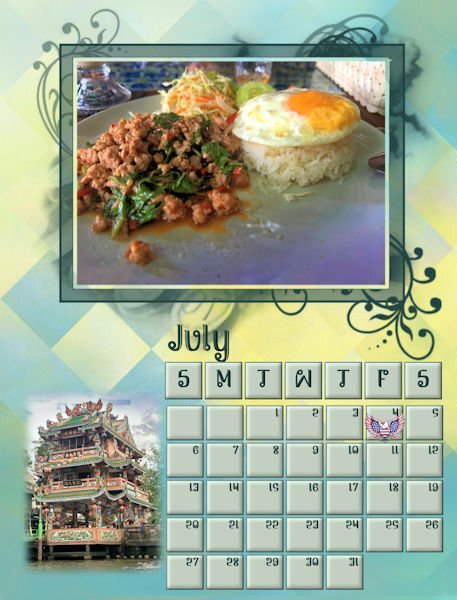
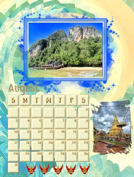
July and August The backgrounds are both from AI modified with FF distortion filters. I know that my backgrounds are fussy, but from what I see in David's pictures, Thailand patterns are vibrant and filled with patterns and colors. All the pictures are from David. One thing that I noticed when saving as jpgs is that the resolution was 100 px. I checked the other templates, and they varied from 100 to 200. Carole, should we be changing the resolution to 300 if we are planning to have our calendar printed?8 points
-
7 points
-
Donna, your patterns are really interesting to look at. You are really well versed in AI and FF so your backgrounds come out really well. And I'm super blown away how well polished and finished your months are. There's is feeling of motion, like waves, in that background and you can see it's affect on the mask of the smaller picture (I love that mask btw).7 points
-
Donna, I don't think your backgrounds are fussy. To me they are vibrant and they fit your theme really well - I like them just as they are.6 points
-
6 points
-
Oh, that reminds me. I forgot about slipping a photo or graphic behind the date grid. Actually, I did it on my monthly calendars occasionally. I didn't use a mask, just sized the art to fit.6 points
-
6 points
-
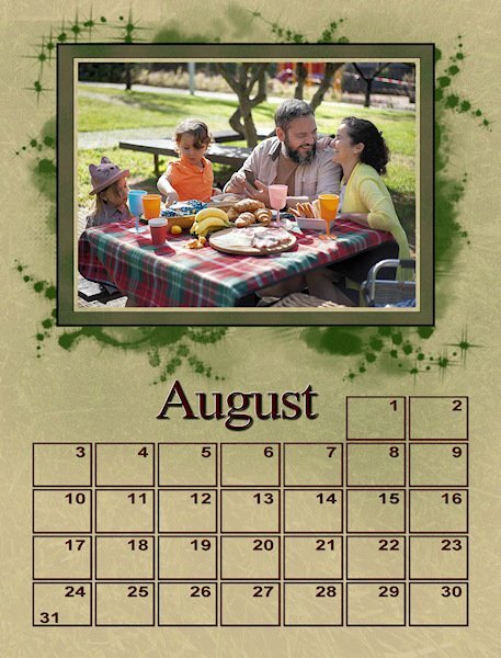
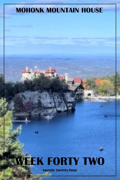
I would have a hard time picking. they both appeal to me. the people one looks so happy it makes me smile, the other one is so inviting I just want to walk right in, sit down and start eating.6 points
-
I am doing the same. the photos I'm using actually look better in a portrait orientation. It's sometimes a happy surprise when I fit them in the mask and think, hey, I would not have thought to use this photo this way and it look cool. Your flowers are stunning. Not just the photography but how full and perfect they look. You have a very green thumb.6 points
-
5 points
-
5 points
-
5 points
-
5 points
-
My theme for this years calendar is Kentucky. Last year I kept it wide open for just about anything. I established a basic layout and "pattern" that I was going to stick with and I think I was able to do that. Before starting, I looked on internet to see if "months" have specific colors associated with them and found out it is totally subjective LOL. I don't think I found two charts anywhere that matched or were even in the ballpark with each other. I just picked one and used it. I incorporated each months birthstone into each calendar. Fortunately NOT subjective, they are pretty much set in stone (pun intended har har !!). Here are the first three. I'll do three more posts each with three calendars. They are all in the gallery and I'm linking to them there in these posts.5 points
-
Susan, thank you so much for your kind comments. I sometimes have a tendency to over decorate. AI and Filter Forge are really fun to play with. Sometimes, it is hard to give the correct prompts to AI and have to try over and over. I have three that I use MyEdit and Adobe Express which are paid programs. I also use Microsoft Designer which is free, but requires credits which somehow just appear in my account.5 points
-
5 points
-
Absolutely! I always value anyones views and preferences, the beauty of the campus is that anything creative is always open for discussion. I find it dificult to veer away from my style, although I do on many occassions, which is good for me.5 points
-
Yes, the blend mode tool is next to the opacity. It is impossible for me suggest a blend mode. As you will have to try them all, depending on the image and background you use, to achieve the look you want. Try overlay, sheer, or soft light for example.4 points
-
Blend mode? Is that the drop down menu next to the opacity adjust? I just use normal. I haven't played with the other options. What are you suggesting? I ♥ your July and August!4 points
-
I love the theme of your calendar. I have a passion for lichen and fungi. Unfortunately, there isn't the variety out here, as there is at home.4 points
-
I would have really liked this one if I hadn't seen the other one first. I think the one with people in it is joyful and that gives it an edge over this one.4 points
-
4 points
-
Gerry, these are brilliant. I also like the consistency of each page. Which is what I aim for with my calendars.4 points
-
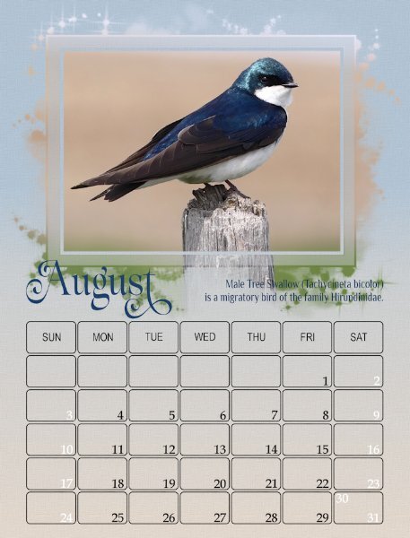
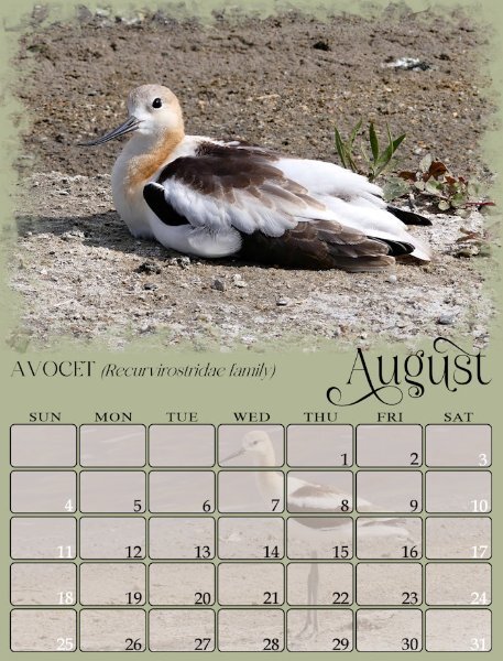
Carole, if I'm not mistaken the French movie industry will write the first letter of a christian name in lower case, and the surname's first letter in upper case of the actors names in the credits. As their surnames are regarded of more importance. As for my photos, no I rarely edit my photos. In order to achieve maximum depth of field, I use an aperture setting, set at f4 with the metering focused on the bird. Mind you in this shot there wasn't anything immediately behind the swallow other than the wide open field.4 points
-
Just wow, Gerry. The color combinations on your gradients are amazing not to mention everything else.4 points
-
@Julian AdamsThe bevel looks good on the days, without the outline (for June). For July, your airbrushing is so subtle that I would not have known if you hadn't said anything. @Mary Solaas I don't understand why you had to use a different technique to colorize the dates? Did you merge the white with the dates? Just locking the transparency would have be enough to change individual date color. @Ann Seeber It looks like those masks have generated very different results than I expected initially. All those ideas are definitely going to go into a class/tutorial/workshop! @Sue Thomas I remember seeing credits at the end of some shows/movies where they didn't capitalize the names. I guess it is a style on its own but as you pointed out, some interesting glyphs can then be used! Curious to know: do you manage to always get a nice "solid" background or do you edit the photo to get it? @Sharla Next time, I should warn people that the photos should be horizontal. I didn't mean to make it harder for users. @Donna Sillia Those backgrounds are very interesting! @Gerry Landreth Great work! That calendar will be lovely! By the way, once you are done your pages, you can then post them in the gallery for everyone to enjoy them! We are almost done!4 points
-
Sharla normally I like masks but then I can choose their size. Like you many of my photos didn't fit well into the masks, but slowly I'm getting there. Trial and error is a good description of this proces 😉4 points
-
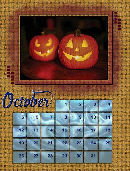
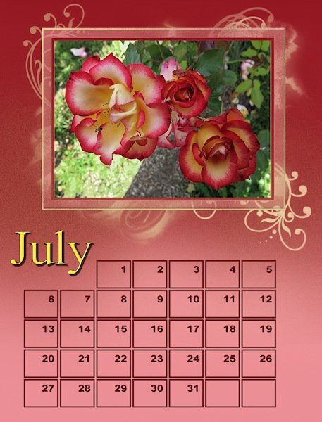
I used an airbrush on this. I wasn't happy with the way the gradient was blended into the lighter pink so I just touched it up with an airbrush to make it look more smooth. Then I decided to do a little bit of random variations in the color during the transition. Then I got the idea of adding yellow under the mask to accentuate the yellow coloured month. I don't know much about how to use masks so I created a masks y selecting all and then using the selection tool removed the rectangular picture frame so I would not get yellow paint on it. The possibilities are just endless!4 points
-
I tried a bevel and cutout and would keep it if I sent it digitally, but for printed I always would worry about the shadows as they really darken when printing. It's funny to me that I try what others are doing because it looks fabulous on their layout. then I do it on my layout and it looks like a dogs breakfast...and I have CATS! hahaha. Kidding aside, I didnt interpret any of the post as critical. I like to hear from everyone on what they like and dont like because I can then try something I would never have thought to try and see if I like it or not, or it sends me on another path of discovery. Everyone's thoughts are valid and important to my learning and opening my narrow eyes.4 points
-
I'm sure Carole has the definitive answer but I always use png, not jpg for printing because the quality of a png is pixel for pixel perfect whereas a jpg always loses a little. The originals are 2400 X 3150 pixels which at 300 dpi would print out at 8" X 10.5". What I did last year was use the AI resize tool to get them to fit on an 8.5" X 11" sheet of glossy photo paper. It wasn't much of an enlargement or distortion so they printed very nicely. I don't understand why you are getting 100 to 200 px. Maybe you're reading pixels/cm not pixels/inch? @Cassel ?3 points
-
Wow! Daniel, your calendar is full of terrific pictures nicely assembled to match each month of the year with the seasons. I especially like your winterization of the months.3 points
-
It has been a fun challenge. Many of my photos were horizontal but just didn't work in the masks - they just looked wrong and boring so I had to be creative with how I used them which is a good thing.3 points
-
3 points
-
I've been using png files as my main pic, then adding a paper underneath to change the mask. Now if I could just get PSP to work again, I could catch up.3 points
-
3 points
-
I liked the photo with the people better but both whites and blacks were blown out so I couldn't tweak the contrast to my liking for printing. I also tried a little more saturated color peeking through the mask and more texture on the background "paper". The "paper" is a layer of a photograph of grass on top of my background with the transparency quite low. I thought grass would make a good background but the color was too bright.3 points
-
3 points
-
3 points
-
It’s been great doing this workshop with you all because we do have different styles and approaches and they are great to see and learn from. I love the differences. I never use masks in layouts so this calendar workshop has been a challenge for me. More than half of the photos I thought I’d use simply didn’t work with the masks and some of the ones I have used looked awful at their original size hence I’ve enlarged many of them so that some detail emerges. It’s been interesting having to do this because it’s not what I’d usually do. I'll persevere to the end but I am still a reluctant mask user!3 points
-
There are so many creative styles people have developed here. I learned a lot from seeing what I like in other people's ideas. I sort of developed a style of doing this last year. I was pretty happy with a lot of the calendars I came up with then. This year the first few calendars were trying to remember the techniques that I used to use. Then I started trying to push the envelope on those. I'm not really sure what my style is yet, but I think you can tell that I'm leaning in a certain direction that works for me. I do want to push the envelope though doing things like I mentioned above strong in an airbrush to modify a gradient and the color underneath the mask. This is really so much fun and teaches you so much about the nuts and bolts of Paint Shop. I have been using paint shop back to version 8 to edit my photographs and the digital fractal artwork that I created. I logged many many hours just working on a single layer. It's taken me all these years to learn how to use layers.3 points
-
Not using a capital letter to start the month is a nice idea, paricularly if a glyph or a swash is added to replace that capital letter like Susan did.3 points
-
I am of the same thought as you Corrie. I have tried several techiniques using the mask, replicating many of what I have seen being done on here with the masks. In all honesty and it is my own personal opinion and preference not to create frames, or even elaborate to much on the masks. Again , as far as I'm concerned masks are meant to be subtle adornemts to any layout, if that is the right word to use. In this case, the calendar for me, the focus is then taken from the photo and placed upon the decorative/beveled etc masks. Calendars are meant to identify dates and events, adding (my own) photos are a great way to add a peronalized touch. Calendars are also like magazines, they are flat, withouts shadows, bevels etc. Hence it is my view to keep the focus on the photos, and the date boxes, whilst decorative and pleasing to the eye. Please don't anyone interpret what I have said as being critial.3 points


